10 Opt-in Form Best Practices to Increase Conversion

Opt-in forms are so simple that they are tricky. Don’t get confused yet. They are very simplistically elegant, but only if you know the right elements to include and the perfect games to play. So we have jotted down everything you may need to know to clear your confusion. Moreover, there are also 10 best opt-in forms practices that are guaranteed to increase conversion.
What is an opt-in form?
An opt-in form is essentially a webform that marketers use to gain express consent from their leads. Usually, opt-in forms appear in the form of pop-ups or in the feature box on the homepage. Sometimes, they even cover an entire landing page.
However be the appearance and position, an opt-in form works to deliver mutual acknowledgment between a lead, who is interested in the product or service that the site offers, and the marketer, who gains permission (through the form) to include the lead in their email list to send newsletters to.
Why is opt-in better?
Opt-in forms are an industry favorite for a number of reasons. Their easy nature and efficient output put them in the marketing campaigns of all marketers. Some of the most common benefits of opt-in forms are given below.
- Simple email list-building
- Low unsubscribe rate
- Reliable contacts
- Improved deliverability
- Greater conversions, etc.
Single opt-in vs double opt-in
A single opt-in form only requires the visitor to provide their details like email address, name, etc., on the form. Once the visitor fills out the form, they are instant added to an email list. Here, no confirmation is required.
On the other hand, the double opt-in form is a two-step process. In the first step, users have to provide their details on the form and hit the subscribe button. Next, an email is sent to their address asking for confirmation. And only when visitors open their email and click to confirm they are added to the email list.
Both the forms have their own merit. One is much simple, and the other more sure and risk-free. In fact, the gap between single opt-in form and double opt-in form is almost non-existent. So if you are confused, a simple solution would be to A/B test and see what works best!
Is opt-in the same as a landing page?
Landing pages are uniquely designed web pages that are developed with the sole purpose of lead generation. They are here to collect information on potential leads so they can gradually convert them into paying customers. And in exchange, they often include lucrative discounts or offers on amazing products.
Opt-in forms, alternately, are simple forms with minimal fields. They are diversified in appearance, positioning, and nature. They may include various input fields like address, previous history, etc., or simply ask the email. They may include offers like a free ebook or directly mention newsletters. Furthermore, some marketers even embed the opt-in form on a landing page for better results.
Hence, if you were wondering if opt-in forms are landing pages? Then no, opt-in forms are not landing pages but often appear so for specific campaigns.
Best opt-in forms practice
There are many ways you can improve your opt-in form to increase conversion. Some of the most common tricks being a limited number of fields, a wordplay on the CTA, fancy form, including social proof, etc. Any blog on the internet will tell you that. So today, we have researched some of the most amazing tips to enhance your opt-in form so you can increase conversion that you won’t find anywhere else. So stay tuned.

Listen to data
Sure, you can research some of the best tips and trick to employ, and they may be suitable. But what works for some is not guaranteed to work for another. So make sure you stay in the loop of what your clients like.
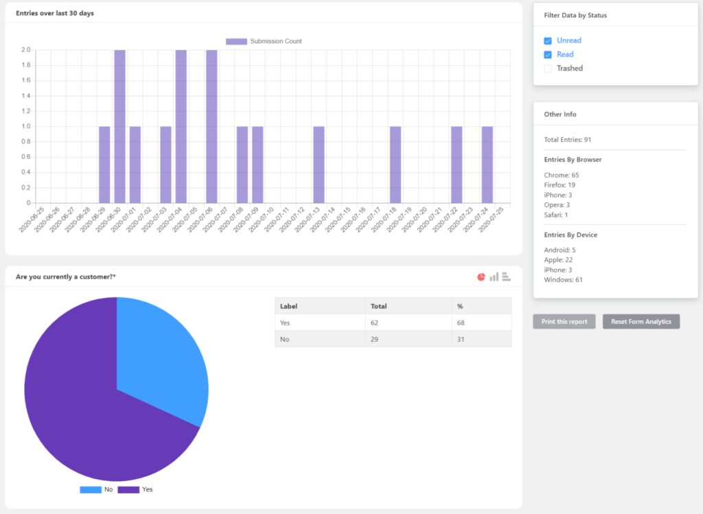
We suggest you use premium tools to know your visitors better. An expert tool will provide you with valuable insights like when the visitors visit your site, which type of content converts better, which CTAs work, etc. This, in turn, will help you design a better list-building strategy.
Use the correct number of opt-ins
Yes, opt-in forms are vital for lead generation. But that doesn’t grant you the license to bombard your uses with them. Keep your site neatly organized in terms of design and content so the user knows what to find where.
Only using a pop-up may not be a wise choice. Almost every one of us closes the pop-up that appears first on-screen without even giving a read. But what if the user later finds interest in your content and wants to subscribe? Make sure you have a form lying in close proximity.
Use forms instead of links
A lot of people include the subscribe option at the footer. This is a wise idea since visitors frequently look at the footer for contact options, subscriptions, feature lists, etc.
However, providing a link that redirects users to another page in order to be enlisted is a whole lot of unnecessary hassle that nobody wants to go through. Instead, replace it with a form. Users can provide their details then and there, and it’s easy for everyone.
Make sure your opt-in form is visible
The very purpose of your opt-in form is for users to subscribe so you can, in due time, convert them into paying customers or upsell more products to them. So it doesn’t do anyone any good if it stays hidden from users’ eyes.
There are a number of positions where you can place an opt-in form for optimal performance, like the hello bar, feature box, etc. Additionally, you can design the form with attractive colors, so it stands out. And accessorize it so other elements on your page help users quickly navigate to it.
Use a feature box
If you are looking to highlight your opt-in form, then a feature box is the perfect way to go. It sits on your homepage, right above the scroll line, and sometimes across the entire screen.
Feature boxes are very simple in nature. They typically contain one icon image, and a couple of sentences accompany that image. So a feature box is a perfect solution. And creating feature boxes in WordPress is relatively easy as well. So you really don’t have anything to worry over.
Be straightforward about your content
Let’s imagine a scenario where a visitor lands on a website with lots of cute comics, and they subscribe to their newsletter in the hope of getting more comics. But instead of cute comics, the newsletters are invitations to buy different products. Not very pretty, is it?
It is in the best interest of both the client and you that you be forthright about the content of your periodic newsletter. Hence, including the nature of your content, how frequently you send newsletters, etc., in the opt-in form is good practice.
Offer past issues of your newsletter
While we are on the topic of being candid about the content of your newsletter, an excellent way to go is to offer a sample of your newsletter. You can offer past issues, or you can conjure up a model so visitors can see what they are getting into.
Sample newsletters are a great way to communicate what you have to offer to your prospective clients. Moreover, after seeing past issues, only the users who are sure about you will opt-in. So you don’t have to waste your time and effort behind uninterested individuals.
Include a privacy statement
In this age and era, it is vital to be direct about privacy policies. Users need to know what sort of data you will be collecting, and why, for how long you will store the data, and what you will do with it after that date.
Hence, it is crucial that you include a privacy statement in your opt-in form. This will help you say transparent with your users and also save you from possible legal complexities.
Add an unsubscribe button
Adding to the topic of data security, another obligatory step to designing an opt-in form is to include an unsubscribe button on your form. Always remember that customers are the sole owners of their data and their journey.
So it is imperative that they get a say in how the journey should be and be allowed a way out, should they choose to end it. Moreover, a simple unsubscribe button can also save you from GDPR complications.
Put a default email address in the placeholder opt-in form
Users can be skeptical about putting out their personal data. But you can easily put their doubts to rest by using the placeholder smartly. An opt-in form typically contains a name field and an email field. Or even just the email.
Naturally, this can make the user a little nervous. Just go to your form editor and put a dummy email like [email protected] instead of putting in commands like “Place your email address here.” This not only guides the users but also assures them, gaining their trust.
Final words
See? Not so difficult, is it? Now that you know the basics of opt-in forms, it may be a good next step to try your hands at creating some. Fluent Forms is an excellent form builder packed with incredible form-building features like CRM integration, email automation integration, swift input fields, drag and drop, conditional logic, landing page mode, global styler, etc. Anything and everything you may need to create an intelligent landing page that converts like crazy!


Leave a Reply