Every form you build should convert.
The complete guide to WordPress forms: what to build, what to avoid, and how to turn more visitors into submissions. No coding required.
Most websites have a form. Very few have a form that works.
A contact form sitting on a page isn’t a lead generation tool; it’s just a box. The difference between a form that converts 3% of visitors and one that converts 18% isn’t magic or money. It’s a handful of decisions: how many fields you show, where you put the label, what your submit button says, what happens the moment someone makes a mistake.
This guide covers all of it. Whether you’re building your first contact form or auditing a checkout flow that’s leaking conversions, you’ll find everything you need here – written for website builders, not developers.
No coding required
•
25 min read
•
Updated August 2026
1. Form-Building Fundamentals
Before you think about colors, fonts, or conversion rates, you need to get the structure right. The fundamentals in this section apply to every form you’ll ever build — a one-field newsletter signup and a twelve-step application form both depend on the same underlying decisions. Get these right and everything else in this guide becomes easier to apply. Get them wrong, and no amount of optimization will fully recover the experience.
1.1 Field types: Use the right input for the job
Picking the wrong input type is one of the most invisible sources of friction in a form. A user who has to type a date manually when a date picker would do it in two taps is already annoyed before they’ve answered your first question.
The rule is simple: use the most specific input type the data allows. Free text is a last resort, not a default. Fluent Forms gives you over 65 input fields – the table below maps the most useful ones to the job they’re built for.
Find the right field in 5 seconds
1.2 Labels: above the field, always
Label placement is one of the most studied decisions in form UX, and the research is consistent: labels placed above the field outperform labels inside the field (placeholder text) on every metric – completion rate, error rate, and perceived ease.
When a user clicks into a field with a placeholder label, the label disappears. They now have to remember what they were filling in while typing. On a longer form, this causes errors. On mobile, where the keyboard covers half the screen, it causes abandonment. Nielsen Norman Group testing found that placeholder-only forms increase errors across all user demographics — not just less experienced users.
1.3 Required vs. optional: mark the exception, not the rule
Most forms are mostly required fields. If 8 of your 10 fields are required, don’t mark all 8 with a red asterisk; mark the 2 optional ones with “(optional)” instead. This reduces visual noise and the feeling of being interrogated.
Quick test: Count the asterisks on your form. If there are more than 2 or 3, flip the convention – mark optional fields instead and remove every asterisk.
1.4 Field ordering: chronological and psychological
Fields should follow the natural order in which a person thinks about giving you that information, not the order in which your database stores it.
The rule of thumb: easy fields first, sensitive fields last. Start with name and email – information people type dozens of times a day from muscle memory. Move to more considered fields in the middle. Put anything that feels sensitive (phone number, budget, business challenges) at the end.
By the time someone reaches a field that gives them pause, they’ve already filled in several fields and are psychologically more committed to finishing than abandoning. This is sometimes called the commitment principle.
1.5 Single-column vs. multi-column layout
The default answer is single column. Multi-column layouts look compact but cause two problems: they imply a reading order that users don’t reliably follow, and on mobile they either collapse awkwardly or stay tiny.
Baymard Institute UX benchmarking found that 16% of e-commerce sites still use extensive multi-column checkout forms, directly contributing to cart abandonment when users misinterpret field order.
The one justified exception is paired fields that are genuinely parallel: First name/Last name is the classic case. The pairing is semantically meaningful, both fields are the same size, and splitting them signals to the user that they belong together.
1.6 Form length: the right number of fields
There is no universal ideal field count. The right number of fields is the minimum number that gives you what you need to deliver value to the user.
For a newsletter signup: 1 field (email). For a discovery call booking: 4–5 fields. For a mortgage application: as many as the process genuinely requires.
The question to ask about every field before adding it: “What does this field let me do for this person that I couldn’t do without it?” If the answer is only “segment them in our CRM,” that’s your use case – not theirs. Cut it, or at least make it optional.
1.7 When to use a single-page form vs. a multi-step form
Use a single-page form when the total field count is 5 or fewer, the form is low-commitment (a newsletter signup, a quick contact form), and the user can see the full scope at a glance without needing to scroll. Single-page forms are simpler to build, simpler for the user to understand, and have no navigation overhead.
Use a multi-step form when the form genuinely needs more than 6–7 fields, when conditional logic determines which questions appear (since showing all possible conditional branches on one page creates confusion), or when the form has distinct logical stages that benefit from separation — “about you,” then “about your project,” then “confirm and submit.”
What you don’t want is a 3-field form broken into three steps. That adds navigation overhead — a “Next” button, a “Back” button, a progress indicator — to a task that should take 20 seconds. The structural choice should serve the user’s task, not create the appearance of simplicity by hiding all the fields behind pagination.
Fluent Forms supports both approaches natively — single-page forms by default, multi-step via the Form Step field.
* required fields
↑ Unrelated fields side by side — confusing reading order, breaks on mobile
Put these fundamentals to work.
Fluent Forms includes every field type in this guide, ready to drag and drop – no coding required.
2. Form Conversion Optimization
Most forms fail because of small decisions that compound into friction – a field that didn’t need to exist, a submit button that says “Submit,” a privacy note that sounds like a legal disclaimer. This section covers every lever you can pull to close that gap between someone landing on your form and actually completing it.
2.1 Field count is your biggest conversion variable
Every field you add to a form costs you completions. Not metaphorically – measurably. Studies consistently show that reducing a form from 11 fields to 4 can more than double conversion rate. The relationship isn’t linear (going from 3 fields to 2 doesn’t double conversions), but the direction is always the same: fewer fields, more completions.
The exercise is worth doing on every form you own: go through each field and ask whether removing it would actually hurt your ability to follow up or deliver value. Phone number on a newsletter signup? Cut it. Company size on a contact form? Cut it. First and last name when first name alone would do? Cut it to one field.
What you collect at signup doesn’t have to be everything you’ll ever know about a lead. Progressive profiling, i.e. collecting more information over multiple interactions, is almost always a better strategy than front-loading a long form.
2.2 Multi-step forms outperform long single-page forms
When a form genuinely needs many fields – a quote request, an application, an onboarding flow – breaking it into steps consistently improves completion rates. The reason is psychological: a progress bar showing “Step 1 of 3” is far less intimidating than scrolling to see the bottom of a 12-field form.
The first step should be the easiest. Name and email, or a single qualifying question. Once someone has completed step 1 and seen “Step 2 of 3,” they’re committed. Abandonment at step 2 is dramatically lower than abandonment from a single-page form with the same total number of fields.
Fluent Forms handles multi-step forms natively with the Form Step field, including progress bar styles you can customize to match your brand.
2.3 Micro-copy does the heavy lifting
Micro-copy is the small text around and inside your form – the label, the helper text below a field, the privacy note below the email field, the text on the submit button. It’s the part most people think about least. It’s also one of the highest-leverage conversion improvements you can make without changing a single field.
The places where micro-copy matters most:
2.4 Smart defaults and pre-filling
If you already know something about a user – because they’re logged in, or they came from a specific campaign, or they filled in a form before – pre-fill those fields. A form that greets someone with their name and email already filled in converts dramatically better than a blank form, because it signals that you know who they are and you’re not wasting their time.
Even without user data, smart defaults help. A country field that defaults to the user’s detected country, a date field that defaults to tomorrow, a dropdown that defaults to the most commonly chosen option – these small choices reduce the decisions a user has to make.
2.5 Inline validation, not end-of-form errors
The worst validation experience is filling out an entire form, clicking submit, and being confronted with five red error messages. At that point the user has to scroll back up, figure out which field is wrong, fix it, and try again. Every one of those steps is a dropout opportunity.
Inline validation catches errors at the lowest-friction moment. The user just typed the value; it’s fresh in their mind. Fixing it right there takes two seconds.
2.6 Trust signals placed at the right moment
Trust signals on a form – a privacy note, a testimonial, a “used by 700,000+ websites” badge – only work if they’re placed where doubt arises. That’s almost always just before the submit button, not at the top of the form where the user hasn’t yet decided to engage.
For lead gen forms, a one-line testimonial directly above the submit button (“We booked 3 new clients in our first week” – Jane, Studio Owner) can lift completions by double digits. For forms that collect payment or sensitive data, a security badge and a one-line data commitment (“Your data is encrypted and never shared”) at that same position does the same job.
2.7 Mobile conversion deserves its own checklist
More than half of web traffic is mobile, and form completion rates on mobile are consistently lower than on desktop – not because mobile users are less interested, but because most forms are designed on a desktop and tested on a desktop. The tap target is too small. The fields are too close together. The keyboard covers the field the user is trying to fill.
The mobile-specific fixes that move the needle most: making every tap target (field, button, checkbox) at least 44px tall, putting one field per row without exception, placing the submit button where a thumb can reach it without scrolling, and ensuring your form doesn’t shift or resize when the mobile keyboard appears.
2.8 Partial submission recovery
Most form abandonment is silent — the user closes the tab and you never know they were there. But if someone filled in their email address before leaving, that’s a recovery opportunity, not a lost lead.
Some form plugins can capture data as users fill it out — before they ever hit submit — giving you a record of incomplete submissions to follow up on. This is standard practice in e-commerce cart abandonment flows but significantly underused on lead generation and application forms.
Fluent Forms handles this through two native features. Partial Entries automatically captures form data as users fill it out — even without submission. Save & Resume is the user-facing complement: it gives respondents an explicit way to save their progress and return later, removing the all-or-nothing pressure that causes people to delay starting long forms in the first place.
3. Common Form Mistakes
Every mistake in this section is one we’ve seen repeated across thousands of WordPress forms – not because the people building them are careless, but because each one feels like a reasonable choice in isolation. Collecting “just a little more” data feels harmless. A generic error message feels fine because the developer testing it already knows what went wrong. The cumulative effect of these small choices is what separates a form that quietly underperforms from one that visibly works.
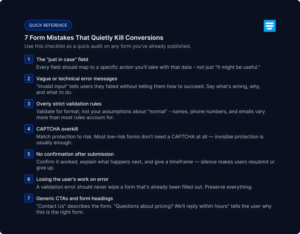
3.1 The “just in case” field
Almost every overlong form has the same origin story: someone in a meeting said “while we’re at it, can we also ask for…” and a field got added that nobody on the team can clearly justify six months later.
The tell-tale sign is a field that exists for a hypothetical future use case rather than the current one. “Company size” on a newsletter signup. “How did you hear about us?” on a support request form. “Job title” on a free trial signup where the product works the same regardless of title.
Quick test: Before adding any field, ask: “What specific action will this data let me take that I couldn’t take without it?”
The fix isn’t just “have fewer fields”. The fix here is a process: every time someone proposes adding a field, ask them to name the specific action that data will trigger. Not “it would be useful to know” – what will you actually do differently if you have this data versus not? If there’s no concrete answer, the field doesn’t go on the form. It goes on a list of things to ask later, after the relationship has already started.
3.2 Vague or technical error messages
“Error: Invalid input.” “Something went wrong.” “Field required.” These messages are written from the system’s perspective, not the user’s – and they put the burden of figuring out what to do next entirely on the person trying to complete your form.
A good error message answers three questions: what’s wrong, why it’s wrong, and what to do about it. “Please enter a valid email address – e.g. [email protected]” does all three. “Invalid email” does none of them; it just tells the user they failed without telling them how to succeed.
This matters most for fields with format requirements that aren’t obvious. A password field that requires a special character should say so before the user gets it wrong, not after. A phone field expecting a country code should show the expected format as helper text — not as a rejection message that appears after submission.
3.3 Overly strict validation rules
This is the mirror image of mistake #2: not just unclear validation, but validation that’s wrong. The most common offender is phone number validation that assumes a single country’s format and rejects everything else. This is a problem for any business with customers outside that country. Email validation that rejects valid but unusual addresses (plus-addressing like [email protected], or newer top-level domains) is another frequent culprit.
Name fields are a particularly common source of this mistake. Validation that requires a “first name” and “last name” — and rejects single-word names, names with apostrophes, or names with non-Latin characters, actively excludes real users with real names.
The general principle: validate for format, not for your assumptions about what a “normal” answer looks like. When in doubt, validate less strictly and let your team review submissions for genuine errors rather than blocking legitimate ones at the door.
3.4 CAPTCHA overkill
CAPTCHA exists to stop bots, but it’s frequently deployed as if every visitor is a suspect until proven human. A CAPTCHA on a low-risk form adds friction for 100% of real users to stop a small percentage of spam that could often be caught another way.
Try invisible or low-friction spam protection first (honeypot fields, time-based submission checks, or Cloudflare Turnstile, which runs invisibly in the background for most users). Reserve checkbox-style CAPTCHAs (“I’m not a robot”) for forms with genuinely higher risk.
3.5 No confirmation after submission
A user fills out a form, clicks submit, and… nothing visibly happens. Or the page just reloads to the same blank form. Or there’s a brief flash of text that’s gone before they can read it.
This is one of the most common and most fixable mistakes on the list. After submission, a user needs three things: confirmation that it worked, a sense of what happens next, and — if relevant — a timeframe.

This matters even more for forms tied to money, bookings, or applications. The anxiety of “did that actually submit?” is one of the most common reasons people resubmit a form (creating duplicate entries) or abandon the process and contact support separately.
The fix is almost always cheap: a redirect to a thank-you page, or an inline success message that replaces the form. Fluent Forms supports both natively, along with the ability to customize the confirmation message per form — there’s no reason for any form to end in silence.
3.6 Losing the user’s work on error
Imagine filling out a detailed 8-field form, clicking submit, being told there’s a validation error — and finding every field now empty. This happens when a page does a full reload after a failed submission, wiping everything the user entered.
3.7 Generic headings and CTAs
“Contact Us.” “Get in Touch.” “Sign Up.” These headings tell a visitor what type of form they’re looking at — not what happens when they use it, or why they should bother.
4. Form UI and UX suggestions
Getting the structure right (Section 1) and the conversion levers right (Section 2) still leaves one layer unaddressed: how the form actually feels to interact with. That feeling is determined by the visual and interaction design decisions covered in this section.
4.1 Field states: what every input communicates
Every field on your form is always in one of five states. Each state communicates something to the user — and if that communication is absent, unclear, or inconsistent, the user has to guess what the form expects from them.
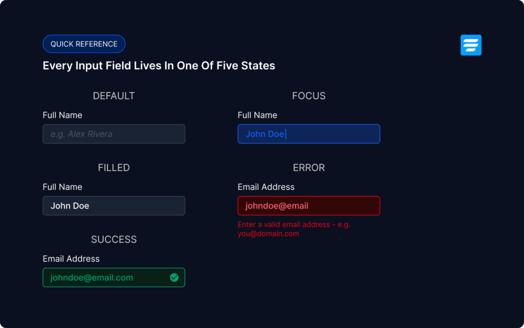
Default is the resting state. The field is waiting. A muted border and placeholder text tell the user what goes here without demanding attention.
Focus is the active state — the user has clicked in or tabbed to this field. A stronger border and a soft glow ring signal “you’re here.” Without a visible focus state, keyboard users have no way to track where they are on the form. This is the most commonly removed and most consequential missing state.
Filled is what the field looks like after the user has typed and moved on. The placeholder is gone, the real value is visible, the border returns to its default weight. It’s a quiet confirmation that the input was received.
Error is triggered by invalid or missing input. It needs three things to work: a visual change to the field itself (red border), an icon (not color alone — colorblind users need a non-color signal), and a message that says what went wrong and how to fix it. “Invalid input” fails all three. “Please enter a valid email — e.g. [email protected]” passes all three.
Success is the green-checkmark state: the field has been validated and cleared. Not every form needs per-field success states — they add the most value on forms where accuracy matters (payment fields, email addresses, passwords) and less value on freeform text fields like message boxes.
4.2 Loading and async states
The moment between clicking submit and seeing a response is one of the most anxiety-producing moments in a form interaction. Without visible feedback, users have no way of knowing whether their click registered, whether the form is processing, or whether something silently failed. The result is duplicate submissions — users clicking submit two, three, or four times because nothing visibly changed after the first click.
Fluent Forms handles this in two ways that matter to your visitors.
First, the submit button disables and shows a loading indicator the moment it’s clicked — making it physically impossible to submit twice without any configuration on your part.
Second, Fluent Forms uses AJAX submission by default, meaning the page never reloads at all. On a traditional full-page-reload form, a validation error wipes every field the user filled in. On AJAX, the error appears inline, the user’s data stays exactly where it was, and fixing the problem takes seconds rather than starting over. This alone is one of the strongest arguments for using a dedicated form plugin over a basic contact form solution.
4.3 Conditional logic: showing the right fields at the right time
Conditional logic lets you show or hide fields based on what a user has already answered. A form that asks “Do you have an existing website?” and only reveals the URL field when the answer is “Yes” is shorter, cleaner, and less intimidating than one that exposes every possible field to every visitor, regardless of relevance.
Conditional logic doesn’t just reduce visible field count; it changes the psychological experience of the form. A visitor who only sees fields relevant to their situation feels like the form was built for them specifically. That feeling of relevance is a conversion signal in itself.
4.4 Accessibility: the one thing you control
A good form plugin takes care of label-to-input association, ARIA attributes, and keyboard navigation order automatically. These are baked into the rendering engine and require no configuration. The one accessibility variable you control directly is contrast: whether your placeholder text, helper text, and labels are dark enough to read comfortably.
Light gray placeholder text on a white background is one of the most common contrast failures on published forms, and one of the most invisible to the person who built the form, because they’re looking at it on a good monitor in a controlled environment. The person filling it out might be on a phone in direct sunlight. WCAG AA requires a 4.5:1 contrast ratio for normal text; WebAIM’s free contrast checker takes 30 seconds to verify yours.
4.5 Button hierarchy and CTA design
Every form ends with an action, and the button is the last thing a user sees before committing. If it looks weak, provisional, or similar to everything around it, the decision to click becomes fractionally harder for your visitors.

The primary button should be the most visually dominant element on the form – solid fill, brand color, sized like the form’s destination rather than an afterthought. A secondary action (Previous/Back on a multi-step form) should be visually subordinate: outline or text-only, lower contrast. When two buttons look equally important, the form is asking the user to make a design decision that should already have been made for them.
The label matters as much as the styling. “Submit” is the weakest possible option. “Send my message,” “Get my quote,” “Book a call,” “Start free trial” all outperform it, because they name the outcome, not the action.
4.6 Design consistency across field types
A single form can combine text inputs, dropdowns, checkboxes, date pickers, file uploads, ratings, and payment fields. Without attention, a form with many field types looks assembled from different design systems rather than built as one thing.
Some form plugins include a global styler that sets border, radius, and color values across every field type at once. Set it once, and every field inherits the same treatment.
5. Types of web forms
Everything so far in this guide applies to every form. But “a form” is never what you’re actually building. You’re building a contact form, a booking form, or a product order form, and each type carries its own characteristics. Below, we cover forms you’re most likely to build.
5.1 Lead generation forms
A lead generation form starts a relationship: the visitor trades their contact details for something they want – maybe a guide, a demo, a newsletter, or a quote. The best lead gen forms feel less like forms and more like a fair deal stated clearly.
Demo Form
5.2 Payment forms
Payment forms such as orders, donations, paid registrations, and service purchases carry the highest stakes of any form type, because every field sits directly between the visitor and completed revenue. Friction here isn’t an inconvenience; it has a cost.
Demo Form
5.3 Registration forms
A registration form confirms a person’s place in events, courses, membership communities, or maybe workshops. The form’s job is simple – capture attendance details accurately, and don’t lose anyone between “I want to join” and “I’m confirmed.”
Demo Form
5.4 Booking & appointment forms
Booking forms add a dimension no other form type has: date and time picker. This is the centerpiece of a booking form, and getting it right matters more than any other single field decision on the form.
Demo Form
5.5 Quiz & survey forms
Quizzes and surveys are often the longest forms on a site, and unlike other types, length can be the point. A ten-question quiz that produces a personalized result, or a survey that genuinely needs fifteen questions, is justified as long as the respondent can see the value and the finish line.
Demo Form
5.6 Contact forms
A contact form is the most common form on the internet. A few small choices separate a contact form that generates conversations from one that just occupies a page.
Demo Form
5.7 Calculator forms
Price estimates, loan payments, ROI projections, quote builders — calculator forms flip the usual exchange. Instead of asking the visitor for something, the form gives them something: an answer they wanted right now.
Demo Form
5.8 Conversational forms
A conversational form presents one question per screen, chat-style, so filling it out feels like a dialogue rather than paperwork. The format shines exactly where traditional forms struggle: longer question sets that would look intimidating as a single wall of fields.
6. Technical setup and compliance
A form that looks perfect can still fail invisibly — notifications that never arrive, spam that floods your inbox, personal data handled in ways that create legal exposure. This section covers the technical layer that determines whether your form actually works after you hit publish.
6.1 Email deliverability: the most common “broken form” that isn’t broken
The single most common form problem on WordPress isn’t the form — it’s the email. WordPress sends notifications through PHP mail by default, which most mail providers treat as suspicious. The submission saves correctly, but the notification lands in spam or nowhere at all, and the site owner concludes the form is broken.
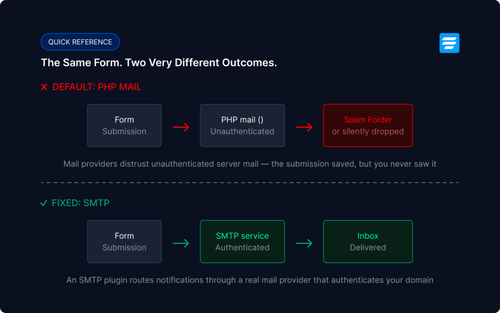
The fix is sending notifications through a proper SMTP service instead. A dedicated SMTP plugin – FluentSMTP is a completely free option – routes your form emails through a real mail provider (your host’s SMTP, Amazon SES, Brevo, Google Workspace), which authenticates them properly and gets them delivered.
6.2 Spam protection strategy
Section 3.4 covered why CAPTCHA-on-everything is a mistake. Here’s the positive strategy: layer invisible protections first, and escalate only if spam actually gets through.
Start with a honeypot. It’s an invisible field that only bots fill in, silently filtering them out with zero friction for real users. If bot volume persists, add Cloudflare Turnstile, which runs invisibly for almost all legitimate visitors. Reserve visible CAPTCHAs for genuinely high-risk forms.
Then re-evaluate quarterly. Spam patterns change, and protection you added during one bad week may be unnecessary friction the rest of the year.
6.3 GDPR and consent
If your form can be filled out by anyone in the EU or UK, consent basics apply. Three rules cover most situations.
6.4 Data storage, access, and retention
Every submission is stored in your WordPress database. That raises three questions worth answering deliberately rather than by default.
If your form accepts file uploads, restrict allowed file types and maximum size. An unrestricted upload field is an open invitation for abuse.
7. Measuring and improving your forms
Your audience, your offer, and your traffic are specific to you, and the only way to know how your form actually performs is to measure it. The good news: form analytics is simpler than most analytics, because a form has exactly one job.
7.1 The three numbers that matter
7.2 Finding where people give up
On longer forms, aggregate completion rate hides the useful detail: which field is the wall. If your form tool captures partial entries, reviewing them shows you the last field people filled before leaving. If twenty abandoned entries all stop at “Phone number,” that field is your problem.
7.3 Reading results with the right expectations
Benchmarks vary wildly by industry and form type, so don’t chase someone else’s number. The comparison that matters is your form against your form last month. A change that lifts completion from 12% to 15% is a 25% improvement in leads.
8. Choosing the right form plugin
Everything in this guide can be executed with the right form builder — but “the right” is doing a lot of work in this sentence. This section is the evaluation checklist: the features that determine whether a form plugin can actually implement what you’ve just read, and the questions to ask before committing.
8.1 The evaluation checklist
At least fourteen things to check before you commit.
8.2 Page builder forms vs. a dedicated plugin
Elementor, Bricks, and most page builders include a basic form widget, and for a 3-field contact form that only needs to send an email, it’s genuinely enough.
But the ceiling arrives fast: no conditional logic, no multi-step, no entry storage, no partial entries, minimal spam options, no payment fields.
The practical rule: if the form’s only job is “send me a message,” the builder widget is fine. If the form is part of how your business generates leads, bookings, or revenue, use a dedicated plugin.
8.3 Where Fluent Forms stands
This guide has stayed deliberately tool-agnostic — every principle above works in any capable form builder. But since the natural next question is “so which one?”, here’s the direct answer for the plugin this guide comes from.
Every item on the checklist in 8.1 is native to Fluent Forms: 65+ input fields, multi-step forms with customizable progress bars, per-field conditional logic — available in the free version — AJAX submission with inline validation, partial entries and save & resume for abandonment recovery, spam protection via honeypot, Akismet, reCAPTCHA, hCaptcha, and Cloudflare Turnstile, 60+ native integrations, conditional notification routing, entry management with a visual reporting dashboard, an advanced form styler, payment fields for Stripe, PayPal, and other popular gateways, numeric calculation and a lot more.
And it was built deliberately to be lightweight and stay fast on every page it loads on, which is why it runs on 700,000+ WordPress sites.
Frequently Asked Questions
Build forms people actually finish
Every principle in this guide compounds. The right fields, in the right order, with honest labels, clear errors, and a confirmation that closes the loop – together they’re the difference between a form that quietly leaks visitors and one that converts them.
You don’t need to apply all of it today. Pick your most important form and run it through this guide. Then compare the numbers in a few months.
Get better at forms.