Best Form Design Tips for Your Website to Get More Conversions

Are you in trouble trying to increase the conversion rate of your website with a well-designed contact form? Follow these form design tips to go one step further.
Nowadays, we can’t think about a website that does not contain any web forms such as registration form, survey form, billing form, customer feedback form, contact form, or email sign up form.
Creating a form is very easy, but the hard thing is getting people to fill that.
An ordinary web form is just a group of empty boxes with a general button. Users get bored quickly with these sorts of styles, and they tend to leave the webpage immediately. A study shows that there are 4.2 million users who are creating online forms, and among them, only less than 2 percent of visitors get into your email list. The rest of them are ignoring your forms. So building a web form with a proper design template is necessary for a website to increase the conversion rate.
Today we have gathered the best form design tips to make your form more user-friendly and get more user engagement to the best. But before that, let’s discuss what is the web form and why is it important to design your web forms properly.
What is a Web Form?

If you often visit websites, you must notice that maximum sites will ask you to fill up a form.
A webform is an electronic document that holds a layout of required user input fields. Web forms help to collect information from users, transfer that information to suitable servers, and establish any relevant follow-up. Text fields, radio buttons, checkboxes, etc. are used in web forms to gain user feedback or the information required from users.
A good contact form or web form is vital for better user experience and response. Forms on your websites help you to acquire your business goals because users need to connect with you through your forms when they are using your products.
Overall we can say that the purpose of a web form is to collect user information and convert them into potential customers. For every website owner, it’s evident that they want to know more about their customers. On the other side, users tend to fill up the forms which are less time-consuming and look great on the eye. In that sense, it is crucial to build a form with a proper design sense.
Now you must be thinking, why is it important to design your web form properly?
Well, no worries, let’s have a short discussion on this too.
Why is it important to design your web form properly?

The most common use of web forms is to collect information. As an example, we can say that we collect users’ emails for further communication. A well-designed form can help you increase the conversion rate of your website and collect the information of your visitors. By the same token, if you don’t care about the form design, you’re likely to lose a significant amount of potential leads.
People make their first impressions to your form just within 50 milliseconds. Which is too short for having a proper look at your web form and being conveyed. So, today we will discuss some essential aspects of the design and layout of your web forms to make a strong impression on your visitors.
Web form UX
UX refers to the user experience, which is focused on shorter physical features of your form. Such as how your form can be efficiently studied within a short time, how easy it is to understand, how a user will exactly know what to do next, and obviously how user-friendly your form is. Webform UX is all about your customer experience when they are allocating with your business. A well-designed form on your website appears to your users as a professional, reflective, helpful, and enjoyable website to work with.
For example, if you provide an email address to your customer service, good UX will take you so far to check how your email is working.
Web Form UI
UI is focusing on the user interface where your user would see how easily they can interact with your form. Such as how clear your form graphics are, how much readable your forms’ texts are, how easily users can copy from the form, how comfortably they can click on the submit button, etc. is dependent on the UI of your web form.
As an example, you have made a field on the form and named it “inscription,” which means address. Your users definitely would not understand the meaning of the field, and they would likely leave the page.
So, what are the best tips for your form design so that you can get more conversions on your website?
Well, let’s jump to the solution.
Best form design tips to get started now

There are numerous ways to improve your form design for your website. Depending on form length and size, tips vary. But in this blog, we have tried to organize 16 best form design tips for your website to get more conversions. You would choose among those tips whichever you think is convenient for your form design and for your website.
Keep it short, simple and straightforward
People lead busy lives, so they don’t have time to solve confusing or lengthy questions. Asking too many questions in your form may raise the risk of losing submissions and conversions. When creating your web form, try to avoid unnecessary items or information. Only add the crucial queries you need on your website for further use. Always ask simple and straightforward questions. Using complex words on your item or too lengthy questions also tends to drive your visitors away immediately.
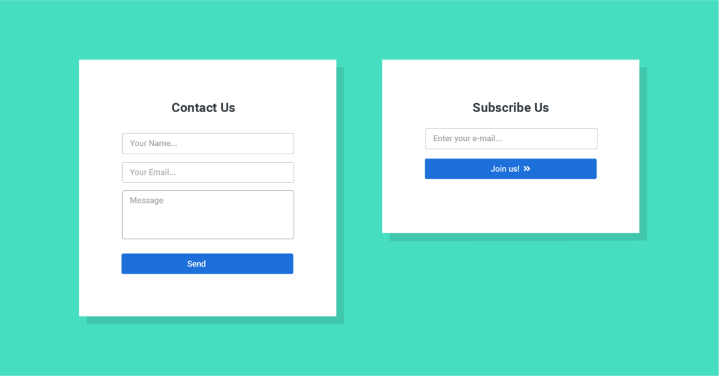
For example, if you want to make the “contact form” or “subscription form”, then the form should be as specific as the image given below:
Title your form clearly
Titles are meant to be the center of the form. So it is better to avoid stories on the title. Always try to give a clear title to your form so that your users can easily understand what the form is about and what they will get in return. A perfect example would be BettingExpert.com. They got 31.54% more signups to their form by just changing its title.
If you want to make a marketing subscription form, you have to clearly define the title as “Subscribe to x (website name) marketing blog.” For your better understanding, a picture is given below.

Show fields when you needed
Containing or adding too many questions or irrelevant fields can easily disappoint your visitors. Irrelevant fields may annoy your customers and increase the chance of leaving forms halfway without submitting them. Asking the same question twice is also a hassle for your visitors. Like asking for the password once and then again, “confirm your password.” Avoid seeking personal information like phone numbers and spouse names or details, if they aren’t necessary.GDPR law has made this matter more specific for online businesses. So, you need to focus on this if you are providing relevant fields to your web form for a better user experience.

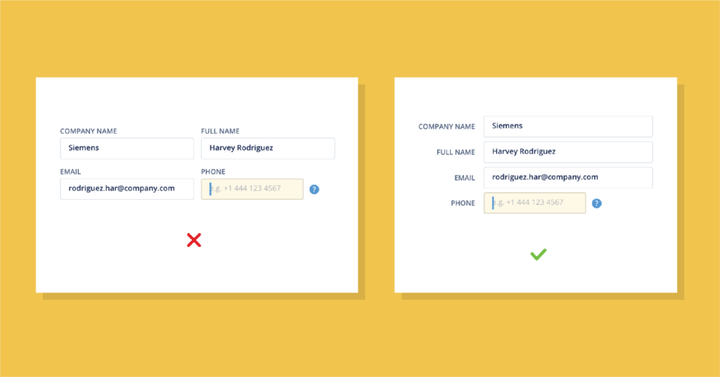
Follow a single column layout for each field
A study done by the CXL institution found that filling up a single column form is 15.4 seconds faster than a multi-column form. Your visitors don’t want to waste their time on understanding your questions and fill those up slowly. There are chances of losing users just because your form is too complex to fill.
Our eyes move in a natural direction. Using multiple columns can cause your eyes to move erratically, and that increases the time of form completion. Almost everyone is using a mobile phone nowadays. And they feel comfortable completing a bunch of tasks from mobile devices. So if you use single-column layouts for your form, especially when creating a long-form, it can save your users time in the completion of the form. So make sure your users find the forms easily understandable and can submit either using a mobile phone or desktop.
Always start with an easy query
Once someone starts filling out your web form, they are committed to it. People would be eager to complete the form as soon as they can. But if you start with some difficult questions at the beginning, they might lose interest in filling out the forms.
Always start with easy questions like name, email, address, etc. If there is a question about billing information like the client’s card number at the top of the list, instantly, the situation is getting worse for them. And they would not like to invest their time in that web form. So, you need to go for your queries from easier to harder.

Apply logically sequencing
Put your questions on the web form in a logical sequence. Don’t put your questions randomly. Like if you ask for a password before customers’ names, then users would find it odd, and this also reflects the unprofessionalism of the business.
You have to put your questions in a sequence; connect your questions with one another like the previous one to the next one. Each item should come one after one in an organized order. Big jumps from one subject to another is confusing to your visitors.
It is also important to implement your questions keeping in mind the different formats for different regions. As an example, the dates of Japan, Europe, and the USA all have different ways of displaying them.
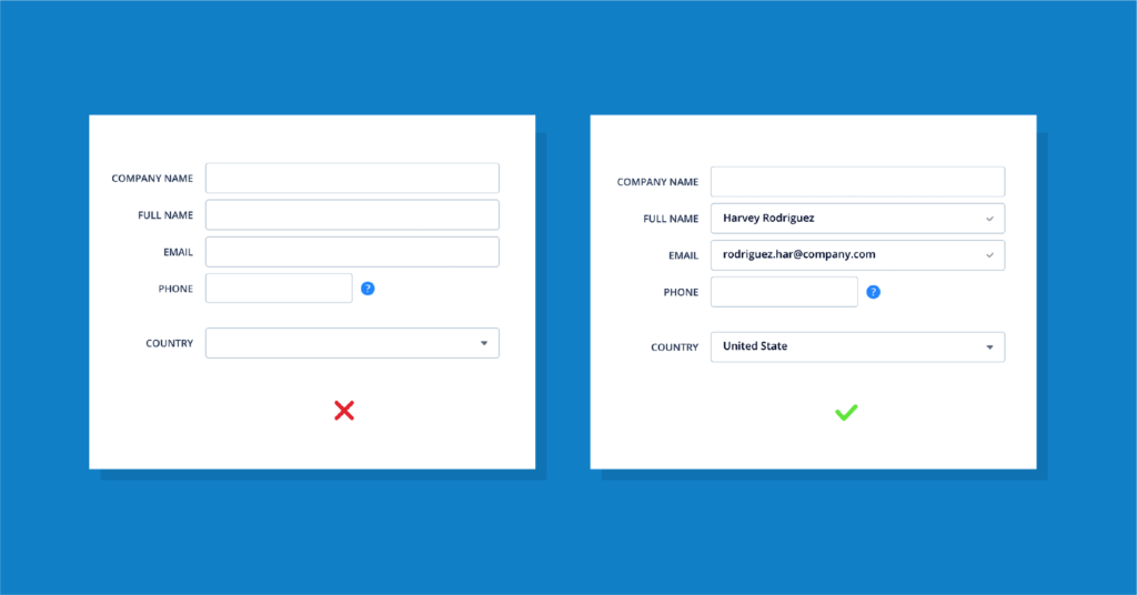
Add auto-fill browser
Help your users in completing some specific fields of the web form by using the browser auto-fill option. If the user is using an advanced auto-fill browser, up to ⅓ of the contact form can be filled out automatically. In that way, it will save a lot of time for your user, and they will love to go with your web form.
Browser auto-fills also minimize the risk of a typing error on essential fields such as email fields, addresses, etc. Though in B2B business, it is also possible that the user and the buyer might be two different people sometimes. But if you make your auto-fill extension editable, then it would be easier for both parties to cope.
Highlight the Active Field or Column
When a visitor is filling out a specific field of the web form, highlight that field. The highlighting area will help the user easily interact with the area if they get distracted by any chance.
Changing the border color and size can give a powerful visual indication. The same concept might be followed for error texts, as well. For the input field, the color of the border might be in red, and for error messages, you may add the color red.
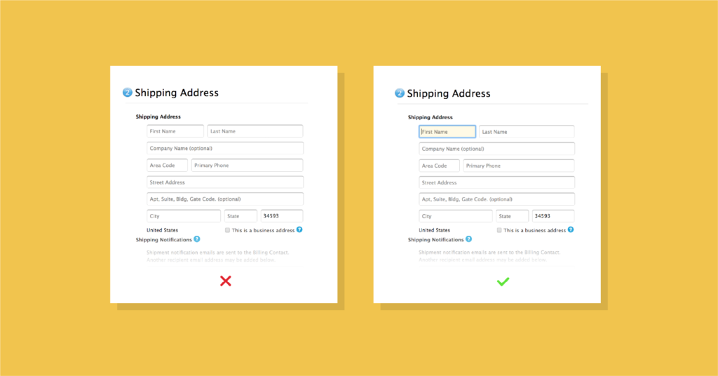
You can also autofocus the field of your form so that your visitors know where they need to start. Then they can follow the one-column sequence step by step to fill up your web form.
Permit copy and paste
Not permitting users to copy and paste information may decrease the conversion rate of your web form. Users might like to copy one specific information to avoid the risk of error.
Especially with devices like mobile, it is harder to put the same information so many times. When they have to write, again and again, users may find it frustrating and time-consuming.
So, when you are not allowing them to do so, they would abandon the web form.
Provide explicit instruction to error texts
Error handling is a vital part of web designing, and especially in web forms, it is more important to focus. When presenting errors to your users, don’t just depend on using colors. Try to use text and vector icons to help your users understand the problem.
Explaining the problem to your visitors can reduce the hassle for both. If you use “Something went wrong, please try again” or “Error 999”, your users wouldn’t understand what actually went wrong. Always use words and specify errors that anyone can understand. Explain the error to your users that what is wrong, and what’s needed to be done to solve the error.

Add a clear call to action (CTA) button.
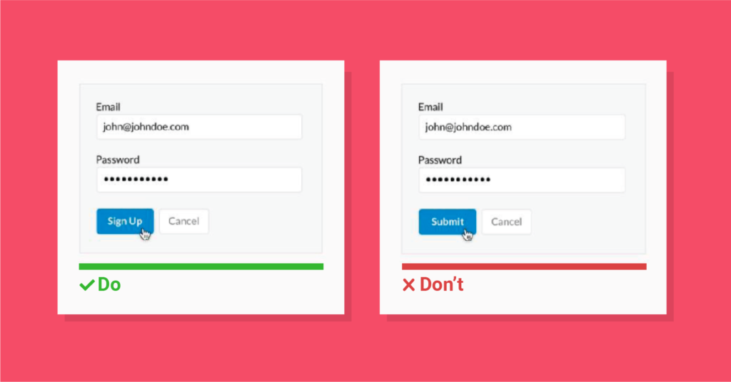
Your webform’s call-to-action button has a huge impact on the form’s conversion rate. You might confuse your visitors by using some straight language on your button like “ok.” In that case, your users will not understand what you are asking them to do. You need to be specific on each button for your web forms.
Tell your users what they will get after pressing this button individually. Instead of using confusing words, try to express the situation. For instance, if your form is about ticket booking, you can use “Make a booking now” on your CTA button rather than using just “Submit.” For an inquiry form, you can use words like “Get in touch” or “Make an inquiry.” Be clear about the intent.
Avoid CAPTCHAs and use reCAPTCHA
CAPTCHA is used for detecting spam, but this is extremely annoying as people are unable to catch CAPTCHAs within a short time. The chances of errors are also high in CAPTCHAs.
Well, it is also vital to ensure the security of your website. reCAPTCHA can be a clever solution to that. You can use reCAPTCHAs to confirm safety. reCAPTCHAs are really user-friendly and more efficient than CAPTCHAs in detecting spam, fake accounts, and bots. Users are also finding it more comfortable to complete.
Ignore slicing your fields
Sometimes we often slice our forms’ input fields (such as the phone number field, address field, name field, etc) in multiple parts of our web form. Slicing your form fields too much creates a negative impression on your users. They can’t interact with the web form easily as they have to frequently switch between the fields. Forms like these are a waste of time for your users and leave a negative impression.
So, keeping your form fields appropriate is a much user-friendly way to follow.

Make mobile-friendly forms
Nowadays it is odd that there is someone who doesn’t have a smartphone or not browsing with their phones. With the increasing number of phone users, the number of netizens is also increasing.
Though people are browsing, buying products online, completing web forms with their phones, it is also a significant need to make your forms mobile-friendly. In this busy era, you cannot expect people to open their giant devices every time they need to fill up a web form.
Creating mobile-friendly forms can make people’s life easier. They can quickly fill and submit forms with their smartphones, and your conversion rate would also increase. So, invest in optimizing your web forms for mobile devices.

Use the progress bar for long forms.
You must be filling up a form and getting bored with its so many questions. The process might have seemed like a never-ending one. For this kind of problem, often web developers are adding progress bars in their form designs for displaying the progress.
With these progress bars, users can have a quick idea of how many more questions they need to answer or how much more time they may need to invest in the form. Without the progress bar, if users find your web forms never-ending, they are likely to leave the form without finishing it.

Help your users by explaining specific information.
Sometimes users do not understand what you are looking for in a question. As a result, chances are high to occur error. If you give a proper explanation of the item to the question, your users might find it much easier to fill-up the form.

You can add example labels and placeholders on the input field or short descriptions besides the bar for a better understanding of users. These sorts of activities would give them a clear idea about what they need to enter the field.
Conclusion
Web forms are a significant element of professional websites. Web developers and online business owners all over the world are using it to bring leads to their sites. Creating web forms on a website might seem very simple, but it is one of the most vital resources to create a customer database, make leads, and improve sales.
Best form designs look great, easy to cope and help in getting conversion rates. For a better form design, you need to focus on UX and UI properly. By following these study-based form design tips, you can quickly improve the quality of your forms and see more effective results. You can use Fluent Forms which will allow you to create modern, engaging, and user-friendly forms in a minute.
So, what are you waiting for? Think fast which form you will add on your website and start designing the forms following our tips.




Leave a Reply