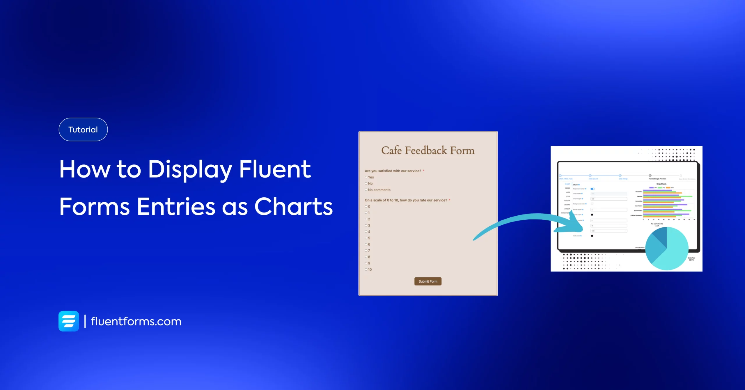
How to Display Fluent Forms Entries as Charts Using Ninja Tables and Ninja Charts
Fluent Forms is a fantastic tool for creating surveys, contact forms, and more. It can be utilized further to display the form results towards the users.
With Ninja Tables and the Ninja Charts add-on, you can showcase real-time form submissions in visually appealing charts like pie, bar, or line graphs.
This guide provides a step-by-step process to set up this integration, along with a real-world use case to demonstrate its value.
Why you need visual reports with your form submissions
Visualizing form data in real-time can transform how you engage your audience. Charts make data more digestible, highlight trends, and add a professional touch to your website. Whether you’re running a survey, collecting feedback, or tracking registrations, displaying submissions as charts can:
- Engage Visitors: Dynamic visuals keep users on your site longer.
- Build Trust: Transparent data (e.g., survey results) fosters credibility.
- Drive Decisions: Real-time insights help you analyze responses instantly.
Imagine you run a small coffee shop and want to collect customer feedback through a Fluent Forms survey. You ask customers to rate their satisfaction (e.g., Very Satisfied, Satisfied, Neutral, Unsatisfied) and leave comments.
Instead of manually analyzing entries, you want to display a pie chart on your website showing the distribution of satisfaction levels in real-time. This not only engages visitors but also shows transparency, encouraging more customers to participate.
Here’s how to make it happen with Fluent Forms, Ninja Tables, and Ninja Charts.
Step-by-step guide to displaying Fluent Forms entries as real-time charts
Before we move on to the tutorial, let’s check out what amazing things Fluent Forms can do for you, rather than just gathering feedback.
Fluent Forms is an excellent form builder plugin for WordPress. It is a lightweight and comfortable tool. Anyone can create any kind of form with its smooth interface. Its drag-and-drop feature makes it easier for users to make any form within a few minutes. Furthermore, Fluent Forms comes with 60+ input fields and 70+ pre-built templates to make the form-making process sleeker. You can also get 60+ third-party integrations with the plugin.
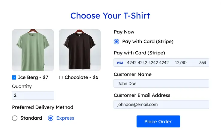
Moreover, advanced post creation, Stripe and PayPal integration, PDF entry generation, file upload, conditional logic, and more features are also available in Fluent Forms. You don’t need to worry about the form security with this tool, as it is secured with reCAPTCHA, Honeypot, and Akismet.
So, without any doubt, Fluent Forms is full of unique features. The developers of the tool add more functionalities every two or three months. Moreover, the plugin is super cost-effective.
Build Smarter Forms for Free
Now let’s get started with our step-by-step tutorial.
Step 1: Install and activate required plugins
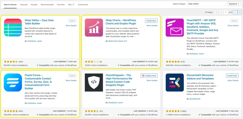
To get started, you need three plugins installed on your WordPress site:
- Fluent Forms (Free or Pro): For creating the form, and gathering entries.
- Ninja Tables (Free or Pro): For managing form data in tables.
- Ninja Charts (Add-on): For converting form data into charts.
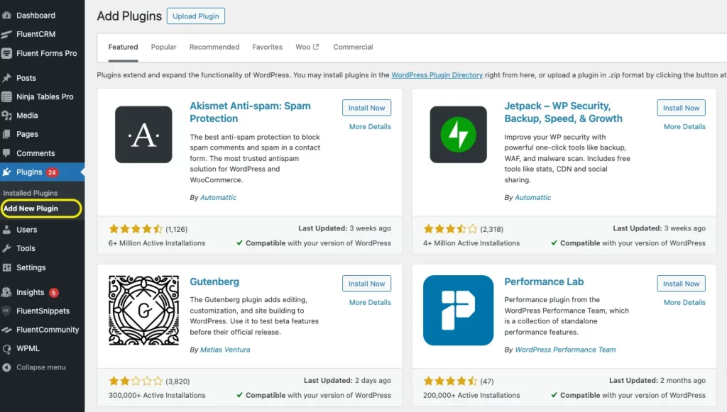
Install Plugins:
- Go to your WordPress dashboard > Plugins > Add New.
- Search for “Fluent Forms,” “Ninja Tables,” and Ninja Charts.
- Install and activate all the plugins.
Step 2: Create a survey form with Fluent Forms
Let’s create the customer feedback form for our coffee shop use case.
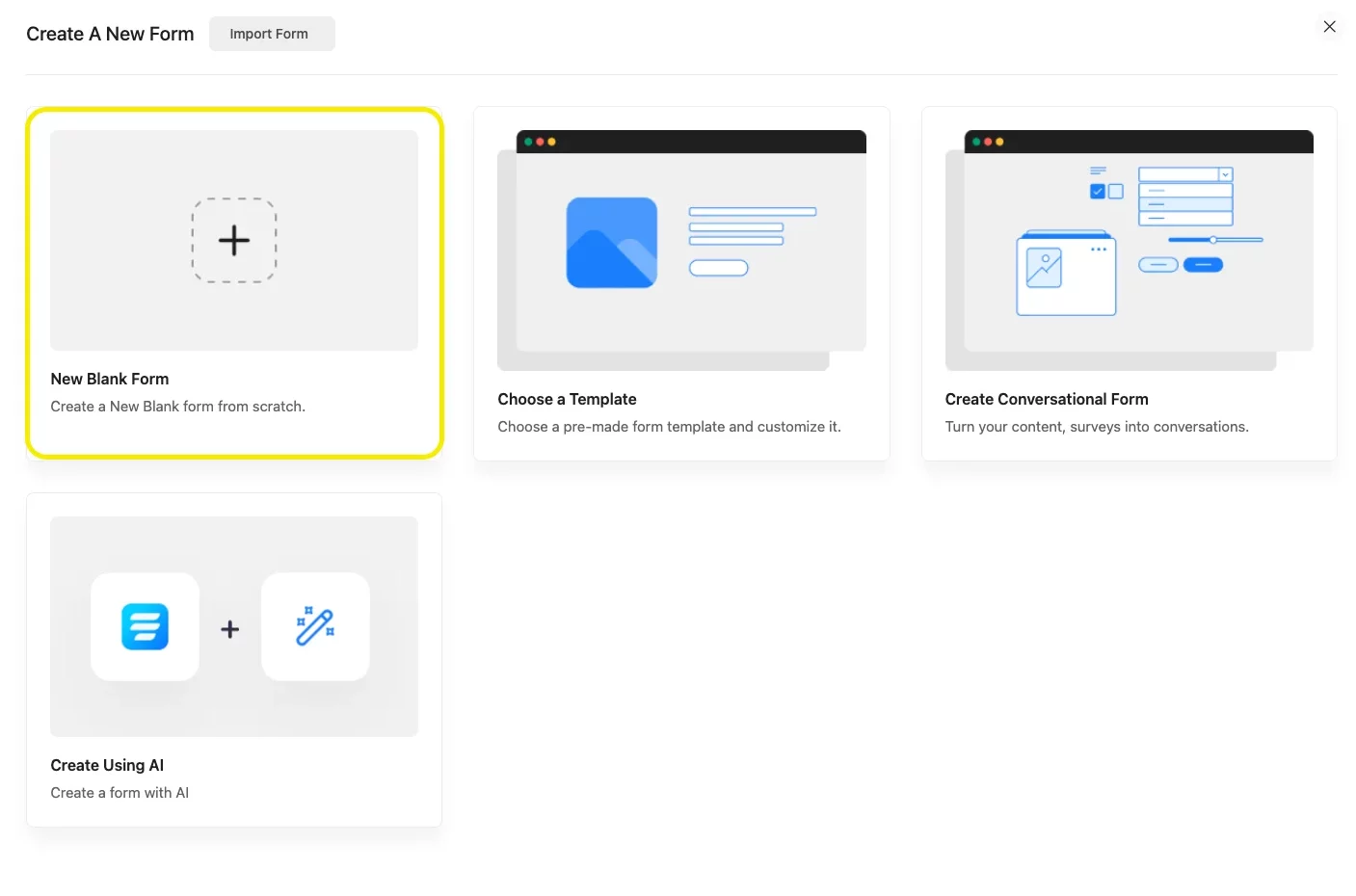
Navigate to Fluent Forms:
In your WordPress dashboard, go to Fluent Forms > New Form.
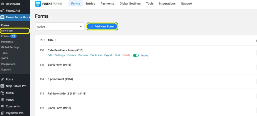
Choose a template (e.g., “Survey Form”) or start with a blank form. You can also download form templates from our templates gallery.
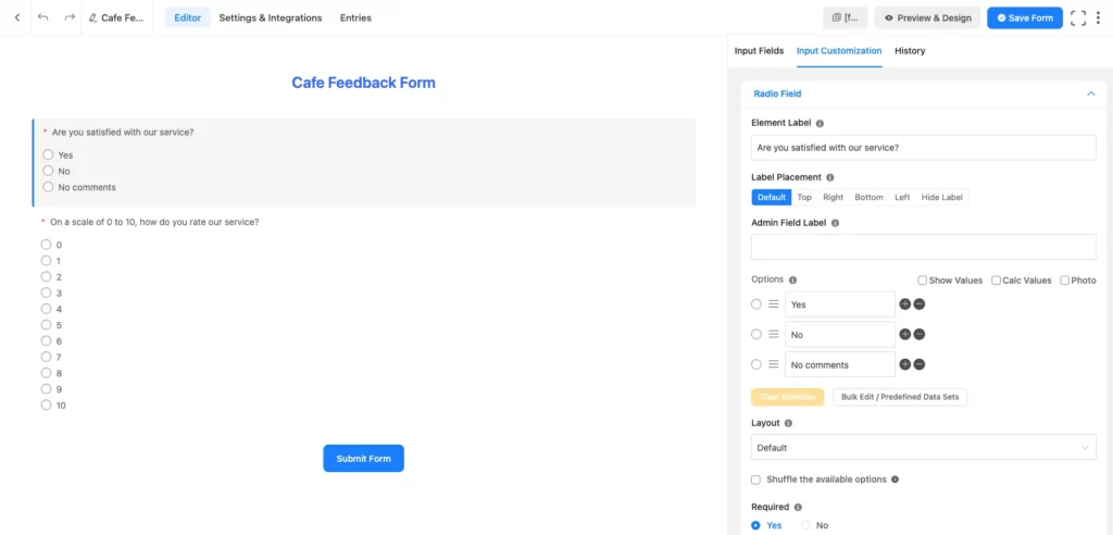
Add Form Fields:
Drag and drop fields like:
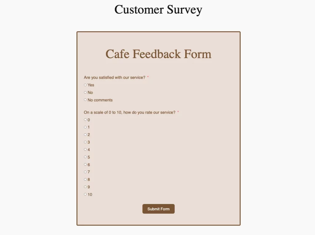
- Radio Field: For satisfaction levels (e.g., Very Satisfied, Satisfied, Neutral, Unsatisfied).
- Text Area: For optional comments.
- Name and Email (optional, for tracking submissions).
Publish the Form:
Create a new page (e.g., “Customer Feedback”) and paste the shortcode.
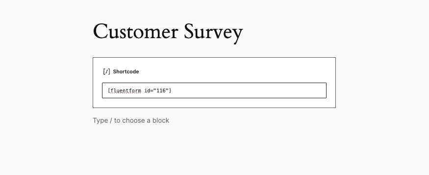
Publish the page and submit a few test entries to generate data.
Step 3: Create a chart with Ninja Charts
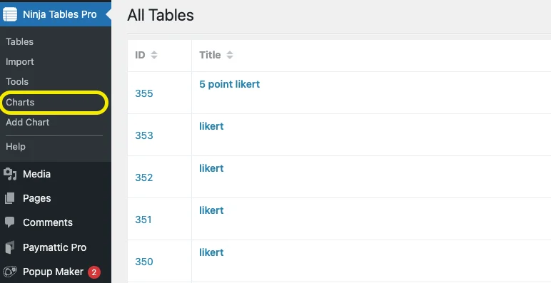
Go to the Charts section from Ninja Tables Pro.
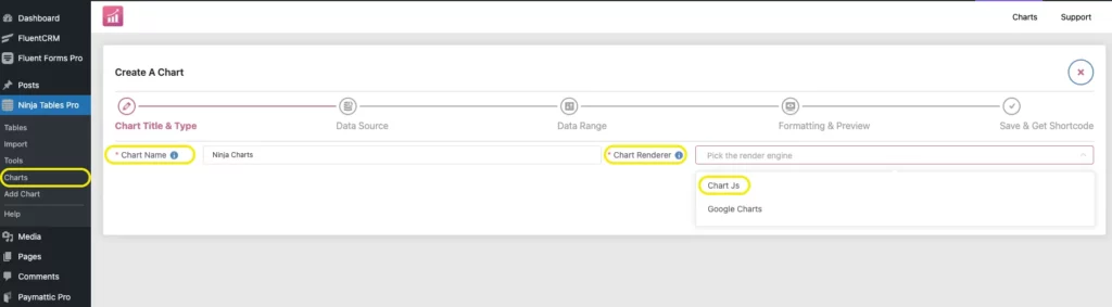
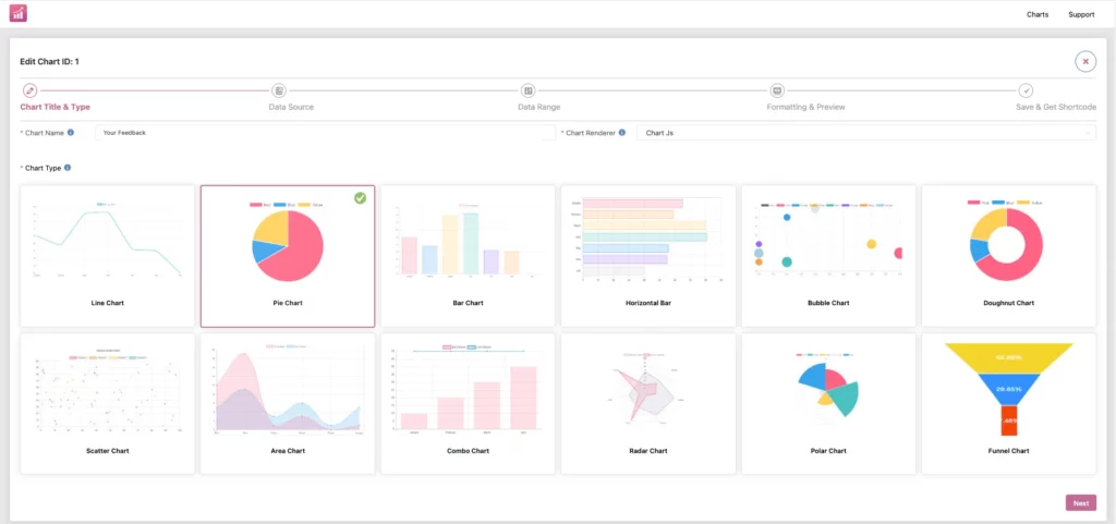
After heading to the Charts section, click on Create a Chart and you’ll see an interface like this. Name your chart and choose the chart renderer as per your preference. We used Chart Js by default.
There are various types of charts to choose from. You can try any type, we’ve used a pie chart in this case.
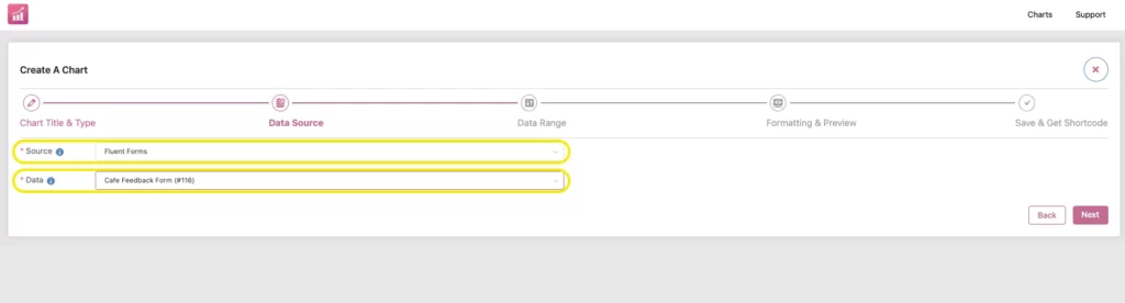
Select the Source, in our case it’s Fluent Forms, and choose the form you want to display entries.
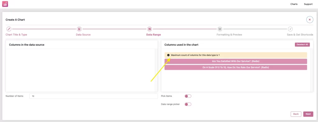
Now select the column and data range you want to display.
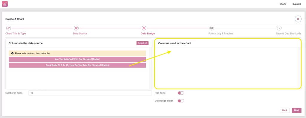
Drag the column from left to right. You can only choose one column to display. In case you want to show different columns for pie charts, then create another chart to do so.
Now, format the chart as you want to display; you can modify the height, position, axes, legends and also add animations to the chart.
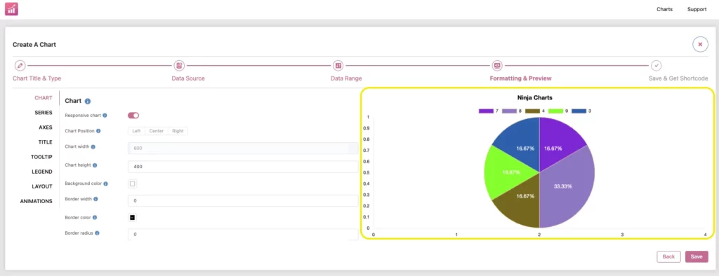
Save the chart and copy the shortcode.
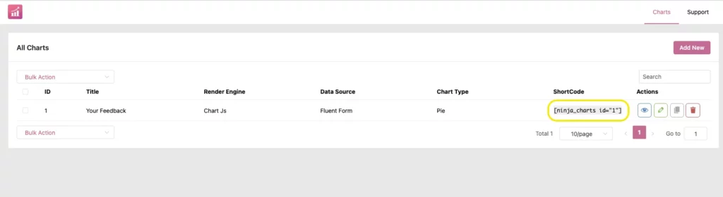
Step 4: Display the chart on your website
When you’re done creating your chart, now is the time to display it. As you have already copied the shortcode, paste it into a new page.
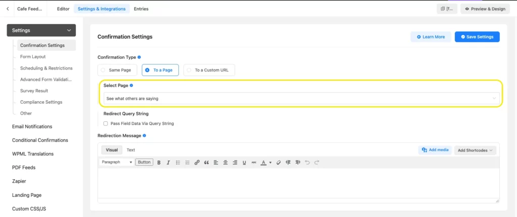
We planned to redirect the visitors upon form submission. So that they can see the real-time reports of other customers.
To do this, go to the Settings & Integrations tab of the survey form. And drop down to the Confirmation Settings.
Choose Confirmation Type > To a page, and select the page you created to show the charts.
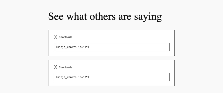
Upon form submission, the users will be redirected to a page like this:
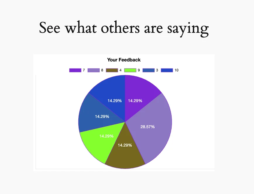
You can also visualize other answers by the customers on the same page by creating another chart like this.
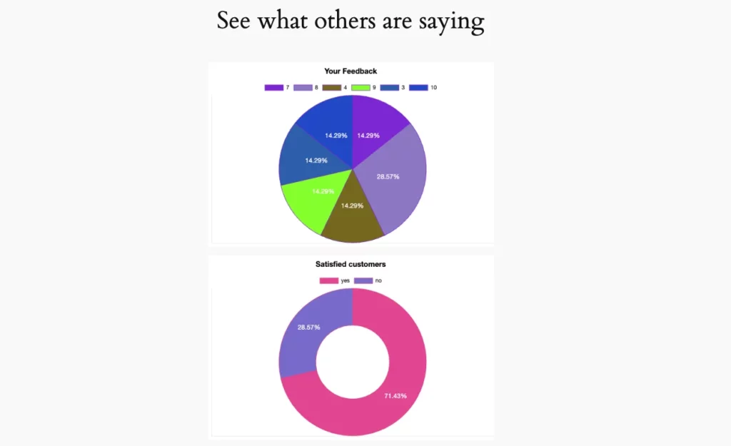
Use case in action: Coffee shop feedback pie chart
For the coffee shop, the pie chart now displays the percentage of customers who selected each satisfaction level by ranking.
As customers submit feedback, the chart updates instantly, showing real-time trends. This transparency builds trust, encourages more submissions, and helps the business identify areas for improvement (e.g., addressing “Unsatisfied” feedback).
Wrap Up
By integrating Fluent Forms with Ninja Tables and Ninja Charts, you can transform raw form submissions into engaging, real-time charts. This setup is perfect for businesses, bloggers, or organizations wanting to visualize survey results, feedback, or registration data. Follow the steps above, and you’ll have a professional chart up and running in no time.
For more details, check out the Ninja Tables documentation or Fluent Forms integration guide. Ready to boost your WordPress site’s data visualization? Get started today!

This is Sumit. He’s a physics major who’s trying to understand both the physical as well as the WordPress worlds. Whenever he’s not busy, plays fifa or spends time with his family.


Leave a Reply