
Top 10 Dos and Don’ts of Web Form Design in 2023

A contact form is one of the most significant parts of a website. If you want to see more success in conversion, then you need to know the dos and don’ts of web form design. Hold tight because I’m going to reveal all the actions you must take regarding forms. User experience for your web form plays a vital role in increasing the conversion rate of your website. So you need to design your web form very well for better user experience and user interaction.
Web design UX or web design UI refers to the user experience and user interaction, respectively, to your website. In more detail, UX is focusing on how easily can your web form understandable, how easily you can detect what to do next by just seeing your form at a glance, etc. UI is referring to clear graphics, readable texts, how painless using your form, etc.
Today we have listed ten dos and don’ts for your web form design that will help you to guide your users to complete the form.
10 dos in your web form design
Web forms hold the key to win the clients’ information for future communication with them. You need to understand what ways could be useful or ineffective while creating your web form. Almost everything, like its colors, size, and features, affects the output. Let’s see ten dos you can implement on your web form design:
Create it relevantly
Don’t rush into the design or color of your form at the beginning of the form-making process. First, you need to think about what type of form you are going to add to your website. You need to be clear about the purpose of the form and what you will get from visitors through this form. Matching with your web form type, then you need to add fields or columns to your form. Make your form suitable for your users.
You can add value to your form by providing some advanced options to your web form. As an example, Focus Lab has made a contact form for their website. This form has an option at the beginning that asks users to choose a field, and according to the selected field, it directs them to an optimized form.
Keep it simple

Always try to make your form simple. Everyone is busy with their own business every day. So why bothering people by asking too many questions? Only add the essential items that you need for your query. In a contact form, you don’t need to ask for visitors’ address. Asking only for the name, email, and the question would be the smart way to get information in a contact form. Using simple words to your web form also can make your visitors stay on your website and fill your form correctly.
Make a clear title
Titles are the central part of a web form. Your visitors need to understand immediately what the form is about by reading the title of your form. So always try to add a clear and simple title at the top of the form. A website increases its sign up percentage to 31.54% by changing their titles. Don’t put complex words or make confused people by the title of your form.
If you want to make a billing form, then just add the title “Billing information.” Random words might drive your people quickly.
Try to start with an easy question
People tend to fill up the web forms as soon as they can. They are likely to invest their time on things they like. But if you make your questions complex at the beginning of the form, they might leave your form instantly. So always start with easy queries like name, email, contact, etc.
If you ask for their credit card details at the top of the list, they might think your form is wasting their time from the beginning so they would drive to another website. The solution is to continue your form easier to harder.
Sequence your questions logically

Suddenly jumping from one question criteria to a different question type might confuse your visitors or clients. It is essential to chain your queries logically. If you ask for a client address before asking their name, it looks odd to them. It reflects that your business and its people are unprofessional.
Organize your questions in the known order. Each question should connect with another. The next question should come to the sequence with the previous one. Also, try to maintain the cultural differences in your form. Like if you put the date in your region, it might be seeing another time the visitors of another country. So it is also important to maintain this sort of thing.
Allow copy and paste
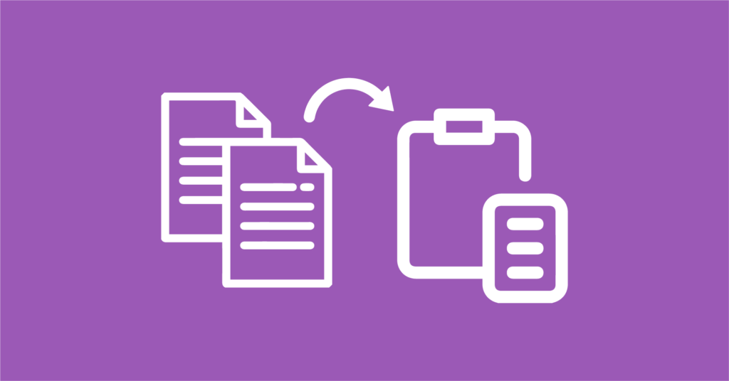
People are submitting their information from their mobile phones most of the time. Typing the same kind of data every time is annoying to them. They also get frustrated and leave the form incomplete as they are finding it time-consuming.
So, let your users copy and paste the information. It also reduces the chances of occurring errors.
Allow autofill
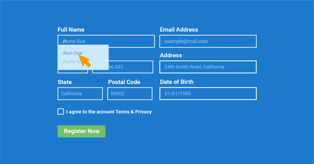
Autofill browsers minimize the risks of errors in important fields like email, name, address, etc. If you add the autofill browser, it is possible to complete the ⅓ of the web form.
When people find your form is saving their time, and they can quickly fill up the options, they would like to complete your form. With the autofill browser extension, both buyer and business owners can easily manage each other communication.
Apply progress bar when using long-form
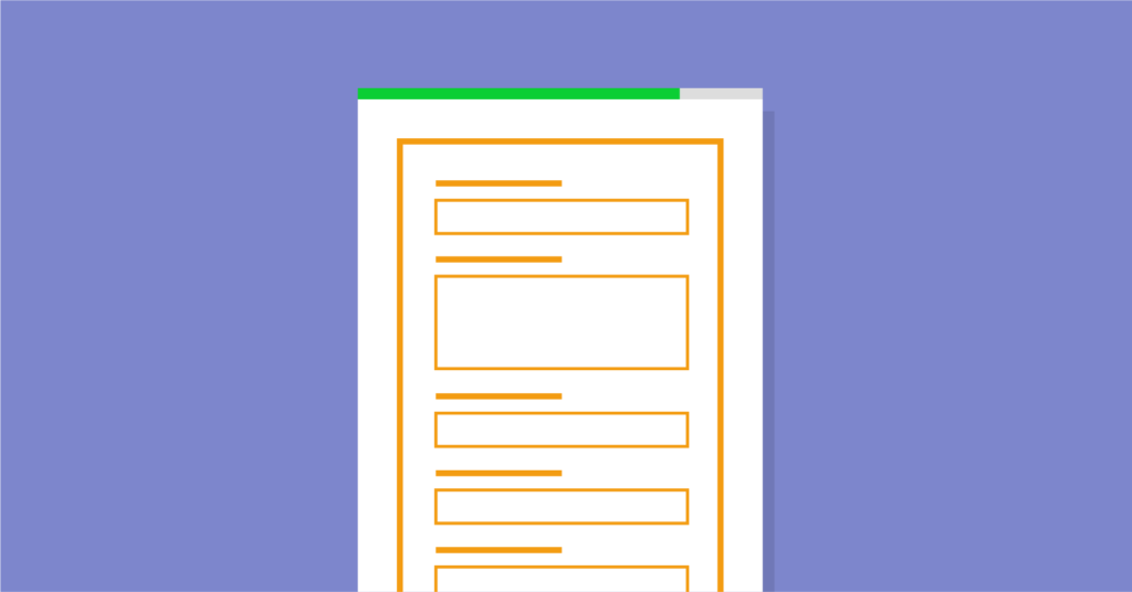
When making a form with a long list of questions, you should try a progress bar in your web form design. Long list questions might easily bore your visitors. They might find the process is never-ending. So, nowadays, web developers found a solution for this, and they add a progress bar on the web form.
Your users can easily see the process like how many more questions they need to answer, the percentage of filled up questions, etc. In that way, the chances of leaving your form without completing may decrease.
Include a clear CTA button
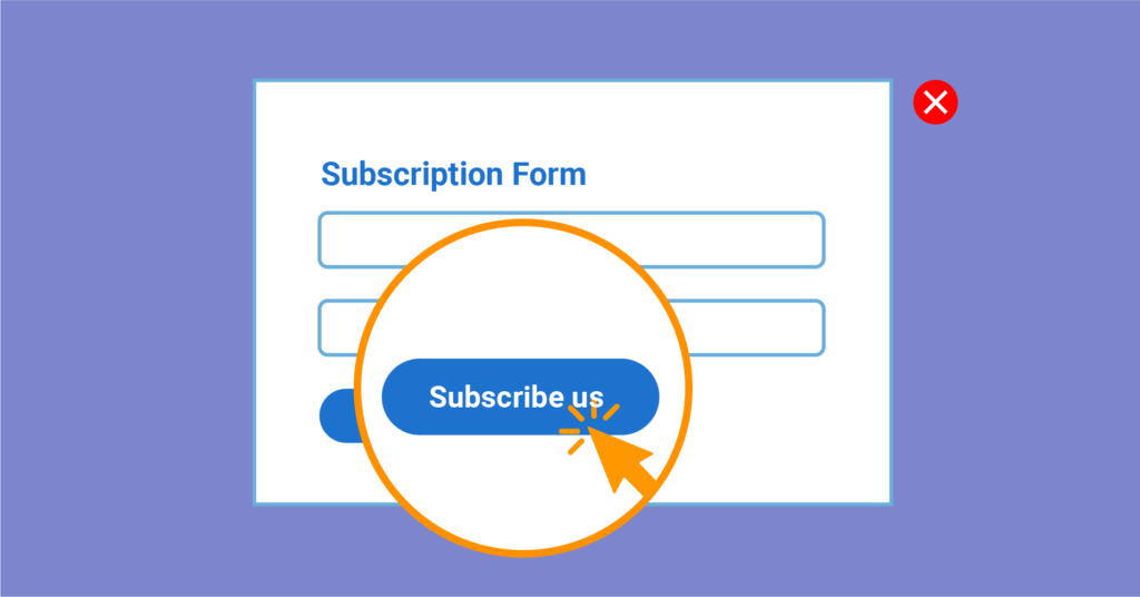
Your CTA button on the web form should be clear. A clear CTA button has a significant impact on increasing the conversion rate on your web page. If you use confusing words or very straightforward words on your CTA button, people won’t understand what they will get after submitting your form. So, instead of using words like “submit” or “ok,” using “contact us” if the form is a contact form. If its inquiry form use “get in touch” or something catchy by what your clients can get the idea of feedback or result of submitting the form.
Maintain good quality graphics in your web form design

Maintaining a charming user interface is very important for your website’s web form. You need to keep in mind that the colors, images, charts, fonts of your form must have a good visualization for your users. Bad graphics can cause difficulties to your user’s eye, or they might dislike it because of the color contrast.
If your visitors can’t see your form because of blurry effects, it’s obvious they would leave right away without even answering the first query.
10 don’ts in your web form design
When designing a web form, it’s important to know what activities might ruin the user’s experience as well as how to improve it. Your visitors want more than a good looking website. A small mistake can cost you big if you don’t care about what users want.. So, here are ten don’ts for you to follow while building the next perfect contact form.
Don’t bore your people

The look and the feel of the first look of your web form explain a lot about your company. Neither make your form too emotional nor make it cold. Your visitors must not be scared by seeing your form. Though, they might get bored also if the form is not attractive.
So, try to keep the design clean and entertaining. Make it easy for people to read or scan. Designer Christian Annyas has chosen a dark theme in both the website background and the font of his website. As a result, it is hard to read the contents, and its first impression is also not good.
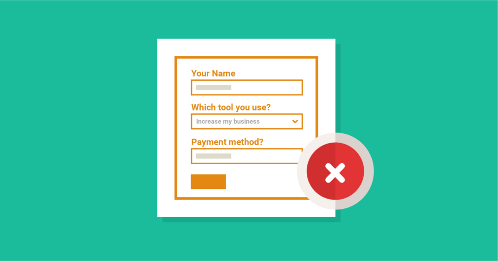
Don’t ask unnecessary questions
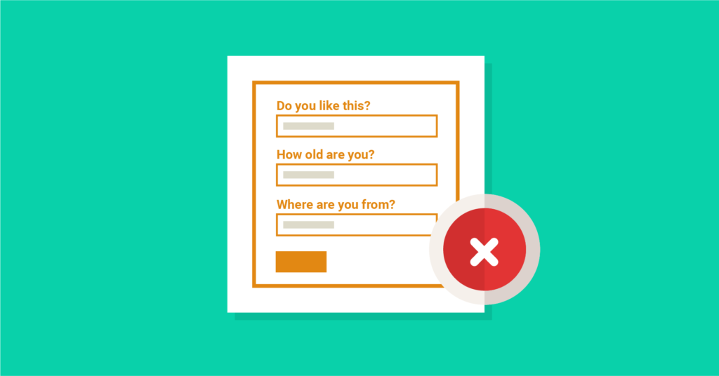
Oftentimes, you must notice that there are websites that are asking so many irrelevant questions. As an example, for a contact form, they are asking you for your national card number. These kinds of unimportant questions easily make people frustrated to stay on a web page for a long time.
Don’t ask irrelevant questions. If you don’t need to know something, stay away from adding them because time is money. And, you want your users to fill that form, not to abandon it.
Don’t use CAPTCHA
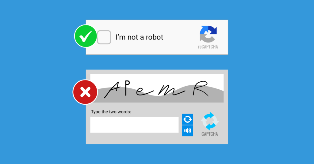
We all know that CAPTCHA is using for testing human existence. But why do we need to check it every time? You are examining your visitors without letting them enter the website. Using CAPTCHA is a lousy process; you are also not liking it when you are joining other websites. So why are you applying it for your website? And how much spam are you getting every day?
So, to make it easy for you and your visitors, it is always better not to use CAPTCHA. Just avoid those; instead, you can use reCAPTCHA to maintain security for your website.
Don’t use difficult input fields
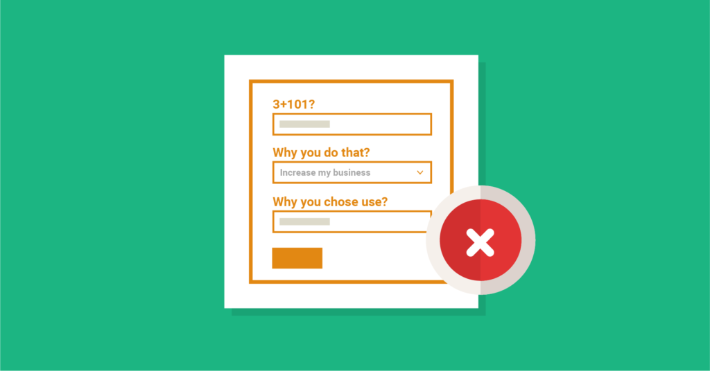
Using technical or tricky words may lead your visitors to leave your website. And this is also reflecting the unprofessional aspect of your business. Adding too many fields also time-consuming for users to understand and complete within a short time.
So, always make natural fields for better user experience and minimize fields as possible to maintain proper timing of submission.
Don’t raise uncertainty in reliability
Due to many reasons, people can’t contact you directly. So, the only option is for them is to contact you online. Design your web form in that way by which people actually can feel the existence of you. Make sure that your form is rich enough to make the first impression and reliable.
Don’t just ask for people’s information. Also, provide your information and do maintain fields for people’s queries too. If someone wants to contact you directly, they can quickly contact you using the online form, even if you’re not online. Prove it that your web form meant the substitute of you.
Don’t make your form unusable

Focus on the usability aspect of your form. Don’t use too many dark colors or too many color contrast in the form. Forms fonts, sizes also matter in holding your visitors to the site. Readability plays a vital role in the form of making visitors exist and submit the form.
A design agency named Insojourn made a contact form that will almost hurt your eyes if you want to see the fields in the form. Filling up fields is way too far to do.
Don’t make your users wait for your form loading
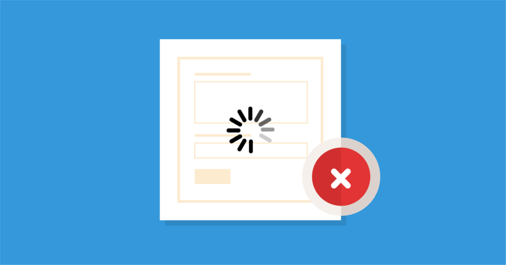
Everyone is busy with their own tasks every day. People don’t have much time to spend on your web form. They want forms that are easy can get and can easily submit. Don’t make a form that has slow loading speed. When users would find that they have to wait for loading the form, they won’t invest a second on the form.
So, for an excellent user interface, always ask your developers to develop a fast speed form and website.
Don’t use multi-columns
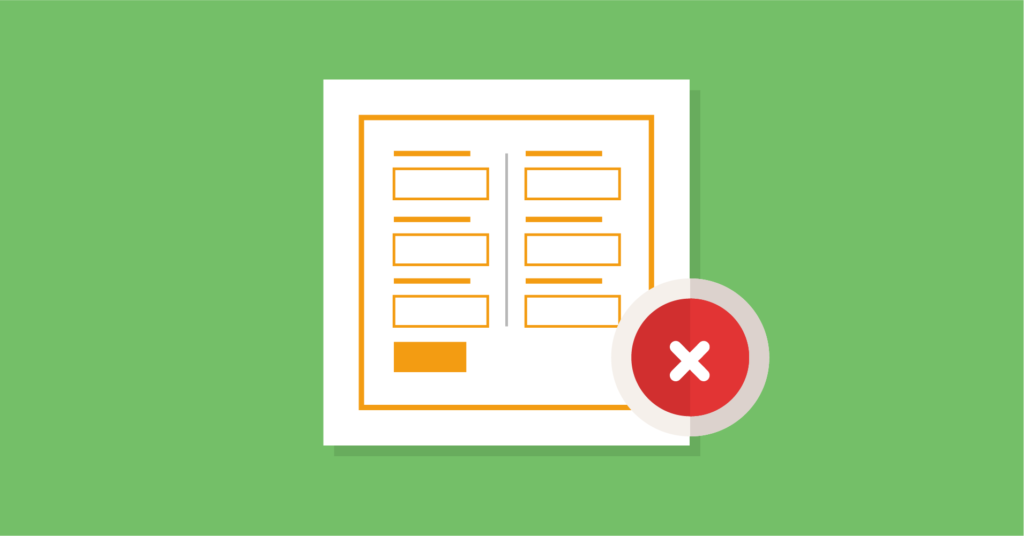
Using multi-columns in the form is difficult to understand the questions quickly. People are not likely to invest their time in understanding each item first, go through those slowly, and then fill up the fields. And everyone is doing most of the tasks on a mobile phone. If you use multi-column layouts on your web form, then it is difficult for your clients to complete the form within a short time.
Multi columns move the eyes uncertainly. Especially when submitting a long-form choosing multi-column layouts would be a wrong choice.
Don’t ask for personal information
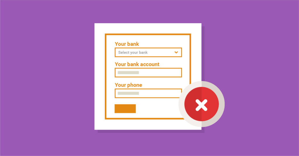
First of all, people are trusting your website without any actual existence seen from you. Then you are asking people to give their personal information on your form. Isn’t it sound odd? You can ask them for their namer, email, but asking for numbers would be too much. But in case if you need some personal information, always mention in the form why you need it, and what would be the outcome of it to your users if they provide it.
Don’t forget to test your form.
Last but not least, don’t forget to check your web form is working correctly or not. Otherwise, sometimes you might just launch the form on your website, but it is not working when users are getting onto it. If your form not works, it leads to the unconscious attitude of you or your business to your users. Don’t let people think you as an unprofessional online business owner. So, always test your form before launching it.
Final words
Your contact form reflects your business. Building a form for the website is the best way to listen to your customers. Take it seriously and make it as if it means you care about the people who come to your website. Of course, I don’t claim that the ways mentioned above are the hard and fast rules to abide by.
The dos and don’ts of web form design discussed in this post are the best practices for all forms you’re going to create for any purpose. Still, there is room for improvement based on the industry and business type. Make the form better according to this guide and track the performance.
If you see the curve is getting up, stay there. On the other hand, make more changes if positive outcomes are not coming as you expected. There is no once-for-all fix inform in web form design. It always evolves, and you should keep an eye on what users want.
Finally, an epic form building tool like WP Fluent Forms can relieve your stress and make life better. If you’re not ready to buy the pro, get started with the free version. Your form building experience can be so sweet you’ve never expected.

Hello, This is Prema. I work as a marketing strategist for Fluent Forms at WPManageNinja. When I am not playing with words, I go to explore nature.


Leave a Reply