
WordPress Data Visualization in 4 Easy Steps

WordPress forms are multifaceted things that can accomplish various tasks, from the fundamental lead generation to the crucial transactions, to even the complex quizzes, polls, and even market research.
But what about visual data representation? Don’t worry! Excellent form builders today have that made that a breeze too. So read along as we discuss three very important topics.
- What is a visual representation of data?
- WordPress data visualization: use cases
- How to present your data graphically?
What is a visual representation of data?
The process in which large sets of data and metrics are converted into different visual depictions like charts, graphs, etc., is called data visualization. This is mainly done to turn otherwise intangible data into easily perceivable pieces that can quickly communicate information.
Moreover, when you are dealing with forms in the hundreds, there is hardly any scope for assessing each individual entry. Neither is it often helpful on its own. Hence, when you generate a graph, you can get a gist of the overall trajectory without the extra hassle.
Visual data is especially useful in accumulating data and removing background noise so one can form a story highlighting important information like market trends, outliers, any sudden change in consumer behavior, etc.
WordPress data visualization: use cases

As for the usefulness of data visualization, it can be used in almost every aspect of a business or task. From corporate leaders sharing growth to stakeholders to sports teams analyzing opposition teams to teachers displaying overall performances.
Some of the use cases of visual data representation are given below.
- Identify market trends.
- Keep updated with sudden changes.
- Survey on employee and/or customer satisfaction.
- Access data remotely.
- Report to clients.
- Find more potential aspects for business expansion.
- Oversee current trajectory and goals.
How to present your data graphically?
As you can see, beautiful data visualization has immense implications. So if you find yourself in need of some, you can follow the procedure mentioned below and do WordPress data visualization in 4 easy steps.
We will be using Fluent Forms to demonstrate the process since it is the fastest and arguably the best WordPress form builder with the most easy-to-adapt features. Moreover, data visualization comes free with Fluent Forms. So let’s go.
Step 1: Locate form entries
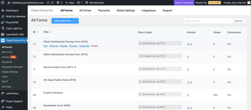
Your very first step would be to locate the form entries. You can do that in three ways.
- Open up the All Forms page from the Fluent Forms dashboard and then click on the Edit option at the bottom of the form.
- You can also open the form editor and then switch to the Entries tab.
- Or, on the Fluent Forms sidebar, notice the Entries option. Click on it and then select the webform from the dropdown menu.
However, do keep in mind that the visual reports can only be generated if your form includes close-ended input field types like radio fields, dropdown, checkboxes, etc. That is input fields that fetch definitive responses.
Step 2: Display visual data
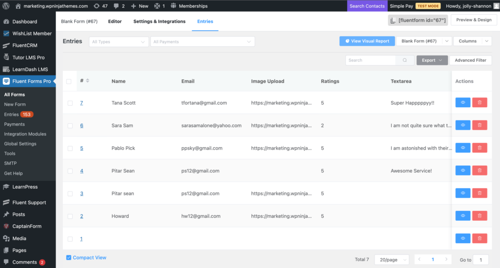
When you land on the entries page, click on the View Visual Report button in the top right corner. This will display an overview of your total submitted results of the input option, including the percentages of each option in graphical format. A pie chart is shown by default, with different colors depicting different input options. If you prefer to view a bar chart or a column chart, you can do that too.
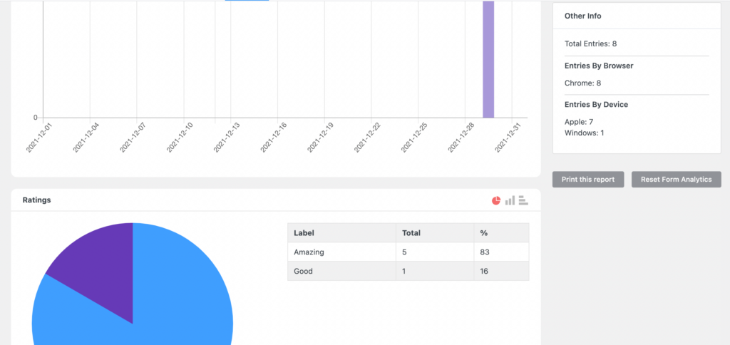
Step 3: Gain quick analytics
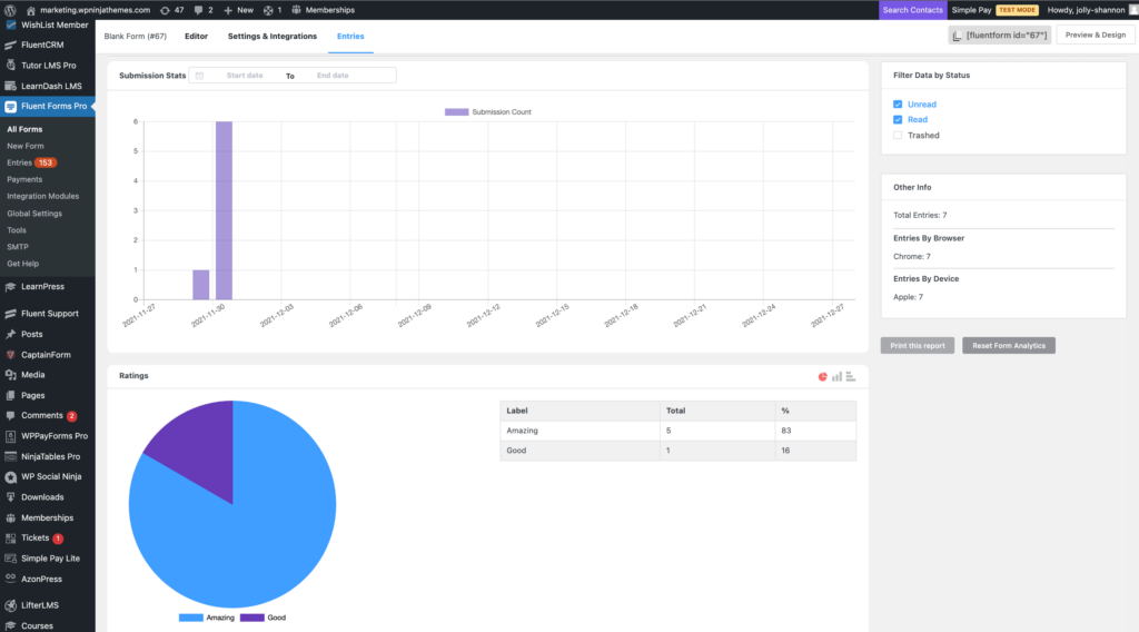
But that’s not all. There is a small Other Info tab on the bottom right side which will give you a quick overview of your form entries. Some of the data you can view here are total entries, entries by browser, and even entries by device.
Step 4: Print form entry report
Moreover, if you want to make a detailed report on these data, you can do that too. Just below the Other Infor box, there is a Print this report button. Clicking on this button will display a preview of the report and configure settings like destination, pages, layout, paper size, margins, pages per sheet, scale, etc.
Once you are done, click on the Save button, and the PDF file will be saved in your preferred destination.
Fluent Forms visual data representation
Fluent Forms makes WordPress data visualization a piece of cake. That too without costing a dime. But that’s not all that you can do. This WordPress form builder is well known for its easy navigation and swift functionalities. You can create efficient forms with zero code. Conversational forms, conditional confirmation, form layout, form restriction, and scheduling, custom CSS, email summaries, honeypot, ReCAPTCHA, PDF generation, MailChimp integration, Slack integration, etc., are only some of the features you can get with Fluent Forms for FREE. So what are you waiting for? Check it out and find out all the gems hidden in the nooks and corners.

Mahiyath is a digital marketer for Fluent Forms. She likes to explore through the alleys of WordPress and learn about the themes and plugins, currently specializing in WordPress forms. When she’s not doing that, she’s planning her next adventure.


Leave a Reply