Major changes in Fluent Forms UI Update – (Before/After, UI & UX)
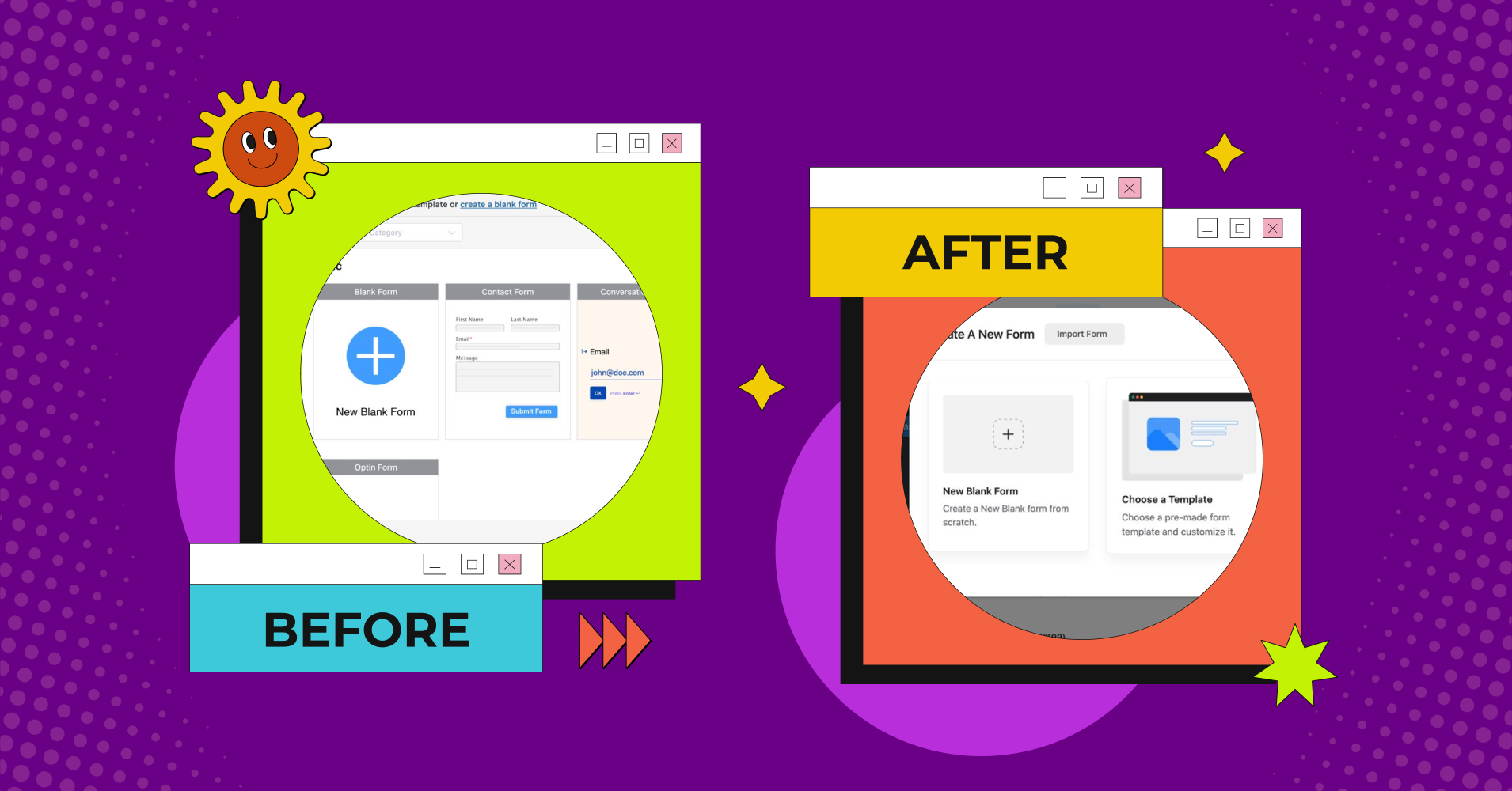
Fluent Forms is the lightweight, yet powerful, and fastest form builder in the WordPress community. Our aim was to make it the most user-friendly tool at an affordable price. That’s why Fluent Forms’ free version is way more powerful than other form builders in the market. However, from 2018 to 2022 we focused on updating the features, and functionalities of the plugin, and by that time, we’ve reached 300K active installations.
Now, it’s time to update the interface of the plugin to give our users a more eye-catching, and easy-to-navigate experience. In this post, I’ll show you some comparisons of the before, and after UI of Fluent Forms. So that, you can easily understand the differences. So, let’s see what we have for you!
New changes in Fluent Forms
We didn’t change the whole plugin interface completely but tried to improve the look of the tool to make it more convenient to use. I’ll discuss some major parts below. Let’s dive in!
Better user experience
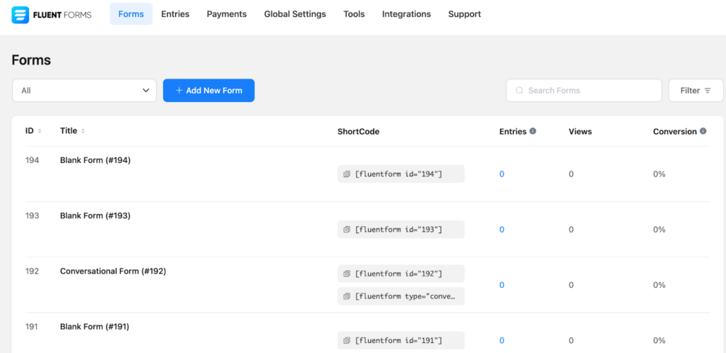
Navigation is an important part of any tool to move from one place to another easily. In this update of Fluent Forms, we made it more easier to understand. For instance, earlier, we had smaller buttons, texts, and tabs.
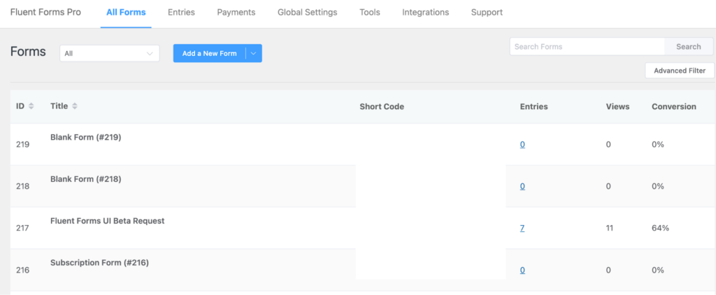
But now, we’ve made the buttons and tabs bigger, designed larger fonts, and had better eye-catching contrast to give the best user experience.
Pre-built templates
Previously, we had a basic pre-built template interface. I won’t say that wasn’t beautiful, or hard to understand. But the interface of the Add a New Form button was a bit confusing with the dropped-down menu bar, where we added the conversational forms option.
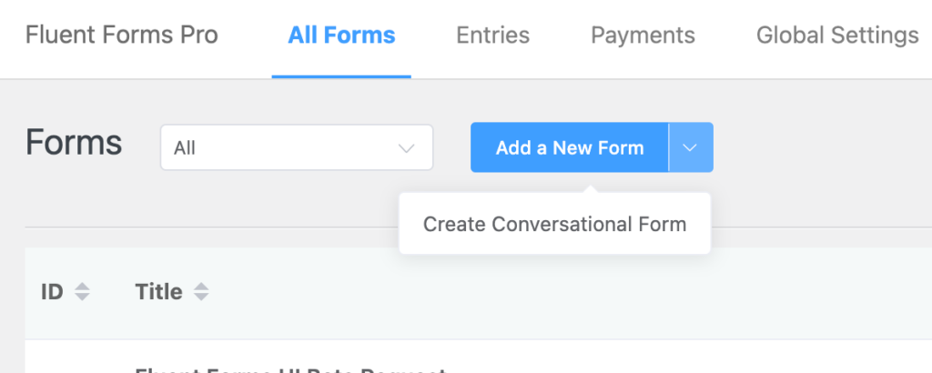
Besides, all types of templates were in one place, where you had to find the suitable template as per your requirement.
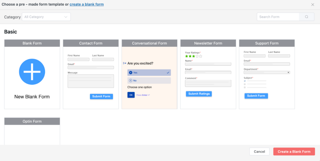
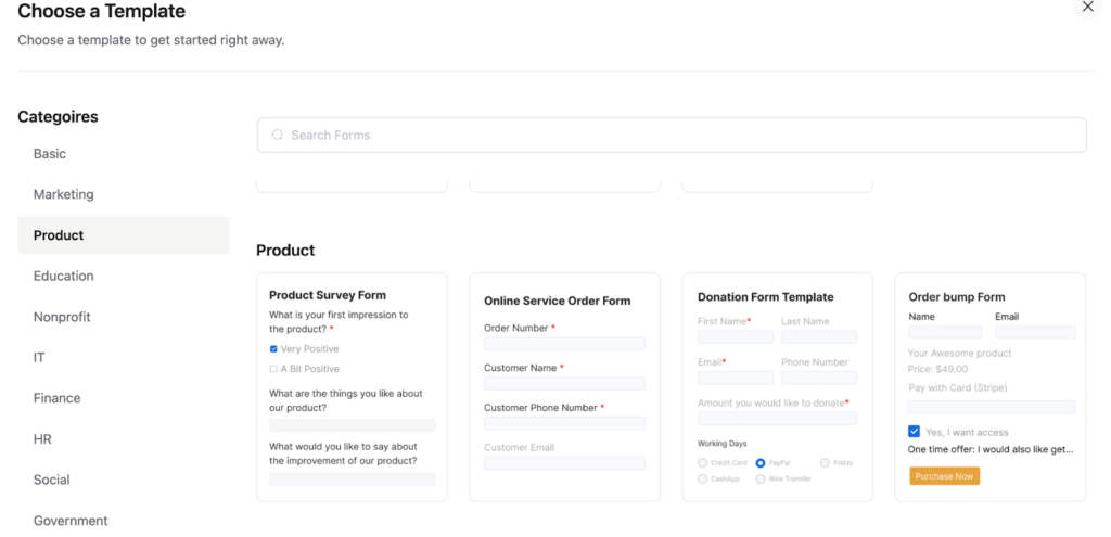
In this update, we’ve put different categories of templates in the first place.
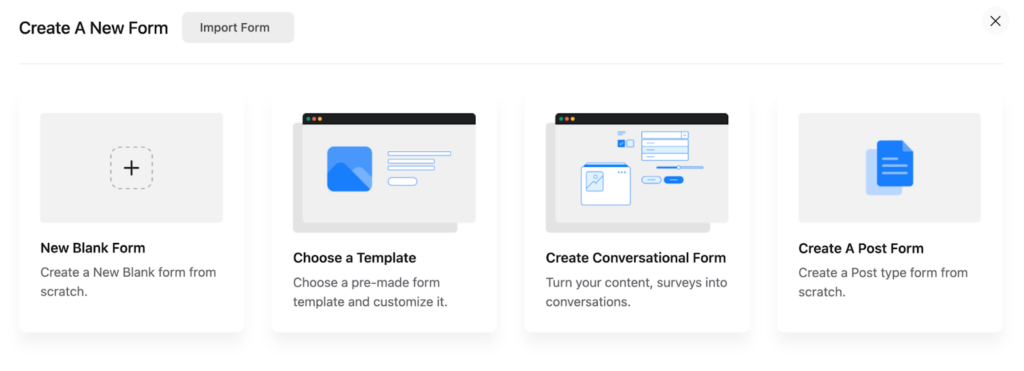
For example, if you click on the Choose a Template option, you’ll get all the categories on the left sidebar to choose from.
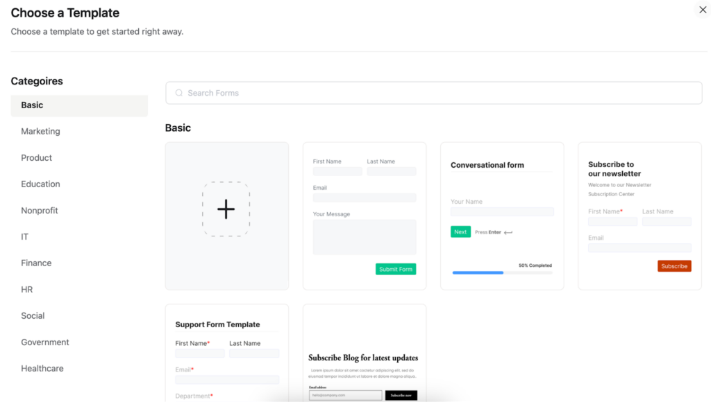
When you’ll tap on the different categories, you’ll get the dedicated templates for that option.
Form editor
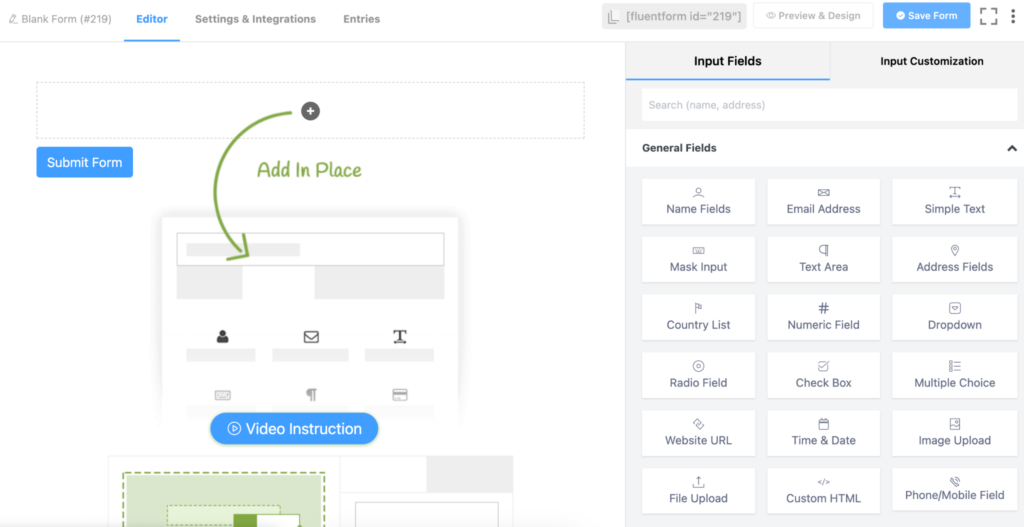
After selecting a form template, you’ll be driven to the form editor as always. Formerly, the editor was good-looking and understandable with the form fields on the right sidebar.
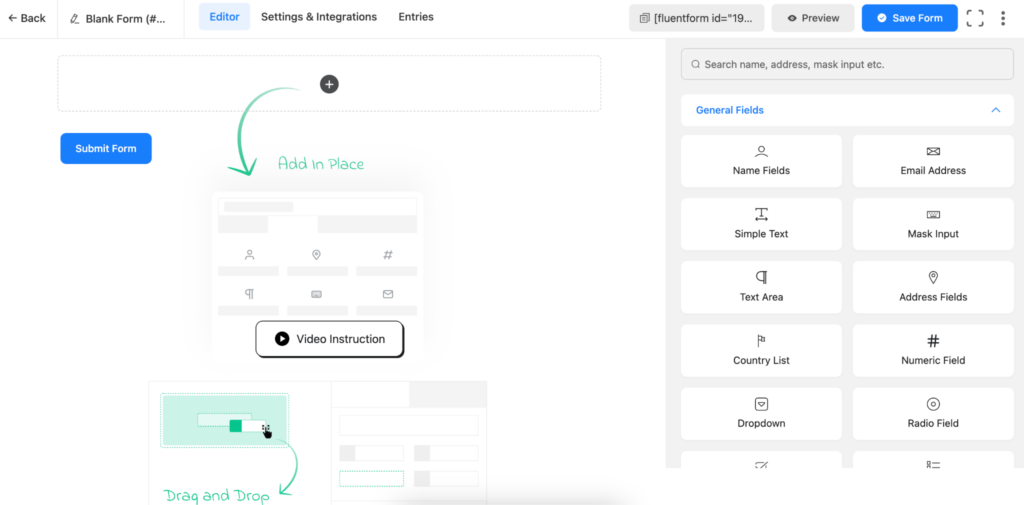
Now, the editor looks fresher with some color contrast, larger buttons, and text. Besides, the fields also look defined and popped out to catch users’ attention.
Fields section
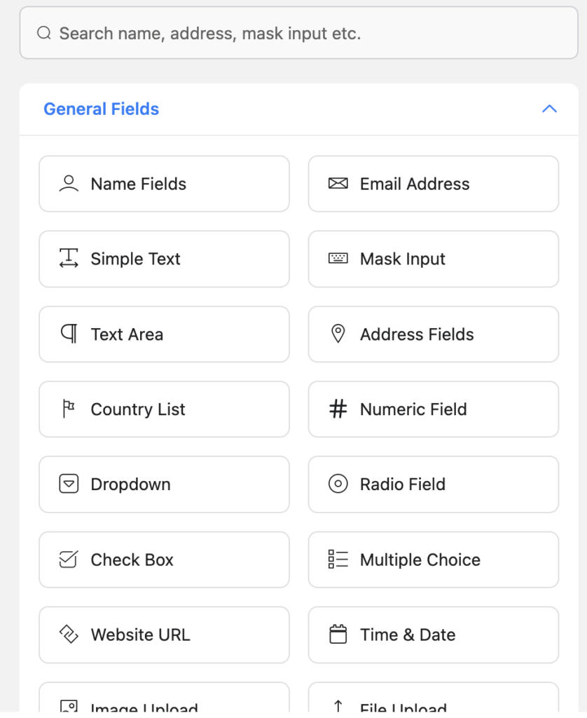
Previously, we had three column fields part for each section, such as General Fields, Advanced Fields, Payment Fields, etc.
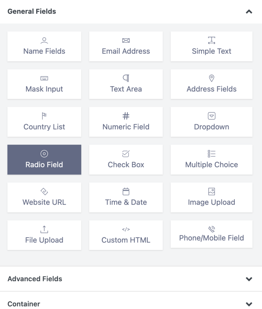
Now we put the fields into a two-column section and made the boxes larger. So, the section is striking more attention than before.
Form Style
Fluent Forms has a very amazing form style. We kept it simple, yet beautiful, and easy to understand. As a result, users can customize it on their own preferences.
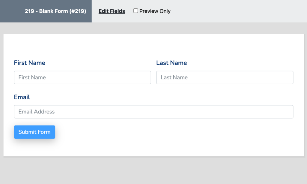
In the newest update of the tool, we made the form style more elegant. Added some tweaks to it to present it in a more appealing way.
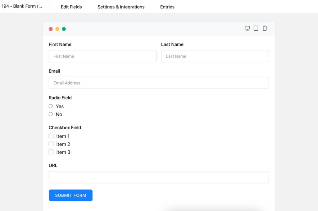
Furthermore, earlier, we had an edit section and a preview option only at the top of the form preview option.
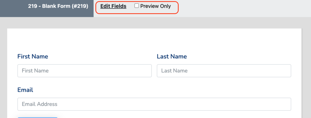
But now, we brought the Settings & Integrations option, and the Entries button at the top of the form preview section.

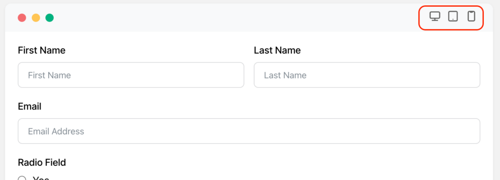
More so, we’ve added different screen responsive buttons at the top right corner of the form. So, you can check how the form would look on different devices.
Global Styler section
As I said earlier, Fluent Forms is already rich in features and functionalities. You can give your form a modern, and updated look with the global styler, or custom CSS feature of the tool. Earlier, we had a basic interface for the settings.
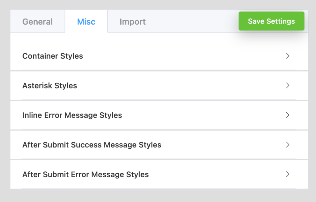
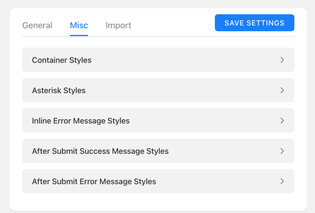
Now, it’s more attractive with some tweaks, and Twitch to the global styler editor. The settings panels are well-defined with a bordered area, and the fonts are designed to look more elegant.
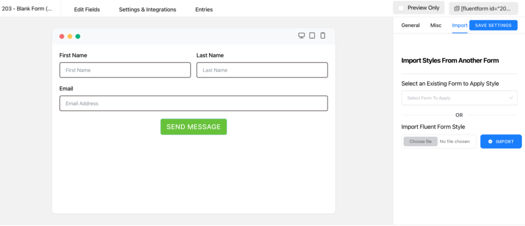
More so, from now on, you can customize the preset of the default form template style by clicking on the Customize Selected Preset button.
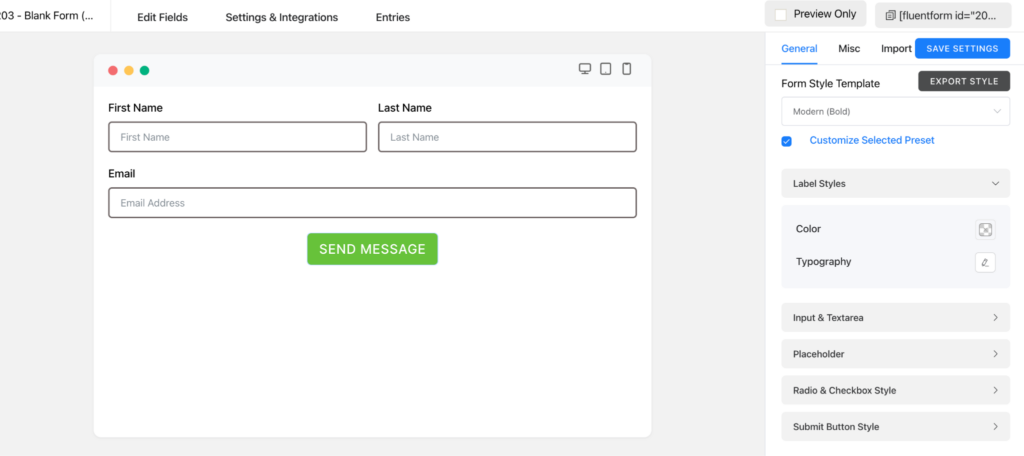
You can also import any other form’s template in a file format.
Settings & Integrations part
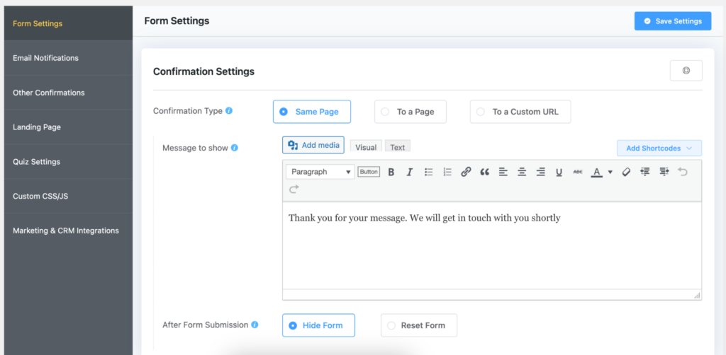
The Settings & Integrations section of the plugin was already loaded with tons of features to arrange your form in a more organized way and protect it from any kind of harm. But in the first part of it which is Form Settings, users had to scroll a lot to get each customization option. It looked something like this.
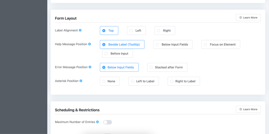
Once you scroll down to the next part, the left sidebar option was lost, and every time you had to scroll up to get the main settings option.
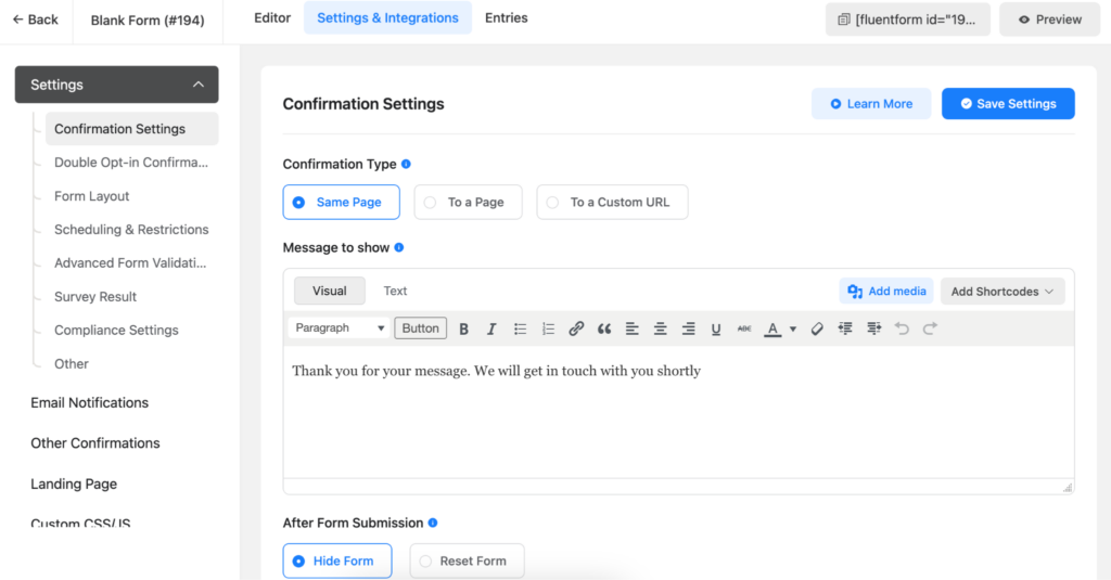
But now, the problem is solved. All the sections are beautifully defined on the left sidebar, and one has to scroll only a bit if there need to make any changes to any specific part.
If you’re already a Fluent Forms user, you can check the beta version of the new UI release. Please fill out the form below to join the beta testing team.
Upgrade soon!
With the latest framework of Fluent Forms, it’s faster and smoother than before. The symmetric view of the tabs, and fields of the tool will make it more user-friendly.
Now that you’re going to get the new version of the plugin, get the beta tester of the plugin to experience it before the final release. And we’ll release it, you’ll get the final version immediately. If you’re not a Fluent Forms user, try the tool to get an amazing experience.




Leave a Reply