How to Make an Opt-in Form Work Better

When you visit a new website, what’s the first thing you see? Or sometimes the last? An online form urging you to subscribe to them, so they keep in touch, right? Most of the time, you hit the cross button, but some web forms do catch your attention. We are about to find out why these opt-in forms stand out and what makes them useful. You can style opt-in form in a way that people can get connected more quickly, and you can earn some potential leads for your business. This post reveals the secret.
What is an opt-in form?
An opt-in form is an online form used to acquire consent from users. This webform is an official statement recognizing their interest in a service or a product that you provide. The form also permits you to contact them in the future.

These forms are usually user subscription or email marketing forms. Responsive opt-in forms can help you increase your subscribers, who, in turn, grow to be your customers. They are vastly used by eCommerce websites to send email newsletters, product sales, and other marketing materials.
Opt-in forms appear in various fashion. The most common are pop-ups that appear on homepages and landing pages. They also come as built-in widgets across the website. These simple forms, armed with the right tools, can convince the users to sign up to the email newsletter and enrich your subscribers’ list.
What is double opt-in?
A prevalent online form is a double opt-in form, and it’s highly likely that you’ve already encountered a few. Double opt-ins are usually emails or text messages you are sent after submitting a form. They contain a link asking you to verify your consent. By clicking on the link, you confirm your consent, and only then, you will be added to the email list.

Double opt-in email marketing preserves the integrity of your subscribers’ list. These help to prevent common mistakes like wrong email addresses, etc. from happening. This saves you from wasting time and energy behind email addresses that aren’t even valid. Also, it gives the user a chance to think back on their decision. By clicking on the link, they are explicitly voicing their interest. This will gain you an active email list to market your product to.
What is opt-in email marketing?
The term opt-in email marketing mainly refers to the practice of converting mere website visitors into customers. With an opt-in email, you can effectively invite a visitor to sign up for your email list. Usually, these subscribers are offered something in exchange for their email addresses, like news updates, elite support, ebooks, etc.

Opt-in email marketing helps in picking subscribers who are genuinely interested in your product or service. This saves you from the extra hassle of contacting people that aren’t even interested. When a visitor submits your opt-in form, they are expressing their consent, and you can send marketing emails without any reservation. Opt-in email marketing helps you maintain trust with your user and keeps you GDPR compliant.
Email marketing may seem like a lost art, but it has flourished on the contrary. The spam rates have fallen, which paves an excellent way for you to maintain a sound connection with your subscribers. Using opt-in email marketing is more fruitful and neat than buying email lists or other grey tactics.
How to create an opt-in form in WordPress?

Creating opt-in forms is very easy. There are several form builder plugins available in WordPress now that will do the job. One such plugin is the Fluent Forms. Using this, you can make beautiful opt-in forms with just a few clicks.
Fluent Forms assigns a unique shortcode with all the forms you create. You will have to replace this shortcode with the form id from the All Forms tab. And then all you have to do is copy this shortcode and paste it on the page or post you want to display over.
You can also further stylize your opt-in form using custom CSS.
How to optimize your opt-in form?
Opt-in forms are great when it comes to increasing conversion rates. These web forms look very simple, and it is precisely for this reason, they are a little complicated to execute. But you don’t have to worry. There are some do’s and don’ts, which, if you follow, you are sure to create an effective opt-in form. We have put together a list of tips that will help you create an excellent opt-in form and convert like crazy.

Make sure your opt-in form is visible
No matter how beautiful your opt-in form is, if it is not visible to your visitors, it will not be beneficial. So you will have to pay attention as to where you put your opt-in form. You can include it in prominent places like the top bar, or you can design it as a popover. Or you can also create a designated page for subscriptions. Whatever you do, make sure that your message is clear. Do not overshadow it with extravagant graphics and details.
Do not ask too much in your form
Pay attention to what you put on your opt-in form. Don’t ask anything that you don’t need. This may throw visitors off. Internet users are becoming smarter by the day. They are more cautious about their security, and any unwanted question will make them question your integrity. So instead of asking too many questions, keep your form short and simple. If you need further details, you can always ask them later on in a follow-up email. This will also help you build a relationship with your client.

Give the user the freedom to choose
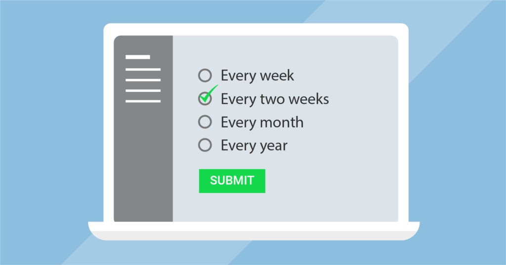
Let the user decide how often they would like to receive your emails. This assures them that they won’t be receiving any troublesome emails. Present them with various options comprising of different plans. This way, they can choose what suits them. Allowing users multiple plans will gain you more confidence by showing that you are there for them. Not only that, friendly options will result in better conversion rates too.
Be transparent
Being open about your company can be very beneficial. Nowadays, people are more concerned about their data security. And often, they won’t tread into unknown territory if they don’t feel welcome and secure. Here, if you come forth with your details, users will be reassured of your soundness. Moreover, they will have a clear understanding of what to expect from you. This will result in a healthy client-customer relationship.

Show your credentials
An excellent way of being transparent is by showing your credentials upfront. This could be the logos of your certifications or testimonials from your customers. You could also showcase your various affiliations. These will assert your stand as a legitimate company and claim your visitors’ confidence. Your subscribers will be much at ease, knowing that their personal information is in the right hands.
Place your opt-in form on the front
As we mentioned before, your opt-in form shouldn’t be difficult to find. If the user has to scroll too much, then they are as good as lost. Navigation bars, headers, sidebars, etc. are smart choices for an opt-in form. Your form should appear in front of the user. But pay attention so that it doesn’t seem too evasive. The bonuses they will receive should be apparent to the user from the opt-in form. If the message is clear, there will be more conversions.

Categorize your audience
If you are a versatile company with varied services or products, you should consider categorizing your audience. Because your visitors may come from different groups of people with different tastes. And it is your job as a marketer to appeal to them. You can make multiple email lists comprising customers with different interests. Simply note where they signed up from and put them on separate listings. This way, you can stir their interests more, and the emails you send will be more focused on the different groups of subscribers.
Ask for email address TWICE
One of the widespread mistakes is the wrong email address. Incorrect email addresses on your list will do you no good. You will be wasting efforts and resources on an invalid address. To stop this from happening, you can ask your visitors to fill in the email address field twice. This will ensure authentic submission and protect you from mistakes. This little verification will help you make the mailing list quality better.

Use the opt-in form as a popover
We have made it very clear that the opt-in form should stand out on your page. A very efficient way to do that is by using a popover. But you’ll have to take special care of the timing. If it pops suddenly, it might hamper the users’ ongoing work, reading, shopping, etc. This will annoy the user. So your popover should appear as soon as the user opens the window. And to make it more appealing, you should include information about bonuses.
A popover should be friendly
Popovers are great. But you have to be careful while deploying them. Like the case mentioned above, timing is a factor. Just like a mistimed popover can do more damage than good, an aggressive popover, too, will have adverse effects. Your visitors should be gently reminded to subscribe, not forcibly pushed to do so. So you should pay special heed to the users’ freedom. They should be able to close it quickly. Or if they want to sign in later, they should be able to do that with ease.
Increase user engagement
Opt-in forms are nothing new. They are far too familiar for comfort. So you’ll have to amp up and bring your A-game to the table. You can include a little contest to increase user engagement. Contests will excite the user. This, in turn, will result in better conversion rates. But the contest should be simple. Otherwise, it will complicate things.

Give them a reason to sign-up
A very effective way of motivating subscriptions is by including an incentive. You can offer something like a coupon, or a report to new subscribers. These will add value to your opt-in form. You can surf the web for incentive ideas and note what people are offering on sign-up. Some of the common incentives include toolkit, templates, checklists, video tutorials, courses, etc. If you have business affiliations, you can collaborate with them and offer gifts from your partners.
Offer a discount
Discounts! That’s a word we all love. A great way to encourage visitors to sign-up is by offering lucrative discounts on your e-commerce website. A discount offer on your opt-in form will make it more compelling. Discounts convert visitors to subscribers very effectively. This may come in various ways – a percent-off coupon or a gift card. Or if you could offer some free products for new subscribers.

Be straightforward about your content
You should be open from the beginning. Tell your users what to look forward to in the emails. By setting the expectations from the very start, you are allowing users a clear understanding of the subscriptions. This way, the users will know when to expect your email and how often to expect it. They know that they’ll always receive something of value so the subscribers will not be confused or irritated when the email comes. And your clarity will reassure your audience that you won’t spam them.
Rename your newsletter
When you hear the word “newsletter,” you automatically think of the long and tiring pages, containing words that blur out the world. It has an overall dull vibe to it. But you can change that. Come up with a witty name that better resonates with you and your company, and people will be able to connect with you more. Renaming newsletters are a great way of revealing your personality to your audience. Instead of the usual newsletter, you can use terms like bulletin or memo. This will make you stand out from the crowd and gain subscribers.

Make your Call-To-Action button more enticing
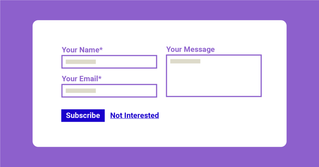
When an opt-in form appears, people automatically expect the typical webform with a “Subscribe” button. A little tweak in the online form will make it more striking. By restricting yourself to boring “Subscribe” buttons, you may hurt your conversion rates. You can stylize the button to make it more eye-catching.
Furthermore, you can choose to word your CTA in such a way that it reflects your message. This makes the message more clear. Plus, it tricks the user into thinking more of what they are getting than what they have to do to get it. As a result, your conversion rates grow higher.
Include other channels of communication
You can attach other means of communication like social media links to your opt-in form. This will work great for user engagement. If you have a Youtube channel, you’ll gain more viewers and possible subscribers from the opt-in forms. And if you have an app, then this is an excellent way of introducing people to it.

Showcase social proof
A visitor may like your product or services, but they may be hesitant about connecting with you. You will have to gain their trust by proving your reliability. An excellent way of doing that is by showcasing social proof. Putting your subscriber count on the front gives an assurance to new visitors. This shows how many people already trust your service. This will assure new visitors that they are not alone. Once they feel that they will be more comfortable. But this works effectively if the number is significant. In case you just started with your business and don’t have a big pool of subscribers, you can use quotations from your users. This will serve the same purpose.
Have a clear privacy statement
Pay special attention to how you word your privacy statement. Make sure to compose it in a positive manner. This will help you come off as trusting. You should avoid using negative words like spam, even if it is positive. Too much of these will have an unfavorable effect on visitors. Attaching a link to your privacy statement on your opt-in form is a good practice. This puts your subscribers at ease. They know how much information you are asking for and how it will be used.

Use a form instead of a link
It is a great practice to have an opt-in page on your website. However, if you include it as a page on your website, you will have to think about optimizing it for SEO too. This is too much headache to take if all you want are some email addresses. And subscribing is more of an instantaneous task. So users are less likely to hit the link to your page and subscribe to your newsletter. Instead of links, you can use top bars, sliders, etc. to present your form. This is more apt for simple tasks like signing up for a newsletter.
Final thoughts
So you get the gist. Opt-in forms work magically to enrich a subscribers’ list. But you’ll have to put effort into making it beneficial. A striking opt-in will go a long way in increasing the conversion rate. To sum it all up, if your form has the following qualities, you can expect some good results.
- Is simple
- Shows creativity
- Is clear about discounts and offers
- Shows reliability
- Is enticing
We hope this article has been helpful to you. Tell us what you think in the comments.


Leave a Reply