The Philosophy Behind Fluent Forms’ New UI and Improved UX

Fluent Forms is coming with a fresh design and improved functionality. But isn’t it important to know why did we change? There are a lot of reasons that motivated us to present our users with a new environment for building modern forms. But the most important one is giving a better user experience — so the users feel more energized while working with their favorite tool.
The story of getting started with Fluent Forms
Back in 2018, we started Fluent Forms as a form builder plugin with a vision to make it the most user-friendly tool. The second reason was to make a tool that’s affordable for business owners.
Fluent Forms are sensible, easy to use, quick to use, good looking and they JUST WORK! THE BEST and my 1st CHOICE!
madisoncre, wordpress.org
At that time form builder tools were pricey. Each plugin offers such pricing modules where you can buy the basic plan at a small cost. But when you think about more features and functionalities, you have to pay extra for an additional plan.
However, we went for a model where we’d offer all the premium features without charging an extra penny. Not to mention the free version of the plugin is way more powerful than many of the premium plugins that still exist in the market.
Searching for a simple and free “if answer equals X, reveal the next bit” capable form was maddening… this not only did the trick for me, but it was very easy to integrate it into the design of the site I use it for.
grimcity, wordpress.org
To be continued with the story, instead of focusing on the look, we were busy adding new features and functionalities. From 2018 to 2023, we reached zero to 300K active users.
And it’s time to update the interface and make it more eye-pleasing and efficient.
What we changed. Why we changed.
Let us inform you first, we didn’t change the whole UI completely. We tweaked it to the best possible level. Two reasons for that –
- A large number of websites are using the product. So, there’s a huge risk of breaking something down. We avoided any potential problems.
- The changes cost development time and cost. If we spend too much on that, we’ll not be able to implement what we planned to give our users.
Keeping these factors in mind, we tried to improve the look so that it becomes more convenient and easy to use.
Although we’re talking about the UI, we worked with the UX as well. Since UI is a large part of the UX, it’s evident that the user experience will also be improvised.
With the new changes, we’ve worked on the following things:
- We worked on the UI to make it look modern, inspiring, and fresh
- The user experience got better
- Easy navigation from one place to another
- Reduced server requests to enhance performance
In the next few sections, I’ll try to explain the significant portions of the new changes. Hold tight!
Importance in accessibility
It’s undeniable that a good UI thinks about people who are somewhat biologically challenged. Accessibility is a core part of our design and development.
An insider secret: We’re also updating our website with a new design and we followed the standard accessibility guidelines (WCAG).
However, with our plugins, we’re working on accessibility and there’s more to accomplish. For now, we’ve improved a significant amount of design to make both the UI and UX more accessible. We followed an important UI rule: usability over fancy design.
Contrasty color: Accessible products need more contrast so that it looks clear on visually impaired eyes. To keep our branding aligned, we couldn’t apply heavy contrast but it’s definitely better than the previous state.
Visible buttons and tabs: Another change is making buttons and tabs more visible. There are many buttons exist inside the plugin along with multiple tabs. We improved in a way that they look clearer and are pleasing to the eye to create a better experience.

Screen reading options: This is for blind persons and we added it a while ago. In the new version, we checked our fields again if all of them are okay with the feature. If users enable the screen reader, they can understand what’s written on the screen. Now users can hear without seeing the form with a suitable screen reader.
Tab functionality: It’s now easier to navigate inside a form. By pressing the tab button from their keyboards, users can move on to the next fields easily.
Symmetric fonts: To improve better visibility, we also make the font-style same in places (some got bigger, some got smaller). This was a thoughtful process, and we worked on it to make the look more justified from a standard design perspective.
Important note: Since accessibility requires more color contrast and bigger fonts, you can apply that with the theme you’re using in your website.
We keep Fluent Forms in a neutral position so that you can adapt colors and fonts according to your theme.
A fresh editor
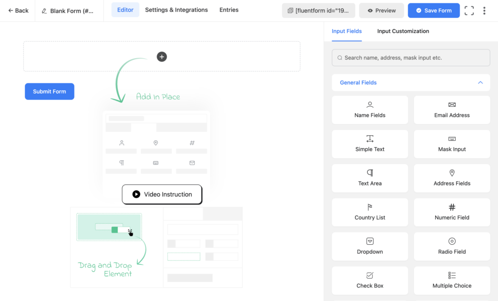
The editor looks cleaner and has everything in order to build your form easily. Previously the fields are in three columns, and now they’re in a two-column sidebar. The reason behind this is to give more space there and accommodate more fields.
More symmetric UI
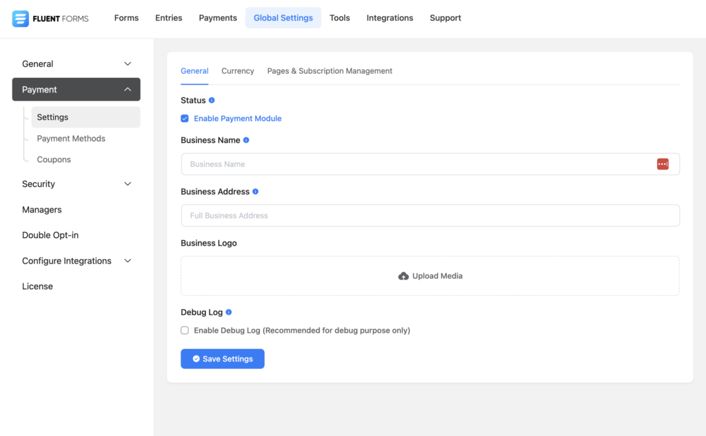
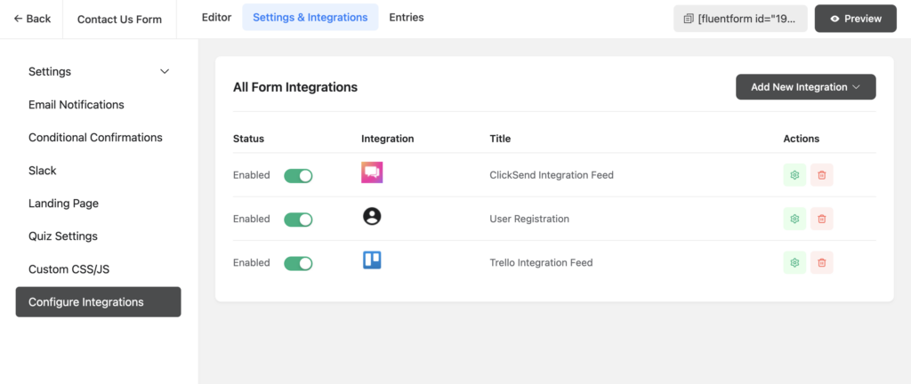
Symmetry is a part of nature. That’s why the human eye wants to see symmetry in structures. In Fluent Forms, there were some missing parts in the early stages. Now it’s more symmetric with shapes, space, and colors. This function is applied all over the plugin. Spacing of menus, icons, and buttons are evenly placed.

Easy to navigate
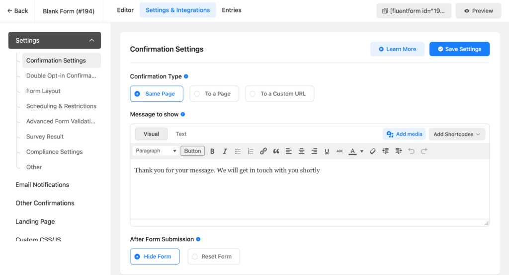
Navigation is a significant part of UX. Users should move from one place to another without any hassle. Inside Fluent Forms, navigation is now even easier. For example, you can switch from the Editor to Entries to Settings smoothly. You can find all the settings aligned under the right categories to find them easily.
More organized built-in forms
Fluent Forms has a large collection of ready forms that help you get started without scratching your head. With the new version, this section became cleaner with a beautiful design and a more organized structure.
The following two parts are not related to the UI, but they will impact the UX significantly from the backend.
Improved form preview
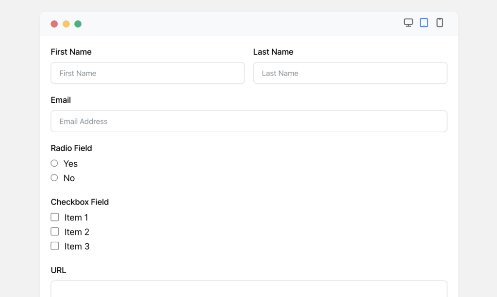
The form preview section has also been improved with a new interface and updated functionality. Not only it looks great but you can also see how your form will appear across various screens: desktop, tablet, and mobile.
New framework
This is a totally internal part of our development. With the latest framework, the plugin becomes faster and smoother. We also renamed hooks and reduced server requests for faster performance.
REST API
To send requests to servers, there are two popular methods: AJAX and REST. AJAX is an old method, and it was included with Fluent Forms. With the new version, we changed it to the REST API.
Don’t forget to upgrade
Well, you know now what you’re going to get with the new version. Let’s become beta testers if you want to experience it before the final release. And you can get the final version right after the release. Fill out the form below to get access to the beta version.



Leave a Reply