WordPress Form Optimization for Your Site

As cliché as it may seem, webforms are part and parcel of the digital experience. We encounter tonnes of webforms in the shape of contact forms, newsletters, payment forms, etc., every day.
But for every form that we do submit, there are many that we don’t even notice. Or worse, we get annoyed by it. Thus a question naturally appears. What makes the audience trust one form more than the other?
The answer, my friend, is WordPress form optimization. Along with other factors like brand value, brand loyalty, one key factor that decides how well an online form will perform depends on how well it has been optimized for the target audience.
WordPress form optimization
If your web form does not grab a user’s attention, no one is going to hit the submit button. Therefore you will need to employ some tips and tricks to optimize your webform better and increase your conversion rates.
So, we have done some research and prepared a list of 5 best practices, which, if applied, will let you create better online forms and convert more. Read on to find them out.
Avoid mistakes by guiding users
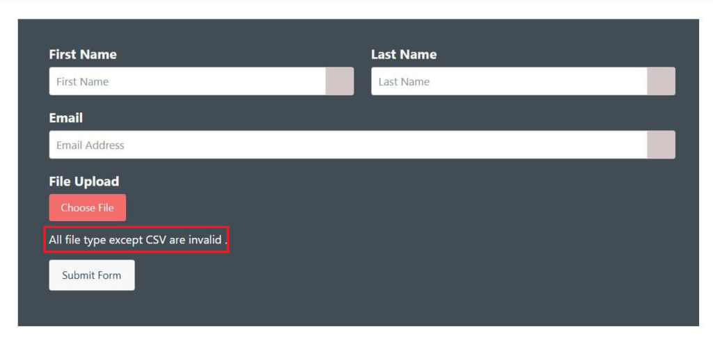
When you scale your data collection process, mistakes are an everyday event. The more you scale, the more mistakes appear. But that’s a good thing. You will observe a pattern in them and know how to solve users’ problems.
People will frequently fill in a wrong digit or forget to provide a piece of vital information. These are some common mistakes that can clutter your database. To make sure this doesn’t happen, mark your compulsory fields with an asterisk mark.
Moreover, you can compose descriptive error messages that will guide your users and help them understand what is asked of them. One user explains how comprehensive error messages helped them keep their database organized.
Enticing call-to-actions

Call-to-actions, commonly known as CTAs, serve a crucial purpose of a web form. But a boring “Submit Now” button ushers in monotony. This is something we have been seeing from time immemorial, and now we don’t even give it any more attention.
This is a scope for you to get creative and excite the user. By spelling out what the user is doing, or the advantages of filling out this form, you are having a conversation with the user. They will feel connected to the cause.
You can make these call-to-actions even more impressive by incorporating interesting colors into them. This is a simple trick that works wonders. Users vow by it.
Reduce typing (GET param)
When we sit, whiling away our time, we don’t like to put too much effort into anything else. But sometimes, you are going to need to deploy a complex form with lots of form fields. Or even a simple form that asks for sensitive data. This also leaves plenty of space for confusion and mistakes.
You can solve this quickly by sending specific URLs with form fields already containing the information. For instance, payment fields already mention the amount in a donation form or stating your most popular service on a registration form, you will tactfully lessen both the need to type and the scope of mistakes in one clean stroke.
Fluent Forms allows you to do that with the GET param feature. This allows the user to set default form values from URL parameters. This feature is super smart and reduces hassles significantly.
Break down your long forms
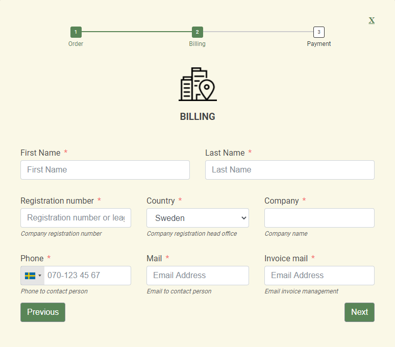
Let’s give it to you straight. Long forms intimidate users. That’s that. But that doesn’t mean you shouldn’t get the information you need. There are a few ways you can work around that. For starters, keep only the fields you need. Most studies suggest a maximum number of three to seven form fields.
Therefore, a sensible thing to do would be to ask only the most needed questions. And when you have cultivated a relationship with that user, ask them for more information throughout the journey.
But if you must, make sure to break them into step forms. This is a smart way of asking all the questions you need answering. Most proficient form builders like Fluent Forms will allow you this feature.
Let Users Know Where They Are
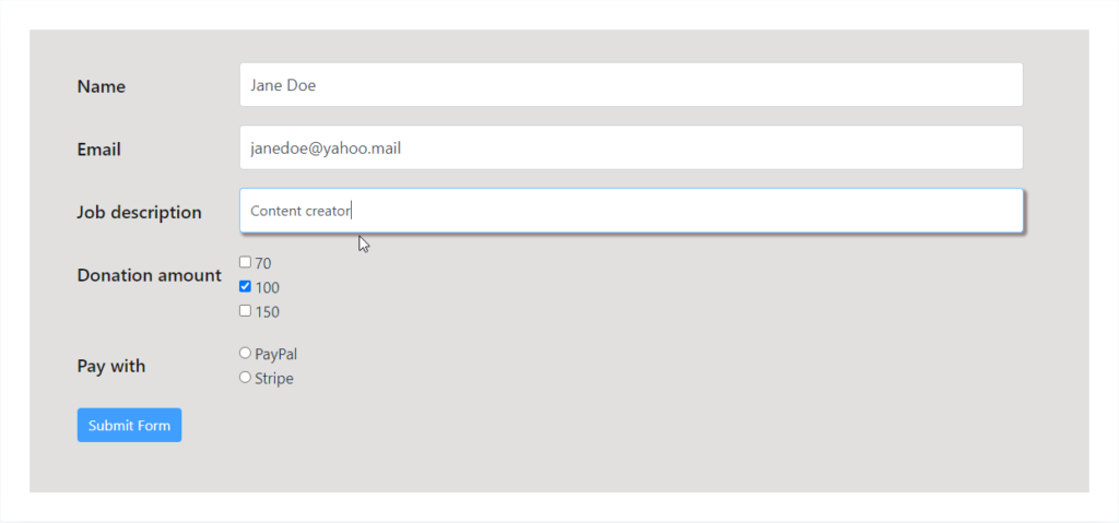
Essentially, the purpose of web forms is to collect data from the audience. Hence, it is crucial to make the experience as smooth as possible. Users can easily confuse the fields and fill them up with wrong information. Or leave the form incomplete from frustration.
To solve this, you can easily single out the form they are working on by visually styling select fields. This is possible with all WordPress form builders that allow custom CSS and JS.
For instance, with Fluent Forms, you can effectively get to the backend of a form and customize your form to guide your users. See the form above and style your forms visually.
Fluent Forms
Fluent Forms is the fastest and most versatile WordPress form builder plugin that will let you create all kinds of forms in a matter of minutes.
This form plugin is equipped with 45+ input fields, 70+ prebuilt form templates, 35+ integrations. However, these alone cannot define the plugin. The security measures are immaculate, which allows the users to create forms without any threats.
Moreover, advanced features like partial form submission, user registration, global styler, etc., make it a leading name in the industry. The form builder comes in a freemium model offering a range of benefits to users from all around.
WordPress forms for you
WordPress forms can help you immensely and there are several reasons why you should use a contact form. From generating leads to scaling businesses to collecting funds, they’ll cover a range of functionalities. No matter what your purpose is, an online form will help you get there. And now that you know WordPress form optimization, best start building your forms.
Use Fluent Forms in this regard. It is super fast and super lightweight. Download it for free, and try it out yourself. Tell us in the comments below and join our community for a better



Leave a Reply