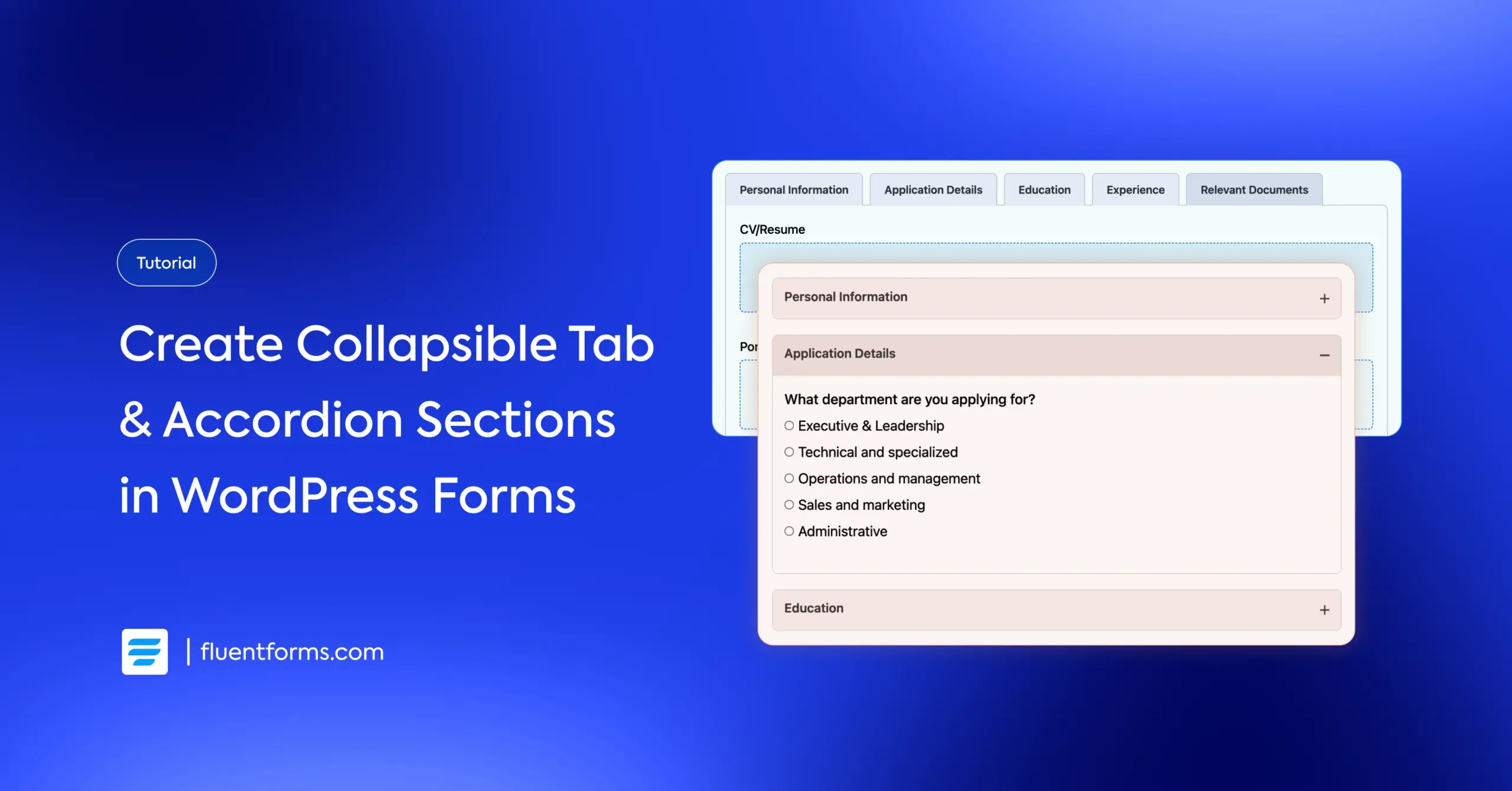
How to Add Accordion and Tab Sections in WordPress Forms
I’m not saying the WordPress core team has a hidden microphone in the Fluent Forms development room, but the timing sure does look interesting. We’ve just rolled out accordion and tab sections in your favorite form plugin, the same feature that WordPress 6.9 is finally releasing this December.
I guess great minds do think alike. As visitors are leaning towards organized content, what could be better than collapsible sections? They’re the perfect decluttering tool, allowing you to present complex information in bite-sized portions.
For your forms, this means you can group related fields to break down lengthy questionnaires into manageable sections. The clean interface and smooth experience help users navigate sections at their comfortable pace. Great, isn’t it? Let me show you how to set this up and increase your completion rate.
TL;DR
- Accordions stack content vertically with expandable sections. Choose accordions when content flows top-to-bottom, mobile experience is a priority, or users are looking for specific information.
- Tabs organize content horizontally with clickable labels. Choose them when sections are unrelated, users need to jump between categories, or you want a dashboard-style layout.
- Fluent Forms’ accordions and tabs offer customizable titles & descriptions, display modes, connected/disconnected designs, mobile-optimized layouts, and collapse settings.
- How to add them: In the Fluent Forms editor, simply drag the Accordion/Tab container field into your form, choose display mode, & place relevant input fields between the “Start” and “Close” tags.
- Ideal use cases: event registrations, job applications, service quotes, product orders, user profile settings, and complex surveys.
- Accordions vs. multi-step forms: Use accordions for organization and flexibility; use multi-step forms for sequential processes and very long forms.
What are accordion and tab sections
At their core, both accordions and tabs solve the same problem: they save space. They organize content into collapsible or separate panes, preventing your users from being overwhelmed by a “wall of text.” However, they handle that organization differently.
Here is the breakdown of how they work and when to use them.
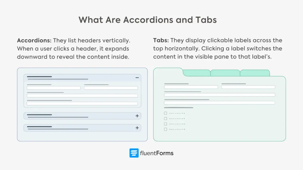
Accordions (The Vertical Stack)
Accordions list headers vertically. When a user clicks a header, it expands downward to reveal the content inside, usually closing the previously open section to keep things tidy.
Accordions are best for content that needs to be scanned quickly, like FAQs or optional form details. They are ideal for showing users information only when they ask for it. Since smartphone screens are narrow and scroll vertically, accordions are naturally mobile-friendly.
However, if the content inside a section is very long, expanding it can push the rest of the content far down the page, potentially overwhelming the user.
Tabs (The Horizontal File Cabinet)
Tabs mimic a physical file cabinet. They display clickable labels horizontally across the top. Clicking a label switches the content in the main (visible) pane instantly to the clicked label’s content without moving the rest of the page layout.
They’re best for distinct categories that don’t necessarily need to be read in order. For forms, this is great for separating “Personal Info,” “Billing,” and “Preferences” into their own dedicated spaces. Tabs are fantastic on wide screens because they utilize horizontal space, keeping the overall page height consistent.
Which one should you choose?
Choose Accordions if: You are designing primarily for mobile users or if you have content that can be broken down into short segments (like a specific line of questions in a survey).
Choose Tabs if: You have distinct, unrelated categories of information and you want to keep the page layout stable. They work best when the user needs to switch back and forth between sections.
Now that you’re well acquainted with accordion and tab sections, let’s see which accordion and tab features Fluent Forms offers.
Fluent Forms accordion & tab features
Accordions/tabs are an input field of Fluent Forms listed within the container fields. You can choose whether you want the field to be an accordion or a tab section from the field’s customization options. Here are the different customization & layout options for Fluent Forms’ accordion/tab field:
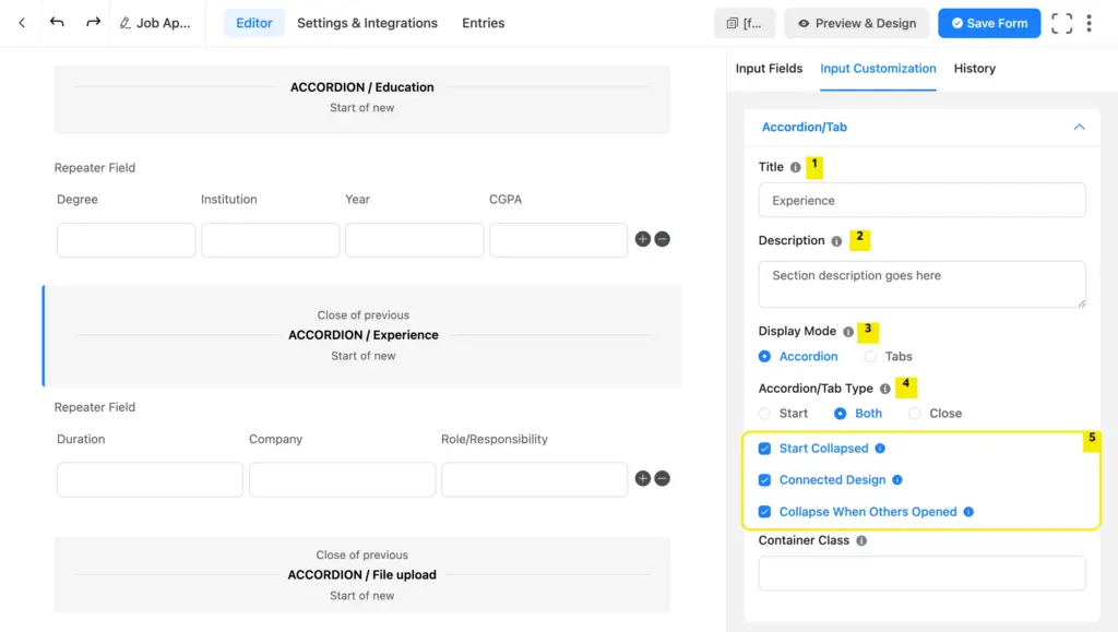
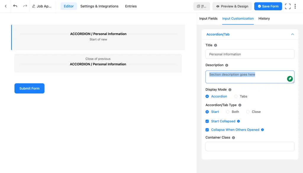
1. Title: This is the section name that’s visible even when the tab/accordion is closed. The section titles help users easily navigate through the sections.
2. Description: This is the section description. It’s visible on a closed accordion section, but only after a tab section is opened.
3. Display Mode: Display mode dictates whether your sections will be tabs or accordions.
4. Accordion/Tab Type: Whenever you add an accordion/tab section field to your form, two tiles appear inside your form editor tab: one indicating the start of the section and another, the close. You can take another field to start another section; that will also come with a separate start and close. This way, all your sections have distinct start and closing tags.
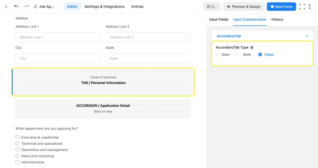
However, you can keep your editor tab neat by turning a closing tag into the start of another. All you have to do is select “Both” as the accordion/tab type.
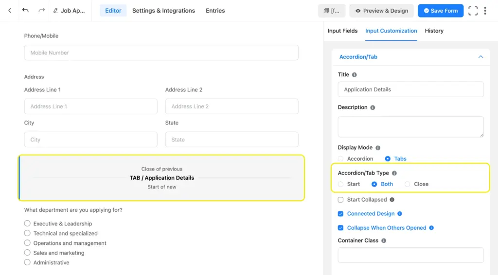
This works well when your form has multiple sections that come one after another.
5. Settings: This part comes with 3 distinct configurations. If you check “Start Collapsed,” the section will stay collapsed at first till users expand it.
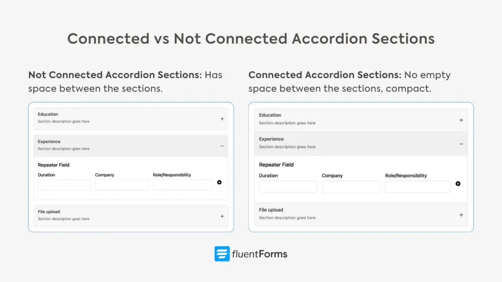
Next customization is “Connected Design.” This dictates whether there’ll be empty space (margin) between your sections. If you check this option, the space will be omitted. You can see the difference for accordion sections in the image below.
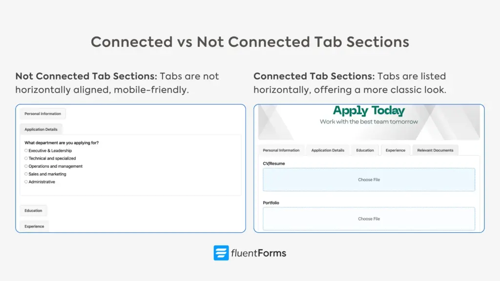
Tab sections assume their classic look when you choose “connected design,” and the section titles are horizontally listed on top.
However, mobile devices don’t usually have enough space to accommodate multiple tab names side by side. If you keep the option unchecked, the tabs will appear one below another, offering a better mobile experience. Here’s what the styles look like.
The section titles appear on a light grey background, with the expanded section title on a slightly less light grey background. This offers a great user experience while maintaining readability.
The last setting decides whether to collapse the section when another is opened. Checking this keeps the form’s look minimal and clean.
Now you’re acquainted with what Fluent Forms’ accordion and tab sections can do. Next, let’s learn how to use them to declutter our forms.
How to create accordion and tab sections in WordPress forms (using Fluent Forms)
Let’s start at the beginning. We’ll cover the basics in brief. Check out our beginners’ guide if you need detailed instructions.
- Go to your WordPress dashboard.
- Find the “Plugins” option on the left menu bar.
- Select “Add New.”
- Search for the “Fluent Forms” plugin.
- Click “Install.”
- Activate the plugin when installation is complete.
- Upgrade to Fluent Forms Pro since the accordion/tab section is a pro feature.
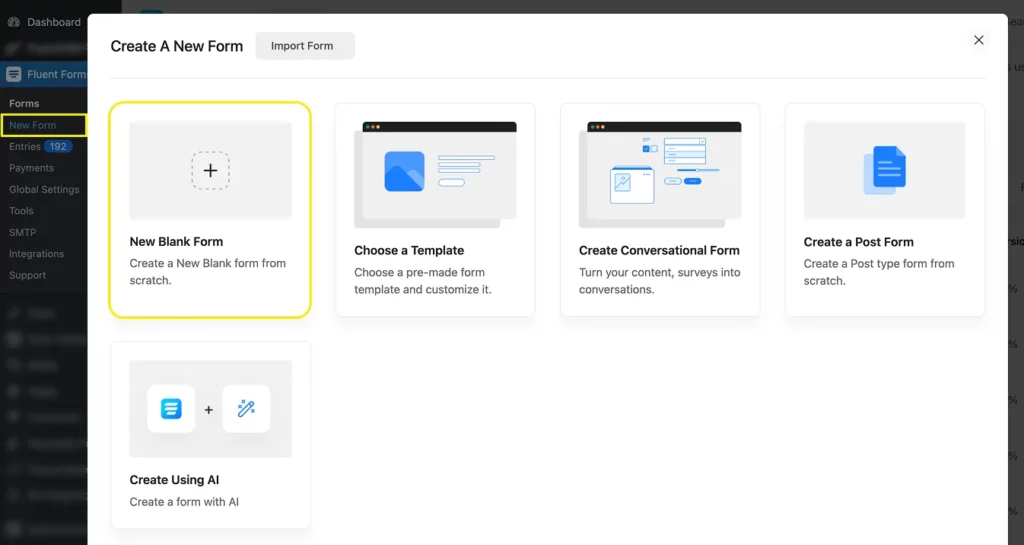
Now you’re all set, so we’ll move on to creating our form. Go to your dashboard. From the left-hand panel, navigate to Fluent Forms > New Form > New Blank Form.
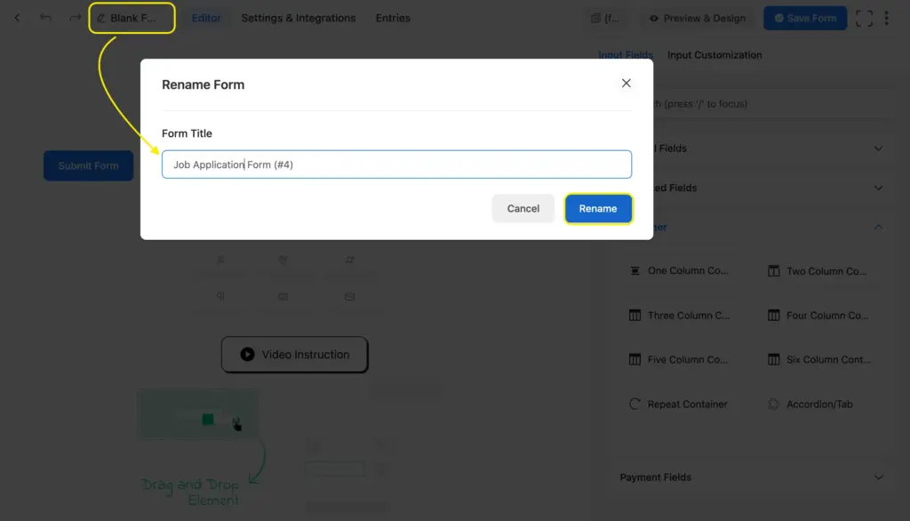
It’ll take you to the form editor tab. Let’s rename our form first.
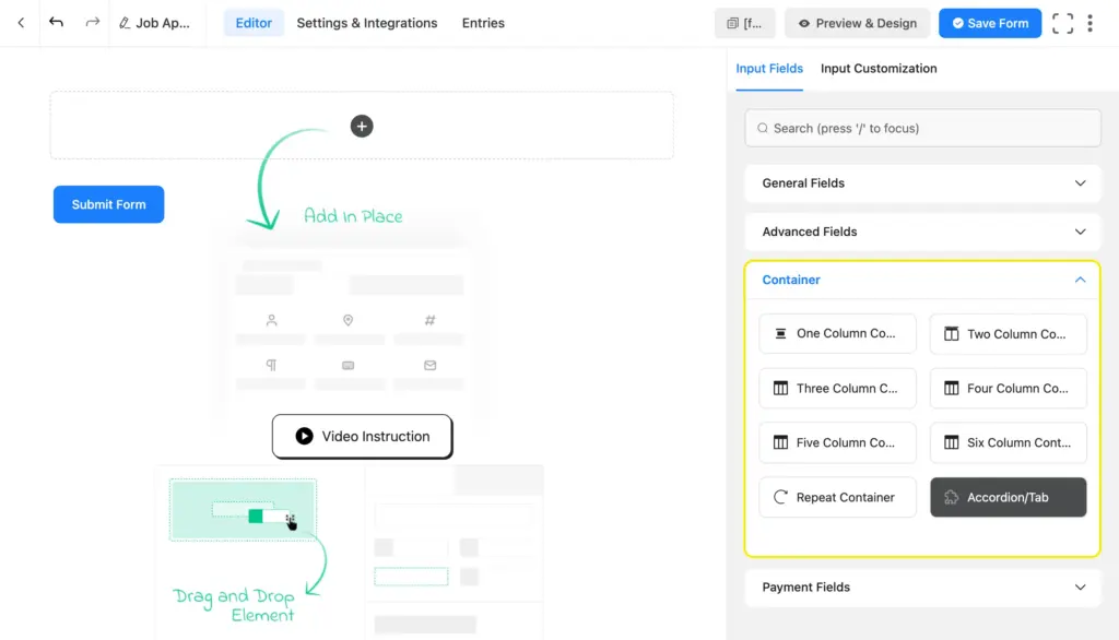
Then, you’ll find the input fields on the right side in four categories: general fields, advanced fields, containers, and payment fields. You’ll find the accordion/tab fields within the container fields.
Once you take the section, customize its title and description. If you don’t want a description, simply leave the box empty. Choose whether you want the section to be an accordion or a tab.
Configure the closing tag based on whether you want it to be the starting tag of a new section as well. If yes, check “both” under accordion/tab type and rename the title to match the following section. If not, simply take a new pair of tags by inserting another accordion field for the next section.
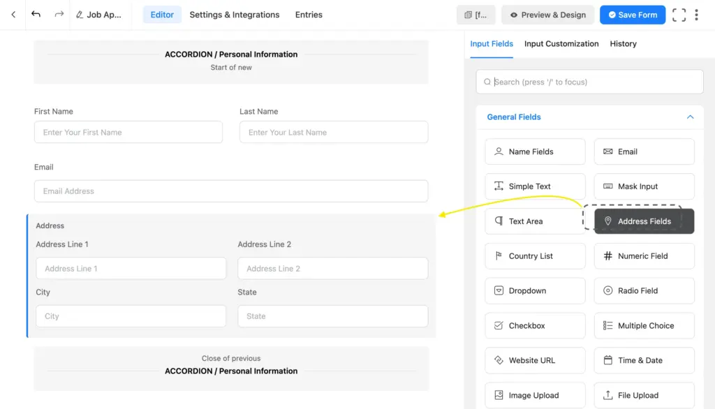
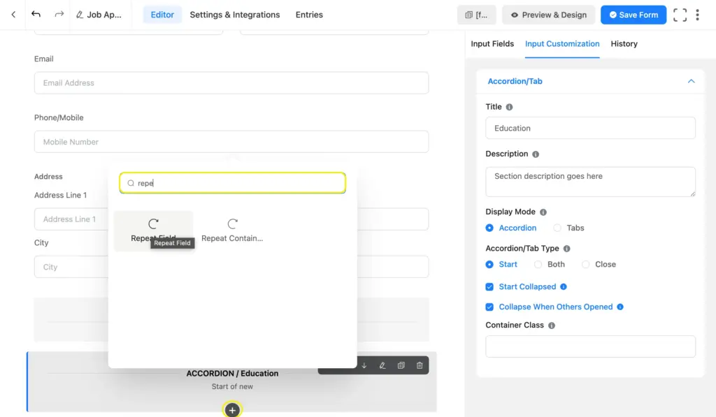
Next, drag and drop the necessary input fields inside each section based on their purpose.
You can also click the plus icon that appears on hover to search for an input field.
Complete all your sections with the necessary & relevant fields. We took 5 accordion sections for our job application form: personal information, application details, education, experience, and documents. Here’s what our job application form looks like.
Where do accordion or tab sections work best
Use Accordions when your form has a natural top-to-bottom flow, but you want to reduce scrolling and visual overwhelm. On the other hand, tabs are best when users need to reference multiple areas or compare options. Here are a few use cases that accordion and tab sections are suitable for.
Restaurant order forms
If you are running a food ordering system, listing 50+ items in a single long column could be too much for users. Simply use Tabs to categorize items (“Appetizers,” “Entrees,” “Drinks”). It mimics a physical menu, and users can skip entire categories they aren’t interested in without endless scrolling.
Detailed job applications
Resumes cover a lot of ground: contact info, education history, past employment, references, and cover letters. Using Accordions for each section (e.g., “Education History,” “Work Experience”) keeps the form compact. Applicants can focus on filling out their work history without being distracted by the “References” section further down.
Service estimates & quotes
Agencies often have complex quote forms where clients pick and choose services (e.g., a web agency offering Design, SEO, and Maintenance). Use an Accordion for each service type. This way, clients who want SEO don’t need to scroll past twenty questions about Logo Design; they simply leave that accordion closed.
User profile & account settings
When users are updating their accounts, they usually have a specific goal in mind, like changing a password or updating a credit card. They rarely do everything at once. Use Tabs to separate “Profile Info,” “Security,” “Billing,” and “Notifications.” It separates the tasks visually, turning a confusing admin page into a clean, easy-to-navigate dashboard.
Think about how your users will interact with the form. If there’s a logical order (surface level to deeper/easy to difficult, etc.), go with accordions. If users need to jump around or compare sections, tabs are your answer. And when in doubt, test both and see which one gets you better completion rates.
When to use accordion sections vs multistep forms
Both collapsible forms and multistep forms fix the problem of “too much scrolling,” but they change how the user interacts with your form. The main difference comes down to freedom and focus.
Use accordions for organization
Accordions keep everything on one page. They allow the user to see the “big picture” and stay in control of what they open and close. They’re best for grouping related fields that don’t need to be filled out in a specific order. Example: A product order form where “T-Shirts,” “Hats,” and “Stickers” are inside their own accordion folds. The user can open the “Hats” section first if they want.
Use Multi-step forms for orders
Multi-step forms break the form into distinct pages with a “Next” button. This forces the user to focus on one task at a time and usually prevents them from seeing step 2 before finishing step 1 (with required fields). They’re suitable for long, complex applications or processes where steps need guidance or depend on another (for example, “If users answer ‘Yes’ to question 1, show a different Step 2”).
Which one should you go for?
Choose Accordions if: You want to tidy up a long form but let users fill it out in any order they like.
Choose Multi-Step if: You need to guide the user through a specific sequence or the form is so long that it needs a progress bar to keep the user motivated.
Multi-step forms come with a “per-step data save” option that allows you to collect partial entries. However, this feature is unavailable in Accordion/tab sections, as it’s a layout feature. However, you can still collect partial entries using the “Save & Resume” input field (button).
Make user experience smoother with accordion sections
Long forms don’t have to look intimidating. With accordion and tab sections, you can transform an endless scroll into an interactive, manageable experience that saves your users’ time and mental energy.
Whether you choose the vertical interface of accordions for mobile users or the categorized organization of tabs for desktop dashboards, the goal is achieved the same: creating organized, user-friendly forms that actually get completed.
Regardless of how complex your job applications, event registrations, or product order forms are, these layouts provide much-needed breathing room. Collapsible sections balance detailed data collection and a clean interface, allowing users to focus on the task at hand without losing sight of the bigger picture.
So, are you ready for the higher engagement and better conversion rates that come with clean forms? Let us know when you start tidying up your forms and how it goes!
Enjoying this article?
We regularly publish actionable content on our blog. Subscribe to get them delivered straight to your inbox.
We won’t spam you. You can unsubscribe whenever you want.

Sarika writes for Fluent Forms and loves to offer insights into small businesses. She’s curious and enjoys discussing ideas, interests, and perspectives. In her free time, she’s either marvelling at architectural beauties or trying different cuisines.


Leave a Reply