Must-follow Rules for Styling Contact Forms | These Principles are Unbreakable
Why is styling contact forms an essential part of your website?
Every business owner wants to turn their leads into customers. What they experience instead is people visit regularly, but the conversion is not happening as expected.
If you want to know the reason that’s thwarting them to be converted, I’m here to explain it in detail. Just keep in mind, if you were dabbling in designing contact forms, then it’s time to be serious.
A contact form is a vital part of a website, and it’s not any less important than the full website.
You give your full care and attention while designing your website but overlook the contact forms because it’s a tiny part. But, this little portion works like a charm when you need conversion.
Why styling contact forms is important
As I have mentioned once that a contact form is a significant part of a website, you can’t ignore the importance of it.
The following reasons can be responsible for a bad user’s experience: unnecessary steps, confusing fields, broken in mobile devices.
Styling contact forms requires your full attention at the same the essential principles to be carried out during the form-making process.
Take care of the alignment
This is one compelling yet straightforward rule that can make the form look better. Long forms intimidate users, and if you can’t engagingly design the forms, people will leave it there.
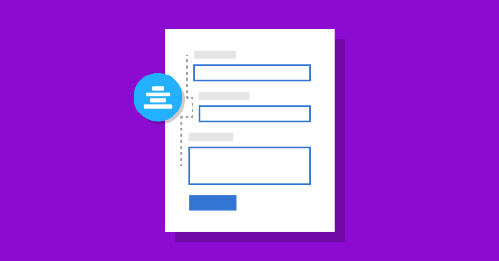
Alignment is a crucial part of giving your form the best shape. This is where you can start improving the quality of your form’s visual experience.
One big challenge of modern websites is improving the UX for mobile. When you would implement this rule, your form will appear more nicely on mobile devices.
Here are some rules to maintain for keeping the alignment on the right form:
- Ideally, labels look good on the left. But, put it above the form fields.
- Grouping is an important task, but the horizontal structure can ruin the aesthetic. That’s why we suggest to keep them vertically in stacks that are connected together.
- Don’t put multiple-choice options in the dropdown menu unless it’s too long. Organize them vertically because it means a better user experience.
Include all necessary fields
You may think that keeping your form shorter makes it more appealing. But that doesn’t always happen. Sometimes you need to tell it elaborately. In that case, it’s necessary to include all relevant fields.
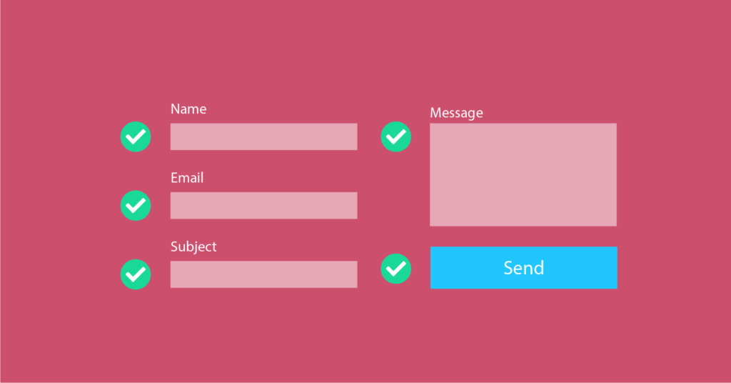
What you believe to be unnecessary may turn out as essential. According to your expectations, people may not fill out the form as the form’s missing out significant part. Shortening makes a form clean but may reduce the conversion at a time.
What you can do instead is organize the long-form in a way that doesn’t bore people. Most importantly, you need to clarify what every field is collecting. Then, users will trust you, and long-form can perform well.
Keep input field label separate from placeholder text
What does a placeholder do? It helps users with additional text that slightly explains what information to put in a field. When users start typing, these hints disappear.
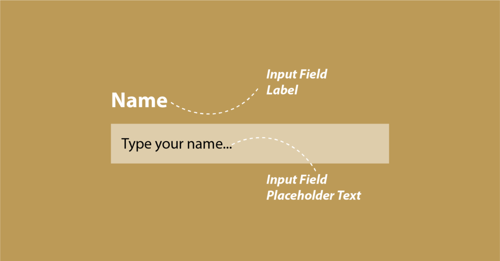
If you use placeholder text as your form label, it will create a bad user experience. How?
- When users click on the box, the text will no more be in existence. So, users have no second chance to know what the field was about. They can’t be sure if they were writing the right information.
- Secondly, when users see there’s something already written, they might think it’s already filled because of the autofill feature. Not users are dumb, but you should not create a scenario that arises confusion.
Although I don’t suggest to use placeholder text as a form label, you can use it as a floating label. By default, users will see one piece of text, which is both – placeholder and label. When they start writing, the text will disappear, and a floating label will arise.
For simple forms such as login forms, which require two fields only, you can use placeholder as a label. Again, when you’re going to collect a lot of information, this approach portrays a bad practice.
Make the form as user-friendly as possible
No matter where your users are coming from, either desktop or handheld devices, you should assist them with helpful techniques. In other words, your form should be more friendly so that users can input with no complication.
It’s your form that needs to be equipped in a way users can feel comfortable while filling it out. If users can’t fathom what to do, then you’re responsible for your loss.
Let’s check out some techniques to simplify the input process.
Logical tabbing
It’s a thing web developers can understand easily. I have included a link for logical tabbing to see what’s is about. By enabling this feature, you’re resolving issues for desktop users and others who have problems with accessibility. If you focus on styling contact forms in the right way, you must take care of the user experience and logical tabbing is a great option to go for.
Input masks
If the input format is uncertain, users will get confused about whether to put a specific symbol or not. On the other hand, the lack of formats makes it difficult for people to correct. Either way, the two situations lead users to abandon the form.
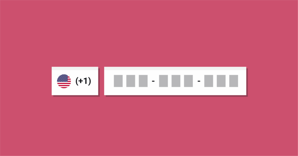
Input masks are the right answer as they auto-insert the correct format, and users don’t have to worry. When users type the input, the format comes naturally.
This type of auto-formatting also leads to fewer clicks (especially if a field like a phone number or credit card is broken into multiple fields) and quicker form completions.
Progress bar
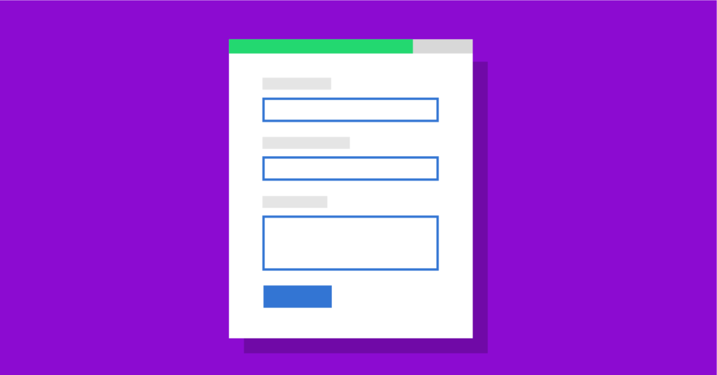
A progress bar shows users how far the form is to be completed. It doesn’t have a direct effect on the form filling process. Since users know how long the form is remained to be finished, they feel more comfortable and less terrified.
Input types
HTML input types will help users see the right keyboard options as they type on mobile, saving them from having to type everything from scratch (like the “.com” for email).
If you add input type in your form fields, users will see the variance in their keyboards on mobile. When they click the email box, the keyboard will automatically appear with small letters. Similarly, if they click on the website field, the keyboard will come up with a .com option.
Autofill
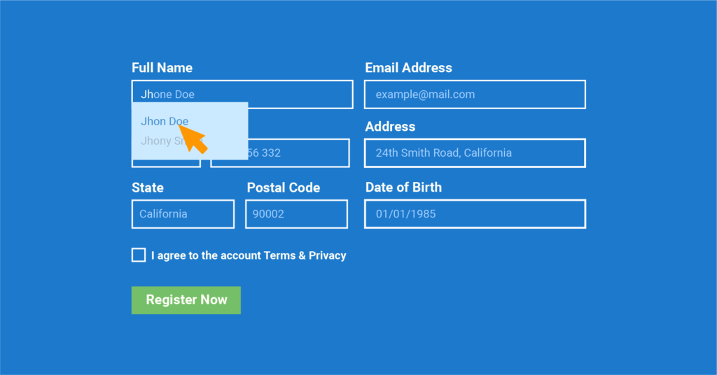
Well, it’s more a Google feature than yours. Two solutions are there for you. First, you can create fields so that they can meet the autofill’s requirements. In that case, don’t apply any unusual field label, which is hard for Chrome to understand.
The second way is using a plugin. Find a WordPress plugin that is built for only this purpose. When you have enabled this feature, the primary fields will be filled out automatically, which is an excellent relief for users.
Conditional logic
Conditional logic is an exciting invention, least to say. When people are struggling to get an efficient way of making their forms clutter-free, this option could be a fantastic solution.

Users won’t see the options until they click on the particular field. For example, you have included multiple options under transportation: by road, by air. If users click on ‘by road’ only then they will see the bus, car, and motorbike.
WP Fluent Forms comes with this cutting-edge feature, which helps you keep your forms free from all the mess.
Be careful with call to action
I don’t think I need to explain how important the buttons are. It’s a core part where you want your audience to click and take some action, right? The least I can tell here is to improve buttons in your contact forms.
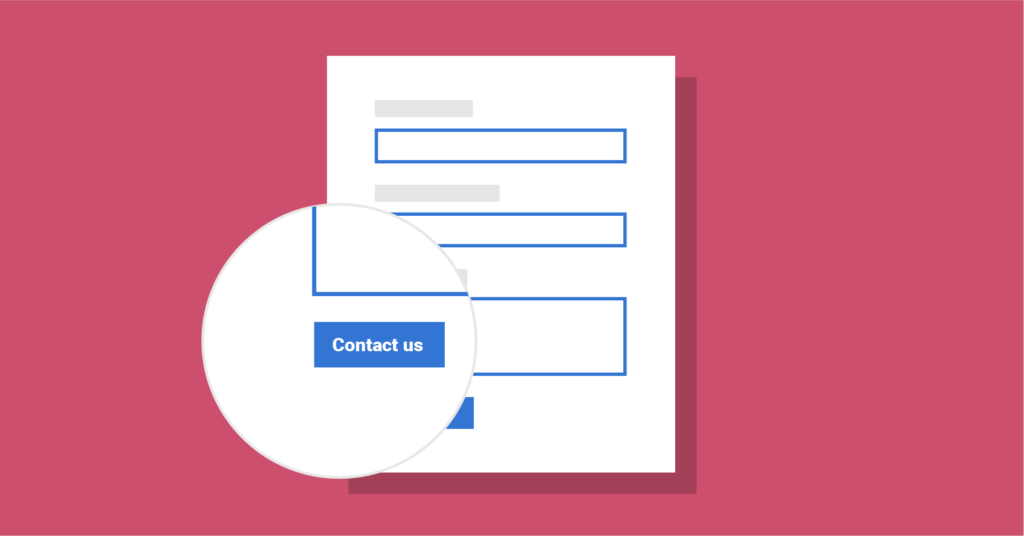
For starters, always align the primary CTA with the form fields, even if it doesn’t seem logical. For instance, if you have a “Next” and “Back” button, “Next” should appear on the far left as it’s the action most users are going to take.
What do I mean by improvement? Let’s start with the button text. “Submit” is the most used text in the entire world. What about using some stronger copy like “Tell us what you think” or “Get the ebook now?”
Final remarks
I can’t say all contact forms would be the same. Based on the business goal and the design of the website, every contact form is different. But, the points I have discussed above are equally important for all forms you’re going to execute.
Now, it’s time to build a contact form that users will love. Keep one thing in mind that users don’t fear of long forms. The more user-friendly you can make it, the better people are going to take it.
While styling contact forms keep the following things in mind:
- To create a better experience for respondents
- Make every point as clear as possible
- Include all the relevant fields
- Utilize the submit button to increase conversion
- Build it in a way that it doesn’t break across devices
Try WP Fluent Forms to get an unforgettable experience while creating WordPress forms. Not only you can make super-fast forms but you will get a lot of top-notch features. Choosing from demo templates to getting priority support, Fluent Forms gets your back.



Leave a Reply