How to Create Opt-in Forms for WordPress

Despite the explosion of social media usage, email remains one of the best ways to approach a concerned audience engaged in your business. But in order to make this interaction fruitful, you have to turn your readers into leads. These people willingly hand over their email addresses to get the value they expect you to offer them in return. However, getting your visitors’ email addresses is not that easy a task, especially after the GDPR law has been introduced. Still, there are several ways to make this happen.
One of the most suitable ways of capturing leads is by applying opt-in forms for WordPress websites. Opt-in forms are placed on your website to inspire visitors to subscribe and permit you to contact them. There are hundreds of plugins in WordPress to create opt-in forms. Today, in this article, you will learn how to create free opt-in forms using Fluent Forms, to grow your WordPress mailing list.
Benefits of using opt-in forms fora WordPress website

Well, nowadays there are many reasons for people to use opt-in forms for their websites. Let’s check some out.
- Opt-in forms help get more users’ subscriptions that support the GDPR rule.
- You can engage with your visitors in the future if you have their information. So, opt-in forms will help you with that too.
- If you are a new blogger, you might offer some helpful ebooks or PDFs to people. You can offer them selected downloadable content right after they subscribe to your mailing list. This can help your email list grow.
- Opt-in forms are very easy to create and add to your WordPress site. With the handy plugins available in WordPress, you can smoothly design one.
Ultimately, they’re a significant way to capture leads and improve the brand value of your online business. Now, let’s find out how to build opt-in forms for WordPress using Fluent Forms.
Create and style opt-in forms for WordPress using Fluent Forms

Fluent Forms is an excellent form builder plugin for WordPress. It is a lightweight and comfortable tool. Anyone can create any kind of form with its smooth interface. Its drag-and-drop feature makes it easier for users to make any form within a few minutes. Furthermore, Fluent Forms comes with 60+ input fields and 70+ pre-built templates to make the form-making process sleeker. You can also get 60+ third-party integrations with the plugin.
Moreover, advanced post creation, Stripe and PayPal integration, PDF entry generation, file upload, conditional logic, etc., functions are also available in Fluent Forms. You don’t need to worry about the security with this tool, as it is secured with reCAPTCHA, Honeypot, and Akismet.
So, without any doubt, Fluent Forms is full of unique features. The developers of the tool add more functionalities every two or three months. Moreover, the plugin is super cost-effective.
You can create any contact form using the plugin. The opt-in form is one of them. Now, let’s figure out how you can design opt-in forms for WordPress using this form builder plugin.
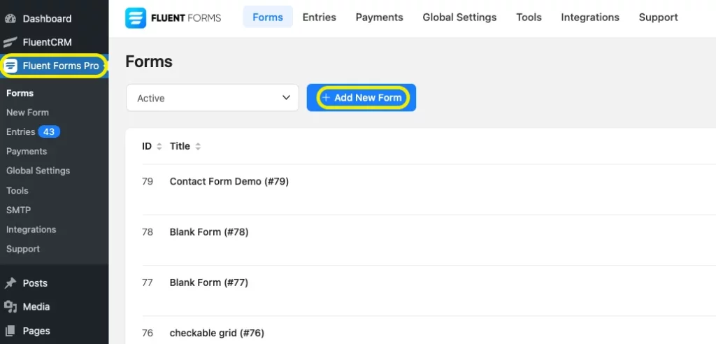
First of all, go to your WordPress dashboard and select Fluent Forms Pro. Then click on Add a new form.
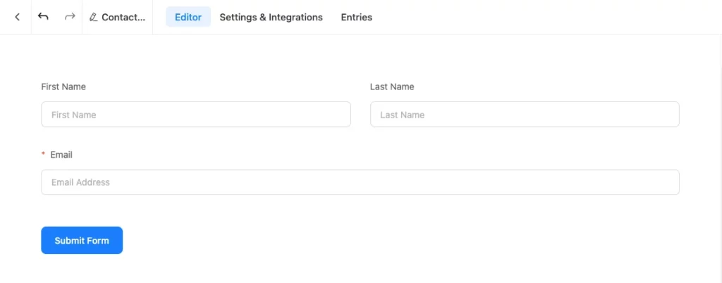
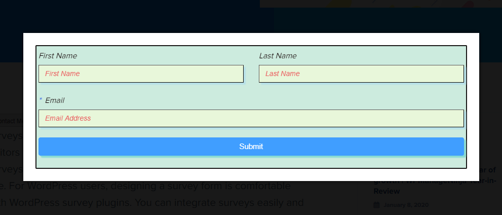
Here, click on Blank form and create your opt-in form. After creating a form, customize it as you want, such as a name field, an email field, a subscription button, etc. I have created a form for you to understand better. I have named the form “Opt-in form” to find it easily on the dashboard. Here is the preview of it.
Global Styler
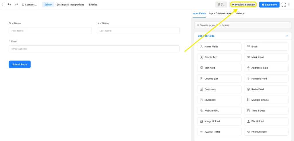
Now, if you want the colors, fonts, and style of the form to match your website’s customization, you can use the global style of Fluent Forms. When you are finished creating a form, click on the preview and design mode from the top right corner of the editor. A preview window will open, and you can edit your form as you want.
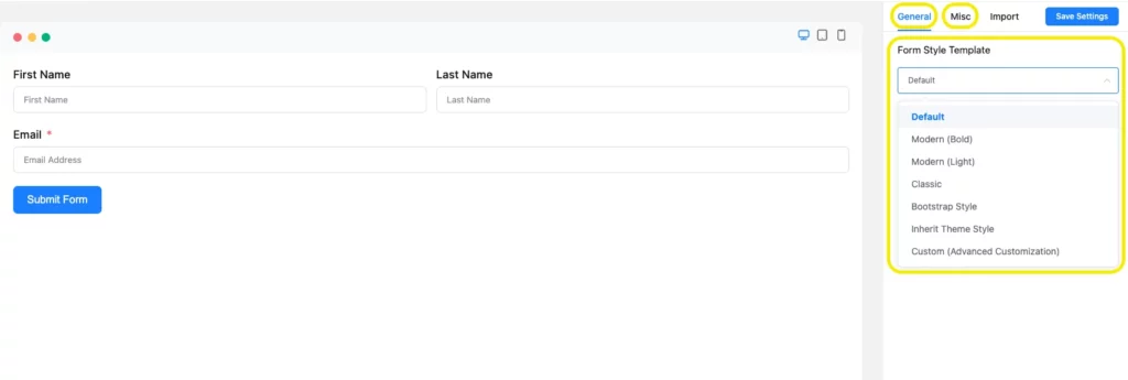
Here, you will see two holders, named General Tab, and Misc Tab. From the General Tab, you can choose any of the template styles, such as Classic, Modern, Bootstrap Style, and Custom (Advanced Customization).
Bootstrap Style
For demonstration purposes, I have selected the Bootstrap Style. After selecting my template, I have opened the Misc Tab, and the preview looks like this.
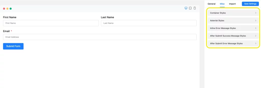
Here, you will find styler named as Container styles, Asterisk Styles, Inline Error Message Styles, After Submit Success Message, and After Submit Error Message Styles.
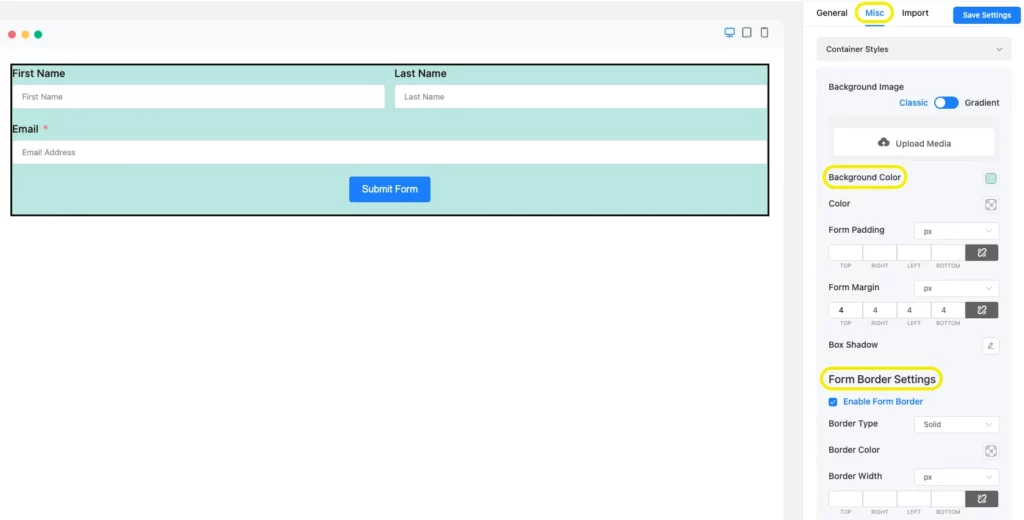
By clicking on Container Styles, you can edit the Background Color, Color, Form Margin, Form Padding, Border Type, Border Color, Border Width, and Border-Radius. Besides, you can define your Form Color, Form Width, Border Width, and Color the way you want with these fields. For a better grip, have a look at the given screenshot.
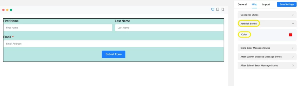
The Asterisk Styles section of the form will help you in setting the color of the asterisks in your form. You might need to use them for marking the important fields in your form. It’s important to keep in mind that you have to add that asterisk sign from the main form editor while you were creating the form. I have set a mark for the Email section from the editor.
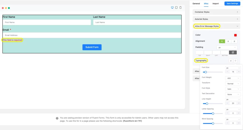
Let’s see what Inline Error Message Styles is for. This section will help your users identify the sections that are mandatory to fill up. If one is missed, the user will be reminded of it with an error message, and you can customize the message you want to display, like the Font Size, Font Weights, text decoration, Line Height, and Letter Spacing.
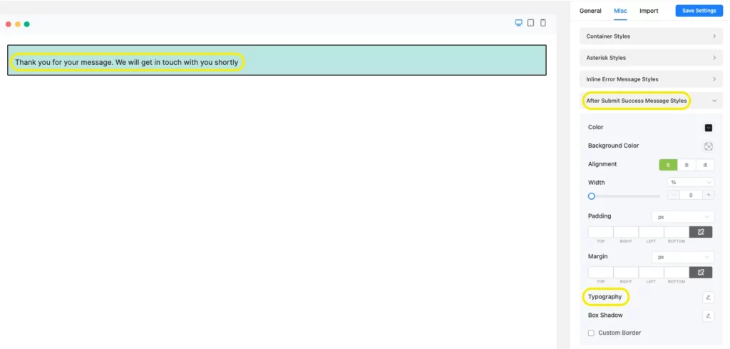
You can also customize the After Submit Success Message or After Submit Error Message Styles with this styler. For example, I have customized the After Submit Success Message texts.
For testing, fill out the form and click on the submit button to view the message after submission. Now, tick on the After Submit Success Message, and customize the color and background of the text, Typography, and Box-Shadow.
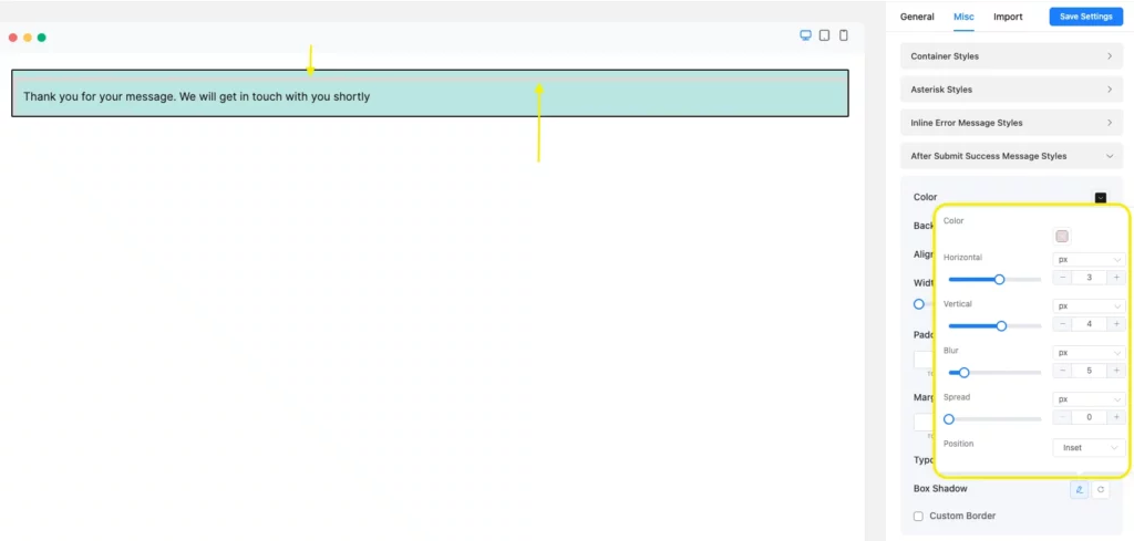
In the Typography field, you can resize your Fonts, select Font-Weight, Transform, Font Style, Text-Decoration, Line Height, and Letter Spacing.
The Box-shadow field will allow you to customize a shadow behind the text-box area. Have a look at the given screenshot.
Custom (Advanced Customization)
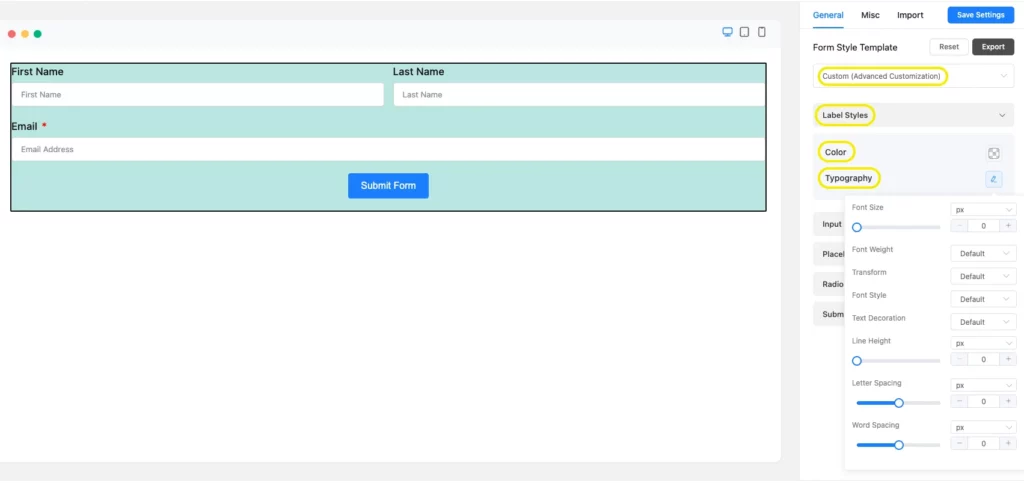
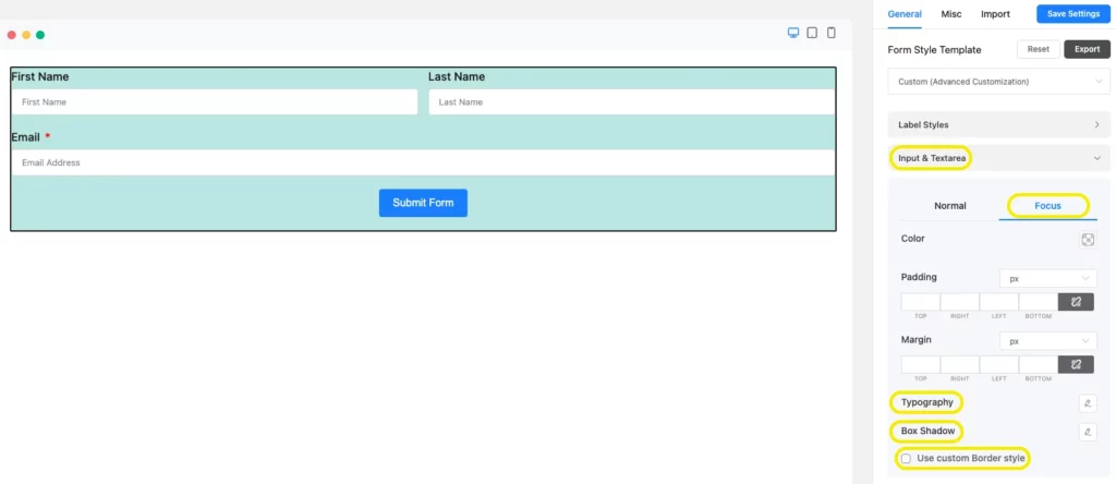
Furthermore, if you also want to design your form fields and the submit button with the global styler, you have to select the Custom (Advanced Customization) from the General Tab. Here you can edit Label Styles, Input & Textarea, Placeholder, Radio & Checkbox Style, and Submit Button Style.
If you click on the Label Style, a new dropdown menu will open with color and Typography options. You will be able to change the Font Color, Font Size, Font Weight, Font Style, Text-Decoration, etc.
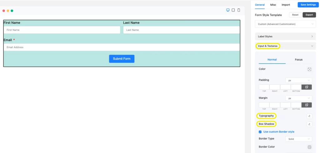
Input and Textarea will help you to change the background color and the font color of your form. Additionally, you can set the Font Size, Font Type, Letter Spacing, Font-Weight, etc., with the Typography. With Box-Shadow, you will be able to customize the shadow behind your box areas shown in the picture below.
You can even decorate the border by clicking on Use Custom Border Style. It will help you to personalize the form Border Color, Border Width, and Border Radius of your form fields.
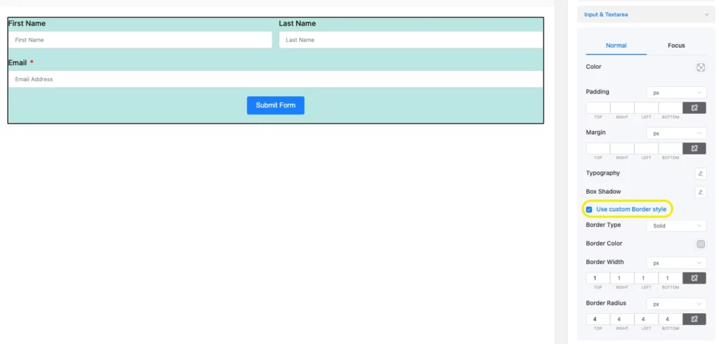
Fluent Forms global styler also lets you design the focused fields of the form. To do that, click on the Focus option from the Input & Textarea and customize it as you want. Even the focus field border can be customized by selecting Use Customer Border Style, just like the form field border.
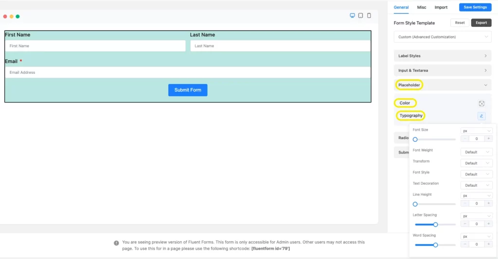
With Placeholder, pick the color of the placeholder of the input fields to give it a standard look. Use the Typography together with the Font Size, Font Weights, Text Decoration, Line Height, and Letter Spacing.
Now, if you add section break, a checkbox grid from the general form editor, two new sections will open on the Custom (Advanced Customization) edit field named as Section Break Style, and Grid Table Style. You can edit those fields with these sections. Also, to get more information about Radio and Checkbox style, you can read our article that is based on global styler.
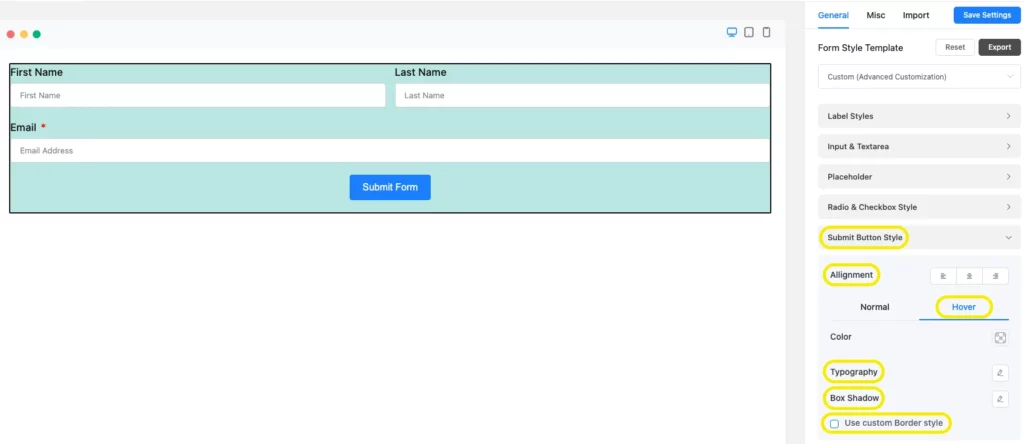
Submit Button Style
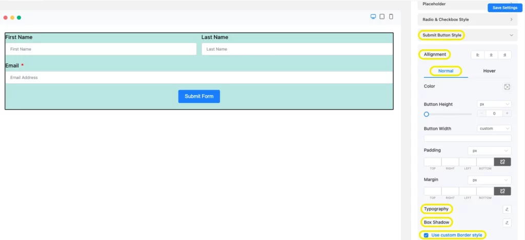
Fluent Forms global styler also lets you customize the submit button of your form. Click on Submit Button Style, and a new dropdown menu will appear with two options. One is normal, and the other one is hover.
The normal section will guide you through setting the background and font color of the button, to setting the position of the button. There is also Typography for setting the font size, font type,e letter spacing, etc. Besides, you can design the box shadows specifically for this button. If you enable the Use Custom Border Style, you can select the border type, border color, border width, border radius, etc., for the submit button.
Let’s find out about the Hover section. When you float over the submit button you will notice some changes on the button. The hover section is about letting you customize these changes. It comes with the same styles as the other fields such as background color, font color, typography, box shadows. Borders can be redesigned by using “Use Custom Border Style”.
So, these were some instructions for creating and customizing opt-in forms for WordPress with Fluent Forms Global Styler. Now it’s time to attach the opt-in form to your page. Let’s see how you can do that. We will also guide you on how to customize the form simply by using some shortcodes.
Enjoying this article?
We regularly publish actionable content on our blog. Subscribe to get them delivered straight to your inbox.
We won’t spam you. You can unsubscribe whenever you want.
How to attach opt-in forms for WordPress on your page and edit with shortcodes
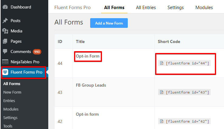
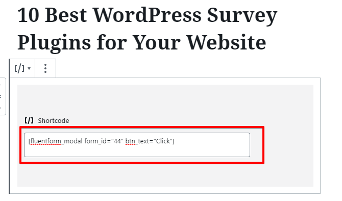
Go back to the form editor, and click on the shortcode of the form you have just created. Copy the code. Let’s see mine.
Then get back to the posts of your WordPress dashboard and select any of the articles to apply the form code and see what happens.

Here for demonstration purposes, I have chosen an unpublished article of mine and pasted the code here.

Now, to create a pop-up form in Fluent Forms, you have to customize your shortcode a bit. Instead of pasting the code as
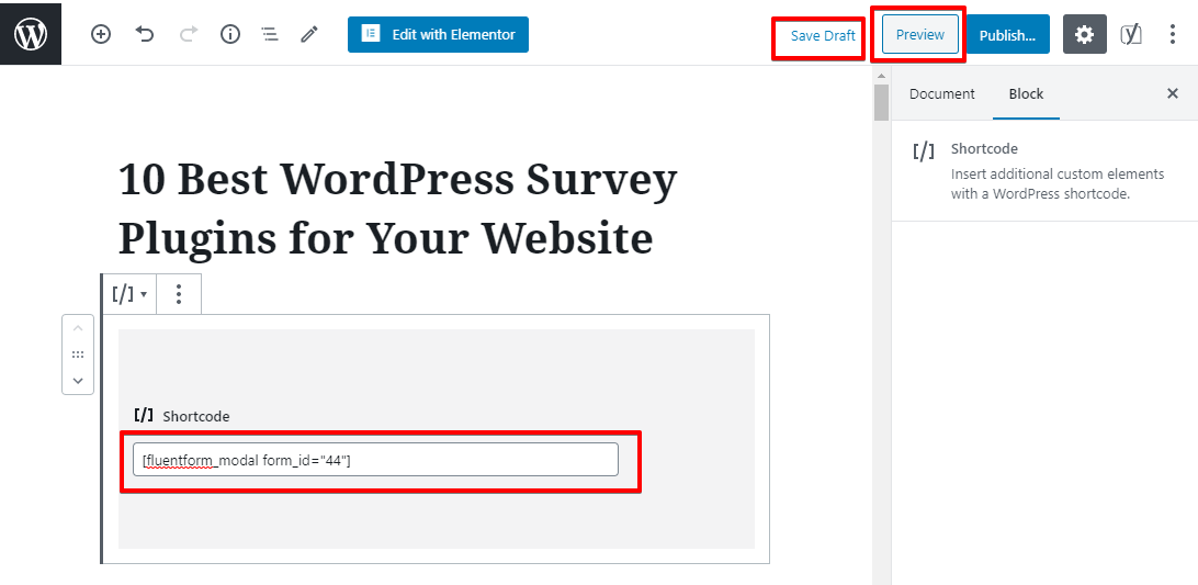
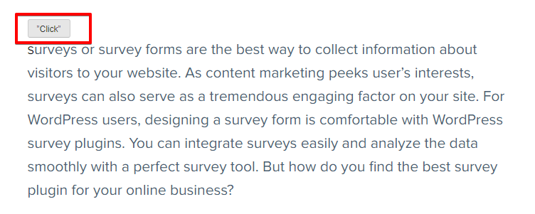
Then save the draft and click on the preview mode of the form to see the layout. Your users will see it as a “contact me” button. I put the form at the beginning of the article so that users can see it at first. If I kept it to the bottom line, sometimes users might leave the page without even noticing it.
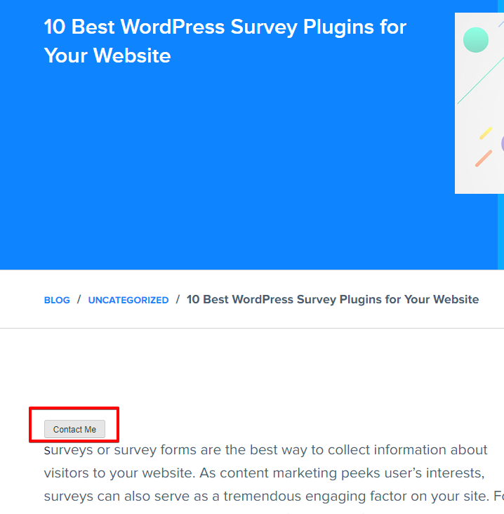
Tick on the button and see what comes. Whoa! A popup form appeared just in front of my article.
Now, you can also change the trigger buttons’ text, design, and background color by using some simple shortcodes. To change the text of the button, add (btn_text=” Click”) on your form shortcode. So here for my form, the ultimate code will be:
Save and preview it.
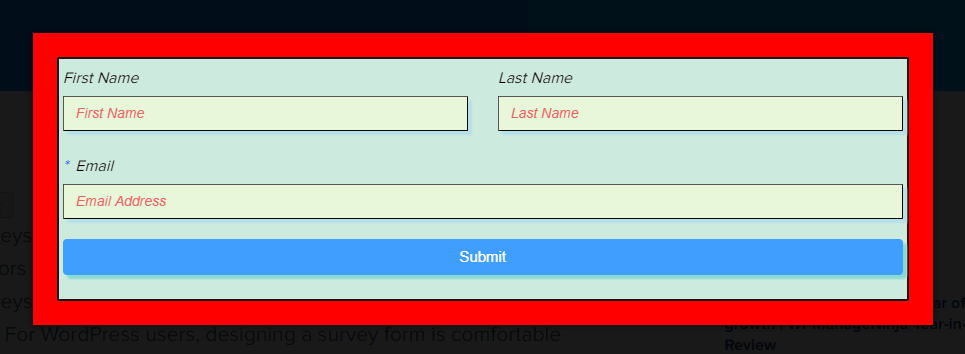
To change the background color of the pop-up form, add this piece of code (bg_color=” gray”) inside the shortcode. Now the shortcode for the popup will be:

Let’s have a look at the preview of this too.
Now, want to add a custom CSS class to the button so that you can style it as you want? To add a CSS class, add the shortcode (css_class=”myClass myClassAgain”) inside the button shortcode, you must use “css_class” as the key to assign the classes to buttons.

By adding this, CSS class will be added to your button like the screenshot below.

So, congratulations! You have learned how to design opt-in forms for WordPress with Fluent Forms. You must be wondering now why I should use Fluent Forms for creating opt-in forms, right? So, let’s find out the reasons behind Fluent Forms holding its ground.
Final words
We know that creating opt-in forms for WordPress websites is a bit of a chore. But building forms with Fluent Forms makes the process more straightforward and intuitive. However, once you have added the opt-in forms on your website, your work is not done. After adding that form, you will get email lists, and then you have to start your marketing activities. We hope this article was helpful to you in creating opt-in forms for WordPress.

Hello, This is Prema. I work as a marketing strategist for Fluent Forms at WPManageNinja. When I am not playing with words, I go to explore nature.