
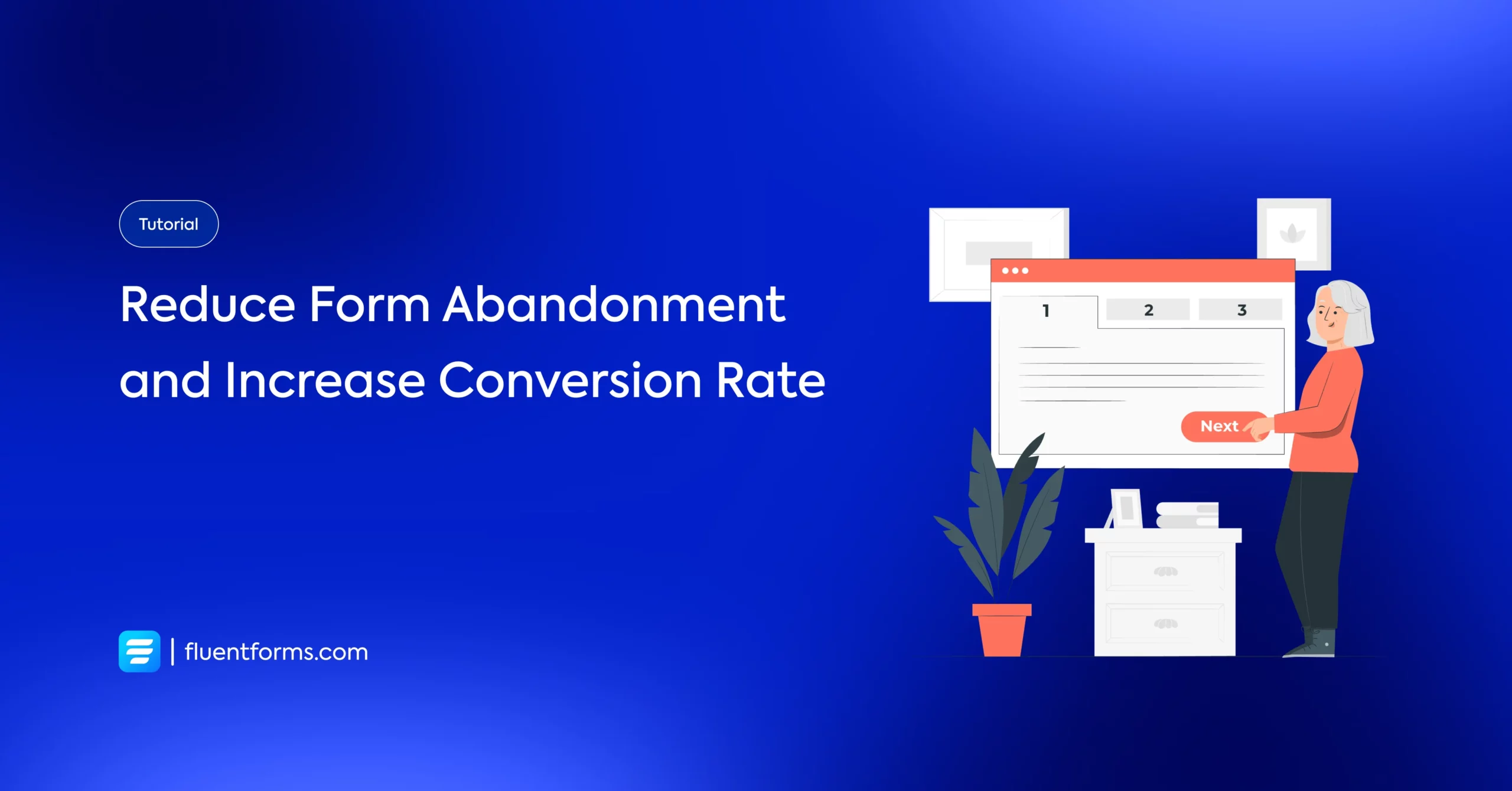
How to Track and Reduce Form Abandonment to Increase Conversion Rate
Form abandonment is a common term in lead generation that indicates that a form is partially filled out but not submitted.
When a user leaves a form after starting to fill it out, it’s supposed to be an abandoned form. The basic identity of an abandoned form is that it is not submitted.
Strategically, improving the form abandonment rate requires the scope to track the completion rate and optimize the repeatedly abandoned forms.
In this blog, you will get an overall idea about what web form abandonment is, how to measure form abandonment, and the experience-driven tips for improving the form abandonment rate.
TL;DR
- Form abandonment, in a nutshell, is leaving a form before submission
- Abandoned forms can help you get new leads if tracked properly
- Irrelevance, security issues, and too many text fields are the prime reasons for form abandonment, which means form optimization is the key to reducing abandoned form rates.
- Designing a form with the proper form fields and a better user experience, adding a save and resume button when providing a link, introducing conversational forms while attaching a lead magnet, and similar practices are some of the top proven strategies to recover form abandonment.
- In WordPress, an integration or built-in analytics feature of a form-builder plugin can help you track the abandoned form rate.
What is form abandonment
Form abandonment is an action done by a form submitter who started filling out the form but eventually did not submit. So, form abandonment, from the user’s end, refers to leaving a form without submitting it.
Every abandoned form leaves an abandoned form behind, whether it is a contact, lead generation, subscription, order, survey, or any similar web form.
Reasons behind an abandoned form
There can be multiple reasons why a user leaves a web form incomplete. There might be some length, clarity, technical, or similar issues that make a user bounce back from the submit button.
Highlighting the wrong sequence or missing the necessary fields are significant reasons behind the increasing form abandonment rate. Sometimes, users might not like your form aesthetics and designs, which will result in form abandonment.
Security issues
A user will not be ready to submit their contact information as long as there is any security issue. It might be about the informational, entity-based, or related to the website’s internal security.
Too many text fields
A user is not always available to write a few words, depending on their interest. When you add too many text fields rather than adding some choosing options, a user may lose interest and abandon a form instantly.
Irrelevant questions (in terms of surveys)
While doing a survey, irrelevant questions can ruin a user’s initial interest. It’s not always about the length of the form. Users help themselves less while doing a survey, and it serves your purpose more. So, they are less into replying to some vague questions.
Technical issues
Technical complications, lack of clarity, and slowness of the website make a user leave a form. These disengage the users from the primary intention of filling up a form. Any kind of distraction can bother a user.
Why reducing form abandonment rate is important
As we know, a web form serves the users at the bottom of the funnel, it’s not that simple to bring the user straight to that conversion funnel. In that stage, an abandoned form indicates that you have lost a potential customer.
Technically, reducing an abandoned form means increasing the possibility of conversion.
Let’s see what you can gain through reducing the number of incomplete contacts or related forms:
- Decreases bounce rate
- Increases conversion
- Brings more leads
- Improves customer retention
- Broadens payment collection
How to track abandoned form rate in a WordPress site
Applying form abandonment recovery practices can develop consistency in your form collection, while tracking will help you find where you can make a difference. Using the Independent Analytics integration with Fluent Forms, you can streamline the basic purpose of your form collection by tracking the conversion rate.
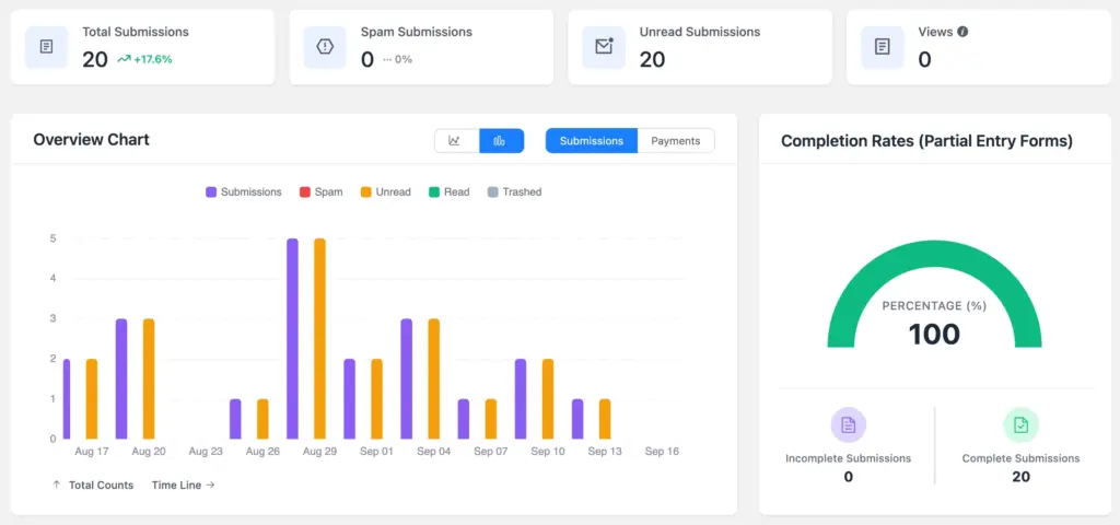
Fluent Forms, with its latest update, provides you with the numerical report of form completion, which is a strong visual data point for form abandonment tracking. You can check the Completion Rate (Partial Entry Forms) in the Overview Chart.
Simply go to Fluent Forms Pro < Reports and click on the Overview/Payments/Submissions to check the reports. You can select the date range and download PDF reports.
You can also check the timeline. You can check both the number of complete and incomplete submissions. While tracking the total submission, you can also check the spam submissions and read/unread submissions.
You can simply run an A/B test and toggle your form-building preferences to make sure which format works better for your business.
Proven ways to fix web form abandonment issues
Solving a form’s internal development issues is a must to decrease the abandonment rate, where you need to evaluate the form-building from the user’s point of view.
It’s about how simply it works, how welcoming it appears, and how quickly it finishes. Clarity, brevity, and scannability are the keys that hook your user into starting to fill out a contact form without any second thought.
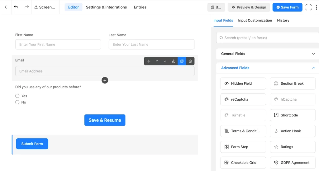
Save and resume button
The save and resume button in a form works effectively when a user wants to save progress and submit a form later. It keeps the already submitted information updated; laterally, the user might complete the form with a single click using the link given.
For example, if a product review/feedback form has 10 questions, and one question is like: ‘What feature did you like most?’, the user would like to answer this question after a few days.
In similar cases, a ‘save and resume’ button can help the user submit the form later with the proper answer.
Partial entries submission
If there is a partial submission option, you can track the abandoned form and get some valuable information. For example, if a user keeps a form incomplete but fills in the email address column
Conversational forms
A conversational form introduces a personalized experience and improves user engagement through its interactive format. The more engaged your users are, the less likely they are to leave the form page.
A conversational form provides a chat-like experience, so the user finds it more casual, which creates the tendency to go on to the next pages.
Adding a lead magnet
A lead magnet, in the simple sense, is an invisible deal between a visitor and a business that the user will provide their email/phone in return for whatever valuable service the business provides. It might be educational content, a personalized discount, or a free subscription.
If the users think the thing you are offering is worthwhile for sharing personal info, they wouldn’t mind completing a form with required information.
Simplify the user experience
A form’s user experience is what makes a user relate the visuals and texts to the purpose. It’s about highlighting exactly where it’s required.
The clarity all over a form’s body connects the user easily with its intent.
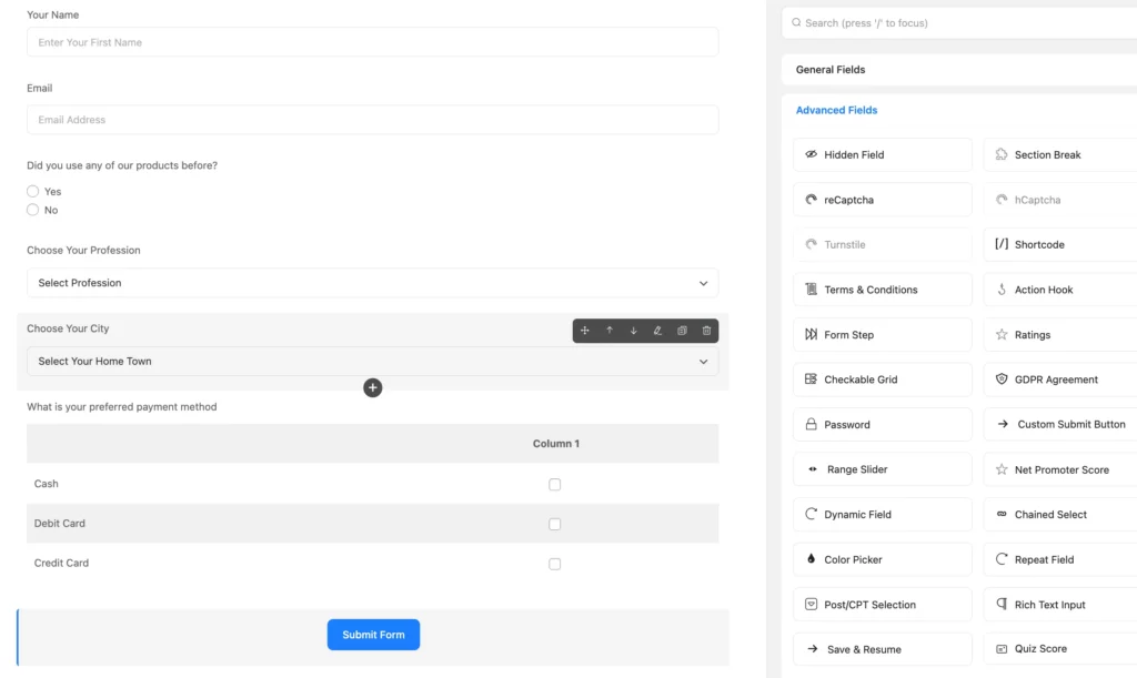
Remove unnecessary fields
If a single field serves multiple purposes, then what’s the need to add multiple fields?
Reduce as many fields as possible, and also limit the query.
Use fields like range slider or chained select to make it more functional without adding multiple fields.
Selection options
Rather than impose your writer verbally, you can add selection options such as:
- Dropdown
- Multi-select
- Radio field
- Checkbox
- Multiple Choice
- Checkable grid
- Range slider
- Dynamic field
Introduce a mobile-friendly design
A mobile-friendly design doesn’t always mean the shorter ones. It might be long, but with multi-step and save progress features. The width of every field, text size, and color are also some matters of concern.
Auto-fill and suggestions can also convince the users to proceed.
In short, mobile users should find an app-like feel while filling out the form.
Strengthen your site security
Most of the forms are filled with personal info, a synced browser’s login, and sometimes with way too much sensitive data like payment information. That’s why your form, as well as your website, should stand strong in the matter of security.
The subtle difference between HTTP and HTTPS (Hypertext Transfer Protocol Secure) can make a big change. It’s the SSL certificate that validates your site’s payment security. The hCAPTCHA and reCAPTCHA, too, are the crucial points you shouldn’t miss to earn users’ trust.
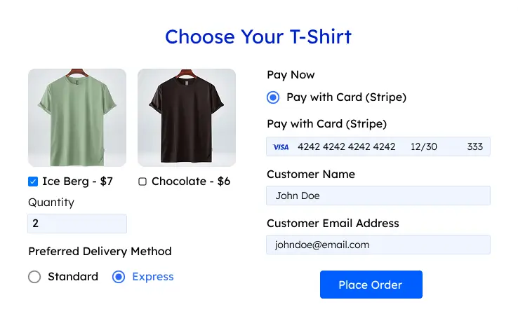
If you are pursuing payment info, PayPal or Stripe can be some recommended payment methods that your users will like to use.
So, introduce strong form security actions and ensure robust data protection.
At the end, compromising security is compromising marketing, branding, and conversion.
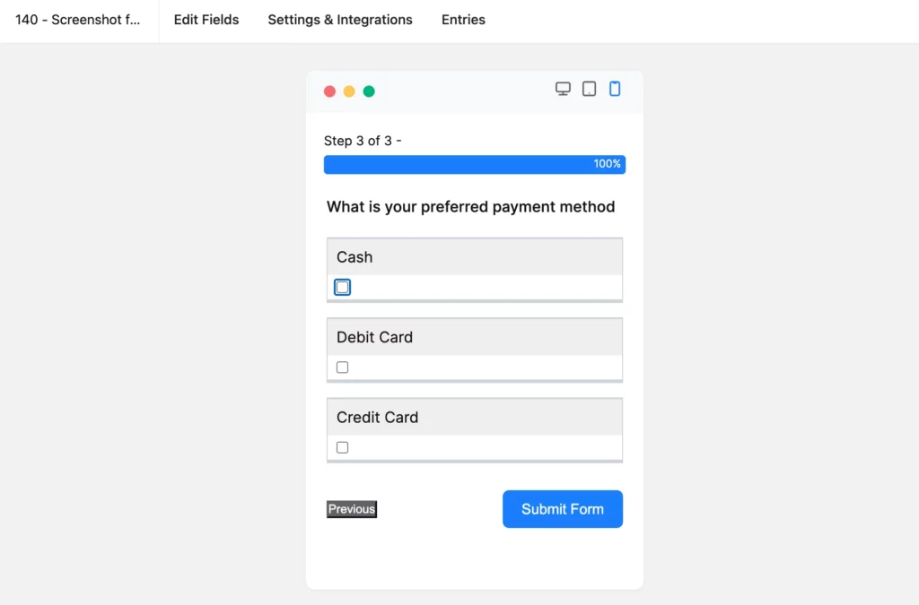
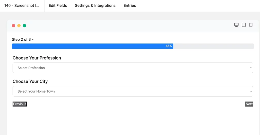
Multi-step form completion
A multi-step form eliminates the boredom of proceeding with a long form and makes the user accomplish it faster. It’s the progress indicator and custom step title that help a user engage easily. Ultimately, the breakdown strategy works when serving the main purpose – conversion.
Use predefined templates
Using well-designed templates can help you publish forms according to the user’s intent. Suppose you are going to make an admission form. In that case, if you use a pre-built admission form, allowing a little customization, it will mostly match the users’ demand.
Wrap up
Reducing irrelevance throughout the contact form on your website and bringing clarity makes it reasonable for the users to continue the submission. The form should be concise and summarized when prioritizing users’ privacy concerns.
The proper form building software can assure you of an improved form submission rate.
Build Smarter Forms for Free

Hi, this is Aparup. I am a Literature postgraduate, mixing my creative thoughts with my experience in the tech industry to surpass AI. Professionally, I am a content marketer seeking solutions to users’ problems regarding WordPress.


Leave a Reply