Landing Page Best Practices Marketers Need to Know
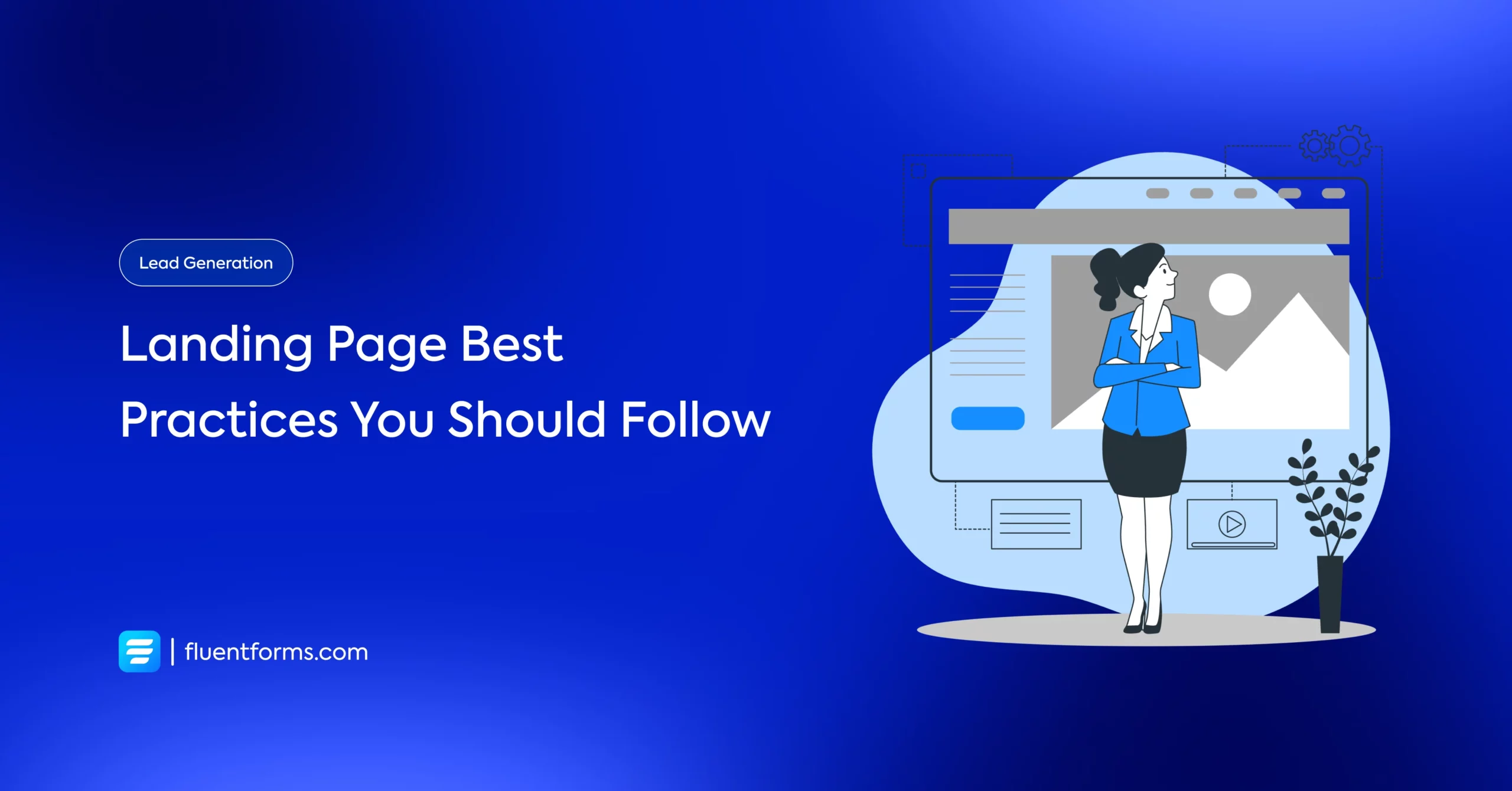
How do you convince your audience to visit your website? Well, if you are a marketer, you already know about landing pages. Whenever a user clicks on one of your ads, the landing page is the very first place they go. This is where they check out their desired product and relevant information. So the landing page is your first shot at making a good impression.
However, every time a user abandons your website from the landing page, you are losing a conversion. So, to increase the conversion, you need to follow some landing page best practices, including creating a great design for it.
So, how do you do that? Well, this article brings you 12 ways that are proven as landing page best practices.
Why do you need a landing page on your website?
A thoughtfully crafted landing page is needed to keep your visitors focused. Remove navigation, diverting links, or too many options to capture your visitor’s attention. This way, your users will be in full concentration, and you can guide them to complete the required task, such as filling out your lead form. In sum, you need great landing pages for converting a high percentage of visitors.
Now you know the importance of landing pages; let’s see twelve landing page best practices to make sure your page brings high conversions.
12 landing page best practices to boost conversions
To increase your website conversion rates, optimize landing pages using best practices and accurate data. There are so many factors that come together to make a great landing page. But using those elements in the most fitting manner depends on what your landing page goals are. In this blog, we have listed twelve landing page best practices to create a well-performing page. Let’s dive into each.
Make a clear offer
For every ten people visiting your landing page, at least seven will leave the page. So, how do you keep that number low? Marketing expert Joe Chernov once said, “Good marketing makes the company look smart, [but] great marketing makes the customer feel smart.” So, when you start planning your landing page optimization, think about how you can let your visitors know what’s in it for them.
The headline of your landing page is the first thing your users will read upon visiting your landing page. Make them feel smart, appreciated, inspired, and excited through your landing page title. In sum, the headline should clearly and concisely convey the value of your landing page and offer.
Keep the essential messages above the page
You don’t want your visitors to search and scan your entire landing page just to find the offer. Place your essential messages above the fold of the landing page. So, your users can quickly understand what information you are going to provide once they scroll down. Then they click on that as per their needs.
Use a form, an anchor link, or attractive CTAs above the page to grab visitors’ attention. That way, users don’t need to scroll through the whole page to get the desired information. They can click on the link, and it will take them to their desired page or location. You can even place your lead capture form for them to fill in exchange for the desired resource.
Grab visitors’ attention
The important fact about a landing page is that it has to catch your visitors’ attention or intrigue them so they’re willing to fill it out. So, how do you do that? Well, as a first step, use a catchy headline or CTA button that will compel your visitors. Make your copy clear and concise, and guide your visitors to the desired action. Applying words like “you” or “your” makes people feel more engaged with you or your business. Furthermore, you can utilize your landing page with some relevant, inspiring images or even add videos to motivate them into completing the required task.
Keep your landing page simple

You have to collect as much information as possible from your leads. But never ask for too much information. It creates a cluttered look on your page, and your customers get confused by seeing too many questions. Try to keep it simple; leave white space on your page. Uncluttered pages make it easier for users to understand the queries and find your CTA button. Complicated questions on your landing page might frighten people rather than convince them to convert.
Remove distractions
A landing page has one objective, and that is converting your visitors into leads. You need to keep people on your page until they take action. Any competing links, like internal links, navigation bars, or other page bars, on your landing page will distract your visitors.
So, remove any other links from your page, unless, of course, you want them to visit that page. But keep that number minimal, like one or two links. In sum, you have to think in a way that every outbound link on your landing page should create opportunities for visitors to increase your page conversions.
Provide social proof
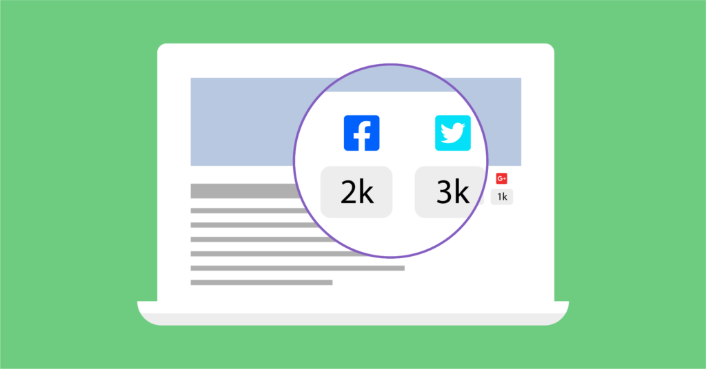
How would you convince people to believe in your business and give their information to you? Well, provide them with some proof of how other people have benefited from your company. That way, the potential customers can see what they can get from your business and the benefits of buying from you. Providing social proof will help you build trust and credibility among people in your brand.
Keep the loading time fast
The loading time of your landing page has a massive impact on increasing or decreasing the bounce rate. It is easy to maintain landing pages on the website, but you need to make sure that there is nothing slowing down the load time. Use compressed versions of your images to make the page load faster. Finally, when your landing page doesn’t load fast, it can also damage the page’s SEO.
Make it mobile-friendly

Among so many landing page best practices, a meaningful way to increase conversion is to confirm that your pages are compatible with any device or screen size. Nowadays, people are habituated to handheld devices like mobile phones or tablets. So it is necessary to give your visitors every possible opportunity to convert, no matter how they are viewing your page.
There are many tools or plugins on the market that will allow you to add this feature to your landing page. Using them, you can easily make your form mobile-friendly.
Be consistent
Visual consistency also matters for rising conversion rates. As an example, if you place a Facebook ad that drives people to your landing page, you have to make sure that the text, imagery, or other elements of the ad are related to your page. They should convey the same message and present the same offers. Otherwise, people might get confused about your purpose in the process. Continuing with consistency is one of the best practices for crafting a landing page.
Optimize for SEO
You might be getting visitors to your landing page through email campaigns, social posts, or other marketing methods. But you should also optimize the page with target keywords for the organic search. This is an effective method you should follow for your landing page best practices. When people search for your key phrase, they should discover your landing page.
People get landing pages via organic search all the time. For instance, maybe one of your landing pages is your homepage, so it should come up at the very least if someone searches by your company’s name.
Test and update
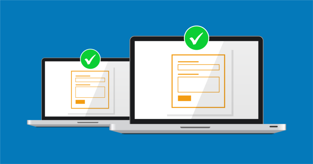
A constant task you have to do for improving conversions is testing your page. To know which element is providing the best performance from the landing page, you need to check different variants at a time. Then track the conversion for each change, and then implement changes. The more A/B tests you run, the more accurate data you will get.
Remember that, during an A/B test, you take one element at a time. For example, two versions of a button or two different copies. Don’t run experiments on both at the same time. If you run tests on multiple elements at the same time, it becomes hard to track which version of an element is converting more.
Another critical aspect of landing page best practices is, you should stay up to date. You might notice that your previously best-performing ads are beginning to fall off. This is happening because of your outdated landing pages. So update your page regularly by changing some elements, such as the background color or a new CTA, or designing a fresh page. That way, Google will find your landing page clean and updated.
Add a thank you page
Last but not least, the thank you page is another element in the list of landing page best practices. Once someone fills in the requirements of your landing page and completes the action, provide them with a visual confirmation that you have received their information. You can show a text after submission by writing “Thank you, we received your information,” or design a whole new thank you page with visually pleasing elements. It will increase your brand value.
Wrapping up
Landing pages can be an excellent way to create the majority of your new leads. So, you need to pay attention to this sector. If you run your page with a vast number of additions, variations, and tweaks, there’ll be no reason for the conversion of the landing page not to increase. As long as you are following the landing page best practices that we have discussed above, you will be on your way to creating a high-performing landing page. We hope you find this article helpful. Moreover, you can check out our article about creating a landing page for more help.

