Where to Place Forms on Your Website to Maximize Conversion

If you manage a website for your online business, you know that forms are the means of lead generation, customer engagement, and conversions. However, where you place forms on your website can make or break their effectiveness. A poorly placed form can go unnoticed, while a strategically positioned one can boost your conversion rates.
For example, a newsletter signup form placed above the fold on the homepage can capture casual visitors, whereas a detailed demo-request form should go on a pricing or contact page where leads are already interested.
In this guide, we’ll review every type of page (homepage, feature/product pages, pricing, blog, contact, landing pages, etc.) and explain exactly which form (lead form, signup form, contact form, survey, etc.) should go where for maximum impact.
Whether you’re running a tech startup, a retail store, or a food and beverage business, the right form placement strategy is a key factor in transforming casual visitors into loyal customers. Let’s go through the details of how to make them work for your specific goals.
Why form placement matters
Form placement isn’t just about aesthetics; it’s about user psychology and behavior.
A form that’s hard to find or pops up at the wrong time can frustrate visitors, leading to abandonment. On the other hand, a well-placed form that aligns with user intent and conveys a clear value can convert window shoppers into buyers.
Your audience expects a seamless experience. And you can create a smooth buyer’s journey by placing forms where users naturally look and ensuring they align with the page’s purpose. This smooth user experience ultimately encourages them to take the desired action, multiplying your sales and ROI.
So, let’s get into the details with no further delay.
Key factors in form placement
Before going into pages, consider these universal factors about form placement to deliver a smooth user experience (UX).
- Goal: First, think about the action you want your visitors to take. Quick actions (like newsletter signups or free trials) often benefit from above-the-fold placement. However, if you need to ask them for detailed information, place the form after establishing trust and showing proof of the value you can provide.
- Context: Place forms near relevant content. For example, a “Download eBook” form belongs right after the eBook teaser or related blog post. This smooth flow is crucial for making your visitors take the right action at the right time.
- User Behavior: Use analytics or heatmaps to see where people look and scroll more. For instance, heatmaps show that the bottom-right corner of a page is hardly viewed. Hence, if you place a form there, most of your visitors might miss it.
- Device Variability: “The fold” isn’t fixed; it changes depending on device type. What’s above the fold on a desktop might be below the fold on a phone. That’s why you should always test layouts on various screens.
Keeping these in mind, let’s go page by page in the following section.
Where should the forms go on your website
Here’s a breakdown of the best practices of strategically placing a form on different pages of your site to boost conversion, offer a smooth user experience, and make your forms appear natural.
Above vs. below the fold
The “fold” separates the immediately visible area of a webpage from the content that requires scrolling. Placing forms above the fold guarantees instant visibility, while placing them below the fold can work better if users need more context (trust signals or product details) before converting.
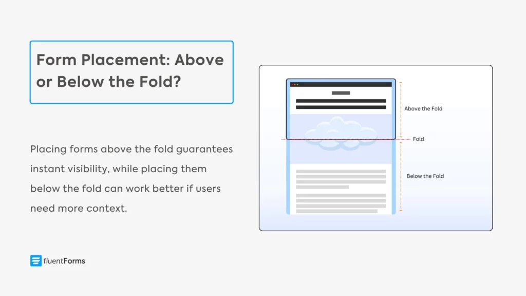
Above-the-fold: Any form placed here can be seen without scrolling. This prime spot captures attention for quick conversions. Many SaaS or marketing homepages put a short signup or “Get Started” form in the hero section at the top. However, the form must be relevant to the page, so it feels natural.
Below-the-fold: When a visitor has already read about your product’s benefits or seen testimonials above, they may be more willing to submit detailed information. The user knows more about you at this point, so a longer form is less intimidating. That’s why putting a form further down can reduce abandonment on longer forms.
Don’t assume one position is always best. The result depends on your audience and page purpose. For straightforward offers (like discount coupons), above-the-fold often wins, whereas below-the-fold might outperform when it comes to complex offers. Run A/B tests of different form placements to see what truly works for you.
Homepage forms
The homepage is your website’s front door, and it’s where first impressions are made. Any form placed here should be subtle yet accessible, focusing on lead generation or initial engagement. Popular homepage form placement options include:
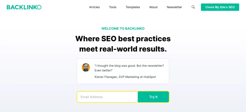
- Hero banner/above fold: If email capture or lead gen is a top goal, feature a simple form or button in the hero area. A classic example is Backlinko’s homepage, which places the email signup form at the center. The form only asks for one field (email) and has a clear CTA (Try It). This “hero” placement ensures maximum visibility as soon as the page loads.
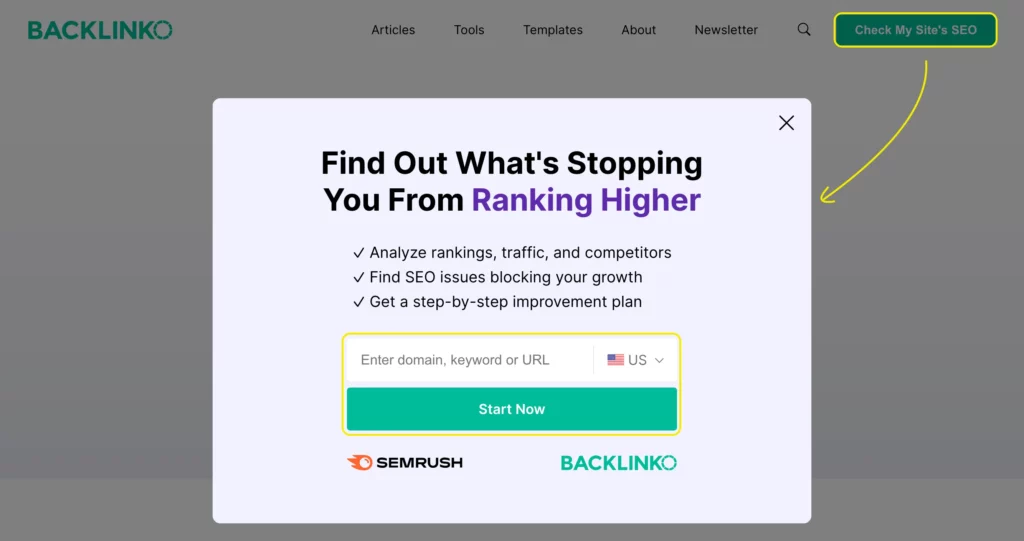
- Top navigation bar or announcement bar: Most sites use a thin fixed bar at the top for newsletter sign-up or trial offers. This stays static as users scroll, keeping the form always present on screen. It’s less intrusive than a pop-up, but ensures high visibility. Below is another example from Backlinko.
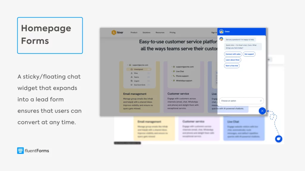
- Floating/sticky elements: A sticky chat button or floating “Get a Quote” can act like a form. These follow the user as they browse (for example, a live chat widget that expands into a lead form on Hiver’s homepage). These sticky CTAs ensure that users can convert at any time.
- Footer: The footer is on every page, so a signup form here is sitewide. But footer forms are among the least-seen areas (a bottom-right heatmap is dark). They work best for users who scroll to the end of the page, like engaged blog readers or someone looking for more information.
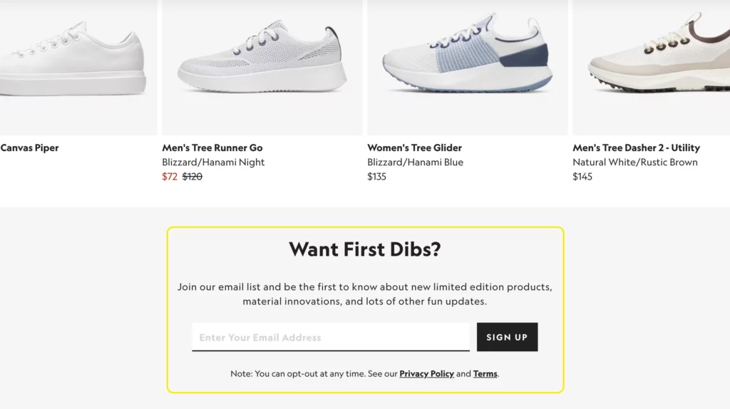
- Below the fold: Sometimes homepages display summaries of features, testimonials, etc. You can place a signup form at the bottom of those sections as a CTA. This is good because those featured sections catch your audience’s attention, making them interested in your brand. Here’s an example from Allbirds.
The homepage is usually the most-visited page. Your homepage visitors include both people who are new to the industry and people who are comparing your features and pricing with those of your competitors.
Feature & product pages
The feature/product page is where your users come to learn about a solution or evaluate their options. The user is usually further down the funnel if they’re visiting these pages. Forms on these pages often serve as secondary CTAs or capture leads in exchange for gated content.
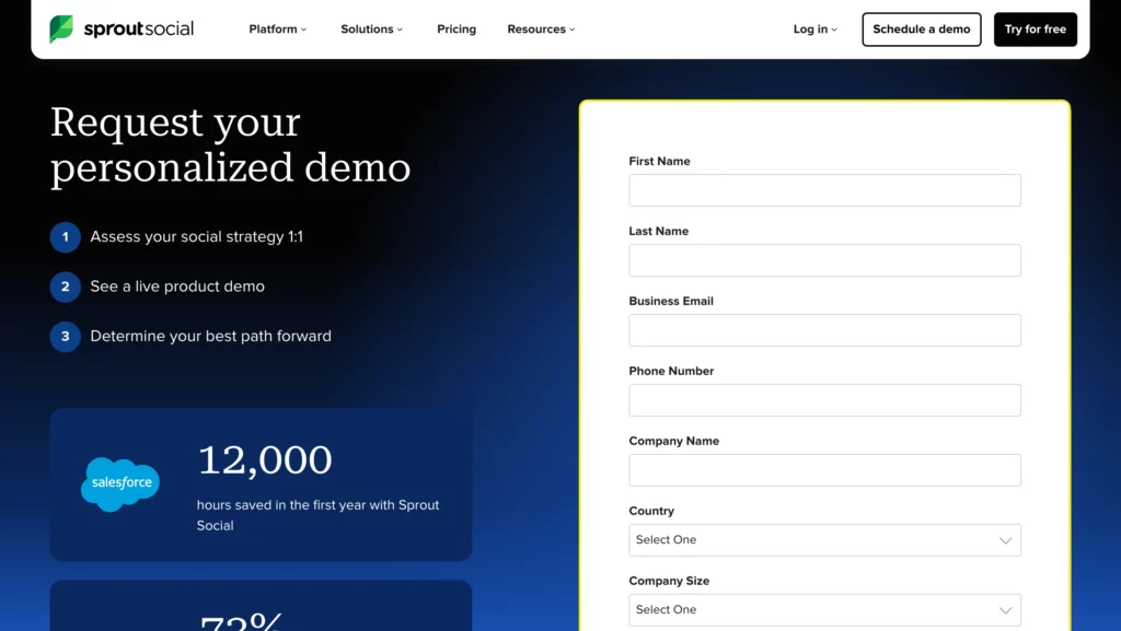
- Free trial/demo request: If you have a product feature page (common for SaaS/tech), embed a small signup or “Request Demo” form in the hero or sidebar of that page. For instance, a header button like “Start Your Free Trial” or “Download Free” (the free version of freemium products) can open a short form with name/email. You can even direct users to a detailed demo page like Sprout Social does.
- After relevant information: If your product page is long (like a detailed tutorial or feature list), you can include inline forms (or links to forms) midway. For example, after explaining a feature, insert a form that offers a case study download or lets users chat with sales. A/B testing can reveal the optimal point (i.e., 30% vs. 50% scroll) for form placement.
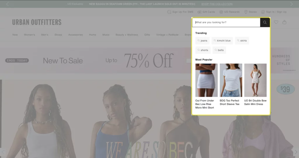
- Sidebar/navbar forms: A sidebar or top navbar might hold a newsletter signup or “Get a Quote” box. However, visitors might miss a sidebar form. Therefore, if you implement it, make sure to also add an exit intent popup or a footer form as backup. Here’s an example of an interactive search form in Urban Outfitters’ navbar.
- Above vs. below the fold: For key features, keep the form above the fold near the feature’s headline. If the feature needs explaining, you might place the form a little lower, after the initial introduction.
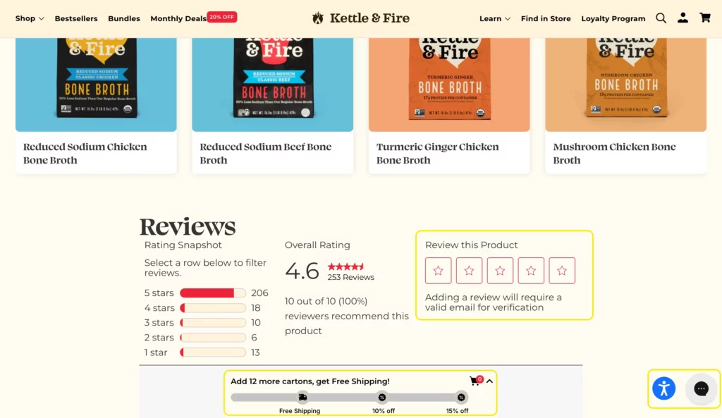
You can also place a product review form below the fold (let the entries dynamically add to the displayed reviews below the form for user trust and credibility) of individual product pages.
Kettle & Fire (an e-commerce site) displays a product rating form and 3 pop-up forms (an add-to-cart form with a progress bar, an accessibility form icon, and a chat widget) on their individual product pages. These forms aid in a smooth user experience without cluttering the page.
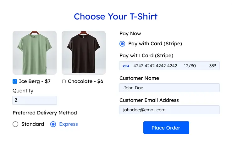
On product pages, forms can ask for a bit more information than a newsletter. A demo request might include name, email, company name, and perhaps one qualifying question (determines if a prospect/lead is a good fit for a product or service). Forms with 3 to 4 fields are ideal here; however, if you need to ask more questions, you might consider using a multi-step form.
Pricing page
The pricing page is where your bottom-of-the-funnel prospects come to compare plans, buy, or sign up. Forms here should make it easy to take the next step.
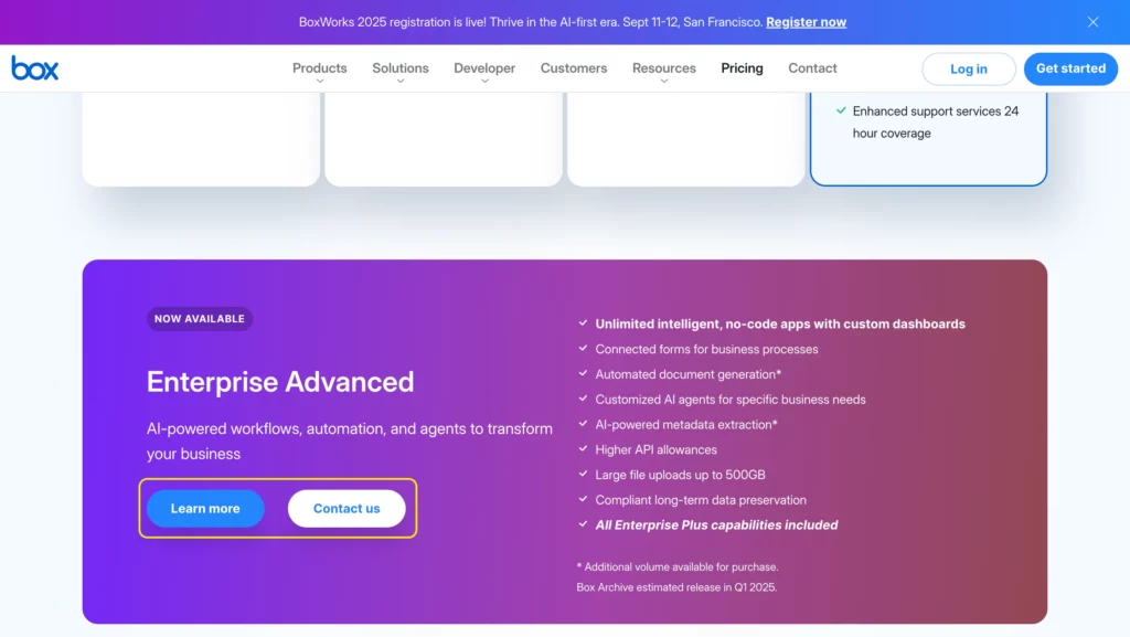
- Primary form (purchase/sign-up): If you sell directly on the page (like e-commerce or SaaS signup), the main form is often the plan selector and checkout process. Make these prominent and keep them above the fold. You can take note of Box’s pricing page.

- Secondary form (lead capture): Some of your leads might be hesitant to buy, so use a stay-in-touch form below the fold to collect their emails and nurture them over time.
Moreover, a “Contact Sales” or “Request a Quote” form link (could be a CTA) is common in pricing pages to help prospects make their decision. These links can open a pop-up form or scroll to a simple form further down the same page.
- Adaptive form: According to Hubspot, if a visitor repeatedly returns to pricing without signing up, you should consider displaying a specialized form asking, “What’s stopping you from signing up?”.
This two-question form (email + “reason” multiple choice) captures their contact and gives you feedback on objections. It’s a smart way to engage high-intent visitors.
- Layout: Try to keep the pricing page forms above the fold or in a sticky sidebar, as users often scroll back up and down comparing plans. Use vibrant or contrasting colors to ensure the form or CTA stands out.
Use conditional logic in pricing page forms to tailor questions based on user selections to make the forms short and relevant, and keep navigation minimal. This will reduce user frustration, resulting in a high purchase rate.
Blog and content pages
Blog readers are often early-stage leads who are not ready to buy yet. Therefore, forms here are usually about capturing leads whom you can nurture later.
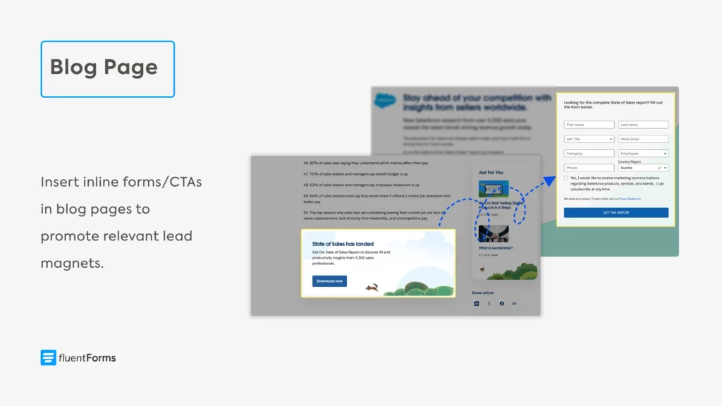
- Inline forms: Embed a short form mid-article or at the end of a post offering a free resource. The free resource could be the free version of your tool, free templates, the complete guide, etc. Make sure the resource is contextual and the offer comes after a relevant section. Here’s an example from Salesforce.
- End-of-post forms: Many blogs place a newsletter signup or lead magnet form at the bottom of the article. Users who reach the bottom have high engagement, so a footer form “Be the first to get updates” can convert them. This catches leads who’ve finished the content and want similar content in their email.
- Exit-intent pop-ups: When a user’s cursor heads toward the close button, an exit-intent pop-up can appear with a last-chance offer (newsletter, discount, or free resource). Exit popups can convert very well, you just have to ensure they are non-intrusive (don’t cover the whole screen on mobile, or Google may penalize you).
- Sidebar forms: As a secondary option, you can put newsletter forms or CTAs in the sidebar. However, these are often overlooked if your visitors are engaged readers. Therefore, if you use a sidebar form, pair it with a more prominent form.
Blog forms (newsletter, freebie download) should be very short; usually just an email field, maybe name. The goal is to build an email list, and users might find longer forms (asking for job title, company, etc.) intrusive.
Landing pages
Landing pages are focused on achieving a single goal, usually lead generation or selling a product. Typically, you make an offer (free resource, discount deal, etc.) to incentivize users to take the action you expect from them.
If users find your offer enticing, they complete the action (provide information in exchange for the free resource/make a purchase) through forms. That’s why you need to ensure your users face no difficulties finding the form.
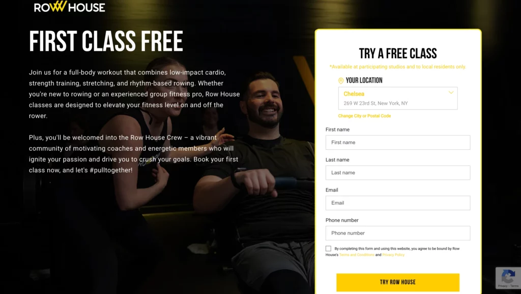
- Hero or center: Most landing pages put the form in a prominent place, often in the hero section or immediately after a headline. The visitor should be able to see the landing page form without confusion. For example, you can place the download form on the right side above the fold, with persuasive copy on the left. Here’s an example from Row House.
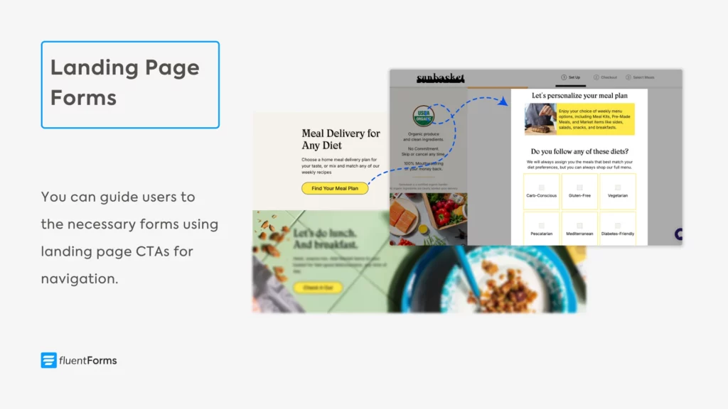
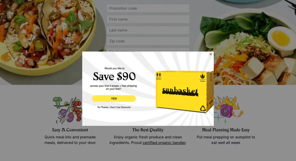
- Keep distractions minimal: Many high-converting landing pages remove navigation and secondary links so the form is the main focus. Make the call-to-action clear (like “Download Now” or “Get Instant Access”) and place it right with the form (the form’s submit button, or a separate CTA button that opens up a form when clicked, like in Sunbasket’s example below).
- Multiple forms: In case you want more than one form on your landing page, you can make the second one a pop-up that’s triggered by scroll or exit intent. Besides, you can use relevant CTAs to open up additional forms.
- Form fields: Tailor the fields to the offer. If it’s a simple newsletter or eBook, ask just for email (and maybe first name). For a sales lead, you can include extra qualifying fields (company size, role), but only after you’ve made the value clear. If you need a long form, consider a multi-step or conversational form and add a progress bar so users know how close they are to completing it.
Carefully plan the information you want to capture through your landing page form; if you ask for too much, the users might abandon it altogether. You can conduct A/B tests to find out the ideal form and CTA positioning, color, and layout.
Contact page
The contact page exists solely for the user to get in touch. Therefore, the contact form must be at the focal point of a contact page.
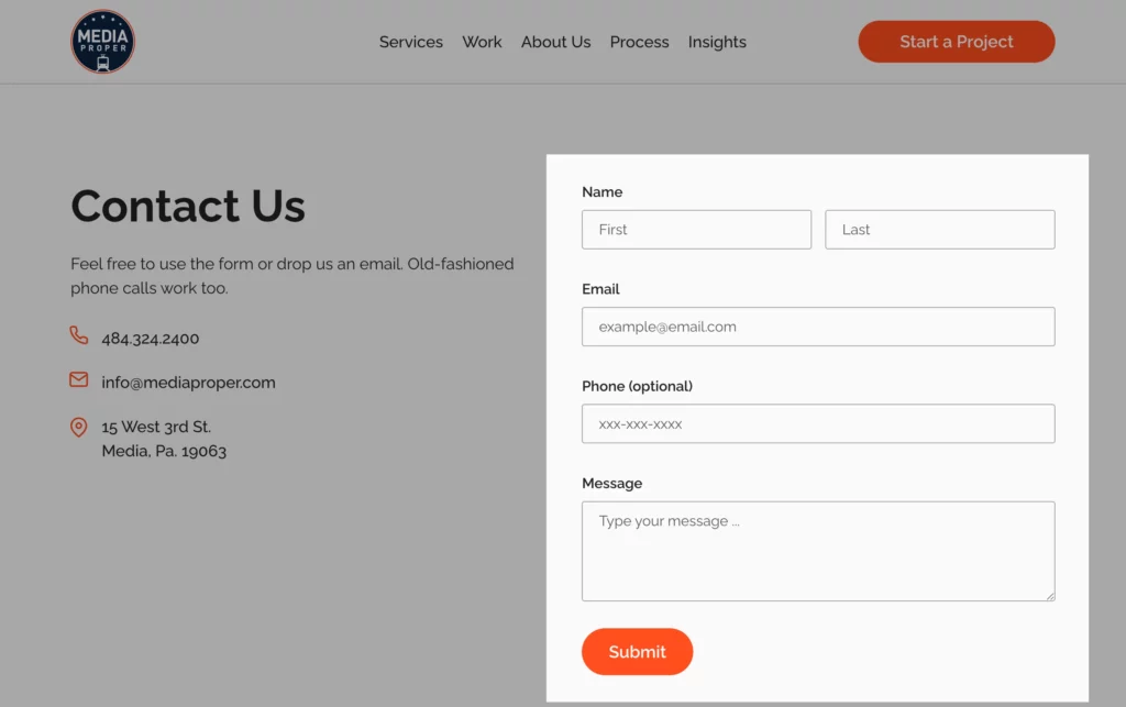
- Make it prominent: Place the contact form at the top of the contact page so visitors don’t have to scroll. Often, the form occupies the full width or a large column, with contact details on the side or below. Here’s an example from Media Proper.
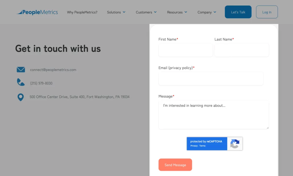
- Keep it simple: Since users who reach the contact page want to connect, make the form straightforward. Use only relevant fields (name, email, message) and keep it “short and sweet”. You can set the contact page’s submit button text to “Send Message” to make the form more intuitive. You can follow PeopleMetrics’ example below.
- Offer options: While the form is central, also list alternative contact methods (phone, chat, support email) nearby to build trust. But ensure the form stands out visually.
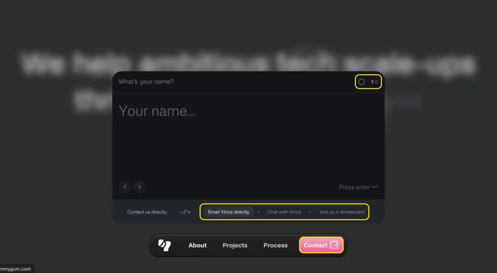
Yummygum uses a conversational form with 6 questions as its contact page. They also provide links to alternative contact options at the bottom of the form.
No matter where on your website you place a form, always make sure the form is device-responsive. Use clear labels and calls-to-action, reassure users with privacy notes or trust badges, and explain what happens after they submit. Make sure your forms load fast to offer a smooth user experience.
Pro Tip: Use Fluent Forms to build visually attractive forms for your WordPress site. Fluent Forms helps you create fast and mobile-responsive forms with zero coding. Moreover, it offers you 60+ input fields and tons of features, including drag-n-drop builder, built-in templates, conversational forms, conditional logic, step forms, advanced calculation, allowing payment acceptance, and more.
Build Smarter Forms for Free
Place forms where your audience acts
By strategically placing each form where it naturally belongs and focusing on user experience, you can turn every page of your site into a conversion opportunity. Use a heatmap to view which areas on your site are most visited, and place your important forms there.
If you want to capture a wider range of leads, keep form fields to a minimum, maybe only an email field. Add these short forms to your homepage or blog pages to capture newsletter subscribers whom you can nurture over time. Put longer forms on pages that are visited by warmer leads, like demo request pages or custom pricing pages.
If you use multiple forms on the same page, use visual hierarchy. Place the most crucial form in the most prominent place, and make it larger in dimension; use contrasting colors. Place the secondary forms in a way that they don’t steal your main form’s thunder.
Last but not least, regularly test different placements, form lengths, and designs. Try the same form in the hero vs. a popup; measure which brings higher conversions. Experiment with colors and copy as well. Use heatmaps and click maps to see what’s working better and make adjustments to your strategy.

Sarika writes for Fluent Forms and loves to offer insights into small businesses. She’s curious and enjoys discussing ideas, interests, and perspectives. In her free time, she’s either marvelling at architectural beauties or trying different cuisines.


Leave a Reply