Create A Product Order Form in Only 2 Minutes

Let’s face it. If you have a website, you are trying to sell something. It could be something direct like an eCommerce site. Or something a little more subtle, like an eBook or a course. Don’t worry, we are not here to judge.
We are here so you can register quick orders and raise higher revenues. So in this blog, we have put together everything you may need to know about how to create an order form in WordPress. So let’s go!
Fluent Forms

Fluent Forms is by far the most efficient WordPress form builder out there. It is fast, it is light, and it will get the job done like it’s nobody’s business. It is a powerhouse of features with 50 input fields, 40 integration modules, and 70+ prebuilt form templates.
But that’s not all. Some of the most impressive features include
- PDF submission
- Conversational forms
- reCAPTCHA
- Honeypot
- Email summaries
- Conditional routing
- Payment options
- Google sheets
- Zapier, etc.
Fluent Forms is the most beginner-friendly form builder. Download now and start crafting beautiful forms FREE!!!
How to create an order form in your WordPress website
An order form is one of the most demanding WordPress forms out there. So today, we will be showing you how you can create one easily. We will be using Fluent Forms to demonstrate as it has some of the most coolest features that can make even a boring form elegant. You can always check out the product order form template. You can find it among the Fluent Forms demo forms. However, if you want to do all the work and craft the form yourself, then here’s how you can create an order form in 6 easy steps.
So stay tuned as we get into all the nitpicky details.
Step 1: Ask their name
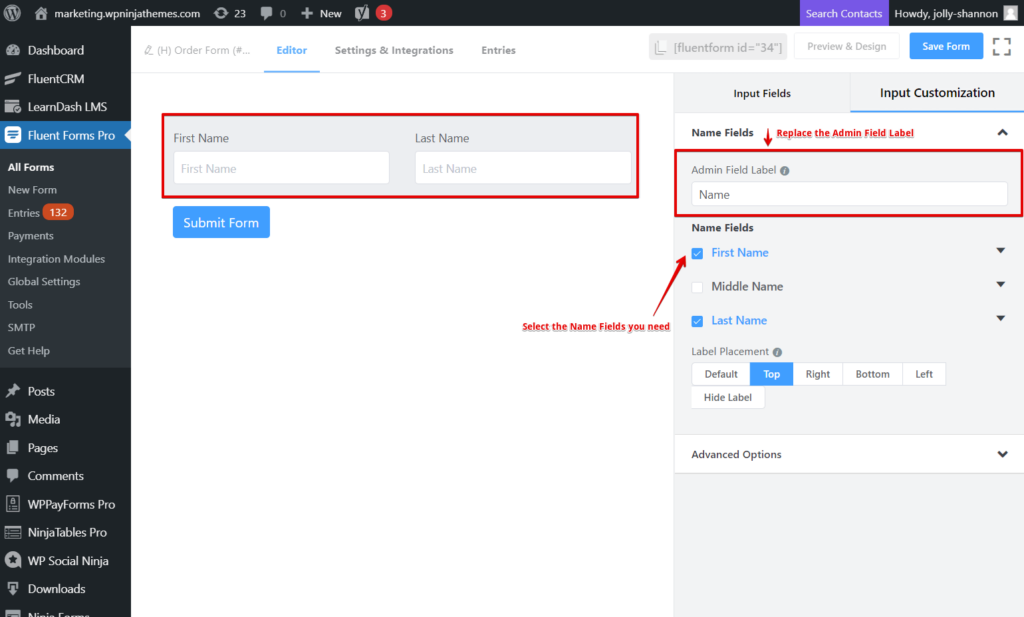
First and foremost, you are going to need a name to assign the order to. So quickly go to the input fields and drag and drop the Name Field. You can rename the Admin Field Label to something more suitable like “Provide your name please,” “Order placed by,” or you can just keep it as it is. You can select the name fields you like and skip the rest.
Step 2: Ask for their contact details
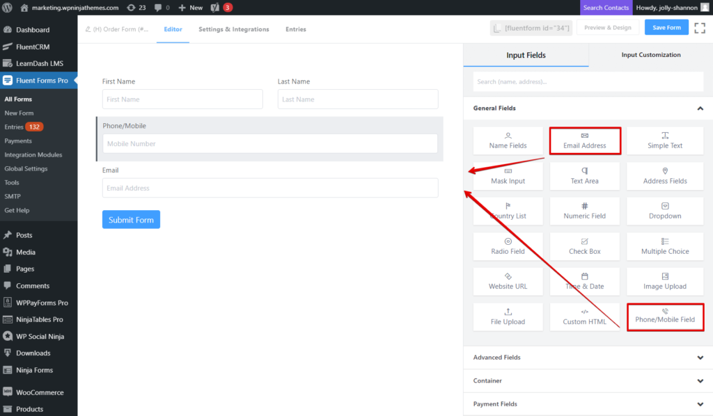
Next up, you will need to collect their contact details, so you have a means of connecting with them in case you need to notify them of any unavoidable cancellation, any query regarding the order, or to simply state their order is ready to be picked up.
Most companies either go for a phone number or email address. We suggest you collect both. So drag and drop the Phone/Mobile Field. And then do the same for the Email Field. You can adjust the element labels, and placeholders and such, if you wish. You can even set a default value using the smart codes.
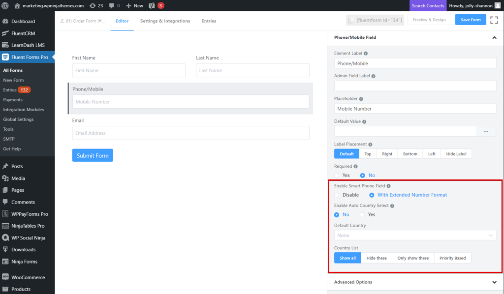
However, since the Phone/Mobile field is a premium feature, it means there are more features to play around with. You can enable an intelligent phone field with extended number format and enable auto country select as well. If you choose to forgo the latter, there is a dropdown menu you can set the default country from. In case you are expecting orders from several countries, you can hide some, or show only a selected few, or display the country names on a priority basis.
Step 3: Ask for the shipping address
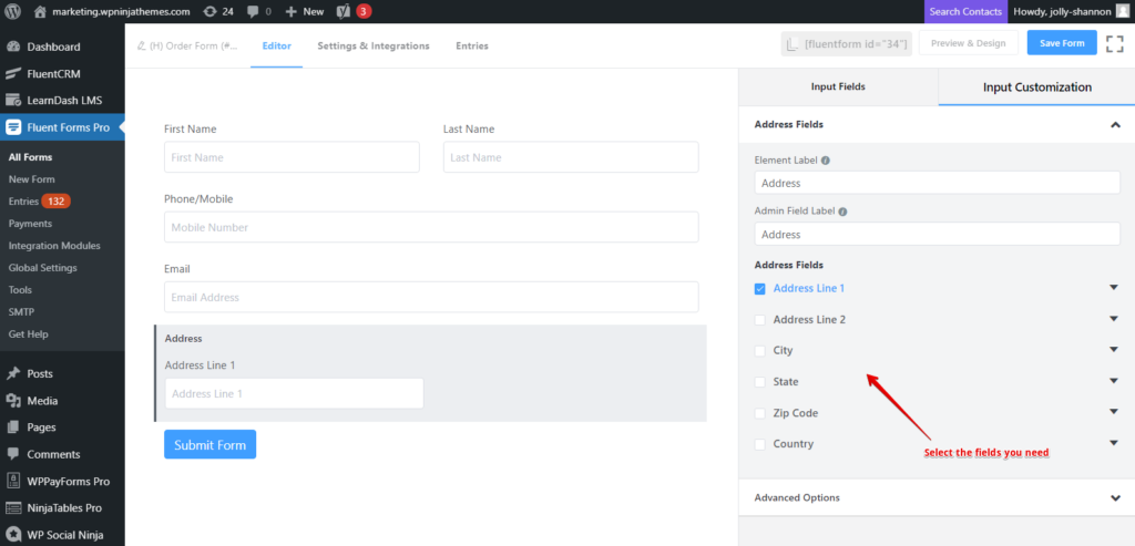
If you offer delivery of the product, then this is for you. And if your client is going to pick it up for themself, then skip over to the next step.
To ask for the shipping address, just drag and drop the Address Field. It comes with six different fields like city, state, zip code, etc. But if you don’t want to go into many details, then only choose Address Line 1 and skip the rest.
Step 4: Ask for product details
Now that we have all the essential information we need about the customer, it’s time to proceed with the order. And there is more than one way of going about this business.
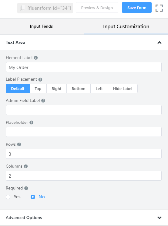
First, you can obviously deploy a Simple Text Field or a Text Area Field and change the Element Label to “My Order.” This will allow the customers to describe their orders.
However, this leaves a margin for error as the user may leave out important details about the order. So it’s better to provide all the options you have to offer (if possible) and let them choose from there. You can do it in the following ways.
- Multiple Choice
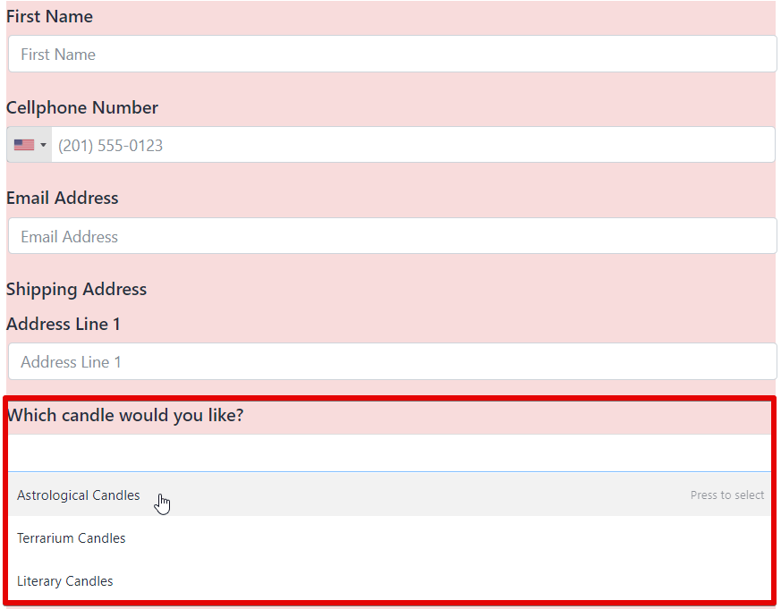
A multiple-choice field is basically a dropdown field. But, the key difference is, it lets the client choose more than one option. And if you are selling something, you wouldn’t want your users to be confined in only one order, would you?
- Checkbox
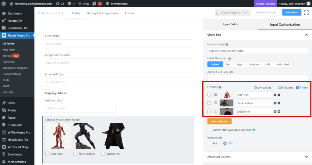
With the help of a checkbox field, you can display all your offered items in a single place, and the customer can select the one they like. This is like a radio field in principle, but where the radio field allows only one option to be ticked, a checkbox allows several. The more, the merrier, right? Oh, and you can also attach a photo of your product.
- Checkable Grid
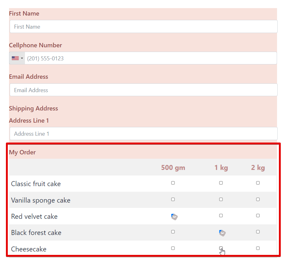
The options we mentioned already work great for singular products. But what if your products come in different sizes or weights? For example, let’s say you are a cake shop specializing in 5 different types of cakes, and you offer them in 3 different weights. You will need something a little more detailing, right?
That’s where checkable grids come in handy. With this input field, you can add as many columns and rows as you need, and your customers can select the specific product that they came for.
- Payment Field
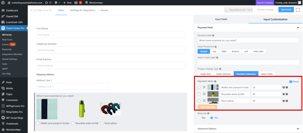
And if you want to clarify the monetary matters, the payment field is the way to go. This, together with a custom payment field, will tell the users what they are getting into, so there is no confusion later on.
Just go to the input customization of the payment field, and select the product display type. You can offer a single item or allow your clients to pick only one (radio selection) or many (checkbox selections, select fields) products from the offerings. Then go on and define the products in the payment items. You can also attach photos for discretion. Then move forward to the custom payment amount field, and enable the calculation so your users can know the total bill.
Step 5: Ask if there are any special requests
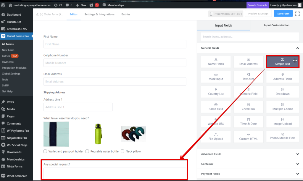
There’s always a 50/50 chance that people are buying a product so they can gift it to someone else. Especially if your business specializes in warm, fuzzy stuff, so it is only natural that they will want to go an extra step and wrap a nice little message as well.
Hence, it is always a wise idea to ask your customers if they have any special requests. Maybe a cute card or a nice message on the cake? Just drag and drop a Simple Text Field and rename the Element Label and you are good to go.
Step 6: Time to pay
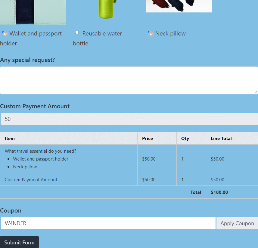
This is an additional step. If you have the client picking up the product, then you can skip it. To let the users pay for the product, drag and drop the Payment Method Field. It will have six options, including one for offline payment.
Currently, Fluent Forms has five different payment integrations to offer so you can collect seamless payments and donations through PayPal, Stripe, Mollie, RazorPay, and PayStack. And if you have any active coupons, you can also drag and drop a Coupon Field.
WordPress product order forms summarized
So, was it easy? Or was it effortless? But why stop there? You can also make the most of our global styler and design beautiful WordPress forms. While you can create an order form easily for free with Fluent Forms, an upgrade to a pro license will unlock all the premium features, regardless of which plan you go for. So why not give it a try?
2 responses to “Create A Product Order Form in Only 2 Minutes”
-
Can this be integrated with Woocommerce for payment at the end?
-
Sorry, woocommerce integration is not available.
-




Leave a Reply