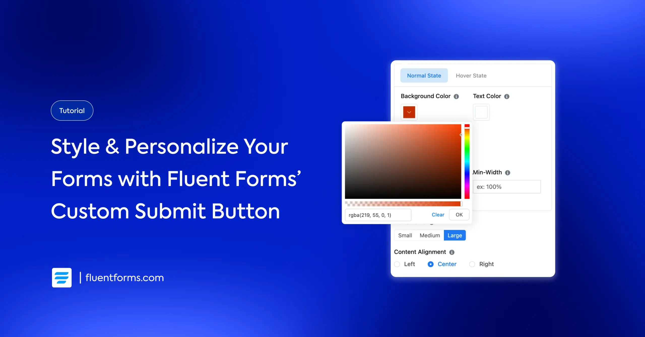
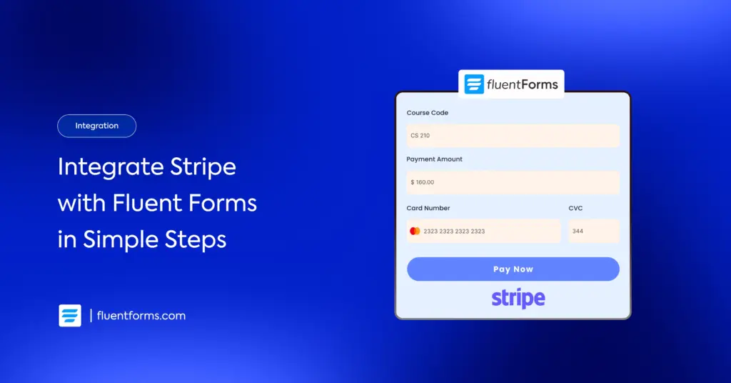
Make Your Forms Stand Out with the Custom Submit Button Field of Fluent Forms
Your form might be perfectly designed, with the right fields, layout, and offer. But if the submit button is generic or blends into the form, people scroll right past it. Not because they aren’t interested. Because nothing made them stop and notice.
A button is more than the last step in a form. It’s the moment someone decides whether the offer is worth their time. A button that reads “Get My Free Quote” or “Yes, Sign Me Up” creates a micro-moment of intent. And you need to bring that moment into focus so even casual browsers notice it and feel intrigued.
The good news: this is one of the easiest things to fix. You don’t need a designer or a developer. You just need a thoughtfully designed button. It should be prominent enough to notice, specific enough to feel worth clicking, and polished enough to match the rest of your page.
That’s exactly what Fluent Forms’ Custom Submit Button field gives you. You get complete control over the label, style, placement, and visual feel, without any code. However, you have full CSS control at your disposal if you need. And it’s completely free.
In this blog, I’ll walk you through how you can make your forms stand out with Fluent Forms’ custom submit button.
TL;DR
- Fluent Forms has a dedicated Custom Submit Button field that can be used to create styled buttons.
- You can change the button text, colors, border, radius, size, alignment, and hover state, all without code.
- Place it anywhere in your form, including inline with other fields for compact newsletter or lead-capture form layouts.
- Use Conditional Logic to show or hide the button based on other field values.
- The feature is completely free.
Why use a custom submit button
A well-designed button with clear intent performs better than a generic one. It creates a noticeable visual hierarchy and takes the monotony away. Fluent Forms’ custom submit button gives you the flexibility to style your buttons without needing code or access to the advanced styler.
Here’s how it elevates your buttons:
- Match your brand: Use your brand colors, fonts, and style instead of the default look
- Write better copy: You can replace “Submit” with something more compelling, like “Send My Message,” “Get My Free Quote,” or “Download My Free Ebook.” A good rule is to write a phrase that completes the sentence “I want to…”
- Add conditional logic: show or hide the button based on users’ selection elsewhere in the form
- Create layout flexibility: Place the button anywhere in your form, not just at the end. Moreover, you can pair it with an email field on the same row for compact newsletters or lead capture forms.
Small changes can make a real difference in how your form feels to users. That’s why you should pay attention to the details and make the user experience even smoother. Let me show you how you can do that.
How to add a custom submit button with Fluent Forms
Here’s a step-by-step tutorial on how you can customize your buttons with Fluent Forms’ Custom Submit Button field.
Step 1: Install Fluent Forms
If you don’t have Fluent Forms installed yet, go to your WordPress dashboard, navigate to Plugins → Add New, and search for “Fluent Forms.” Install and activate the free version; the Custom Submit Button field is available at no cost.
Once activated, you’ll see the Fluent Forms menu in your WordPress sidebar.
Step 2: Create your form
Go to Fluent Forms → New Form and either start from scratch or pick one of the 70+ pre-built templates. Add the fields you need from general, advanced, container, or payment fields, and configure each one as needed.
At this point, a submit button appears at the bottom, which will be replaced when you add the custom submit button.
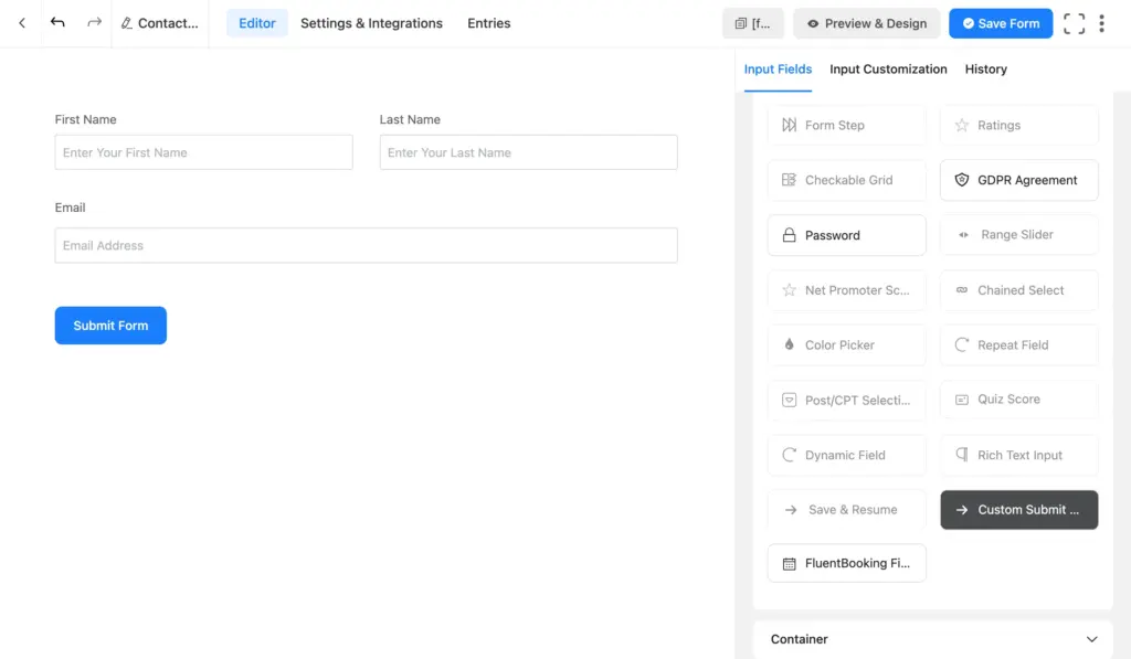
Step 3: Add & customize the custom submit button
From the field panel on the right, find the Custom Submit Button field under the Advanced Fields section and drag it into your form wherever you want it to appear. Then click the edit icon on the field to open its settings.
Here’s what you can customize:
Button Type: Choose between a standard text button or an image button. Most use cases need the text option, but the image button works well for icon-based or visually driven designs.
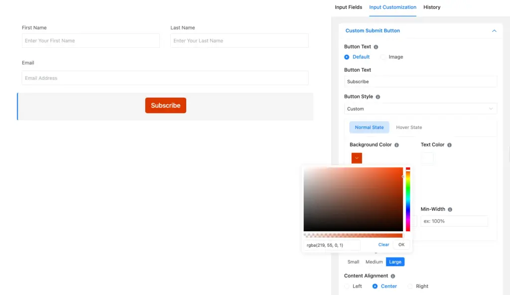
Button Text: This is your CTA. Instead of “Submit,” write something specific to what the user gets: “Get My Free Quote,” “Send My Message,” or “Confirm My Order.” Personalized CTAs are effective motivators and boost conversions.
Background Color: Set the button’s fill color to match your brand or make it stand out on the page. Pick something with enough contrast against the surrounding content.
Text Color: Choose a text color that’s readable against the button background color. Try dark on light backgrounds; white on dark works well.
Border Color: Add a border to give the button a more defined edge. Useful for outlined or minimal button styles with a transparent background.
Border Radius: Controls how rounded the corners are. Set it to 0 for sharp corners or increase it for a pill shape.
Min Width: Set a minimum width in percentage. Setting it to 100% (which is the default) makes the button full-width, which can work well for mobile-first forms or single-column layouts. If you leave it empty, the button size adapts to the button text with standard padding around it.
Size and Alignment: Adjust the button’s overall size and control whether it aligns left, center, or right within the form.
Hover State: Switch from Normal State to Hover State in the settings panel to configure what the button looks like when someone mouses over it. You can set a different background color, text color, and border color for the hover state; no code is required.
Advanced Options: Under the Advanced Options tab, you’ll find Container Class and Element Class fields. These let you add custom CSS classes to target the button precisely with your own styles. Besides, you can write “ff-hidden” in the container class to hide the button (suitable for calculators where you might not want entries). You’ll also find Conditional Logic here, which lets you show or hide the button based on other field values in the form.
That’s it. The button is fully yours to configure. When you’re done, save your form and click “Preview” to see how it looks. Next, I’ll show you a unique use case of the custom submit button.
Create inline forms with custom submit buttons
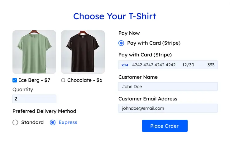
A popular use of the Custom Submit Button field is building inline forms, where the input and the button sit side by side on the same row. The aligned look of an inline form is visually pleasing and keeps your page clean.
Normally, forms stack fields vertically. But when you strategically place a custom submit button in a column container, you create a compact email signup that looks like this:

This layout is popular for newsletter signups, waitlist forms, and search bars. It feels lighter and less intimidating than a full multi-field form, which can improve conversions.
To build this in Fluent Forms:
- Add a custom HTML field to write the headline
- Take a three-column container for name, email, and button, or a two-column container for only email and button.
- Add the fields in place in the columns
- Add a custom submit button in the last column and style it
- Edit the column container to adjust column widths so the name and email fields take up more space. This makes it easy for users to type in their information.
Now that you can style your buttons using all customization styles, there are some pre-designed buttons for you in the next section. These buttons use CSS, which I’ll provide here, so you can easily copy and use them on your site.
CSS custom submit buttons you can copy
Here are some ready-to-use CSS styles for custom submit buttons. These buttons are inspired by CSS Scan. You can download them to keep them saved, or copy the provided code below and use it in your form’s custom CSS section (in settings) to get the same effects.
Here’s how to apply them to your forms:
- Add a custom submit button
- Set the minimum width (I left it empty for auto width)
- Set alignment (these are center-aligned within a three-column container)
- Note down your button text, we’ll need it.
- Copy the CSS of the button you like
- Navigate to “Settings & Integrations” from your form and scroll down to “Custom CSS/JS”
- Paste the CSS in the custom CSS section
- Replace 292 with your actual form ID across the code
- Replace “Button 1” with your actual button text across the code
- You can also change the color by replacing the hexcodes
- Once you’re done, scroll to the bottom of the page and click “Save CSS & JS”
- If you’ve downloaded the buttons form and want to upload it to your site, unzip it first and upload the JSON file
button[name*="custom_submit_button-292"][aria-label="Button 1"] {
  background-color: transparent !important;
  background-image: none !important;
  border-radius: 0 !important;
  box-shadow: none !important;
  padding: 1.1em 1.55em !important;
  color: #373B44 !important;
  background:
    conic-gradient(from 90deg at 3px 3px, #0000 90deg, #373B44 0)
    .45em .45em / calc(100% - 3px - .9em) calc(100% - 3px - .9em) !important;
  transition: background 0.6s cubic-bezier(0.25, 0.46, 0.45, 0.94), outline 0.6s ease, outline-offset 0.6s ease, color 0s !important;
  outline: 3px solid transparent !important;
  outline-offset: .6em !important;
  font-size: 16px;
  border: 0 !important;
  opacity: 1 !important;
  user-select: none;
  -webkit-user-select: none;
  touch-action: manipulation;
}

button[name*="custom_submit_button-292"][aria-label="Button 1"]:hover,
button[name*="custom_submit_button-292"][aria-label="Button 1"]:focus-visible {
  color: #373B44 !important;
  border-radius: 0 !important;
  opacity: 1 !important;
  background:
    conic-gradient(from 90deg at 3px 3px, #0000 90deg, #373B44 0)
    0px 0px / calc(100% - 3px) calc(100% - 3px) !important;
  outline: 3px solid #373B44 !important;
  outline-offset: .05em !important;
}

button[name*="custom_submit_button-292"][aria-label="Button 1"]:active {
  background: #373B44 !important;
  color: #fff !important;
  border-radius: 0 !important;
  opacity: 1 !important;
}
button[name*="custom_submit_button-292"][aria-label="Button 2"] {
background: transparent !important;
background-image: none !important;
border: none !important;
box-shadow: none !important;
border-radius: 0 !important;
position: relative !important;
color: #f0f0f0 !important;
z-index: 1 !important;
padding: 12px 24px !important;
font-size: 16px;
overflow: visible !important;
opacity: 1 !important;
user-select: none;
-webkit-user-select: none;
touch-action: manipulation;
}
button[name*="custom_submit_button-292"][aria-label="Button 2"]::before,
button[name*="custom_submit_button-292"][aria-label="Button 2"]::after {
content: '';
position: absolute;
bottom: 0;
right: 0;
z-index: -1;
transition: all .4s;
}
button[name*="custom_submit_button-292"][aria-label="Button 2"]::before {
width: 100%;
height: 100%;
background: #28282d;
border-radius: 10px;
}
button[name*="custom_submit_button-292"][aria-label="Button 2"]::after {
transform: translate(10px, 10px);
width: 35px;
height: 35px;
background: rgba(255,255,255,0.08);
backdrop-filter: blur(5px);
-webkit-backdrop-filter: blur(5px);
border-radius: 50px;
}
button[name*="custom_submit_button-292"][aria-label="Button 2"]:hover {
color: #f0f0f0 !important;
opacity: 1 !important;
}
button[name*="custom_submit_button-292"][aria-label="Button 2"]:hover::before {
transform: translate(5%, 20%);
width: 110%;
height: 110%;
}
button[name*="custom_submit_button-292"][aria-label="Button 2"]:hover::after {
border-radius: 10px;
transform: translate(0, 0);
width: 100%;
height: 100%;
}
button[name*="custom_submit_button-292"][aria-label="Button 2"]:active::after {
transition: 0s;
transform: translate(0, 5%);
}
button[name*="custom_submit_button-292"][aria-label="Button 3"] {
  background-color: #fff !important;
  background-image: none !important;
  border-radius: 15px 225px 255px 15px 15px 255px 225px 15px !important;
  border-bottom-left-radius: 15px 255px !important;
  border-bottom-right-radius: 225px 15px !important;
  border-top-left-radius: 255px 15px !important;
  border-top-right-radius: 15px 225px !important;
  border: 2px solid #41403e !important;
  box-shadow: rgba(0, 0, 0, .2) 15px 28px 25px -18px !important;
  color: #41403e !important;
  padding: .75rem;
  transition: all 235ms ease-in-out;
  user-select: none;
  -webkit-user-select: none;
  touch-action: manipulation;
}

button[name*="custom_submit_button-292"][aria-label="Button 3"]:hover {
  box-shadow: rgba(0, 0, 0, .3) 2px 8px 8px -5px !important;
  transform: translate3d(0, 2px, 0);
  color: #41403e !important;
}

button[name*="custom_submit_button-292"][aria-label="Button 3"]:focus {
  box-shadow: rgba(0, 0, 0, .3) 2px 8px 4px -6px !important;
}
button[name*="custom_submit_button-292"][aria-label="Button 4"] {
background-color: transparent !important;
background-image: none !important;
border: none !important;
border-radius: 0 !important;
box-shadow: none !important;
color: #00132C !important;
padding: 16px 23px;
position: relative !important;
z-index: 0 !important;
overflow: visible !important;
user-select: none;
-webkit-user-select: none;
touch-action: manipulation;
}
button[name*="custom_submit_button-292"][aria-label="Button 4"]:hover,
button[name*="custom_submit_button-292"][aria-label="Button 4"]:active {
outline: 0 !important;
color: #00132C !important;
background-color: transparent !important;
}
/* Fill rectangle — behind */
button[name*="custom_submit_button-292"][aria-label="Button 4"]::before {
content: "";
position: absolute;
right: -7px;
top: -9px;
width: 100%;
height: calc(100% + 3px);
background-color: #D5EDF6;
transition: background-color 300ms ease-in;
z-index: -1;
}
button[name*="custom_submit_button-292"][aria-label="Button 4"]:hover::before {
background-color: #8ed2fa;
}
/* Border — always on top */
button[name*="custom_submit_button-292"][aria-label="Button 4"]::after {
content: "";
position: absolute;
inset: 0;
border: 1px solid #266DB6;
z-index: 1;
pointer-events: none;
}
button[name*="custom_submit_button-292"][aria-label="Button 5"] {
  background-color: transparent !important;
  background-image: none !important;
  border: none !important;
  border-radius: 0 !important;
  box-shadow: none !important;
  color: #000 !important;
  letter-spacing: 1px;
  padding: 15px 24px;
  position: relative !important;
  z-index: 0 !important;
  overflow: visible !important;
  user-select: none;
  -webkit-user-select: none;
  touch-action: manipulation;
}

button[name*="custom_submit_button-292"][aria-label="Button 5"]:hover,
button[name*="custom_submit_button-292"][aria-label="Button 5"]:active {
  color: #000 !important;
  background-color: transparent !important;
}

/* Yellow offset block */
button[name*="custom_submit_button-292"][aria-label="Button 5"]::before {
  content: "";
  position: absolute;
  background-color: #ffe54c;
  width: 100%;
  height: 100%;
  top: 7px;
  left: 7px;
  transition: 0.2s;
  z-index: -1;
}

button[name*="custom_submit_button-292"][aria-label="Button 5"]:hover::before {
  top: 0;
  left: 0;
}

/* Border — always on top */
button[name*="custom_submit_button-292"][aria-label="Button 5"]::after {
  content: "";
  position: absolute;
  inset: 0;
  border: 1px solid #000;
  z-index: 1;
  pointer-events: none;
}
button[name*="custom_submit_button-292"][aria-label="Button 6"] {
background: linear-gradient(to bottom right, #EBEBEB 50%, #FFFFFF 50%) bottom right / 200% 200% !important;
border: 1px solid #000 !important;
border-radius: 0 !important;
box-shadow: none !important;
color: #000 !important;
padding: 12px 20px;
transition: background-position 0.5s cubic-bezier(.165, 0.84, 0.44, 1) !important;
user-select: none;
-webkit-user-select: none;
touch-action: manipulation;
}
button[name*="custom_submit_button-292"][aria-label="Button 6"]:hover,
button[name*="custom_submit_button-292"][aria-label="Button 6"]:focus-visible {
background-position: top left !important;
color: #000 !important;
}button[name*="custom_submit_button-292"][aria-label="Button 7"] {
background-color: transparent !important;
background-image: none !important;
border: none !important;
border-radius: 80px !important;
box-shadow: none !important;
color: #fff !important;
padding: 19px 26px;
position: relative !important;
z-index: 0 !important;
overflow: visible !important;
user-select: none;
-webkit-user-select: none;
touch-action: manipulation;
}
button[name*="custom_submit_button-292"][aria-label="Button 7"]::before,
button[name*="custom_submit_button-292"][aria-label="Button 7"]::after {
border-radius: 80px;
content: "";
position: absolute;
}
/* Outer glow ring */
button[name*="custom_submit_button-292"][aria-label="Button 7"]::before {
background-color: rgba(249, 58, 19, 0.32);
inset: 0;
z-index: -2;
}
/* Gradient pill — inset 4px, expands on hover */
button[name*="custom_submit_button-292"][aria-label="Button 7"]::after {
background-image: linear-gradient(92.83deg, #ff7426 0, #f93a13 100%);
inset: 4px;
transition: all 100ms ease-out;
z-index: -1;
}
button[name*="custom_submit_button-292"][aria-label="Button 7"]:hover {
color: #fff !important;
}
button[name*="custom_submit_button-292"][aria-label="Button 7"]:hover::after {
inset: 0;
transition-timing-function: ease-in;
}
button[name*="custom_submit_button-292"][aria-label="Button 7"]:active {
color: #ccc !important;
}
button[name*="custom_submit_button-292"][aria-label="Button 7"]:active::after {
background-image: linear-gradient(0deg, rgba(0,0,0,0.2), rgba(0,0,0,0.2)), linear-gradient(92.83deg, #ff7426 0, #f93a13 100%);
inset: 4px;
}@keyframes glowing-btn8 {
0% { background-position: 0 0; }
50% { background-position: 400% 0; }
100% { background-position: 0 0; }
}
button[name*="custom_submit_button-292"][aria-label="Button 8"] {
background-color: transparent !important;
background-image: none !important;
border: none !important;
border-radius: 80px !important;
box-shadow: none !important;
color: #fff !important;
padding: 14px 22px;
position: relative !important;
z-index: 0 !important;
overflow: visible !important;
user-select: none;
-webkit-user-select: none;
touch-action: manipulation;
}
/* Sharp rainbow outline */
button[name*="custom_submit_button-292"][aria-label="Button 8"]::before {
content: "";
position: absolute;
top: -2px;
left: -2px;
width: calc(100% + 4px);
height: calc(100% + 4px);
background: linear-gradient(45deg, #ff0000, #ff7300, #fffb00, #48ff00, #00ffd5, #002bff, #7a00ff, #ff00c8, #ff0000);
background-size: 400%;
border-radius: 80px;
animation: glowing-btn8 20s linear infinite;
opacity: 0.5;
z-index: -2;
}
/* Black pill */
button[name*="custom_submit_button-292"][aria-label="Button 8"]::after {
content: "";
position: absolute;
inset: 2px;
border-radius: 80px;
background-color: #111 !important;
background-image: none !important;
transition: inset 100ms ease-out;
z-index: -1;
}
button[name*="custom_submit_button-292"][aria-label="Button 8"]:hover {
color: #fff !important;
background-color: transparent !important;
background-image: none !important;
}
button[name*="custom_submit_button-292"][aria-label="Button 8"]:hover::after {
inset: 0;
background-color: #111 !important;
background-image: none !important;
transition-timing-function: ease-in;
}
button[name*="custom_submit_button-292"][aria-label="Button 8"]:active {
color: #ccc !important;
background-color: transparent !important;
}
button[name*="custom_submit_button-292"][aria-label="Button 8"]:active::after {
background-color: #111 !important;
background-image: none !important;
inset: 2px;
}button[name*="custom_submit_button-292"][aria-label="Button 9"] {
background-image: linear-gradient(45deg, #FF512F 0%, #F09819 51%, #FF512F 100%) !important;
background-size: 200% auto !important;
border: none !important;
border-radius: 10px !important;
box-shadow: 0px 0px 14px -7px #f09819 !important;
color: #fff !important;
font-weight: 700;
padding: 15px 30px;
transition: background-position 0.5s ease !important;
user-select: none;
-webkit-user-select: none;
touch-action: manipulation;
}
button[name*="custom_submit_button-292"][aria-label="Button 9"]:hover {
background-position: right center !important;
color: #fff !important;
}
button[name*="custom_submit_button-292"][aria-label="Button 9"]:active {
transform: scale(0.95);
color: #fff !important;
}Style your forms with custom submit buttons
The Custom Submit Button field in Fluent Forms is one of those features that looks small on paper but opens up a lot of creative possibilities in practice. You can use it to:
- Implement your brand with colors for consistency and professionalism
- Build compact inline forms for signups and lead capture
- Add personality to forms that would otherwise look generic
- Convert more while making your forms beautiful
And since it’s part of Fluent Forms’ free version, there’s nothing to unlock. Just drag the field in, set your label, and start styling.
If you want to use the CSS snippets above, remember to replace 292 with your own form ID (it’s the number in your form’s shortcode) and use your button text as the aria-label in the CSS selector.
Happy styling.
Build Smarter Forms for Free

Sarika writes for Fluent Forms and loves to offer insights into small businesses. She’s curious and enjoys discussing ideas, interests, and perspectives. In her free time, she’s either marvelling at architectural beauties or trying different cuisines.


Leave a Reply