Multi-step vs Single-step Forms: What Should You Use in WordPress
Every form has a purpose. But not every form delivers.
Sometimes, keeping everything on one page makes sense. Other times, it’s smarter to break things into steps. If you’re working in WordPress, whether you’re a site owner or agency, you need to understand the difference between multi-step and single-step forms.
This guide cuts to the essentials. We’ll explain when each format is right. We’ll share real-world performance data. And we’ll show you how to build both in WordPress using Fluent Forms (including its free version and conversational mode).
TL;DR
- Single-step forms show all fields at once; best for short forms like contact or newsletter signups.
- Multi-step forms break longer forms into sections; ideal for bookings, surveys, or mobile use.
- Conversational forms present one question at a time in a chat-like flow; improves engagement.
- Fluent Forms supports all three types:
- Free version includes single-step and conversational forms.
- Pro version unlocks multi-step forms with page breaks and progress bars.
- Single-step forms are best for short, and simple forms.
- Use multi-step when forms are long or need better mobile usability.
- Studies show multi-step forms can increase conversions up-to 300% for longer processes.
- Fluent Forms makes it easy to build, customize, and embed any form format directly in WordPress.
What is a single-step form
A single-step form displays all fields at once on a single page.
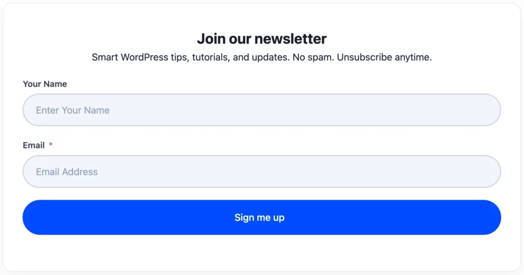
No “Next.” No progress bar. Just fill in everything and submit.
It’s fast. It’s simple. It’s ideal for short forms-like contact pages or newsletter signups with only a few fields.
What is a multi-step form
A multi-step form divides longer content into bite-sized chunks.
Users fill out a few questions, then click “Next.” They move step by step until the form is complete. Progress indicators guide them along.
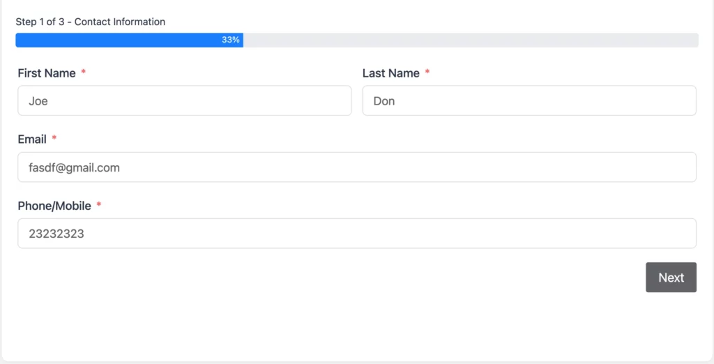
This feels lighter. It’s easier on mobile. And, when done well, it converts better than long single-page forms.
Quick overview
Criteria | Single-step Forms | Multi-step Forms | Conversational Forms |
Structure | All fields on one screen | Fields divided across steps/pages | One question shown at a time (chat-style) |
Best for | Short forms (contact, signup, basic lead) | Longer forms (registrations, bookings, surveys) | Interactive forms (quizzes, feedback, onboarding) |
User experience | Fast, straightforward | Guided, less overwhelming | Highly engaging, mobile-friendly |
Conversion behavior | Best for 2–4 fields | Converts better for 6+ fields | Converts well for long or boring forms |
Progress indication | Not needed | Yes (progress bar/steps) | Implicit (through conversation flow) |
Setup time | Minimal | Moderate | Minimal (toggle conversational mode) |
Fluent Forms | Free | Pro | Free |
Check out Fluent Forms’ Conversational Forms and Multi-Step Forms features to learn more.
When to use single-step forms
Pick a single-step form when:
- You’re collecting just a few fields
- You want one-click completion
- You want users to see everything up front
Use cases include:
- Basic contact or signup forms
- Simple lead-gen forms on landing pages
Single-step forms are frictionless. But they don’t scale. Add too many fields and users bail.
When to use multi-step forms
If you want to know when to use multi-step forms, first you need to understand when not to use single-step forms. Here’s an example for you to judge:
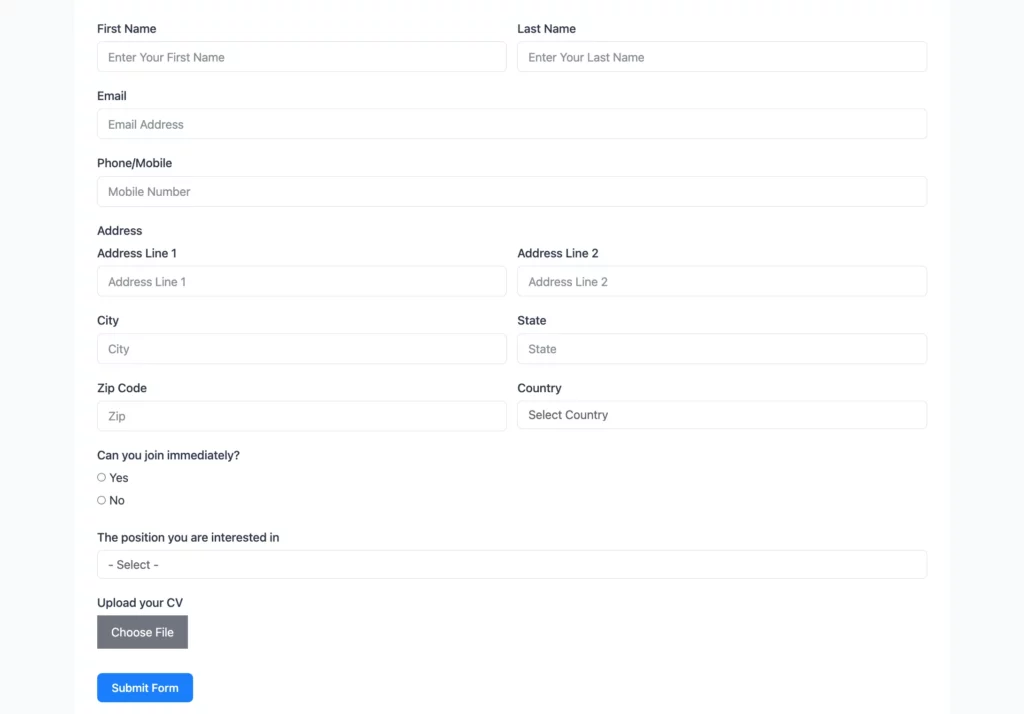
Now, ask yourself if you would feel bored when filling out this form, or does the length bother you visually and make you feel overwhelmed?
If the answer to these questions above is yes, then you already know when to use multi-step forms.
Choose multi-step when:
- You need more fields
- You want to group them into logical sections
- You want to lower drop-off on longer forms
- The form is used mainly on mobile
Examples:
- Event registrations
- Booking forms
- Detailed lead gen with lots of conditional logic
- Surveys, quizzes, and applications
Multi-step forms guide users through each section. They reduce overwhelm. And they build trust step by step.
Fluent Forms Multi-step forms feature comes with “Partial Entries”. If your users are only completing a few steps and leaving forms incomplete, saving partial entries can be your rescuer.
Which format converts better
Here’s the truth: short forms convert best as single-step. Simple. Efficient.
But for longer forms, the evidence is clear-multi-step wins.
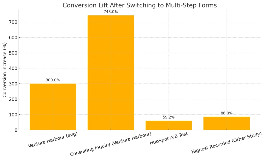
Real-world proof:
- Venture Harbour reported form conversion increases “up to 300%” after switching to multi-step designs.
- One case saw a consulting inquiry form jump from 0.96% to 8.1%-a 743% increase.
- HubSpot ran an A/B test and found a 59.2% lift in conversions for multi-step forms.
- In another study, multi-step forms converted up to 86% higher when deployed correctly.
How to create a single-step form in Fluent Forms
Fluent Forms makes it easy to build single-step forms-even in the free version.
Example: Simple contact form
Let’s build a basic form with:
- Name
- Email
- Message
Step-by-step:
Install and activate Fluent Forms (from WordPress > Plugins > Add New).
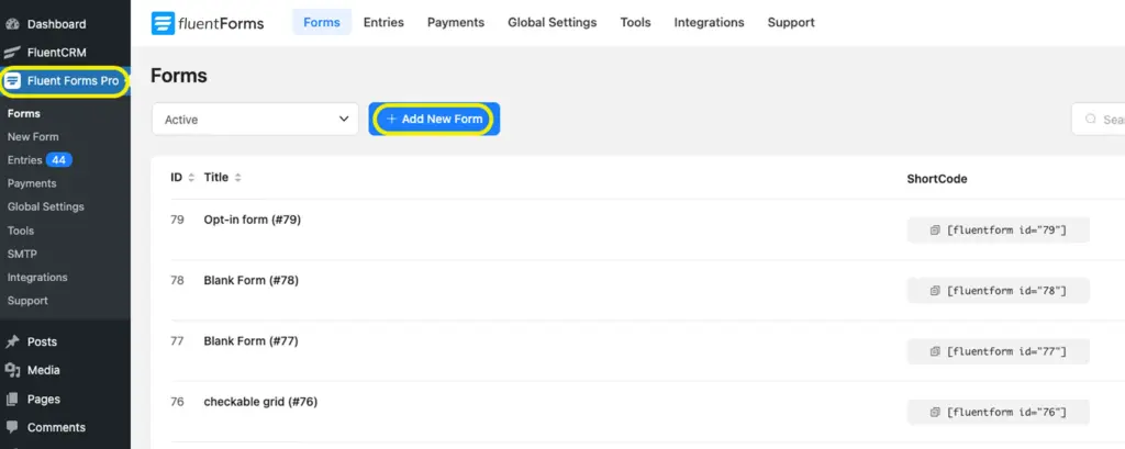
Go to Fluent Forms → All Forms → Add a New Form.
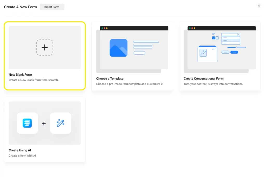
Choose Blank Form or a template (like Contact Form).
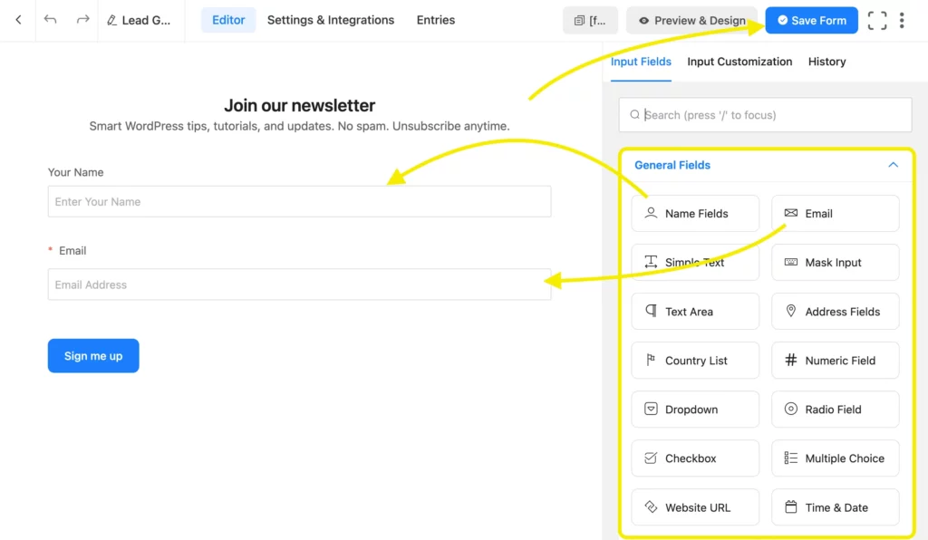
Use the drag-and-drop builder to add:
- Name Field
- Email Field
Customize labels, placeholders, and validation as needed.
Configure form settings → email notifications to get messages in your inbox.
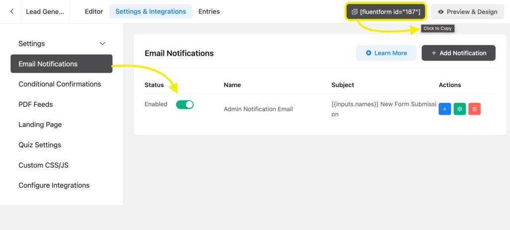
Copy the form shortcode and paste it on any page/post using the Shortcode block.

That’s it. Your form is live-all in one step.
How to create a multi-step form in Fluent Forms
Multi-step forms are a premium feature in Fluent Forms Pro. But setup is simple with the page break tool.
Example: Agency service booking form
Form steps:
- Step 1: Contact details
- Step 2: Project details
- Step 3: Schedule a call
Step-by-step:
Go to Fluent Forms → Add New Form. Add fields for Name, Email, and Phone.
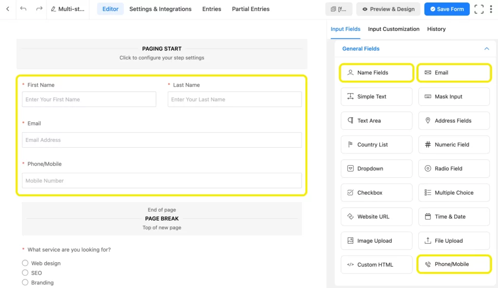
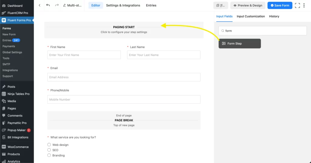
Drag in a Form Step field (Pro only) to split steps.
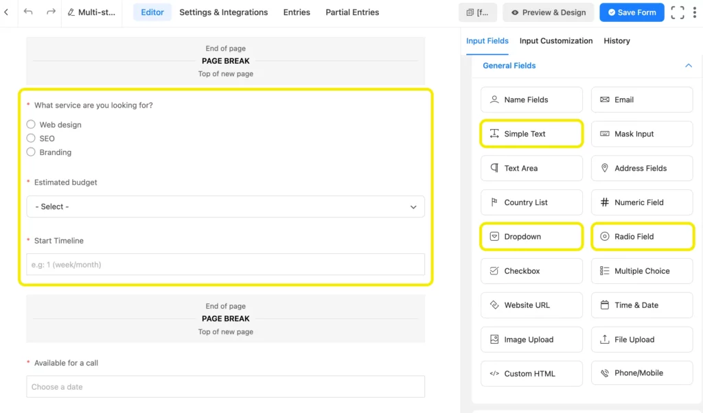
On the next step, add a Radio field to give the customer an option to choose, a Dropdown field for budget estimation, and a Simple Text field. You can customize them as per context.
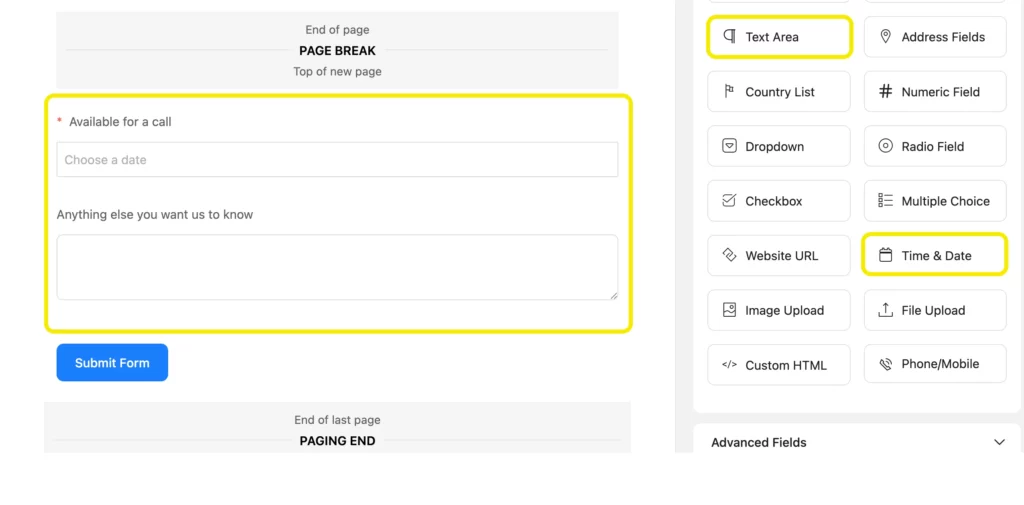
Add another Form Step. Then add a Time & Date field for scheduling a date for call and a Text Area field for additional comment/questions.
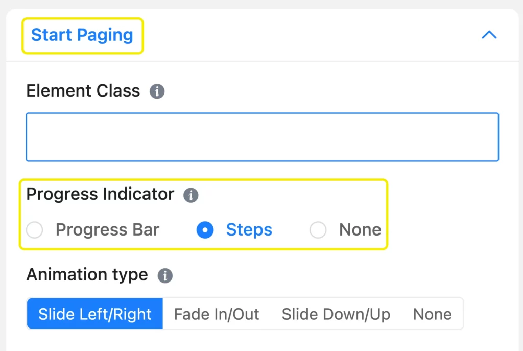
Under Paging Start →Input Customization, enable the progress bar if needed.
Customize labels like “Next” and “Previous”, by clicking on the Page Break sections. Embed the form using the shortcode.
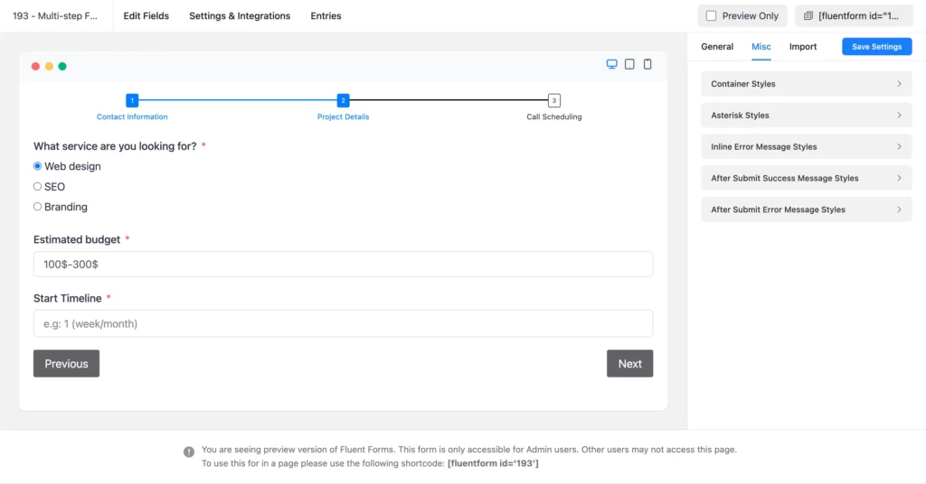
Your users will now see the form in stages-one section at a time-with navigation and progress.
Learn how to enable partial entries of form submissions, so that you never miss data from un-submitted forms.
Conversational forms: a modern alternative
Conversational forms bring the multi-step experience into a chat-like interface.
They show one question at a time, like a conversation. No distractions. Just focus on one answer at a time.

Why use them?
- They feel interactive
- They’re mobile-friendly
- They improve engagement
In Fluent Forms (even free), just toggle on Conversational Form Mode from the form settings. Publish using a direct URL or embed it on your site.
Want to give Conversational Forms a try? Learn- how to create conversational forms nice and easy.
Why Fluent Forms works for both
Whether you’re using one-page, multi-step, or conversational forms-Fluent Forms has you covered.
Free version includes:
- Drag-and-drop builder
- Conditional logic
- Multi-column layout
- Conversational mode
- Spam protection
Pro adds:
- True multi-step forms
- Page breaks and progress bar
- Payment fields
- CRM/email/cloud integrations
- Entry limits, form landing pages, and more
It’s fast, flexible, and made for WordPress.
Build Smarter Forms for Free

Final thoughts
Use single-step forms for fast, no-fuss submissions.
Use multi-step forms to guide users through longer processes-without overwhelming them.
Use conversational forms when you want high engagement with a smooth, modern feel.
With Fluent Forms, you don’t have to choose blindly. You can try each layout, test your conversions, and go with what works.




Leave a Reply