Form Accessibility: Forms For All
In our everyday lives, online forms are something that we frequently come across. So forms should be accessible to anyone irrespective of their abilities or technological proficiency. This means that people with visual, auditory, cognitive, and motor impairments should be able to use forms with ease.
In this article, we will discuss web accessibility, form accessibility, and why accessibility is important. In the end, we will provide some helpful tips on how you can implement accessible forms.
Web accessibility
Web accessibility is a term that refers to designing and developing websites in a way that accommodates users with various types of disabilities, including auditory, cognitive, neurological, physical, speech, and visual impairments.
As Tim Berners-Lee, the inventor of the World Wide Web, states, “The power of the Web is in its universality. Access by everyone regardless of disability is an essential aspect.” Web accessibility ensures that people with disabilities can perceive, understand, navigate, interact with, and contribute to the web, thus making the web a more inclusive space.
In many cases, web accessibility is mandated by law. The United Nations Convention on the Rights of Persons with Disabilities (UN CRPD) considers access to information and communications technologies, including the web, a basic human right.
Web accessibility not only benefits individuals with disabilities, but also people using devices with small screens or different input modes, older adults, and individuals with situational limitations. By making a website accessible, the overall user experience can be improved.
What is form accessibility?
Form accessibility takes up a significant part of web accessibility. From signing up for something to buying a product, or contacting someone, we use forms to collect information from users. Since forms are so frequently used, it is essential to make forms accessible for all users.
Accessible forms support screen reading and keyboard navigation so that users with visual, auditory, cognitive, and motor impairments can fill up forms comfortably.
So what are some of the key elements of accessible forms? Let’s check out.
Screen readers compatibility
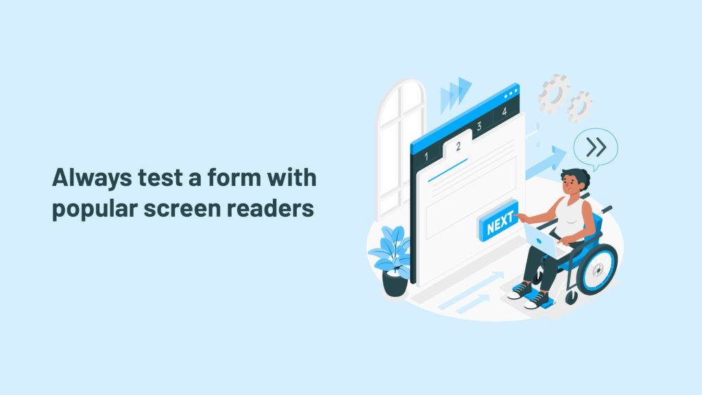
Screen reader compatibility is important for users with visual impairments who rely on these assistive technologies to interact with digital devices. A developer should always test a form with popular screen readers, such as NVDA or VoiceOver, to verify that all form elements are correctly communicated to the user.
Sometimes, we can’t validate form fields using HTML elements. That’s when various aria attributes come in very handy. These attributes help screen readers give a clearer picture of each element on a website to the user.
Labels
Labels provide concise descriptions for each form field. They help users understand what information they are required to fill in the form fields. People with normal eyesight can figure this out easily, but not everyone can.
When form accessibility is implemented correctly, visually impaired users can use screen readers to read forms. To do so, developers can use label tags (<label> and </label>) to make their forms accessible to screen reader users. When it is not possible to use label tags, an attribute called aria-describedby can be used in the code. Both the tag and attribute basically give instructions to the screen reader about which text to read out when someone focuses on a particular field of the form.
Sometimes placeholder text is used in place of labels which can cause problems for users with accessibility needs. People with visual impairments might find it challenging to read placeholder text because it doesn’t contrast well with the background.
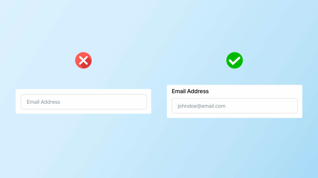
Moreover, screen readers often fail to recognize and read out this placeholder text. So instead of placeholder text, developers should use clear labels above form input fields.
Error messages
We all mess up sometimes while filling out online forms, don’t we? When we do, it’s important to know what went wrong so that we provide the correct information. And error messages help us do that.
A good online form should have error messages that are easy to read and understand for everyone, including individuals with special needs.
To ensure that everyone understands the error messages, developers can use the aria-invalid="true" attribute. When a screen reader comes across this code, it tells the user that there’s something wrong with the input.
But knowing there’s a problem isn’t always enough – you also need to know what the problem is. This is where aria-describedby comes in. It points to a message explaining what went wrong.
Keyboard navigation
Maybe someone has a physical disability, or perhaps he just prefers using the keyboard while browsing the web. How does he move between different input fields while filling out an online form?
That’s when online forms need to work well with keyboard navigation. Anything you can do using a mouse, you should be able to do using only a keyboard in an online form that is fully accessible via keyboard.
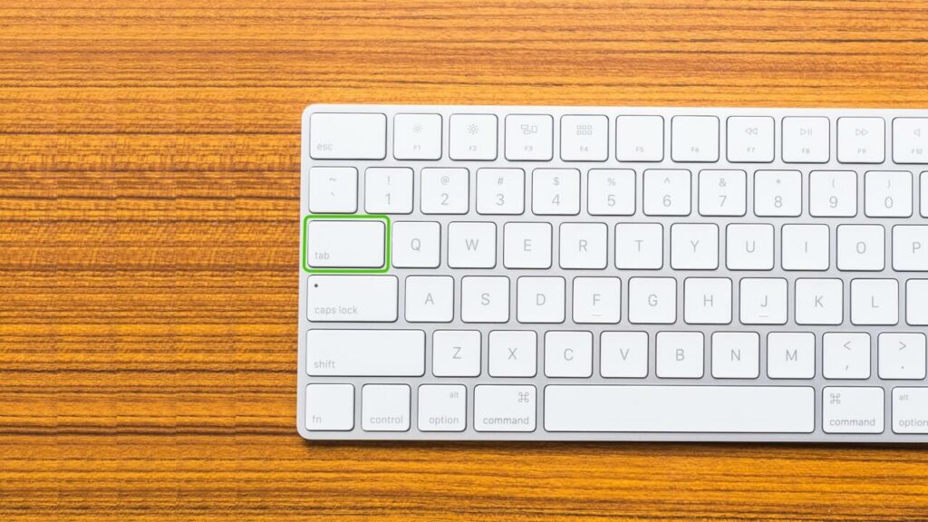
An accessible online form provides users the ability to access all form elements, including buttons, checkboxes, radio buttons, and navigate using the Tab key on the keyboard. So, whether the user is a mouse mover or a keyboard conqueror, an accessible form will treat everyone equally.
Semantic HTML form elements are used to make forms that support keyboard navigation. A semantic element tells you exactly what’s inside a code. For instance, <form> or <button> tells you exactly the purpose of it. On the other hand, non-semantic elements, such as <div> don’t give you any clues about what kind of content is inside.
If you use semantic HTML elements when you’re coding your website, users can simply press the Tab key to jump from one field to the next while filling out a form.
Visual cues
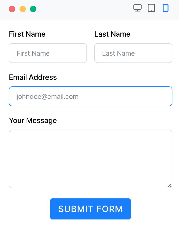
Visual cues, such as focus indicators and clearly visible form field borders, help users understand where they are in the form and which form elements are interactive. You have to make sure to use high-contrast colors and clear focus indicators to enhance the usability of your forms.
The World Wide Web Consortium (W3C) suggests that the contrast ratio between text and its background should be at least 4.5:1 for text that’s smaller than 14 points. This helps ensure that the text is easy to read for everyone.
To give you an example – when a user navigates a form built with Fluent Forms using the Tab button, a border with good color contrast pops up around it to highlight the input field.
Why accessibility matters in your business
By making your product accessible, you not only provide aid to users with disabilities but also enhance your business prospects.
Making your product accessible strengthens your brand by showcasing your commitment to inclusivity and customer needs. It also makes a clear statement that your business is aware of the best practices.
While your product might not achieve full accessibility, minor adjustments can significantly boost inclusivity as web accessibility for users with disabilities can be considered a civil right.
As a business that operates in the digital world, ensuring your product is accessible to everyone is a legal obligation too. The Americans with Disabilities Act (ADA) mandates equal access to public services for individuals with disabilities. While the ADA doesn’t explicitly list web accessibility as a civil right, it’s possible to include web accessibility within the scope of this law.
Apart from these, accessibility also helps your business grow by improving the SEO and overall usability of your product.
Accessibility in Fluent Forms
Fluent Forms is the smartest and most lightweight form-builder plugin in the market right now. It is a drag-and-drop WordPress plugin with tons of great features and functionalities. You can never go wrong with this plugin when it comes to designing various types of forms.
Some of the notable features of Fluent Forms are —
- Drag-and-drop form builder
- Dozens of useful pre-built form templates
- Conversational forms
- Conditional logic
- 45+ native integrations
- PDF add-on
- Multi-column form layout
- Calculated fields
- Payment feature
- Quiz and survey module
As far as accessibility is concerned, Fluent Forms is developed in such a way that makes it an accessible form-builder. In this way, everyone, including people with disabilities, can navigate forms built with Fluent Forms.
Fluent Forms supports keyboard navigation for online forms. Users can take advantage of the Tab key on the keyboard to select different input fields. For improved readability, Fluent Forms offers different color schemes that help people who have poor visibility. What’s more important about accessibility in Fluent Forms is that people with disabilities can use screen readers to interact with forms made with Fluent Forms.
So, when you use Fluent Forms to create forms to collect leads, run surveys, sell products or collect information, you know that the forms are accessible. Thus you ensure the inclusivity of your business.
Conclusion
Accessibility is about inclusivity, usability, acknowledgment of diverse user needs, and compliance with legal standards. And Fluent Forms is strongly committed to ensuring that the forms you build are accessible irrespective of people’s abilities.
Comment down below and let us know how you have implemented accessibility in your business. Also, follow our social media channels for more content.



Leave a Reply