
How to Create a Call to Action: Tips and Examples

Say, this is an advertisement from your favourite clothing brand:
Correct ten out of ten fashion quizzes & get 50% off on any clothing item.
(Only 250 coupons remaining out of 1000)
Take Quiz Now →
Surely, you’d take the quiz?
Well, this is how a call-to-action works.
A call to action (CTA) is an invitation, in the form of a button, link, or phrase, that encourages a user to take a specific, desired action. Effective CTAs are clear, compelling, and strategically placed to guide users and increase conversions.
This guide provides a step-by-step framework, 10 actionable tips, and 13 real-world examples to help you create CTAs that work.
You can also get a call-to-action idea custom-created for your business from us for free.
Let’s proceed right to it without any more distractions.
What’s a Call to Action
A call to action is a piece of text, an image, or a button designed to encourage an audience to take a particular action.
CTAs can be embedded into web pages, advertisements, emails, social media posts, and more. The strategic placement of a well-written CTA is crucial for guiding users through the buyer’s journey and boosting key metrics like conversions, leads, and traffic.
Key Elements of Creating a Call to Action
Before diving into specific tips, it’s essential to understand the fundamental components that make a CTA successful.
1. The format: use buttons
CTAs are most commonly placed in the form of buttons. Buttons are visually distinct, universally understood, and easy to click, reducing friction and making it more likely for a user to take action.
2. The strategy: guide the buyer’s journey
Your CTA should be relevant to the user’s current stage in the buyer’s journey.
- Awareness Stage: A CTA on social media might be “Learn More” to direct a user to a landing page.
- Consideration Stage: A CTA on a product page could be “Compare Plans and Pricing” or “Download the Guide.”
- Decision Stage: A CTA on a checkout page would be “Buy Now” or “Complete Your Purchase.”
3. The placement: be strategic
A typical website homepage often contains multiple CTAs. For example:
- Header: “Join Our Community” or “Start Your Free Trial.”
- Mid-Page: “Explore Our Products” or “Get More Information.”
- Footer: “Subscribe to Our Newsletter.”
Place your primary CTA “above the fold” (visible without scrolling) on landing pages. Also, include CTAs at natural conclusion points in your content, such as at the end of a blog post, in your website’s header and footer, and within product descriptions.
4. The copy: inspire emotion and action
The text on and around your CTA button is critical. It should clearly tell the audience what they will get by clicking. Use strong, action-oriented verbs and create a sense of belonging, trust, urgency, or curiosity.
A CTA button’s copy should be short and concise, typically 2-5 words (e.g., “Start Your Free Trial”). The surrounding copy can be longer to provide context and explain the value proposition.
5. The design: make it stand out
Your audience will only spend a few seconds scanning a page. An ideal CTA needs to be instantly visible. Use design elements to make it stand out:
- Contrasting Colors: Choose a button color that pops against the background.
- Strategic Positioning: Place it in a logical, easy-to-find spot.
- Size and Whitespace: Make the button large enough to be noticeable and surround it with empty space to avoid clutter.
Your audience won’t spend longer than a few seconds on a page. That’s why an ideal CTA should stand out, so the user notices it within that time, and feels the urge to complete the action.
10 tips to create a compelling call to action
Here are ten proven strategies to make your CTAs more effective and increase your conversion rates.
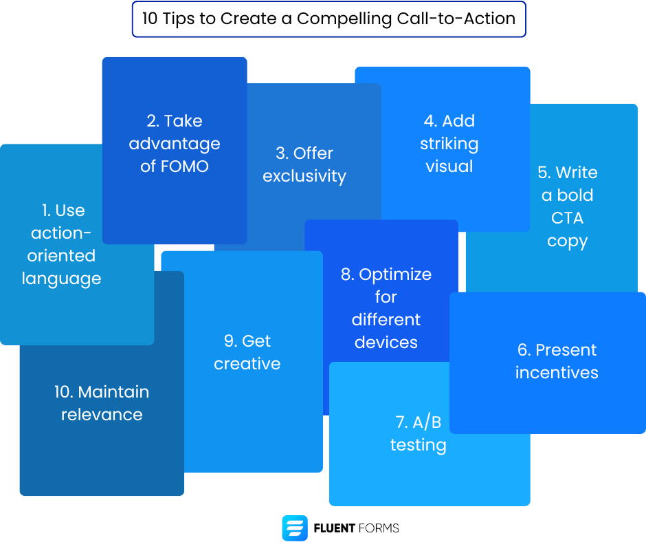
1. Use action-oriented language
Ask your audience to take a specific action through a CTA; that makes it easier for you to lead them in the desired direction.
Start your CTA with a strong verb that tells the user exactly what to do. Words like “Get,” “Start,” “Join,” “Explore,” “Discover,” or “Download” are clear and direct. Adding adverbs like “Now” or “Today” creates a sense of urgency.
2. Take advantage of FOMO
Fear of missing out (FOMO) works great if you want users to take an action. It’s a powerful psychological motivator because no one wants to miss out on an opportunity. Create urgency by showing that an offer is limited:
- Highlight how many people have already signed up.
- Show a countdown timer for a sale.
- Display the number of products left in stock.
3. Offer exclusivity
People value exclusivity. Frame your offer as a special opportunity. Use phrases like “Get Exclusive Access,” “Become a VIP,” or “Join Our Inner Circle” to make users feel prioritized and important.
4. Add striking visual
An image is indeed worth a hundred words. Images are scannable and have the power to create an emotional impact. Use high-quality photos or illustrations that complement your message and draw the user’s eye toward the CTA.
5. Write a bold CTA copy
Your CTA copy needs to be confident and energetic. It should clearly communicate the value the user will receive. Make it benefit-driven; focus on what the user gets, not what they have to do.
6. Present incentives
Incentives encourage action. Use words like “Free,” “Save,” or “Win” to highlight the benefit. Numbers are also highly effective. For example, “Save 50% Today” is more powerful than “Save on Your Order.”
7. A/B testing
Don’t guess what works best. Test it. Create two versions of a CTA (an A and a B version) and see which one performs better. You can test:
- Button size and shape
- Button color
- CTA copy
- Placement on the page
After you change your site, observe your clickthrough rates for a month and compare them with the previous ones. This process is continuous, and you can always seek to do better.
8. Optimize for device
A user on a laptop may be researching, while a user on a mobile device is often ready to act. Tailor your CTAs accordingly. For mobile users, CTAs like “Call Now” or “Get Directions” are highly effective because they leverage the device’s native functions.
9. Get creative
Move beyond standard phrases like “Submit” or “Click Here.” Creative, brand-aligned copy can make a CTA more engaging. For example, a fashion brand might use “Unlock Your Style” instead of “Shop Now.”
Besides, with ingenious CTA, you can recognize your customers’ pain points even before they do. Your CTA tells them what they want and why they want it. And once they decide to get it, you never have to look back.
10. Maintain relevance
It’s best to keep your CTA relevant to your industry. There are some specific requirements specific to each sector. For example, healthy goes with food, next-generation goes with technology, etc. Learn what your audience wants from you and offer it to them.
Additionally, some general concepts can be included as well, like environment-friendly, recyclable, charitable deeds, raising awareness, etc.
Let’s see how some of the popular businesses created their CTAs to get an even better idea of what you can do with your CTAs.
13 powerful call-to-action examples
1. Netflix
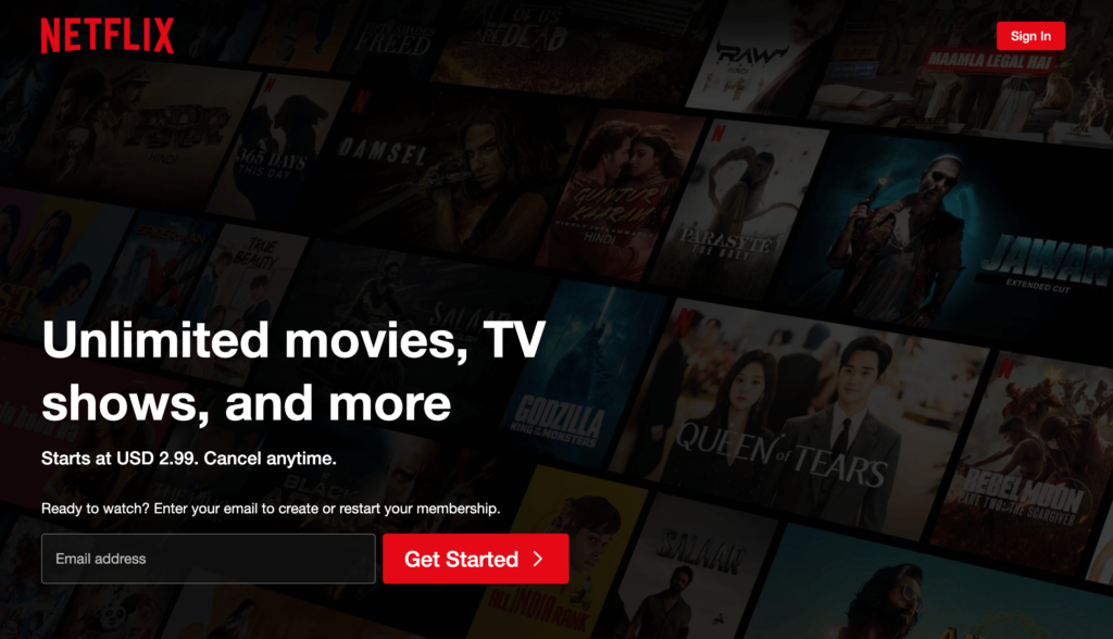
Netflix keeps it short and sweet. In the first line, you see what they’re offering you. In the second, you see the price and your terms of agreement with them. You learn that it’s not a lot of money, and you’re not under any obligation to keep continuing with them.
It gives you enough freedom to consider them as your medium of entertainment. You find yourself trying the platform without giving it much thought.
2. International Rescue Committee
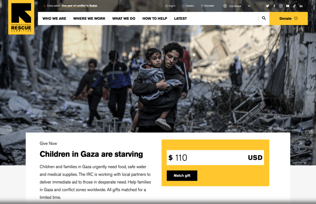
See how the International Rescue Community uses the power of visuals to raise donations. They’re also using a color for the CTAs that’s contrasting to the background and pops. The use of the word donate makes the CTA even more convincing. You know what you’re doing, where your donation is going, who you’re saving, etc., which makes you much more comfortable making a donation.
3. Vogue
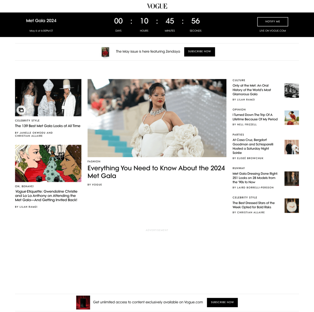
Vogue uses a countdown to a hyped event like the Met Gala to create a sense of urgency among its audience. Everyone wants to participate in the post-Met Gala discussion and therefore needs to witness the event while it’s live. That’s what Vogue is banking on.
Additionally, they offer exclusivity if you sign up for their newsletter. And to learn what happens in the entertainment world before anyone beats you to it, you subscribe to their channel.
4. Valentino
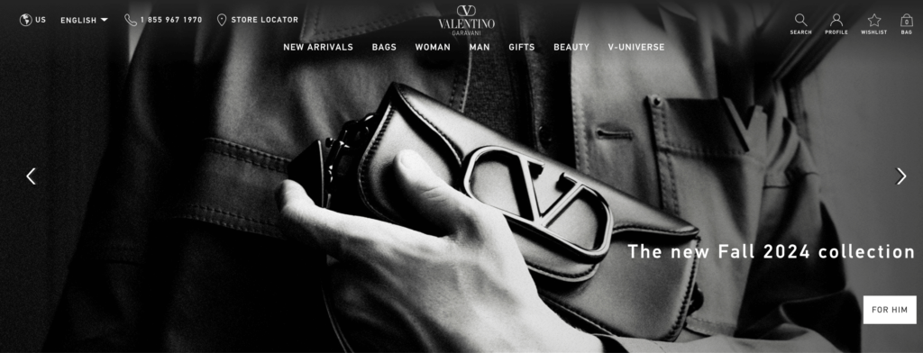
Instead of common phrases like buy or see more, Valentino uses FOR HIM as their CTA button. This takes the monotony out of their CTA, making it more clickable. This, coupled with a classic black-and-white background image, gives them a higher clickthrough rate.
5. KFC
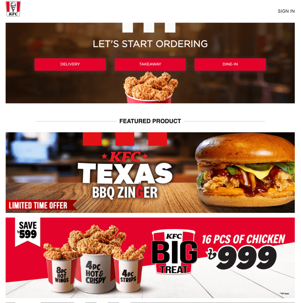
KFC offers one of three options in its CTA buttons. So when a potential customer visits their website, they’re motivated to order takeout, delivery, or dine-in. Additionally, they create a sense of urgency by using the phrase limited time offer on one of their CTAs. They further motivate you by showing how much you’re saving by ordering a combination.
6. Microsoft
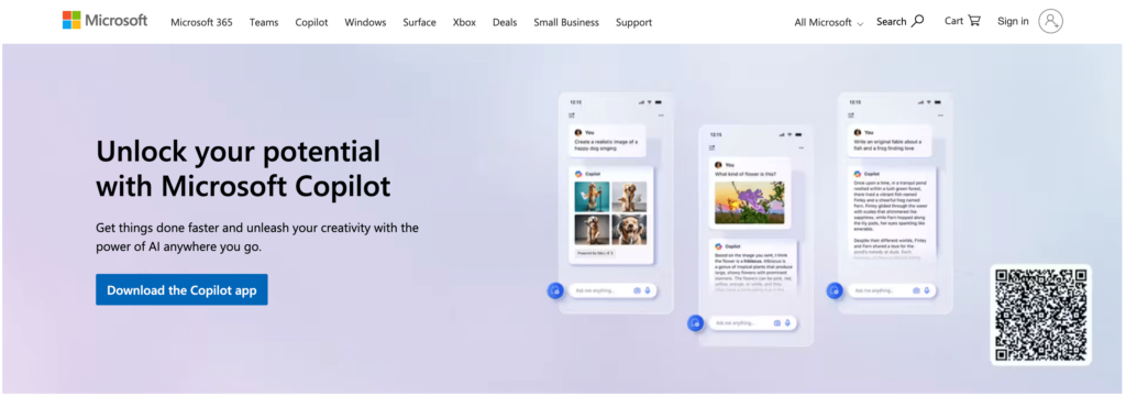
Microsoft makes you feel confident about yourself in their CTA copy. It makes you want to find out what you can achieve once you unlock your full potential. It’s out of that curiosity and hope that you attempt to download the Copilot app.
7. Bank of Singapore
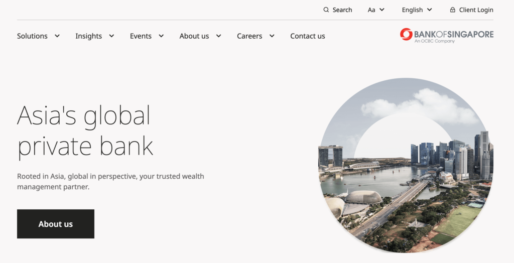
The Bank of Singapore utilizes the power of the word partner in their CTA. It makes you trust that they’ll be working with you along the way. They’re also targeting both local and global clients by choosing their words carefully.
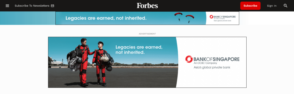
Check out this ad they put on top of Forbes’ website. It makes you believe in yourself. You feel that you can build your own legacy. And you consider working with them because they made you believe in yourself.
8. Louvre
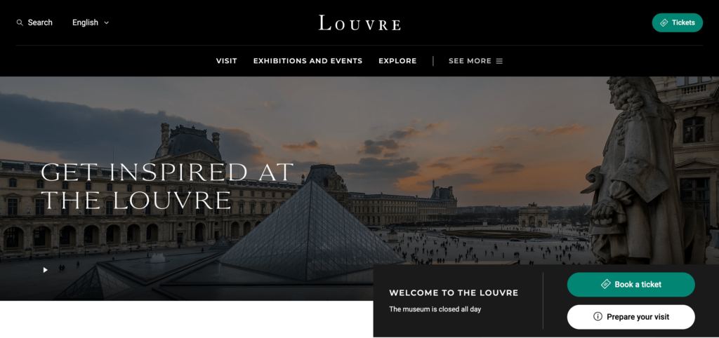
The Louvre invites you to visit it to get inspired. And let’s be honest, who doesn’t want to get inspired? Their phrasing instantly makes them stand out. They’re not just another museum you visit to observe art, but one that inspires you to create art yourself. It’s an idea you instantly fall for.
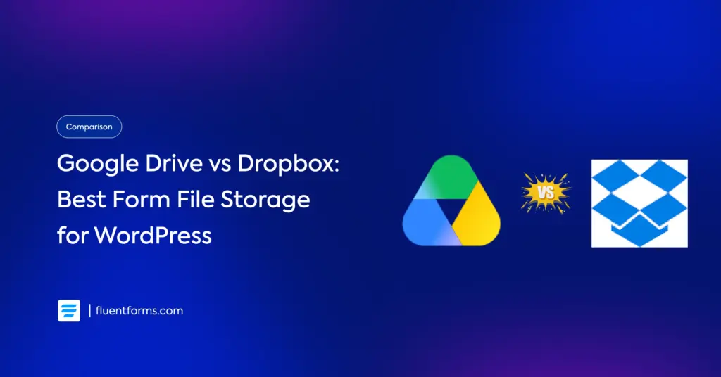
9. Fluent Forms
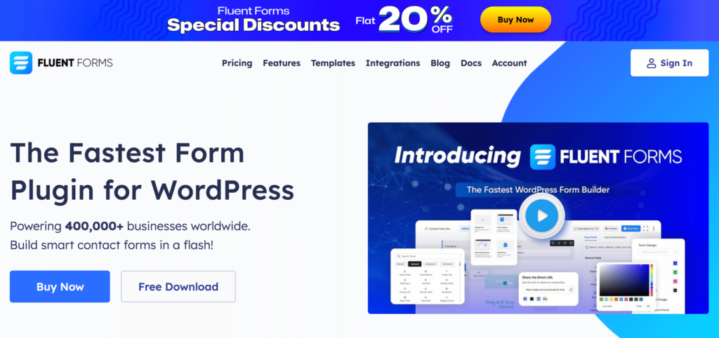
Fluent Forms tells you exactly what you’re getting in their CTA, the fastest form-building plugin. Additionally, they tell you how many businesses they’re empowering, which makes you trust them with your business.
Create beautiful contact forms for your WordPress website with Fluent Forms. Download the smartest form builder plugin to be a part of four hundred thousand successful businesses.
10. Quaker Oats
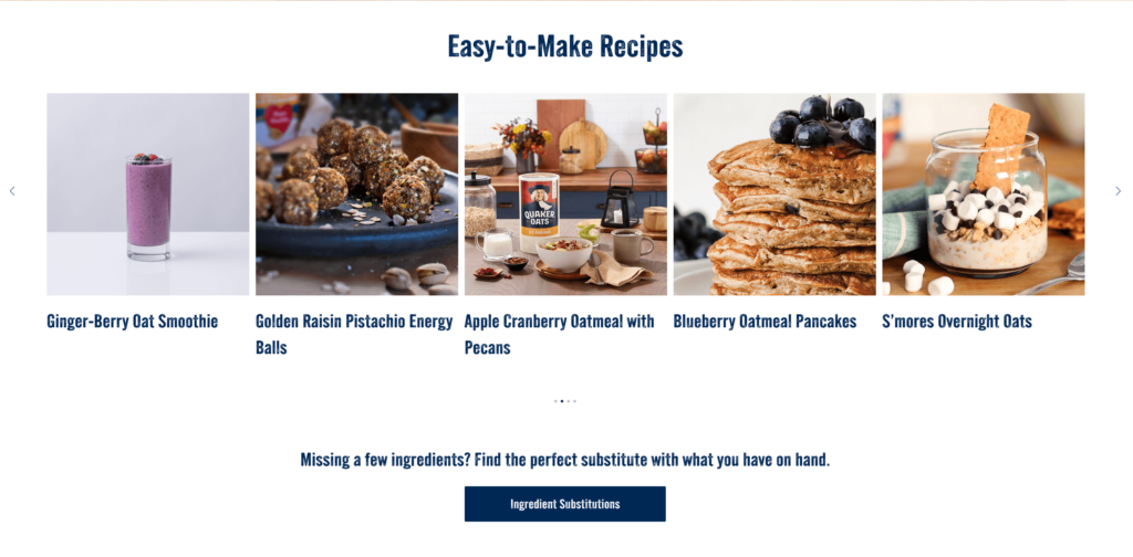
You go for oats when you’re thinking of healthier meal choices. And when you’re looking for a healthier diet, you want to avoid the unhealthy ingredients used in conventional recipes. Quaker Oats knows your pain point, and they offer you a solution.
They bring you healthier ingredient substitutes, and since you find what you’re looking for on their website, you’re more likely to purchase from them.
11. Blue Buffalo
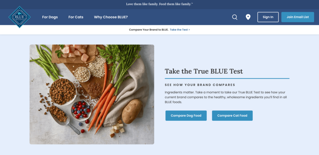
Blue Buffalo knows how much you care about your pets. That’s how they know you’re careful about what you feed your pets. Therefore, they ask you to compare the nutrition in your current pet food with the one they’re offering.
Of course, you take a free, effortless test to find out how you can better take care of your pets. And if they’re offering a healthier choice, you switch your current brand to them.
12. Twinings
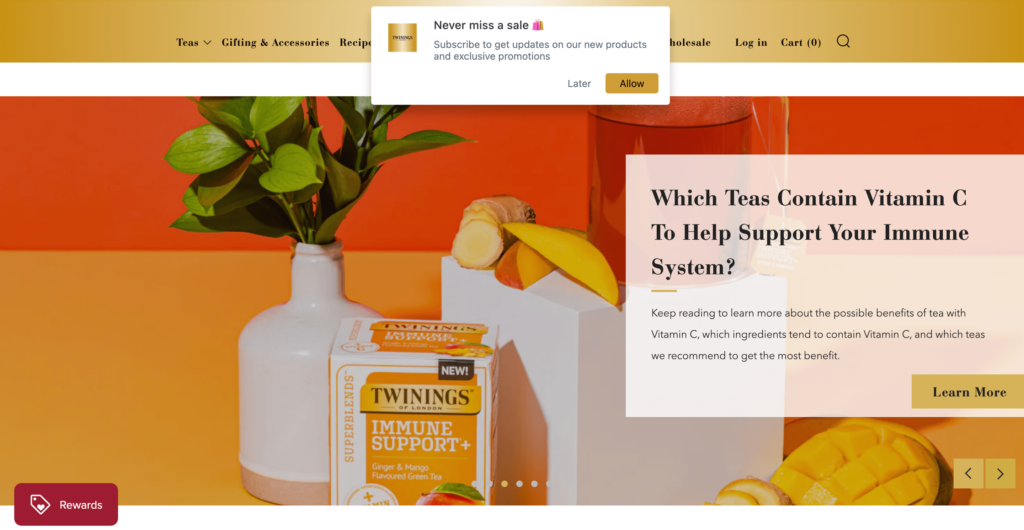
Twinings used the power of striking visuals and the allure of rewards and updates on upcoming tea flavors to lure their customers. The theme of the image goes perfectly with their primary color, gold, yet it makes the buttons pop. And let’s be honest. Which tea lover doesn’t want to try out a new tea flavor, especially when it looks this good in the image?
13. Lagunitas
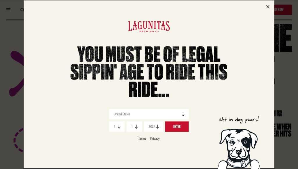
Last but not least, this site came to our attention from Pinterest. Look at how they used humor to intrigue customers. And if you try to cross this date of birth tab, they take you to this YouTube video that says “Act Your Age.” Their ingenuity makes you want to purchase from them. And just like that, now you know you can never go wrong with a little humor.
What’s next
Your CTA is how you communicate with your audience. It needs to be strong and bold. When you radiate energy and confidence, your audience picks on it and feels good about doing business with you. However, being bold doesn’t mean that it can’t be light in mood. Use humor, get creative, and see the magic.
Use our tips on how to create a call to action to write the perfect CTA for your business and multiply your leads and conversions overnight. Let us know if you find these tips and examples helpful, and share your insights with us. Let’s bring innovation to the world together.

Sarika writes for Fluent Forms and loves to offer insights into small businesses. She’s curious and enjoys discussing ideas, interests, and perspectives. In her free time, she’s either marvelling at architectural beauties or trying different cuisines.


Leave a Reply