
How to Create an Effective Feedback Form in WordPress

Asking for feedback is easy. Getting meaningful feedback is a bit trickier.
It’s not that your customers or colleagues don’t want to share their thoughts. They do. But the thing is, generic questions often get generic responses like, “It was fine” or “Make it better.”
In this blog post, I’ll show you how to move past that with an effective feedback form that collects actionable feedback from your users. I’ll cover everything from how to plan your approach to structuring and creating a feedback form capable of collecting measurable data and how to analyze that data to gain real insight.
I’ll also list the feedback forms of some of the most successful brands of different sizes & industries and explain why they work for them.
Let’s jump right in.
TL;DR
- Define one clear goal per form: Focus on specific objectives like checkout issues OR navigation problems. Alternatively, allow users to select between them and then leave their review for more targeted and categorized feedback.
- Keep it short (3-5 questions max): Mix measurable questions (rating scales, multiple choice) with 1-2 open-ended questions for detailed insights
- Use structured response options: Replace yes/no questions with scales (e.g., “Very easy” to “Very difficult”) to get actionable, measurable data
- Include an “Other” option: Always add this to radio/checkbox fields with a conditional text box so users can provide answers you didn’t anticipate
- Place forms strategically: Place a feedback form where it’s most relevant, like a checkout process review after an order confirmation.
- Make fields optional: Forcing all answers leads to abandonment; let users choose what they want to share
- Analyze patterns, not just individual responses: Look for trends across multiple submissions and track changes over time
- Close the feedback loop: Act on insights and if necessary, communicate changes back to users to encourage future participation
How to create an effective feedback form
An effective feedback form is a result of a thoughtful approach, asking a combination of measurable and qualitative questions (but not too many!), and making the process smooth and effortless for your users. I’ll discuss the process in detail in the following steps.
1. Know your purpose before you start
This is the most crucial step. If you try to solve all your problems with one form, it will be unfocused. While you can have multiple feedback forms on your website, each of them should be centered around a clear objective. For example:
- E-commerce/customer feedback forms: These forms are for surveying how satisfied your users are with a product/service they purchased.
- Customer support feedback: Helpful for finding out how efficient your customer support system is in solving users’ problems.
- Employee feedback forms: This is an effective way to find out what challenges your employees face and how to improve the work environment.
- Event feedback forms: Great for gathering insight from your past event’s attendees and using that information to improve your next events. Questions include asking about the quality of food, presentations, entertainment, ambiance/venue, what attendees liked most or least, etc.
- Website feedback form: Website feedback forms are for enhancing the user experience for your website. It helps you find out whether your users are receiving the same message that you want to convey, whether they’re easily finding the right product/solution, etc.
Once you decide on your goals, it’s time to move on to planning your form.
2. Strategise your feedback form
Let’s say your goal is to receive feedback on your website. But asking your users to give feedback on your website is too broad. Everyone will talk about different aspects, and you’ll have a hard time sorting through the responses and gathering actionable data.
That’s why you need to segment different parts of your website, prioritize them, and ask about each at the right point/place according to their priority.
Some of your website improvement objectives may include:
- Reducing friction in the checkout process
- Making sure users can easily find what they’re looking for
- Keeping navigation easy
- Ensuring information clarity
- Making your website accessible and device-responsive
- Improving the page load speed
- Improving the search functionality
- Making sure there are enough resources/tutorials
- Improving the visuals
- Ensuring users can easily contact customer support
- Minimizing bugs, errors, or broken links
I have only listed a few; you might need feedback on many other aspects aside from these. However, you can’t ask all of them in one go, because that’ll make the form too long, and users tend to skip longer forms.
Let’s say you can ask about the smoothness of your checkout process after a user checks out. Moreover, you can ask about how easy it was to contact support agents in the customer support feedback form. On the product/feature page, you can ask about navigation, information clarity, design, responsiveness, speed, searchability, etc., in order of priority.
Once you’re done prioritizing, you have to create your feedback form’s structure. Structuring your feedback form is crucial since this helps you receive structured data from your users, and structured data means better analysis and actionable insights.
It’s best to have 3 to 5 questions in your feedback form. Phrase most of your questions in a way that you can add response options with them. Use an open-ended question (no response option) for detailed insight, or two at most. While you’re designing the response options, it’s best if they’re measurable (like a Likert scale). For example:
|
Instead of |
Did you find what you were looking for? 〇 Yes 〇 No |
|
Try |
How easy was it to find what you were looking for? 〇 Very easy 〇 Easy 〇 Somewhat easy 〇 Difficult 〇 Very difficult 〇 I didn’t find it |
In the next section, we’ll easily create a feedback form in WordPress using the form builder plugin Fluent Forms. We’ll use Fluent Forms because it comes with multiple input fields designed to collect insightful feedback using structured questions and responses.
3. Build your form using a WordPress plugin (Fluent Forms)
If you’re new to Fluent Forms, these steps are for you:
- Go to your WordPress dashboard.
- Find the “Plugins” option on the left menu bar.
- Select “Add New.”
- Search for the “Fluent Forms” plugin.
- Click “Install.”
- Activate the plugin when installation is complete.
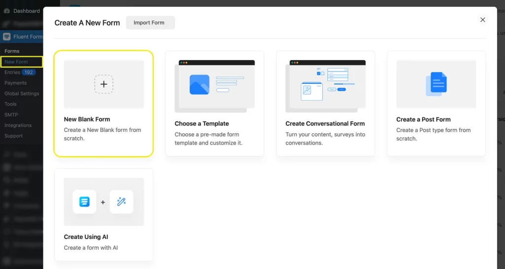
Once activated, you’ll find the plugin on your dashboard’s left panel. From there, navigate to New Form > New Blank Form.
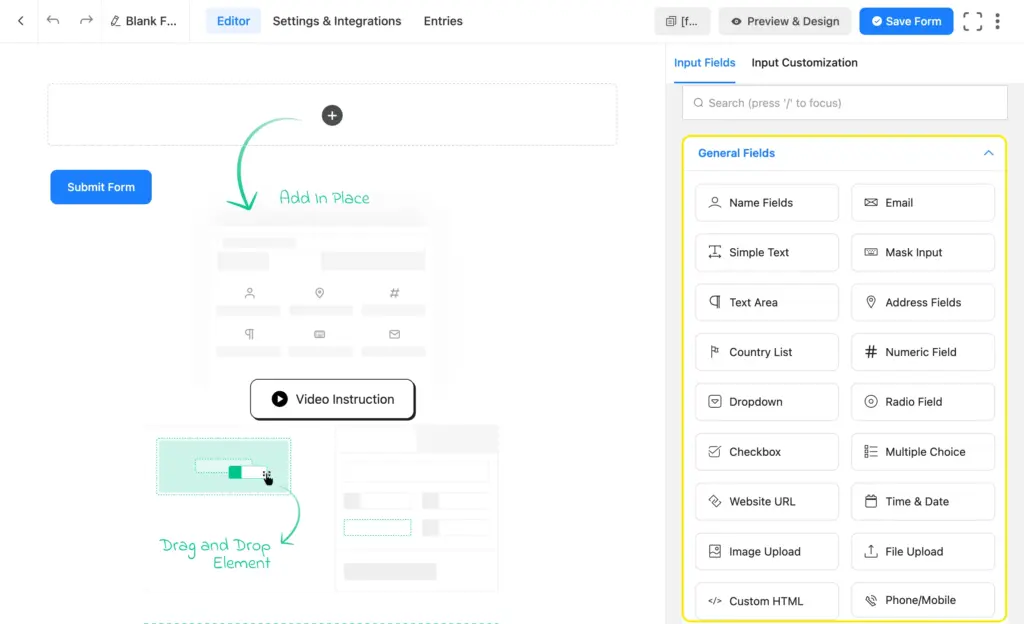
It’ll lead you to the form editor tab. There, you’ll find the input fields on the right side in four categories: general fields, advanced fields, containers, and payment fields. You’ll find the survey/feedback fields within the general and advanced fields. The container fields are for creating multicolumn layouts for your form fields.
Fluent Forms input fields for receiving insightful feedback:
|
Structured Feedback |
Open-ended Feedback |
|---|---|
|
|
Radio vs. Dropdown field and Checkbox vs. Multiple choice field: What to use?
Both the radio and dropdown fields serve the same purpose: users get to choose only one option. However, radio options always remain visible, while dropdown options become visible when users click the downward arrow to open the dropdown menu.
So which one should you use? Well, using a radio field creates a smoother user experience since it saves them 1 extra click and mouse movement. And trust me, that matters! However, using the dropdown field gives your form a cleaner look. So simply go with what matters more to you, the user journey or the clean look. My suggestion is to go with the Radio for fewer options.
You can decide between the checkbox and the multiple-choice field in a similar manner.
Now let’s change our form’s name in the upper left corner and drag, drop, and customize the input fields that best serve our purpose. We’ll start with a radio field.
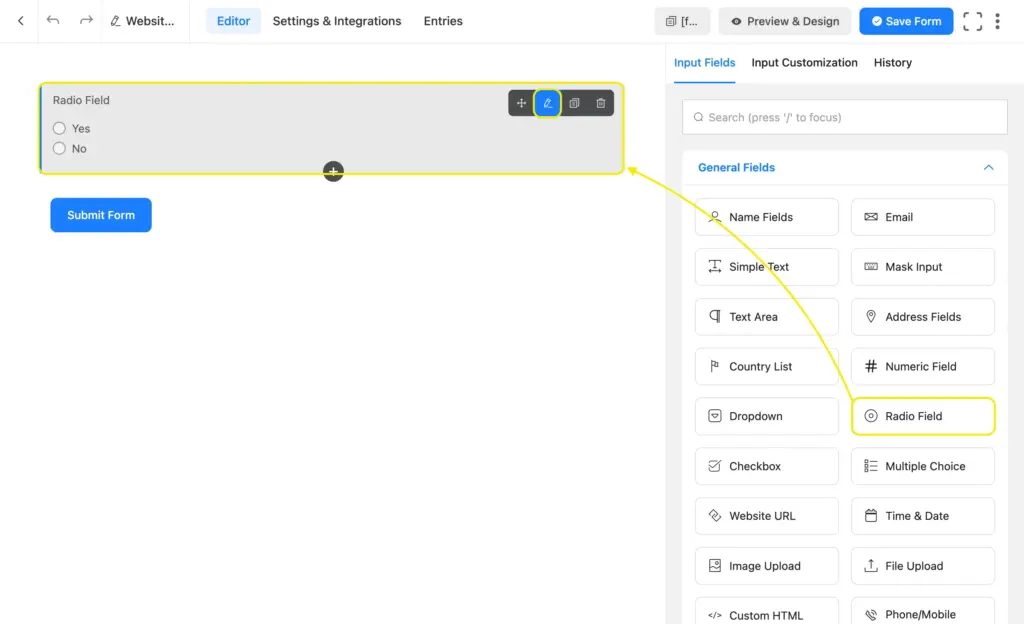
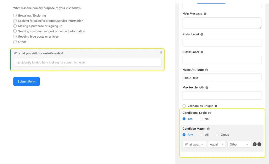
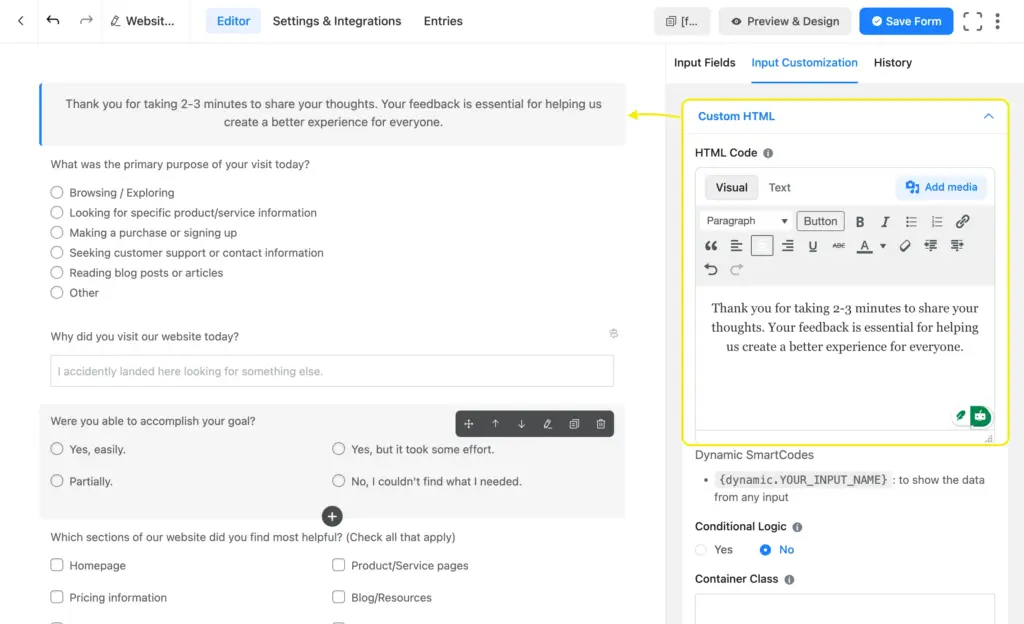
The pencil icon in the upper-right corner of each field opens its input customization options. You can change the label text, add options, apply conditional logic from advanced options, and more.

It’s best to always include an “Other” option with your radio or checkbox fields. Simply link a simple text field with the other field using conditional logic. This way, when a user has something in mind outside of the provided options, they can check “other” and write down their answer in the text box that appears.
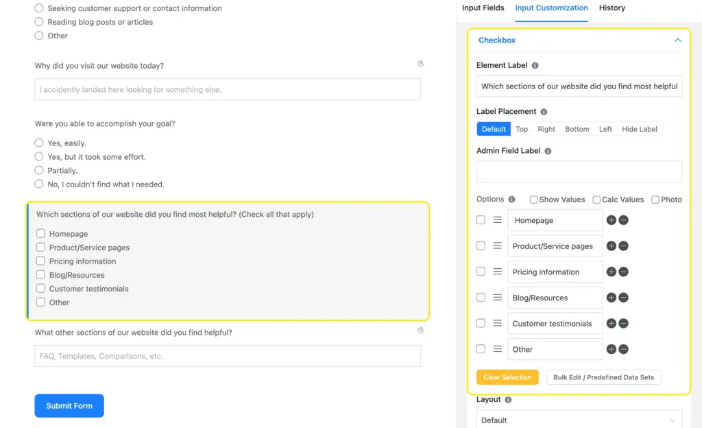
Moreover, Fluent Forms’ checkbox field comes with a built-in “Other” option. If you enable that option, a text box automatically appears when users select “other.”
Next, we’ll add a simple text field to collect the answers of the users who choose “Other” in the radio field. Once we customize the label or placeholder text, we’ll add a condition to this field so it stays hidden unless someone selects “Other” in the radio field.
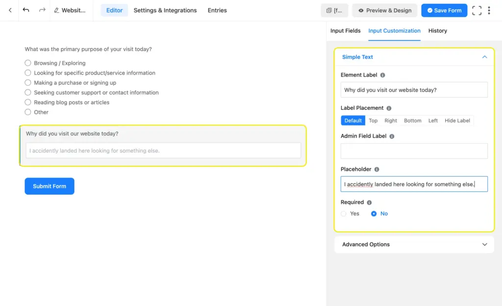
Go to “Advanced Options” from Input Customization. Scroll down to “Conditional Logic” and select Yes. Choose any under the condition match and move to the three boxes. In the first box, select the radio field’s label on which this simple text field depends. In the second box, select “equal,” and in the last box, select the option “Other.”
This translates to: Show this simple text field if “What was the primary purpose of your visit today?” is “equal” to the option “Other.”
Next, we’ll take another radio field to ask users if they could accomplish the goal for their visit. After that, we’ll take a checkbox field to ask them which section(s) of our website they found most helpful. We’ll add an “Other” option here as well so users can list any other section that they found helpful.
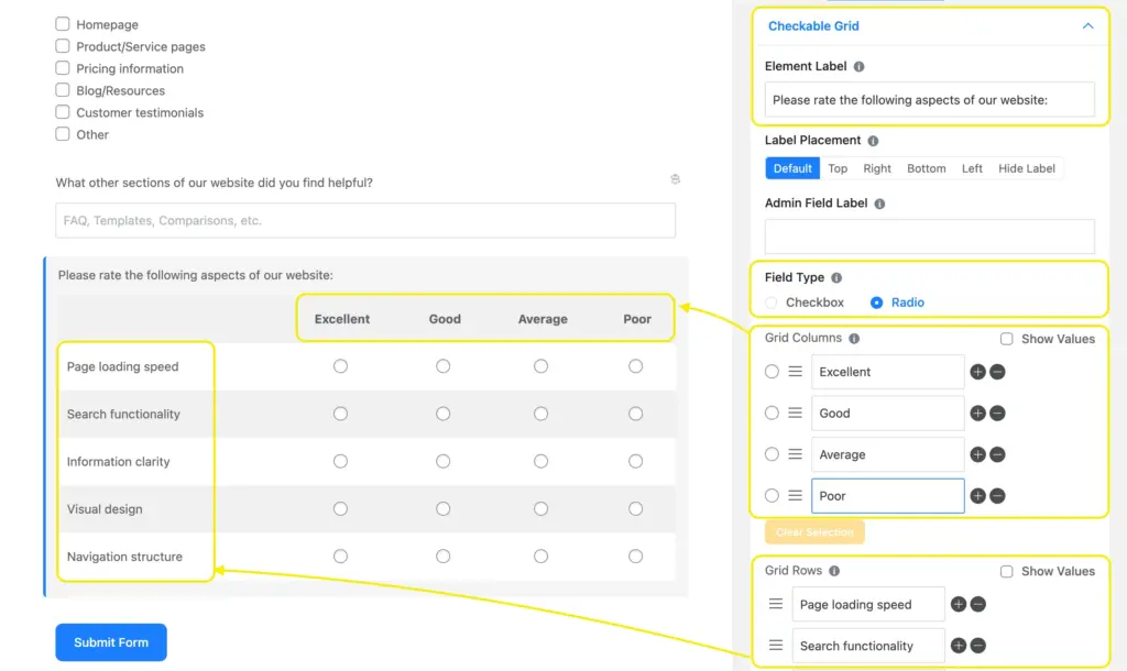
Next, we’ll add a checkable grid field for some quick, measurable feedback on the site’s technical performance. You can choose whether you want the field type to be a radio or a checkbox. We want a radio for this one.
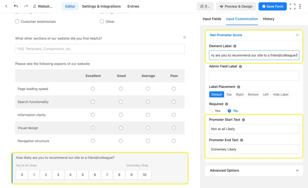
After that, we’ll take a net promoter score (NPS) field to ask users how likely they are to recommend our site to a friend. You can customize the promoter starter and end text.
Finally, we’ll add a textarea field to collect our users’ suggestions on how to further improve our website.

Lastly, we’ll click the submit button and change the button text to “Submit Feedback,” and add a static text on top of the form using a visually editable “HTML Field.”
We’ll also change the layout of some radio/checkbox fields to give the form a more balanced look. I chose the 2-column layout, so the options look balanced yet clean.

It’s best to keep the fields optional. Users are doing you a favor by submitting their review; they should get to choose which questions they want to answer. Forcing them to answer all the questions might lead to a lower conversion rate.
When you’re done, save our form by clicking the “Save Form” button in the upper right corner, and move to the Preview & Design tab to style our anonymous feedback form.
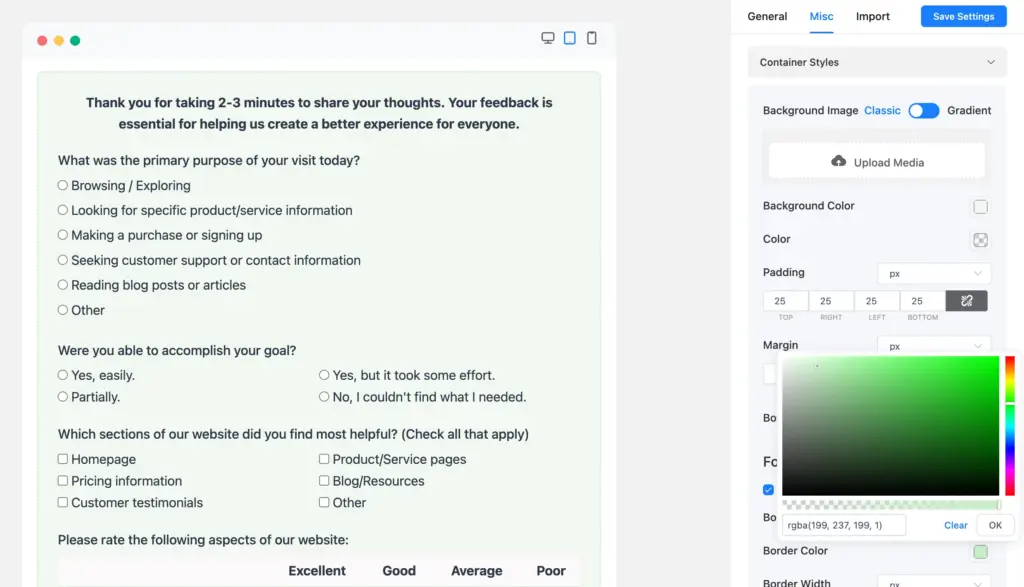
We changed the background color and padding, added a border (dashed style), and customized the background color of the checkable grid rows and the button color of the normal & hover state using Fluent Forms’ advanced visual styler.
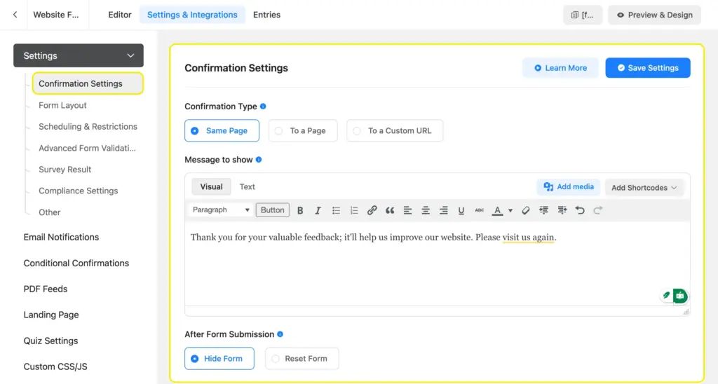
When you’re done styling, customize the thank-you message from the settings tab. You can also direct your users to a custom thank-you page.
Once you’re satisfied with everything, test your form in your sandbox before publishing it on the targeted page.
The key to making the most of a form is placing it strategically.
Website feedback form: On the contact page/exit intent pop-up/floating widget at the bottom right corner.
Support feedback form: Immediately after a support ticket is closed
Customer feedback form: On the order confirmation/thank you page
Product review form: A link to a dedicated landing page (with the review form) sent to the buyer’s emailEvent feedback form: A link to a dedicated landing page (with the review form) sent to attendees’ email
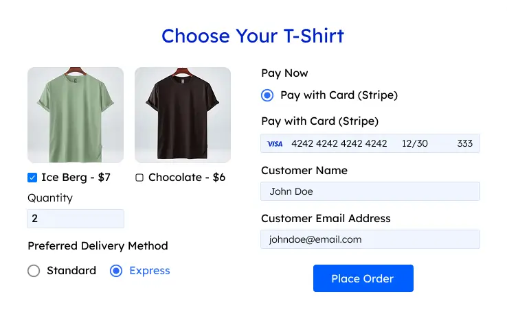
Here’s a preview of the form that we created in this tutorial.
You can also create conversation-style feedback forms. They keep users highly focused, as the form presents only one question at a time. You can share conversational forms with independent URLs (landing page style) or embed them on your site. Mention how long it’ll take to complete the form at the beginning to encourage users.
4. Analyze the feedback
Now comes the most-awaited part: analyzing our feedback to gain actionable data. Go to the entries and navigate to the visual report.

Inside the visual report, you’ll find visual charts of the responses. You can click the chart icons to toggle between pie charts and vertical or horizontal bar charts. The percentage distribution will tell you about the overall performance of your website.

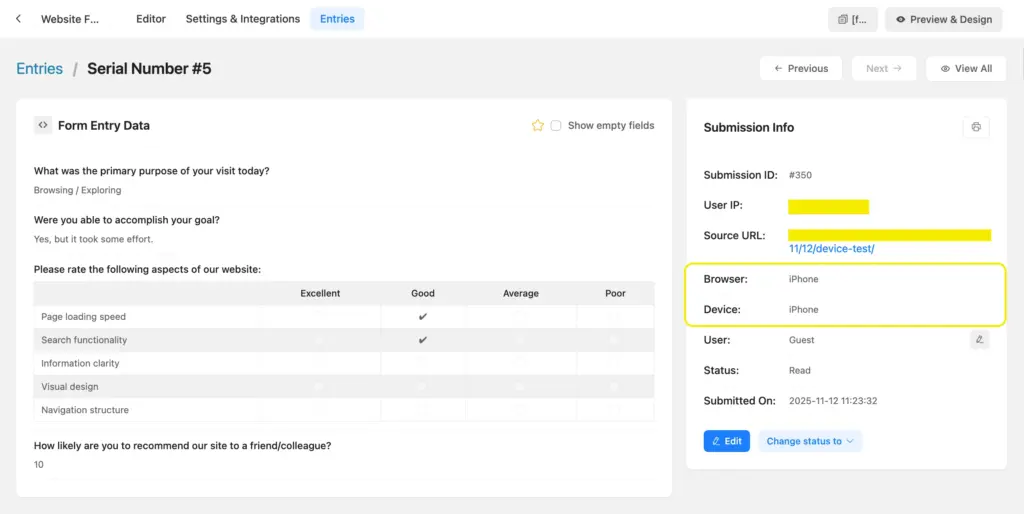
If you receive “poor” feedback on any performance metrics from a user, view that submission to gather more insight. Simply click the corresponding view icon with that submission ID and check the device and browser information. If most of the poor reviews come from iPhone or Android devices, you’ll know that your website isn’t mobile responsive.
Also, check if users have left any insightful comments. Verify their claim and make adjustments to your site accordingly.
Build Smarter Forms for Free
In the next section, we’ll study a few real-life feedback forms to find out their strengths and how they serve their purpose.
Feedback form examples: a case study
Here, we’ll analyze the feedback forms of some established businesses of medium to enterprise size. With the psychology and logic behind them, you can easily plan and strategize yours.
1. Masala Zone (restaurant feedback form)
Masala Zone asks for some personal information, like your name and email, and which of their restaurants you visited recently (the one you want to review).
Then they ask you to rate a few metrics like quality, value for money, friendliness, speed of service, etc,. on a 5-point Likert scale and ask you if you’d visit again.
All of this feedback is measurable; they learn how much or little you liked their services on a granular level.
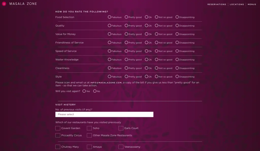
Next, they ask you about your previous visits. This way, they can easily cross-examine if you have left any other feedback on those visits and compare it to your recent feedback.
They can also monitor the result analytics to see if any of the metrics are receiving negative feedback from multiple people and investigate them for improvement.
2. Anytime Fitness (a gym feedback form)
Anytime Fitness is a gym franchise that asks for your personal information (name, email, phone number, and gym location) in their gym review form. This information is for verifying that you actually attend the gym, since it’s a user feedback form.
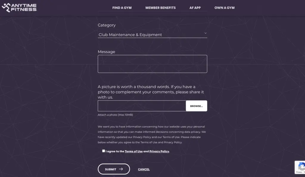
The feedback part comes after the personal information part. They let you select what your feedback is about from a range of options (dropdown), and then you get to write your feedback (message). What’s interesting is, you get to attach an image with your feedback as further explanation/proof. In one hand, this helps you explain your feedback better; on the other hand, they easily understand the gravity of the situation with the image attachment.
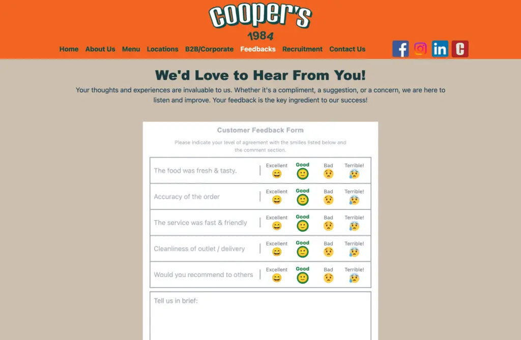
3. Coopers (bakery feedback form)
The first part of Cooper’s feedback form is a 4-point Likert scale on 5 metrics. This part of the feedback is measurable. Next, they added a text box for an open-ended answer: “Tell us in brief.” This part of the feedback is qualitative; if users have any insights or concerns, they look into that.
They show a cheerful, welcoming message before the feedback form starts. This encourages their customers to leave an honest review.
The Cooper’s Bakery feedback form ends with asking for personal information, like whether you’re a B2B customer or a corporate or an individual buyer. This helps them understand their customers’ demographics better. Next, they ask for your company name, outlet, and invoice number, email, etc., for verification.
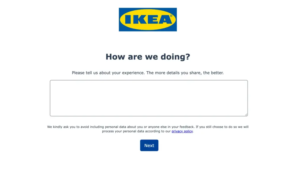
4. IKEA feedback form
IKEA uses a multi-step form (3-step) to collect its reviews. In the first step, they throw an open-ended question where you can write your review in detail.
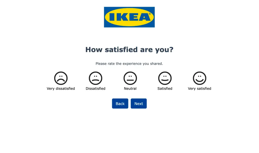
The next step of the feedback is a quantitative (a five-point rating) question about users’ satisfaction level. This helps them categorize the feedback as compliments or concerns.
The final part of their feedback asks for specifics, whether the feedback is about a store/an app/a website/support, etc. They also ask you to choose a store outlet if the feedback is related to a specific store. This helps them further categorize the feedback.
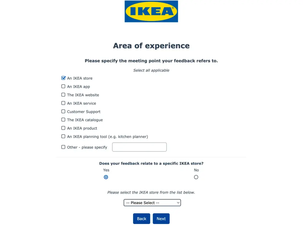
Since they receive a massive amount of feedback, the categorization proves really helpful. If they notice a spike in a certain category over a short period of time, they look into that for an anomaly and fix it.
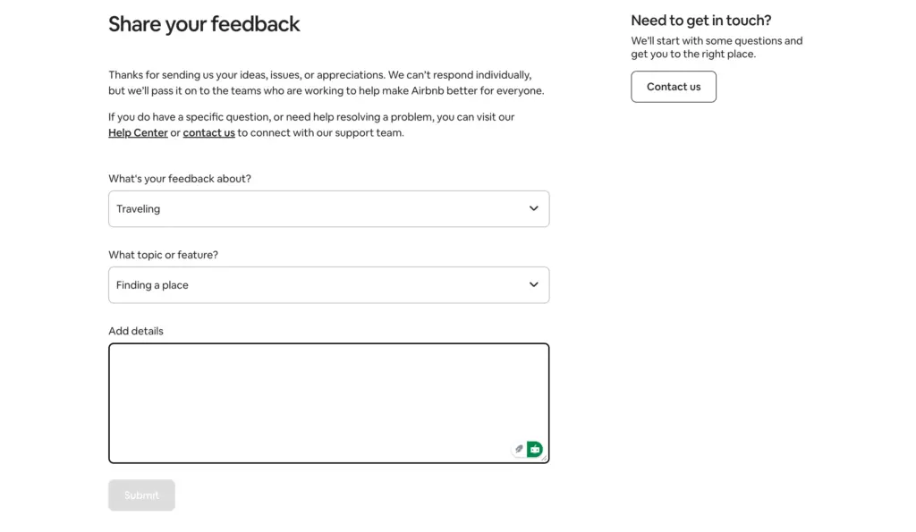
5. Airbnb feedback form
Airbnb has two types of feedback systems: the Guest/Host Review System (Post-Stay) and the Website/App Feedback Form (General Use).
The guest/host feedback forms are very detailed. On the day of checkout, guests receive an email from Airbnb asking them to rate their stay out of 5 stars. The email also has a link to the Airbnb website for leaving a detailed review.
The detailed feedback includes a private note (only for the host) and a public review (the one that’ll be displayed). Then they ask you to review the cleanliness, check-in, communication, location, value, etc., out of 5 stars.
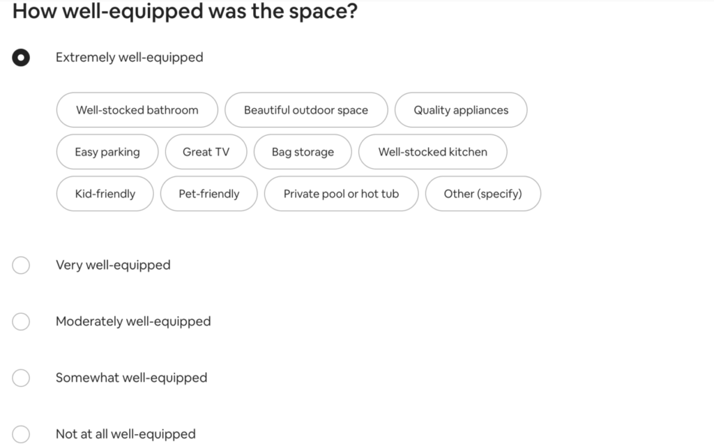
They further ask you about the smoothness of the check-in process, how well-equipped the space was, an account of available amenities (AC, heating, TV, blankets, etc.), and the availability of relaxation areas (pool, hot tub, patio, BBQ grill, etc.). The guest can submit their review within 2 weeks of their visit.
Their website/app feedback form, on the other hand, is very short and simple (only 3 fields). You have to select what the review is about and the relevant topic/feature. Next, you get to write the review in detail.
The simplicity of the form reduces friction by a greater degree, resulting in a higher conversion rate. However, you might wonder how they understand the sentiment or gist of the review, since they receive tons of reviews, and acting on every single one of them is nearly impossible.
The fun part is that they group their reviews according to their categories and then run those reviews through an NLP (Natural Language Processor). The NLP can automatically scan thousands of comments and identify emerging keywords. If “map is slow,” “map won’t load,” and “map freezes” suddenly start appearing, the system flags a “Map Performance Issue.”
It can also determine if the tone of the comment is positive, negative, or neutral. This allows them to quantify sentiment without a star rating. For example, they can see, “Negative sentiment regarding ‘checkout button’ has spiked by 30% in the last 24 hours.”
You can download your forms’ entries and run them through language processing algorithms as well. It’ll help you detect patterns in your feedback to prioritize your improvement sectors.
Do you feel inspired enough to work on your feedback form now? Let us know how it’s going or if you have any questions. We’d love to listen.
Make confident decisions with clear feedback
Creating a great feedback form isn’t about asking dozens of questions. It’s about clarity and purpose. By shifting from “How was everything?” to “What was the most difficult part of your experience today?”, you guide users to give you the specific, constructive feedback you need.
It’s also about respecting your users’ time, asking questions that matter, and being prepared to act on what you learn. Start simple. Pick one thing you genuinely need to know, ask about it clearly, and make it easy for people to respond. The insights you gather should lead to improvements, which lead to better experiences.
Start with a warm welcome and be honest about how long it’ll take to complete the process. Ask fewer questions for higher conversion. Add a combination of quantitative (questions with measurable options) and qualitative (open-ended) questions. Keep the whole feedback process easy & smooth for users. Ensure your feedback form is mobile responsive.
Last but not least, remember that collecting feedback is an ongoing cycle. When done right, it keeps your business aligned with what people actually need. So go through your feedback at regular intervals, analyze it, and act on the insight you get. With that, your feedback will become your asset, and your brand will benefit from each of them.

Sarika writes for Fluent Forms and loves to offer insights into small businesses. She’s curious and enjoys discussing ideas, interests, and perspectives. In her free time, she’s either marvelling at architectural beauties or trying different cuisines.


Leave a Reply