
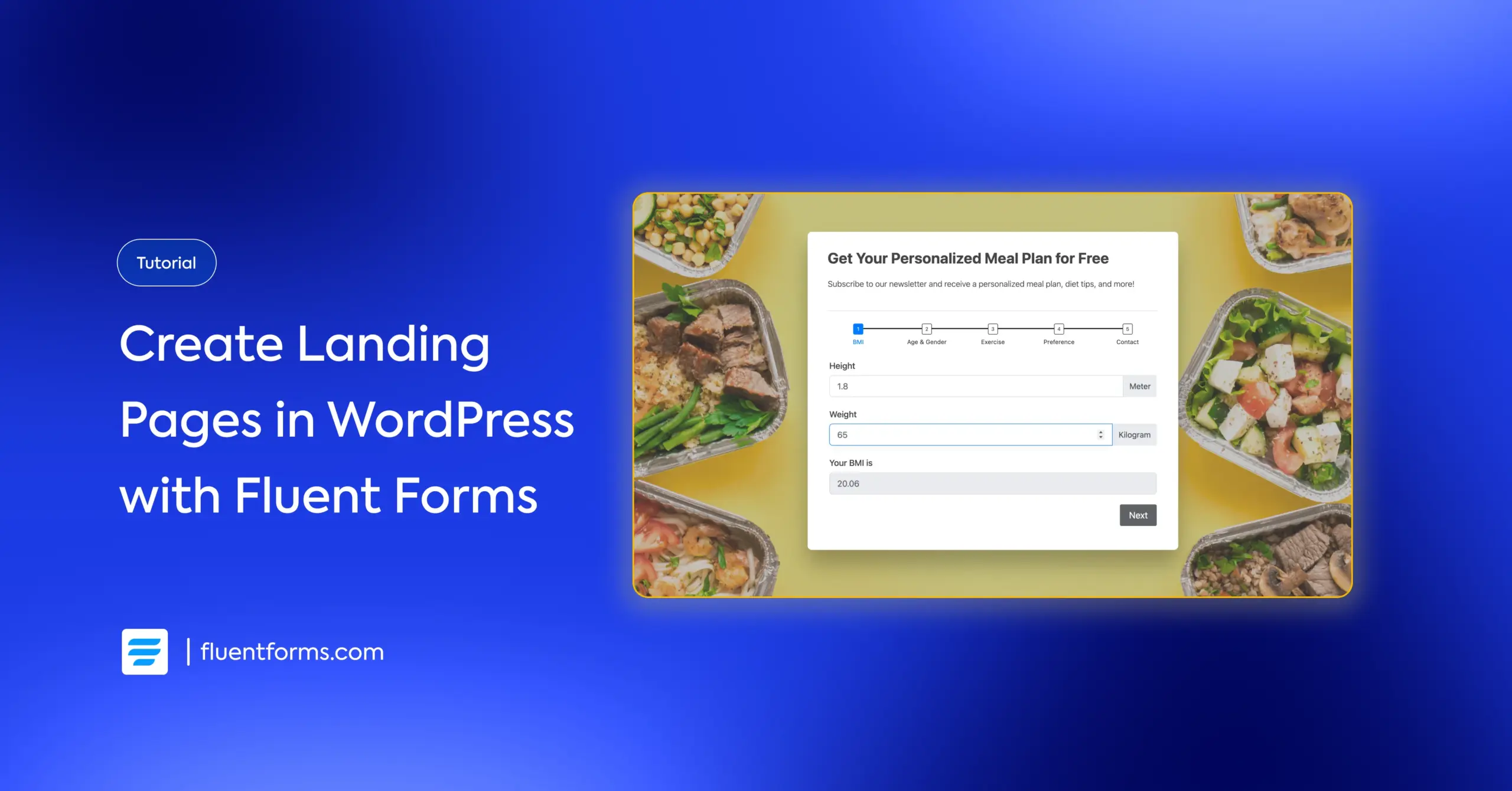
How to Create a Lead-Generating Landing Page Using Form Plugin
A landing page is one of the most effective tools for generating leads. Unlike a homepage or product page, it focuses on a single goal and guides visitors toward one specific action, making it easier to convert them.
Businesses typically use landing pages to offer something valuable in exchange for a visitor’s contact information. It can be a free ebook, template, or discount. This offer, known as a lead magnet, gives people a reason to engage and helps you build a list of potential customers to follow up with.
In this guide, I’ll show you how to create a lead-generating landing page in WordPress using Fluent Forms. We’ll cover what a landing page is, how to set one up step by step, and the best practices to help you get more conversions.
Let’s get started.
TL;DR
- A landing page is a standalone page focused on a single goal, like collecting leads or promoting a product.
- Key elements include a clear goal, a lead magnet, minimal distractions, a strong CTA, and social proof.
- You can create a landing page in WordPress using Fluent Forms Pro by enabling the Landing Page module.
- Steps: Create your form, customize the landing page design, and share it via direct URL, shortcode, or HTML embed.
- Best practices: Keep the design simple and readable, write clear and compelling copy, use high-quality & relevant visuals, and ensure mobile responsiveness.
- You can also use conversational forms as landing pages for higher engagement & conversion.
What’s a landing page
A landing page is a standalone web page created specifically for a marketing or advertising campaign. It’s where a visitor “lands” after clicking on a link from an email, ad, or other online source.
For example, if you click on this ad, “50% off running shoes,” you land on a page showing those shoes with a buy button/purchase link, not the store’s homepage.
Here are the key characteristics of a landing page:
- A specific goal: Purpose of the page, usually to get visitors to take a specific action.
- An incentive: A lead magnet, offered to motivate visitors to take the desired action.
- Minimal distractions: Usually no navigation menu or other links.
- Clear call-to-action (CTA): A button to encourage & guide users to take the action.
- Social proof: Testimonials or reviews from real users to motivate new visitors.
Landing pages are generally used for generating leads, promoting products/services, and collecting registrants for events. Companies usually offer free ebooks, templates, samples, etc., to generate leads. For sales, the typical incentive is to offer discount deals. Remember, your offer must solve your target audience’s pain points or make their life easier.
You can convert more using a landing page than product pages, since the distractions are minimal, and users stay focused through a guided navigation. Let’s see how you can easily create a landing page using Fluent Forms and start converting more.
How to create a landing page in WordPress with Fluent Forms
In this section, I’ll show you step-by-step how to create a landing page in WordPress using Fluent Forms (the fastest contact form plugin for WordPress) and easily convert more visitors. But first, if you don’t have Fluent Forms activated, these steps are for you:
- Go to your WordPress dashboard.
- Find the “Plugins” option on the left menu bar.
- Select “Add New.”
- Search for the “Fluent Forms” plugin.
- Click “Install.”
- Activate the plugin when installation is complete.
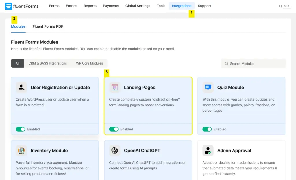
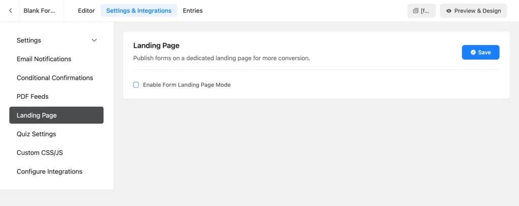
Once the plugin is activated, you need to upgrade to Fluent Forms Pro, since the landing page is a pro feature of Fluent Forms. After that, enable the Landing Page module from Integrations > Modules.
The next step is to create your form. Let’s see how.
Create your form
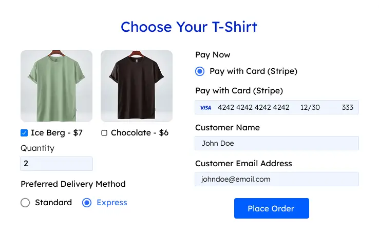
Let’s say you’re a nutritionist. You want to collect leads by offering a free personalized meal plan. You need some information to personalize the meals, which you’ll collect via this form.
Go to Fluent Forms > New Form > Create from Blank. Inside the editor, you’ll find the input fields on the right. Take the necessary fields to create your form. For example:
Numeric field: To collect height and weight, and calculate the BMI
Radio field: To collect age, gender, exercise level, etc., information
Checkbox: To collect dietary preferences, diet goals, etc.Email: To add to your subscriber list & send the meal plan.
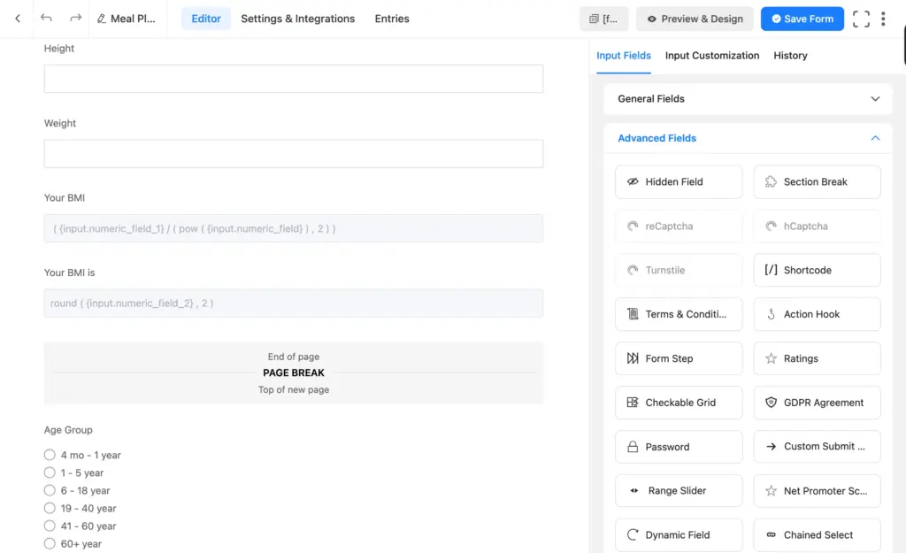
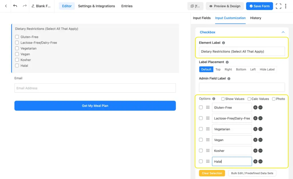
My form turned out quite long, so I decided to add some form steps. Click on an input field to customize it. Customization options include:
- Form label (form question),
- Placeholder (a light-colored text shown in the input box),
- Radio/checkbox options
- Conditional logic
- Prefix/suffix
- Help text
- Default value
- Form step title & style
- Minimum/maximum value, etc.
Once you’re done, click “Save Form.” You can style the form from the “Preview & Design” tab. When you’re happy with the style, save it. Next, I’ll show you how to create a landing page from this form.
Customize your landing page
Click on the “Settings & Integrations” tab from your form. Navigate to “Landing Page” and enable it.
Inside, you’ll find the customization options. Here’s what they mean:
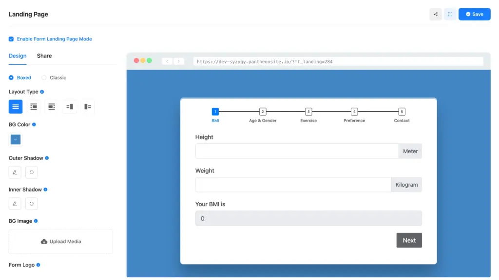
- Style: Boxed (form container assumes the form’s background color) & classic (the form container is transparent)
- Layout: Whether the form is centered or left/right aligned (you can add an image beside the form with left/right alignment)
- BG Color: Your landing page’s color
- Shadow: Options to add an outer & an inner shadow to your form (custom position, blur & spread amount)
- BG Image: The form’s background image
- Form Logo: You can upload your logo for brand recognition and visibility.
- Featured Image: This image appears as a preview when you share the page.
- Page Heading: Allows you to add a page title.
- Description: Lets you add a secondary description/copy to your page.
- Security key: Here, you can add a string of characters as a security key, which will be added to the page’s URL.
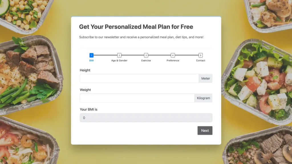
Here’s how our landing page looks after adding a background image, heading, & subheading.
Now, let’s see how we can share this landing page.
Share your landing page
Switch to the “Share” tab from your landing page settings. You’ll find the “Share Via Direct URL” option on top. Use it to share the page on socials, via email, or messages. Anyone with the URL can access your landing page and submit the form.
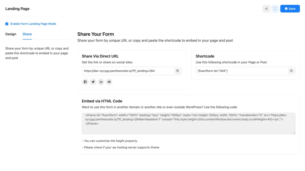
You can use the shortcode to embed the form anywhere on your site (only the form, not the page). To embed the page on your website, you have to use the HTML code provided here (at the bottom).
Now that your landing page is ready for sharing, let’s double-check if you’ve implemented all the best practices.
Lead-generating landing page best practices
This section features the proven landing page best practices. Implementing them smoothens your user journey and, as a result, improves your conversion rate.
Keep the design user-friendly
Design should be user-friendly. What does it mean?
Well, it means that rather than glittery, your design should be practical. It means that design isn’t about how the landing page looks but rather about how it feels. It should feel effortless.
For example, the texts should be easily readable. This means you should use a font size comfortable for the eyes and use a contrasting background color.
Make sure the background color isn’t too bright, or it might irritate the eye.
Maintain a logical flow throughout the form; the easy questions should come first, followed by the detailed ones. Ensure your form uses clear labels so users aren’t confused about which information is asked. Use a single column if possible (the eyes don’t have to zigzag).
Last but not least, don’t ask any unnecessary questions. The information you ask for should be worth the value you provide; otherwise, visitors will drop your form. If you ask for personal/company information, leave the field optional.
Use clear, compelling copy
An ingenious CTA copy can be a game-changer. Your copy should make them want to get what you’re offering. Make them feel inspired, curious, sentimental, or excited. Make them feel connected to your offer via the copy. Moreover, use an easy-to-understand heading, as it’s your most prominent text.
If you’re a beginner, start with two things.
- Clarity: Make sure the copy has two elements. What users will receive and what they have to do in return.
- For the CTA button: Make sure the button text finishes the sentence “I want to …” For example, submit or subscribe may not be what they want to do. But “Download My Free Ebook” is something that completes the sentence “I want to.”
You can conduct A/B tests and analyze the results. Track what’s working better and keep making changes accordingly.
Add high-quality, relevant visuals
People notice the images/visuals before the text. If your visitors are in a hurry, they take a look at the image and decide whether they should spend longer on your landing page. So if you want to create a good first impression, make sure the visuals stand out.
Use professionally taken images of people using your products/services. Make sure the photo quality is high. The colors should create a sense of trust (avoid red if possible, as people associate red with warning). Overall, make sure the visuals are in sync with the message you’re conveying.
Ensure device responsiveness
Many of your users will visit your landing page using their mobile devices (especially if they find you on social media). And you need to create a smooth navigation for them. Make sure your landing page layout is easy to scroll on all types of devices so users easily get your message and perform the required action.
Fluent Forms automatically makes your landing page device-responsive. The multicolumn layout automatically stacks the columns one below another, and the heading and copies are visible without users having to scroll right. You can view how they’re going to look on mobile devices from the landing page settings before actually sharing the page.
Bonus: Use conversational forms as landing pages
Conversational forms are becoming a popular choice for landing pages. They’re more engaging, user-friendly, and tend to have higher conversion rates than traditional forms.
Instead of showing all questions at once, conversational forms present one question at a time. This keeps visitors focused on the current step rather than overwhelmed by a long list of fields. The result is a smoother experience that feels more like a conversation than a form.
Use the welcome screen to show your landing page headline and copy. Use it to introduce your offer, explain how visitors will benefit from it, and set expectations before they begin. It’s the first thing users see, so it sets the tone for the entire experience.
As users move through the form, a progress indicator shows how far they’ve completed. This visual cue keeps them motivated, reducing drop-offs along the way.
If you want a modern, distraction-free landing page that guides users step by step, conversational forms are your go-to. Fluent Forms lets you create & share conversational forms completely for free.
Simply, start from scratch or choose from our conversational form templates. You can also convert one of your existing forms into a conversational form with a single click.
Build Smarter Forms for Free
Boost your conversion with simple landing pages
Whether you want to generate more leads or boost your sales, a landing page is your answer. But creating a high-converting landing page doesn’t have to be complicated. With Fluent Forms, you can build a professional, focused landing page without any extra tools or technical skills.
Remember, a strong landing page needs a clear goal, a compelling lead magnet, minimal distractions, and a straightforward call-to-action. Combine that with user-friendly design, persuasive copy, quality visuals, and mobile responsiveness, and you’ve got a page that’s ready to convert.
So create your form or simply start with a template, and set up your landing page now (because it’s that easy!). Don’t wait, since the sooner you do it, the sooner you start converting more of those visitors.

Sarika writes for Fluent Forms and loves to offer insights into small businesses. She’s curious and enjoys discussing ideas, interests, and perspectives. In her free time, she’s either marvelling at architectural beauties or trying different cuisines.


Leave a Reply