
Fluent Forms Accessibility Guide: Fixing aria-label Errors and Meeting WCAG Standards

Accessible forms get more completions. When every visitor can read, understand, and fill out your form regardless of ability or device, conversion rates naturally increase.
The European Accessibility Act (EAA) took effect in June 2025 for businesses selling to Europe. ADA Title II rules now require WCAG 2.1 AA for US state and local government sites. Accessibility lawsuits targeting inaccessible forms on private business websites continue to rise.
This guide will help you build accessible forms with Fluent Forms. You’ll fix common aria-label and form label errors, test built-in accessibility features, handle color contrast, and add autocomplete attributes to achieve WCAG 2.1 compliance.
TL;DR
- Fluent Forms outputs semantic HTML labels and supports keyboard navigation by default. Most accessibility features work by default.
- If audit tools flag “missing form label” or aria-label errors, check your field labels in the editor. Every field needs a visible label, not just a placeholder.
- For Name and Address fields, check sub-labels too (First Name, Last Name, Street, etc.). Each sub-field needs its own label.
- Set label placement to Top for the best screen reader experience.
- Use Fluent Forms’ Form Styler or custom CSS to ensure text and borders meet WCAG contrast ratios (4.5:1 for text, 3:1 for borders)
- Add HTML autocomplete attributes to personal-info fields using PHP filters to meet WCAG 2.1 Success Criterion 1.3.5.
- Test every form with your keyboard (Tab key), an automated tool (WAVE or axe), and a screen reader (VoiceOver or NVDA).
What WCAG Requires from Your Forms
WCAG (Web Content Accessibility Guidelines) is the international standard for web accessibility. Most laws reference WCAG 2.1 Level AA as the minimum requirement. WCAG 2.2, released in October 2023, adds a few new criteria but doesn’t replace 2.1 for legal compliance purposes.
For forms, five success criteria continuously show up in audits:
- 1.3.1 Info and Relationships (Level A): The structure and relationships conveyed visually (like a label next to an input) must also be available programmatically. This means using proper
<label>elements, not visual proximity alone. - 1.3.5 Identify Input Purpose (Level AA): Fields collecting personal information (name, email, phone, address) must declare their purpose with the HTML autocomplete attribute so browsers and assistive tech help users fill them in.
- 3.3.1 Error Identification (Level A): When a form error is detected, the error must be described in text. A red border alone is not enough.
- 3.3.2 Labels or Instructions (Level A): Every form field must have a label or instruction telling users what to enter.
- 4.1.2 Name, Role, Value (Level A): Every form control must have a name that screen readers announce (e.g., “Email Address” instead of a blank). States like ‘checked’, ‘expanded’, or ‘required’ must also be readable by assistive technology.
If your website serves customers in the EU, handles government services in the US, or operates in industries covered by accessibility regulations, meeting these criteria is a legal requirement.
How Fluent Forms Accessibility Works Automatically
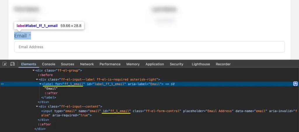
Fluent Forms generates semantic HTML for every form it renders. When you add a field in the editor and give it a label, Fluent Forms creates a proper <label> element connected to the <input> via for and id attributes. Screen readers announce these labels when a user focuses on the field.
Example: If you put “Email Address” as plain text above an input field, a sighted user sees the connection. But a screen reader doesn’t. It’s visual only. Fluent Forms uses a
<label for="email">tag tied to the input’s id, so the connection is in the code. That way, the screen reader reads it.
Here’s what happens:
- Semantic labels: Every input field type (text, email, dropdown, checkbox, radio, textarea) gets a programmatically associated label when you fill in the Element Label in the editor.
- Keyboard navigation: Users Tab through all form fields, select radio buttons and checkboxes with Arrow keys, and submit with Enter. No extra configuration needed.
- Proper aria-labels on buttons: Navigation buttons in multi-step forms (Next, Previous, Submit) include aria-labels so screen readers announce their purpose.
- Multi-step form buttons: Fluent Forms adds aria-labels to the Next, Previous, and Submit buttons in step forms. Screen readers announce “Next,” “Previous,” and “Submit” (or your custom button text) when users reach these buttons.
- Focus indicators: When a user tabs into a field, a visible border appears around it to show which field is active.
- Screen reader compatibility: Fluent Forms is tested with popular screen readers. Field labels, error messages, and required field indicators are announced.
- Accessible multiselect: The Choices.js dropdown used for multiselect fields supports keyboard interaction and screen reader announcements.
For most standard forms, these defaults mean your form is already partially accessible. The sections below cover what you need to check and configure to close the remaining gaps.
Fix aria-label and Form Label Errors
When you run an accessibility audit on a page with a form, tools like WAVE, axe DevTools, or Google Lighthouse check whether every <input> element has a programmatically associated label. If one doesn’t, you’ll see errors like:
- “Form element does not have an associated label”
- “Missing form label”
- “Empty form label”
- “aria-label attribute does not match visible text”
These errors mean a screen reader user will hear something like “edit text, blank” when they focus on the field. They won’t know what information the field expects.
In Fluent Forms, these errors come from one of three situations: a field is missing its Element Label, a compound field (like Name or Address) has sub-fields without sub-labels, or a placeholder is being used instead of a visible label.
Check your field labels in Fluent Forms
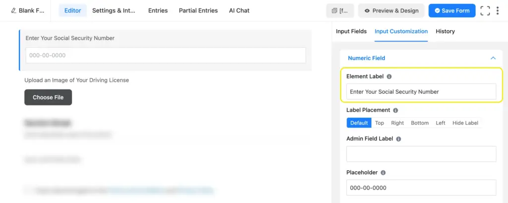
Every input field in Fluent Forms has an Element Label setting. This is the visible text above (or beside) the input, connected to it programmatically (meaning screen readers and other assistive tools read the label when a user focuses on the field). If this label is empty, the field fails accessibility checks.
To check and fix your labels:
- Open your form in the Fluent Forms editor.
- Click on each field to open its settings.
- Look for the Element Label option. Make sure it has a descriptive label (e.g., “Email Address,” “Phone Number,” “Your Message”).
- If you want a cleaner design without visible labels, hide the label visually using custom CSS, while keeping it accessible to screen readers. From your form, navigate to Settings & Integrations > Custom CSS & JS > Custom CSS and type:
.fluent_form_FF_ID .ff-el-input--label { position: absolute; clip: rect(0,0,0,0); }. Click Save CSS & JS. Visible labels are always the better choice, though.
Do not use placeholder text as a substitute for labels. Placeholders disappear when users start typing, which creates confusion. Screen readers don’t consistently announce placeholder text. And users with autocomplete enabled have no way to verify which field received which data once the placeholder is gone.
Fix label issues on Name and Address Fields
The Name and Address fields in Fluent Forms are compound fields. A single Name field generates separate inputs for First Name and Last Name (and optionally Middle Name). The Address field generates inputs for Street Address, City, State, Zip, and Country.
Each sub-field needs its own label. If a sub-field’s label is missing or empty, it triggers an accessibility error.
To check sub-labels:
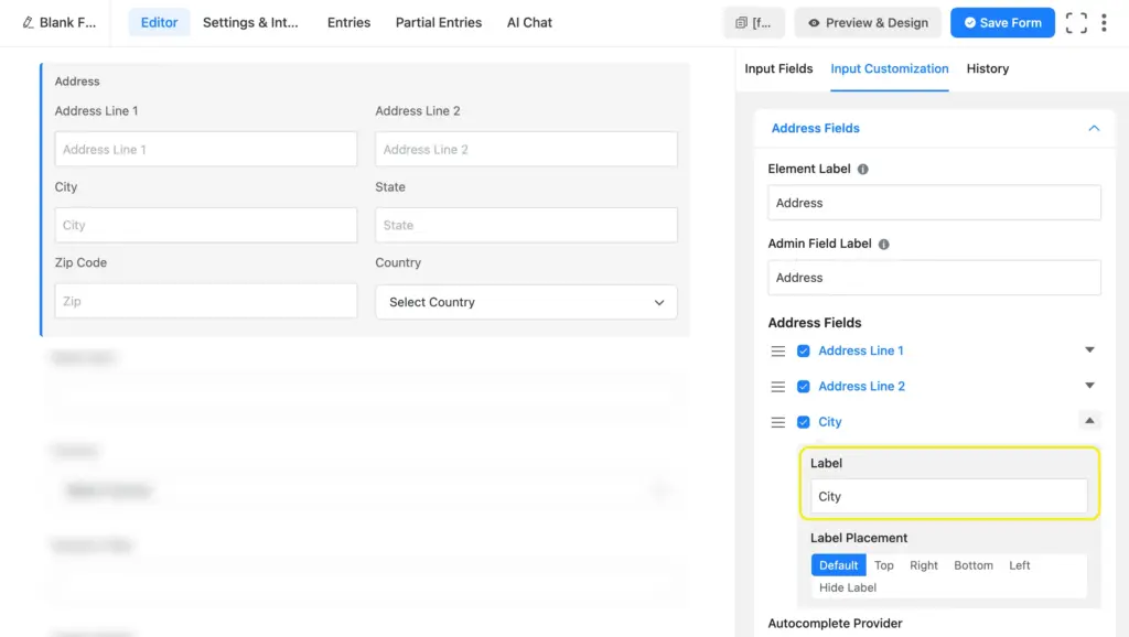
- Click on the Name or Address field in the editor.
- Open the field settings (Input Customization). You’ll see configuration options for each sub-field.
- Verify every enabled sub-field has a label text filled in.
- If you’ve disabled a sub-field’s label visibility, make sure there’s still a label value present for screen readers.
The same applies to any field generating multiple inputs from a single editor element. Always check the rendered HTML to confirm each input has its own label (right-click any field from the preview, select Inspect, and confirm there’s a <label> tag with a for value matching the input’s id).
Set Up Labels and Layout for Accessibility
Choose the right label placement
Label placement options include Top, Left, and Right. Fluent Forms lets you control label placement at three levels:
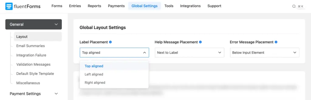
- Global default (all forms): Go to Global Settings > General > Layout > Label Placement. This sets the default for every new form on your site.
- Per-form default: Go to your form’s Settings & Integrations > Form Layout > Label Alignment. This overrides the global setting for that specific form.
- Per-field override: Click any field in the editor, open its settings, and change the label placement for that individual field. This overrides the form-level setting.
Top placement is the most accessible option, because:
- Screen readers process content in source order (top to bottom, left to right). With top-aligned labels, the label always appears before its input in the source code, so the screen reader announces the label first.
- On mobile screens, top-aligned labels stack naturally without layout issues.
- Users with cognitive disabilities find top-aligned labels easier to associate with their fields compared to side-aligned labels.
Left and right alignment work if the label is properly associated with the input via the for attribute (which Fluent Forms handles). But top placement removes any ambiguity about which label belongs to which field.
Configure error message placement
Fluent Forms offers two error message positions, configurable at both levels:
- Global default (all forms): Go t o Global Settings > General > Layout > Error Message Placement.
- Per-form override: Go to your form’s Settings & Integrations > Settings > Form Layout > Error Message Position.
The two options:
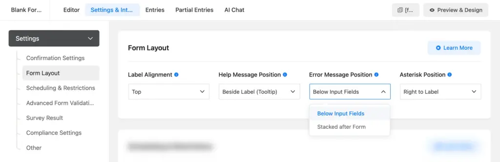
- Below Input Fields (called “Below Input Element” in Global Settings): The error appears directly under the field that caused it. This is the better choice for accessibility. Users see (and hear, via screen readers) which field has the problem and what they need to fix.
- Stacked After Form (called “Stack to Bottom” in Global Settings): All errors appear in a list after the submit button. Users have to scroll back up to find and fix each issue, which is harder for everyone and especially difficult for screen reader users.
Set your global default to Below Input Element in Global Settings > Layout. Override at the form level if a specific form needs different behavior.
Set asterisk position for required fields
Control asterisk placement for a specific form in Settings & Integrations > Settings > Form Layout > Asterisk Position. Options are None, Left to Label, and Right to Label.
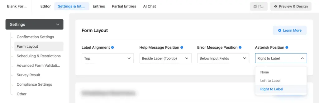
A couple of things to keep in mind:
- Don’t set it to “None” unless you have another way of indicating required fields. Users need to know which fields are mandatory before they start filling out the form.
- Don’t rely on the asterisk alone. WCAG’s “use of color” criterion applies to visual indicators too. Add a note at the top of your form explaining what the asterisk means (e.g., “Fields marked with * are required”). Fluent Forms’ required field validation already handles the programmatic side, so screen readers announce when a required field is left empty.
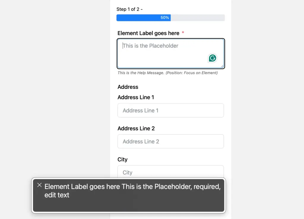
Choose the right help message position
Help messages are the short instructions you add to a field to guide users (e.g., “Enter the email you used to register”). Fluent Forms gives you four placement options at the form level (Settings & Integrations > Settings > Form Layout > Help Message Position) and two at the global level (Global Settings > General > Layout > Help Message Placement).
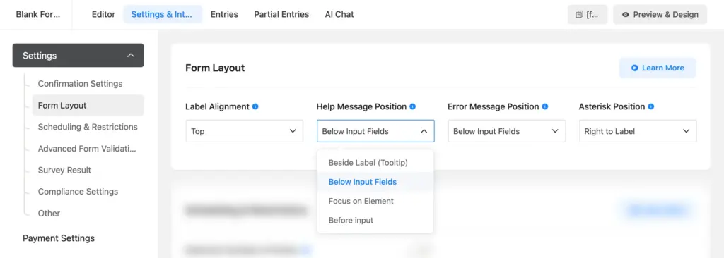
Form-level options:
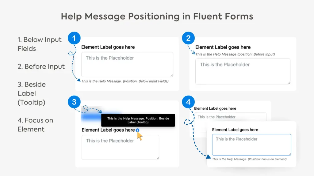
- Beside Label (Tooltip): The help text appears as a small icon next to the label. Users hover over the icon to see it. Looks clean, but screen reader support for tooltips is inconsistent. Users who don’t hover over the icon will miss the instruction entirely.
- Below Input Fields: The help text appears directly under the field, always visible. Best for accessibility. Screen readers announce it, and sighted users see it without extra interaction.
- Focus on Element: The help text appears when the user clicks into or tabs to the field. Works for keyboard and screen reader users, but sighted users won’t see the instruction until they’ve already selected the field.
- Before Input: The help text appears above the input but below the label. Always visible, accessible to screen readers.
Global-level options: Next to Label or Below Input Element.
For accessibility, Below Input Fields (form level) or Below Input Element (global level) are the safest choices. The help text stays visible, screen readers pick it up, and users don’t need to hover or click anything to read it.
Improve Color Contrast With Form Styler
WCAG requires specific contrast ratios between text and its background:
- At least 4.5:1 for normal text (under 18pt or 14pt bold)
- At least 3:1 for large text (18pt+ or 14pt+ bold) and for active UI components like input borders
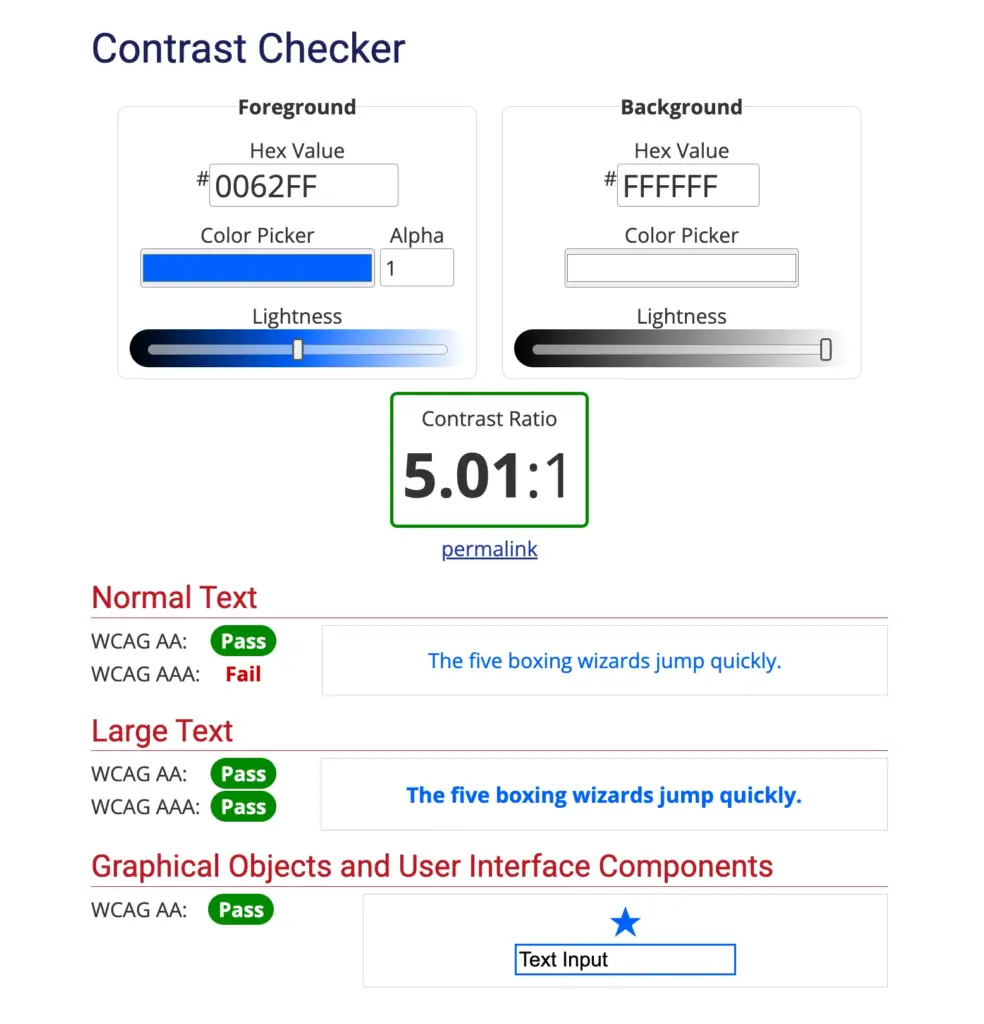
Low contrast is one of the most common accessibility failures on the web. Light gray labels on a white background, thin light borders on input fields, or low-contrast placeholder text all fail these ratios.
To check your form’s contrast, use a free tool like the WebAIM Contrast Checker. Enter your foreground and background color values (hex code), and it tells you whether they pass.
Adjusting colors in Fluent Forms
If you’re using Fluent Forms Pro, the Advanced Form Styler lets you customize colors directly. Go to your form’s editor and open the Preview & Design tab to access the styler. You can edit:
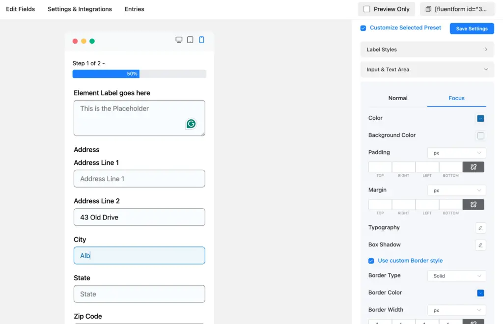
- Label text color: Make sure it has at least 4.5:1 contrast against your page background.
- Input field border color (both normal & focus state): Needs at least 3:1 contrast. A common fix is switching from light gray (#ccc) to a darker gray (#767676 or darker).
- Input field text & background color (both normal & focus state): Requires a minimum of 4.5:1 contrast.
- Placeholder text color: Also needs 4.5:1 contrast. Most default placeholder colors fail this. Adjust it in the styler or with CSS.
- Error message color: Red on white usually passes, but check your specific shade. Some lighter reds don’t meet 4.5:1.
- Submit button: Button text against button background must meet 4.5:1. Button background against page background needs 3:1.
If you’re on the free version, get the same results with custom CSS in Settings & Integrations > Custom CSS / JS. After making changes, run the contrast checker again on the live form to confirm your values pass.
Add Autocomplete Attributes for WCAG 1.3.5
WCAG 2.1 Success Criterion 1.3.5 (Identify Input Purpose) requires form fields collecting personal information to declare their purpose programmatically. The standard way to do this is with the HTML autocomplete attribute.
When an email field has autocomplete="email", the browser auto-fills the user’s email address. For users with motor disabilities who rely on eye-tracking or switch devices, this saves significant effort. For users with cognitive disabilities, it reduces the chance of entering information in the wrong field.
Fluent Forms doesn’t add autocomplete attributes by default. You add them using PHP filter hooks.
How to add autocomplete attributes:
- In your form, click on the field you want to add autocomplete to (e.g., your Email field).
- Open Advanced Options and note the field’s Name Attribute (e.g.,
emailorinput_text). - Add a PHP snippet to your theme’s
functions.phpor use a code snippets plugin. Here’s an example for an email field:
add_filter(
  'fluentform/rendering_field_data_input_email',
  function( $field ) {
    if (isset( $field['attributes']['name'] )
      && $field['attributes']['name'] === 'email' ) {
      $field['attributes']['autocomplete'] = 'email';
    }
    return $field;
  }
);
Only add autocomplete to fields asking for the user’s own personal information. Don’t add it to fields asking about someone else (e.g., “Emergency contact name”).
Test Your Forms for Accessibility
Run an automated audit
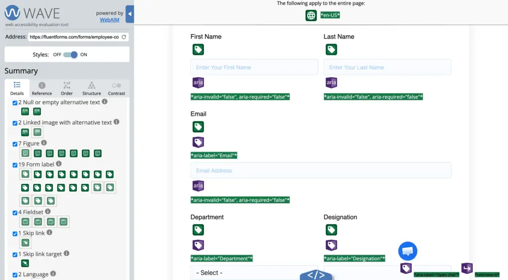
Automated tools are a fast first pass. They catch structural issues like missing labels, low contrast, and missing autocomplete attributes. But they only find about 30-40% of accessibility problems. You still need manual testing.
Three free tools that work well:
- WAVE: Paste your page URL or use the browser extension. Shows errors directly on the page with visual icons.
- axe DevTools (browser extension): Open Developer Tools > axe tab, scan the page. Groups issues by severity and links to WCAG criteria.
- Google Lighthouse: Built into Chrome DevTools. Run an accessibility audit from the Lighthouse tab. Gives a score and a list of specific issues.
After fixing issues, run the audit again to confirm the errors are resolved.
Test with your keyboard
Try to complete the form using only your keyboard.
- Tab to move forward through fields.
- Shift + Tab to move backward.
- Space to check/uncheck checkboxes.
- Arrow keys to move between radio button options.
- Enter to submit the form.
Watch for these problems: Is the focused field visible? (If not, the focus indicator is missing.) Do you reach every field? (If a field gets skipped, its tab order is broken.)
Test with a screen reader
Screen reader testing takes a few extra minutes but catches issues that automated tools miss.
- macOS: Press Cmd + F5 to turn on VoiceOver. Use Tab to move through the form. Listen to what gets announced.
- Windows: Download NVDA (free, open source). Launch it, then Tab through your form.
What to listen for:
- Does the screen reader announce each field’s label when you focus on it?
- Does it say “required” for mandatory fields?
- After a failed submission, does it announce the error messages?
- For multi-step forms, does it announce the step navigation buttons?
If any field is announced as “edit text, blank” or “edit,” the field is missing its label.
Accessibility Checklist for Fluent Forms
Use this checklist before publishing any form:
Labels
- Every field has a visible Element Label (not just a placeholder).
- Name and Address sub-fields each have their own labels.
- Labels describe what the field expects.
Layout
- Label Alignment is set to Top in form layout settings.
- Help Message Position is set to Below Input Fields (or Before Input).
- Error Message Position is set to Below Input Fields.
- Required fields show an asterisk with a note explaining its meaning.
Color and contrast
- Label text meets 4.5:1 contrast ratio.
- Input borders meet 3:1 contrast ratio.
- Placeholder text meets 4.5:1 contrast ratio.
- Error messages are readable with sufficient contrast.
- Submit button text and background meet 4.5:1 contrast ratio.
Keyboard and screen reader
- All fields are reachable with Tab key.
- Focus indicators are visible on every field.
- Form is submittable with Enter key.
- Screen reader announces all field labels correctly.
- Error messages are announced after a failed submission.
Autocomplete
- Name, email, phone, and address fields have autocomplete attributes.
- Autocomplete is only applied to fields asking for the user’s own information.
Testing
- Automated audit completed (WAVE, axe, or Lighthouse).
- Keyboard-only testing completed.
- Screen reader testing completed.
Make Every Form Accessible to Every User
Fluent Forms accessibility features automatically handle the foundation: semantic labels, keyboard navigation, screen reader support, and aria-labels on form buttons. On your end, check your labels, pick the right layout options, adjust contrast, add autocomplete attributes, and test before you publish.
Cross-match with the checklist above on your next form. Most fixes take less than five minutes each. Your forms will be more usable, compliant, and completed.
Build Smarter Forms for Free

Sarika writes for Fluent Forms and loves to offer insights into small businesses. She’s curious and enjoys discussing ideas, interests, and perspectives. In her free time, she’s either marvelling at architectural beauties or trying different cuisines.


Leave a Reply