12 Best Contact Page Design: Create a Contact Page Like a PRO

Ever wondered why reputed businesses put a lot of effort into creating the best contact page design?
Simply because the benefits associated with a Contact Page are HUGE!
A business website without a Contact Us page is just like a house with no door at all!
While you’re doing business but giving no importance to a Contact Us page, then you’re missing out on a lot of potentials.
So, this is pretty clear why companies consider a Contact Page crucial. A contact page not only allows your customers to get connected with you directly but also shows a company’s credibility, reliability, and values.
In this article, you will learn the WHAT, WHY, and HOW of a Contact Page comprehensively.
Keep on rolling.
What is contact us page & why it’s so crucial
The definition of the “Contact US” page is simple and straight. This is a web page found on the website that helps visitors directly get in touch with the website owner, business, or organization. The purpose of the contact page is to let users ask questions, inquire, or do any other kinds of communication.
Having a “Contact US” page on your website is crucial for your brand. This page is important because it allows users to get connected with your business without leaving their browsers.
Also, this page offers an opportunity to capture potential leads and sweeten customer service. Through this page, visitors can leave feedback or ask questions about your products or services.
So, by utilizing this page, you can get valuable information about your ideal customer’s preferences and expectations so you can make better business decisions.
Let’s have some reasons why creating the best contact page design is essential for your business.
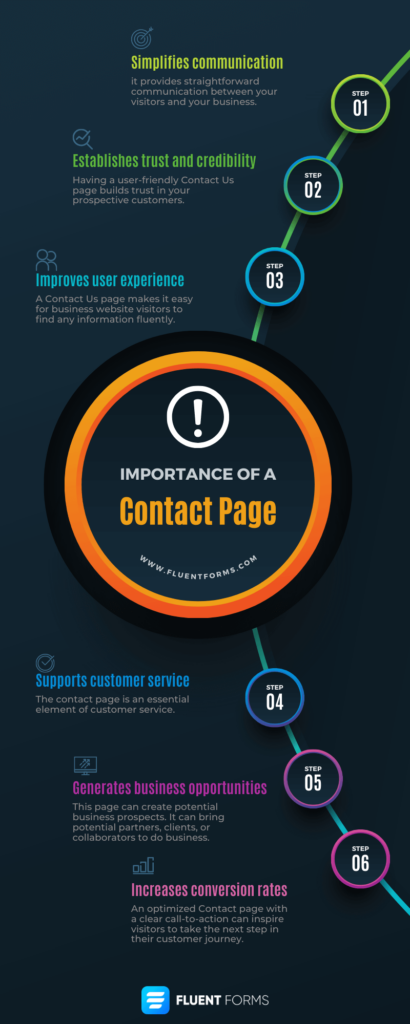
- Simplifies communication: It provides straightforward communication between your visitors and your business.
- Establishes trust and credibility: Having a user-friendly Contact Us page builds trust in your prospective customers.
- Improves user experience: A Contact Us page makes it easy for business website visitors to find any information fluently.
- Supports customer service: The contact page is an essential element of customer service.
- Generates business opportunities: This page can create potential business prospects. It can bring potential partners, clients, or collaborators to do business.
- Increases conversion rates: An optimized Contact page with a clear call-to-action can inspire visitors to take the next step in their customer journey.
What should be your contact us page content
You might be wondering what should be your contact us page content or contact page text that stands out. Here’s a list of ideas you can employ to create the best contact page design.
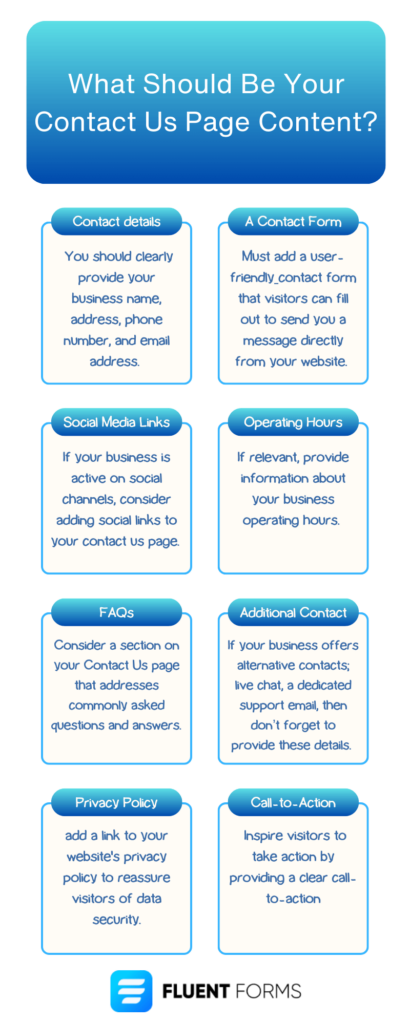
- Contact Details: You should clearly provide your business name, address, phone number, and email address.
- An Easy Contact Form: Must add a user-friendly contact form that visitors can fill out to send you a message directly from your website.
- Social Media Links: If your business is active on social channels, consider adding social links to your contact us page.
- Operating Hours: If relevant, provide information about your business operating hours.
- Frequently Asked Questions: Consider a section on your Contact Us page that addresses commonly asked questions and answers.
- Additional Contact Methods: If your business offers alternative contacts; live chat, a dedicated support email, or particular department contacts, then don’t forget to provide these details.
- Privacy Policy: add a link to your website’s privacy policy to reassure visitors of data security.
- Call-to-Action: Inspire visitors to take action by providing a clear call-to-action.
- Thank You Message: After visitors submit a contact form or reach out to you using other methods, consider displaying a thank you message.
Keep in mind that the best contact page design should be clear and concise, informative, and obviously user-friendly. And your contact us page content may vary based on your need or your business type.
Now let’s get to learn what are some of the best practices you should also employ in your contact us page design.
What are some Contact Us page best practices
The best contact page designs typically:
- Are effortless to find, so your visitor can quickly get in contact with you.
- Demonstrate why someone should get in touch with your business.
- Explain how your enterprise can help visitors solve their problems.
- Have an email and phone number so visitors can reach you on their first shot.
- Contain a short contact form using fields that’ll help you understand who’s contacting.
- Include an effective call-to-action to provide visitors with an alternative or engage them to take a specific action.
- Leverage key contact forms design stuff— like user-friendly formats and clear layouts to create an enhanced user experience for the visitors.
- Display the business’s thought leadership, maybe by including recent blogs or articles about the company in the press.
- Link to active social platforms like Twitter, Facebook, and LinkedIn to give visitors alternatives to engage with the business.
- Redirect to a Thank You page after a certain action is taken like submitting the contact form.
- Promote valuable content and resources.
- Are innovative and unique that allows visitors to associate contacting your business with a positive memory.
- Showcase what your business does so visitors and potential customers can get an idea of the work you do before they even reach out to you.
- Omit unnecessary fields and words, so your page remains as clear and straight.
Now that we’ve gone over the best contact page design practices let’s check examples of some of the best contact page design ideas on the web.
Time to get contact us page design inspiration.
Best contact page design: Contact Us header examples
A modern contact page design typically contains a compelling header. A catchy header pulls the visitor in and inspires them to utilize your customer support system.
Keep reading to see some of the best contact us header examples.
1. Morroni
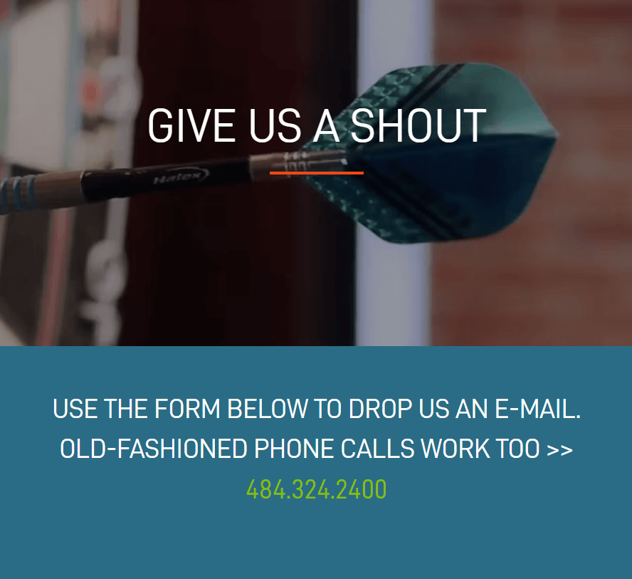
Morroni provides digital services that help businesses in digital transformation. They did a great job here by using the humor tactfully.
They know their audience very clearly and that’s why crafted the line this way. Morroni successfully captures its visitor’s attention by giving them options; in a modern and old-fashioned way.
While most people like to use a contact form, still some would love to connect via phone calls. And Morroni smartly represents their phone call option, making it stand out.
2. Yeti
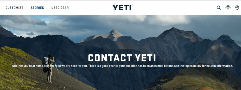
Yeti vends coolers and drinkware for outdoor activities. Anyone who loves outdoor activities would love Yeti’s contact us page design and representation. With a nice background, the text draws the visitor’s attention.
Yeti knows well what their business is all about and how people would ask for help. So, Yeti categorized their support topic that helps their customers to get relevant support instantly. And the line they crafted conveys all they want.
3. Moz
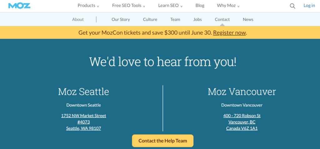
Moz is a popular name in the digital marketing industry. They know how their ideal customers would like to interact with them.
The simple headline here on the Moz’s contact us page draws and welcomes visitors to get connected instantly. Upon clicking the “Contact the Help Team” button visitors can describe their problem or query in a simple form and then get help.
4. Scribd
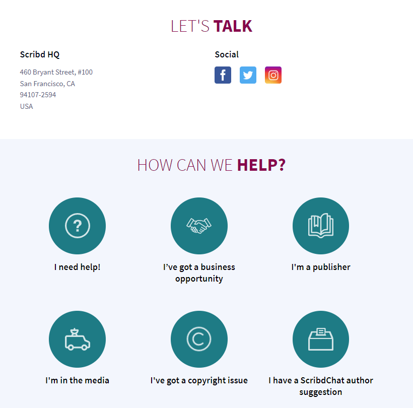
Scribd is a very popular digital library that lets visitors read and enjoy numerous books, articles, slides, magazines, etc.
Like any other Scribd page, their contact us page design is also engaging. They simply put a copy in a conversational way. The simple “Let’s Talk” give a sense of starting a warming conversation.
And then they categorized support topics so that they can get filtered queries from different visitors. This approach ensures swift customer support for the users.
5. Foundation
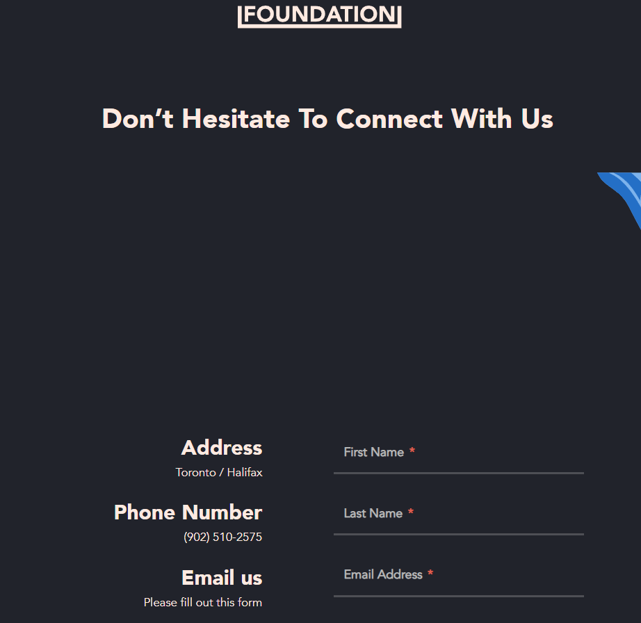
Foundation is a content marketing service provider. The way Foundation crafted its contact us page design is fantastic.
The headline is compelling enough to draw the attention of the visitors who need help. The line “Don’t Hesitate To Connect with Us” gives visitors a sense of welcoming and frank conversation.
Anyone would find this page simple and user-friendly. And that makes this contact page stand out.
Done with the contact us header examples?
Now Here are a few more alternative examples of saying “Contact Us”.
Instead of saying “Contact Us”, you can also say:
- Drop Us a Line
- Reach Out Anytime
- Let’s Chat
- Our Team’s Here To Help
- How Can We Help
At this point let’s have some of the best contact page design inspiration.
7 Best contact page design examples
Here’s the list of top contact page design ideas you can utilize for your business.
1. Tune
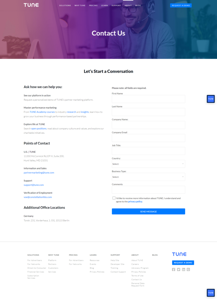
There’s no way we don’t put Tune In on our list of best contact page designs. Tune did everything excellent; beautiful overall design, effective call-to-action, and clear contact information.
The contact form Tune includes is clean and straightforward which ensures visitors who want to get connected with specific queries.
Certainly, this page makes it user-friendly with copy like “Let’s Start a Conversation” and “Ask how we can help you”. These simple yet effective lines make the page very friendly.
The ultimate goal of this page is to help your customers and make a good relationship. And Tune held that in mind and made such a great contact us page.
2. Choice Screening
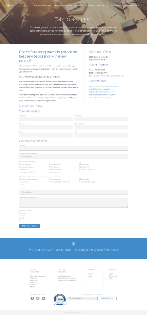
Apart from everything, Choice Screening nailed its Contact Page by writing awesome copy. What could be better than the “Talk To A Human” header?
With this catchy header, they just made a comprehensive contact us page that can delight any visitor instantly.
You might ask why their contact form is too long. But if you check the business nature of the Choice Screening, then you will understand why this page is on our best contact page design list.
3. Mateo
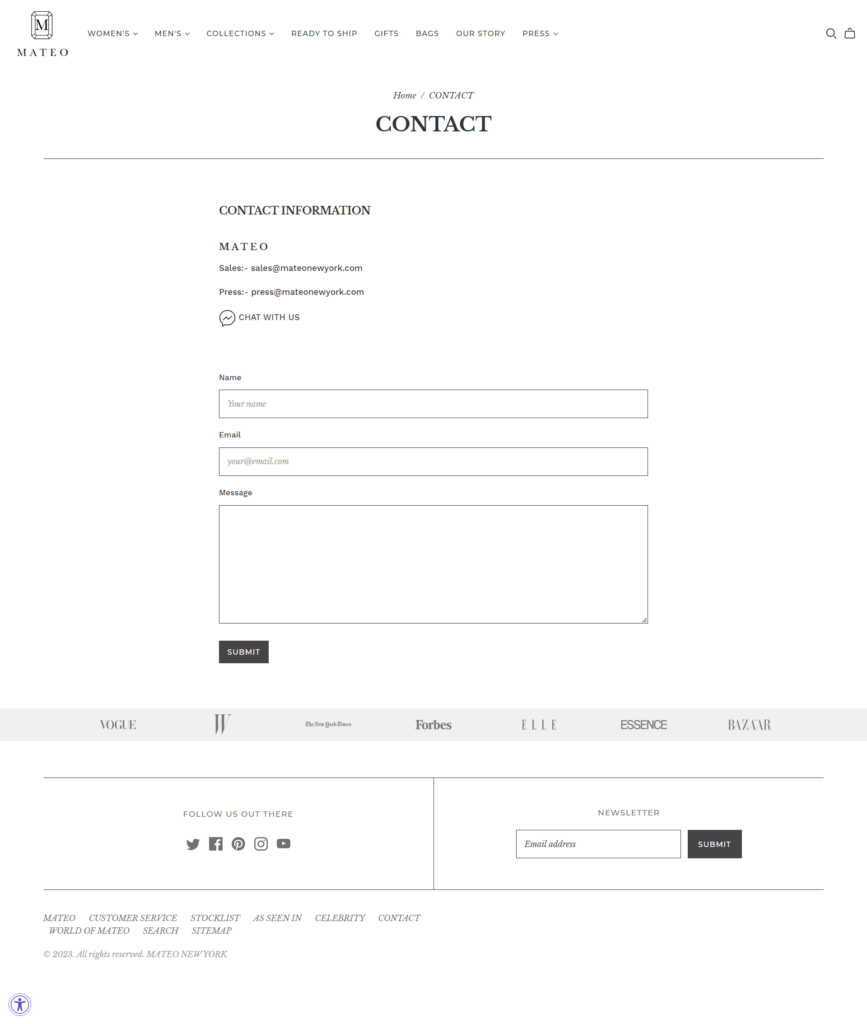
Mateo is a fashion and jewelry brand. The thing we considered adding this to our best contact page design list is that it includes all its significant partners on the page that featured Mateo’s products.
This practice establishes a sense of credibility for the brand and may be enough to give a good impression to its customers.
4. Zashadu
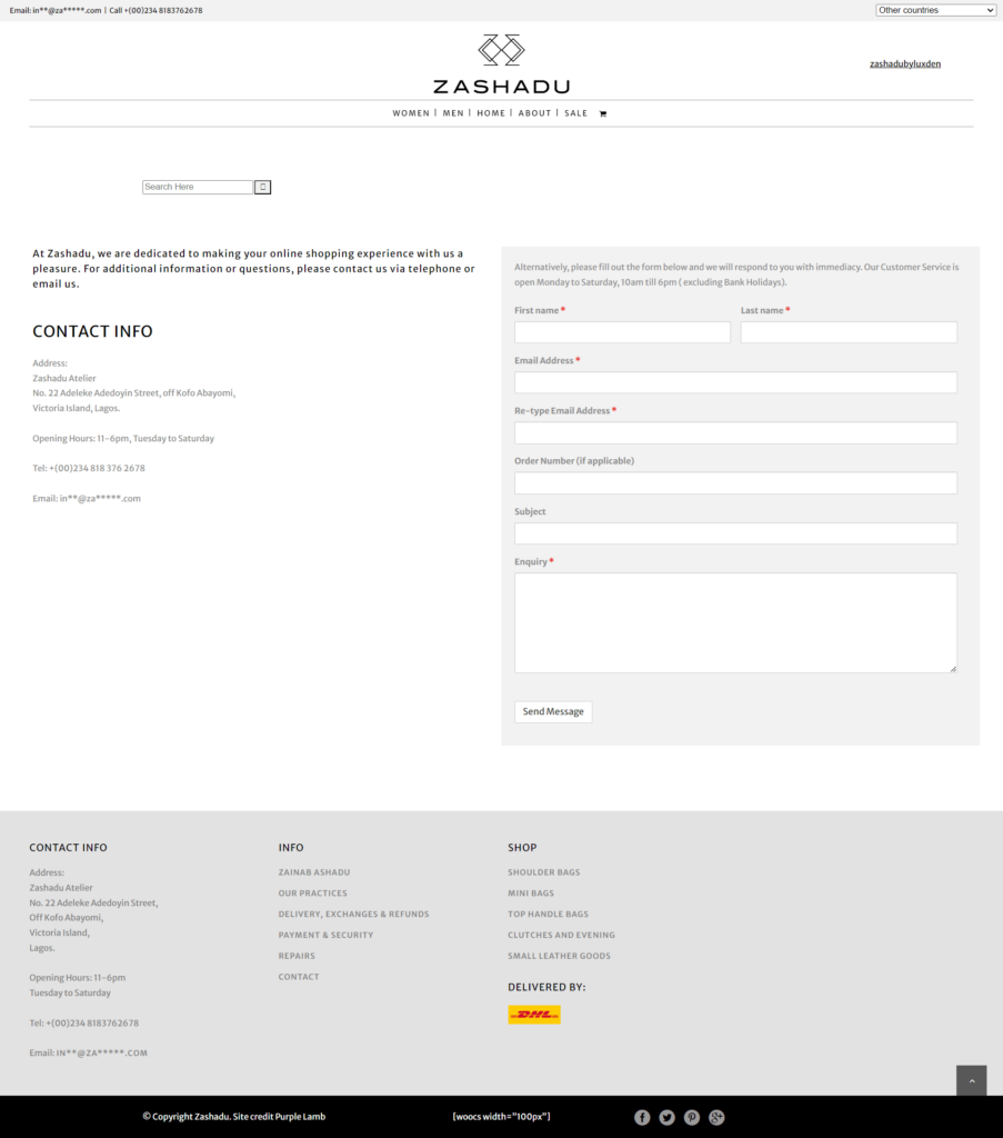
We all know simplicity is the best. And Zashadu just did that.
Zashadu is known for selling handbags and fashion accessories. They’re on our list because of their straightforward contact form.
You can reach out to the company via this contact page and use one of the many options provided in the website’s footer by default. This just makes users’ life easier.
5. ban.do
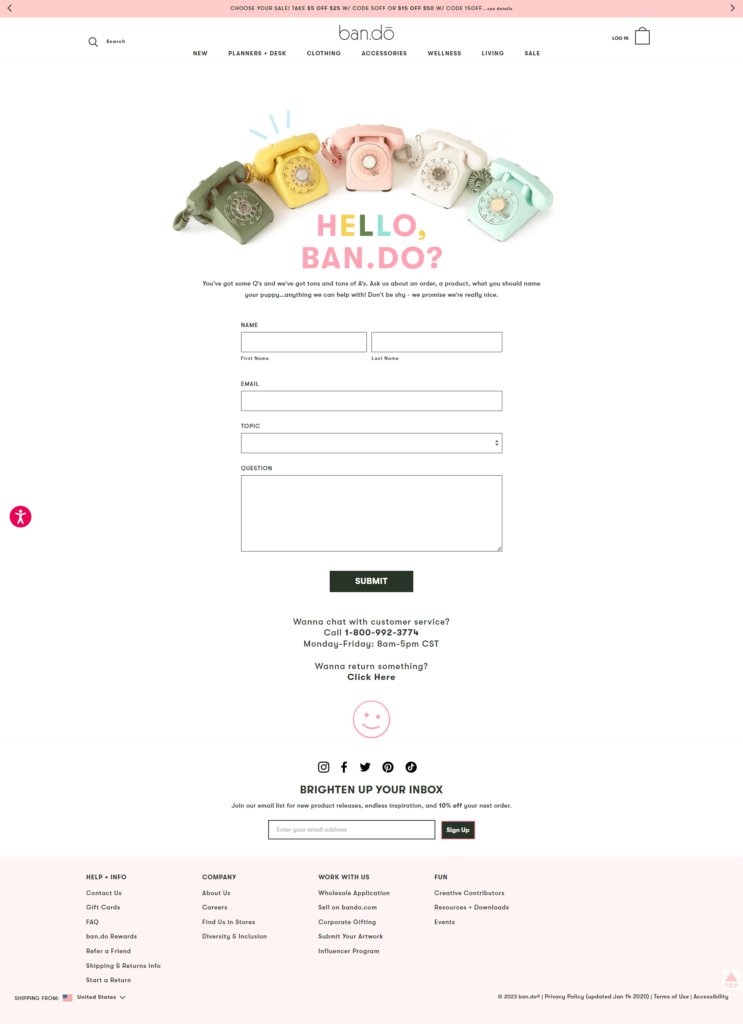
ban.do sells whimsical and creative planners, notebooks, and other accessories. Each of the web pages reflects its brand style with amusing fonts, glowing colors, and impressive animations to keep things delightful.
We considered this one of the best contact page designs available on the internet. Their contact page is designed with various fun elements, including an animation of old-fashioned, colorful phones.
While they made it fun and colorful, they didn’t miss out on the main factors. They beautifully added the contact form that includes every necessary field, all the contact details, etc.
It’s important for any brand to keep their brand’s overall theme in mind and then design any page. And ban.do just did that and showed how consistent they are in their job.
6. Gymwrap
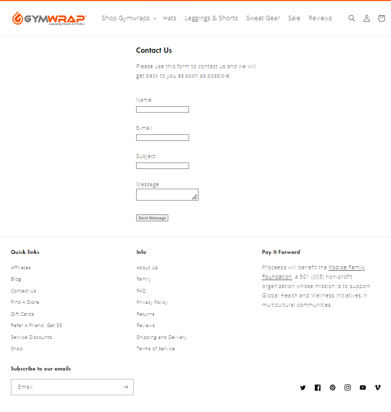
You might find this contact page design average and nothing worth noting. But what Gymwrap actually did is a tricky and praiseworthy marketing strategy.
If you closely look at the nature of the business, collecting leads by offering them a special discount from the contact page is a great strategy.
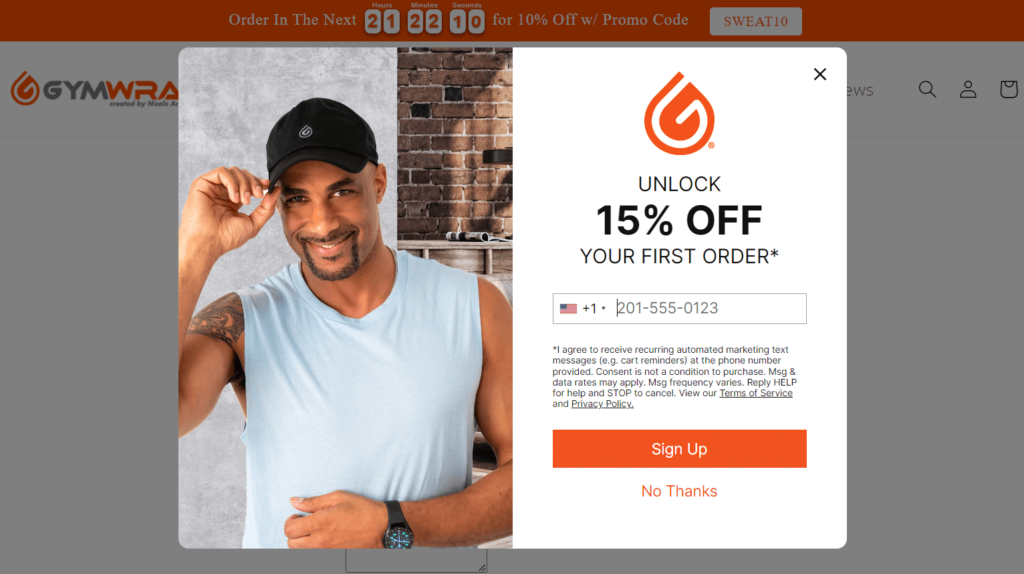
Without distracting the prospective customers’ user experience, it offers visitors an alluring discount for signing up for its newsletter.
With this clever approach, Gymwrap ensures a frustrated customer ends with happiness by providing a special discount. So, they just not only answer the customers’ queries but also make loyal customers.
7. Marvel
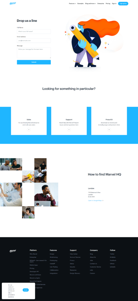
Marvel is a design software. It helps people build and produce digital products. So, Marvel always plays with color and creativity. Therefore, it’s no surprise that Marvel’s contact us page is one of the best contact page designs on the web.
Not only Marvel gives a colorful and playful appearance but it also redirects visitors to the information they are actually looking for.
You will see, in the middle of the page, there are three call-to-action visitors can pick. They categorized these three buttons for giving visitors a more sorted user experience. Also, these CTAs serve their business purpose strategically.
At this point, you know how people are making their Contact Us page and why they are some of the best WordPress contact page designs on the web.
However, did you notice that there is a common element among the list of our contact us page examples? That is the contact us form on website!
Having a Contact Form on your page is solely the most important element of the Contact Us page.
So, how would you create the best contact page design that stands out and is effective in connecting your customer with your business?
Introducing Fluent Forms; an ultimate contact form builder plugin you can use for creating your Contact Us From effortlessly.
Let’s learn how to design a Contact Page with Fluent Forms and set up a contact us form on your website.
Create the best contact page design for your business
No matter what industry are you in or what your business model is, creating an effective contact form is crucial for any business. And building a contact form with Fluent Forms is super easy.
Using Fluent Forms you can craft a contact form in just simple 5 steps. So, let’s learn to crack the steps.
5 steps to create the best contact page
In creating your contact form, your first step is going to be installing the Fluent Forms Plugin.
Step 1: Install Fluent Forms
You need to install and activate the Fluent Forms plugin on your brand’s website.
To do so, go to your WordPress dashboard. Click on “Plugins” from the left menu, and click “Add New”. And then you will catch a “Search Bar” where you need to type “Fluent Forms”.
Fluent Forms will show up as you search and all you need to do is click “Install” first and then “Activate”.
Done installing? Now you’re set to craft your contact form.
Step 2: Create a new contact form
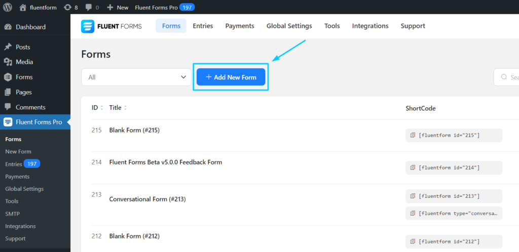
Go to your website’s dashboard and find Fluent Forms on the left menubar.
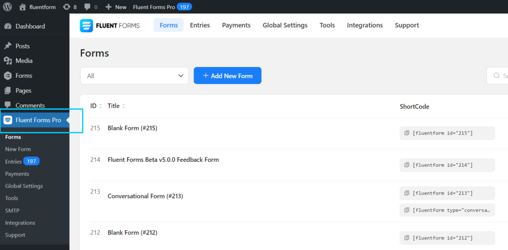
Then click on the “Fluent Forms” and you will see a “Add New Form” button to create your desired form.
Upon clicking on “Add New Form” you’ll get three options; New Blank Form, Create Conversational Form & Choose a Template.
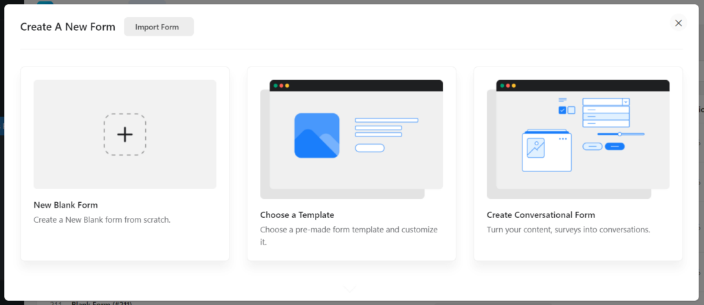
You can select any of the three options. And thanks to Fluent Forms as it allows you to convert any form into Conversational Forms whenever you want.
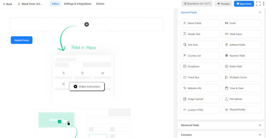
In this case, suppose you select “New Blank Form”, then you will see such an interface below:
Step 3: Add fields and Customize your contact form
Adding fields in your contact form is easy. You’ll have 50+ input fields on the right side of your screen that comes under four different categories; General Fields, Advanced Fields, Container, and Payment Fields.
To create WordPress’s best contact form, let’s try with the most common field; add the Name, Email/Phone, Subject, and Details.
You can easily customize these fields anytime, for instance, add/remove the name option, change the label placement, rename the field, show any field mandatory, and many more!
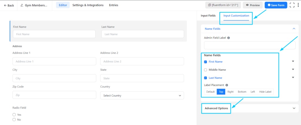
Don’t forget to check out advanced options too. You can use conditional logic to make your gym forms more professional and engaging.
Step 4: Design your contact form
Once you’ve added all the required fields in your contact form and saved the form, you have the option to preview and then design.
You can find the preview button just beside the “Save Form” button.

Upon clicking on the “Preview” button, you will have an interface with options to start designing your contact form.
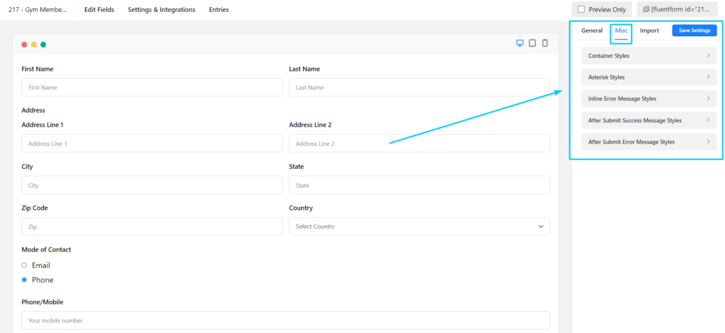
You can change your form’s style, the container color, set the margin & padding, the asterisk style, the after-submit message style, and many more.
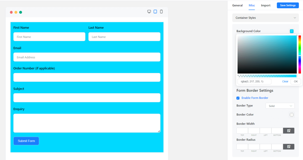
Done with designing? Now you can publish your contact form on your Contact Us page or you can also create a landing page.
Now, can’t resist mentioning another great feature of fluent form; Conversational form. You can create an interactive conversational contact form in no time. How?
Simply, go back to your Editor page. You will see a three-dot on the top-right corner of your screen. Click, then you’ll see the Convert to Conversational Forms option.
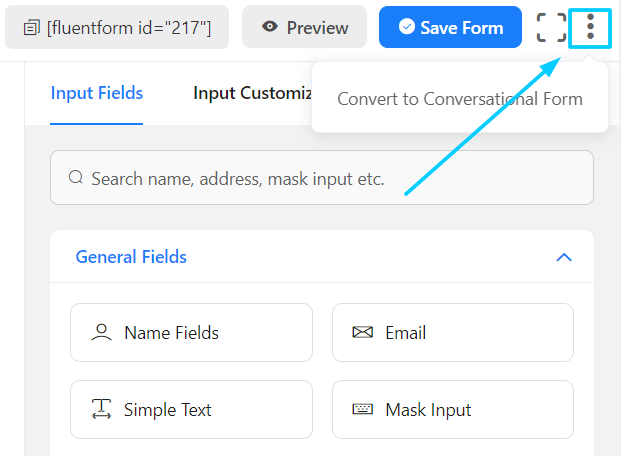
Remember that you will need to make some adjustments to make it compelling.
Step 5: Publish your contact us form and get notified
Now you are all set to publish your best contact form. You can publish your contact form wherever you want; copy the shortcode and paste it to your WordPress contact us page.
Also, you have an exciting option. You can utilize the landing page feature if you want.
To publish your contact form on your WordPress contact us page, go to “Pages” from your WordPress dashboard. You can add a new page or you can publish it on an existing page.
If you’re using Elementor, you can publish your contact form in a couple of ways. First, you can add a new block “Shortcode” and paste your form’s shortcode there.
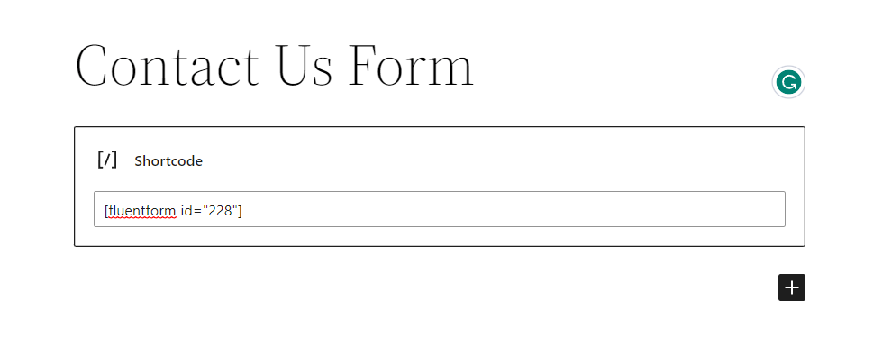
And the second one is more interesting, Elementor has “Fluent Forms” as a default element.
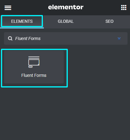
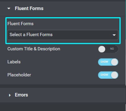
Once you added this Fluent Forms element on the page bloc, you will find an interface where you can choose which form you want to show on the website.
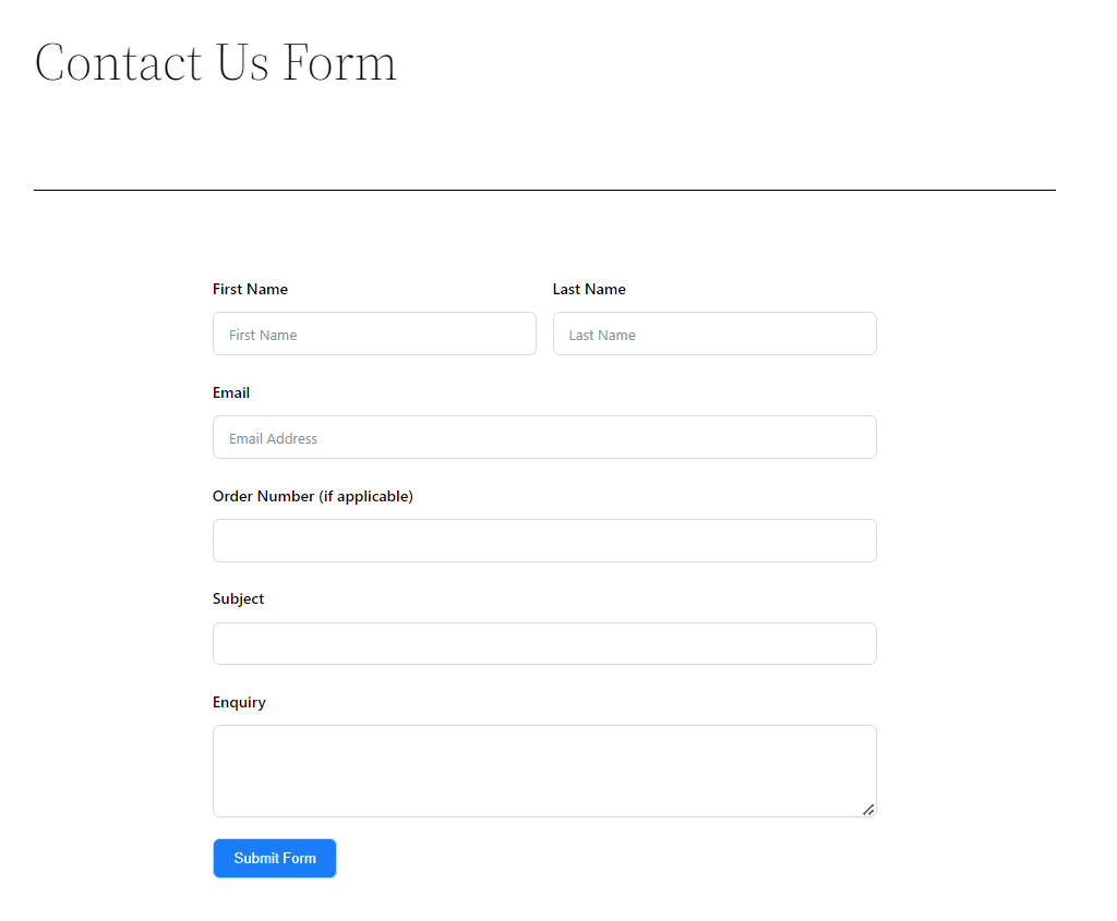
That’s all, you have your contact us form on website and ready to use.
Now let’s discuss how you can get notified whenever someone submitted your contact form to get help.
Get instant SMS notifications to stay in touch
Getting your contact form notification straight to your mobile phone would be great, right? Not only that you can also reply or remind your customers to keep them connected.
Want to enable this feature on fluent forms?
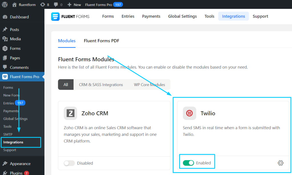
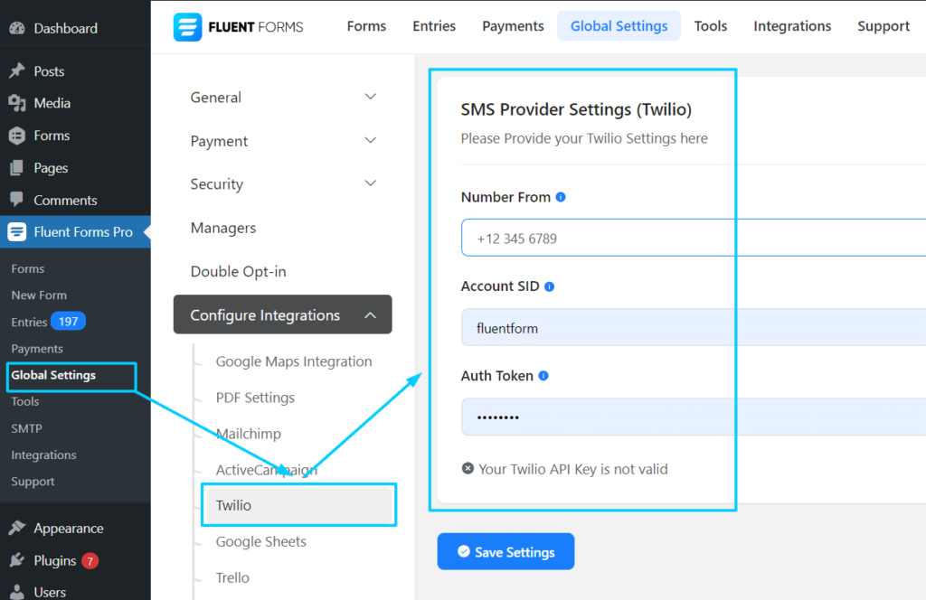
Just go to “Integration Modules” and enable “Twilio” to set notifications.
And then go to “Global Settings”, and set your preferred Number, Account SID, and Auth Token. That’s all, you will get notifications every time someone submits the contact form.
And finally,
Email notification on RSVP submission
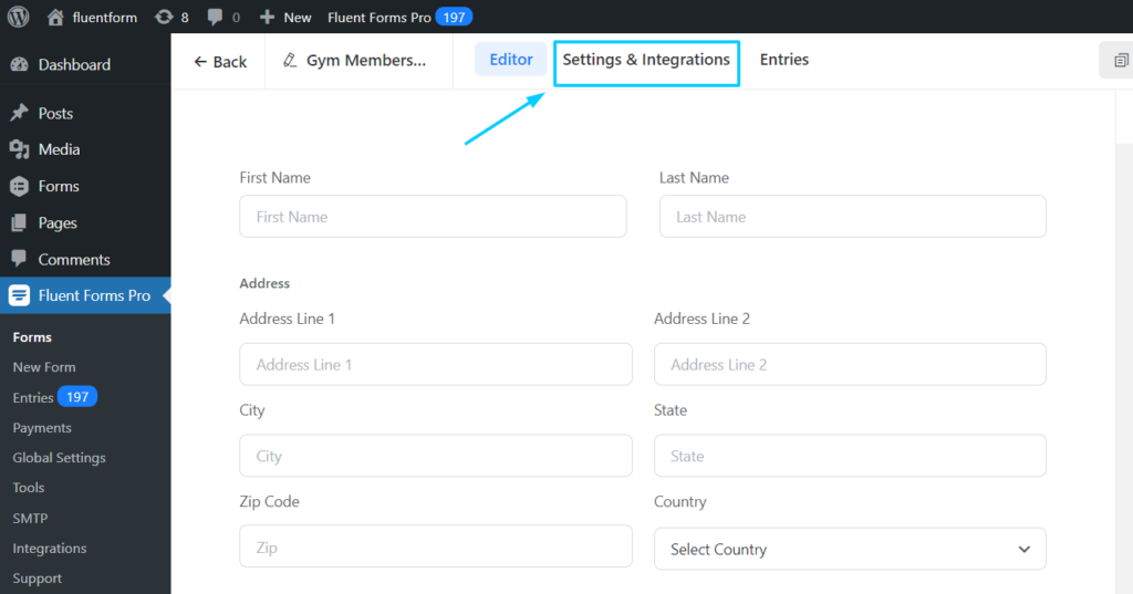
Fluent Forms also let you set Email notifications anytime.
To enable this, go to Settings & Integration.
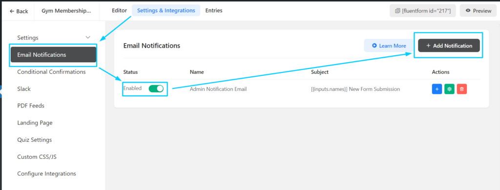
Click on Email Notifications and toggle on to enable Email notifications.
Then click on the Add Notification button to set up your preferred email.
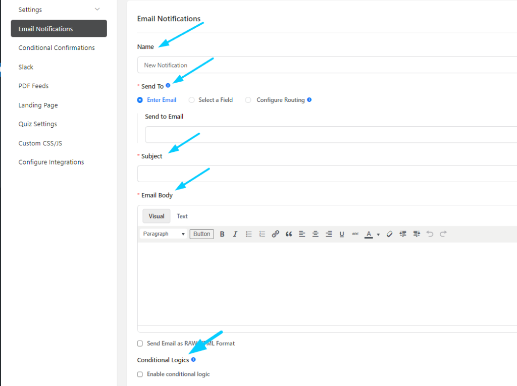
You can set the Notification Name, Send To email address, Subject, Email Body, Conditional Logic, and more.
This is very helpful if you want to send an email to your customers or get notified on your email as well.
You are all set to get a form submission notification via email.
At this point, since you know how you can create the best contact page design for your website, you might be interested in exploring some contact form templates. Don’t you want that?
Contact Form Template
Here are some customer contact form templates you might find helpful.
Customer contact form Template
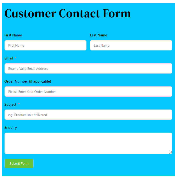
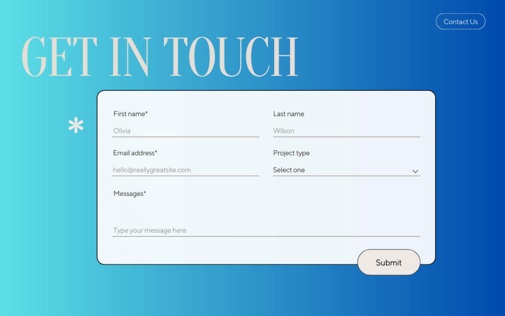
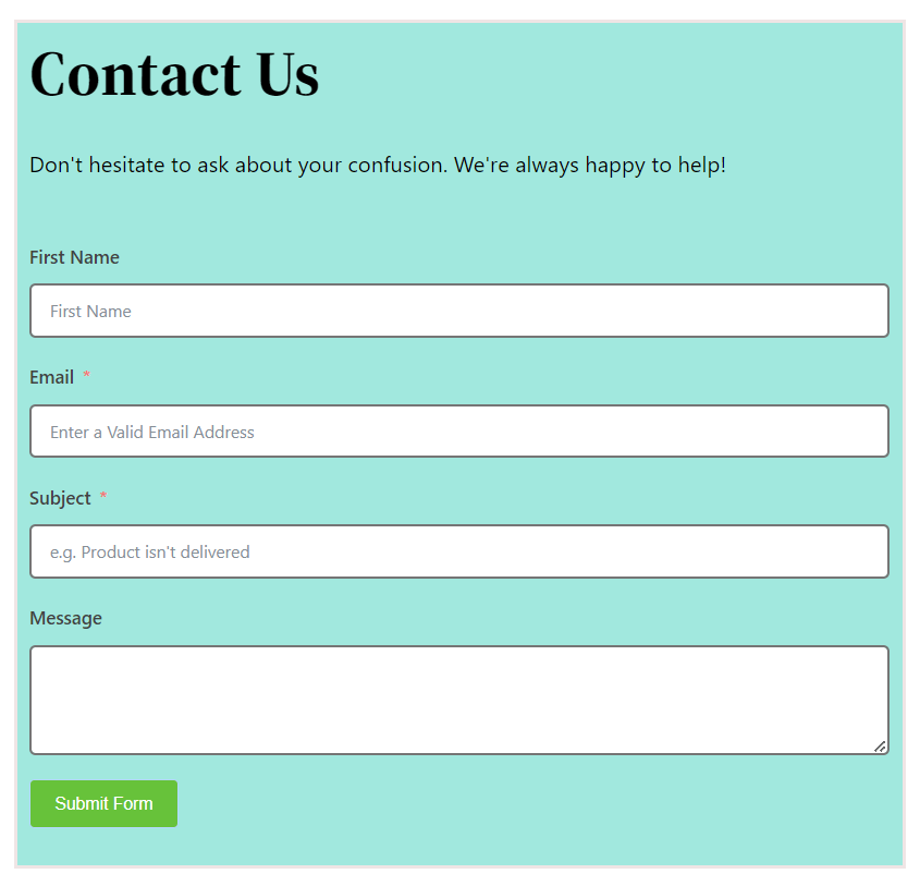
Remember to modify your customer contact form according to your business need.
Final Thoughts
Creating the best contact page design can pose a positive impact on your business.
An ideal contact page includes compelling copies and effective contact forms that kinda create a welcoming environment for your customers to share their issues with you directly.
All of the contact us pages we picked in this article are some of the best in their respective industries, and you can take ideas while creating your contact page without hesitation.
Since you already know how important creating the best contact page design for any business is, remember not to let your “Contact Page” go in vain; instead, put effort into utilizing it to establish brand value and strong customer relationships.




Leave a Reply