

Fluent Forms Selection Fields: A Complete Guide to Choosing the Right One
Fluent Forms gives you a wide range of selection fields for various purposes. Dropdown, radio, checkbox, and multiple choice cover the basics. Beyond those, there’s a ranking field for drag-and-drop ordering, a chained select for cascading dropdowns, a checkable grid for rating several things in one table, and some more built for specific jobs.
I’ll show you every one of them: what each does, the situation it actually fits, and which plan you need. By the end, you’ll know exactly which selection field to reach for the next time you’re building a form.
TL;DR
- Dropdown, radio, checkbox, and multiple choice are the four core selection fields, and all four are free.
- Dropdown and multiple-choice collapse options behind a menu; radio and checkbox show every option on the page at once.
- Checkbox and multiple choice both allow more than one answer selection, and both can limit how many options a user can pick.
- Radio, checkbox, the ranking field, and Payment Item can show an image per option. It’s a Pro feature.
- Time & Date and Numeric Field are free ways to collect an exact date or numeric value.
- Checkable grid, ranking, chained select, color picker, post/CPT selection, range slider, net promoter score, and star rating all require Fluent Forms Pro.
- Payment Item acts as a selection field for pricing, letting a buyer pick one or more priced options as radio buttons, checkboxes, or a dropdown (or a single fixed item).
Why the Right Selection Field Matters
The wrong selection field creates friction. Ten shipping options in a checkbox list mean scrolling past all of them just to compare. A yes-no question hidden behind a dropdown menu adds an unnecessary click. When users type their preferred color instead of using a color picker, you never know which shade of “navy” they want.
Consider three things before you choose: how many options there are, if users can pick more than one, and whether you should tuck the options behind a menu. That’s what decides the right field below.
Settings You’ll See on Almost Every Selection Field
Most selection fields share a few setup basics. I’ll define them once here so each field section below explains what’s actually different about it.
- Element Label: the question or prompt text a visitor sees above the field.
- Admin Field Label: an internal name for the field, useful when the visitor-facing label is long or casual.
- Label Placement: positions the label above, to the left, or to the right of the field, or leaves it at the form’s default. You can also keep it hidden.
- Options: where you add, remove, reorder, and set a default for each choice.
- Bulk Edit / Predefined Data Sets: loads a ready-made list, like countries or US states, instead of typing every option by hand.
- Container Class: a custom CSS class for styling that field’s wrapper.
- Help Message: short guidance text shown near the field.
- Name Attribute: the field’s technical name, used for URL parameters, integrations, and calculations.
- Conditional Logic: shows or hides the field based on another field’s answer. This is free at the field level.
The Four Primary Selection Fields
These four cover most forms on their own, and all four are free. The difference between them comes down to how many answers a visitor can pick and whether the options are displayed on the page or hidden behind a menu.
Dropdown
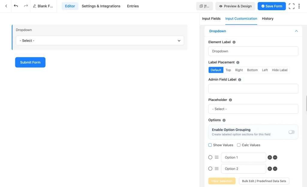
Dropdown (free) collapses every option behind a clickable menu, showing only the placeholder text. In the absence of a placeholder, it shows the first option (or the option you set as default) before users click the menu to expand other options.
It’s the right choice for a long list where showing everything on the page would overwhelm the form, like a country, a state, or a product category with 20 or more entries.
- Placeholder: text shown before a visitor picks an option, like “Select a country.”
- Show Value: attaches a separate backend value per option that’s different from the visible label.
- Calc Value: adds a hidden number to each option, useful for lead scoring or calculations without changing what the visitor sees.
- Searchable Smart Options: lets a visitor type to filter a long list instead of scrolling through it.
- Option Grouping: adds category headings to break up a long list, useful for long lists like a product catalog with subcategories.
Radio Field
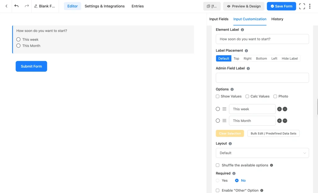
Radio Field (free) shows every option on the page at once, and a visitor picks exactly one.
It works best for a short list, usually under six/seven options, where seeing everything at a glance actually helps someone decide (and improves user experience by reducing click), like a shipping method or a satisfaction level.
- Show Value & Calc Value: attaches hidden backend values to each option, useful for lead scoring or a calculation without changing what a visitor sees.
- Photo option (Pro): adds images to options, useful for a visual choice like a product variant or a design style.
- Layout: arranges options in one to five columns, inline, or as buttons.
- Shuffle: randomizes the option order on each page load, useful for reducing order bias in a survey.
- Enable “Other” Option (Pro): adds an inline text box the moment a visitor picks Other, so you don’t need a separate text field and conditional logic to create the same functionality.
Checkbox
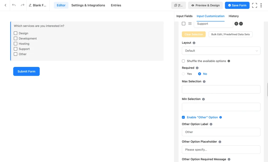
Checkbox (free) works like radio, showing every option on the page, except a visitor can pick more than one.
Reach for it whenever more than one answer is genuinely normal, like “which of these features do you need” or “how did you hear about us.”
Checkbox shares Radio’s Show/Calc Value, Photo addition (Pro), Layout, Shuffle, and Enable “Other” Option (Pro) settings, plus:
- Selection cap: sets a minimum and maximum number of options a visitor can select, so they can’t pick fewer or more than you allow. Useful for “pick exactly 3 of these 8 add-ons.”
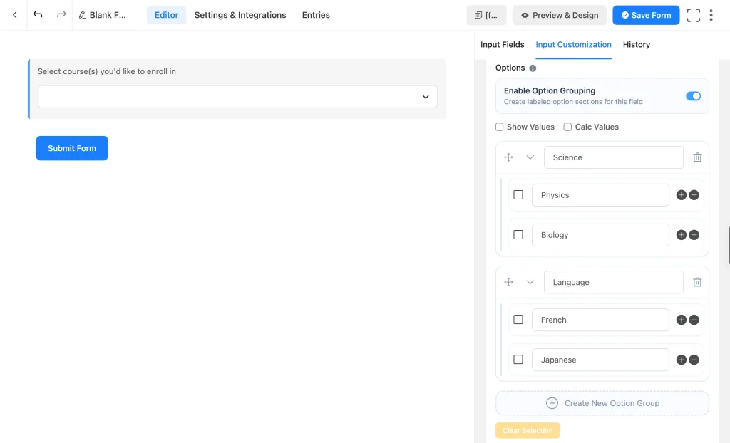
Multiple Choice
Multiple Choice (free) collapses options behind a dropdown-style menu, like Dropdown, but a visitor can select more than one answer.
It’s the field to use for a long list where more than one answer is normal but you still want the options tucked away instead of taking up page space. Useful for letting users pick several services/options from a long menu.
- Placeholder: shown before a visitor makes a selection.
- Min & Max Selection: caps how many or how few options a visitor can pick, the same kind of limit that Checkbox offers.
Which of the four you should use
You know the difference between the fields, let me give you a few example scenarios where each one fits.
- A department picker with 8 to 10 choices and one allowed answer fits Dropdown.
- A 3-option priority level (low, medium, high) fits Radio.
- “Which services are you interested in,” with under 8 options and multiple answers allowed, fits Checkbox.
- A long skills or interests list with multiple answers allowed fits Multiple Choice.
| Field | Selection | Display | Can cap selections | “Other” option | Images | Free/Pro |
| Dropdown | One | Collapsed | Not applicable | No | No | Free |
| Radio | One | Displayed | Not applicable | Yes (Pro) | Yes (Pro) | Free |
| Checkbox | Multiple | Displayed | Yes | Yes (Pro) | Yes (Pro) | Free |
| Multiple Choice | Multiple | Collapsed | Yes | No | No | Free |
Date, Time, and Numeric Selection Fields
These fields sit between “pick from a list” and “type anything.” They still restrict what a visitor can enter, just to a value rather than a predefined option.
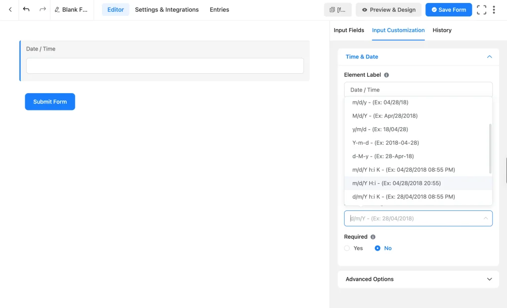
Time & Date
Time & Date field (free) captures a date, a time, or both. Users can select their preference using an interactive date picker (calendar UI).
Use it for booking a call, scheduling a delivery window, or logging when something happened.
- Date & Time Format: picks how the date, time, or both are displayed from a dropdown of standard formats (includes 12/24-hour clocks).
Numeric Field
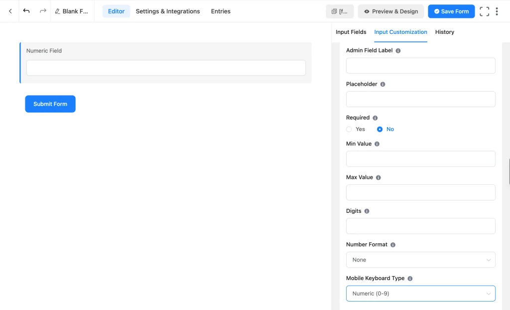
Numeric Field (free) only accepts numbers as answers. Use it for quantity, age, budget, or team size, any answer that should stay a number rather than accept text.
- Min Value / Max Value: sets the allowed range.
- Step: the increment allowed between values.
- Numeric Format: switches between EU and US decimal and thousand separators.
- Digits: caps how many digits users can enter.
- Prefix Label / Suffix Label: adds text like “$” or “kg” next to the number.
Fluent Forms Pro allows you to create calculators using a numeric field, using other fields’ numeric values and mathematical operators.
Range slider
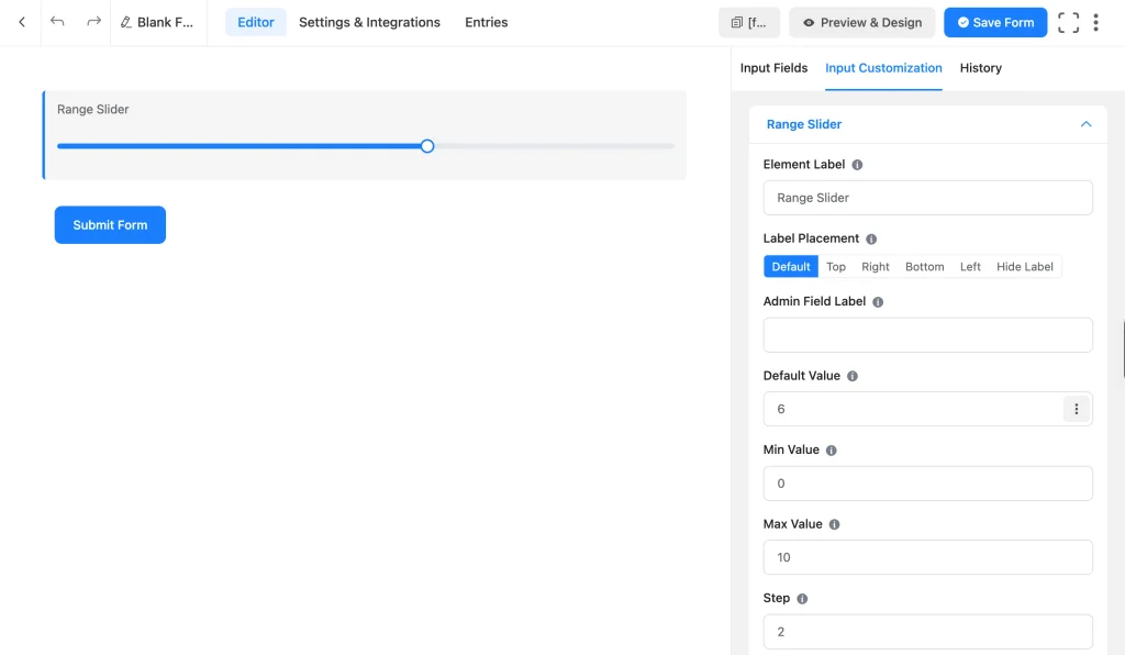
Range Slider (Pro) allows users to drag a slider handle across a horizontal scale to pick a single number value within a range you set, instead of typing it. It fits a budget range, a satisfaction scale, etc. It can also work as a product quantity field, suitable for bulk order forms.
- Min Value / Max Value: the slider’s boundaries.
- Step: the increment that the handle snaps to.
Rating and Ranking Selection Fields
These fields are suitable for qualitative measurements, a loyalty score, a quick satisfaction rating, or a preference order.
Net Promoter Score (NPS)
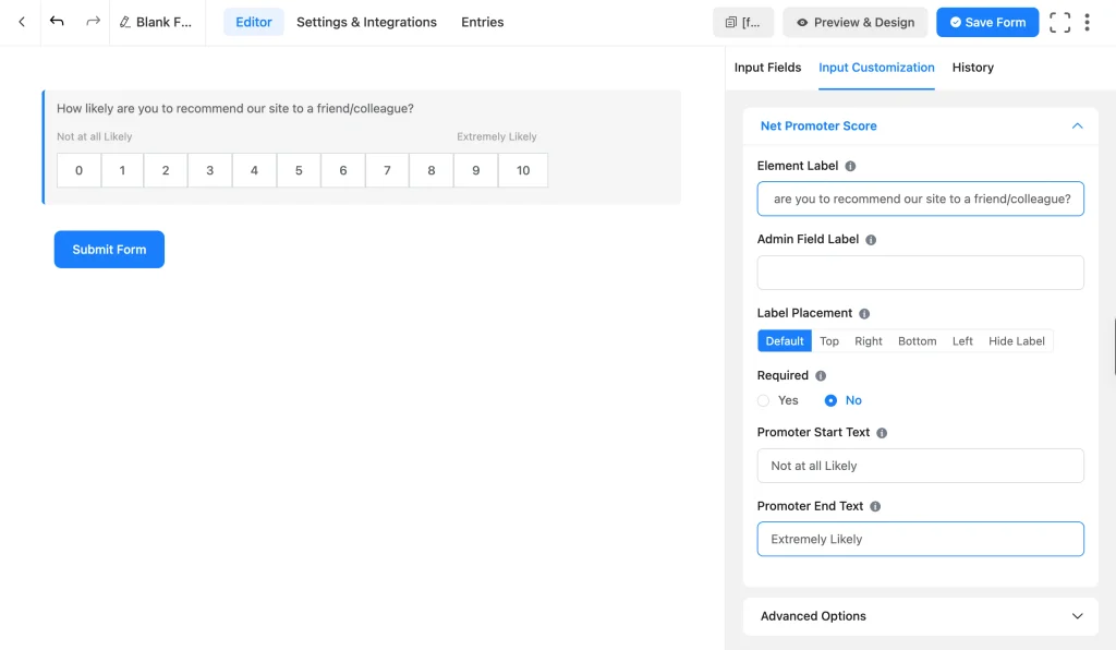
Net Promoter Score (Pro) is a 0 to 10 scale that measures how likely someone is to recommend you.
It’s the standard choice for post-purchase surveys and loyalty tracking, since NPS is a recognized benchmark you can compare across campaigns and over time.
- Start Text / End Text: customizable labels at each end, like “Not at all likely” and “Extremely likely.”
Pairing this field with a text area for the reason behind the score gives you additional context to act on.
Ratings
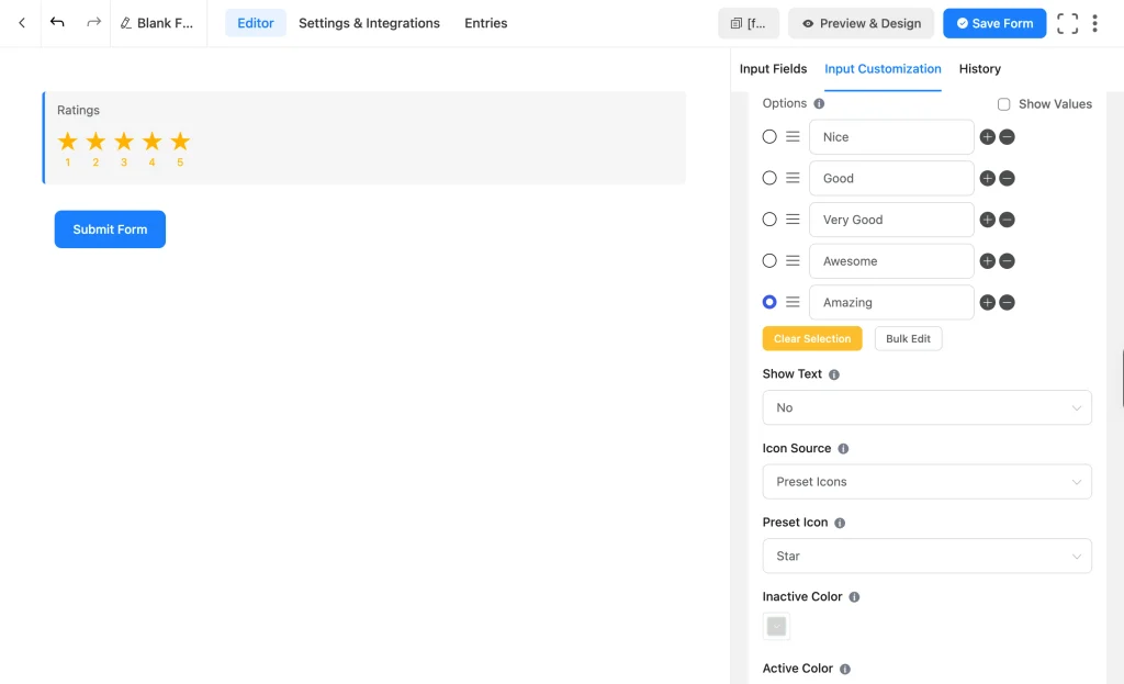
Ratings (Pro) is a row of clickable icons that a visitor clicks to rate something.
Use it for a quick, low-friction rating, like a product review or feedback on a single session, where you want an answer with almost no effort from the visitor.
- Icon Source: star (the default), heart, thumb, smile, bolt, or a custom SVG you paste in.
- Rating Levels: five by default (Nice, Good, Very Good, Awesome, Amazing), and every label is editable.
- Show Text: displays the level label on hover.
- Active Color / Inactive Color: styles selected versus unselected icons.
Ranking Field
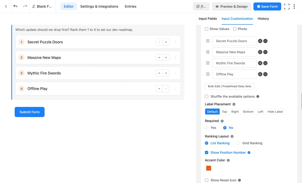
The Ranking field (Pro) allows visitors to arrange the field’s options (by dragging) into their preferred order, instead of picking from them.
Use it when relative preference matters more than a single answer, like ranking product features by importance or sorting priorities before a project starts.
- Layout: List Ranking or Grid Ranking with configurable columns.
- Photo option: attaches an image to each option.
- Position numbers: shows the rank number next to each option, with a reset icon so a visitor can start over.
- Accent Color: customizes the field’s highlight color.
Specialized Selection Fields
These four fields require Fluent Forms Pro. Each one serves a specific purpose that a generic selection field can’t do well.
Checkable Grid
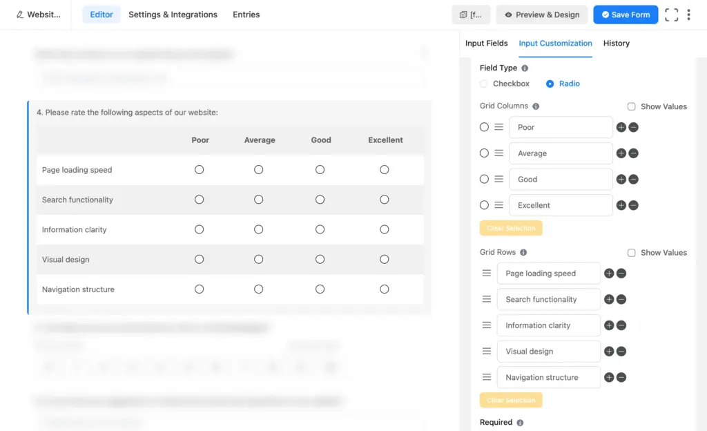
The Checkable Grid (Pro) field allows you to create a table where each row is its own question, and a visitor answers it with radio or checkbox behavior, all in one compact block.
Use it for rating several items on the same scale at once, like rating five product features as poor, okay, good, or great, instead of adding five separate radio questions down the page.
- Field Type: choose Radio (one answer per row) or Checkbox (multiple answers per row).
- Rows and Columns: add, remove, and label each one.
- Pre-selection: sets a default answer for a row.
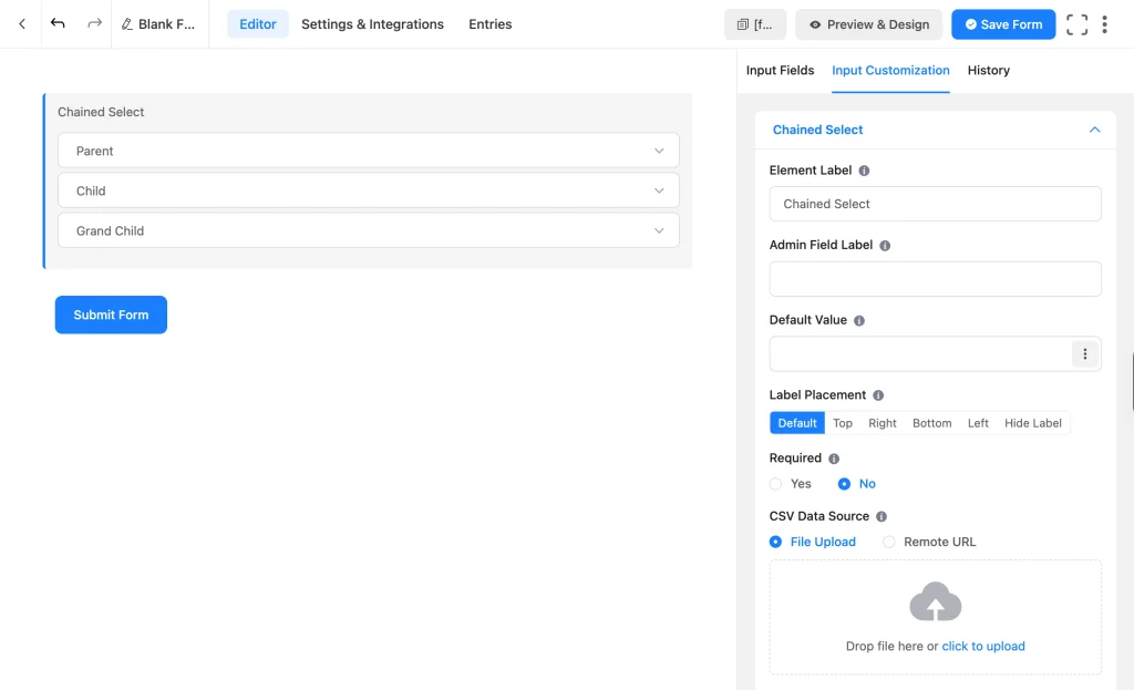
Chained Select
Chained Select (Pro) is a set of dropdowns where picking an option in the first one changes what shows up in the next (cascading dropdowns), built from a CSV list you upload.
The classic example is country, then state, then city, or make, then model, then variant, any selection where the later options depend on an earlier pick.
- CSV Data Source: upload a file or link to one hosted elsewhere.
- Searchable Smart Options: the same filter-as-you-type behavior as Dropdown, useful when any one level has a long list.
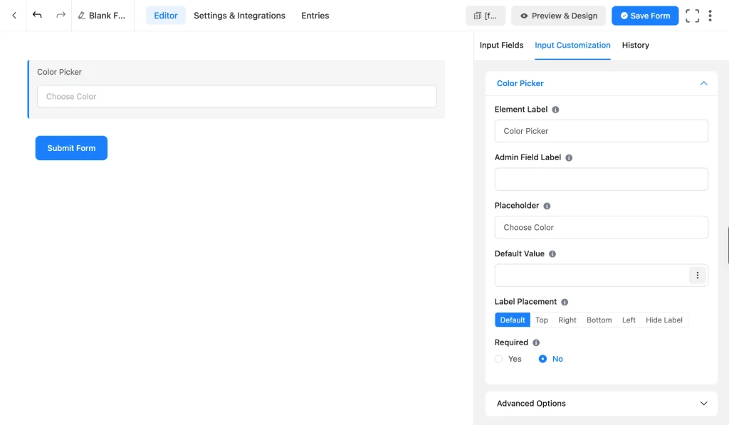
Color picker
Color Picker (Pro) shows a visual swatch picker that returns a hex color code (#RRGGBB) instead of typed text. It fits a custom order where a customer needs to specify an exact product color.
Settings include the standard label, placeholder, and default value options, plus the swatch interface itself.
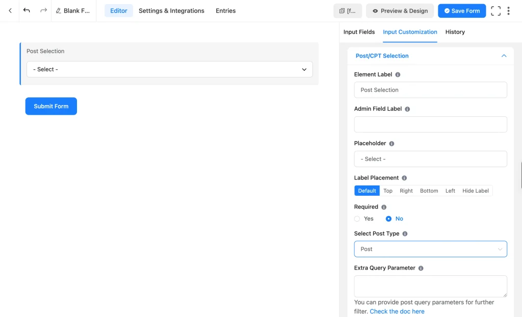
Post/CPT selection
Post/CPT Selection (Pro) is a dropdown that pulls live data straight from your WordPress site, posts, pages, or any custom post type, instead of a manually typed list.
Use it to let a visitor pick an existing post to comment on, choose which product to review, or select from content you already publish, without keeping a second list.
- Post Type: choose which post type populates the dropdown.
- Extra Query Parameter: filters which posts show up, by author, category, tag, or other WP_Query criteria.
Product and Quantity Selection Fields
This field is built specifically for pricing rather than general-purpose choices.
Payment Item
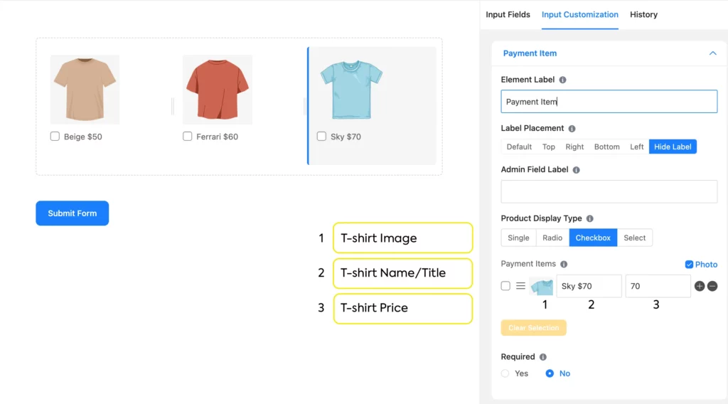
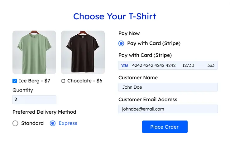
Payment Item field (free) lets a visitor pick one or more priced items and adds them up automatically. Use it to allow the selection to carry its price, like choosing a sponsorship tier, a course, or a physical product.
- Display Type: Single (one fixed-price item, no choice needed), Radio (pick one option), Checkbox (pick multiple, summed automatically), or Select (pick one from a dropdown).
- Photo option (Pro): enable it in the top right corner to add a product image to each option on the Radio, Checkbox, and Select display types.
Radio or Select is the right call when only one option should apply, like a single ticket tier. Checkbox is right when a buyer might want more than one product on the field.
Item Quantity
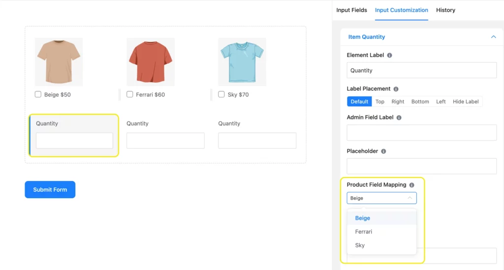
Item Quantity (free) lets a visitor specify how many units of an item they want, paired directly with a Payment Item field. Use it anywhere a buyer might want more than one of the same item, like 3 event tickets or 5 units of a product, so the total updates automatically instead of making them submit the form more than once.
- Map to Payment Item: links this field to the specific Payment Item option it should multiply. Use a separate Item Quantity field for each Payment Item field on the form.
- Min Value / Max Value: sets the allowed range a visitor can order, each with its own error message.
- Default Value: sets a starting quantity instead of leaving the field blank.
Free vs Pro at a Glance
Fluent Forms offers a free version (core) plus one Pro add-on (includes all features). The license tiers differ by how many sites you use it on.
| Field | Free | Pro |
| Dropdown | Yes | Yes |
| Radio Field | Yes | Yes |
| Checkbox | Yes | Yes |
| Multiple Choice | Yes | Yes |
| Time & Date | Yes | Yes |
| Numeric Field | Yes | Yes |
| Payment Item | Yes | Yes |
| Item Quantity | Yes | Yes |
| Range Slider | No | Yes |
| Net Promoter Score | No | Yes |
| Ratings (star rating) | No | Yes |
| Ranking Field | No | Yes |
| Checkable Grid | No | Yes |
| Chained Select | No | Yes |
| Color Picker | No | Yes |
| Post/CPT Selection | No | Yes |
Compare all Fluent Forms free vs. pro features.
Build Smarter Forms for Free
Frequently Asked Questions
What’s the difference between dropdown, radio, checkbox, and multiple choice?
Dropdown and radio fields both allow one answer; checkbox and multiple choice both allow more than one. Dropdown and multiple choice collapse their options behind a menu; radio and checkbox show every option on the page. Choose radio/checkbox if you have fewer (5 or 6) options.
Can I limit how many options someone picks in a checkbox field?
Yes. Checkbox comes with a Selection cap setting that sets a minimum and maximum number of choices, so a visitor can’t pick fewer or more than you allow. The multiple-choice field also offers this setting.
Which Fluent Forms selection fields let you show images with options?
Radio, checkbox, ranking, and Payment Item (on its Radio, Checkbox, and Select display types) all have a Photo option. Dropdown, multiple choice, and checkable grid don’t. Adding an image is a Pro feature in each of these fields.
Is the ranking field free in Fluent Forms?
No. The ranking field requires Fluent Forms Pro, along with checkable grid, chained select, color picker, post/CPT selection, range slider, net promoter score, and star rating.
What’s the difference between a checkable grid and a regular checkbox list?
A checkable grid handles several questions at once, one per row, each answered with radio or checkbox behavior in the same compact table. A regular checkbox field is a single question with multiple answers. Reach for a checkable grid when you’d otherwise be stacking five or six nearly identical checkbox questions down the page.
Do I need Fluent Forms Pro to build a usable selection-based form?
No. Dropdown, radio, checkbox, multiple choice, Time & Date, Numeric Field, and Payment Item are all free, and that combination covers most contact, lead capture, registration, and simple order forms without upgrading.
Do selection fields have a built-in “Other” option?
Radio and checkbox both have an Enable “Other” Option setting that reveals a text box automatically, but that setting requires Fluent Forms Pro. Dropdown and multiple choice don’t have this built in. Catch an unlisted answer there with a separate text field shown by conditional logic.
Can selection fields work with conditional logic?
Yes. Any selection field’s answer can show or hide another field through field-level conditional logic, which is free. Routing based on a selection at the settings or integration level, like conditional email routing, is a Pro feature.
Which selection field should I use for a satisfaction survey?
Star rating works well for a quick, single-question rating. Net Promoter Score is the standard choice for a loyalty or recommendation question. A checkable grid is the better fit when you’re rating several attributes on the same scale in one form.
Build with Fields That Fit Your Purpose
Fluent Forms selection fields help you collect everything from user preferences and product orders to reviews and ratings, all in the correct format. The core Fluent Forms fields, like Dropdown, radio, checkbox, multiple choice, Payment Item, Time & Date, and Numeric Field, cover most forms. Start free and add the Pro fields, like ranking, chained select, and checkable grid, when you’re ready to grow.

Sarika writes for Fluent Forms and loves to offer insights into small businesses. She’s curious and enjoys discussing ideas, interests, and perspectives. In her free time, she’s either marvelling at architectural beauties or trying different cuisines.



Leave a Reply