

All Fluent Forms Survey Features & Fields Explained
Fluent Forms ships with every field type to create effective surveys. But this wide variety makes it hard to know which field fits your question. Radio or dropdown? Checkable grid or ranking? This guide clears that up. For each survey field, I’ll show you what it does, when to use it, why it works, how to set it up in a few clicks, and how to read your results once responses come in.
TL;DR
- Pick your survey type first, fields second. Satisfaction, feedback, polls, prioritization, and research each require different fields.
- Structured fields give you numbers: radio, checkbox, dropdown, multiple choice, NPS, star rating, checkable grid, range slider, and the new ranking field.
- Open-ended fields give you context: simple text, textarea, and rich text input. Use one or two, not more.
- The ranking field lets people order options by preference and reports an average position plus how often each option was ranked first.
- A built-in ‘Other’ option, column layouts, and shuffle are the small features that turn a rough form into a survey people finish.
- Keep it to 3 to 5 questions, make fields optional, and mix measurable questions with one open answer.
- Read reports as patterns, not single responses. The visual report tab turns entries into charts you can act on.
Which Survey Do You Need
To design a survey, first you need to know what you’re measuring. Once the survey’s purpose is clear, you can easily map your questions to specific survey fields to keep the layout clean and organized. Here are some survey types most site owners build and what they’re for.
| Survey type | What it answers | Who needs it |
| Satisfaction/rating survey | How much do people like a product, service, or experience? | Ecommerce, restaurants, gyms, SaaS |
| Feedback form | What worked, what didn’t, and what to fix? | Websites, support teams, events |
| Poll | Which option does the crowd prefer, at a glance? | Blogs, communities, social pages |
| Prioritization/preference survey | In what order do people value these options? | Product teams, event planners, marketers |
| Research/market survey | What are attitudes, habits, and opinions across a group? | Researchers, agencies, nonprofits |
| NPS/loyalty survey | How likely are people to recommend you? | Any brand tracking loyalty over time |
Once you know which of these you’re building, it becomes really easy to choose the field types.
Match Your Survey Type to the Right Fields
| Survey type | Best-fit fields | Suggested layout |
| Satisfaction/rating | Star rating, NPS, checkable grid, range slider | Single column, one question per row |
| Feedback form | Radio, checkbox (with Other), checkable grid, NPS, textarea | 2-column for short options, single column for grids |
| Poll | Radio, multiple choice, dropdown | Single column, results shown live |
| Prioritization/preference | Ranking field | Grid ranking with photos, or list ranking |
| Research/market | Radio, checkbox, dropdown, checkable grid, simple text | Multi-step for long surveys |
| NPS/loyalty | Net Promoter Score, plus one textarea for the “why” | Single column, two fields total |
If your survey runs long, split it across steps instead of one endless page. A multi-step form feels shorter and holds attention.
This post is an overview of all Fluent Forms survey features. See how you can create a survey in WordPress (from scratch) using Fluent Forms.
Structured (Measurable) Survey Fields
Structured fields convert opinions into data you can count. Every answer maps to an option or a number, so you get charts and averages instead of paragraphs to sort through. These are ideal for any survey you plan to analyze at scale.
You’ll find these fields in the form editor. Go to Fluent Forms → New Form → New Blank Form, then drag fields from the right panel (general fields and advanced fields).
Radio field
What it is: A list of options where people pick exactly one. All choices stay visible.
When to use it: Single-answer questions with a handful of options, like “How did you hear about us?” or a 5-point rating written out in words (satisfaction level, frequency, quality, etc.).
Why it works: Every option is visible, so respondents choose in one click with no extra navigation. That saved click increases completion rates.
Set it up:
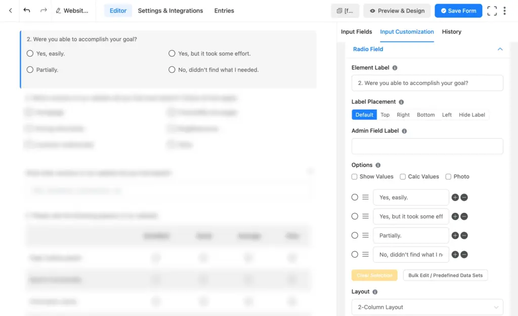
- Drag a Radio Field onto the canvas.
- Click the pencil icon in the field’s top-right corner to open Input Customization.
- Edit the Element Label to your question.
- Replace the default options with your answer choices using the plus and minus buttons.
- Set Required to Yes or No (keep survey questions optional where you can).
- Use the Layout dropdown to arrange options in one column, two columns, or inline (a 2-column layout keeps long lists tidy).
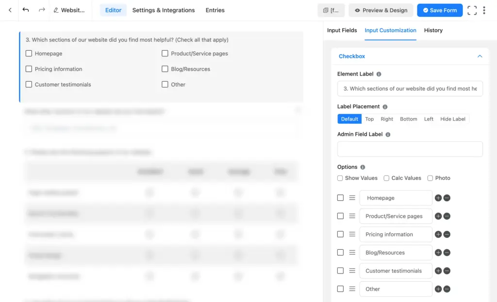
- To catch answers you didn’t list, tick Enable “Other” Option and edit the Other Option Label if you want it to read something other than “Other.”
Checkbox field
What it is: A list where people select as many options as apply.
When to use it: “Select all that apply” questions, like which features someone uses or which sections of your site they found helpful.
Why it works: It captures the full picture instead of forcing one answer. Fluent Forms’ checkbox also has a built-in “Other” option that reveals a text box automatically.
Set it up:
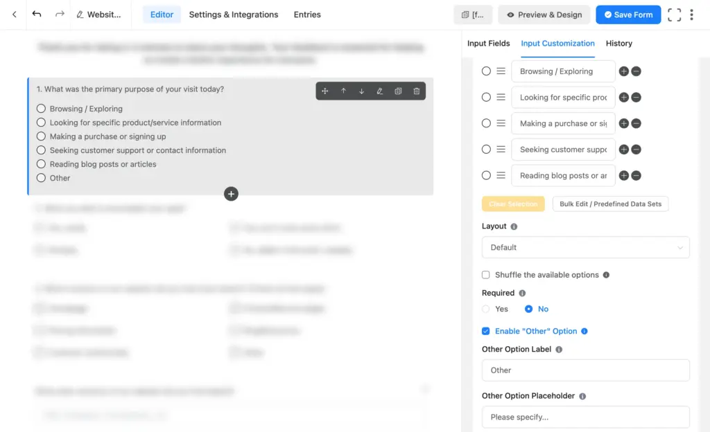
- Drag a Checkbox field onto the canvas.
- Open Input Customization and set your Element Label.
- Add your options.
- Enable the built-in Other option if you want a write-in box to appear when users select it.
- Adjust the column layout for a balanced look (for short-length options, a 2-column layout keeps long lists tidy).
Dropdown field
What it is: A single-select menu that hides options until clicked.
When to use it: Single-answer questions with many options, or when you want a cleaner form face, like choosing a country, a product, or a store location.
Why it works: It saves vertical space and keeps the form uncluttered. For long lists, its options are searchable, so people type to filter instead of scrolling. You can also group options under labeled headers, which makes a big list easy to navigate. The downside is one extra click versus a radio field, so use it when the option list is long and you need a clean look.
Set it up:
1. Drag a Dropdown field onto the canvas.
2. Open Input Customization and set the label.
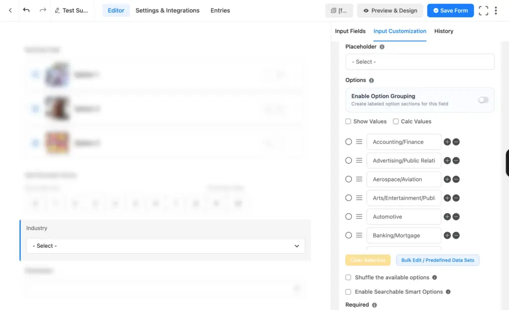
3. Add your options one at a time, or use Bulk Edit / Predefined Data Sets for long lists like countries. In bulk edit, if you place options one below another, they’ll automatically map as separate options.
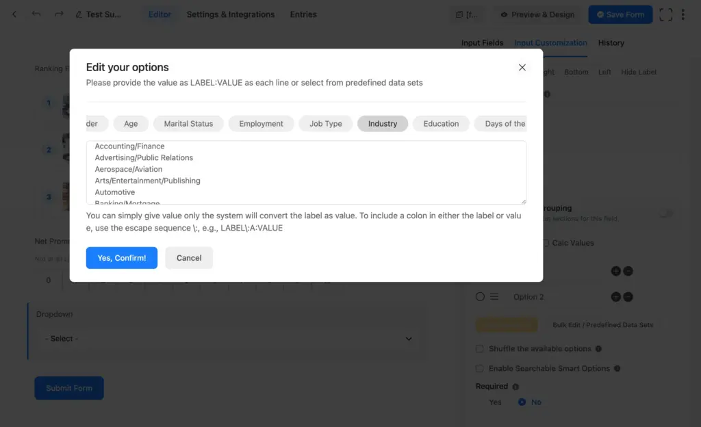
4. Turn on Enable Option Grouping to sort options into labeled sections.
5. Set a placeholder such as “Please select” so the field starts empty.
Multiple choice field
What it is: A menu-style field where people can select more than one option.
When to use it: Multi-select questions where you prefer a compact menu over a long checkbox list.
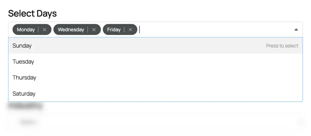
Why it works: It’s the checkbox’s cleaner-looking variant. Same “pick several” purpose, less vertical space. Like the dropdown, it supports searchable options and labeled option groups, so even a long list stays manageable. Choose between the two the same way you choose radio versus dropdown: user journey or clean look.
Set it up:
- Drag a Multiple Choice field onto the canvas.
- Open Input Customization and set your question as the label.
- Add options and set a placeholder such as “Select all that apply.”
- Turn on Enable Option Grouping to organize a long list into labeled sections.
Net promoter score field
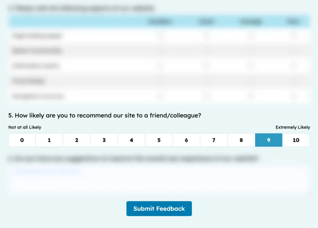
What it is: A 0-to-10 scale that measures how likely someone is to recommend you.
When to use it: Loyalty tracking, post-purchase surveys, and any time you want a single benchmark number you can watch over time.
Why it works: NPS is a recognised standard and is measurable and comparable month to month. Pair it with one open-ended question asking why they chose that score.
Set it up:
- Drag the Net Promoter Score field onto the canvas.
- Open Input Customization and set the Element Label to your question, like “How likely are you to recommend us to a friend?”
- Customize the start and end text (for example, “Not at all likely” to “Extremely likely”).
- Add a Textarea below it for the “why” behind the score.
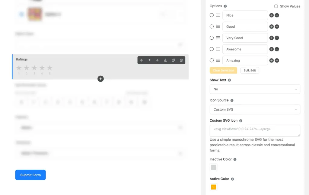
Star rating field
What it is: A row of clickable icons people tap to rate. Five stars is the default, but you set how many levels to show.
When to use it: Quick, low-friction ratings, product reviews, and pop-up feedback where you want a fast answer.
Why it works: Star ratings are instantly familiar, so people rate without thinking. You control almost everything about them: the number of levels, a label for each level, whether that label shows on hover, the icon itself (swap stars for a custom SVG like a heart or thumb), and the active and inactive colors so it matches your brand.
Set it up:
- Drag the Ratings field onto the canvas.
- Open Input Customization and set your label.
- Add or remove rating levels with the plus and minus icons, and name each one (like “Nice,” “Good,” “Amazing”).
- Set Show Text to Yes if you want the level name to appear when someone hovers.
- Under Icon Source, keep the default star or choose Custom SVG and paste a simple monochrome icon.
- Pick your Active Color and Inactive Color to match your brand.
Checkable grid field
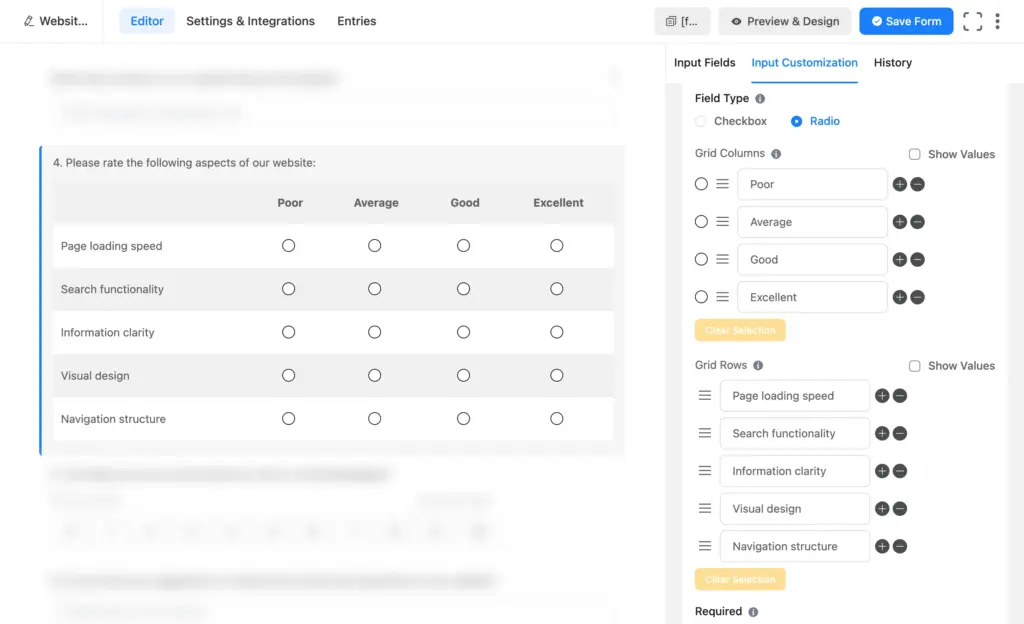
What it is: A table that lets people rate several items on the same scale in one compact block.
When to use it: Rating multiple attributes at once, like scoring food, service, and ambiance on one “Poor to Excellent” scale. This is the classic Likert scale layout.
Why it works: It collects many measurable answers without stacking a dozen separate questions. You can set the field to behave as a radio (one answer per row) or a checkbox (multiple).
Set it up:
- Drag the Checkable Grid field onto the canvas.
- Open Input Customization and set the grid question as the label.
- Add your rows (the items being rated) and columns (the scale).
- Choose radio for one answer per row, or checkbox to allow several.
Range slider field
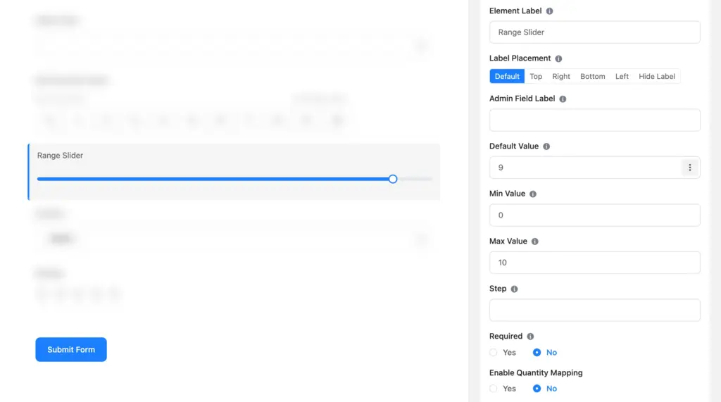
What it is: A handle people drag along a bar to land on a numeric value.
When to use it: Interactive ratings, budget or quantity questions, and any survey where you want the users to slide a handle to select a value instead of typing.
Why it works: Dragging is satisfying and fast, which lifts engagement on longer surveys. You control the minimum, maximum, and step values.
Set it up:
- Drag the Range Slider field onto the canvas.
- Open Input Customization and set your label.
- Set the minimum, maximum, and step increment.
- Style the track color from Preview & Design if you want it to match your brand.
Ranking field: let people prioritize (new)
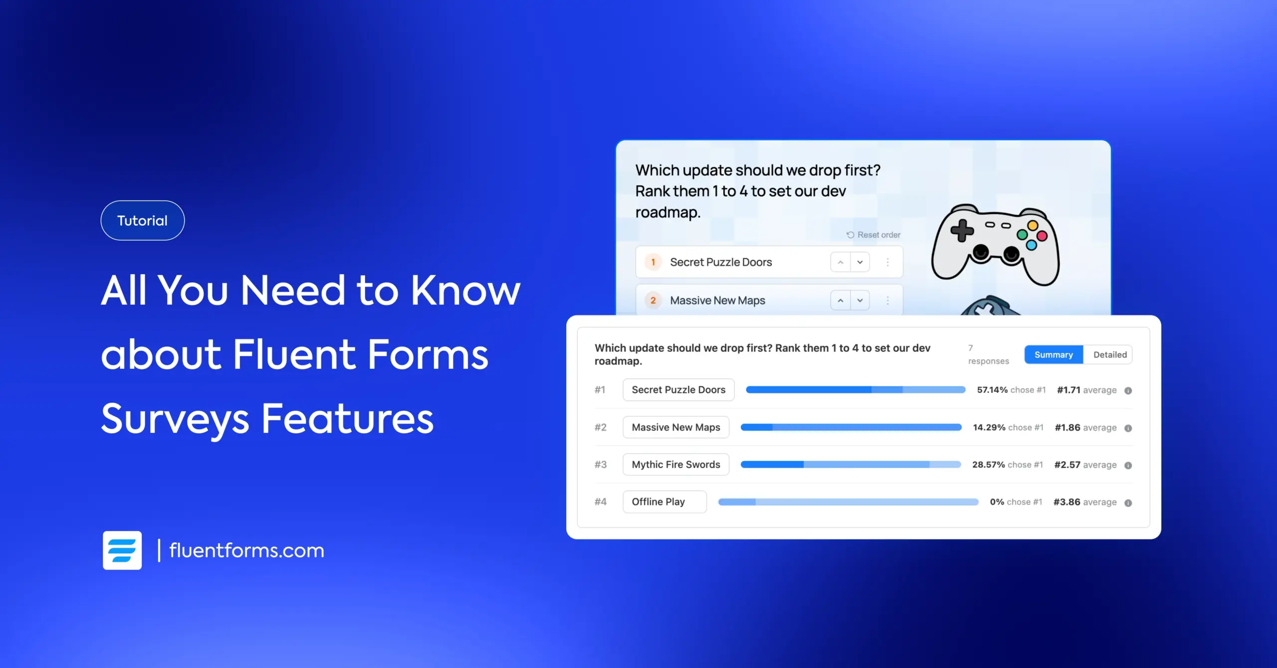
Every field above asks people to rate or pick. The ranking field asks them to order. Respondents arrange options from most to least preferred, and you learn what people value relative to everything else on the list.
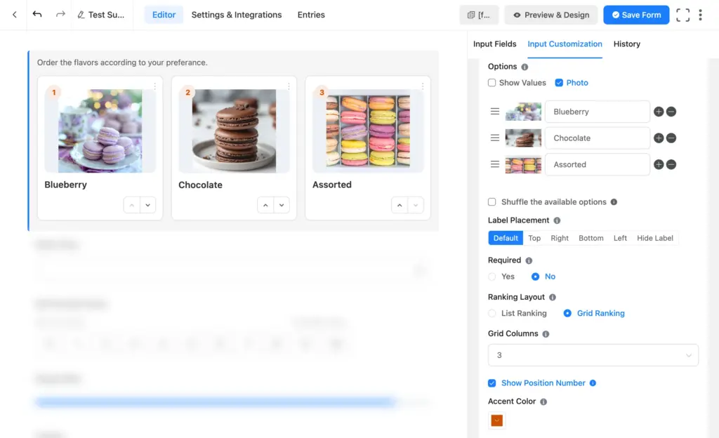
What it is: A field where respondents drag or move options into their preferred order. Each option lands at a position (#1, #2, #3, and so on).
When to use it: Prioritization questions. Which features should we build first? Rank these event sessions. Order these flavors by preference. Any time relative order matters more than an absolute score.
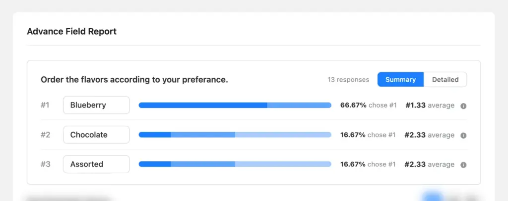
Why it works: Ratings can all come back “important.” Ranking forces a real choice, so you get a clear priority order you can act on. It includes its own analytics report showing average position and how often each option ranked first.
Ranking field setup:
- In the form editor, drag the Ranking Field onto the canvas. Click the field to customize options.
- Ranking Layout: Choose List Ranking (stacked rows) or Grid Ranking (cards side by side). Grid works well when options have images. set how many columns show in the grid layout.
- Photo: Enable this to attach an image to each option. Great for ranking visual choices like products or designs.
- Show Position Number: Displays the current rank number on each option.
- Show Reset Icon: Adds a reset control so respondents can clear their order and start over.
- Accent Color: Sets the color of the position badges to match your brand.
Open-Ended (Qualitative) Survey Fields
Numbers tell you what happened. Words tell you why. Open-ended fields collect the sentences that explain a low score or surface a problem that didn’t occur to you. Use one or two open-ended questions at most per survey, since long text questions increase bounce rate.
Simple text
What it is: A single-line box for short answers.
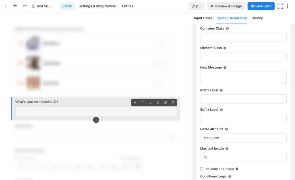
When to use it: Names, job titles, membership IDs, or any short one-line answer a survey needs.
Why it works: It’s the lightest open field, so it adds almost no friction when you need a quick specific detail.
Set it up:
- Drag a Simple Text field onto the canvas.
- Open Input Customization and set the label or placeholder.
- Add a max character limit if you want to keep answers short from Advanced Options.
Textarea
What it is: A multi-line box for longer answers.
When to use it: Suggestions, complaints, or the “tell us more” question at the end of a survey.
Why it works: It gives people room to explain without formatting distractions. One well-placed textarea often produces your most useful insight.
Set it up:
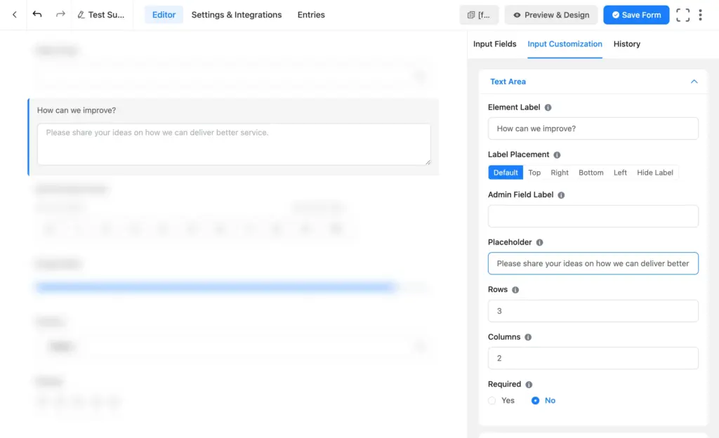
- Drag a Textarea field onto the canvas.
- Open Input Customization and set the label, like “How can we improve?”
- Keep it optional so it never blocks submission.
Rich text input
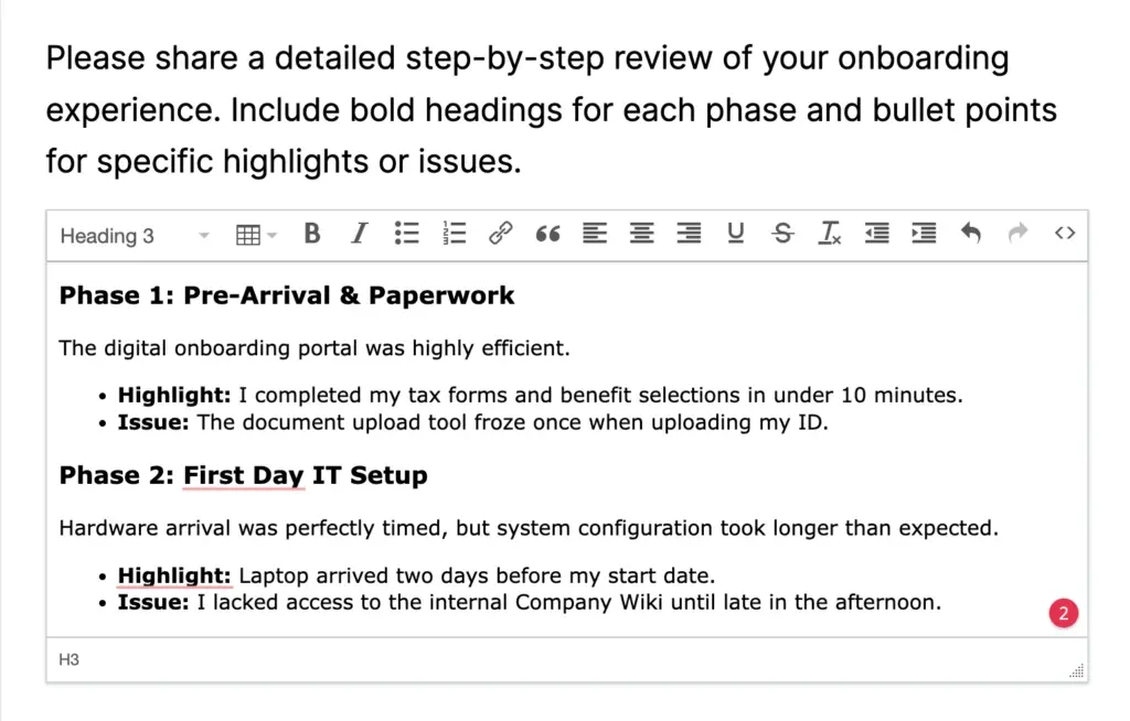
What it is: A formatted text box with headings, lists, bold, and italics.
When to use it: Detailed submissions where structure helps, like internal feedback, applications, or long-form research responses.
Why it works: It lets respondents organize a longer answer so it’s easier for you to read. Reserve it for cases where the extra formatting earns its place, since it’s heavier than a plain textarea.
Set it up:
- Drag a Rich Text Input field onto the canvas.
- Open Input Customization and set the label.
- Set a max character length if necessary.
Features That Make a Survey Work
Add an “Other” option
Provided options might not always cover everything. An “Other” option catches the answers you didn’t anticipate. Radio and checkbox fields have this built in. For dropdown or multiple choice fields, you can add this option by linking a text field with conditional logic.
Balance the layout with columns
Long option lists look cleaner in columns. Open a radio or checkbox field’s options and set a 2-column layout so choices sit side by side instead of running down the page.
Shuffle options to remove bias
People tend to pick whatever option is at the top. Turn on the shuffle setting (available on the choice fields) to randomize option order per respondent, so position doesn’t compromise your data.
Keep fields optional
Respondents are doing you a favor. Forcing every answer leads to abandoned forms. Set Required to No on most survey questions and let people share what they want to.
Show real-time results
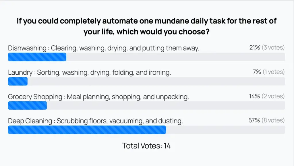
For polls, you can display live results right after submission or on a separate page. In the form’s Settings & Integrations → Survey Result, turn on Append, then Show Label and Show Count. This shows users the poll result upon form submission.
Reading Your Survey Analytics
Collecting responses is step one. The insight comes from reading them well. Fluent Forms creates visual reports from your survey responses.
Where to find it: Open your form and go to the Entries tab to see individual submissions. To see the charts, click View Visual Report. Inside the report, you can toggle between pie charts and horizontal or vertical bar charts using the icons in the top right.
What the data tells you

- Percentage distribution shows how answers split across options. A strong lean toward one option is your signal, whether that’s a favorite feature or a recurring complaint.
- Averages (on scale fields) give you one benchmark number to track over time. Watch it move month to month rather than focusing on a single response.
- The ranking report shows which options people prioritize, using average position and first-place share.
- Device and browser info on each entry reveals context. If most poor ratings on a website feedback survey come from phones, your form or site isn’t mobile-friendly.
How to act on the data
Adjust your approach when you notice patterns. One angry response is noise. The same complaint from twenty people is a roadmap. When a metric scores poorly, open those specific submissions to find the why, then verify and fix. For large volumes of open text, export your entries and run them through a language tool to surface recurring phrases or patterns, the same approach big brands use to spot spikes in negative sentiment.
Start Building Your Survey
Start with one clear goal, pick the two or three fields that serve it, and keep the form short. Being able to single out your goal turns a pile of questions into a survey people finish.
Lead with what you most need to learn. Choose the field that measures it best, preferably 2/3 quantitative questions for stats and trends and a qualitative one for context. Cut anything that doesn’t earn its place.
Building your survey takes a few minutes with Fluent Forms’ drag-and-drop builder and ready fields for every kind of question. So build your first survey today or start with our survey templates. Once you start getting responses, adjust your strategy based on user insights.
Build Smarter Forms for Free

Sarika writes for Fluent Forms and loves to offer insights into small businesses. She’s curious and enjoys discussing ideas, interests, and perspectives. In her free time, she’s either marvelling at architectural beauties or trying different cuisines.



Leave a Reply