10 Simple Tips to Maximize Contact Form Conversion
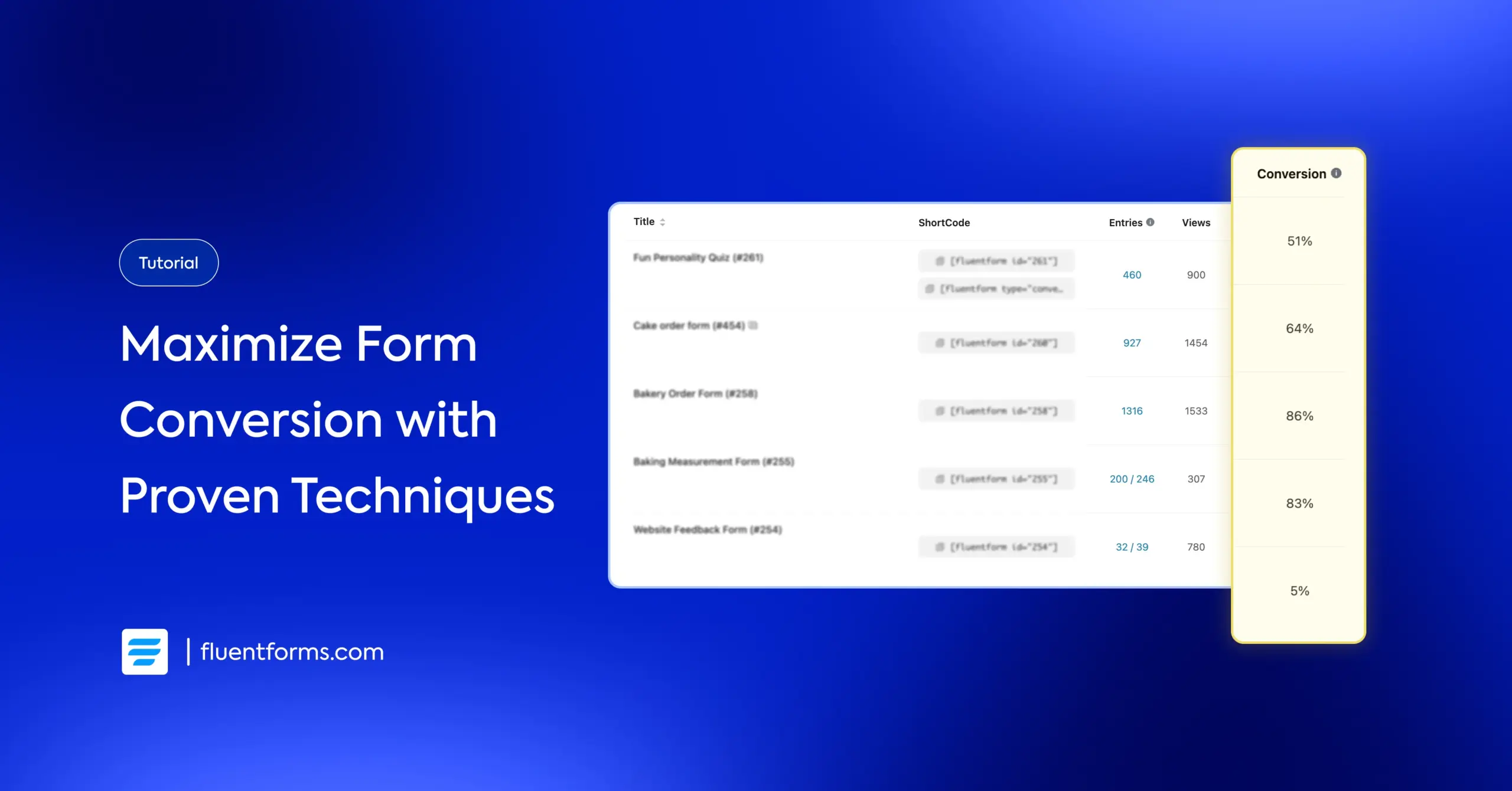
Your contact forms are one of the most important elements on your website. It’s where interested visitors become actual leads. If you’re not seeing enough leads despite lots of traffic engagement, your forms might be the issue.
So, how can you fix that? The good news is, it’s very simple. Most forms underperform because of mistakes that are easily avoidable. The thing is, people are busy and impatient. If your form feels long, confusing, or demanding, they’ll leave. You have to make it quick and straightforward. Moreover, users have to feel that your offering is worth their time and information.
In this guide, I’ll share 10 practical tips to help you maximise contact form conversions. You won’t require any technical expertise to implement them. Just start at a time and pace you’re okay with. Let’s get into it.
TL;DR
- Aim for 3-5 fields to reduce user effort.
- Don’t force users to share info they’re not comfortable with.
- Use contrasting colors and benefit-driven text like “Get My Free Quote” instead of “Submit.”
- Compress images, remove heavy animations, and ensure fast page load times.
- Show relevant questions based on previous answers using conditional logic to keep forms feeling short and personalized.
- Use single-column layouts, place labels above fields, and break long forms into steps with progress bars.
- Make sure your form works perfectly on all device types.
- Place the form above the fold for high-intent pages, after the value explanation for cold traffic.
- Clearly tell users what they get in return for filling out the form & when they get it (Receive your quote within 24 hours).
- Use testimonials, privacy notes, or client logos near the form to minimize second-guessing.
How to maximise contact form conversion
Having worked with a form tool for a while, the best advice I can offer you on form conversion is, “Make the user experience as smooth and frictionless as possible.” But that might sound like a broader concept, especially if you’ve just started.
Making the user experience smooth includes reducing the completion time, guiding users through the form, ensuring an easier-to-follow design, minimising clicks, providing clear instructions, and so on. Let’s walk through some actionable best practices to design the most impactful forms.
1. Keep it short & sweet
People hate long forms. When users see 10+ fields, their brain calculates effort and often decides “not worth it.” Shorter forms feel easy and quick, making people more likely to start and finish.
Aim for 3-5 fields maximum. Only ask for information you absolutely need for the initial contact. If you just want leads, stick to name + email only. You can nurture these leads over time until they’re ready to purchase.
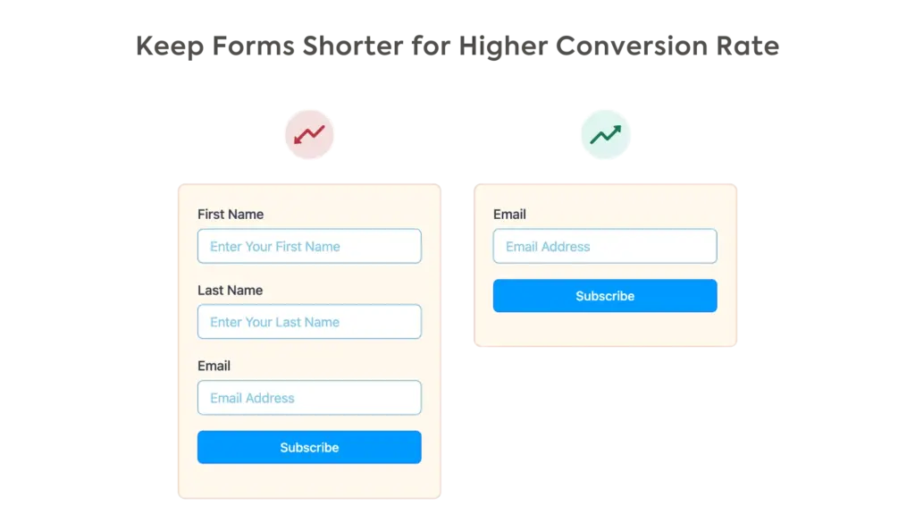
However, by asking one or two more specific questions (like “Company Size” or “Biggest Challenge”), you can filter out casual browsers from serious prospects. This means your sales team gets to invest their time in the leads who are more purchase-ready. The goal shifts from quantity of conversions to quality of conversations.
2. Minimise required fields
Required fields feel like demands. People instinctively resist when they feel forced to share sensitive information like phone numbers or company size. Making fields optional removes pressure and lets people share what they’re comfortable with.
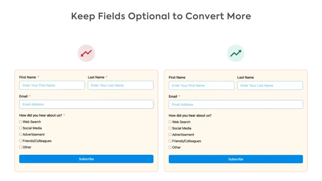
Only mark email (and maybe name) as required. Make phone number, company, “how did you hear about us,” etc., optional (unless they’re necessary, for example phone number is required for a callback request form).
Add a simple asterisk (*) to show what’s truly required. This respects the user’s bounderies and builds trust. When you give them control, they are often more willing to share information because it feels like a choice, not a demand.
3. Make buttons stand out
Your submit button acts as the call to action and, therefore, serves as the ultimate motivation to complete the form. If it blends into the page, users might miss the value proposition.
Instead of a generic text like “Submit,” try “Get My Free Ebook” or “Claim My Spot,” etc. Your button text should complete the sentence “I want to…” It frames the action around the user’s gain, not their effort, by shifting the focus from “I am giving my info” to “I am receiving my benefit.”
Ensure the button stands out so it’s the first thing users notice when they view your form, which will motivate them to fill it out. Try a contrasting color (maybe your site’s accent color) for the button while maintaining readability. Add a subtle hover effect to make the button feel interactive and clickable. Keep it large so mobile users can easily tap it.
4. Optimise for speed
Every second of load time costs you conversions. In fact, a significant number of users will leave before they even have a chance to see it. A slow form doesn’t just lose you a lead; it damages your brand.
Faster pages create a professional, seamless experience and show users you respect their time. Fluent Forms is already the fastest form builder out there and doesn’t delay your page load at all.
Additionally, you can compress any images (use the WebP format, for example) on the form or the page where your form is located. Consider removing any heavy animations that may be slowing down your page.
5. Guide navigation with smart logic
Showing every possible field upfront overwhelms users. Conditional logic reveals questions only when relevant, making forms feel personalized and shorter. People stay engaged because they’re answering questions that actually apply to them.
Map out different user journeys before building (a startup founder needs different questions than an enterprise buyer or a current user). Use conditional logic to show or hide fields based on a user’s previous selections. For example: “What do you need help with?” → Sales shows pricing questions, Support shows issue description, etc.
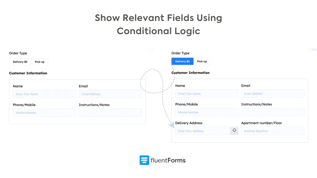
Conditional logic also helps with lead scoring; if someone selects “budget over $10k,” you can automatically tag them as high priority. Moreover, you can use it to personalize the thank-you page or auto-response email based on answers. High-value leads receive an appointment booking link, while smaller inquiries get a resource download.
6. Be strategic in layout & Design
Cluttered or confusing designs create cognitive load, forcing users to work harder and increasing the chance of errors or abandonment. Good design makes the interaction feel effortless. A clean, logical layout helps users understand the form at a glance and fill it out without much effort. Here are some strategies you can follow:
Keep the layout clean
Use a single-column layout whenever possible, as it’s easiest for the eye to follow (multicolumn layout causes the eye to zig-zag across the screen). You can use two columns on desktop devices for a comparatively larger set of fields. Make sure the columns stack one below another on a mobile device. Try to maintain the same alignment (left/center) throughout the entire form.
Maintain a logical flow
Start with the generic/easier questions, followed by more qualifying questions. Gradually show relevant follow-up questions using conditional logic. However, start the order forms with a choice of products, and when users select their product, they can fill out personal information (like email or delivery address) in the checkout stage.
Break long forms into multiple steps
Break long forms into shorter steps with the multistep forms feature. Keep related fields in the same step and give the step a suitable name. Show a progress bar so users can easily understand how close they are to completing the form.
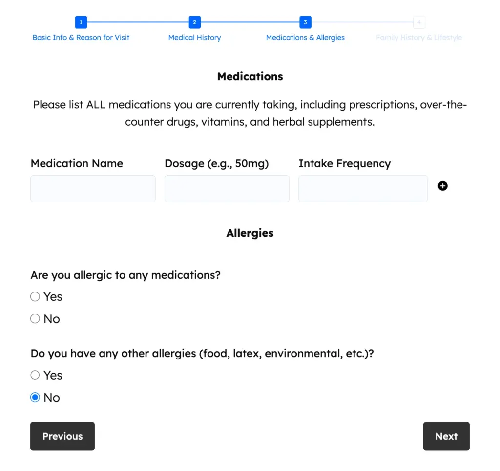
Enable per-step data save for multistep forms so you can receive partial entries. You can also add a save & resume button for long forms. This allows users to save their progress and fill out the rest of the form later using a URL sent to their email or confirmation message.
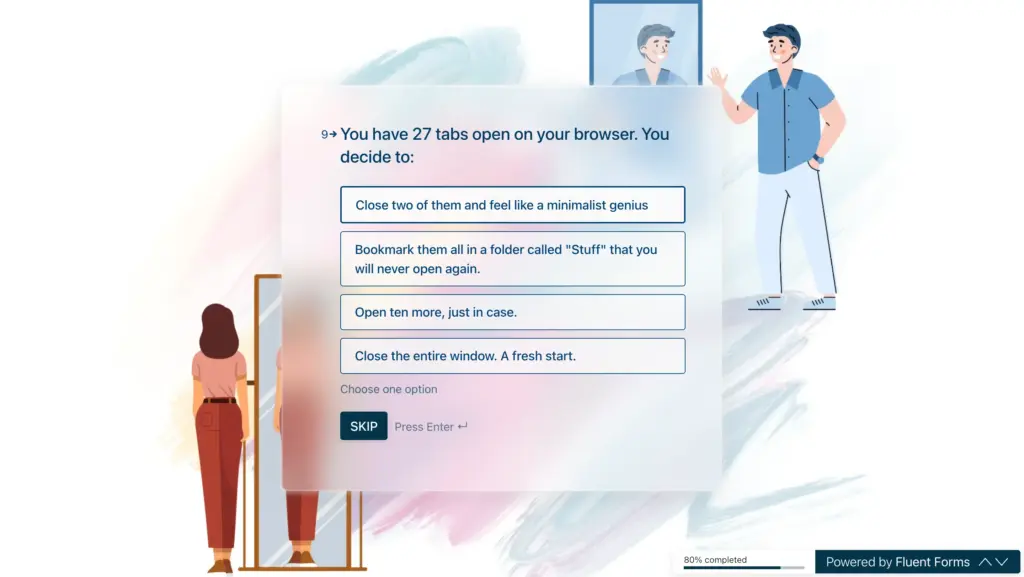
For forms that are not too long, yet not short either (5 to 10 fields), you can use conversational forms. They present one question at a time to keep users focused. Keep the progress indicator visible so users can easily see what percentage of the form they’ve completed. You can also tell users how long it’d take them to complete it at the beginning of the form.
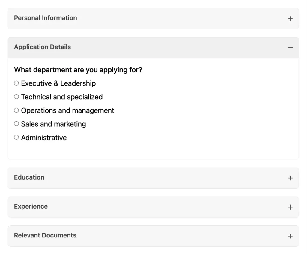
Group related fields together
If the steps are independent and users don’t need navigation guidance, you can group related fields in collapsible sections. Use accordions with clear titles and descriptions so users can choose the order in which they want to complete the sections. Use tabs when users need to frequently switch between sections. With collapsible sections, only one section remains visible at a time, making the form feel manageable instead of overwhelming.
Minimize clicks
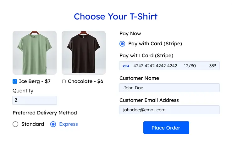
Remove extra clicks whenever possible to make the user experience smoother. For example, both radio and dropdown fields let users choose one option. However, the radio field’s options remain visible, so users can directly select the desired option. Dropdowns take an extra click to reveal the options before users can select an option. However, if there are too many options, it’s better to use a dropdown to ensure a clean look. The same goes for checkbox and multiple-choice fields.
Lastly, place labels above the input fields, not inside them (placeholder text disappears when typing). Use generous whitespace to avoid a cramped feeling. Keep fonts simple and readable at 16px minimum. If you’re using a background color/form border, keep some padding (space inside the margin) for a cleaner look.
7. Ensure responsiveness & accessibility
This ensures your form works for everyone, everywhere. Over half of all web traffic comes from mobile devices, so a broken or frustrating mobile form will lose you customers. Accessibility makes your form usable for people with disabilities, expanding your audience and showing you care.
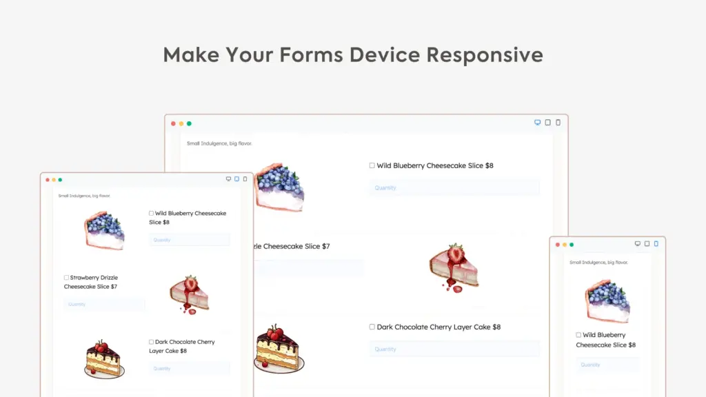
Test your form on different screen sizes to ensure it looks and works great. Make buttons and input fields large enough to tap easily with a finger. Don’t rely solely on colors for messages (green for success/red for validation error); use texts alongside for people with color vision deficiency (CVD). Use proper labels for all fields so screen readers can announce them correctly.
Enable browser autocomplete to save users time. When asking a complex question, provide a clear explanation to guide them.
Moreover, don’t use Captchas that require selecting traffic lights or something equally complicated. Go with options that work in the background. You can also enable the built-in honeypot feature (a trap field that only bots see) if you’re using Fluent Forms.
8. Place the form strategically
If people can’t find your form, they can’t fill it out. For high-intent pages like “Contact Us” or “Request a Quote,” consider placing them above the fold (visible without scrolling), so they’re immediately visible. On longer pages, a sticky or floating form keeps the option visible as they scroll and develop interest. On sales pages, place it after you have clearly explained the value.
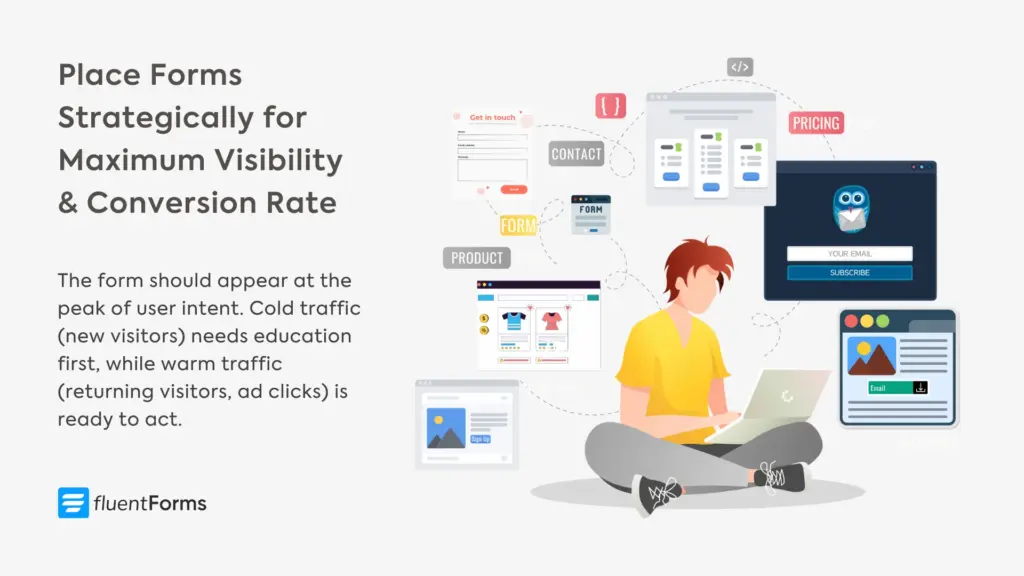
The key is to match form placement to the buyer journey. The form should appear at the peak of user intent. Cold traffic (new visitors) needs education first; put the form after they’ve read a compelling case study or finished an engaging article. Warm traffic (returning visitors, ad clicks) is ready to act; show the form immediately.
Test multiple form placements on the same page: header, mid-page, and footer. Track which location gets the most submissions. Use heatmaps to find out exactly where users engage most.
9. Offer a clear value proposition
This answers the user’s most important question: “What’s in it for me?” People don’t give away their personal information for nothing. A clear value proposition provides the motivation they need by telling them exactly what benefit they’ll receive in exchange for their data.
Add a clear, benefit-driven headline right above your form, like “Get a Free, No-Obligation Quote Today.” Be specific about what they get and when they’ll get it. Set clear expectations about what happens next, like “We reply within 2 business hours” or “We’ll send your custom quote within 24 hours,” directly below the headline.
You can show the value proposition message directly above the form or at the top of the form. Fluent Forms offers Custom HTML and Section break fields to show a static message via the form. Both these fields are visually editable (you don’t need to write HTML code).
Consider offering resources in exchange for contact info: a checklist, template, discount code, or exclusive content. This transforms your form from “contact us” to “get free stuff.” Just ensure the freebie genuinely helps your target customer, or you’ll attract the wrong leads.
10. Show trust signals near the form
Right before clicking submit, people hesitate. They worry about spam, sales calls, or their data being sold. A small trust signal at this critical moment motivates them to proceed. Trust signals like testimonials, security badges, and privacy notes reassure them that your business is legitimate and their data is safe. It’s the final nudge they need.
Place testimonials or logos of well-known clients near the form. Show other social proof like “Trusted by 2,000+ businesses” or “4.9/5 rating from 500 reviews.” Keep it subtle but visible. Include a simple privacy note like, “We’ll never share your email,” and if you handle sensitive information, display security badges (like an SSL certificate lock).
Different trust signals work for different audiences. B2B buyers look for client logos and case study mentions. Consumers trust star ratings and review counts. Everyone inclines towards specificity (“Trusted by 2,347 businesses” feels more real than “Trusted by thousands”).
Consider adding a tiny photo of a real team member near the form with text like “Questions? I personally read every submission. – Sarah, Founder & CEO.” It humanizes the interaction and builds a connection.
Build Smarter Forms for Free
Now you know a lot about form conversions; simply start working on them at a comfortable pace and track the changes. Remember, what works for one audience may fail for another. Your B2B enterprise form needs different optimization than your newsletter signup. Run A/B tests on button colors, form length, headlines, and placement. Small changes can lead to 20–50% improvements.
Small tweaks, big results
Most people think form optimization requires a complete redesign. It doesn’t.
It’s about psychology, respect, and making users’ lives easier. Sometimes it’s as simple as changing “Submit” to “Get My Free Quote” or removing that phone number field nobody wants to fill out.
These micro-changes might seem insignificant, but together, they can boost your form conversion rate like magic. The key is to start somewhere. Pick the easiest tip from this list and implement it today. Track the results for a week. Then move to the next one.
Keep this question in mind whenever working on a form: “If I were a busy, skeptical visitor, would I bother completing this form?” Keep working till your answer becomes “Yes.”
Last but not least, test everything. Consistently track the result of the adjustments you’re making. Stick to what works best for your audience. Leave a comment if you have any ideas or questions.

Sarika writes for Fluent Forms and loves to offer insights into small businesses. She’s curious and enjoys discussing ideas, interests, and perspectives. In her free time, she’s either marvelling at architectural beauties or trying different cuisines.


Leave a Reply