How to Increase Conversion for Your Contact Forms

Whether running a WordPress or WooCommerece store, you should know how to increase your website’s conversion rate to uplift your business growth. And if you maintain a WordPress website, then contact forms must be used.
A good contact form helps you to improve the conversion rate for your website too. But most people don’t know how to design a contact form to grab the users’ attention. So, in this article, we’ll show you how to increase conversion rate of your contact forms for your eCommerce business. First, let’s get some idea about the conversion rate and its’ usefulness.
The definition of conversion rate

A conversion rate means the percentage of users who have completed the desired action on your website or page. This rate is calculated by the total number of people who converted to your page by clicking on any advertisement or CTA’s, dividing by the overall size of the target market. After that, convert that number into a percentage. Now, let’s find out the necessity of making a good contact form.
Why designing a good contact form is important?

A contact form helps users reach out to you anytime while visiting your website. They can be used for any reason, but here are a few benefits of using a contact form.
- Get more leads
- Reduce spam
- Keep track of information
- Easy and simple
- Grow email list
- Offer support for clients
- Get user-submitted content
- Maintain consistency
So, there you have it. The benefits of using a contact form on your website. Now, let’s find out the best ways to customize your forms more efficiently with the robust form builder in WordPress, Fluent Forms.
12 best tips to improve your contact form conversion
The answer to this question depends on what you’re looking to achieve with your contact forms. A lot of factors affect the conversion rate of a contact form. But the best ways to increase the conversion rate can be designed based on proven research. So, here are the twelve best ways to uplift the conversion rate of your WordPress website.
Limit the number of fields
Too many fields on your contact forms look devastating and turn people away. So, reduce the number of fields to give your form a cleaner look and keep your users. A study by Hubspot shows that a form with only three fields increased the conversion rate by 25%, a five fields form grabbed the conversion by only 20%, and the rate went down to 15% with more than six fields.
For example, let’s create a simple checkout form with Fluent Forms. Go to your WordPress dashboard, and install Fluent Forms Pro from the Plugins section.
Now, move on to the Fluent Forms panel, and select All Forms. From there, click on the Add a New Form button.
Then, choose from the available templates or the Blank Form option. We’re selecting the Blank Form template.
Naming our form by clicking on the top left corner button on the form editor.
Now drag and drop the Name Field, Email Field, Number Field, and Address Field from the General Fields section of the Input Fields section.
Now, let’s customize the address field, as we don’t want an address line 2 or many options on our field. So, click on the pencil icon of the respective field, or go to the input customization option of that field.
Then move on to the Payment Fields section, and add the Item Quantity, Custom Payment Amount, and Payment Method fields to the form.
Edit the Element Label of the item quantity field, and set a minimum and maximum value for both the item quantity and the custom payment amount field.
Lastly, let’s add a Rating field and name it “How would you like to rate our checkout form?”.
Save the form when adding fields is done.
So, we’ve created an easy and simple checkout form for your eCommerce website. Here is a preview of your form.
The Payment Method field will be shown once the product quantity and custom payment amount fields are filled. So, this is the simple checkout form with few fields.
Gradually, we’ll show some more customization with the tool for more tips for increasing the conversation rate of your contact forms. So, keep reading.
Remove distractions
Sometimes you need to add the help message text for some fields that people can find complicated to understand and a required field indicator. For example, the email and phone number fields are a must in this checkout form. So we’ve marked them as required and added some help messages to each field.
This will help our users know the fields’ importance and details.
But not all of your fields might be required. In this form, the rating field is not necessarily needed. So, we haven’t added any help messages or didn’t mark the field as required. Too many required options on fields can distract users, and even sometimes, they might leave the form because they can’t fill it easily.
Try multi-step form
We’ve already mentioned the importance of keeping forms short and simple. But if sometimes your forms are long, and there is no way to make them short, consider breaking them into sections. That way, users won’t feel bored filling out the form.
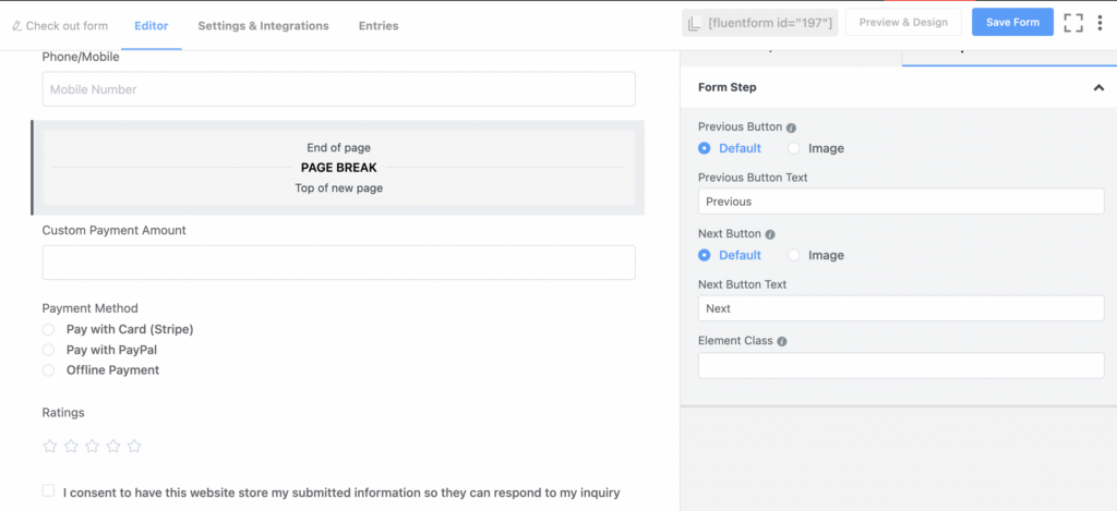
For instance, we’re adding a Form Step field on our checkout form to make it more attractive. Let’s divide the form after the address field option.

After adding the field, the form will look like this.
A nice progress tracker will be shown at the top of the form, and the Next Button will be added to the bottom right corner of the form for the next fields.
Apply partial entries
Often many visitors leave the long forms incomplete. As a result, partially filled-up entries data can’t be obtained. Enabling the partial entries option in a form can access the data that has been partially entered but not fully completed. So, you can get in touch with clients who have already expressed interest in your forms or products.
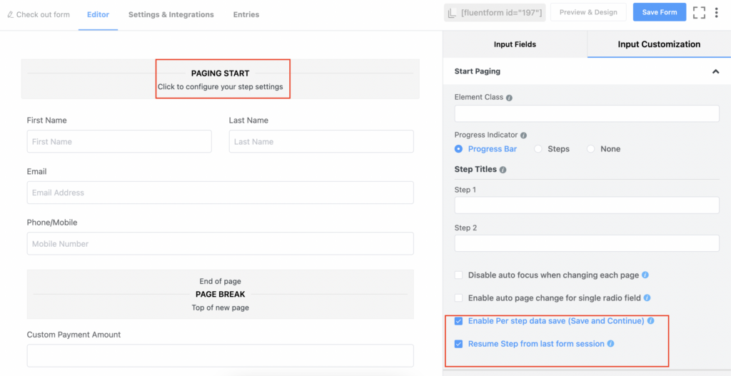
To do that with Fluent Forms, go to the input customization of the Paging Start part of the multi-step form field. Then click on the “Enable Per Step Data (Save & Continue)” button. After that, there’ll another button will open as “Resume Step from last form session”. Enable this option to get the user’s details from the last session.

Save the settings, and go to the preview section again. Then partially fill up a form field and leave the form.
A new option will be added above the form editor as Partial Entries. Click on that to see the entry we’ve just filled out.
You can export these fields as CSV, PDF, Excel, or ODS if you want.
Besides, you can delete a field if it’s not necessary.
Moreover, you can see the entry’s full information by clicking on the blue-colored number below the ID section.
Here is the full view of the specific entry.
See how partial entries can help to easily get the information of a client who has partially filled up a form.
Customize submit button
Customizing submit button also helps to improve the conversion rate of your forms. A study by Hubspot shows that a change in the word from “submit” to “click here” or “go” increases the conversion rate from 15% to 30%. So, let’s customize our form’s submit button with Fluent Forms.
Go to the input customization section of the submit button. You can change the element label, button style, size, or alignment here. We’re changing the element label to “Go”, keeping the button color red, medium size, and button alignment in the middle or center.
There is also a Custom Submit Button field in the advanced fields section. In this field, you can set the hover style of the button, button border-radius, etc.
We’re keeping the default button style.
Add a proper form layout & design
Another thing that needs to be considered when designing your form is that your form should have a user-friendly layout. That means the form should be well-designed in both functionality and visual outlook.
For the proper placement of the fields and their function them properly, set the label placement of the fields from the input customization section of each field.
Place your form on your website page where users land mostly and will find it appropriate.
To set the form layout, go to the Fluent Forms’ Settings & Integrations section, move on to the Form Settings option, and scroll down. Here you’ll get the form layout customization option.
You can do many more customization in the Fluent Forms settings panel. To know more, check out Fluent Forms’ settings & integrations section.
You can use the Global Styler section of Fluent Forms to make your form more attractive. To do so, go to the form editor’s Preview & Design section again. Then select a Form Style Template. We’re going for the Bootstrap Style.
Then move on to the Misc option to make your form more attractive.
Here, you can change the Container Styles, Asterisk Styles, Inline Error Message Styles, After Submit Success Message Styles, and Afer Submit Error Message Styles.
We’ve changed the container background color and enabled a form border. After this, here is the final look at the form.
Don’t forget to save the settings. The form is now looking more appealing. Isn’t it?!
Add a descriptive CTA
Your words on the form page should encourage users to take the desired action and fill out the form. So, the title should be enough to draw the user’s attention and make people keep on reading. For example, you can use words like “Buy Now, Start, Add to Cart, Free”, etc., on your forms. Personalize the call to action using words like you, your, our, and more. Moreover, add a sense of urgency, such as “Today, Now, Last Chance”, or put a countdown timer on your page.
More so, give an idea about what will open next after they submit your form. For example, add a confirmation message about the form submission after a user fills out your form.
Let’s move on to the Fluent Forms’ settings & integrations section again. Here set the confirmation type, confirmation type, and a customized message to show on the Form Settings option.
Avoid using Captcha or reCaptcha
Captcha or reCaptcha are great ways to reduce spam. But they also reduce the number of submissions in a form. Because the images in the Captcha’s are difficult to identify, people find filling out the form time-consuming. Though you can reduce spam on your website, the conversion rate will decrease.
So, what to do to protect your forms from spam? You can use the privacy policy to secure your form’s data or enable the double opt-in option to identify human users quickly.
Fluent Forms has a dedicated GDPR Agreement field on the advanced section of input fields.
It also provides a double optin option in the form settings option. You just need to enable and customize it from the Form Settings option.
Be more human
People like to fill up form that looks and feels more human than regular forms. As a solution, you can use conversational forms to turn your normal forms into something that feels like a face-to-face conversation.
Fluent Forms’ conversational forms style is gaining popularity among its users for its fantastic interface and conversion rates.
To turn your existing form into a conversational form with Fluent Forms, go to the form editor and click on the three-doted option from the top right corner.
Here, you’ll get a “Convert to Conversational Forms” button. Click on it, and you’ll get the conversational forms interface. We’re not adding any fields here as we’ve already customized our fields. So, we’re going to the Design section of the form.
You can set the font style, button color, text, background color, image, mobile layout option, branding option, and more. We’re just adding a background image to our form, and here is the final look of it.
Amazing! Right?!
Make it responsive
A study by Statistica shows that 58% of website visits were on mobile devices. That means many users enter websites, mostly shopping sites, and buy from their mobile phones. So, if you want to increase the conversion of your contact forms, you have to optimize them for mobile.
Do A/B testing
Before publishing your forms, do A/B testing, which means checking if they are performing properly or not. It’s important to ensure a better user experience. To do that, you can publish them on a demo site or page, fill out the form from the preview section, and see if it’s doing well.
Analyze your data
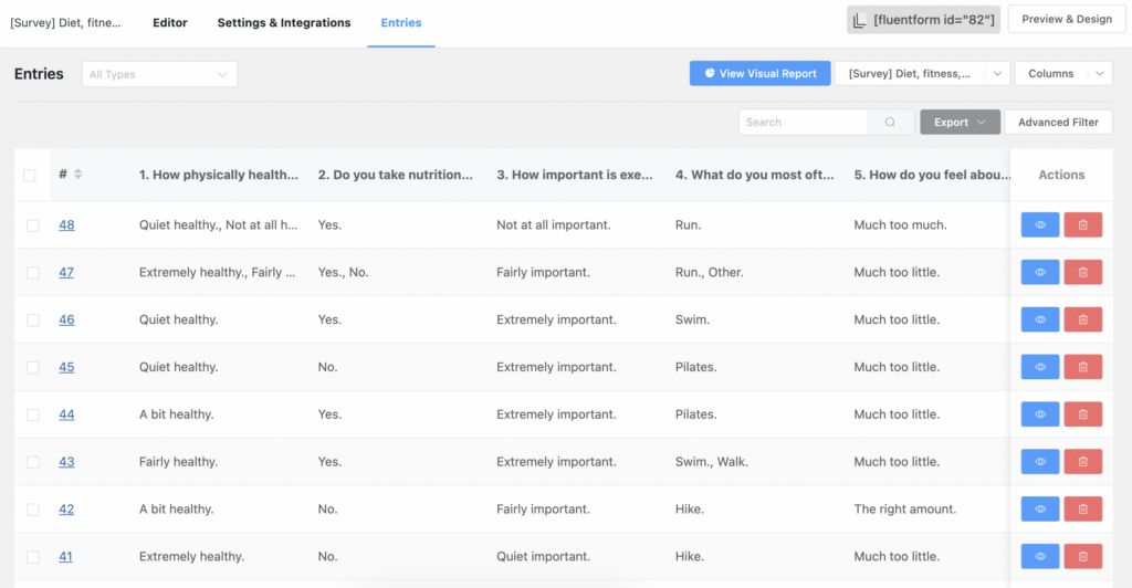
Check out the form’s data regularly to understand the outcome of the form. As a result, you can identify the strengths and weaknesses of your form and fix the issues that are hampering its better performance. For example, go to the entires section of a specific form on your Fluent Forms dashboard. Here, you can check out the performance of your form.

Fluent Forms in a nutshell
Making any form with Fluent Forms is super easy and sleek. You’ll get many fields and integrations to arrange your data smoothly. Fluent Forms has many features and functionalities to make more advanced and updated forms for your website.
It’s well-known for its
- Drag and drop facility
- 70+ pre-built templates
- Conversational forms
- 40+ third-party add-ons
- Signature add on
- PDF add on
- Spam protection
- GDPR friendliness
On top of that, Fluent Forms is the most user-friendly tool that is loved by 200K people. Check out our articles and the Fluent Forms website to know more about the plugin. You can also follow us on Facebook, Twitter, Instagram, and YouTube for more updates and news.


Leave a Reply