101+ Online Form Statistics to Optimize Your Conversion Strategy in 2026

Did you know that those who abandon recruitment forms spend longer on them than those who complete them?
On average, a user who drops out of a recruitment form spends one minute and forty seconds interacting with the form. Someone who successfully converts spends one minute and twenty-five seconds.
Now, what does that tell you? Maybe most companies’ job application forms aren’t as smooth as they think. What do you think about yours? Is it easy navigate? Do applicants easily understand what’s being asked of them? Is the user journey frictionless, or do the applicants find midway through the application that they need 10 years+ experience? Do they have to list everything in the application form that’s already in their resume?
As you ask yourself these questions, you’ll find that there’s room for improvement. There’s always room for improvement, whether it’s an application form, a lead form, or a checkout form, if you know where users struggle the most or abandon the form.
In this blog post, I’ve compiled 101+ online form statistics that’ll give you insight into which parts of your forms need rethinking, which fields to remove, or which copy to tweak. Simply go through these stats and optimize your forms to maximize your conversion rates.
General online form statistics
1. 74% of businesses use web forms to generate leads, with 49.7% identifying them as their most effective conversion tool.
2. 66% of people who start a form successfully complete it.
3. Only 45% of people who visit a form convert successfully.
4. Returning users convert at a higher rate than new ones (but not by much).
5. Approximately 70% of people complete the optional questionnaire.
6. Forex Trading has the overall highest conversion rate by industry (67.35%).
7. Chrome has the overall highest Starter to Completion Rate, while Samsung has the lowest.
8. Edge users have the highest view-to-conversion rate (46.7%) across all forms.
9. For mobile devices, the average form conversion rate stands at 42.95%.
10. Tablets see an average form conversion rate of 41.13%.
11. The average form conversion rate across all industries is 1.7%.
12. Popups make up about 66% of all signup forms.
13. Online Form Builder Software Market size was valued at USD 4.06 Billion in 2024 and is estimated to reach USD 9.48 Billion by 2032.
14. The Online Form Builder Software Market is segmented into Cloud-Based and Web-Based. The Cloud-Based segment currently commands the dominant market position, capturing approximately 59.6% of the total market share.
Form conversion rate statistics
15. Application forms have the highest completion rates. 75% of people who start an application end up completing it.
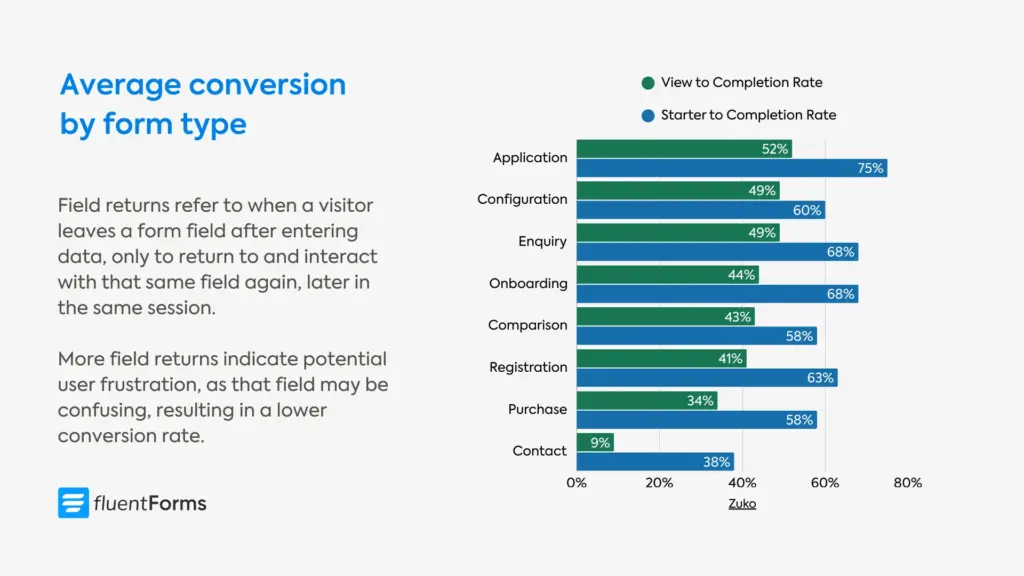
16. Contact forms have the lowest conversion. Only 38% of users who interact with a contact form actually submit their details, with the view to completion rate being 9%.
17. Registration forms are the quickest to complete, taking one minute and thirty-five seconds on average.
18. Registration forms have a 63% start-to-complete rate and a 41% view-to-complete rate.
19. Purchase forms have a 58% start-to-complete rate and a 34% view-to-complete rate.
20. Onboarding forms have a 68% start-to-complete rate and a 44% view-to-complete rate.
21. Checkout forms take the longest to complete: Three minutes and twenty-one seconds on average.
22. On average, desktop users convert at a higher rate than mobile users. The starter-to-completion rate for desktop is 55.5%, while for mobile devices it’s 47.5%.
23. Returning customers convert at a higher rate than new customers, though the difference is not much in most industries.
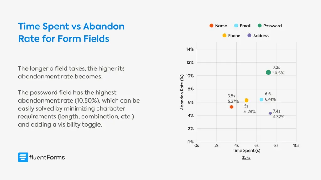
24. The name field has the shortest average completion time (3.5s) and field return figure (0.3).
Factors affecting conversion rates
25. Completion rates drop by almost 50 percent when an application asks 50 or more questions vs. 25 or fewer questions.
26. Asking candidates to re-enter work histories into fields in an applicant tracking system (ATS) is another cause of abandonment.
27. More field returns (when a visitor leaves a form field after entering data, only to return to and interact with that same field again later in the same session) result in a lower conversion rate.
Conversion rates by industry
28. Local government form view-to-completion rate is 85% (the highest).
29. Local government forms are also the longest, with 71 inputs on average, taking over 8 minutes to complete them.
30. Property sector forms take the second longest to complete, over 7 minutes on average.
31. The view-to-completion rate for financial services forms is 47%, although their start-to-completion rate is a little higher (60%).
32. Automotive forms have the lowest conversion rate (18% starter to completion rate & 10% view to completion rate).
Form abandonment statistics
33. More than 67% of site visitors will abandon your form forever if they encounter any complications; only 20% will follow up with the company in some way.
34. The majority (81%) of people have abandoned at least one online form, with over half (59%) indicating that they have done so within the last month.
35. When people return to complete an online form, it’s mostly for their own benefits, such as needing access to a resource (30%) or wanting to redeem an incentive (20%).
36. 19% return to complete an online form if the company initiates additional contact through an email or phone call.
37. 20% of partial form responders will come back and complete the form if they are sent a link to the incomplete form.
Reasons for form abandonment
38. The most common reason for form abandonment is security concerns, which account for 29% of abandonment.
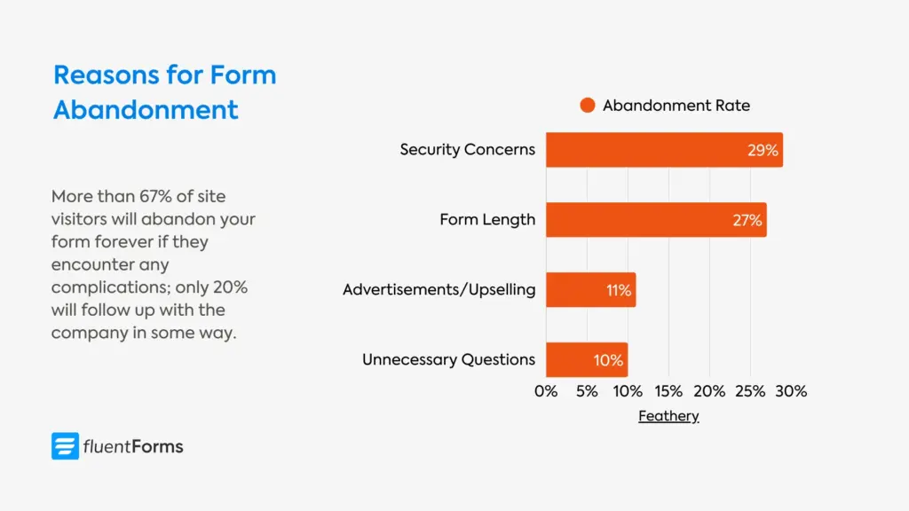
39. Form length stands second at 27%, while advertisements or upselling cause 11% of form abandonment, and 10% of users abandon due to unnecessary questions.
40. Around 60% of job seekers are likely to abandon the job application midway due to the form length or complexity.
41. The password field has the highest abandonment rate (10.50%), followed by email (6.41%) and phone number field(6.28%). Minimizing requirements about password length/character combination might lower the field abandonment rate. Another way to reduce friction is to let users unmask the password they enter.
42. About 50 percent of responding employers said the length of application processes is a positive because it “filters out” applicants.
Mobile form statistics
43. In most industries, desktop users convert at a higher rate than mobile users. The overall view to completion rate for desktop is 37.2%, and for mobile it’s 31.3%.
44. Only 3% of people prefer to fill out online forms on a mobile device, compared to 84% who prefer a laptop or desktop computer and 13% who prefer a physical copy.
45. The software industry has the highest difference in the desktop (53.5%) and mobile conversion rates (38.6%).
46. Application forms are submitted using mostly mobile devices, while contact forms are submitted using mostly desktop devices.
47. A lion’s share of the charity forms (non-profit industry) are submitted from mobile devices.
48. In the gambling industry, mobile forms convert more (54.0%) than desktop forms (53.9%). Although tablet forms convert better (55.1%) than both these devices.
Form design & UX statistics
49. More than a quarter (27%) of people are likely to abandon an online form they feel is too long.
50. On average, marketers use 4.92 form fields on their forms. The number of form fields mostly resembles a normal distribution that centers around five.
51. Comparison forms have the highest number of form fields (44.2) on average, followed by application forms (38.9).
52. Multi-step forms convert 86% higher. Only 40% of marketers use them, but those that do report 17% higher satisfaction rates with their lead generation efforts.
53. Multicolumn forms take 15.4 seconds longer to complete on average compared to single-column forms.
54. Higher form completion rates can be achieved by placing labels on top of form fields.
55. A major European e-commerce site’s sales increased by 35.81% after changing the color and shape of the “Add to Cart” CTA button from blue to green rounded corners.
56. After implementing inline validation messages, A List Apart found:
- a 22% increase in success rates,
- a 22% decrease in errors made,
- a 31% increase in satisfaction rating,
- a 42% decrease in completion times, and
- a 47% decrease in the number of eye fixations.
57. When filling out a form, 90% users prefer to be told about the mistakes as they type.
58. Creating easy-to-use forms improves the rate of first-time submissions with no errors from 42% to 78%.
59. The software industry has the highest number of field returns (5 on average), followed by utilities forms (3.7 on average) and data services forms (3.3 on average). Field return (when a visitor leaves a form field after entering data, only to return to and interact with that same field again later in the same session) indicates potential user frustration or confusion.
60. Contact forms have the highest field returns (6) on average, followed by application forms (3.9).
61. 88% of checkout forms don’t include a single “Name” field, increasing friction and the time it takes to complete a form.
Form field statistics
62. The password field has the highest abandonment rate (10.5%), which is significantly higher than any other field type.
63. Email and phone number questions also contribute to visitor dropouts, as indicated by their respective abandonment rates of 6.4% and 6.3%.
64. 60% of the test subjects consistently copied their email when they retyped it in a confirmation field.
65. Dropdown/select fields significantly lower the conversion rates, followed by textarea fields. Single-line text fields also slightly reduce the conversion rate.
Lead generation form statistics
66. 74% of marketers are using web forms for lead generation, and 49.7% of marketers say that web forms are their highest converting lead generation tool.
67. 90% of Americans admit to being subscribed to at least one newsletter.
68. 33% reported they had a dedicated email account for newsletters only.
69. In the US, the most common reasons for people to subscribe to a newsletter are:
- 39%: receiving discounts
- 21%: reading current news
- 18%: learning more about something that interests you
- 16%: getting access to exclusive content
- 5%: receiving product updates and announcements
Payment & checkout form statistics
Consumers want to feel in control when they’re shopping. Web forms let them explore and get the information they need without feeling like they have to buy something right away. That being said, many factors affect online checkouts, including:
70. 14% of online shoppers are reluctant to provide their phone number.
71. 14% of online shoppers are reluctant to provide their gender.
72. 27% of online shoppers are reluctant to provide their date of birth.
73. The average cart abandonment rate is 70.22%.
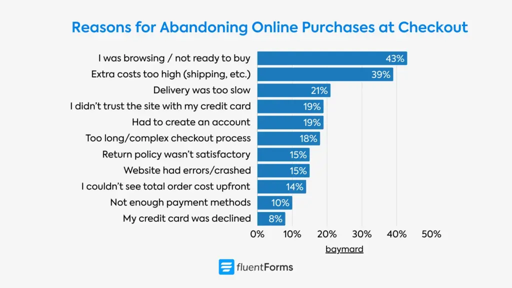
74. 43% of US online shoppers have abandoned a cart because “I was just browsing / not ready to buy.”
75. The second biggest reason (39%) for cart abandonment is “Extra costs too high (shipping, etc.).”
76. 18% of US online shoppers abandon an order due to a “too long/complicated checkout process.”
77. Over 80% of shoppers abandon booking and checkout forms.
AI & smart form statistics
78. Greenhouse increased their demo request form completion rate by 20% using dynamic forms. Previously, the form had nine required fields. The modified version starts with just three fields (email, first name, and last name).
79. 23% of users across the dataset triggered autofill.
80. For autofill users, the overall completion rate was 71%, while for non-users it was 59%.
81. The Form Automation Software Market was valued at $7.09 billion in 2018 and is expected to reach $26.03 billion by 2026.
Industry-specific form statistics
82. The average form conversion rate is 1.7% across different industries (gathered from data of fourteen industries).
83. Professional services forms have the highest form conversion rate, 4.6%, whereas real B2B ecommerce forms have the lowest conversion rate (1.8%).
E-commerce form statistics
84. E-commerce forms have a 51% start-to-complete rate and a 31% view-to-complete rate.
85. On average, e-commerce forms take 163 seconds to complete.
86. Users abandon e-commerce forms after spending an average of 62 seconds.
87. New customers convert more (51.5%) in the e-commerce industry than returning customers (50.3%).
B2B form statistics
88. Financial services forms have a 60% start-to-complete rate and a 47% view-to-complete rate.
89. On average, financial services forms take 96 seconds to complete.
90. Users abandon financial services forms after spending an average of 40 seconds.
91. Nearly 95% of individuals who begin insurance forms successfully complete them.
Healthcare form statistics
92. Healthcare forms have a 73% start-to-complete rate and a 56% view-to-complete rate.
93. On average, e-commerce forms take 74 seconds to complete.
94. Users abandon e-commerce forms after spending an average of 63 seconds.
95. The healthcare industry has the highest difference in new vs returning customers’ conversion rates (39.5% for new vs 58.6% for returning customers).
Education form statistics
96. Education forms have a 75% start-to-complete rate and a 60% view-to-complete rate.
97. On average, education forms take 134 seconds to complete.
98. 98. Users abandon education forms after spending an average of 69 seconds.
Real estate form statistics
99. Property forms have a 52% start-to-complete rate and a 32% view-to-complete rate.
100. On average, property forms take 99 seconds to complete.
101. Users abandon property forms after spending an average of 26 seconds.
SaaS & technology form statistics
102. Software forms have a 61% start-to-complete rate and a 47% view-to-complete rate.
103. Data service forms have a 62% start-to-complete rate and a 31% view-to-complete rate.
104. On average, software forms take 103 seconds to complete.
105. Users abandon software forms after spending an average of 39 seconds.
Form A/B testing insights
106. Michael Aagaard saw a 90% increase in clicks after changing button text from second person (“Get your 30-day trial”) to the first person (“Get my free 30-day trial”).
107. Zuko achieved a 56.3% increase in form conversions by removing “Confirm Password,” while the password reset rate remained steady at 10%.
108. By shortening its form from 30-40 questions to a simpler flow, Vial increased its sign-up completion rate by 30%. On the other hand, Unbounce found that shortening their form resulted in a 14% drop.
109. By making the phone number field optional, ClickTale doubled (from 43% to 80%) the conversion rate of its sign-up form.
110. Pop-ups consistently outperform websites with no pop-ups, and (in case you missed it) can increase conversions by 2100%.
111. Adding a privacy policy that says “100% privacy – We will never spam you” actually reduced conversions by 18.70%. The word “spam” plants doubt in users’ minds, even when the opposite is promised. Replacing it with “We guarantee 100% privacy. Your information will not be shared” increased sign-ups by 19.47%.
Future of online forms: how to optimize yours
With the growth of online businesses, users are no longer limited by a handful of options. As they can choose from tons of options, they continue to side with convenience. Your prospects are filling out forms that are trustworthy and feel less like work. And that form can be yours. Here are a few tips:
1. Always explain why a field is necessary
Users are not fond of sharing their information, and they’re very quick to abandon a form if they feel like you’re asking for irrelevant information. That’s why always explain why you’re collecting their email or phone number, what’s in it for them. If the information isn’t absolutely necessary, keep it optional, or better yet, don’t ask for it altogether.
2. Make your form length proportional to the value offered
Always weigh your offered value against the information you’re asking your users/leads. Ask yourself, if you’d have shared this information for that value or taken the time to fill out a lengthy form. If not, you need to rethink your form’s length and questions and make adjustments. Besides, for every field you remove, your conversion rate increases by 2-3%.
3. Minimize friction for users
Minimizing frictions leads to a smooth user experience. And, the smoother the user experience, the higher the conversion rate. Here’s how you can reduce friction in your forms:
- Use radio fields instead of dropdowns whenever possible. Dropdown fields require an extra click, which might lead to frustration. Radio options, on the other hand, remain visible at all times.
- Integrate the booking calendar with your form. Users hate to wait for reservations/follow-ups after placing a request through the form. Streamlining the booking process right from the form ensures your leads are not going with your competitor who contacted them first.
- Make the checkout process as simple as possible. Ask few questions. Let users pay right from the form, without ever having to change tabs/windows. Amazon patenting “one-click checkout” is the living example of why simpler checkouts are the most effective.
- Use one column. Multicolumn layout requires the eye to zig-zag across the screen, which might agitate users.
- Use multistep forms for longer forms. A few fields per step are less monotonous than all the fields in a single step.
- Let users enable autofill, especially for text-heavy fields like shipping addresses. Offer options whenever possible, because open-ended text fields are less convenient.
- Use clear and concise language. Keep your labels and questions easy to understand. Users tend to abandon forms when they’re confused about what’s being asked of them. For example, “Create a Password” is a clearer instruction than “Enter Password,” and reduces cognitive load, because users aren’t confused about which password they have to enter.
Ready to Build Better Forms?
- 60+ ready input fields
- 100+ customizable templates
- Numeric calculation
- Multistep Forms with progress bar
- Conversational forms
- Quiz & Survey
- Smart logic for personalization
4. Run A/B tests
Nothing is certain when it comes to design elements. What works for one industry or business might not work for another. That’s why you should test how each element performs. Make small tweaks on button color, button texts, CTA copies, etc., one at a time and observe the data for a month or two. Use first person in your button texts instead of seconds, for example, “Get My Free Quote,” or “Get My Membership,” etc. If you get better results, stick with it. Otherwise, make further adjustments.
5. Show trust signals
Another way to achieve higher conversion rates is to show testimonials or trust signals. Show what users are saying about your business/products near your forms, which might motivate new visitors. Apart from that, usean SSL certificate and other security measures so users feel safe about sharing their data with you.
Now that you have data-driven insights on how to convert more, are you ready to act on them? Because the sooner you take the first step, the sooner you start closing those sales. Let your journey towards excellence begin today.
What these form statistics mean for your business
These statistics are both humbling and hopeful.
Humbling, because they show how many conversions are lost for small oversights: the 67% who abandon due to complications, the 29% who leave over security concerns, and the users lost to a password field with too many requirements.
But what makes this data hopeful is that the fixes are usually simple. Multi-step forms convert 86% higher. Inline validation boosts success rates by 22%. Changing “your” to “my” in button copy lifts clicks by up to 90%. Making a phone field optional often doubles conversions.
Of course, shorter and faster forms help with conversion, but perhaps what really matters is that your forms are intuitive. They should explain the purpose of each field, guide users with clear instructions, offer a personalized experience by hiding irrelevant fields, let users save their progress, and so on.
So pay attention to the details, remove the tiniest friction to offer your users the most seamless journey. Start simple, change one thing at a time and track performance. Keep making necessary adjustments as you go.
Let us know how it’s going!

Sarika writes for Fluent Forms and loves to offer insights into small businesses. She’s curious and enjoys discussing ideas, interests, and perspectives. In her free time, she’s either marvelling at architectural beauties or trying different cuisines.


Leave a Reply