A Complete Guide to the Fluent Forms Reporting Dashboard
If your WordPress site has dozens – or even hundreds – of forms, making sense of all that data can be a real headache. Seeing which forms perform best, which get the most engagement, or how payments are trending can be overwhelming and time-consuming.
Fluent Forms solves this with its Reporting Dashboard, giving you clear insights into your form submissions and payments, so you can quickly understand trends and make smarter decisions.
TL;DR
- Fluent Forms Reporting Dashboard lets you track forms, submissions, and payments without juggling spreadsheets.
- Overview tab gives you snapshot of all forms – total submissions, unread entries, completion rates, top-performing forms, traffic heatmaps, and API logs.
- Payments tab shows a clear breakdown of paid, pending, refunded, and failed transactions, plus revenue by form, gateway, and payment type.
- Submissions tab provides a detailed engagement metrics, including read vs. unread submissions, spam tracking, and per-form analysis with flexible grouping options.
Understanding the Reporting Dashboard
Before diving into the specifics, it’s worth understanding what the Reporting Dashboard is all about. Think of it as a central hub for your form data. Instead of toggling between multiple forms or spreadsheets, the dashboard consolidates everything neatly in one place.
It’s divided into three main sections:
- Overview: A high-level snapshot of all your forms’ activity
- Payments: A centralized summary of all financial transactions
- Submissions: A closer look at engagement and user interactions
Each section is powered by metrics, detailed breakdowns, and interactive charts. This makes it easier than ever to turn form data into insights you can act on.
Why reporting matters for forms
Forms aren’t just about collecting data – they’re about using that data to improve performance. A reporting dashboard in a form builder tool helps you:
- Spot winning forms: Identify which forms drive the most engagement.
- Uncover bottlenecks: Detect high drop-off or incomplete submission rates.
- Track engagement over time: See when users are most active and plan campaigns accordingly.
- Manage revenue: Keep a clear record of payments, pending amounts, and refunds.
- Save hours of work: No more switching between form entries, payment gateways, or Google Sheets to figure out what’s happening.
With Fluent Forms, these insights are built right into the Reporting Dashboard.
A Deep Dive Into the Reporting Dashboard
Now, let’s move on to each section to explore the specific metrics and insights they provide.
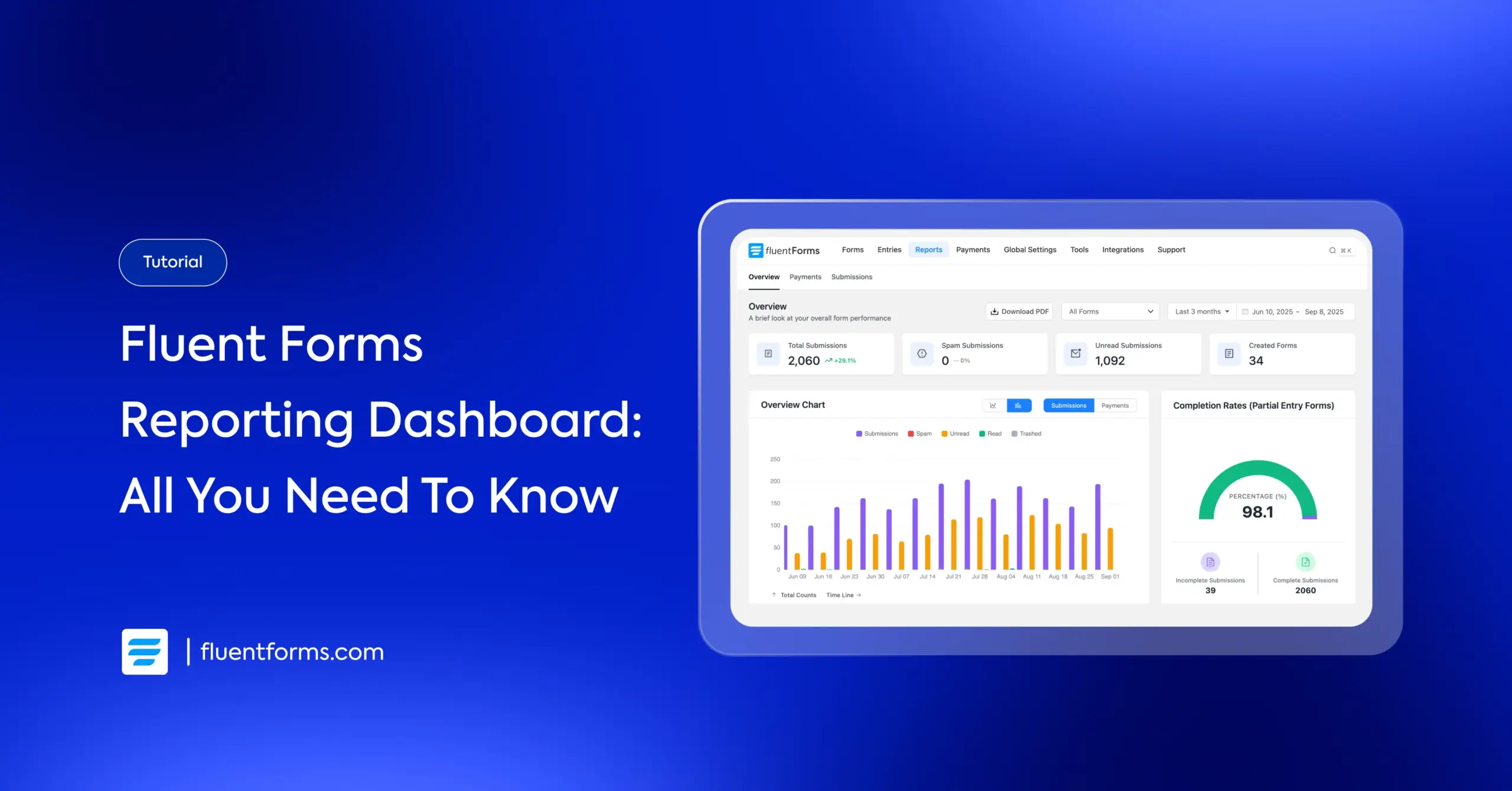
Overview
The Overview is the default view. At the top, it shows four key metrics:
- Total submissions (with percentage change)
- Spam submissions
- Unread submissions
- Number of created forms
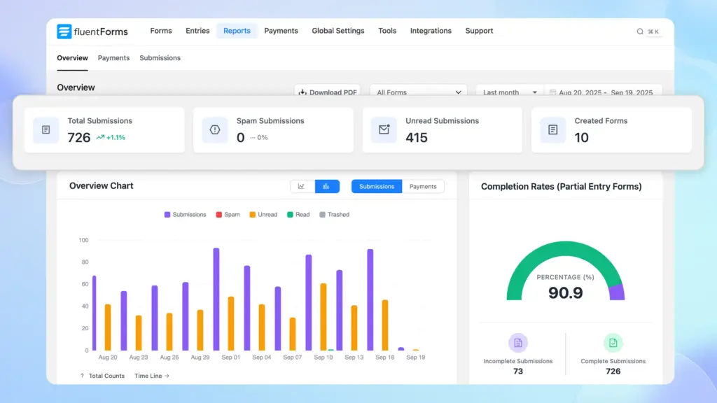
Underneath these cards, you’ll see several charts and graphs:
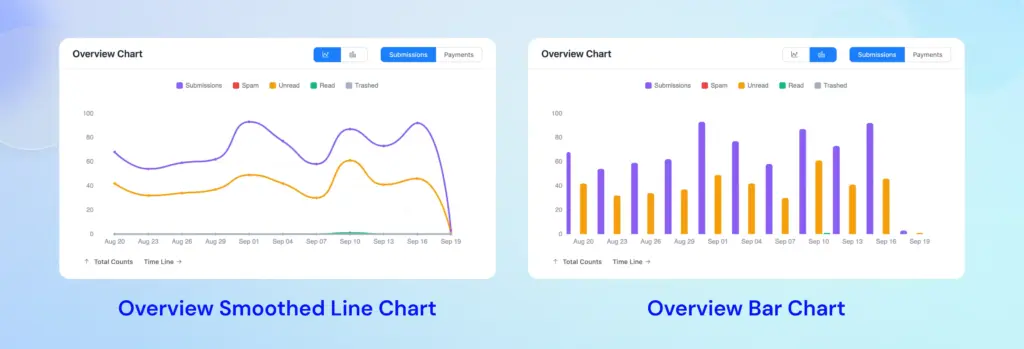
Overview Chart displays a timeline chart (bar or smoothed line) that plots form submissions and payments across the date range. You can toggle between showing submission counts or payment amounts. You can track spikes or drops from these charts.
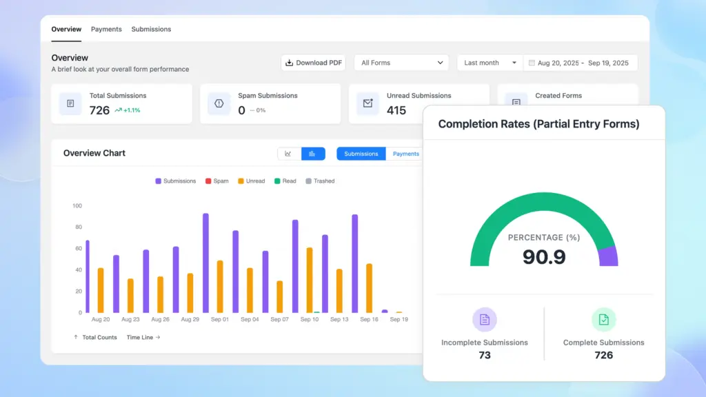
If you have partial entries enabled, the Completion Rate shows the percentage of started forms that were completed. A low completion rate on a form signals that many users are abandoning it.
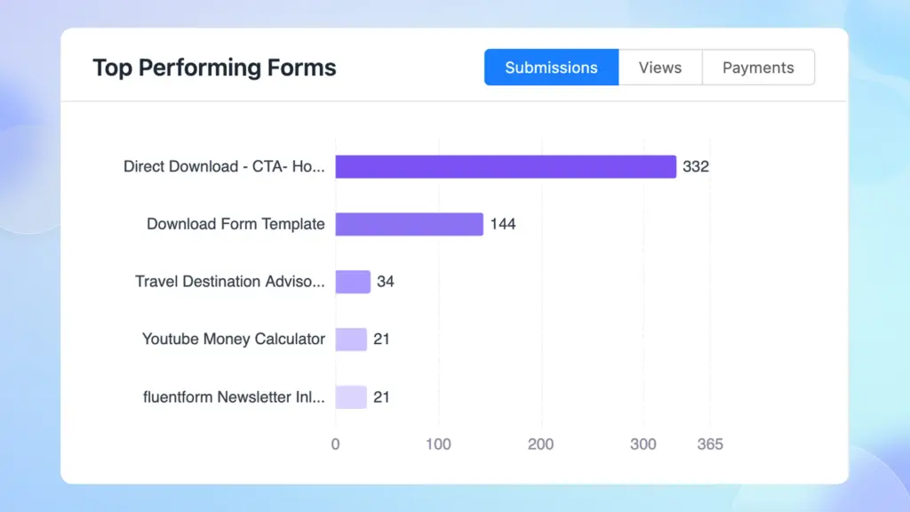
Top Performing Forms is a ranking (by submissions, views, or payments) of your forms. This instantly highlights your best forms – the ones driving the most traffic or revenue.
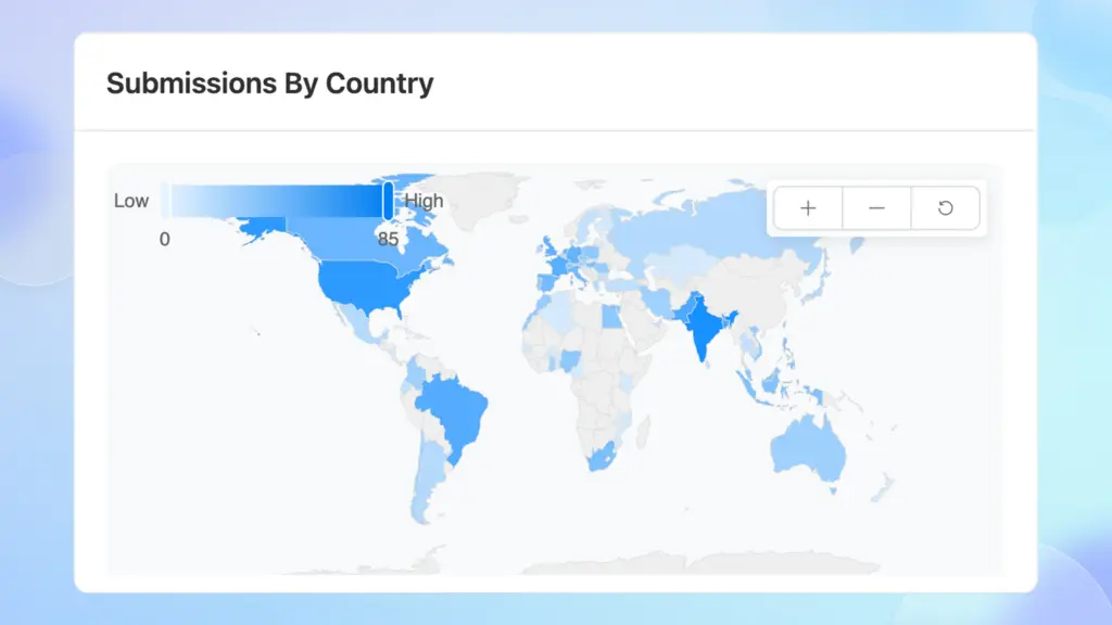
Submissions by Country is a map that reveals your audience’s geographic spread across the globe. Brighter regions indicate more submissions. A slider lets you focus on high- vs. low-volume countries.
Submission Timeline Patterns is a heatmap grid (days vs. hours) showing when submissions occur. Darker shaded rectangles mean higher submission volume. You can toggle between AM/PM to see specific time blocks.

Finally, the API Logs is a chart of integration calls (Success, Processing, Failed). This shows if any webhook/API requests failed or are pending, so you can troubleshoot integration issues at a glance.
Payments
The Payments tab gives you a dedicated view of your transaction data.
At the top are four summary cards:
- Total Paid (completed payments)
- Total Pending
- Total Refunded and
- Total Net Revenue (paid minus refunded)
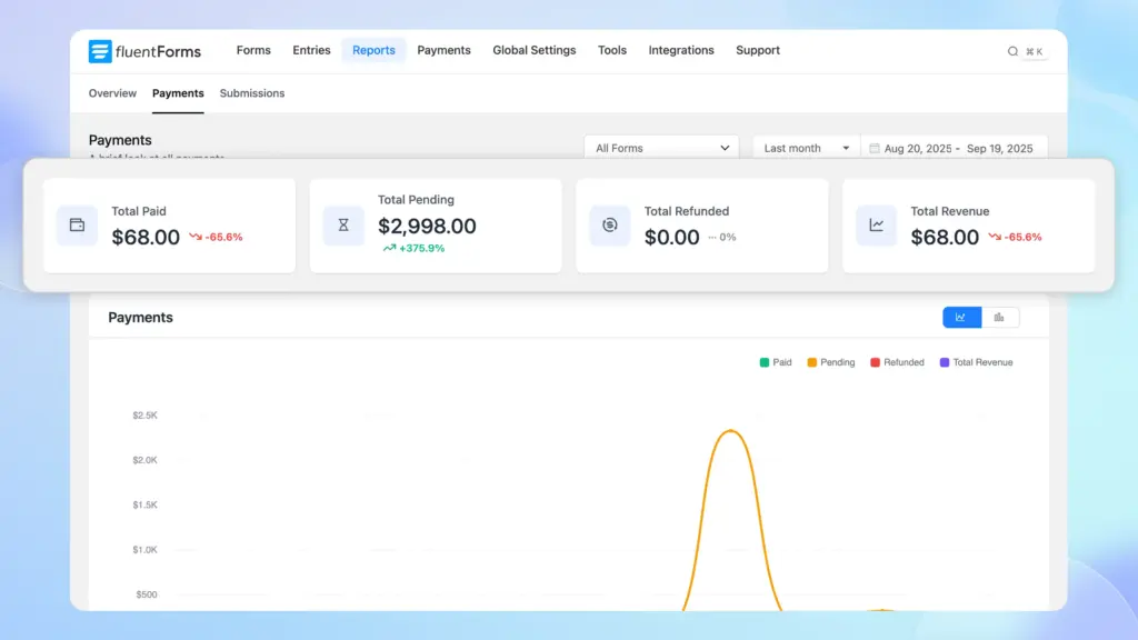
These cards tell you at a glance how much money has been processed, what’s still pending, and what’s been returned.
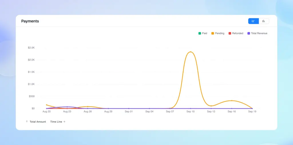
Below the cards, several visualizations appear. Payments Chart: A bar graph plotting Paid, Pending, Refunded, and Net Revenue by date. Each point on the line shows the amount on a given day.
Subscription Chart: If you use recurring payments, this chart tracks monthly subscription income over time.
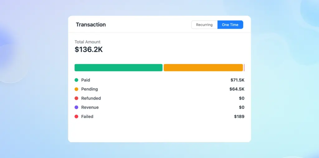
Transaction Summary Chart: A combined chart/table letting you toggle between Recurring and One-Time payments. For each mode, it lists totals for Paid, Pending, Refunded, Revenue, and Failed. This breakdown shows you, for example, if a lot of transactions are stuck pending or if many are failing, by category.
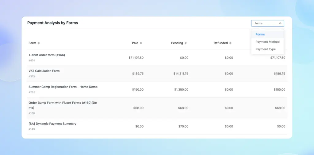
Further down, the Payments tab has tables for deeper analysis. Using the dropdown menu, you can choose Payment Analysis by Form, Method, or Type:
- Payment Analysis by Form: A table listing each form with columns for Paid, Pending, Refunded, and Net Revenue. This makes it easy to see which form is earning the most money (and which might have pending or refunded amounts).
- Payment Analysis by Method: A table breaking down totals by payment gateway (PayPal, Stripe, Mollie, Paystack, Offline/Test, etc.). For each method, it shows the total Paid, Pending, Refunded and Net Revenue, plus a Count of transactions. This helps you see if a particular gateway is underperforming.
- Payment Analysis by Type: Similar to the above but grouped by one-time vs. subscription payments. It shows Paid, Pending, Refunded, Net Revenue, and transaction count for each payment model.
With these reports, you can monitor revenue and identify issues in seconds. For instance, if the Pending or Failed totals are abnormally high for a given day or gateway, you know to investigate payment setup or server issues.
Likewise, seeing all revenue per form helps you judge which products or donation forms are most effective.
Submissions
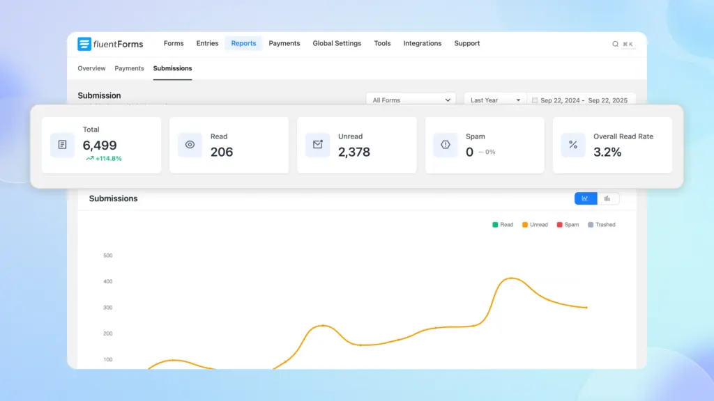
The Submissions tab focuses on how people are interacting with your forms. At the top, it shows summary stats similar to the Overview and Payments tab, but specifically about entry status. You’ll see cards for Total Submissions, Read, Unread, Spam, and Overall Read Rate.
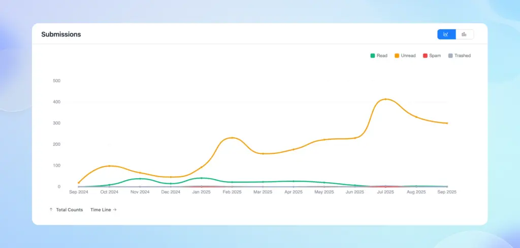
Below this is the Submissions Chart – a color-coded bar graph of entry volume over time. Each bar is divided by status (e.g. Green = Read, Orange = Unread, Red = Spam, Gray = Trashed in the legend).
Under the chart is a detailed Submissions Analysis Table. By default, it groups by Form, listing each form with columns for Total Submissions, Read, Unread, Spam, and Read Rate.
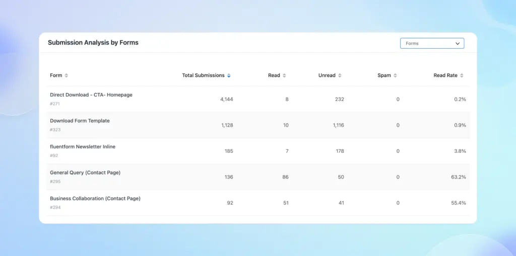
There’s a dropdown on the top right corner of this table that lets you group the data by other fields (Submission Source, Email, Country, or Submission Date). This means you can, for example, see which countries are submitting to a particular form, or which emails or sources are most common.
Putting it all together
Fluent Forms Reporting Dashboard turns your forms’ data into clear charts and tables. The Overview tab gives you a high-level snapshot, while the Payments tab shows exactly how much money is coming in from each form and gateway. The Submissions tab breaks down who is filling out each form and when.
By consulting these reports regularly, you’ll understand trends, track engagement, and monitor your forms’ effectiveness at a glance.
Build Smarter Forms for Free

An Econ major turned into a Digital Marketer by choice. Hello! This is Ashraf and I am here to enlighten you on various WordPress topics and help you make informed decisions.


Leave a Reply