
How to Use Global Default Styles and Dynamic Autocomplete Fields
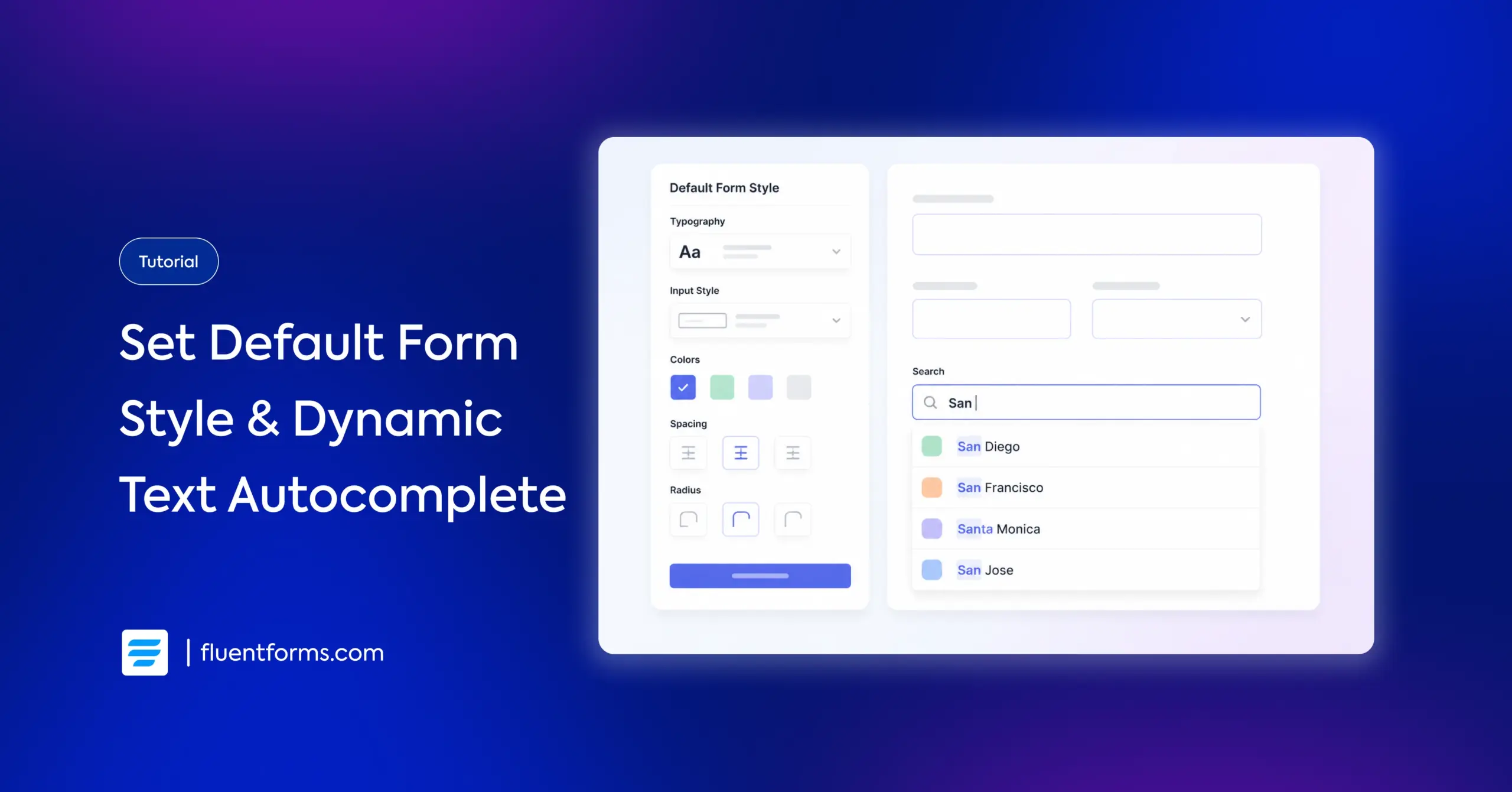
Every new form you create in Fluent Forms starts with a blank style. Previously, styles could be copied from one form to another, but you had to do it for each form individually. The Default Style Template removes that step. Now you can set a style as the default, and every new form inherits it.
And when your forms pull in long lists of options from posts, form submissions, or CSV files, your users have to scroll through every item. The Dynamic Autocomplete field fixes that. It lets users type a few characters and see matching results instantly.
This guide covers how to set up both features, when to use them, and how to get the most out of them.
TL;DR
- The Default Style Template is a free feature in Fluent Forms > Global Settings > Default Style Template. Style one form, set it as the default, and every new form inherits that style.
- You can pick a preset theme (Modern, Classic, Bootstrap, etc.) or copy styles from an existing form.
- Custom CSS and Form Styler JSON are both supported in the default template.
- Imported forms can also inherit the default style during import.
- The Dynamic Autocomplete field (Pro) is a field type inside the Dynamic Field. Set Field Type to “Text Autocomplete” to give users a type-to-search experience.
- It works with all five data sources: Post, Taxonomy Term, User, Fluent Forms Submission, and Dynamic CSV.
- You control the minimum characters before suggestions appear (default: 2) and the max number of suggestions shown (default: 10).
How to Set Up a Global Default Form Style
Once configured, every new form you create automatically inherits the style you’ve defined here. The Default Style Template is a free feature, available in both free and Pro versions.
Where to find the default style settings
Go to Fluent Forms > Global Settings. In the left sidebar, expand the General section. Click Default Style Template.
You’ll find these options:
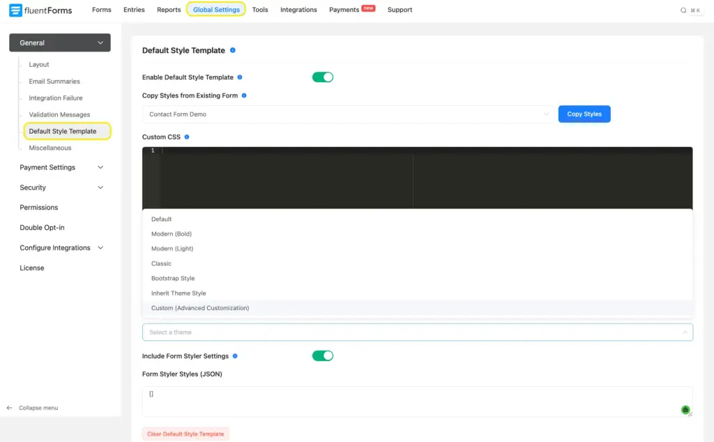
- Enable Default Style Template: Toggle this on to activate the feature.
- Copy Styles from Existing Form: A dropdown listing all your forms. Pick one and click Copy Styles to use its styling as the default.
- Select a theme: Preset themes include Default, Modern (Bold), Modern (Light), Classic, Bootstrap Style, Inherit Theme Style, and Custom (Advanced Customization).
- Custom CSS: A code editor where you can write CSS that applies to all forms using the default style.
- Include Form Styler Settings: Toggle this on to include your Form Styler JSON configuration.
- Form Styler Styles (JSON): A text box where you can paste the JSON exported from a styled form’s Form Styler.
- Clear Default Style Template: A red button at the bottom to reset everything.
Pick a theme or copy styles from an existing form
You have two approaches.
Approach 1: Start from a preset theme. Select one from the theme dropdown. “Modern (Bold)” and “Classic” are good starting points for a quick setup. “Custom (Advanced Customization)” gives you full control through the Form Styler.
Approach 2: Copy from an existing form. If you already have a form styled the way you want, select it from the Copy Styles from Existing Form dropdown and click Copy Styles. This pulls in that form’s complete style configuration, including its Form Styler settings.
I’d recommend the second approach. Build a reference form with all the field types you use: text inputs, dropdowns, checkboxes, radio buttons, textareas, file upload, and a submit button. Style it exactly how you want your brand to look. Then set it as the default. Every form you create after that starts with those same colors, fonts, borders, padding, and button styles.
You can always override the default on a specific form. Open that form’s Preview & Design tab (the Advanced Form Styler), make your changes, and save. The overrides apply to that form only. Your global default stays the same for future forms.
Add custom CSS and JSON styles
The Custom CSS box lets you write CSS rules that apply across all forms using the default style. This works well for details the visual styler doesn’t cover, like hover transitions or animation effects.
The Form Styler Styles (JSON) box accepts exported JSON from any form’s styler. Here’s how to use it:
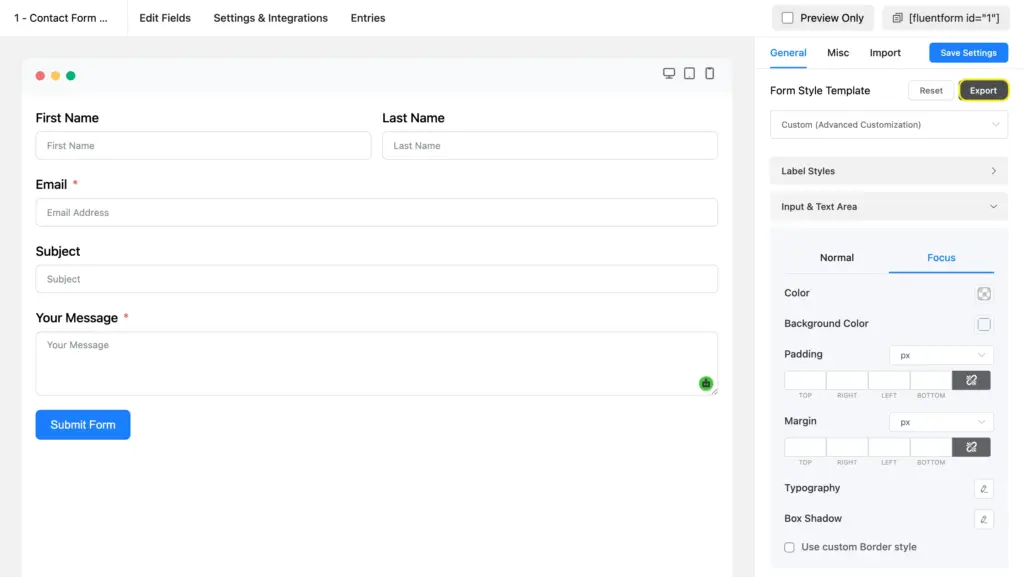
- Open your styled form and go to Preview & Design.
- In the styler sidebar, click Export (next to the Form Style Template dropdown).
- Copy the exported JSON.
- Go back to Global Settings > Default Style Template.
- Toggled on Include Form Styler Settings.
- Paste the JSON into the Form Styler Styles box.
- Click Save Settings.
This approach also lets you transfer styles between WordPress sites. Export the JSON from one site and import it into another.
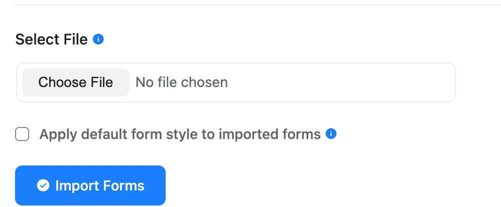
Apply default styles to imported forms
When you import a form (via Fluent Forms > Tools > Import), you’ll see a checkbox to apply the default style template to the imported form. Check it, and the form picks up your global style on import.
This is useful when you download pre-built templates from the Fluent Forms template library or migrate forms from another site. The imported form gets your brand styling without any manual touch-ups.
When to Use Global Default Styles
A default style is a design system for your forms. Define the look once, and it applies to every new or imported form. It ensures consistent branding without repeated effort.
Agencies building forms for clients
Set the default style to match the client’s brand guide once. Every new form on that site starts with the right look.
Membership or course sites with multiple forms
Registration forms, feedback forms, quiz forms, and contact forms all look consistent without extra effort.
WooCommerce stores
Order forms, return request forms, and product inquiry forms share a single branded style. Edit the default once, and new forms follow suit.
Sites with imported or migrated forms
When you pull in forms from another site or the template library, the import checkbox applies your brand styling in one click.
How to Set Up the Dynamic Autocomplete Field
A Dynamic Field in Fluent Forms pulls its options from an external data source instead of a manually typed list. You can connect it to WordPress posts, users, taxonomy terms, other Fluent Forms submissions, or a CSV file/Google Sheet. The field fetches data from your chosen source and presents it to users as selectable options. It’s part of the Advanced Fields module and requires Fluent Forms Pro.
The Dynamic Autocomplete field adds a “Text Autocomplete” option to this module. It turns a static dropdown into a searchable, type-to-find input. Users type a few characters, and matching options from your data source appear below the field as suggestions.
This is ideal when your form pulls in dozens or hundreds of options. Instead of scrolling through a long dropdown, users type what they’re looking for and get filtered results instantly.
Prerequisite: You need Fluent Forms Pro installed and activated. The Dynamic Field module is a Pro feature.
Add a dynamic field to your form
- Open your form in the editor (or create a new one).
- In the right sidebar, switch to the Input Fields tab.
- Scroll to Advanced Fields and click Dynamic Input to add it to your form.
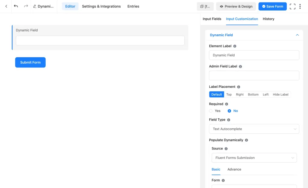
The field appears in the editor with a default label of “Dynamic Field.” Click the pencil icon on the field to open its customization settings in the Input Customization section.
Select “Text Autocomplete” as the field type
In the Input Customization sidebar, find the Field Type dropdown. It has five options:
- Select: Standard dropdown. Users pick one option from a list.
- Radio: Radio buttons. Users see all options and pick one.
- Checkbox: Checkboxes. Users pick multiple options.
- Multi-Select: Multi-select dropdown. Users pick multiple items from a dropdown.
- Text Autocomplete: Users type into a text field and see matching suggestions. This is the option we’re setting up.
Select Text Autocomplete.
When to pick autocomplete over a dropdown: Use autocomplete when your data source has more than 15-20 options. Below that, a standard dropdown or radio field works fine. Autocomplete is best for large datasets where scrolling through a list is slow or frustrating.
Choose a data source and form field
Under Populate Dynamically, you’ll find the Source dropdown. Fluent Forms supports five data sources:
- Post: Pull in WordPress posts, pages, or custom post types.
- Taxonomy Term: Pull in categories, tags, or custom taxonomies.
- User: Pull in WordPress users, filterable by role.
- Fluent Forms Submission: Pull in data from another form’s submissions.
- Dynamic CSV: Pull in data from a CSV file or a published Google Sheet.
I’ll use the Fluent Forms Submission source as the example here.
- Set Source to Fluent Forms Submission.
- Under the Basic tab, select a form from the Form dropdown (e.g., “Contact Form Demo”).
- Select a field from the Form Field dropdown (e.g., “Subject”).
- Check Only Show Unique Result to remove duplicate entries from the suggestions.
- Set a Result Limit (default is 500). This controls how many records are pulled from the source.
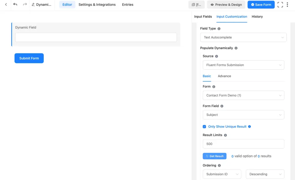
Under Ordering, choose how results are sorted. The first dropdown sets the sort field (e.g., Submission ID), and the second sets the direction (Ascending or Descending). You can also sort by other fields like Browser, Device, IP, Payment Status, or Created At.
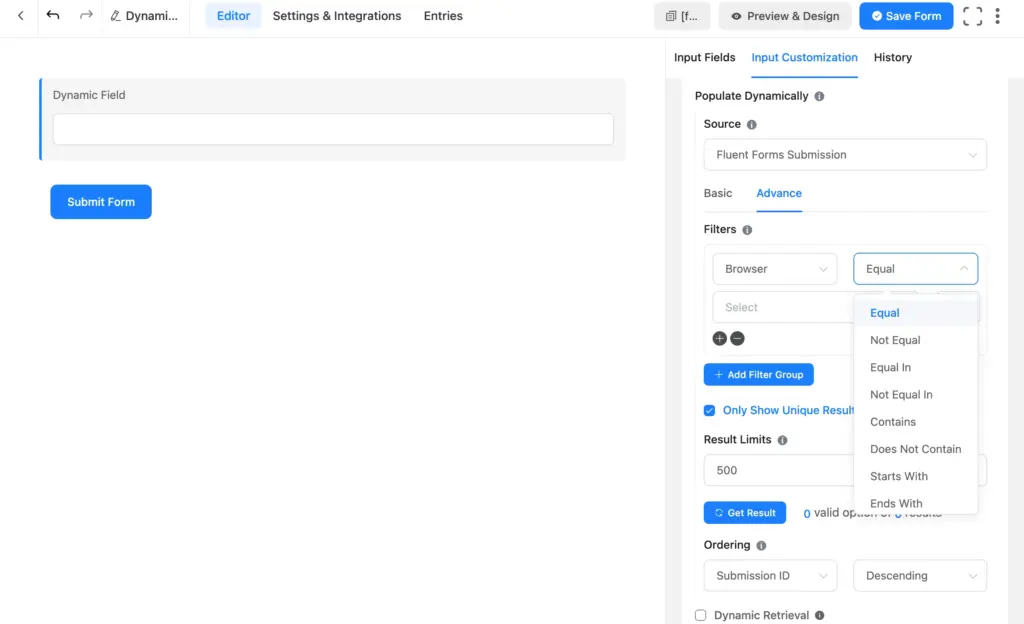
Fine-tune results with filters
Click the Advanced tab to access filtering options. Filters let you narrow down which records appear in the autocomplete suggestions.
Each filter row has three parts:
- Field: What to filter by. Options include Submission ID, User ID, Form ID, Serial Number, Status, Favourite, Source URL, Browser, Device, IP, Payment Status, Payment Method, Payment Type, Form Field Name, Form Field Value, and Created At.
- Operator: How to compare. Options include Equal, Not Equal, Equal In, Not Equal In, Contains, Does Not Contain, Starts With, and Ends With.
- Value: The value to compare against.
Click the + icon to add more filter rows within the same group (AND logic). Click the – icon to remove one. Use the + Add Filter Group button to create a separate set of conditions joined by OR logic.
Example: To show only submissions where the payment status is “Paid,” set: Payment Status > Equal > Paid. Your autocomplete suggestions will only include records from paid customers.
Configure autocomplete behavior
Below the data source settings, you’ll find autocomplete-specific options:
- Placeholder: Text shown in the input before the user starts typing (e.g., “Start typing to search…”).
- Minimum Characters: How many characters the user needs to type before suggestions appear. The default is 2.
- Max Suggestions: The maximum number of suggestions shown at a time. The default is 10. If more results match, only the top 10 (based on your ordering) are displayed.
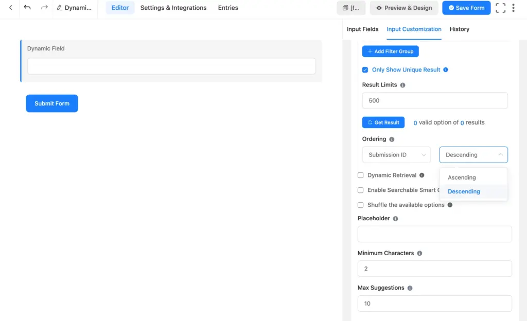
Three additional checkboxes give you more control:
- Dynamic Retrieval: When checked, results are fetched fresh from the data source every time the form loads on the frontend. When unchecked, the form uses the data from when you last clicked Get Result in the editor. Turn this on if your source data changes frequently (e.g., new form submissions coming in daily) and you want the autocomplete to always reflect the latest records.
- Enable Searchable Smart Options: Uses an optimized search library for better performance.
- Shuffle the available options: Randomizes the order of suggestions each time the form loads.
Template Mapping controls what users see versus what gets submitted. The Label field defines the display text (defaults to “Inputs Field Name”), and the Value field defines the submitted data (defaults to {field_value}). Click the pencil icon next to each field to customize the mapping if you need different display and submission values.
When to Use Dynamic Autocomplete
Use autocomplete when your data source is too long for a dropdown. Users type to filter instead of scrolling, which reduces errors and speeds up form completion.
Support ticket forms
Let users type a subject and see matching past subjects. This helps them find existing responses before submitting. Pull data from the Fluent Forms Submission source.
Job application forms
Pull department names, office locations, or job titles from a Google Sheet (Dynamic CSV source) and let applicants search through them instead of reading a long dropdown.
Event registration forms
Pull session titles or speaker names from a schedule form. Attendees type and pick rather than scrolling through every option.
Directory or product lookup
Pull product names or service categories from posts or a CSV file. Users type to narrow down their options fast.
Tips for Getting the Most Out of Both Features
Build a reference form for your default style
Before you set the default, create a form with every field type you use: text, email, dropdown, checkbox, radio, textarea, file upload, submit button. Style it fully. Copy its styles to the default template. This way, the default covers how every field type looks.
Keep autocomplete result limits practical
The default is 500 records. If your source has thousands, pulling all of them slows down the form. For most autocomplete fields, 100-200 records are enough.
Turn on “Only Show Unique Result” for clean suggestions
If multiple form submissions share the same value (e.g., identical subject lines), this checkbox removes duplicates. Users see a clean list instead of repeated entries.
Pair autocomplete with conditional logic
Add a dynamic autocomplete field for one selection, then use conditional logic to show or hide a follow-up field based on what the user picked. For example, the user types and selects a department name, and a second field appears with that department’s contact info.
Test autocomplete on mobile
The autocomplete field renders as a text input with a suggestion dropdown below it. Verify the dropdown is readable on smaller screens and the minimum character count feels right for your audience.
Export and share your default style
Use the Export button in the form styler or copy the JSON from Global Settings to transfer your style to another WordPress site. This saves time if you manage multiple sites.
Build Consistent, Searchable Forms in Less Time
The Default Style Template and Dynamic Autocomplete field solve two different problems, but both save you time and give your users a better experience.
Set your default style once, and stop redoing the same design work on every form. Add an autocomplete field and let users search through options instead of scrolling.
The Default Style Template is free. The Dynamic Autocomplete field requires Fluent Forms Pro.
Build Smarter Forms for Free

Sarika writes for Fluent Forms and loves to offer insights into small businesses. She’s curious and enjoys discussing ideas, interests, and perspectives. In her free time, she’s either marvelling at architectural beauties or trying different cuisines.


Leave a Reply