Styling Beautiful CSS Forms with Fluent Forms’ Advanced Form Styler
Every online business owner wants to turn its leads into customers. However, what they experience in reality is people visiting the site regularly, but not converting to end-users.
To get the conversation going, many online business people resort to contact forms. But many ignore the aesthetics of the forms. If you add a contact form to your site without considering its styling and positioning, it might do more bad than good.
So how can you make beautiful CSS forms for your potential customers?
Well, any standard form needs a clean visual structure, a real hierarchy of form elements, and high functionality o that it looks perfect while working smoothly. There are a bunch of form builder plugins that will help you design beautiful forms.
In this article, we will focus on a specific form builder plugin named Fluent Forms and use its Advanced Form Styler to create beautiful CSS forms. But before we get into that, let’s elaborate on why styling a contact form is essential.
KEY TAKEAWAYS
- Styling plays a crucial role in form design as it impacts user experience and conversion rates.
- The rule of thumb is to prioritize necessary fields, ensure user-friendliness, and avoide complexity.
- Fluent Forms’ Advanced Form Styler feature provides easy customization options without coding.
- You can easily customize the color, typography, padding, margin, box shadow, border and more of different form elements.
Why is styling online forms necessary?
A contact form is a crucial part of your website. When designing a website, you may overlook the contact form as it is a tiny part of the business. But you can’t ignore the impact it leaves.
Contact forms help you to increase the conversion rate for your online business site. So, while creating the contact form, you need to give full attention to it and take the steps necessary to build a stable form for your website.
Otherwise, the form might provide a bad user experience, confuse the audience, thus decreasing the conversion rate.
Now let’s see some essential tips for creating a beautiful-looking form on your website.
Build Smarter Forms for Free

Tips for creating beautiful CSS forms
Well, there are no hard and fast rules for styling contact forms. You can personalize your form as you want. But, you must keep your eye on some basic things.
Include necessary fields
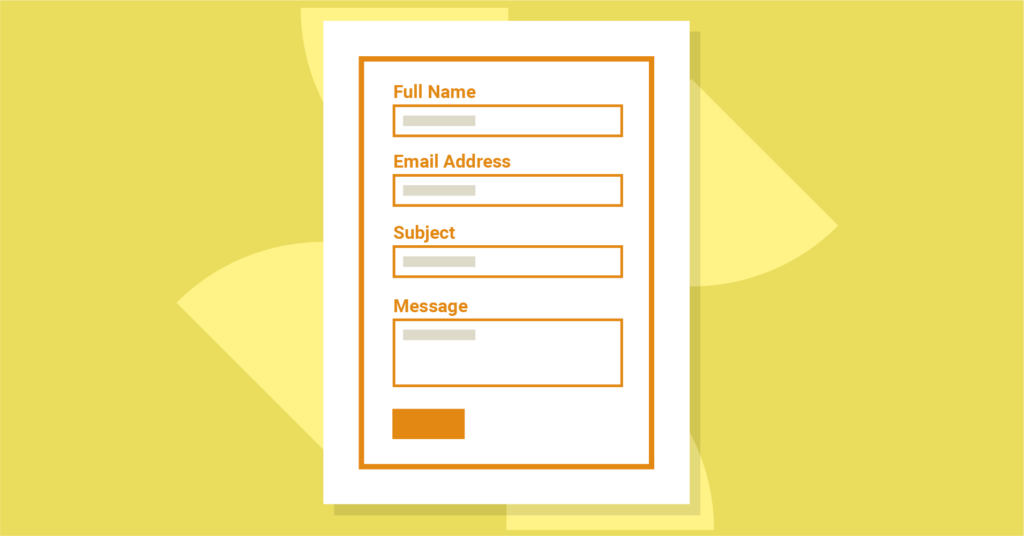
While filling up an online form, you may often face irrelevant or inappropriate questions. For example, if a contact form asks for your passport number when it’s not at all related to the service they provide, you are very likely to leave that page, aren’t you?
On the other hand, if your form doesn’t include enough relevant questions, the purpose of data collection might remain unclear to your audience. You also have to ensure you ask all the essential questions to get all the necessary data. A detailed but engaging contact form will encourage the audience to complete it.
In such situations, you must organize your form in a way that doesn’t bore people. You can add a small clarification about each field, which will gain people’s trust, and they will stay on your website.
Make the form user-friendly

Users are getting into your form either from their desktops or any handheld devices. So, your form should be so that the users can fill your form without any difficulties. Your form needs to be furnished in a way that users can feel the comfort of filling it out.
There are so many reasons for users not to find your form friendly, such as using CAPTCHA, which can be very annoying. When you find it to be irritating yourself, why would you ruin your website with it?
Another factor that’ll drive people away from completing your form is applying tricky or technical words in the questions. People will not put aside much time to fill up your form, so if they have to spend extra time and effort to understand it, they will surely leave it undone. Avoid making that mistake at all costs.
Another common mistake in designing a contact form is using too many dark colors and fancy fonts. You may think you’re decorating your form to make it more lucrative when, in reality, users find these things disturbing when filling up online forms.
Allow autofill
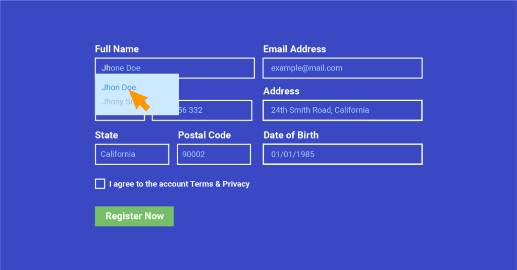
Google is offering the autofill feature to make your life easier. It minimizes the risk of errors occurring in important fields. So, while creating a responsive form CSS, either you can use make your simple so that Google can understand the form fields easily, or you can use any extension for the autofill purpose.
When you are offering this type of flexibility to users, it will save their time, and they can quickly fill up the queries.
Use an attractive call-to-action button

When you are styling form elements, a call-to-action (CTA) button is the most necessary part of it. It is the central portion where your users will click to take some action.
If you use confusing words on your CTA button, people won’t understand the purpose of your form. So if you haven’t paid attention to this part before, you need to go back and improve your buttons.
For instance, in the case of a contact form, instead of using straightforward words like “ok” or “submit,” use “contact us.” Or, use “get in touch” to your CTA button for an inquiry form. In that way, users will easily understand what they will get after submitting your form.
Apply a progress bar

Try adding a progress bar in your contact form when creating a form with a long list of questions. Though it doesn’t have any direct impact on increasing the conversion rate for your form, it will add to the user experience. Your users will be able to see the process of filling out the form.
Well, nowadays, there are so many form builder plugins in WordPress that will help you to style beautiful CSS forms for your website. Today we will see how you can create responsive form CSS using Fluent Forms. So, let’s dive into the topic.
Style beautiful CSS forms using Fluent Forms
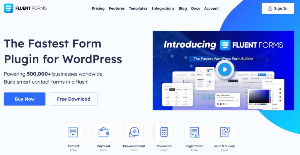
Fluent Forms is an excellent form builder plugin for WordPress. It is a lightweight and comfortable tool. Anyone can create any kind of form with its smooth interface. Its drag-and-drop feature makes it easier for users to make any form within a few minutes. Furthermore, Fluent Forms comes with 60+ input fields and 70+ pre-built templates to make the form-making process sleeker. You can also get 60+ third-party integrations with the plugin.
Moreover, advanced post creation, Stripe and PayPal integration, PDF entry generation, file upload, conditional logic, etc., functions are also available in Fluent Forms. You don’t need to worry about the security with this tool, as it is secured with reCAPTCHA, Honeypot, and Akismet.
It is designed in a way that can create good-looking forms for your WordPress website. Still, if you want to make a form that matches your website style, you can use the Advanced Form Styler feature of Fluent Forms.
Advanced Form Styler allows you to easily style any design without writing a single line of code. Let’s show you how you can do that.
Once you have created a form, click on the Preview & Design on the editor interface.
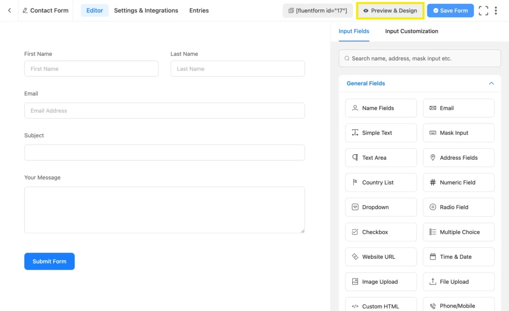
A preview window will open, and now you can style your form elements as you want.
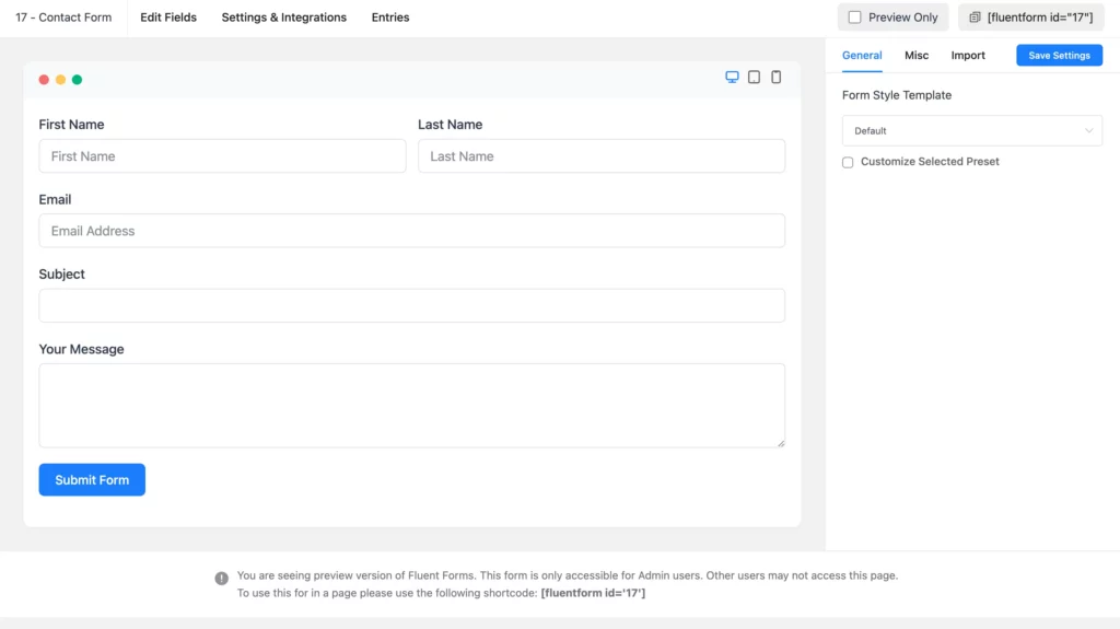
The design part comes with three tabs, General, Misc and Import. The General tab offers some templates for form style. You can choose from any of the templates, such as Default, Modern, Classic, Bootstrap Style, or Inherit Theme Style. You can even choose Advanced Customization for custom styling.
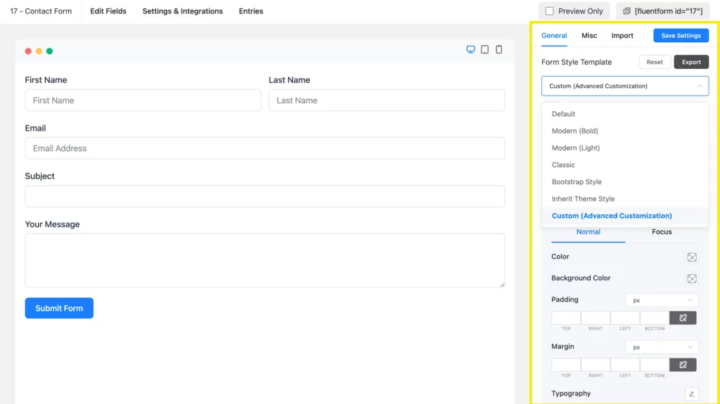
Custom (Advanced Customization)
If you select the Custom (Advanced Customization) option, you can customize the color, typography, padding, margin, box shadow and more of the following form elements:
- Label Styles
- Input & Textarea
- Placeholder
- Radio & Checkbox Style
- Submit Button Style
Fluent Forms provides an intuitive form styling interface that anyone can utilize to easily style their forms any way they want.
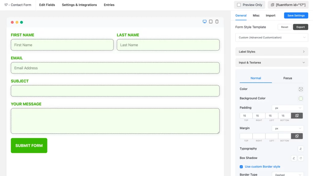
Label styles
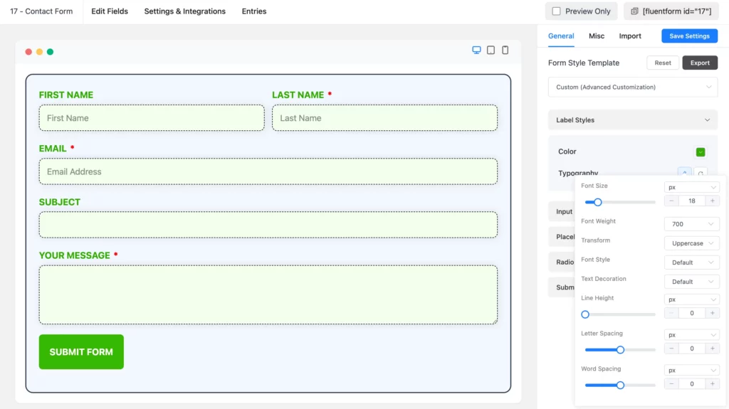
When you click on Label Styles, a dropdown menu will open with color and typography customization options. You can change the text color, Size, weight, text-decoration, etc.
Input & textarea
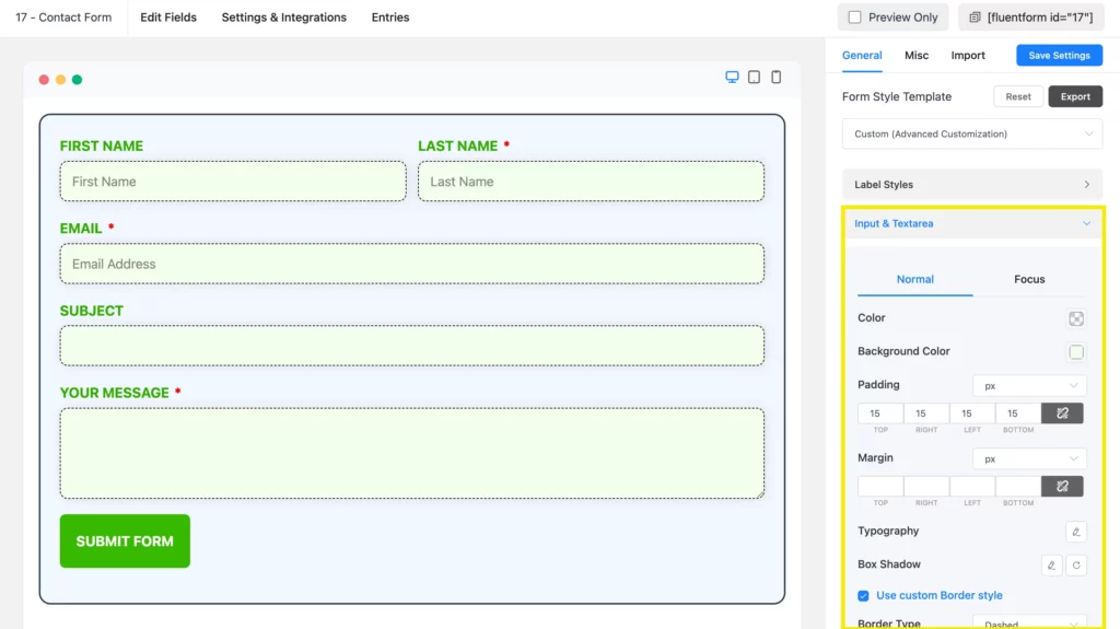
Here, you can change the background color and the font color of your form of Input & Textarea. Additionally, you will be able to set the Font Size, Font Type, Letter Spacing, Font-Weight, etc. You can even customize the box-shadow.
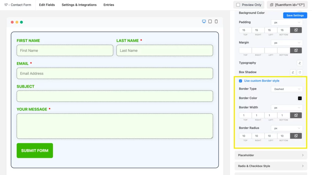
If you want to decorate the border, click on the Use Custom Border Style. This will help you personalize the border color, border width, and border radius of your form fields.
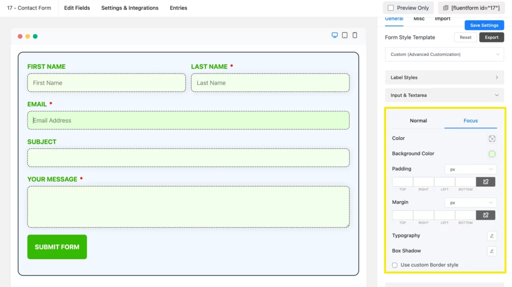
You can also design a specific field when it is focused.
Placeholder styles
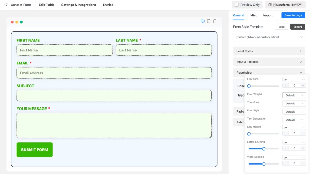
Pick the color of the placeholder of the input fields to give it a signature look. Place the typography together with the Font Size, Font Weights, Text Decoration, Line Height, and Letter Spacing. Have a look at the screenshot below.
Radio and checkbox style
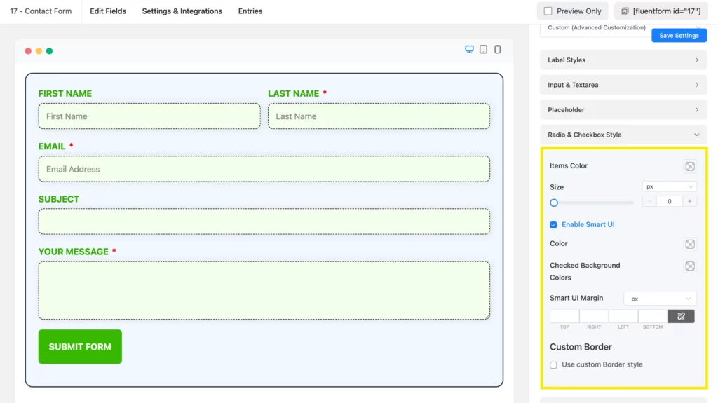
Enable the smart UI to find the edit options of Radio and Checkbox Style. Here, you will find two options for customizing the radio and checkbox fields. Specify the border color or background color of the checkboxes.
Submit Button Style
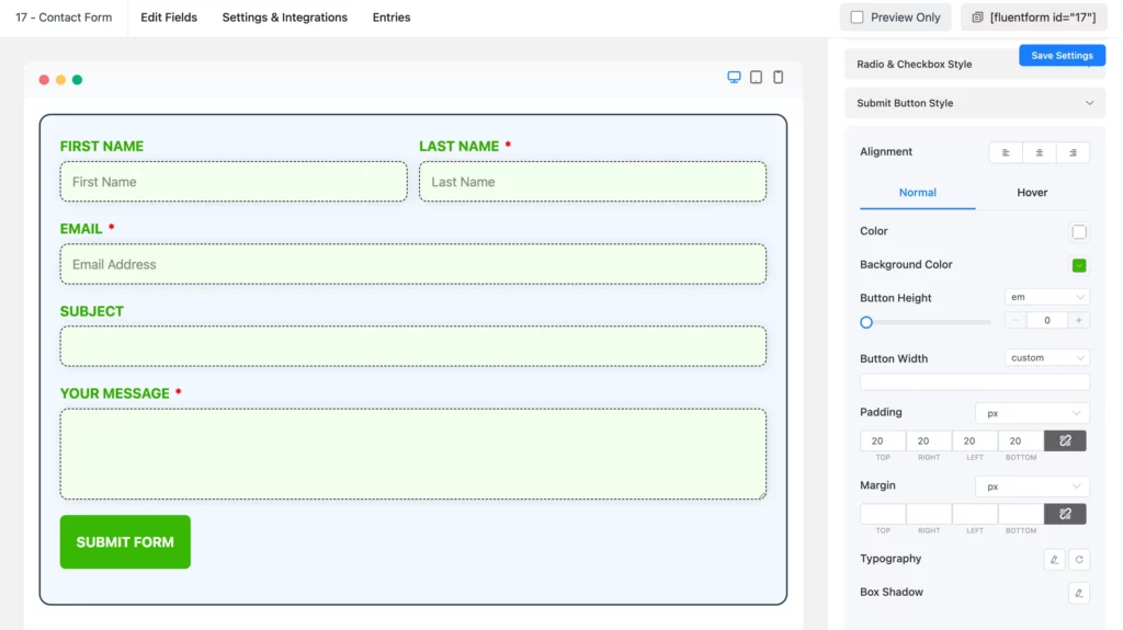
WP Fluent Forms also lets you style the submit button of your form. Click on Submit Button Style, and a new dropdown menu will appear with two options. One is normal, and the one is hover.
In the normal section, you can set the background and font color of the button to set the position of the button. There is also Typography for setting the font size, font type, letter spacing, etc. Furthermore, you can set the box shadows specifically for this button. If you enable the Use Custom Border Style, you can choose the border type, border color, border width, border radius, etc. for the submit button.
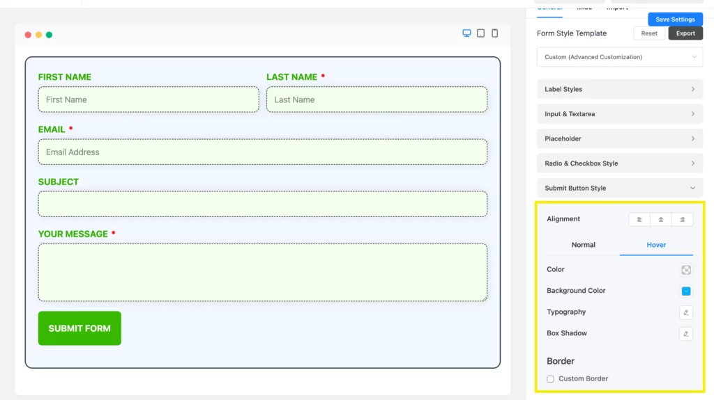
Now, let’s find out about the Hover section. When you float over the submit button, you will notice some changes on the button. The hover section is about letting you customize the option as per your liking. It comes with the same styles as the other fields, such as background color, font color, typography, and box shadows.
So, these are some instructions on how you can style beautiful CSS forms with Fluent Forms’ Advanced Form Styler. There are more, you can personalize your contact form using this styler.
In the next tab called Misc, you will see customization options for the following form elements:
- Container Styles
- Asterisk Styles
- Inline Error Message Styles
- After Submit Success Message Styles
- After Submit Error Message Styles
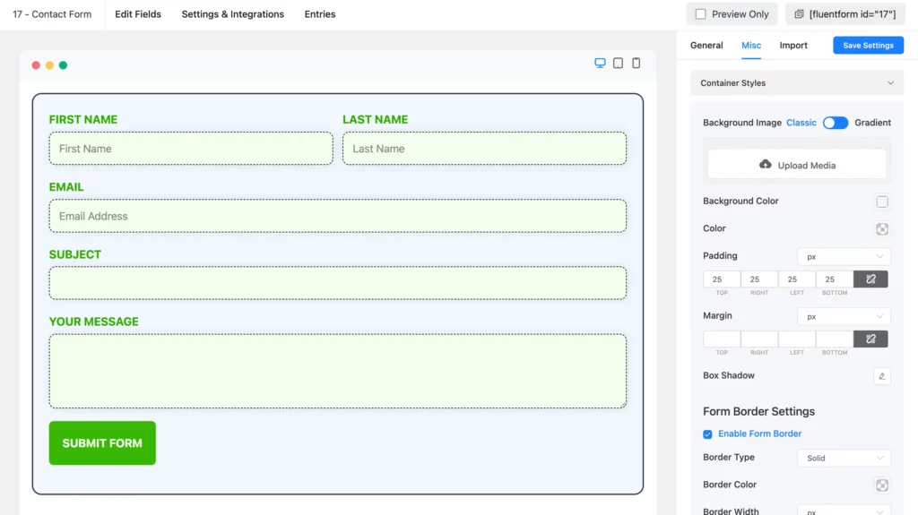
Let’s discuss each of the customization options available for you in details.
Container styles
When you click on the Container Styles, a dropdown menu will open with multiple customization options. Here, you can set a Background Image, customize the Background Color, text Color, container Margin, Padding, Box Shadow and Form Border.
Asterisk styles
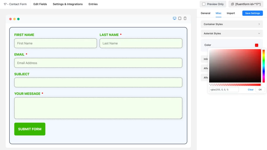
Asterisk styles will help you in selecting the color of asterisks in your form.
Inline error message styles
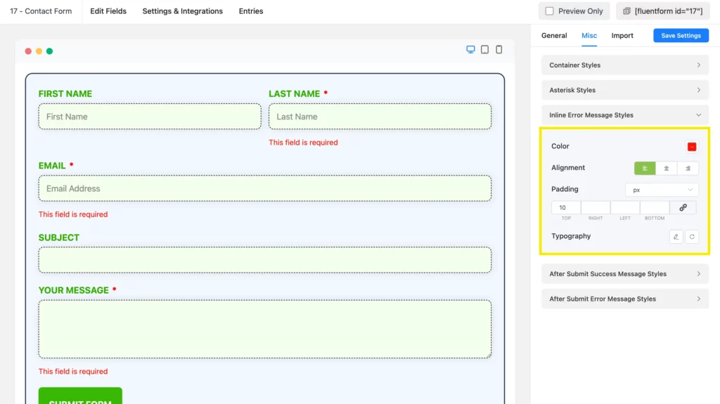
Inline error messages help individuals with filling out forms accurately by providing necessary instructions. You can choose the color, alignment, padding and typography of the inline error messages.
After submitting success message styles
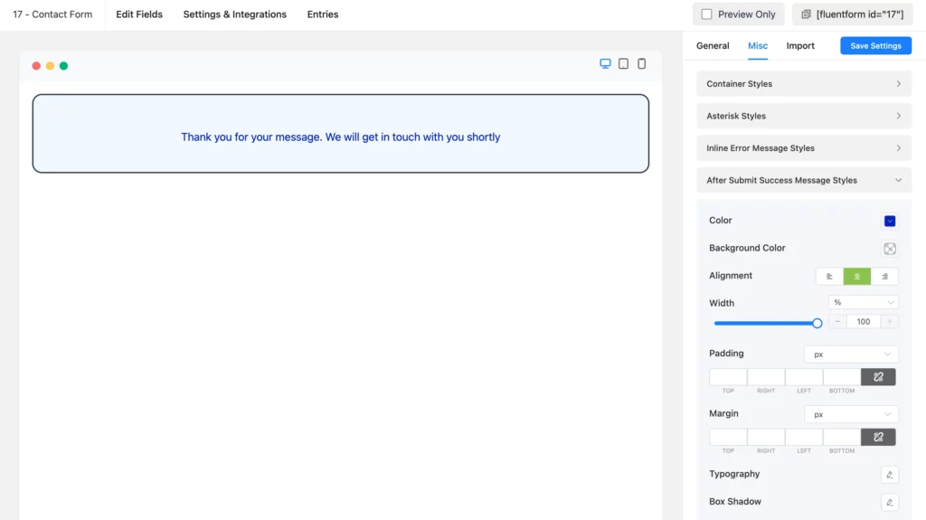
In this setting, you can personalize your form’s success message style that users see after the form submission.
To customize this, fill out the form with dummy data, and click on the submit button to view the success message.
Now, expand the After Submit Success Message Styles. Here you can choose the text color, background, typography, box shadow, border and more.
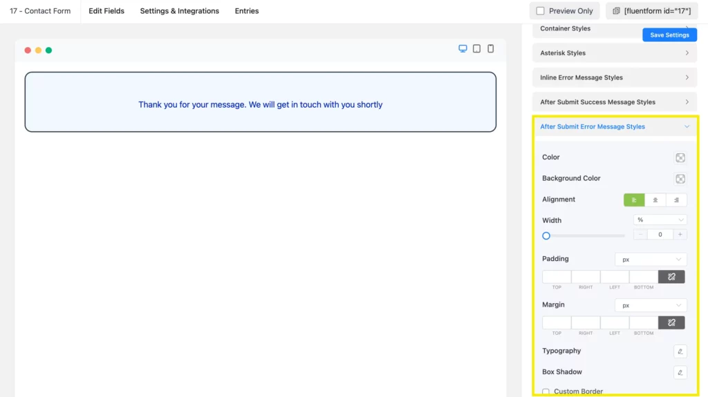
After submit error message styles
You can also customize the After Submit Error Message Styles. There are customization options for text color, background, typography, box shadow, border, and more.
Wrapping up
In this article, I have tried to give a detailed idea about styling beautiful CSS forms with Fluent Forms. This form builder plugin is coming up with new updates every two to three months. There are some video tutorials on using the Advanced Form Styler of Fluent Forms. Also, this contact form builder plugin is very user-friendly and cost-effective.
I hope you find this article helpful and enjoy the add-ons and elements of Fluent Forms’ Advanced Form Styler.
5 responses to “Styling Beautiful CSS Forms with Fluent Forms’ Advanced Form Styler”
-
Hello,
How do I add an arrow icon next to the Submit text on the form button?
-
Hello, you can place the icon code of the font library you are using.
If you’re unable to do this, don’t hesitate to contact our support.
-
-
How can I style the progress indicator steps in fluent form?
-
Hello Charlene,
To style the progress indicator of multi-step forms with Fluent Forms’ global styler, select the custom (advanced customization) template from the global styler. Then move on to the Multi Page – Header Colors option, and customize your progress bar.
-
-
Missing how to style the tool-tip help message box and Icon.




Leave a Reply