
How to Create Responsive Forms on WordPress

Do you make web forms for a diversified user base? If so, the web forms you make should be responsive to improve accessibility.
Creating a responsive form improves the visibility, accessibility, and device-friendliness.
Let’s go through this tutorial blog and make sure every online form you make from now on becomes responsive.
TL;DR
- Responsive forms automatically adapt to any screen size, especially ensuring a mobile-friendly user interface.
- A responsive form ensures improved visibility, accessibility, and conversion rate while reducing form abandonment.
- Using fewer columns, space-friendly fields, breaking long forms, and faster loading are a few of the best practices to ensure a form fits all devices.
- In WordPress, you can easily build responsive forms using customized layouts and responsive styles, with form builder plugins like Fluent Forms.
- Once you have chosen the right fields and implemented proper customization, check the device-friendliness in the preview section and edit until it’s super-responsive.
What is a responsive form
A responsive form refers to a web form that is scalable in terms of the screen size. A form that adapts to different screen sizes without compromising its performance is considered a responsive form.
An online form should be compatible with various types of devices, including computers, tablets, and smartphones, whether you make it with custom CSS or use a perfect plugin. It focuses on optimizing every element of a form.
As it builds up visibility and ensures syncing to every one of a user’s devices, a responsive form is more than adaptable to screens.
Don’t forget that not ensuring a form is responsive can–
- Induce a dissatisfactory user experience
- Increase form abandonment and decrease conversion
- Decrease the clarity of the forms
- Increase the bounce rate as well as the number of visitors
- Lose potential leads or customers
- Lower your website’s overall performance
Best practices to create responsive forms
A few practices while building web forms can ensure their responsiveness and bring more engagement.
Use fields in a way that consumes less space
Space optimization is a very basic step to make your online forms responsive. If the form takes more space, and if this is especially horizontal, then it’s less likely to fit in devices of narrow width such as smartphones.
Don’t add too many columns
Too many columns of a field can make a form lose responsiveness. Better, you can add an extra field rather than make one field messy.
Apply responsive form styles
If your form builder tool already has responsive form styles, choose from there and apply them to new forms. It’s better to have a tested one applied to make sure it appears accordingly, and the process will be much faster.
Ensure the shortest possible loading time
Both your form and the web page you place it on should load faster. Suppose you add fields like image/file upload, the form should not get slow.
Reduce white space
A responsive form should not possess more white space, as it compromises engagement. Utilize the white space otherwise, such as using two/three columns rather than adding a new field.
Use space-saver fields
Space-saver fields like dropdowns help improve responsiveness. For example, if you use a dropdown for ten options, it takes up the space of only one option.
Customize the layouts
You can customize the layouts for better visibility, such as bringing the submit button and making it adjustable. For example, you can clear the label placement and put your instruction in the placeholder.
Use form steps for long forms
As long forms, especially on mobile devices, seem endless, it reduces engagement. So, you can break down the form steps and make a multi-step one.
Steps to create a responsive form on WordPress
Here, you will see the steps to create a responsive form using Fluent Forms – the fastest form builder plugin for WordPress.
First, install and activate Fluent Forms on your WordPress site. Then go to the Forms page and click on the ‘Add New Form’ button.
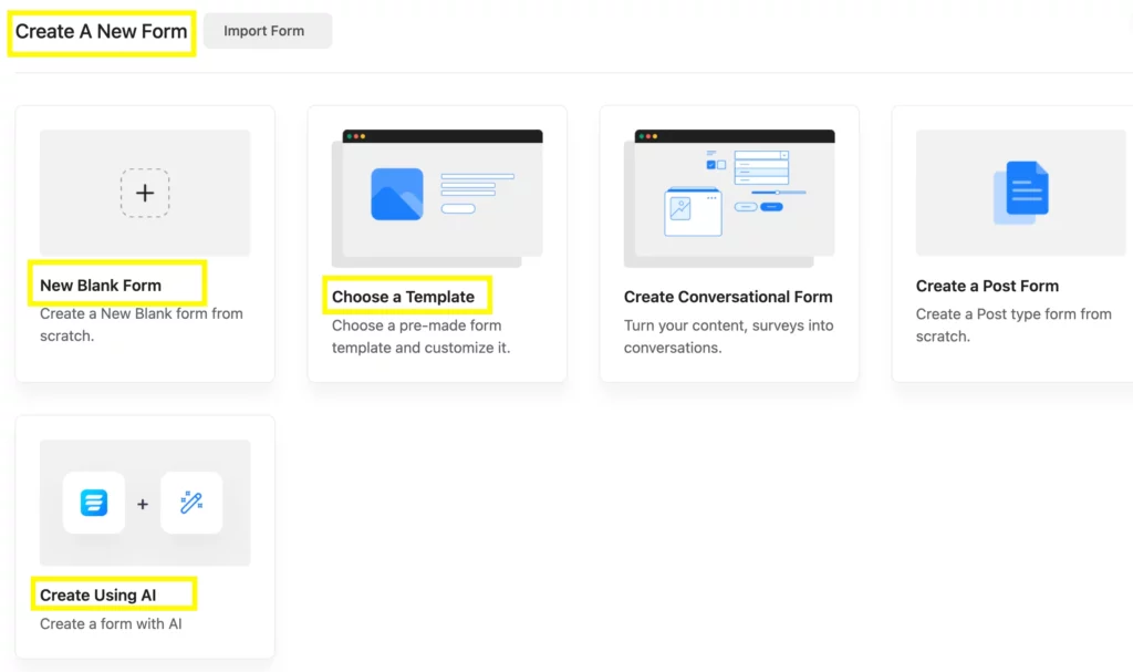
You can now choose New Blank Form, Choose a Template, or Create Using AI. Let’s choose New Blank Form as an example and proceed with the steps.
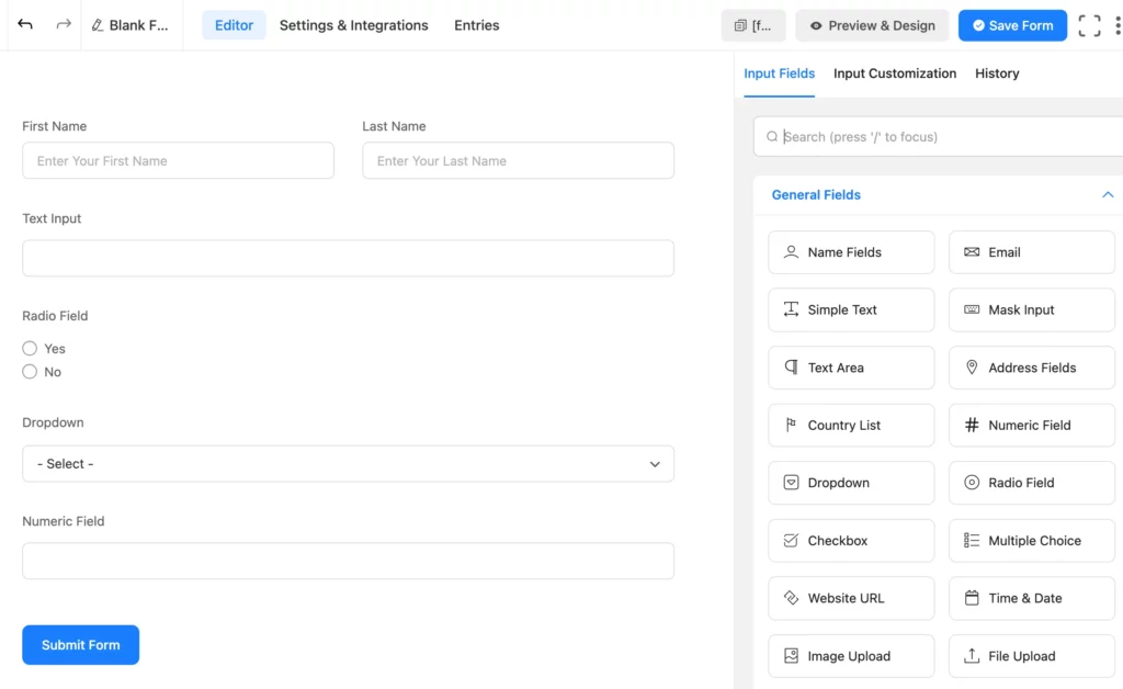
Step 1: Add the most relevant fields
Add the most relevant fields depending on your field choice. Add numeric fields, radio fields, text area, etc, depending on what type of output you want. Fluent Forms has 60+ input fields available.
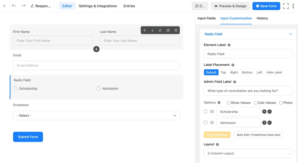
Step 2: Customize the fields
You can select the field you want to customize and change the Element Label, Admin Field Label, Options, Layout, etc. Here, I’ve shown the radio field customization as an example.
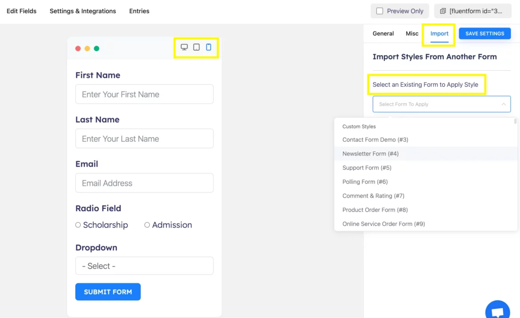
Step 3: Check the preview, and choose and apply form styles
Once you save the form, you can check the preview to see how it will appear on different devices.
Click on the ‘Preview and Design’ button on the editor page to go to the preview page. From the preview page, you can select and apply an existing style.
Ask less, know more
Summarizing the questions and providing options to choose rather than inputting data manually allows users to submit a form easily. It helps in making decisions instantly and getting engaged when you provide one-end selections like radio fields or dropdowns, or multiselect options like checkboxes.
Fluent Forms comes with useful features like conversational forms, address autocomplete, custom CSS and JS, and 60+ demanding integrations that make your user get the ultimate responsive form submission experience.
Start building your responsive forms for free!

Hi, this is Aparup. I am a Literature postgraduate, mixing my creative thoughts with my experience in the tech industry to surpass AI. Professionally, I am a content marketer seeking solutions to users’ problems regarding WordPress.


Leave a Reply