
13 Must-Follow Rules for Styling Contact Forms (That Actually Convert)
Here’s the truth: there are no hard and fast rules when it comes to styling contact forms. You have the creative freedom to design them however you feel is right for your brand and audience.
That said, styling is more than making your form look pretty. It’s about making your forms easy on the eyes and effortless to use. The best designs are the ones that feel completely natural; nothing is excessive or out of place.
When a form is designed well, users instinctively understand what it’s for and what they need to do next. It guides users naturally through each field, removes friction, and saves time.
In this guide, I’ve listed the essential tips and best practices that will help you achieve exactly that for your contact forms. Let’s dive in.
TL;DR
- Keep it short and structured: Only include necessary fields (Name, Email, Message is often enough); use a single-column layout with top-aligned labels; break long forms into steps with progress indicators.
- Make it accessible and readable: Ensure 4.5:1 color contrast, use 16px minimum font size, provide clear labels (not just placeholders), and use proper spacing (16-24px between fields, 480-600px form width).
- Guide users with clear feedback: Use color-coded states (gray=default, blue=focus, red=error, green=success); show inline validation; display specific success messages after submission.
- Reduce friction: Replace text fields with radio/checkbox buttons when possible; enable autocomplete; use help text for complex questions; make the submit button prominent with action-oriented copy.
- Optimize for mobile first: Use 44×44px touch targets, stack elements vertically, test with keyboard open (60% of users are on mobile).
- Consider conversational forms: Chat-style forms that show one question at a time work great for complex lead generation, quotes, or onboarding (but skip for simple 2-3 field forms).
1. Only Show Necessary Fields
Start by asking yourself: Do I actually need this field?
When users see 10+ fields, their brain calculates effort and often decides “not worth it.” Every extra field you add is another reason to abandon the form. So before you think about colors or spacing, ask, “Do I really need this information?”
For most contact forms, Name, Email, and Message are enough. That’s it. You can collect the rest later, once a prospect is already engaged.
If you need to gather more context, use conditional logic. Show extra fields only when they’re relevant. For example, if someone selects “Partnership inquiry,” show a “Company Name” field. If they select “General question,” don’t. This keeps the form short for most users and still collects what you need from the right ones.
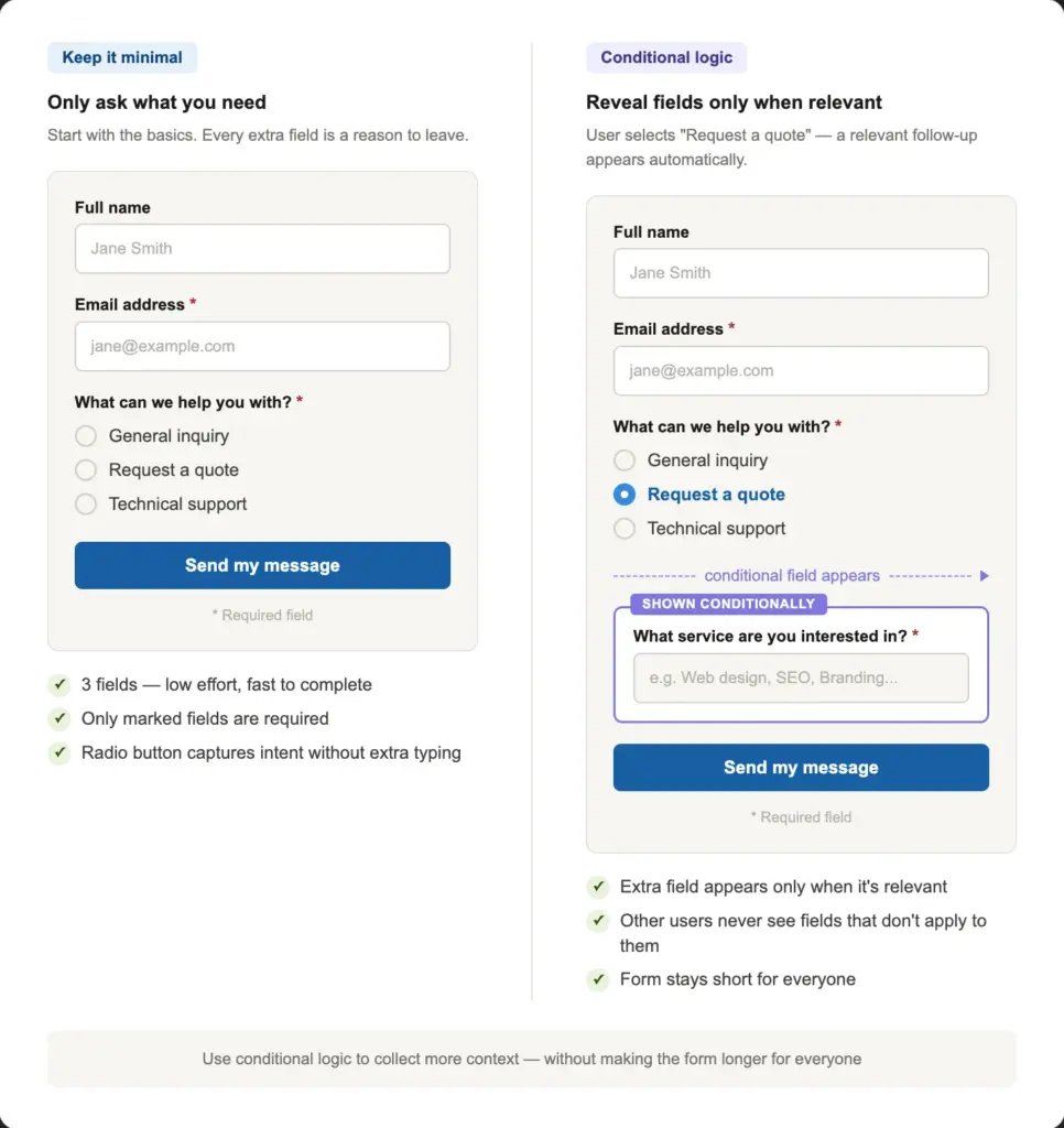
Making fields optional removes pressure and lets people share what they’re comfortable with. If you do keep extra fields, mark the required fields with an asterisk. Let users skip the rest.
A shorter form is almost always a better-converting form. So when you have doubts about a field, don’t add it.
2. Keep the Layout Clean and Well-structured
Users notice the layout before reading any word. A clean layout tells them, “This will be easy.”
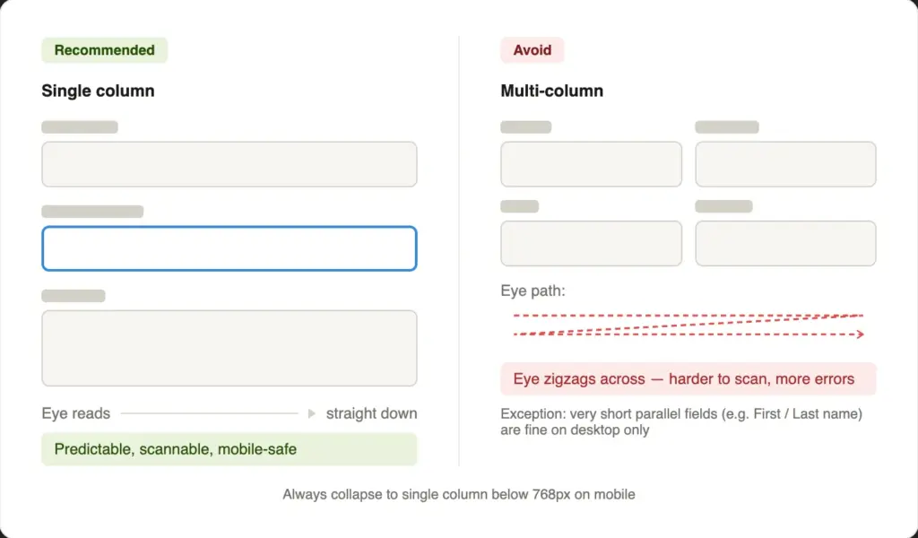
Single column vs. multi-column
Single-column forms are usually the right choice. They’re easy to scan and keep the reading order clear. Multi-column layouts make the eye jump across the screen, which adds cognitive load and causes errors. The only exception: short parallel fields like First Name & Last Name, or City & ZIP code, can sit side by side on a desktop screen. But always collapse them into a single column on mobile.
Maintain proper alignment
Place labels above input fields, not beside them. Top-aligned labels scan faster and show up better on small screens. Keep all fields aligned to the same left edge. A ragged layout, where fields start at different horizontal positions, signals carelessness before users even read your copy.
Match field size to expected input
The width and height of a field tell users what kind of answer you expect. A wide, multi-line textarea signals “write as much as you need.” A short, single-line field signals “keep it brief.”
Use a Textarea field for open-ended message fields. For example, “What problem are you facing with our product?”
For one-line/brief answers, use a Simple Text field. For example, “What’s your pet’s name?”
Use section breaks for longer forms
If your form has more than 6 fields, use section headers or a subtle horizontal divider to group related fields. For example, “Your details” above the name, email, and company fields, and “Your message” above the subject and message field. This breaks the form into digestible parts and makes it feel shorter than it is.
In Fluent Forms, you can use the Custom HTML or the Section Break field to design visually distinct sections.
Organize fields within accordions and tabs
Accordions and tabs are both effective tools for managing long forms.
Accordions stack sections vertically with clickable titles. Only one section expands at a time, keeping the form clean. They’re ideal for mobile and work best when sections follow a natural top-to-bottom order (like Personal Info → Education → Experience).
Tabs organize sections horizontally at the top, letting users switch between them. They work best on wider screens with enough space for all labels. On mobile, they stack vertically like accordions.
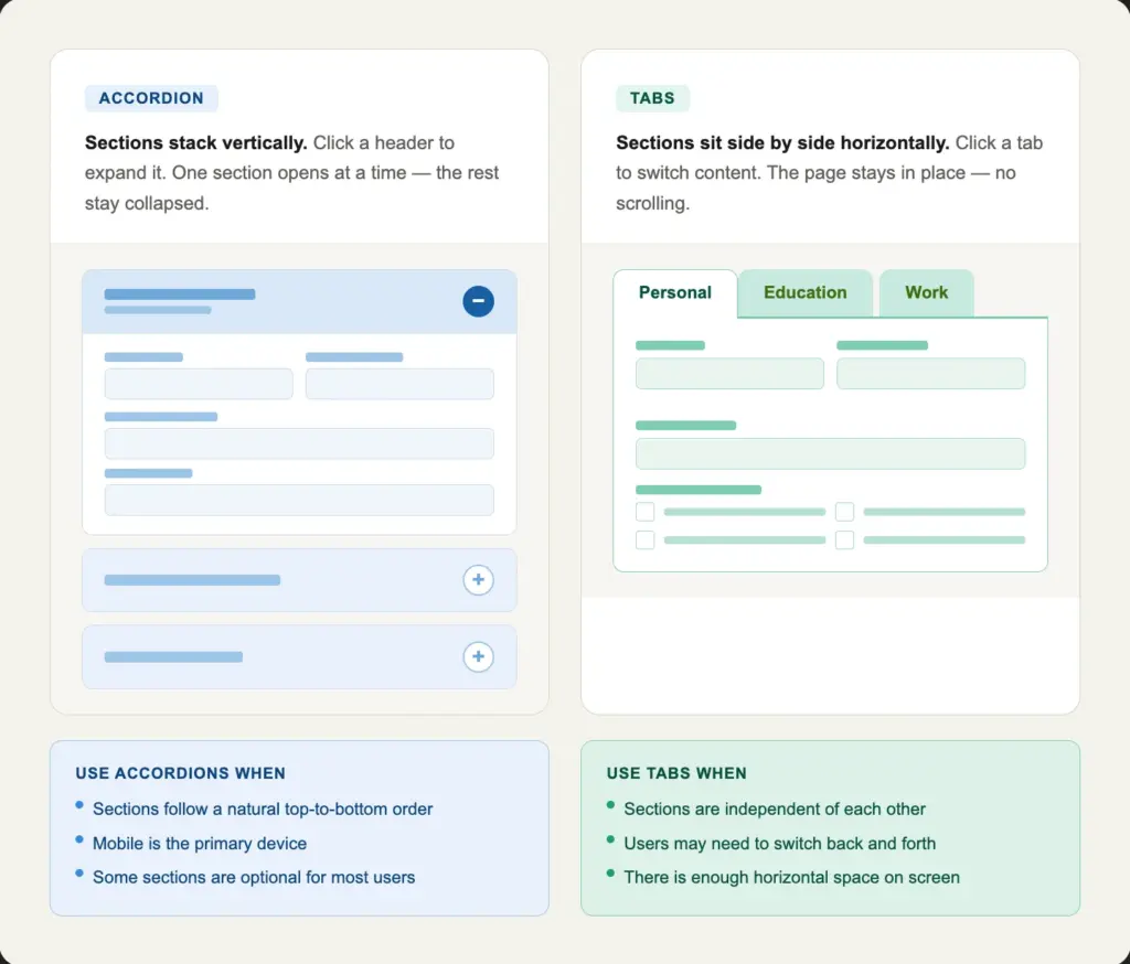
When to Use Which:
- Accordions: Sequential sections users complete in order
- Tabs: Independent sections users may jump between freely
3. Break Long Forms into Steps
A long single-page form shows users everything at once. A multi-step form shows them one easy step at a time.
The difference in psychology is real. Once users complete Step 1, they have already invested effort, so they are more likely to keep going.
How to group fields across steps
Keep related fields together in each step. A natural progression for most contact forms looks like:
- Step 1: Name, Email, etc., personal information (easy, low-commitment)
- Step 2: Subject, service type, or message (more specific)
- Step 3: Terms & conditions, checkout (ending)
Start with the easiest fields. Save more specific or sensitive questions for later steps.
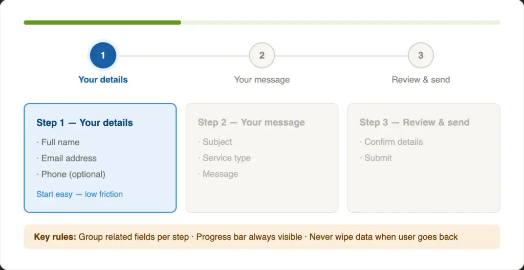
Add progress indicators
Show a progress bar so users can easily understand how close they are to completing the form. “Step 2 of 3” is more reassuring than an endless scroll. It gives users a sense of momentum and a visible finish line. Moreover, add step titles, so users understand what to expect from each step.
Make sure users can go back and forth between the steps and save their progress as they complete each step.
4. Add Clear Labels & Purposeful Placeholders
Add a visible field label to every field. The label should clarify what’s being asked for in that field.
Placeholder text disappears the moment a user starts typing. If they pause mid-form and forget what a field asked, they have to clear their input and re-read. That friction adds to the inconvenience for the users. Screen readers often skip placeholder text entirely, which also makes placeholder-only forms inaccessible.
Use placeholders as format hints, not labels. For example:
- Label: Phone Number
- Placeholder: +1 (555) 000-0000
That combination is clear, helpful, and accessible.
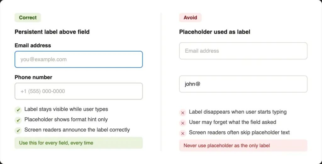
If most fields are required, asterisks everywhere are just visual noise. Consider labeling the optional ones as “(optional)” instead.
5. Maintain Accessibility Throughout
People read forms fast. If anything slows them down, small text, low contrast, low spacing, etc., they stop and leave.
Color contrast
Color contrast is the #1 accessibility violation on the web, affecting 83.6% of all websites. The minimum contrast ratio for body text under WCAG 2.2 Level AA is 4.5:1. Check the contrast ratio for your forms; if the score doesn’t meet the standard (light gray text on a white background), you need to adjust the colors.
The European Accessibility Act has been in force since June 2025. For many private-sector businesses, accessible design is now a legal requirement, not just good practice.
Typography basics
Use a minimum font size of 16px for all input fields. Anything smaller will trigger iOS Safari to auto-zoom the page on tap, which might break the layout on mobile. Stick to clean, legible fonts. For example, clean web fonts like Inter or Roboto work great.
Line height for help text and multi-line fields should be at least 1.5. Cramped text is hard to read.
Focus states
Always style the focus state on inputs. When a user clicks into a field, that field should show a clear outline, usually in your brand’s primary color. Never remove the default browser outline without replacing it with something equally visible. Keyboard users and screen reader users depend on it.
Error messages
Show errors inline, directly below the field where they happen. Use color (like a red border) combined with an icon and a plain-language message. Never rely on color alone; users with color vision differences may not see the red.
Write errors that explain what to do: “Please enter a valid email address” instead of “Invalid input.”
6. Use Proper Spacing Between and Within Fields
Spacing is not just decoration. It guides the eye, groups related elements, and prevents accidental taps on mobile.
Between fields: 16 to 24px of vertical space between each field block gives each input room to breathe.
Inside fields: Add 12 to 16px of horizontal padding and 10 to 14px of vertical padding inside each input. Fields with tight internal padding feel uncomfortable to type in.
Form width: Keep your form container between 480px and 600px wide. Very wide fields create long horizontal eye travel and look unprofessional. A narrow, focused form is easier to read and feels more intentional.
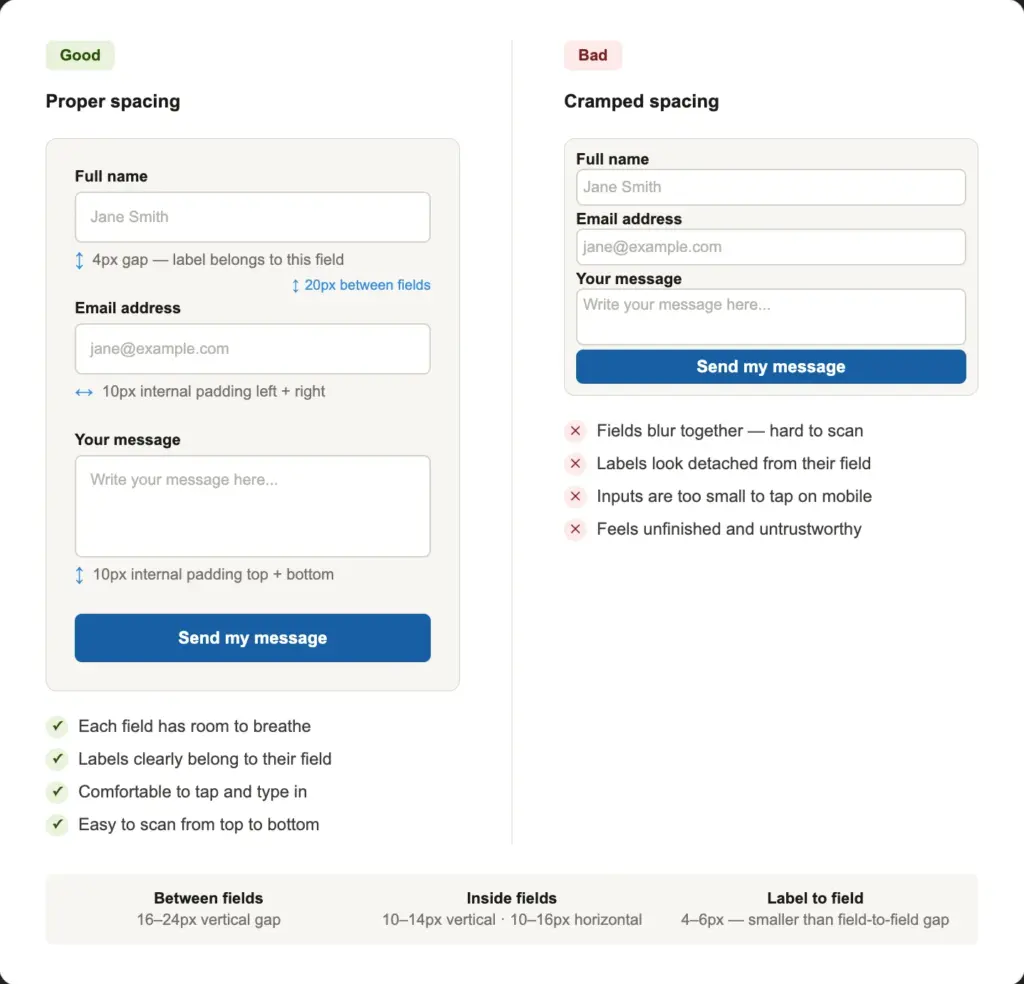
General spacing hierarchy: The gap between a label and its field should be smaller than the gap between one field block and the next. This visual grouping is subtle but important; it makes labels “belong to” their fields and easily guides the eye.
7. Make Your Submit Button Impossible to Miss
The submit button is the one thing users must click to convert. Style it thoughtfully.
Visual style
Make it the most prominent element in your form. Use your brand’s primary action color. Fill it; that’s more noticeable than an outline button. Ghost buttons look elegant, but they often get missed. Make them wide as well, so they’re easy to tap on all devices. Your button should look like the obvious next move.
If you have a secondary button (for example, if the primary button is Buy Now, the secondary can be Try Free), make it look completely different from the primary. A ghost/outline style works fine. Never give two buttons the same visual weight.
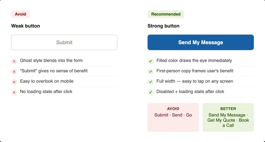
Button copy
Instead of a generic text like “Submit,” try “Get My Free Ebook” or “Claim My Spot.” Your button text should complete the sentence “I want to…” It shifts the frame from “I’m giving away my info” to “I’m getting something.”
Some options that work better than “Submit”:
- Get My Free Quote
- Book My One-on-one Call
- Yes, Let’s Talk
After the click
Disable the button after the first click and show a confirmation message. This prevents duplicate submissions and tells the user their message was sent.
8. Provide Clear Feedback and Confirmation States
The form experience does not end at the submit button. What happens next is just as important.
Success states
Always show a clear success message after submission. The message should visually replace the form, not just appear as a small line of text below it.
Generic copy like “Form submitted” tells users nothing useful. Try something like: “Thanks, [Name]! We’ll get back to you within 24 hours.” That’s personal, specific, and reassuring.
If you use a thank-you page redirect instead of an inline message, that also lets you set up conversion tracking in Google Analytics or similar tools.
Inline validation
As users complete each field, show a small green checkmark to confirm they got it right. This positive micro-feedback builds confidence as they move through the form.
Error recovery
If the form fails to submit, due to a server error or a missed required field, never wipe the data the user already entered. Scroll them to the first error field automatically. Show a clear, helpful message that explains what went wrong and how to fix it.
Use color psychology to reinforce every state
Color is one of the fastest ways to communicate a state. Users do not actively read color; their brains process it in the background. Use that to your advantage.
Define these four states for your form and be consistent across every field:
- Default: Gray border: neutral, waiting
- Focus: Brand blue outline: active, in use
- Error: Red border plus descriptive text about what needs fixing
- Success: Green border or checkmark: complete and correct
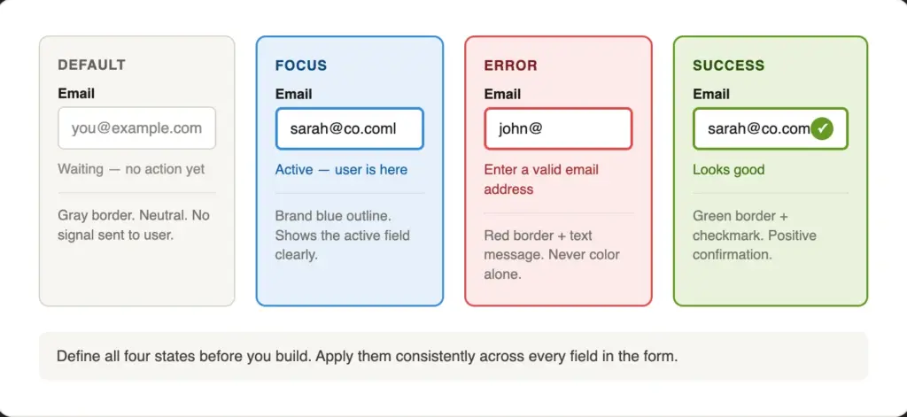
Limit your form to 2 to 3 colors total. More colors create noise and make the form harder to read. And always test your palette in grayscale; if the hierarchy is still clear without color, your design is accessible.
9. Explain Complex Questions with Help Text
Some fields need more than a label. If a user might pause and wonder “what exactly do they want here?” add help text.
Help text sits below the input field, in a smaller size (around 13 to 14px) and in a lighter gray. It is supporting information, not primary copy. Keep it to one or two short sentences.
Common use cases:
- Format guidance: “Enter your VAT number without spaces or dashes.”
- Privacy reassurance: “We’ll never share your email.”
- Character limits: “Max 500 characters.”
Tooltips vs inline help text
Use inline help text (always visible) for information every user needs to see. Use tooltips (visible on hover or tap) for optional context that most users will not need.
10. Reduce Typing & Clicks Wherever Possible
Typing takes time and therefore causes inconvenience. Replace text inputs with selection inputs wherever the answers are predictable.
The rule is simple: if you can predict all valid answers, offer them as choices. Offer an “Other” option that opens a text box, so users can provide their unique answers. If you can’t predict the answers (for open-ended questions), use a text field.
Also, enable browser autocomplete on your fields. Browser autofill fills out a significant portion automatically, saving users time and reducing typing errors.
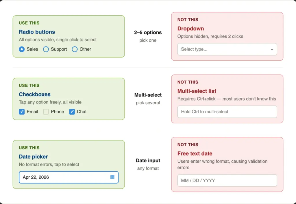
Similarly, use radio and checkbox fields over dropdowns or multiple choice fields when you have the space. For 6-8 options or fewer, this is usually a good practice. They reduce the number of clicks, creating a smoother user experience.
11. Show Images and Visuals Where Relevant
Adding the right visual context can warm up your form and build trust before users begin to read it. A photo of your team or office next to the form signals that real people will respond. It answers the unspoken question: “Who am I actually contacting?” Authentic photos work far better than stock imagery.
For service-selection forms, small icons or thumbnails next to each option make choices faster to scan. Users recognize images faster than text.
Trust signals like a short testimonial, a client logo strip, or a “We reply within 24 hours” note placed beside the form reduce hesitation at the moment of submission.
What not to do
Avoid placing decorative images inside the form container itself. They compete with the fields for attention. Never put a background image behind input fields; it reduces legibility and usually destroys contrast ratios. Consider hiding large companion images on mobile, so the form gets the full viewport.
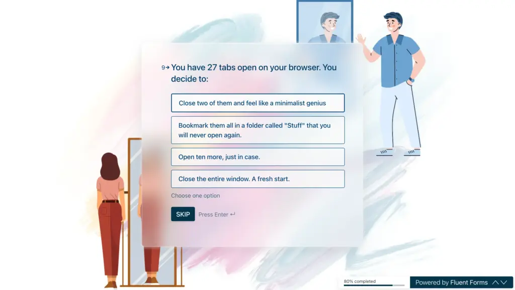
12. Consider Chat-style Forms for a High Conversion Rate
Traditional forms show all questions at once. Conversational (chat-style) forms show one question at a time, like a real conversation. This guided approach makes the process feel easy and engaging, which means more people actually complete the form.
Conversational forms come with a welcome screen and layout options. You can also share them (on social media or via email) as independent landing pages.
They work especially well for:
- Quote or booking request forms
- Lead generation with qualifying questions
- Client onboarding or intake forms
- Any form where personalization adds value (the form can address users by name using smartcode)
When not to use them
Chat-style forms are not the right choice for every situation. For simple 2 to 3-field contact forms, it’s overkill. They can also be harder to navigate with screen readers. And users who want to scan and fill quickly may find the one-question-at-a-time format slower than they expect.
Test chat-style forms against your traditional form before committing fully. Completion rates are usually higher, but the experience is different enough that your specific audience may respond differently.
13. Optimize Every Detail for Mobile Devices
Around 60 percent of web traffic is from a mobile device. Your contact form will be filled out on a phone more often than on a desktop (with the exception of some industries). Design for that first.
Touch targets
All interactive elements, inputs, buttons, radio buttons, and checkboxes should be at least 44×44px according to WCAG 2.5.5. Apple recommends the same in points for native apps. Targets smaller than that are hard to tap accurately, especially with a thumb.
Font size
Use at least 16px inside all input fields. Anything smaller causes iOS Safari to auto-zoom the page when a user taps the field. That zoom might break the layout and force the user to zoom back out before they can continue.
Layout
Always stack form elements vertically on mobile. No side-by-side columns on small screens, as they create horizontal scrolling or very narrow inputs that are hard to type in.
Test with the keyboard open
When a mobile keyboard opens, it takes up half the screen. Test your form with the keyboard active. Does the browser scroll to keep the focused field visible? Is the submit button reachable without closing the keyboard? These are small details that can silently block conversions.
Start with One Rule
You do not have to fix everything at once. Pick the rule that addresses the biggest issue in your current form and start there.
For most forms, the highest-impact starting points are: removing unnecessary fields, fixing label placement, and making the submit button stand out. Those three changes alone can help you achieve a much higher completion rate.
Once you have those in place, work through the rest of the list. Small improvements add to big results. A form that is slightly better in ten ways is significantly better overall.
If you are using Fluent Forms, most of these rules can be applied directly inside the form builder, from multi-step setup and conditional logic to the custom submit button field and the Advanced Form Styler. You do not need a developer or custom CSS for the basics.
What change are you going to make first?
Build Smarter Forms for Free

Sarika writes for Fluent Forms and loves to offer insights into small businesses. She’s curious and enjoys discussing ideas, interests, and perspectives. In her free time, she’s either marvelling at architectural beauties or trying different cuisines.


Leave a Reply