Fluent Forms lets you easily style your forms using custom CSS and JavaScript. Whether it’s adjusting buttons, fonts, or input fields, you have full control over how your forms look and behave.
In this guide, you’ll learn how to apply custom CSS and JavaScript to your Fluent Forms.
Accessing Custom CSS/JS Settings #
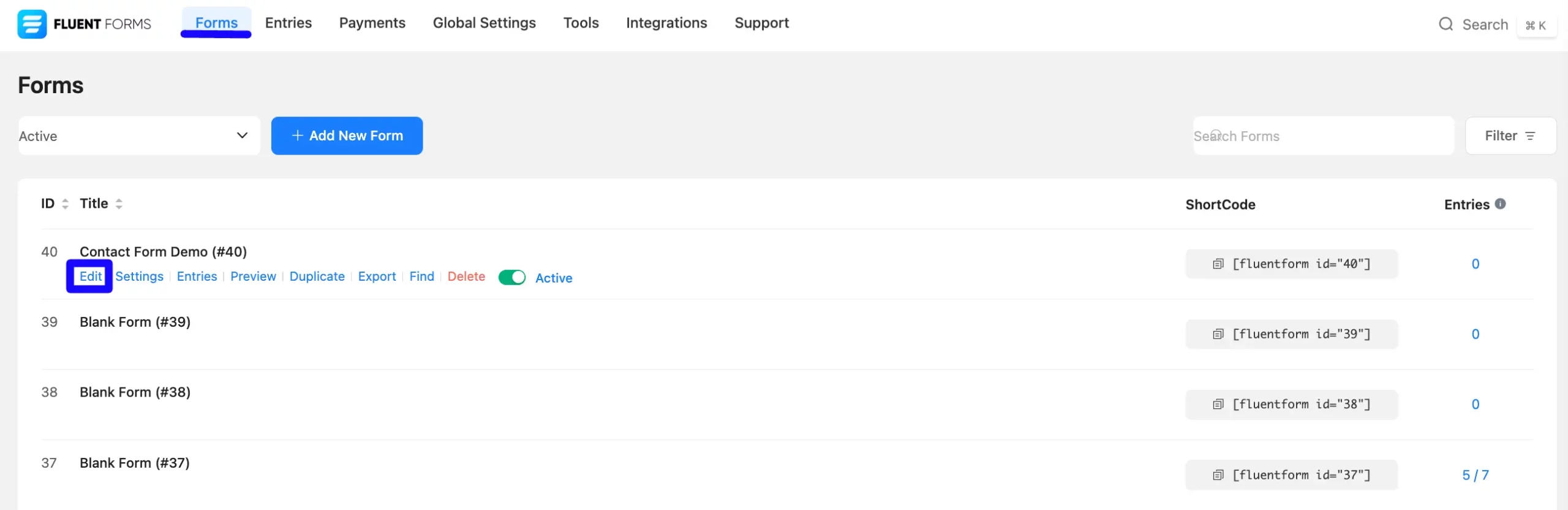
Go to Forms from the top menu and open the Editor page of your desired form by clicking the Edit button.
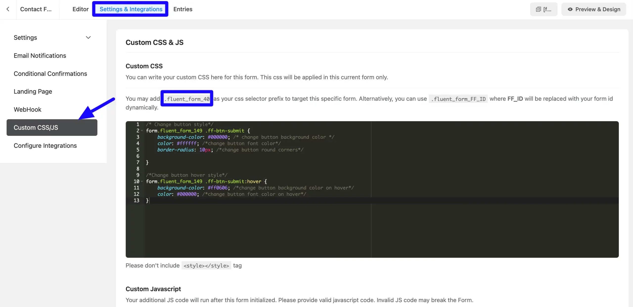
In the Settings & Integrations tab (top right of the editor), select Custom CSS/JS. You’ll see a field for adding custom CSS, along with your form’s unique class (e.g. .fluent_form_40)
Using the Unique Form Class #
Each form is assigned a unique CSS class ( fluent_form_40), which is displayed in the Custom CSS section. Use this to apply styles to a specific form without affecting others.
Example:
.fluent_form_40 .ff_submit_btn {
    background-color: #0073e6;
    color: white;
    border-radius: 5px;
}
Customization Examples #
Please note that you need to replace the ‘.fluent_form_149’ from the code with your own form’s unique class.
Here are some styling ideas you can apply to your form using CSS:
Submit Button Styling: Change the button’s background color, border, or hover effects.
/* Change button style*/
form.fluent_form_149 .ff-btn-submit {
    background-color: #000000; /* change button background color */
    color: #ffffff; /*change button font color*/
    border-radius: 10px; /*change button round corners*/

}

/*Change button hover style*/
form.fluent_form_149 .ff-btn-submit:hover {
    background-color: #ff0606; /*change button background color on hover*/
    color: #000000; /*change button font color on hover*/
}
Input Fields Styling: Customize text boxes, dropdowns, or radio buttons.
/*input style*/
form.fluent_form_149 .ff-el-form-control{
    padding: 6px 12px;  /*change padding*/
    background-color: #fff; /*change background color*/
    border: 1px solid #ced4da; /*change border width and color*/
    border-radius: 10px; /*change corner round/ border radius*/
}
Font styles: Modify fonts to match your website’s branding.
form.fluent_form_149 .ff-el-form-control {
    font-size: 16px; /*change font size*/
    line-height: 1.5; /*change line height*/
    color: #495057; /*change font color*/
}
Label styles: Modify labels to match your website’s branding.
/*Change label styles*/
form.fluent_form_149 .ff-el-input--label{
    font-size:22px; /*change label font size*/
    color:red; /*change label color*/
}
Input Focus Color: Highlight input fields when focused.
/*Change input border color when input is selected/focused */
.ff-el-form-control:focus {
    border-color:red;
    outline: none;
    -webkit-box-shadow: 0 0 0 3px rgba(255, 0, 129, 0.25);
    box-shadow: 0 0 0 3px rgba(255, 0, 129, 0.25);
}
Step Button and Rating: Redesign multi-step navigation buttons and rating stars.
/* Change Rating Star Color */
form.fluent_form_149 .ff-el-ratings label.active svg {
    fill: red;
}
If you repeatedly get bored with the Step Button style, you can change that too.
/*Change Step button styles*/
form.fluent_form_149 .step-nav button{
    background-color: #000000; /* change step button background color */
    color: #ffffff; /*change step button font color*/
    border-radius: 10px; /*change step button round corners*/
}


/*Change Step button styles on hover*/
form.fluent_form_149 .step-nav button:hover{
    background-color: #ff0606; /*change step button background color on hover*/
    color: #000000; /*change step button font color on hover*/
}
After adding your custom styles, click the Save Settings button, and then preview your form on the front end to see the changes live.
If you have any further questions, concerns, or suggestions, please do not hesitate to contact our support team.


