
Error messages in Fluent Forms help users fix mistakes when filling out a form. You can set a global error message for general issues. If a field has its own custom message, it will show that message first. This makes it easier for users to understand what to fix.
This guide will show you how to customize your error message easily with Fluent Forms.
Configure Error Messages for a Specific Field #
To learn how you can configure error message and customize it to any specific Form in Fluent Forms, follow the steps with the screenshots below –
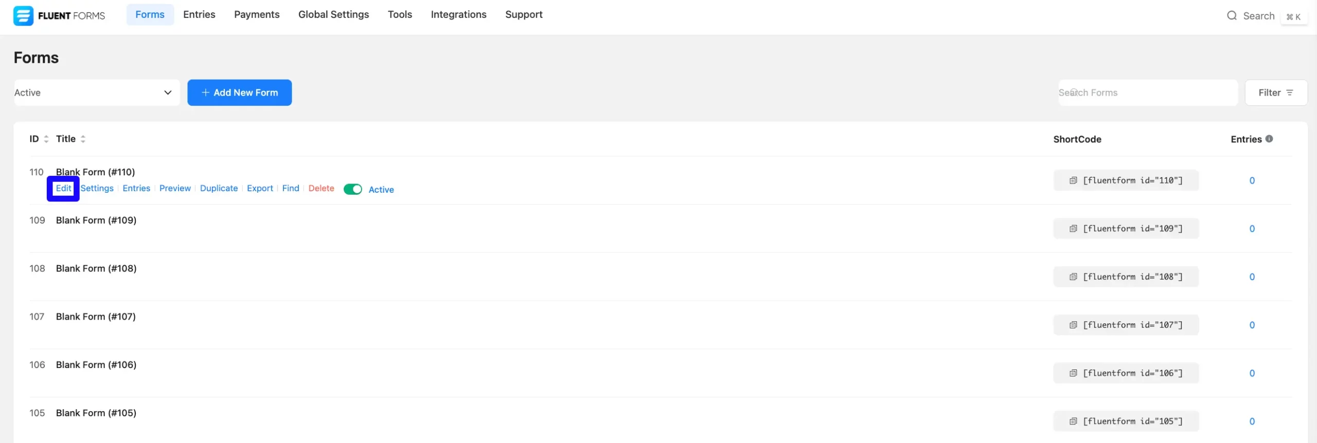
First, go to Forms from the Fluent Forms Navbar and select the Desired Form for which you want to configure the error message.
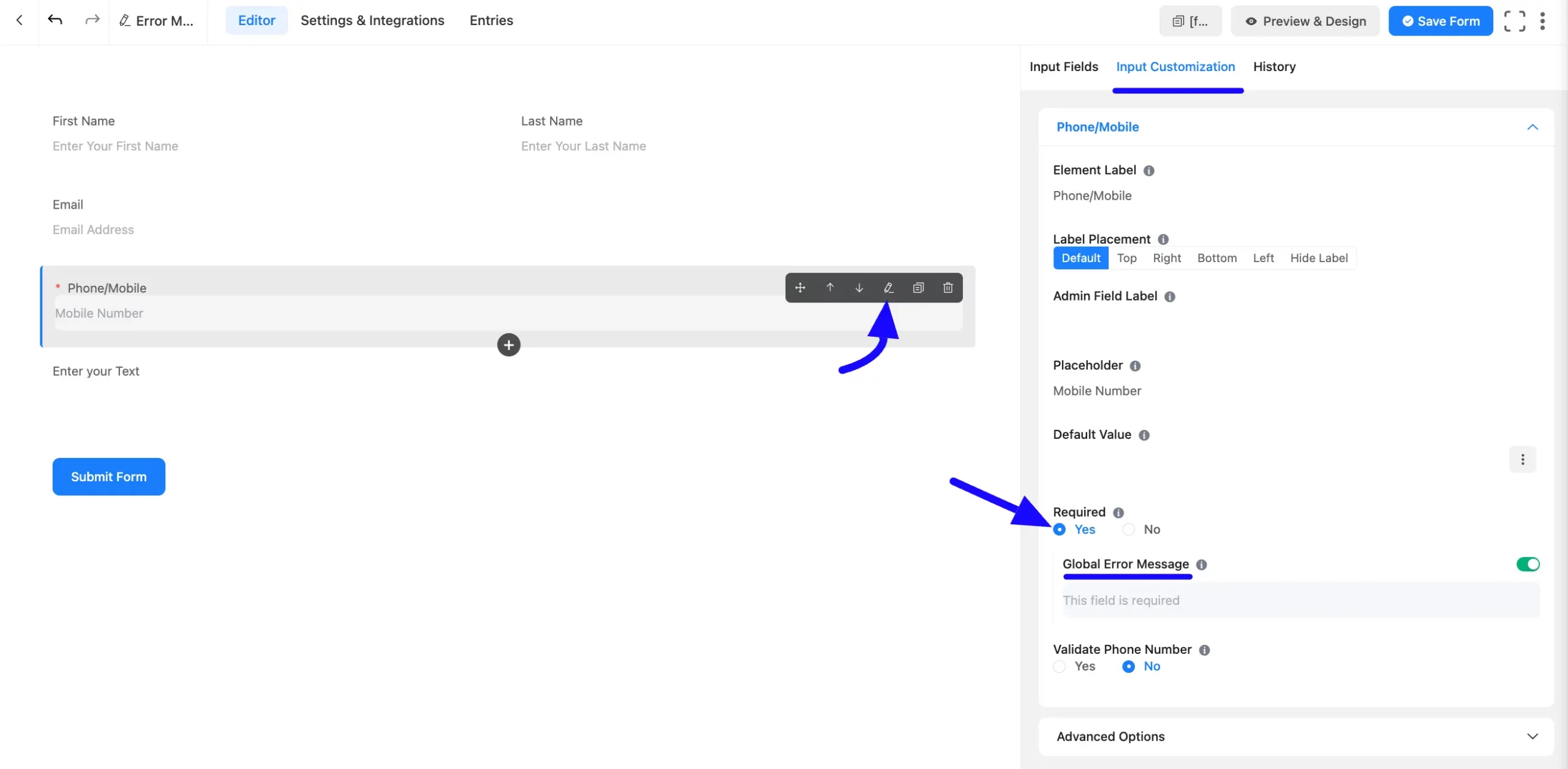
Now, navigate to the Input Customization tab for the field where you want to display Error Message.
Next, ensure that Yes is selected for the Required option. If No is selected, the field will not display an error message. Here, show the default Global Error Message.
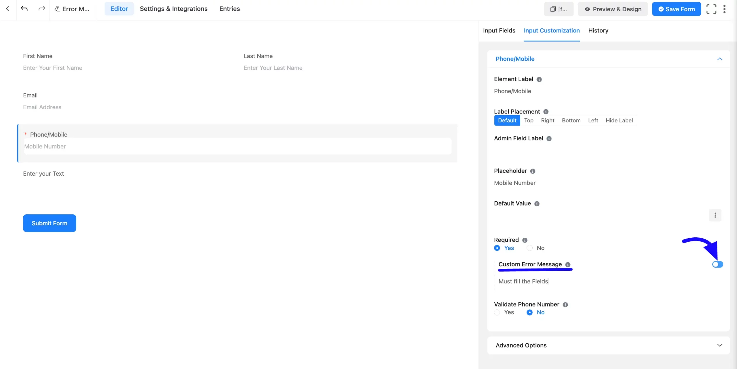
If you want to customize the error message, click the Radio button to turn off the Global Error Message options. Here, you will see the Custom Error Message. Now, you can customize your form field error message as you want.
Then, enter the text or instructions you want to display as the Error Message.
After that, click the Save Form button to apply the changes.
Global Error Message Settings #
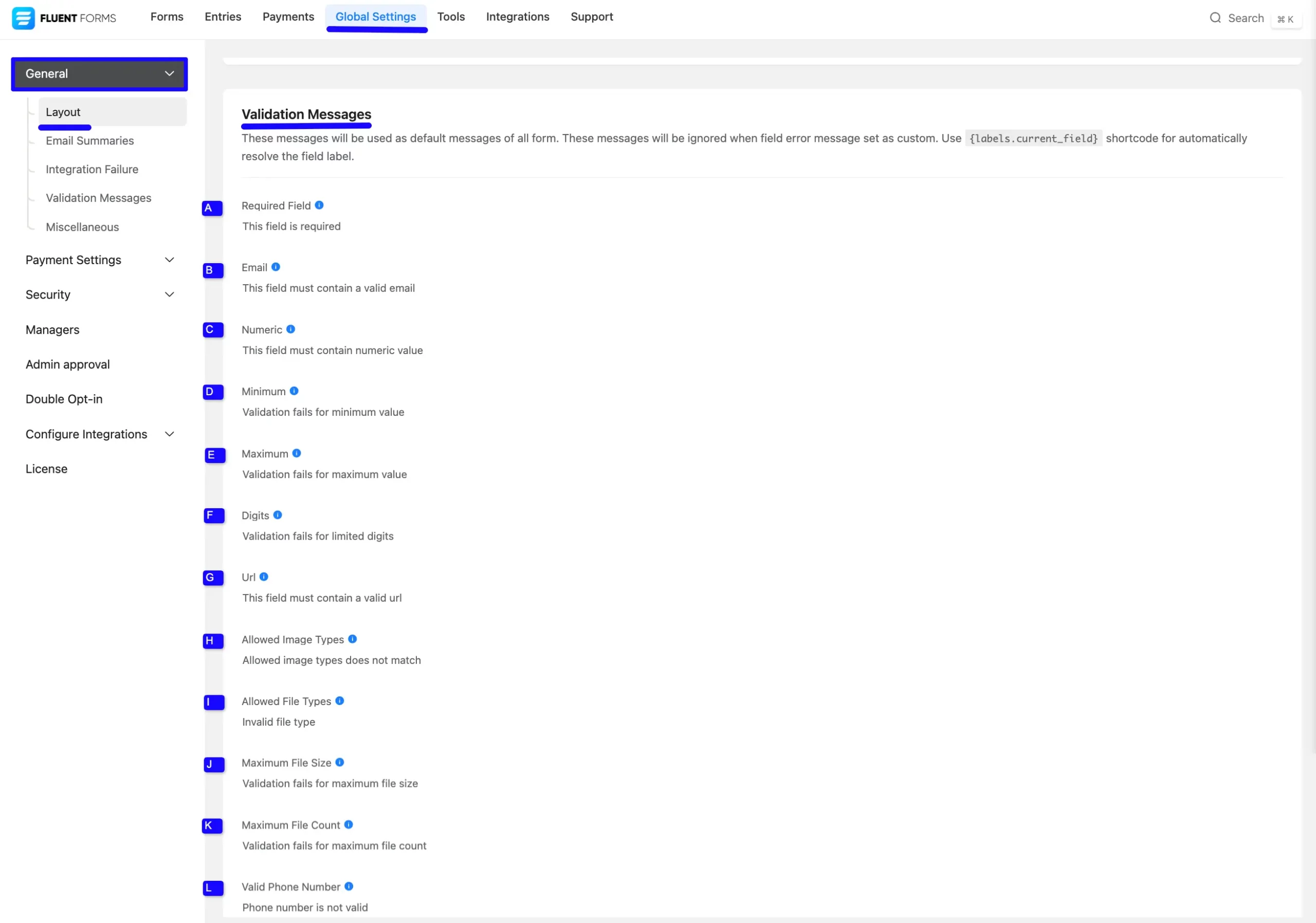
You can manage error messages from the Global Settings menu. First, go to the top menu and click Global Settings. Under General Settings, find the Layout section. Scroll down to see the Validation Messages option. Here, you can set your global error messages as needed.
Validation Messages #
These messages appear when something goes wrong while filling out a form. The global error message will be used if a custom message is not set for a field. You can use the tag {labels.current_field} to automatically insert the field label into your messages.
A. Required Field: Shown when a required field is left empty.
B. Email: Appears if the email address format is incorrect.
C. Numeric: Shown when a number is needed, but the input isn’t valid.
D. Minimum: This appears if the value entered is too low.
E. Maximum: This appears if the value entered is too high.
F. Digits: Shown when the number includes more digits than allowed.
G. URL: Shown when the website link format is not valid.
H. Allowed Image Types: This appears if the uploaded image is not in an accepted format.
I. Allowed File Types: Shown when the uploaded file is not in the allowed format.
J. Maximum File Size: This appears if the uploaded file is too large.
K. Maximum File Count: Shown when too many files are uploaded.
L. Valid Phone Number: Shown when the phone number format is incorrect.
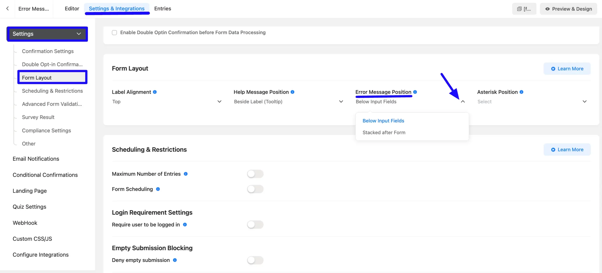
Customization of the Error Message position #
You can be positioned and presented with your Error Message in different ways. To do this, navigate the Settings & Integrations tab and click the Form Layout from the left sidebar under the Settings section.
Now, you can choose the Error Message position you want.
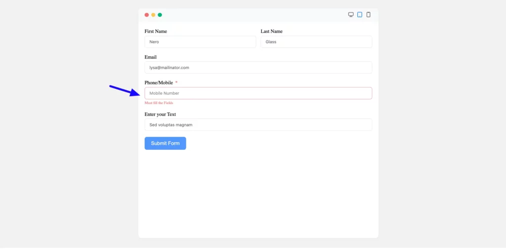
- Below Input Fields: Displays the error message directly below the blank or invalid input field.
- Stacked after Form: Choosing Stacked after Form will present a list of all the required fields that have yet to be filled below the form.
Once you’ve chosen your preferred placement, click Save Settings to finalize the customization.
The preview of the form error message is shown in the screenshot below.
Customizing error messages in Fluent Forms ensures your users can quickly identify and address issues, making their form submission process smoother and more intuitive!
If you have any further questions, concerns, or suggestions, please do not hesitate to contact our support team. Thank you.


