The Checkable Grid input field in Fluent Form is a powerful tool for collecting feedback, surveys, assessments, and preference selection. This field can function as a short combination of multiple checkboxes or radio buttons.
This guide will walk you through adding and customizing the Checkable Grid Field in Fluent Forms for your WordPress site.
The Checkable Grid field is an advanced feature of the Fluent Forms plugin. To use it, you need the Fluent Forms Pro Add-on.
Adding Checkable Grid Field #
To learn how to add the Checkable Grid field to Fluent Forms, follow the steps below:
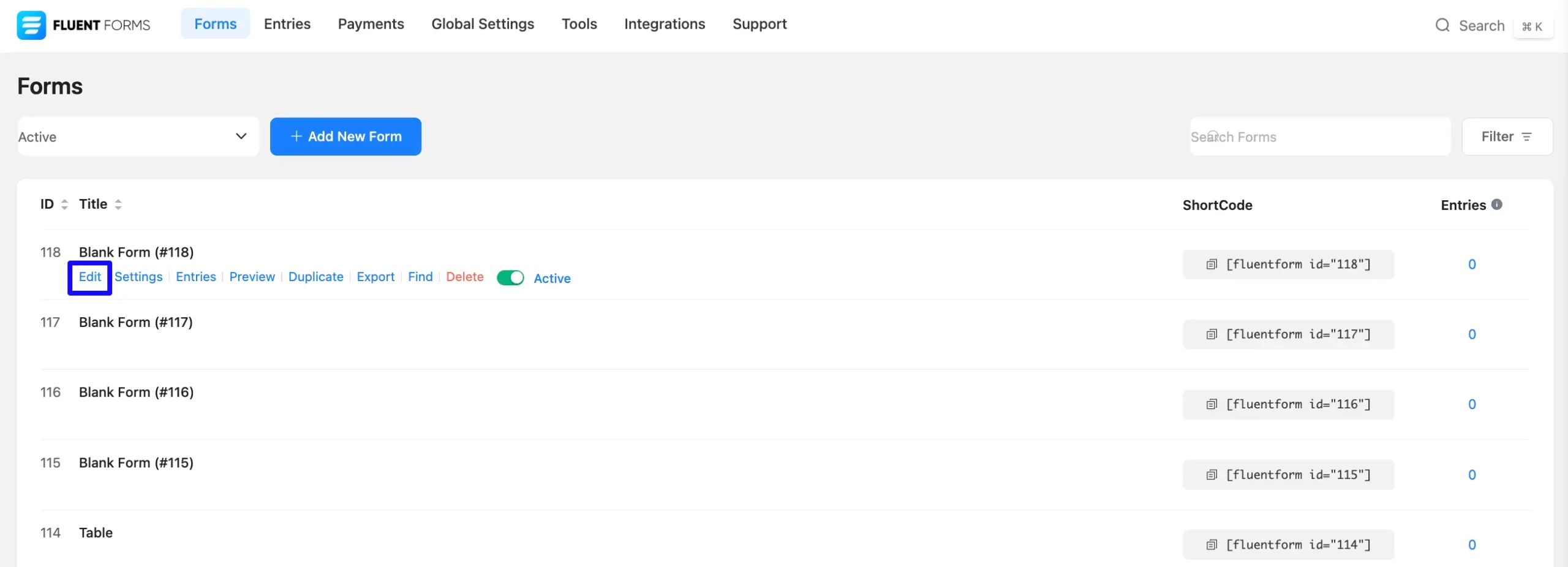
First, go to the Forms section from the Fluent Forms Navbar, choose a desired Form, and click the Edit icon to open the Editor page of that form.
If you do not have any existing forms, read Create a Form from Scratch or Create a Form using Templates documentation to create a new one.
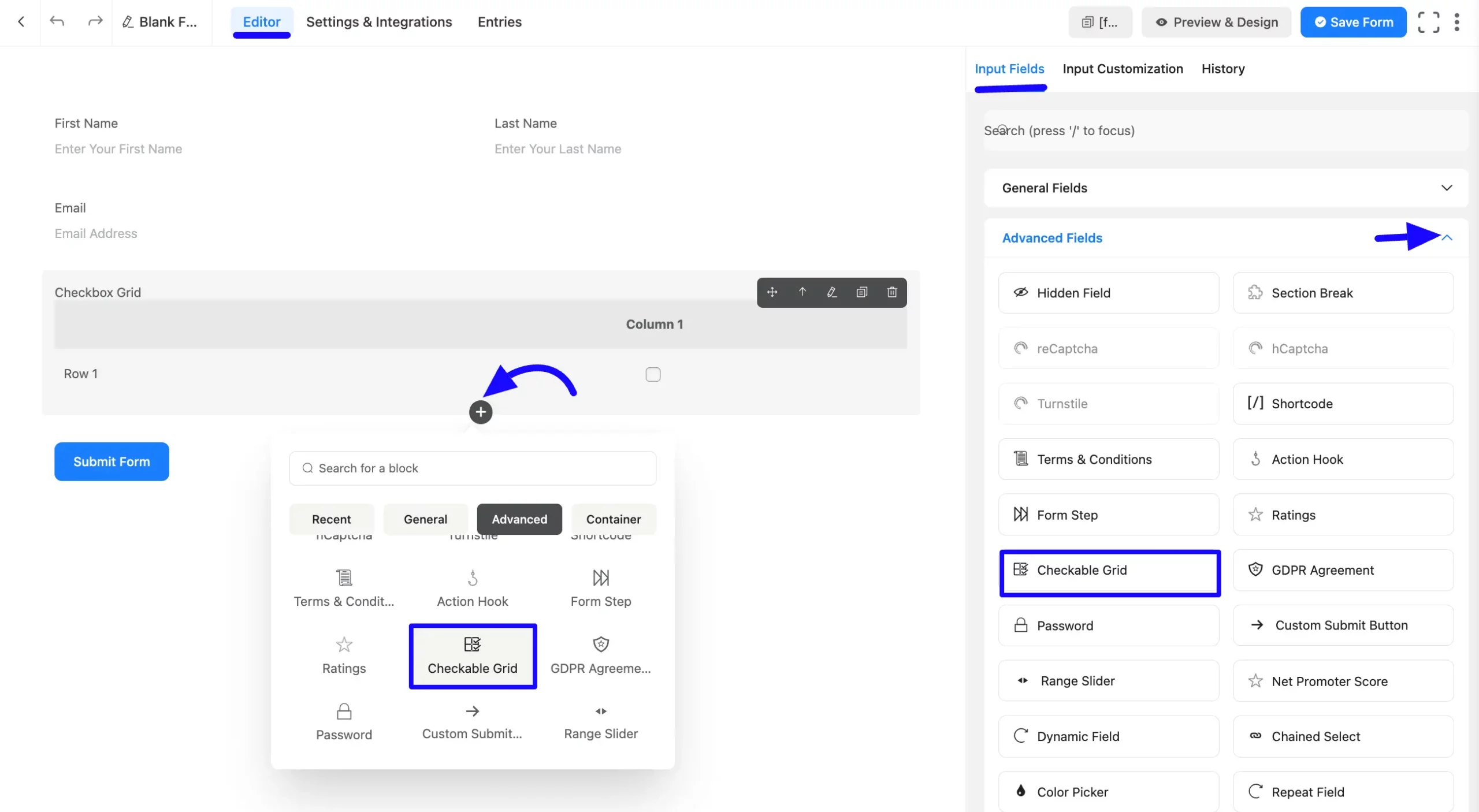
Once on the Editor page, click the Plus Icon in your form editor and open the Advanced Fields module. The Advanced Fields option is also in the right sidebar under the Input Fields tab.
Now, select the desired Checkable Grid Input field by clicking or dragging it and dropping it into your editor.
Customizing the Checkable Grid Field #
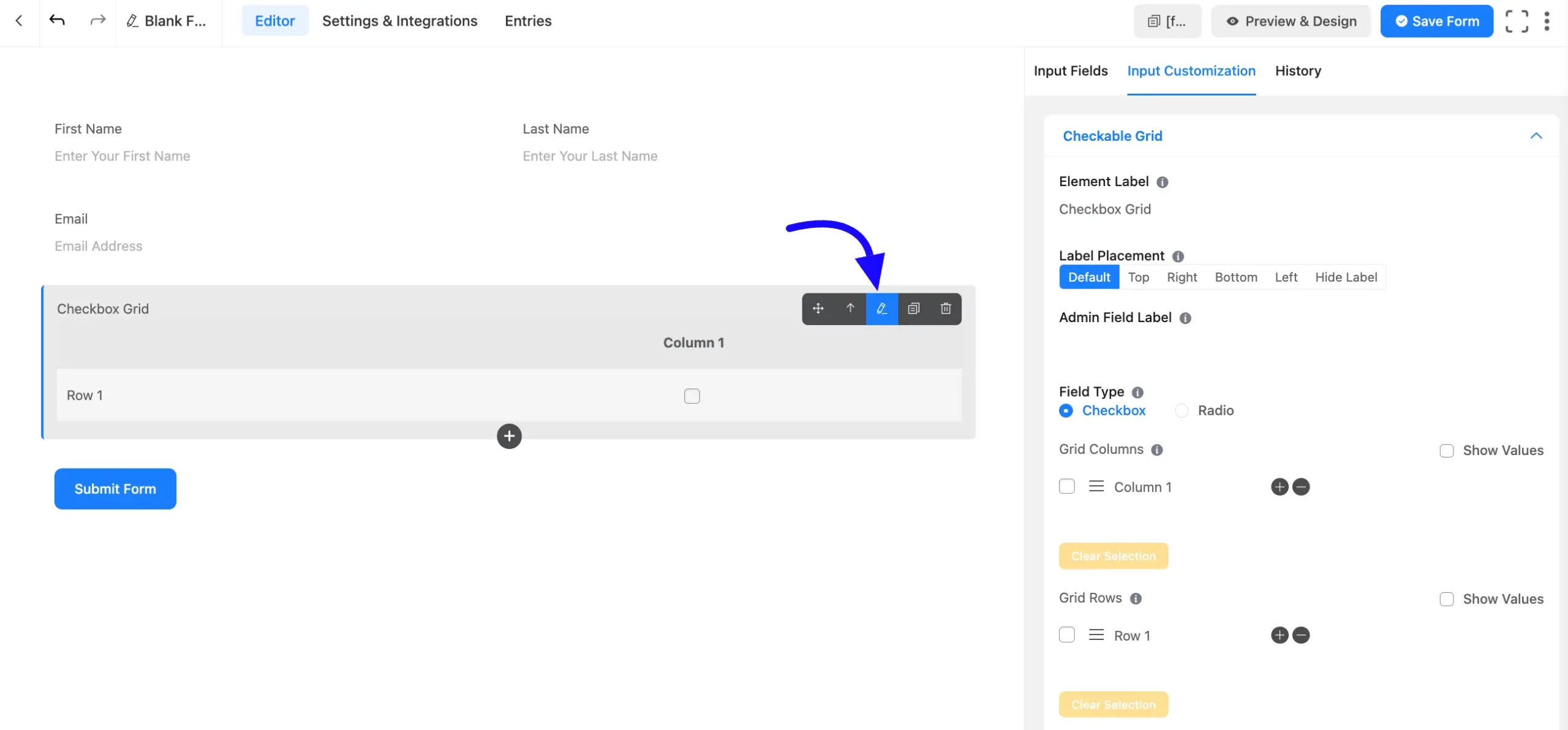
Once you add the checkable grid field, you can customize it by hovering over it and clicking the Pencil Icon. It will take you to the Input Customization tab on the right side and offer the following options for customizing the field.
- Checkable Grid Options
- Advanced Options
Checkable Grid Options #
You will find various settings options for customizing the field. Located in the Input Customization Tab, these options allow you to configure essential aspects of the Checkable Grid input field.
All the Settings under the Checkable Grid Field mentioned above are briefly explained below –
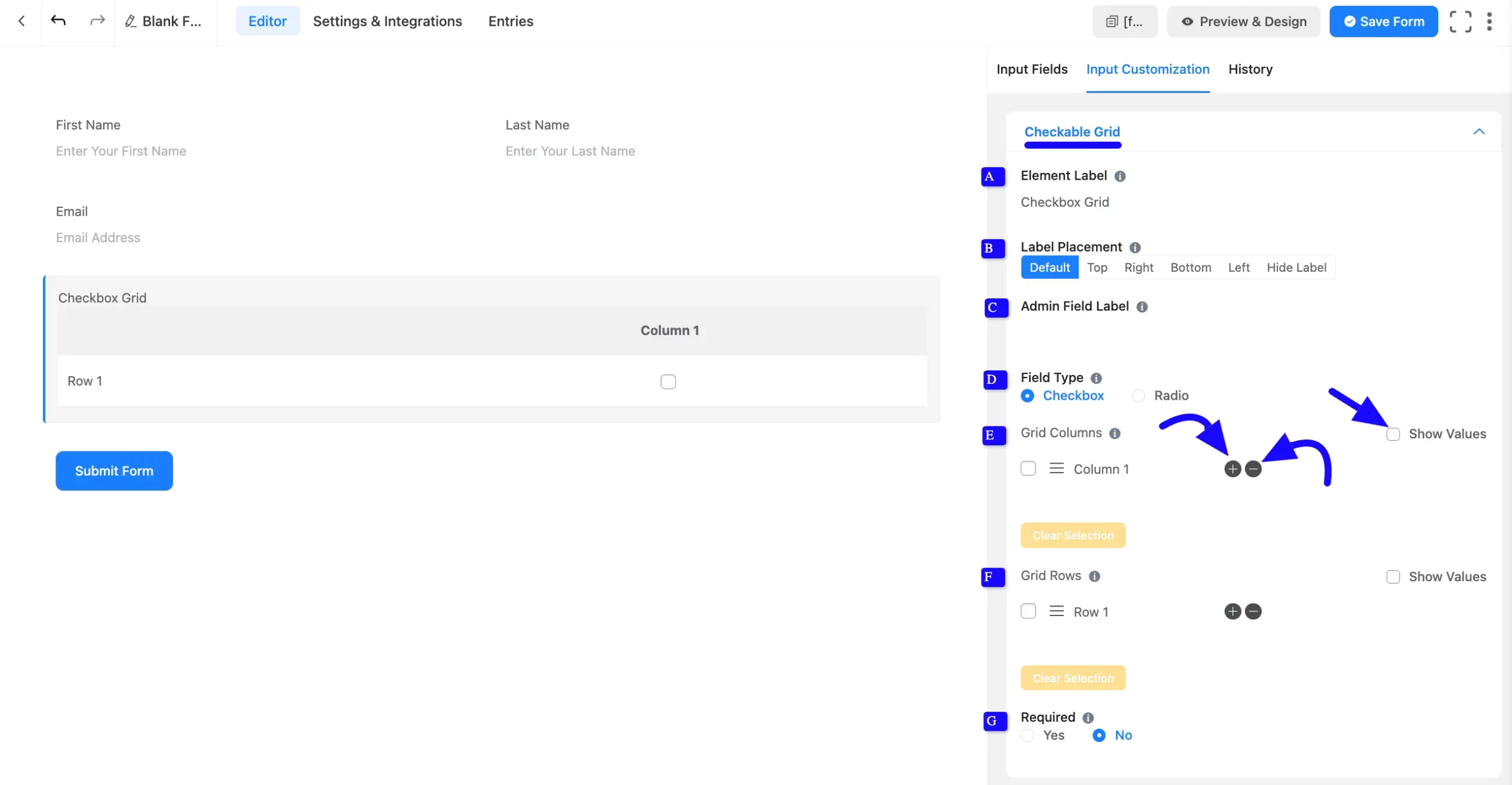
A. Element Label: This is the field title users will see when filling out the Checkable Grid field in a form. You can enter any text here to help users understand the field’s purpose.
B. Label Placement: This option allows you to determine the position of the label title where the user will see it. The available options are Top, Left, Right, and Default. All of those are self-explanatory except the Default. If you select the Default option, it will represent your global label placement settings.
C. Admin Field Label: The admin field label is a field title displayed only to admin users. You can configure this option to show a different field label for your admin users when they view the form submissions.
D. Field Type: Select the checkable grid function as a Checkbox or a Radio button field. A checkbox will work as a multiple-choice option, and a Radio button will work as a single-choice option.
If you select the Checkbox button, your users will have the opportunity to respond in the form of a checkbox. If you select the radio button, your users will have the option to respond in the form of a radio button.
E. Grid Columns: This section allows you to add a column to your grid system. If you want to add a column to the vertical grid, click on the Plus(+) Icon.
For each click, a column will be added to the vertical grid. On the other hand, if you want to delete a column, click on the Minus(-) Icon.
You can customize the Grid column section.
- Selection: You can Pre-select options if needed by clicking the Checkbox option.
- Show Values: You can add value by enabling the Show Value option. It helps for admin convenience.
- Naming Options: You can set column and row labels as you want.
- Rearrange Options: You can rearrange them by dragging and dropping the holding marker options.
F. Grid Rows: This section allows you to add a row to your grid system. To add a row to the horizontal grid, click the Plus(+) Icon.
For each click, a row will be added to the horizontal grid. On the other hand, if you want to delete a row, just click on the Minus(-) Icon.
You can customize the Grid Rows section.
- Selection: You can pre-select options if needed by clicking the Checkbox option.
- Show Values: You can add value by enabling the Show Value option. It helps for admin convenience.
- Naming Options: You can set column and row labels as you want
- Rearrange Options: You can re-arrange them by dragging and dropping the holding marker options.
G. Required: Choose the appropriate option from here to determine whether the field should be empty when the user submits your form.
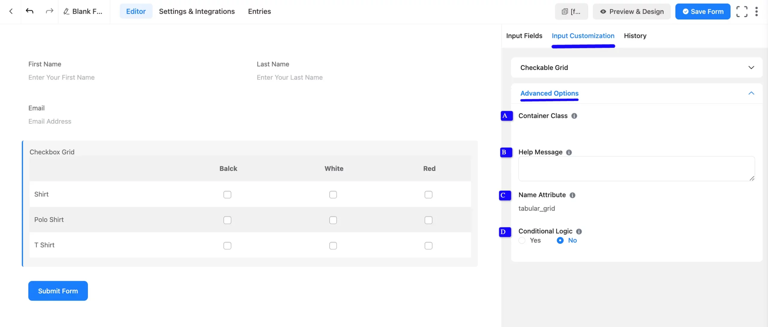
Advanced Options #
Advanced settings allow further customization to meet specific use cases. All the Settings under the Advanced Options tab mentioned in the screenshot are briefly explained below –
A. Container Class: Use this option to add your custom CSS classes to the field’s wrapper.
B. Help Message: This option allows you to guide your user thoroughly. Add your text here, which will be shown as a help message to the user.
C. Name Attribute: The input field’s name attribute is the HTML equivalent of the same name. You don’t need to modify this.
D. Conditional Logic: This option allows you to create specific rules to dynamically hide/show the input field to function conditionally based on your submission values according to your set of conditional logics. To learn more, read this Documentation.
Embed the Form into the Front #
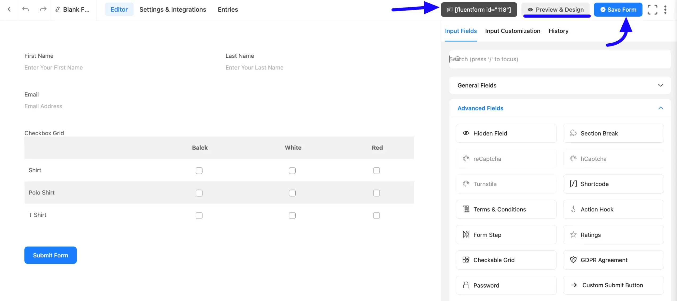
Once you have customized the shortcode field, click the Save Form button to apply the changes.
To display the form on a specific page or post, Copy the Shortcode from the top-right corner and Paste it into your desired Page or Post.
To preview the form, click Preview & Design in the middle of the page.
Preview of Added Checkable Grid Field #
Here is a preview of the form with the Checkable Grid field:
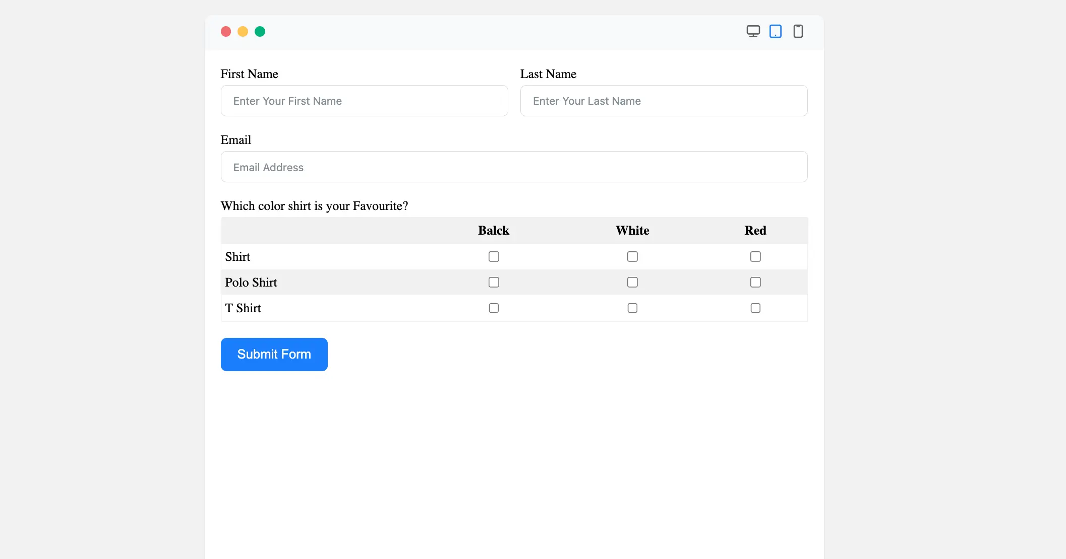
Congratulations! You have successfully added a Checkable Grid Field to your Fluent Forms form.
If you have any further questions, concerns, or suggestions, please do not hesitate to contact our support team. Thank you!


