Want to use a special Submit button on your Fluent Form? It’s simple! This field allows you to replace the Default Submit Button with a Custom Submit Button for better control over positioning, styling, and conditional logic.
This guide will walk you through adding and customizing the Custom Submit Field in Fluent Forms for your WordPress site.
Adding Custom Submit Button Field #
To learn how to add the Custom Submit Button field to Fluent Forms, follow the steps below:
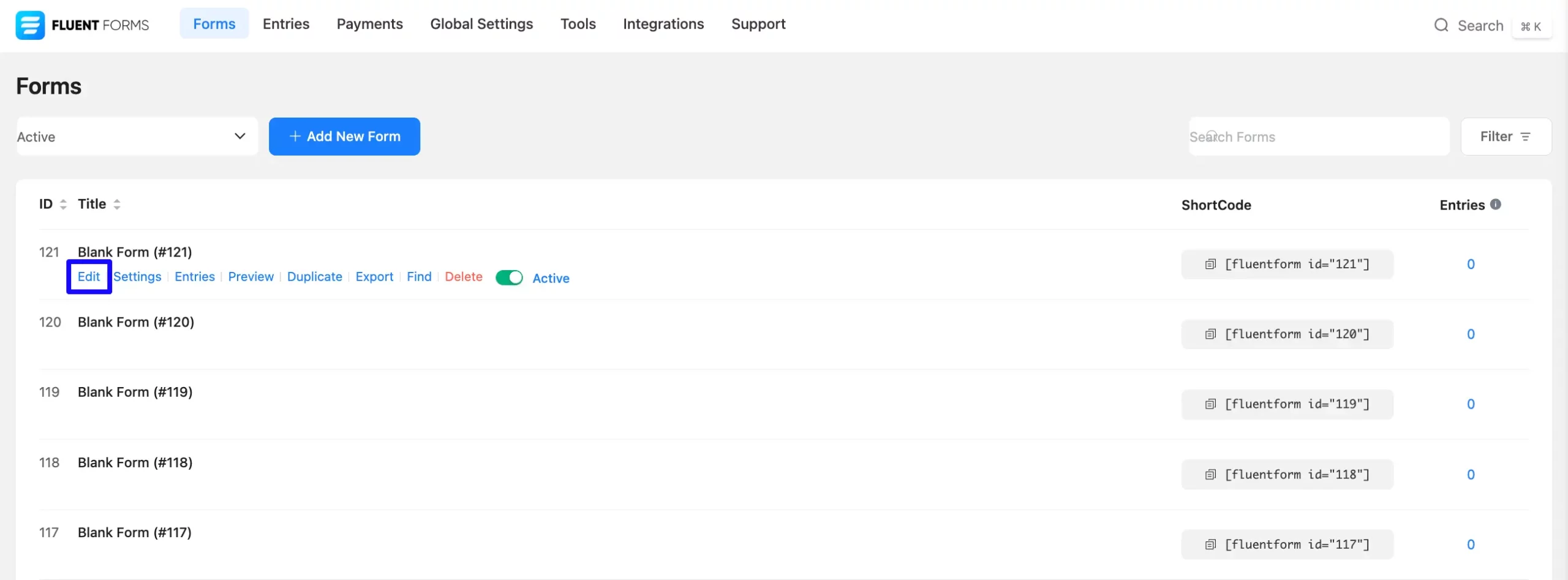
First, look for the Forms section in the Fluent Forms menu. Then, choose the form you want to work on and click the Edit Icon to get to the page where you can change it.
If you do not have any existing forms, read Create a Form from Scratch or Create a Form using Templates documentation to create a new one.
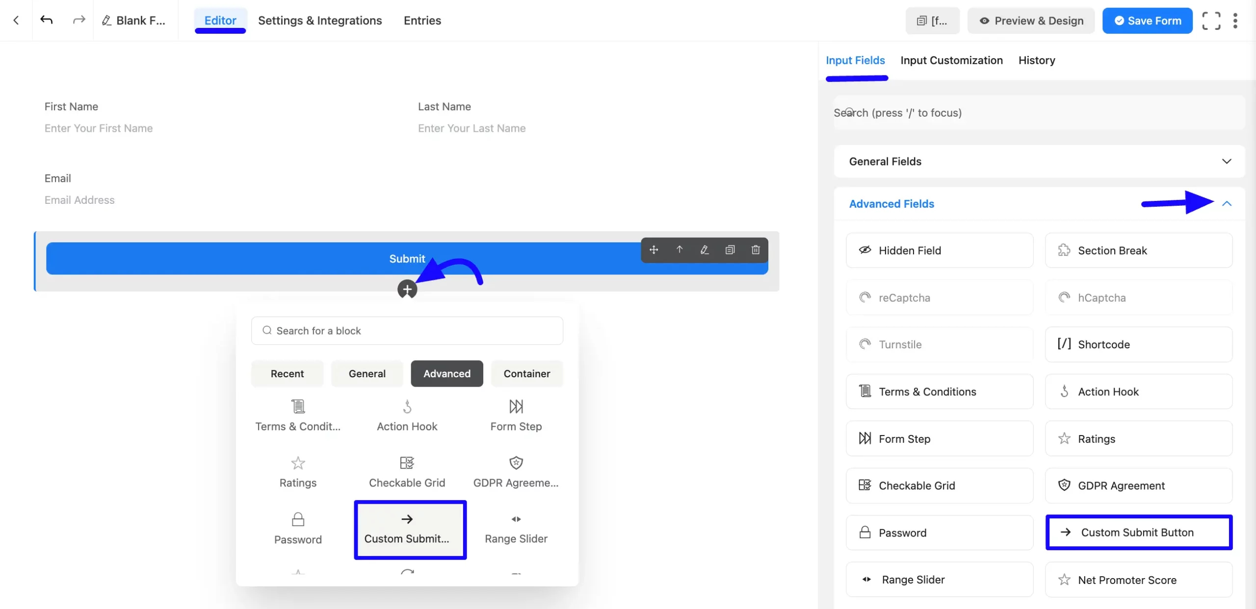
Once on the Editor page, click the Plus Icon in your form editor and open the Advanced Fields module. The Advanced Fields option is also in the right sidebar under the Input Fields tab.
Now, select the desired Custom Submit Button Input field by clicking or dragging it and dropping it into your editor.
Customizing the Custom Submit Button Field #
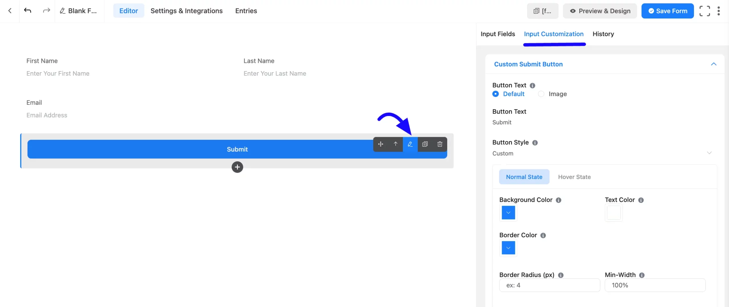
Once you add the Custom Submit Button field, you can customize it by hovering over it and clicking the Pencil Icon. It will take you to the Input Customization tab on the right, which offers the following customization options.
- Custom Submit Button Options
- Advanced Options
Custom Submit Button Options #
Under the Input Customization tab, you will find various settings options for customizing the field. These options allow you to configure essential aspects of the Custom Submit Button field.
All the settings under the Custom Submit Button Field mentioned above are briefly explained below–
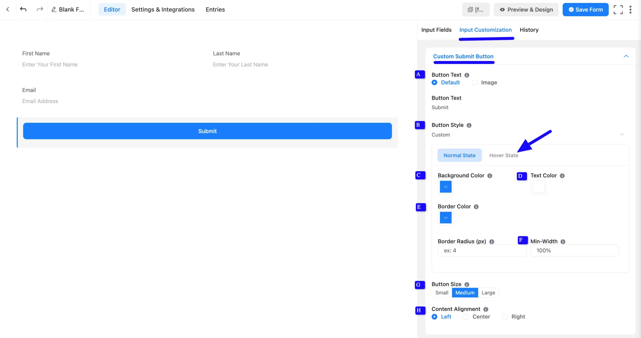
A. Submit Button: Choose between Default or Image for the button. These two options are available in the Submit Button option. Users can keep this Button as a Default button or select the Image option with the URL.
B. Button Style: Customize the button’s color scheme, position, and action to match your form’s design.
C. Background Color: Select a color that fits your website’s theme.
D. Text Color: Adjust the button text color to ensure readability and design consistency.
E. Border Color & Radius: If necessary, define a border color and set the border radius to achieve a rounded button style.
F. Min-Width: Set a minimum width for the button in pixels or percentage.
G. Button Size: Choose from Small, Medium, or Large button sizes that suit your website content.
H. Content Alignment: Align the button’s content according to your design preferences.
Hover State Styling: You can apply the same styling options for the button’s hover state by clicking the Hover State tab and adjusting the styles accordingly.
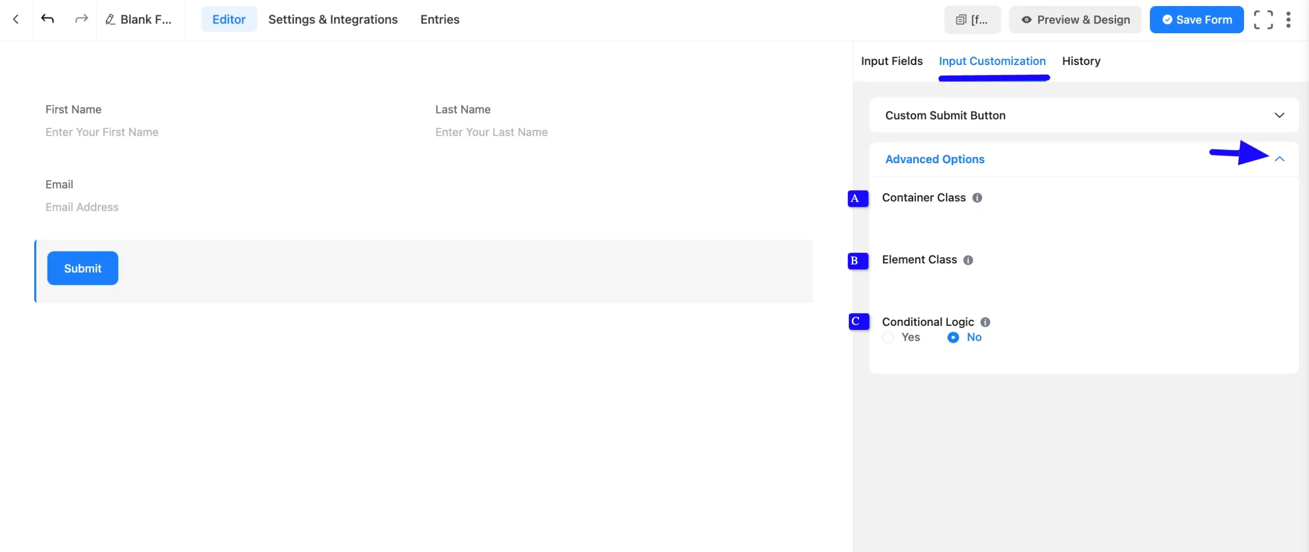
Advanced Options #
Advanced settings allow further customization to meet specific use cases.
A. Container Class: Use this option to add your custom CSS classes to the field’s wrapper.
B. Element Class: Add custom CSS classes to the input field.
C. Conditional Logic: This option allows you to create specific rules to dynamically hide/show the input field to function conditionally based on your submission values according to your set of conditional logics. To learn more, read this Documentation.
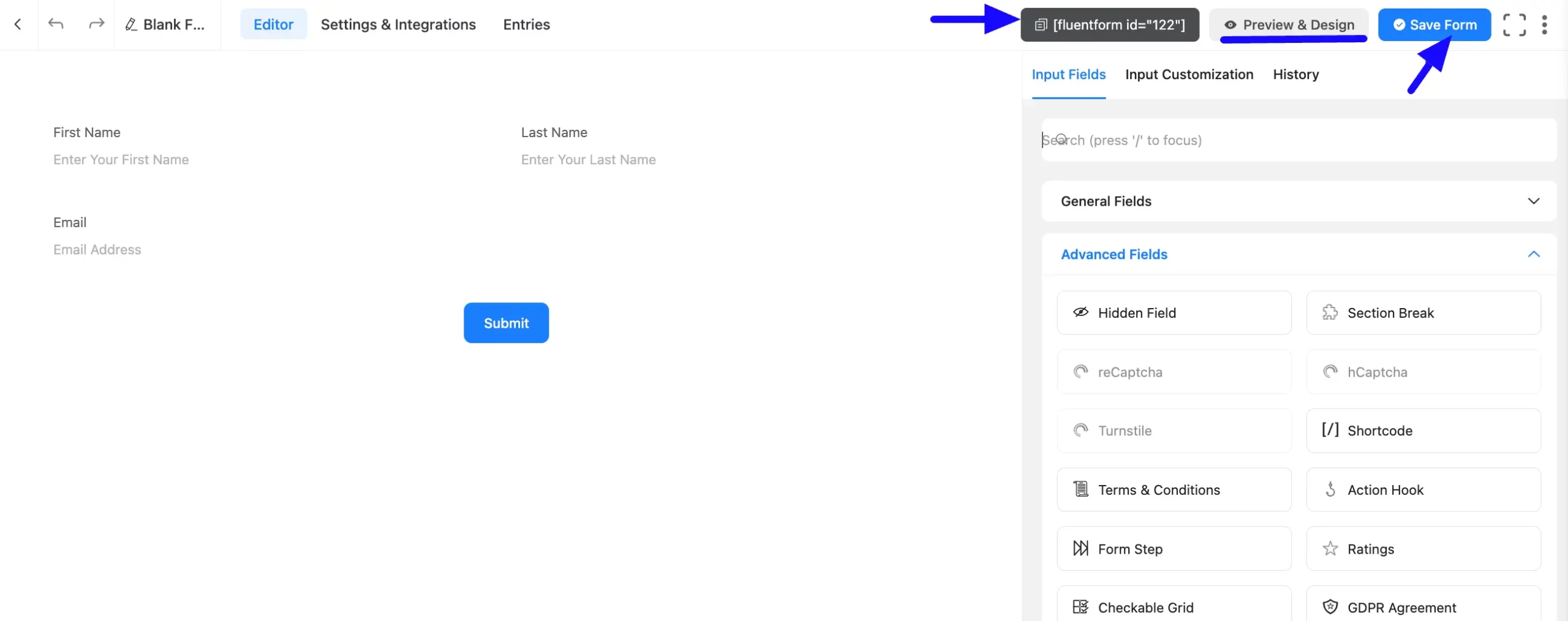
Embed the Form into the Front #
Once you complete the customization, click the Save Form button to save all your changes. Click the Preview & Design button in the middle to see the form preview.
To integrate and display the form on a specific Page or Post, copy the Shortcode from the top right side and paste it into your desired Page or Post.
Preview of Added Custom Submit Button #
Here is a preview of the form with the Custom Submit Button input field.
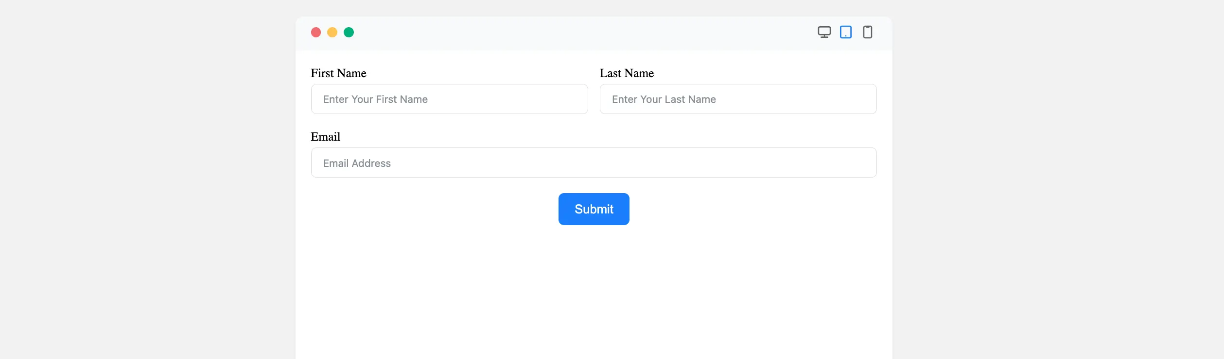
Congratulations! You have successfully added a Custom Submit Button field to your Fluent Forms form.
If you have any further questions, concerns, or suggestions, please do not hesitate to contact our support team. Thank you!


