
Fluent Forms provides visual representation for form entries through Pie Charts, Bar Charts, and Column Charts, enabling users to analyze and print reports.
In this documentation, you will learn how to get a visual representation of form entries in Fluent Forms.
Access the Entries #
There are two types of entries:
- All Entries: This shows a global view of all entries submitted across all forms.
- Individual Form Entries: These are entries submitted to a specific form.
There are three ways to access the entries for visual representation.
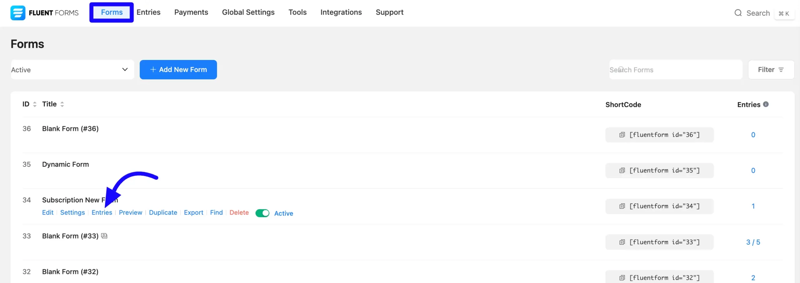
First, navigate to the Fluent Forms Forms sections. Click on the Entries below your desired form.
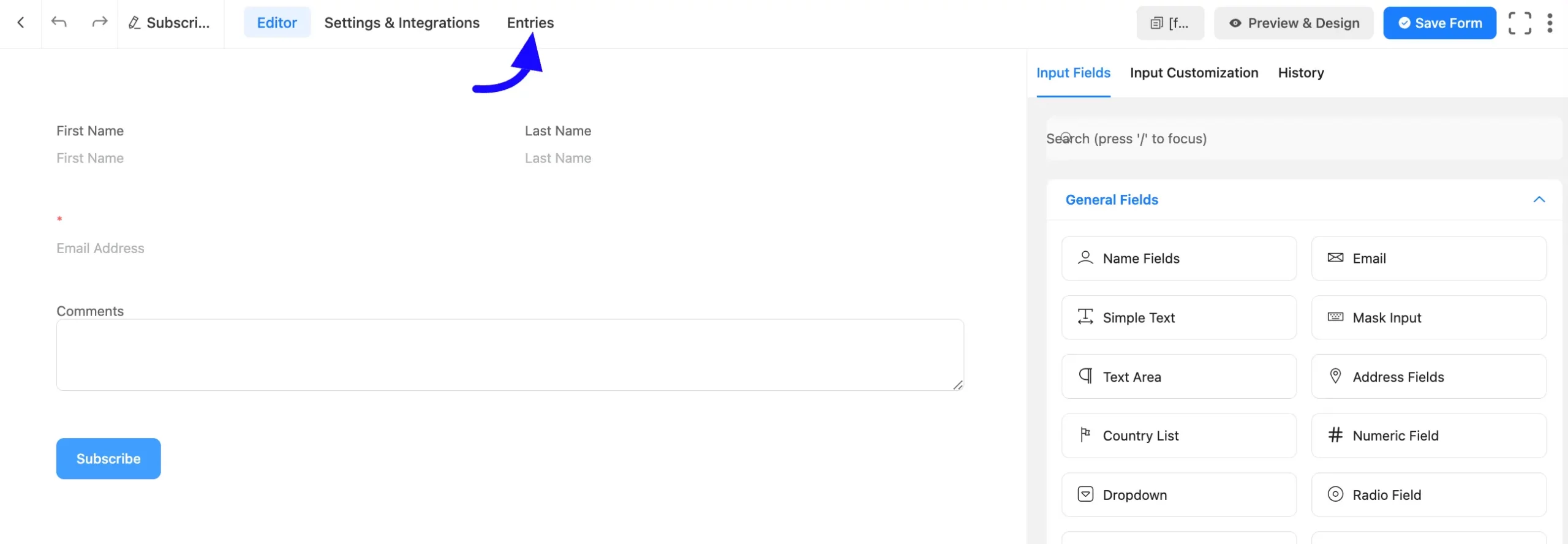
Click Edit under the form, then select Entries from the top bar.
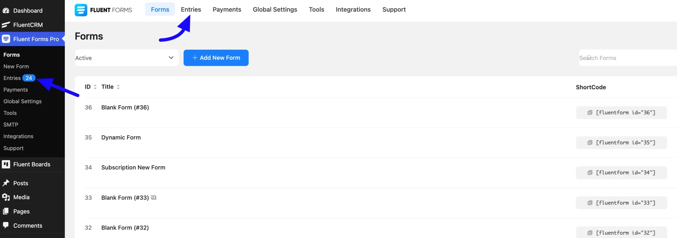
Navigate to Fluent Forms Entries sections and select a form from the dropdown menu.
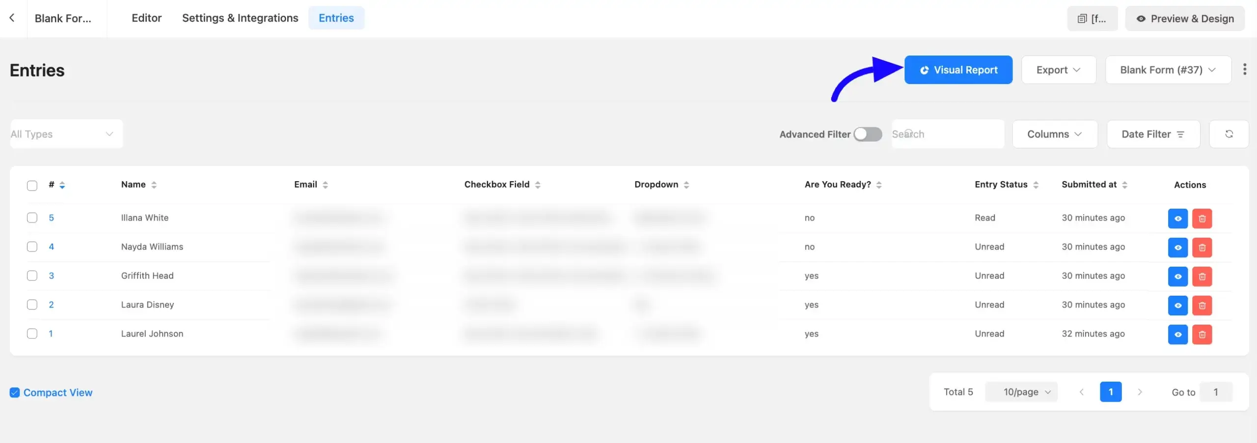
View the Visual Report #
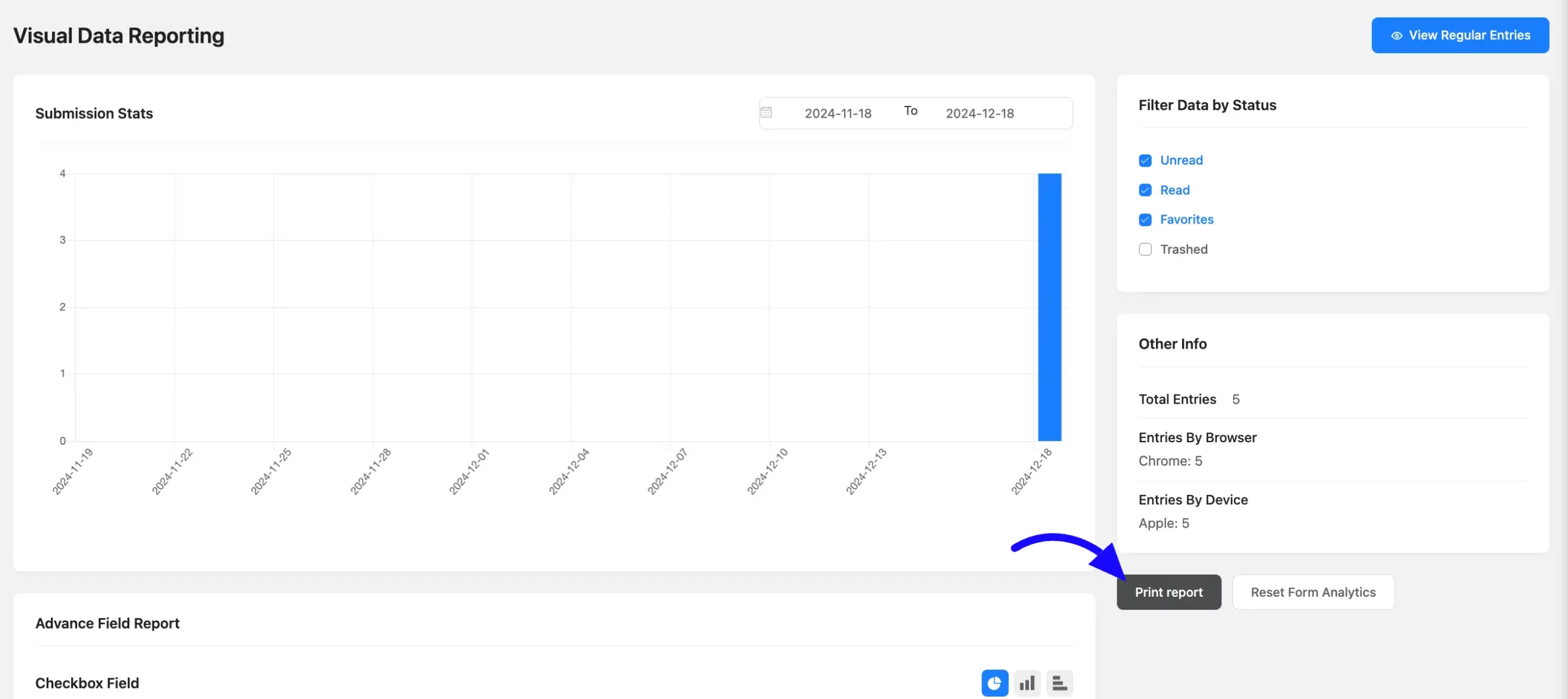
Once you click the Entries option, click Visual Report in the top-right corner of the page. This opens the visual report section for the selected form.
Here you’ll see visual data for choice fields such as checkboxes, dropdowns, and radio fields. The report displays total submissions and the percentage for each selected input.
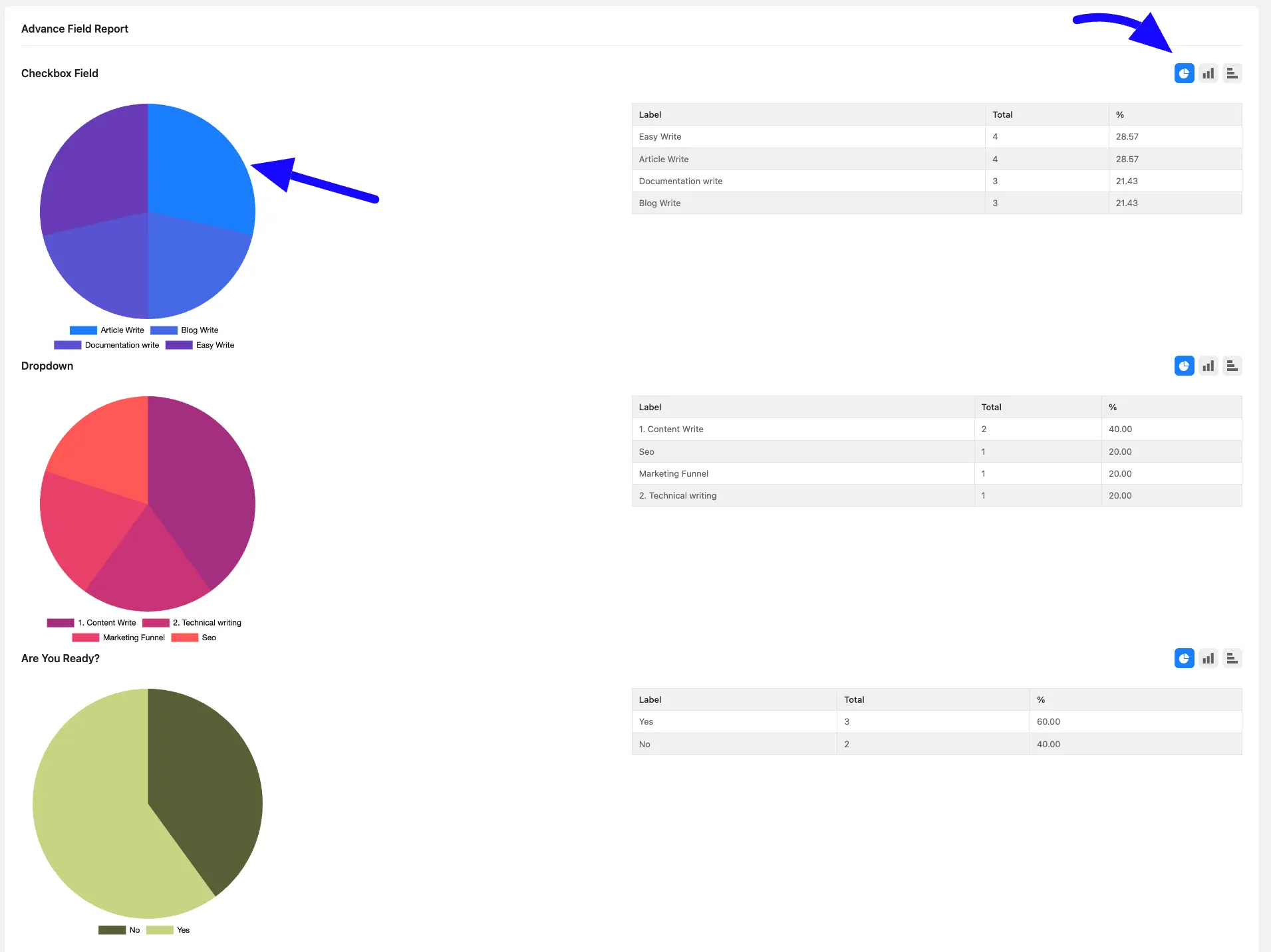
Using the chart icons, you can switch between Bar chart, Column chart, and Pie chart. Also, you can print reports with the Print Report button.
The Other info sections will show the total number of form entries, the browser that was used during submission, and the device name. Also, you can use the Filter Data by Status (read, unread, favourite, and Trashed) to refine the report.
Only choice fields support chart generation. Suppose checkbox, dropdown, and radio field etc.
This is the process for obtaining a visual representation of form entries in Fluent Forms. If you have any further questions, concerns, or suggestions, please do not hesitate to contact our support team. Thank you.


