
The Oxygen Builder Widget and Fluent Forms allow you to create and style powerful forms without code. You can modify your form colors, shapes, sizes, backgrounds, margins, padding, and more, making form creation easy and visually appealing.
This guide will show you how to customize and publish forms using the Fluent Forms Oxygen Widget.
Add Fluent Forms with Oxygen Builder Widget #
First, install and activate the Oxygen Builder plugin on your WordPress site. Then, create a new page and click the Edit with Oxygen button to open the Oxygen editor.
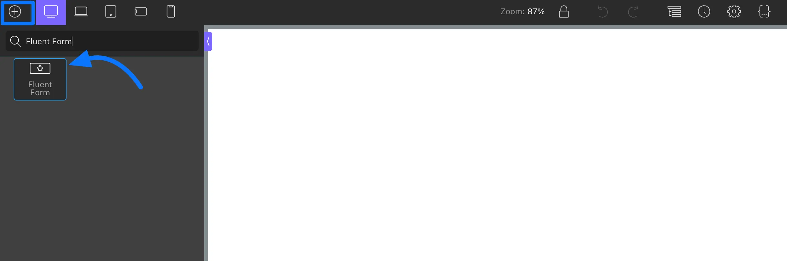
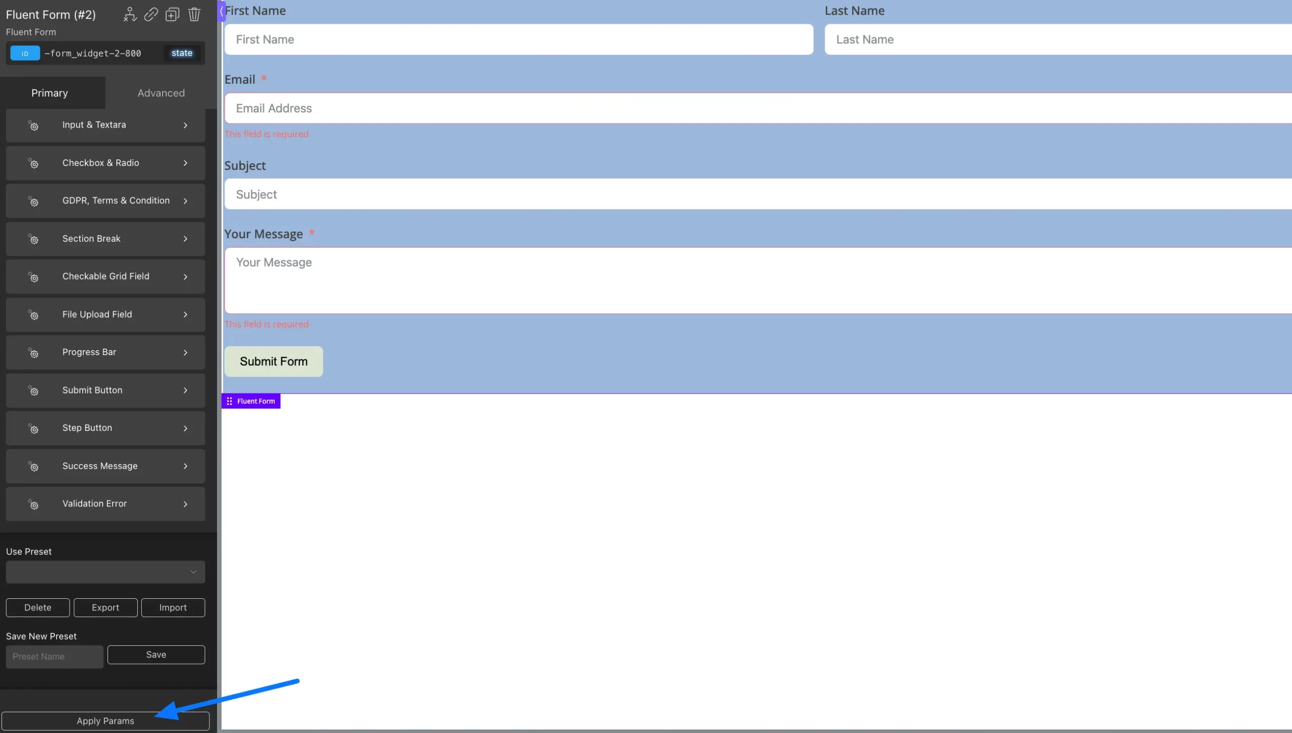
To add element, click the Plus Icon (+) in the top left and type Fluent Form into the search bar. Then, click on the Fluent Form block to add it.
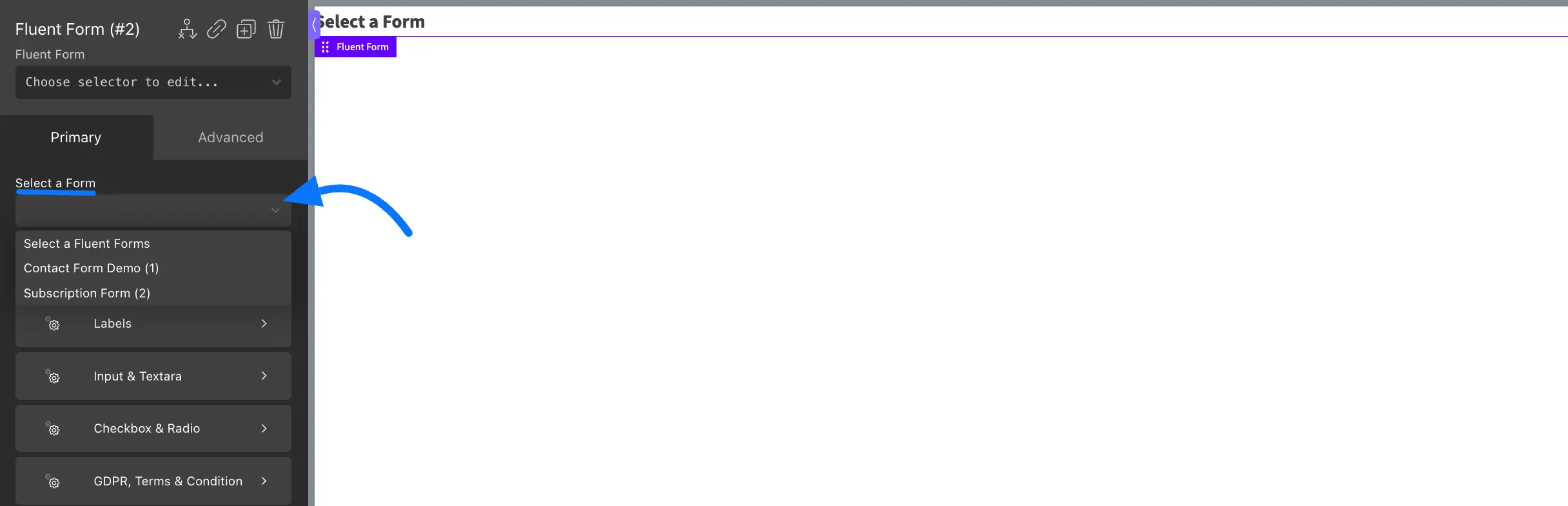
If you already have forms, just choose one from the dropdown. If not, create a new form in Fluent Forms first.
Customizing Form Appearance #
Primary #
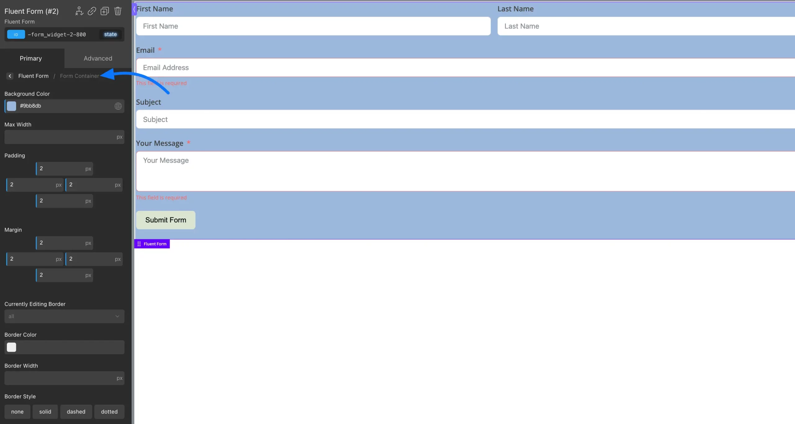
In the Primary section, you can modify your form as you want.
Form Container: You can customize the form container to match your website’s design. You can change the background color, set the maximum width, and adjust the padding and margins to control the spacing around your form.
You can also customize the border by setting its color, width, and style (solid, dashed, dotted, or none). Additionally, adjust the border-radius to round the corners as needed.
Labels: Use the color picker to choose the text and asterisk colors. Customize typography settings such as font family, size, weight, color, alignment, letter spacing, line height, decoration, and style to match your design preferences.
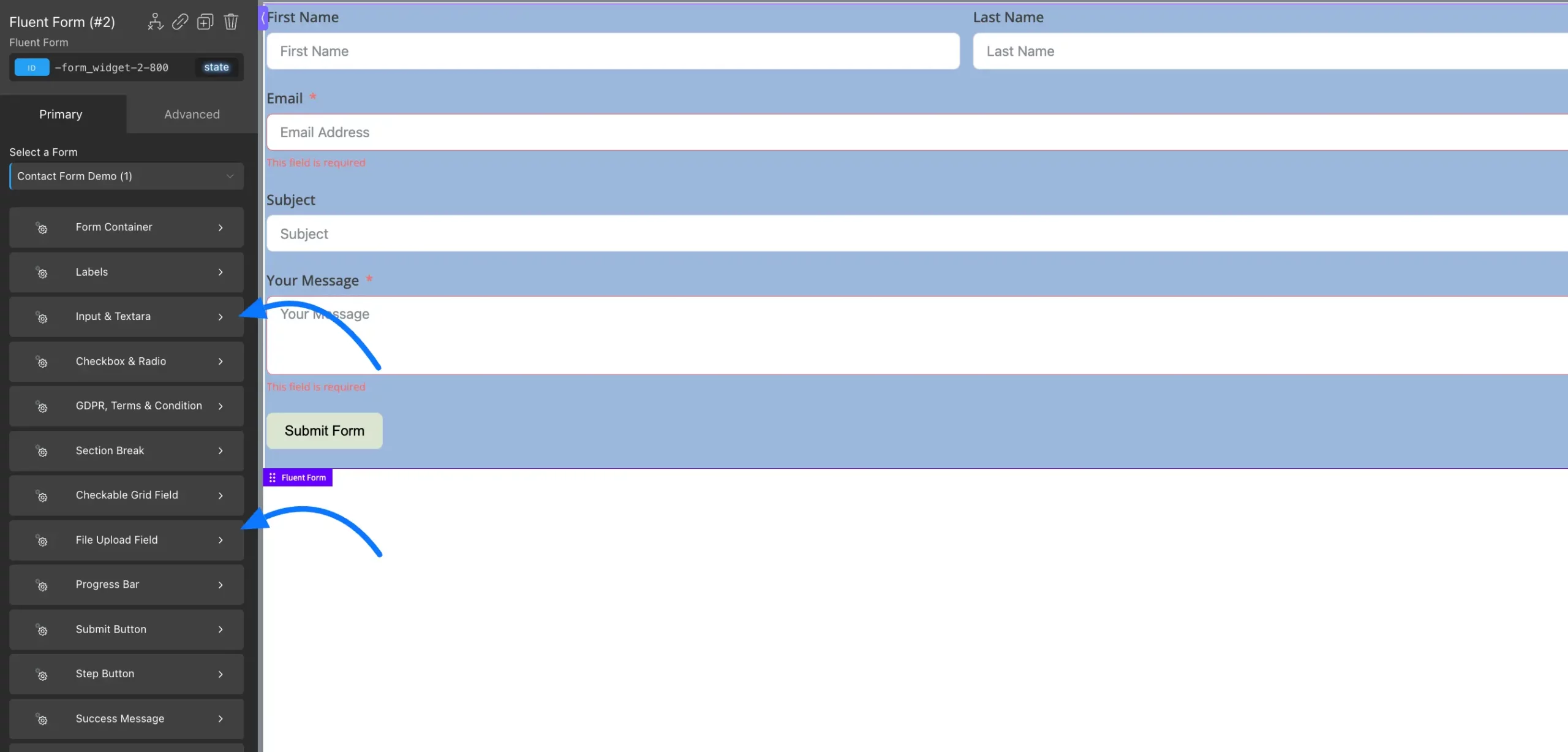
Input & Textarea: You can customize the Input and Textarea fields by adjusting the label color, background, width, height, margins, and padding. You can also set text indent and modify border properties like width, color, style, and corner radius. These options help you create clean, user-friendly form fields matching your design.
File Upload Field: You can style the File Upload button by customizing its color, shape, typography, and border. Use the available options to adjust font size, weight, alignment, border style, width, and radius to match your design.
Multi-step Forms: For multi-step forms, you can style a Section Break and a Progress Bar to divide the form into steps and help users track their progress easily.
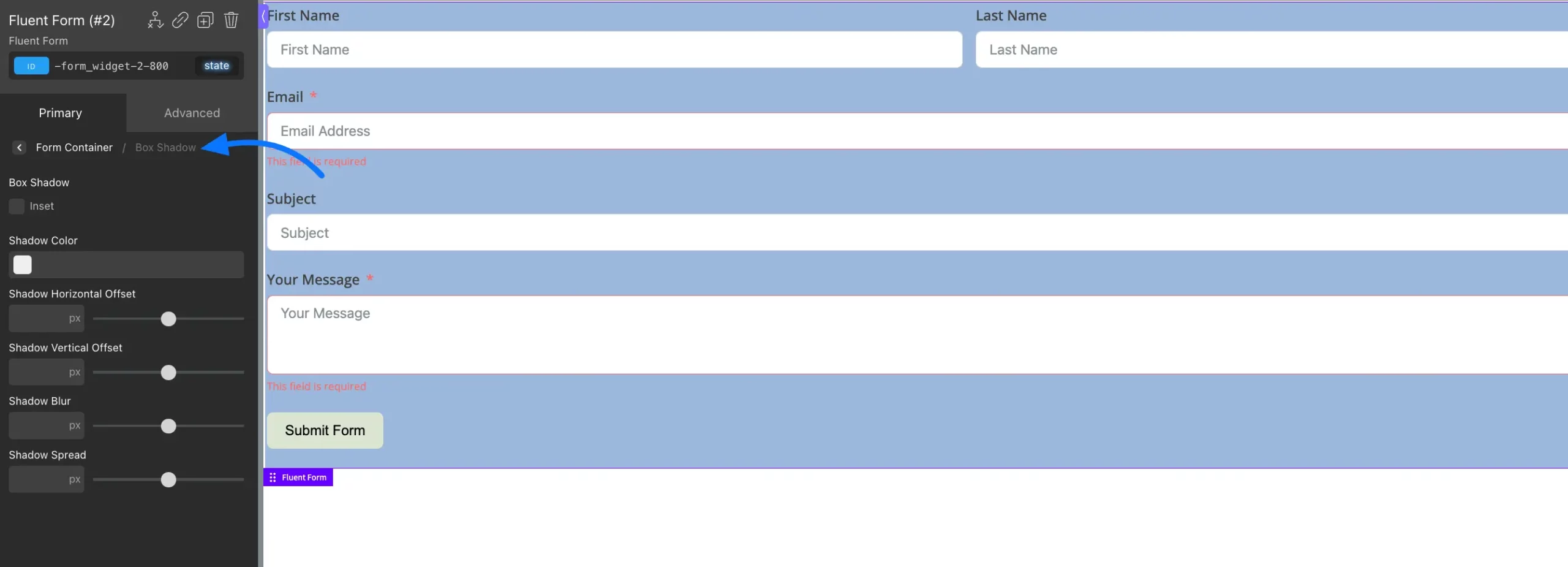
Box Shadow: Box Shadow lets you add a shadow around your form to create a soft depth effect. You can easily adjust the shadow color, direction, blur, and spread to match your design.
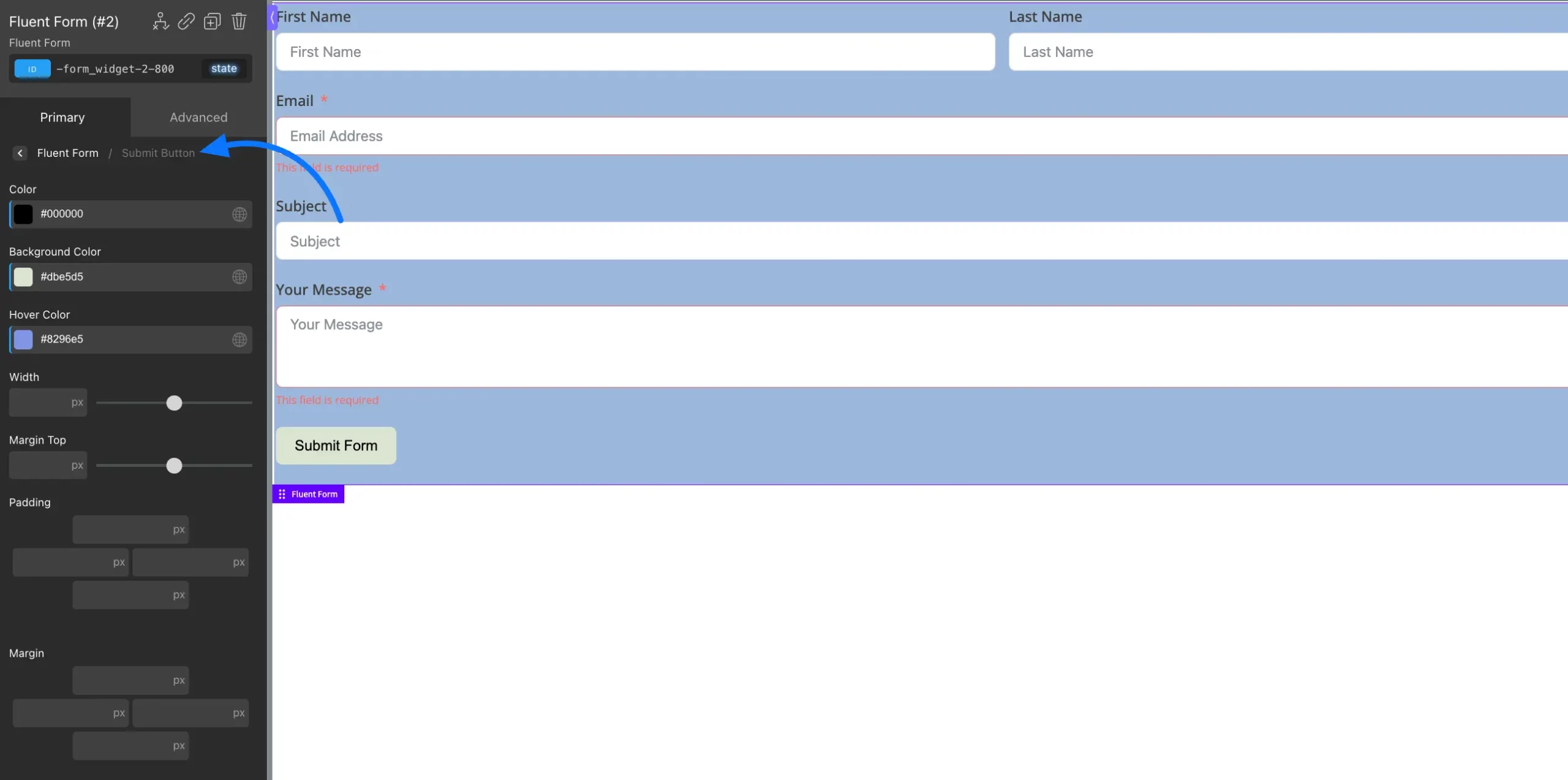
Submit Button: You can style the submit button by changing its color, width, margin, padding, and more to fit the look of your form.
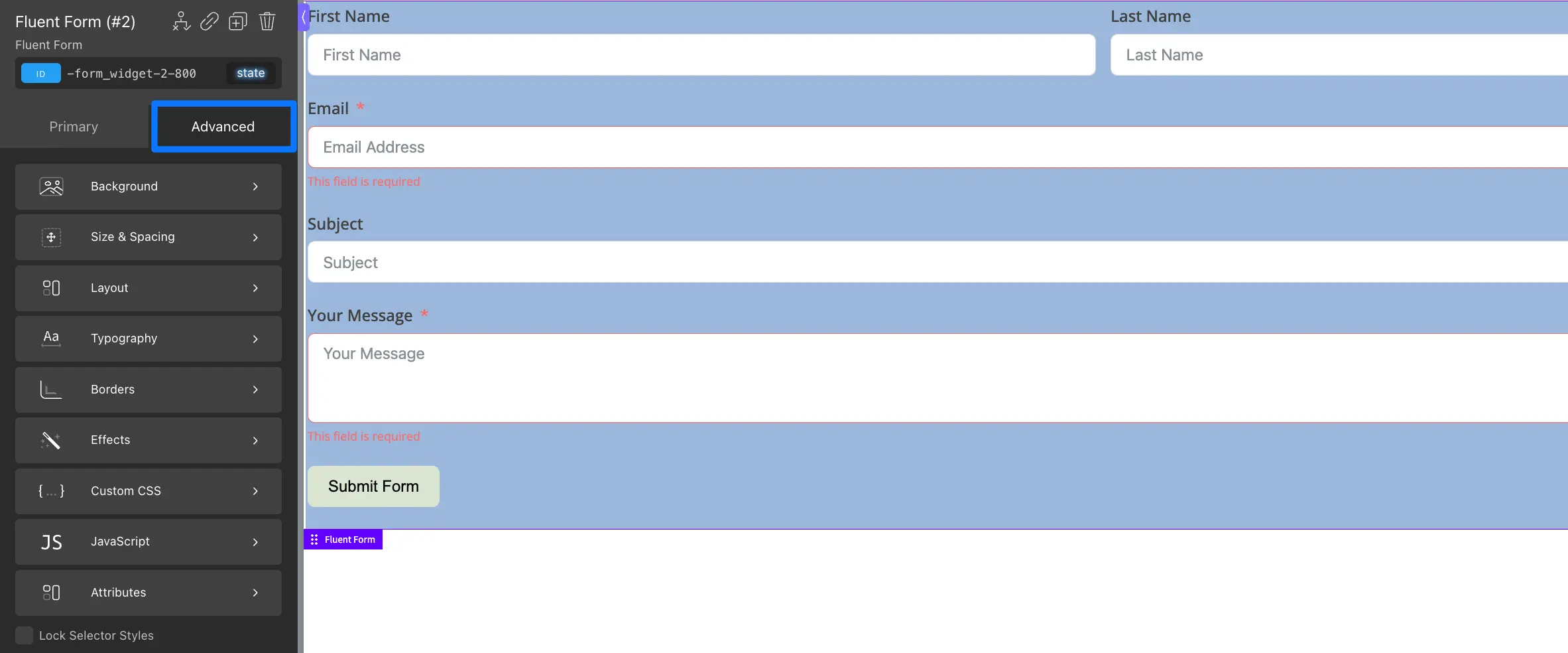
Advanced #
In the Advanced section, you can add simple effects like animations, text shadows, transitions, and change the opacity of your form and submit button. You can also use basic filters and transformations to engage your form more.
Once you’ve finished designing your form, click Apply Params and the Save button to save all your changes.
Publishing Your Form #
When your form is ready, you can easily publish it or share the form directly through a link or on social media to reach your audience easily. platforms.
If you have any further questions, concerns, or suggestions, please do not hesitate to contact our support team. Thank you.


