The Image Upload input field in Fluent Forms allows users to submit images in different formats directly through a form. This feature validates applications, registrations, file submissions, and more.
The Image Upload field is an advanced feature of the Fluent Forms plugin. You require the Fluent Forms Pro Add-on to use it.
Adding Image Upload Field #
To learn how to add the image upload field to the Fluent Forms, follow the steps with the screenshots below –
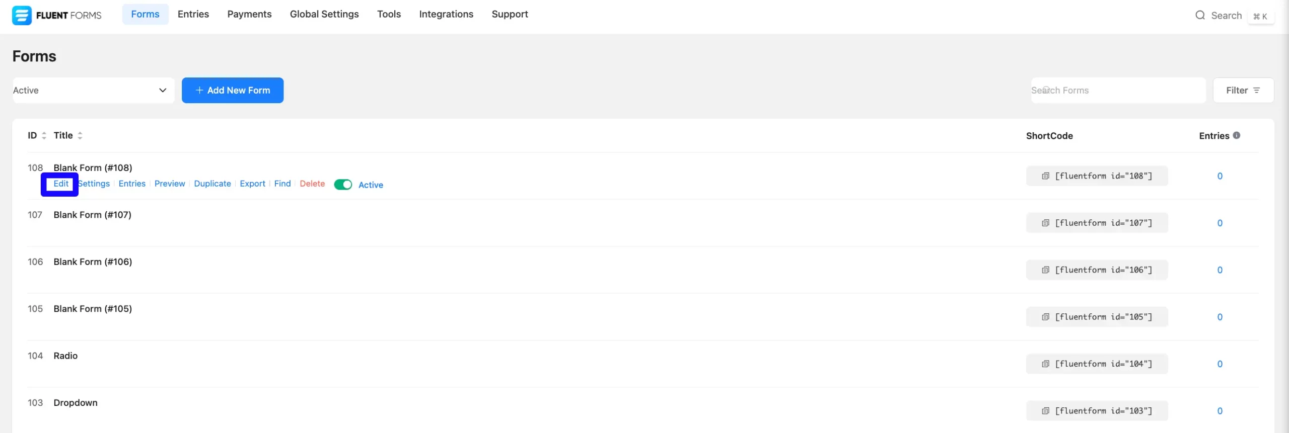
First, go to the Forms section from the Fluent Forms Navbar, choose a desired Form, and click the Edit icon to open the Editor page of that form.
If you do not have any existing forms, read Create a Form from Scratch or Create a Form using Templates documentation to create a new one.
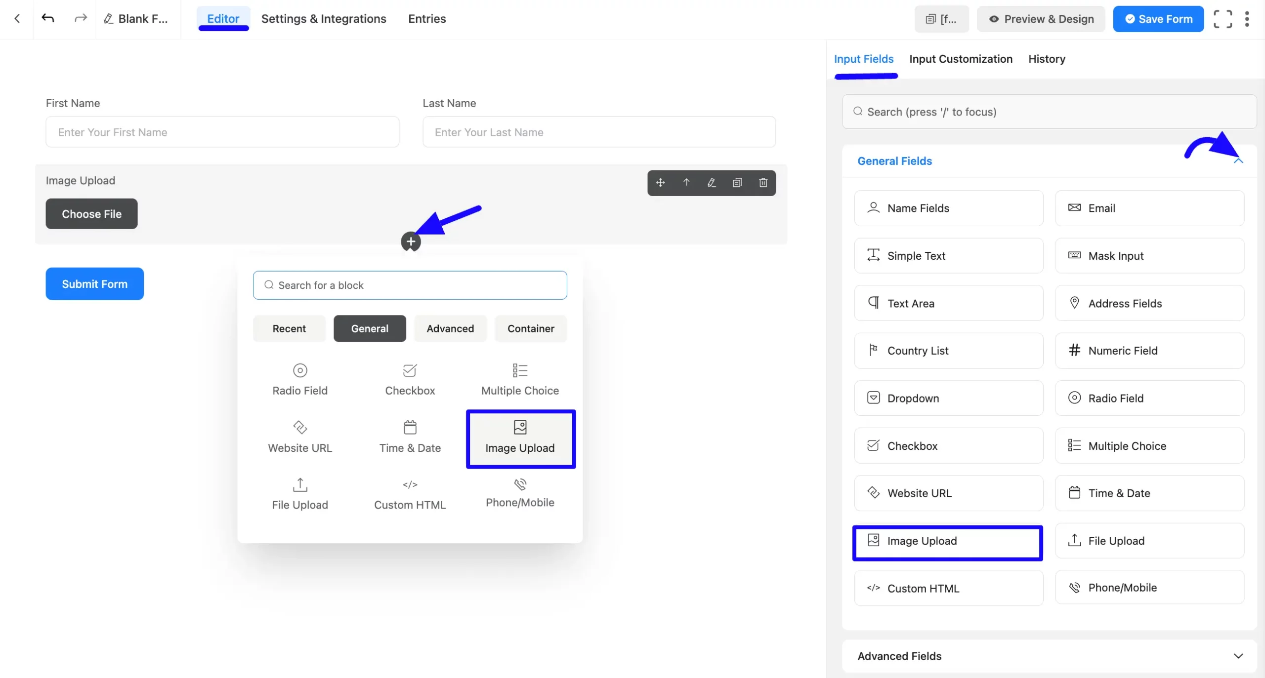
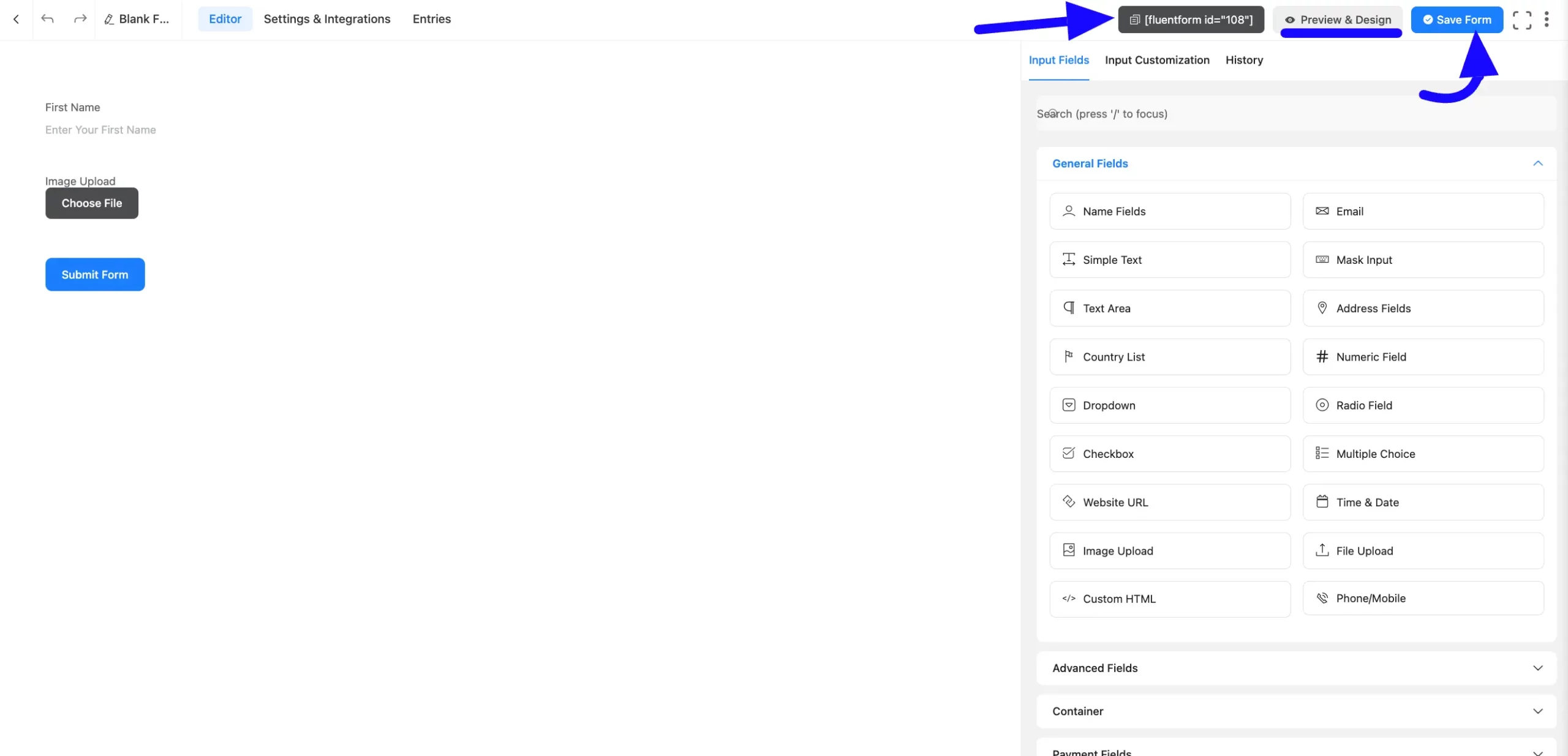
Once on the Editor page, click the Plus Icon in your form editor and open the General Fields module. The General Fields option is also in the right sidebar under the Input Fields tab.
Select the desired Image Upload field by clicking on it or Dragging and Dropping it into your editor.
Customizing the Image Upload Field #
An image upload field has been added. You can edit this field by hovering over it and clicking the Pencil Icon. It will take you to the Input Customization tab on the right side and offer the following options for customizing the field.
- Image Upload Options
- Advanced Options
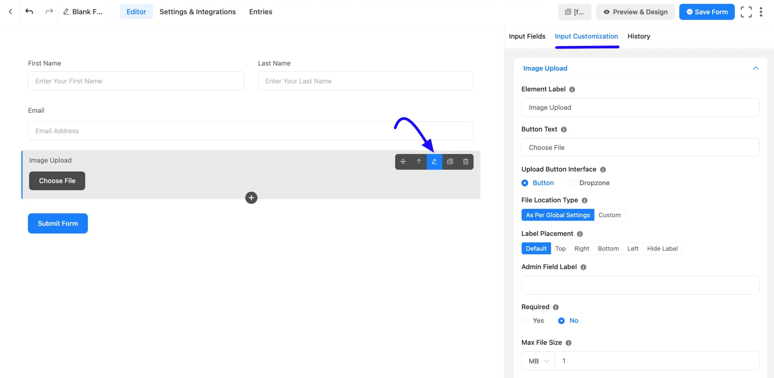
Image Upload Options #
You will find various settings options for customizing the field. Located in the Input Customization Tab, these options allow you to configure essential aspects of the Image Upload field.
All the Settings under the Image Upload Field mentioned above are briefly explained below –
A. Element Label: This is the field title the users will see when filling out the Image Upload field in a form. You can enter any text here to help users understand the purpose of the field.
B. Button Text: This is the text users will see on the button that allows users to browse their local directory and choose an image file.
Example: “Choose File” or “Upload Image”.
C. Upload Button Interface: You can choose the upload button Dropzone or a regular Button that shows off your user when they fill out the form.
D. Upload Button Interface: Choose between a standard Button interface or an interactive Dropzone wrapper.
E. Label Placement: This option allows you to determine the position of the label title where the user will see it. The available options are Top, Left, Right, and Default. All of those are self-explanatory except the Default. If you select the Default option, it will represent your global label placement settings.
F. Admin Field Label: The admin field label is a field title displayed only to admin users. You can configure this option to show a different field label for your admin users when they view the form submissions.
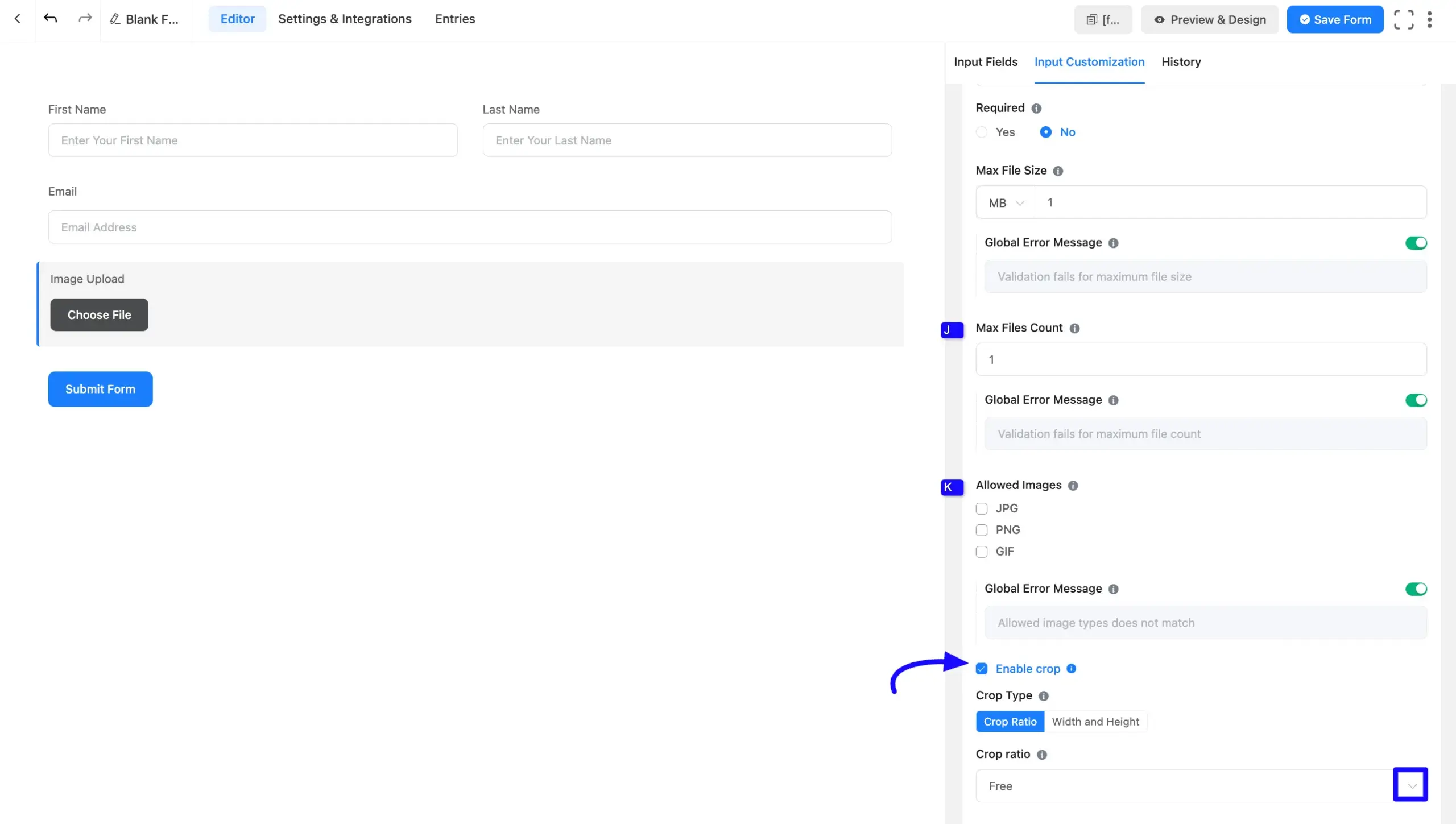
G. Required: Decide whether users must select at least one option before submission.
H. Max File Size: Set a size limit for uploaded images.
- Choose between KB or MB.
- Define the maximum size allowed.
Global Error Message: Customize the warning message if the uploaded image exceeds the limit.
If you want to add a Custom Error Message, you can disable the Global Error Message by clicking the Radio button on the right.
I. Max File Count: Set the number of images a user can upload.
Global Error Message: Define the error message if users exceed the allowed number of uploads.
If you want to add a Custom Error Message, you can disable the Global Error Message by clicking the Radio button on the right.
J. Allowed Images: Select which image format can be uploaded from the following checkbox.(JPG, PNG, or GIF) of image files that will be allowed to be uploaded.
Define the error message to be shown if validation fails for Allowed Image formats.
k. File Location Type: As Per Global Settings & Custom, you will see two options here.
- As Per Global Settings: This option is selected by default, and the Global Settings determine the file location.
- Custom: If you select Custom, two options are available: Fluentforms Default & Media Library. In Custom options, uploaded files can be stored in the Media Library, Fluent Forms Default, or both. You can select the Media Library to upload the files in the WordPress Media Library.
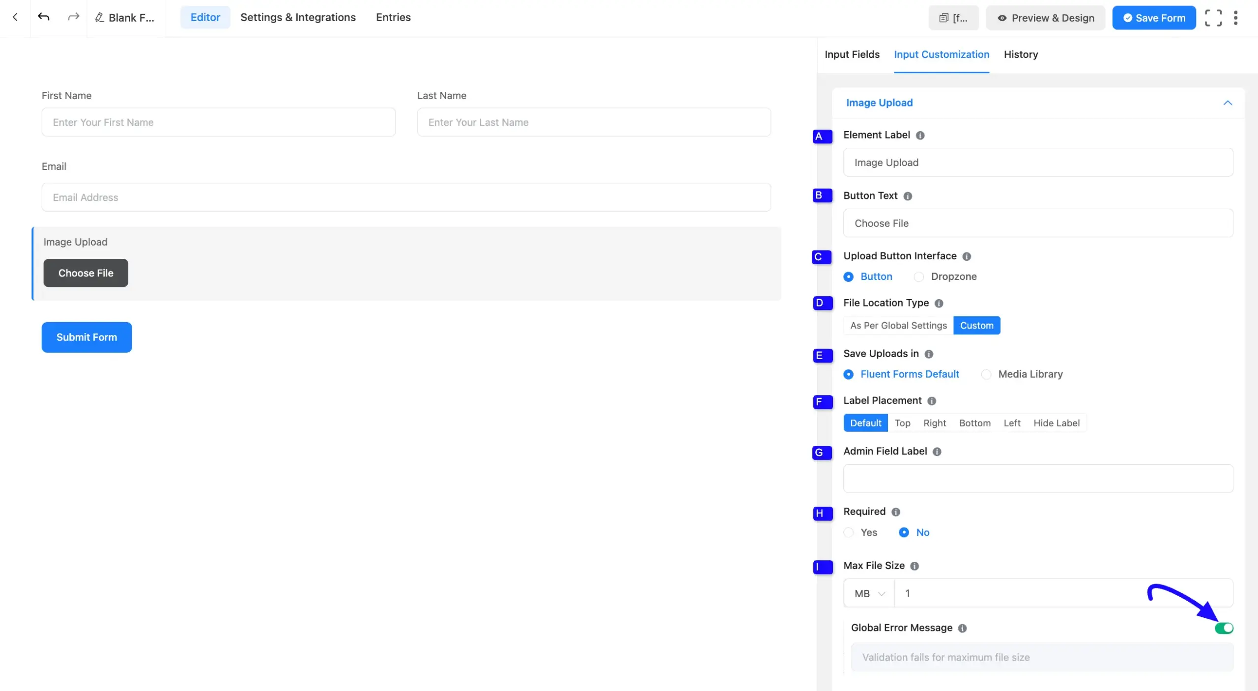
Image Crop #
Image Crop allows users to upload and crop images before submitting the form. Only the cropped image is uploaded and validated on the server side. Enable the Enable Crop option.
Once enabled, additional crop settings will appear below the toggle. This option is disabled by default, so your existing forms will remain unchanged.
Select a Crop Type #
The Crop Type setting controls how the image can be cropped. Fluent Forms provides two crop options:
Crop Ratio (Aspect Ratio) #
You can choose a predefined crop ratio from the Crop Ratio dropdown menu:
- Free (Default): Allows users to crop the image freely without fixed proportions
- 1:1: Square crop, ideal for profile or avatar images
- 4:3: Standard landscape ratio
- 16:9: Widescreen landscape format
- 3:4 / 9:16: Portrait-oriented crop ratios
Width and Height #
Select the Width and Height option if you want to define exact image dimensions.
After selecting this option, enter your preferred:
- Width (px)
- Height (px)
This ensures users can crop images to a fixed pixel size before uploading.
Advanced Options #
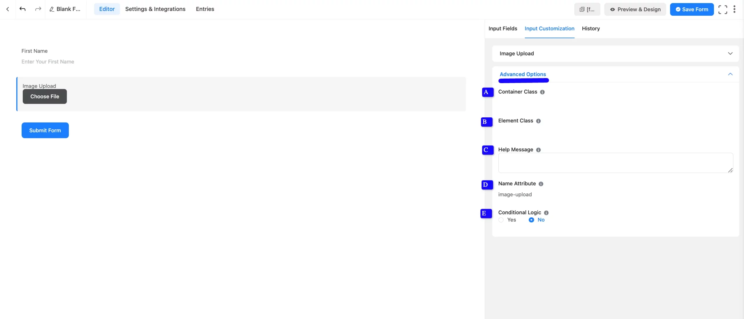
Advanced settings allow further customization to meet specific use cases. All the Settings under the Advanced Options tab mentioned in the screenshot are briefly explained below –
A. Container Class: Use this option to add your custom CSS classes to the field’s wrapper.
B. Element Class: Add custom CSS classes to the input field.
C. Help Message: This option allows you to guide your user thoroughly. Add your text here, which will be shown as a help message to the user.
D. Name Attribute: The input field’s name attribute is the HTML equivalent of the same name. You don’t need to modify this.
E. Conditional Logic: This option allows you to create specific rules to dynamically hide/show the input field to function conditionally based on your submission values according to your set of conditional logics. To learn more, read this Documentation.
Embed the Form into Frontend #
Once you complete the customization, click the Save Form button to save all your changes. Click the Preview & Design button in the middle to see the form preview.
To integrate and display the form on a specific page or post, copy the Shortcode from the top right side and paste it into your desired Page or Post.
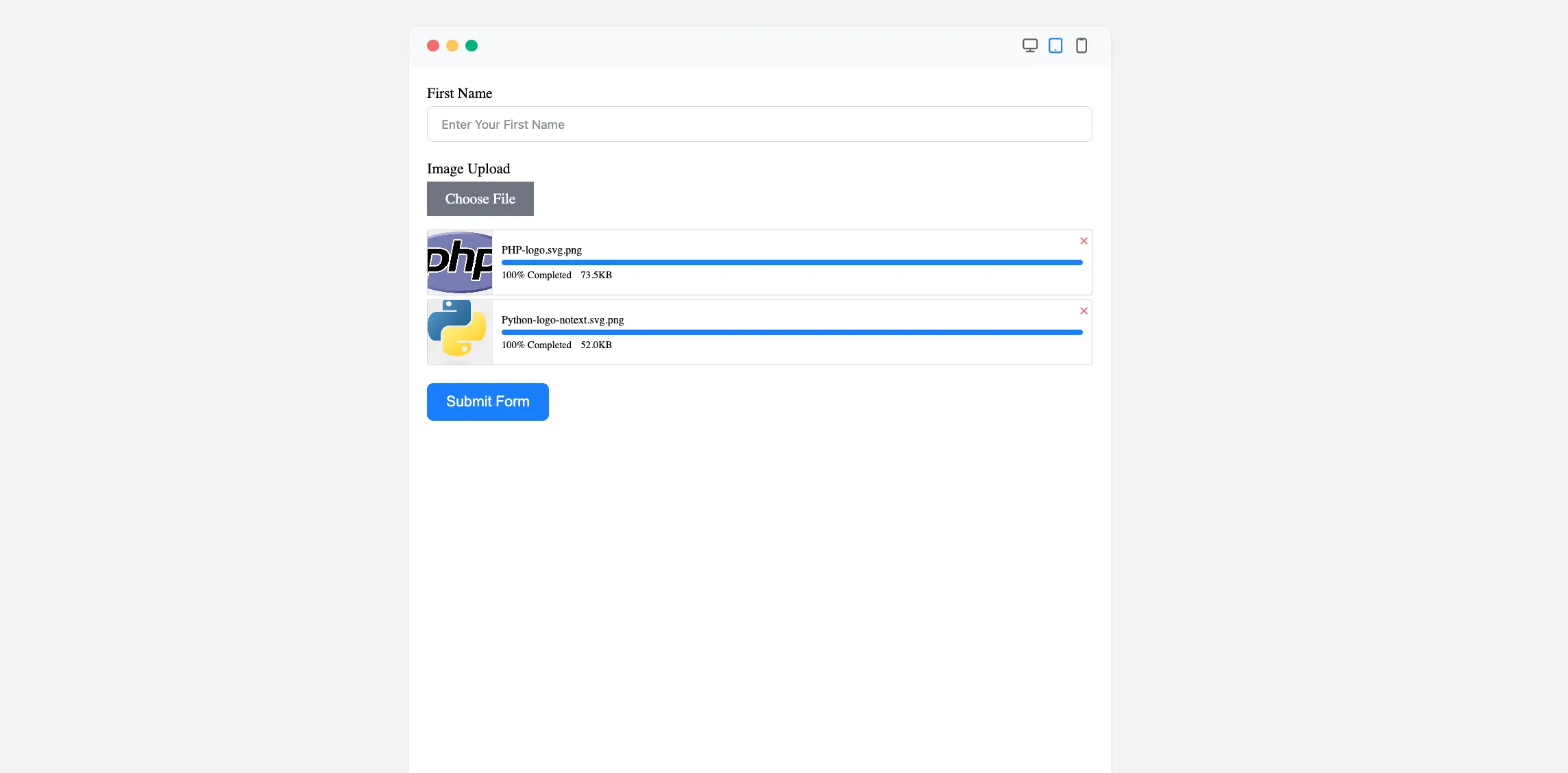
Preview of Added Image Upload Field #
Here is the Preview of the Form to test the image upload functionality.
The Image Upload Field in Fluent Forms is a powerful tool for efficiently collecting images.
If you have any further questions, concerns, or suggestions, please do not hesitate to contact our support team. Thank you.


