
The Range Slider Field allows users to select a number from a pre-defined range by dragging a handle or rating marker.
This guide will walk you through adding and customizing the Range Slider Field in Fluent Forms for your WordPress site.
The Range Slider Input field is an advanced feature of the Fluent Forms plugin. To use it, you require the Fluent Forms Pro Add-on.
Adding Range Slider Field #
To add the Range Slider Field in Fluent Forms, follow the easy steps below:
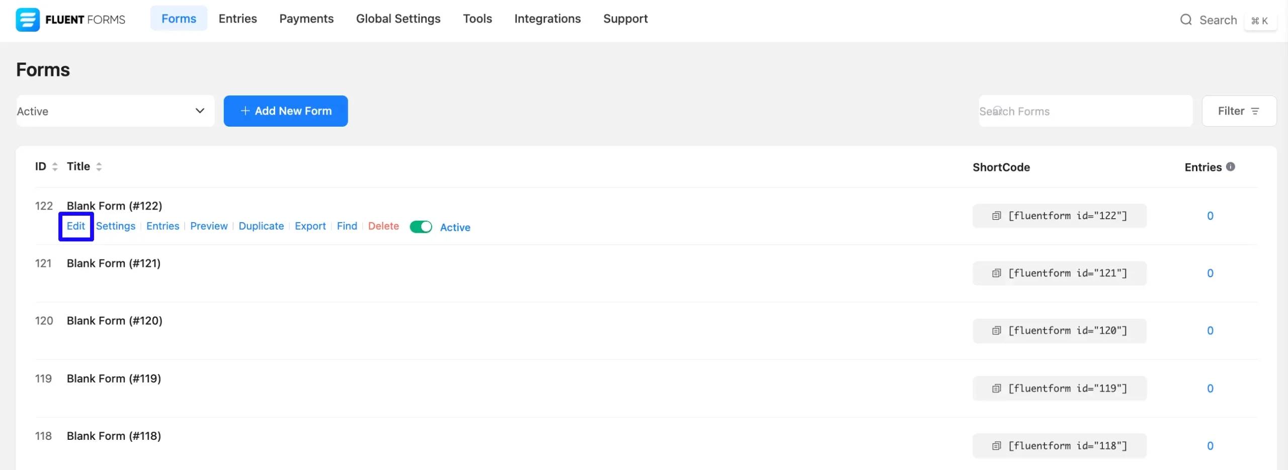
First, go to the Forms section from the Fluent Forms Navbar, choose a desired form, and click the Edit Icon to open the Editor page of that form.
If you do not have any existing forms, read Create a Form from Scratch or Create a Form using Templates documentation to create a new one.
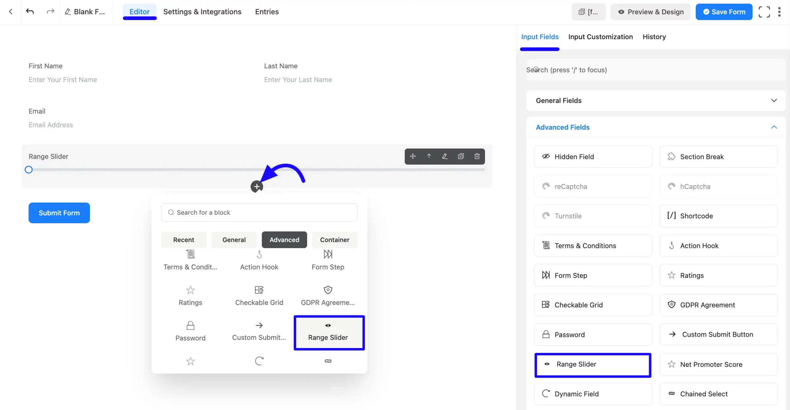
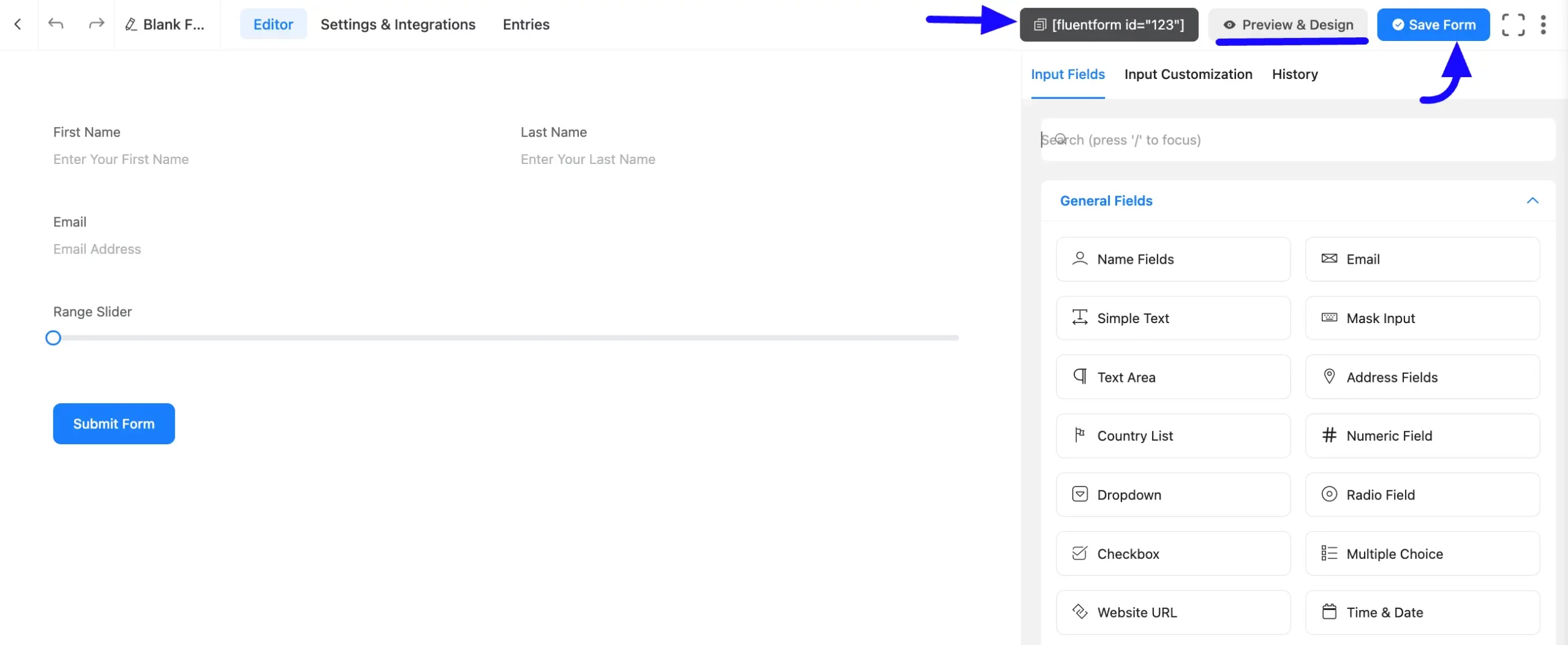
Once on the Editor page, click the Plus Icon in your form editor and open the Advanced Fields module. You can also find this option in the right sidebar under the Input Fields tab.zz
Now, select the Range Slider field by clicking on it or dragging and dropping it into your editor.
Customizing the Range Slider Field #
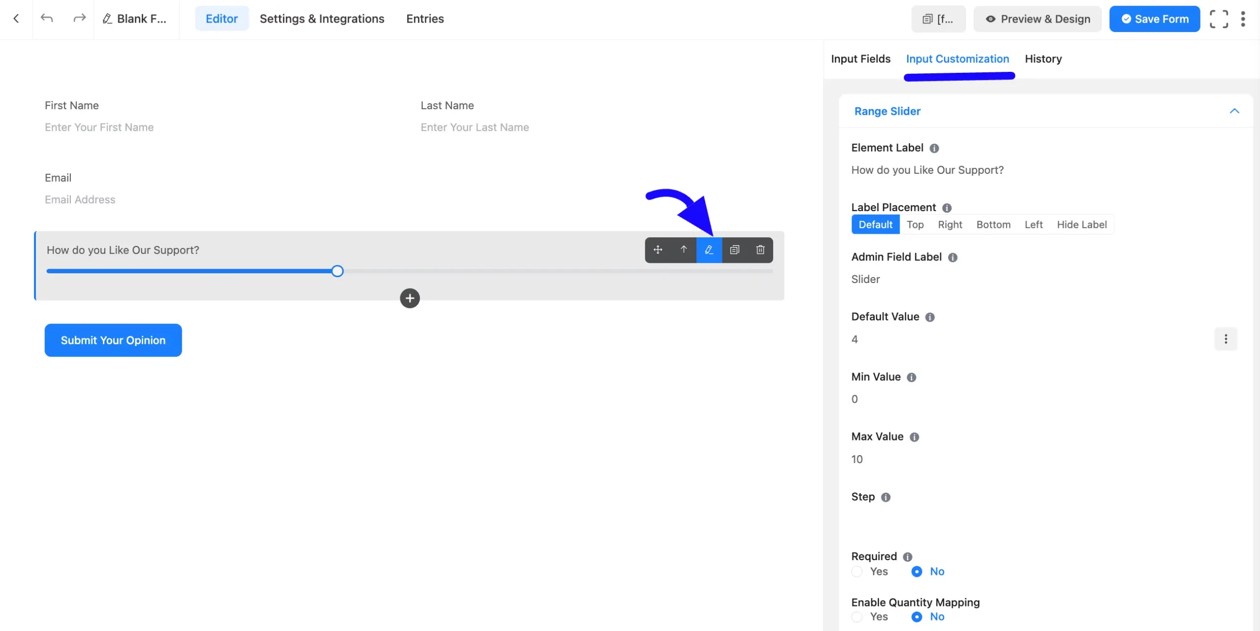
Once you add the Range Slider fiezld, you can customize it by hovering over it and clicking the Pencil Icon. It will take you to the Input Customization tab on the right, which offers the following customization options.
- Range Slider Options
- Advanced Options
Range Slider Options #
You will find various settings options for customizing the field under the Input Customization tab. These options allow you to configure essential aspects of the Range Slider field.
All the settings under the Range Slider Field mentioned above are briefly explained below-
A. Element Label: This is the field title the users will see when filling out the Range Slider field in a form. You can enter any text here to help users understand the purpose of the field.
B. Label Placement: This option allows you to determine the position of the label title where the user will see it. The available options are Top, Left, Right, and Default. All of those are self-explanatory except the Default. If you select the Default option, it will represent your global label placement settings.
C. Admin Field Label: The admin field label is a field title displayed only to admin users. You can configure this option to show a different field label for your admin users when they view the form submissions.
D. Default Value: Using our shortcodes, you can manually set any fixed value in your field and pre-filled your input field dynamically. To get a better understanding of Dynamic Default Value, read this article.
You can add a default value by clicking the Three-Dot option on the right.
E. Min Value: Define the starting Minimum value for the range slider. For example, setting 200 (Min) allows users to select a value within this range.
F. Max Value: Define the ending Maximum values for the range slider. For example, setting 1000 (Max) allows users to select a value within this range.
G. Step: The user can provide a step attribute for this field. Give value “any” for floating value.
H. Required: Decide whether users must select at least one option before submission.
I. Enable Quantity Mapping: Select the Yes button to Enable Quantity Mapping. It indicates that this field is mapped to a product quantity (likely for e-commerce or order forms). After that, Choose a Target Product Field to ensure correct quantity mapping.
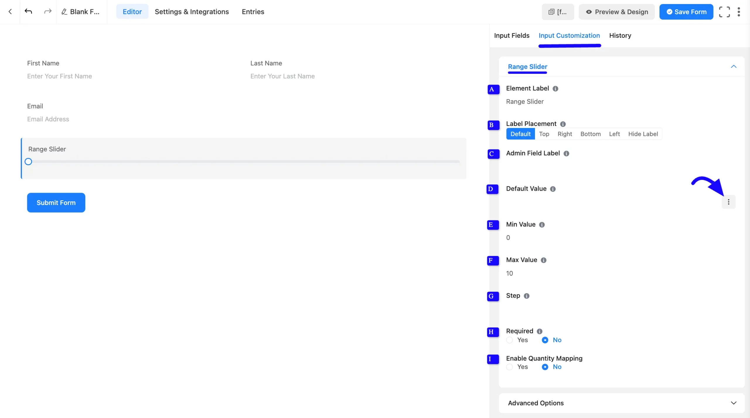
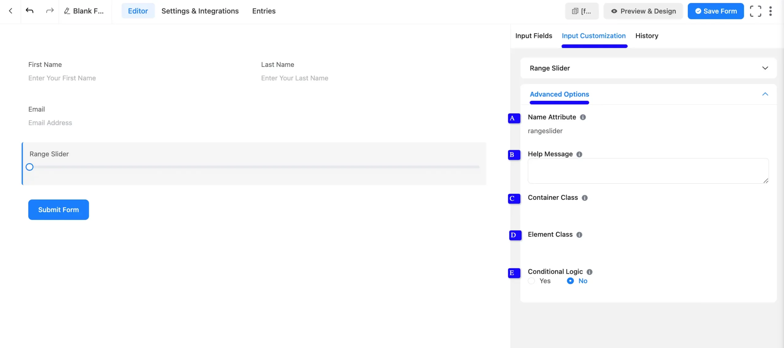
Advanced Options #
Advanced settings allow furtherz customization to meet specific use cases. All the Settings under the Advanced Options tab mentioned in the screenshot are briefly explained below –
A. Name Attribute: The input field’s name attribute is the HTML equivalent of the same name. You don’t need to modify this.
B. Help Message: This option allows you to guide your user thoroughly. Add your text here, which will be shown as a help message to the user.
C. Container Class: Use this option to add your custom CSS classes to the field’s wrapper.
D. Element Class: Add custom CSS classes to the input field.
E. Conditional Logic: This option allows you to create specific rules to dynamically hide/show the input field to function conditionally based on your submission values according to your set of conditional logics. To learn more, read this Documentation.
Embed the Form into Front #
Once you complete the customization, click the Save Form button to save all your changes. Click the Preview & Design button in the middle to see the form preview.
To integrate and display the form on a specific page or post, copy the Shortcode from the top right side and paste it into your desired Page or Post.
Preview of Added Range Slider Field #
Here is the preview of the added Range Slider field under the Form.
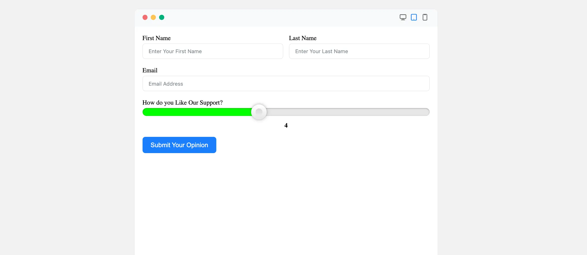
Congratulations! You have successfully added range slider input to your Fluent Forms form.
If you have any further questions, concerns, or suggestions, please do not hesitate to contact our support team. Thank you!


