The Accordion container is a powerful feature that helps you organize long forms. It allows you to group related fields into collapsible sections. Users can click a section’s title to expand or collapse it, making your form look cleaner and easier to navigate.
Add the Accordion Container #
To learn how to add the Accordion Container input fields, follow the steps with screenshots below –
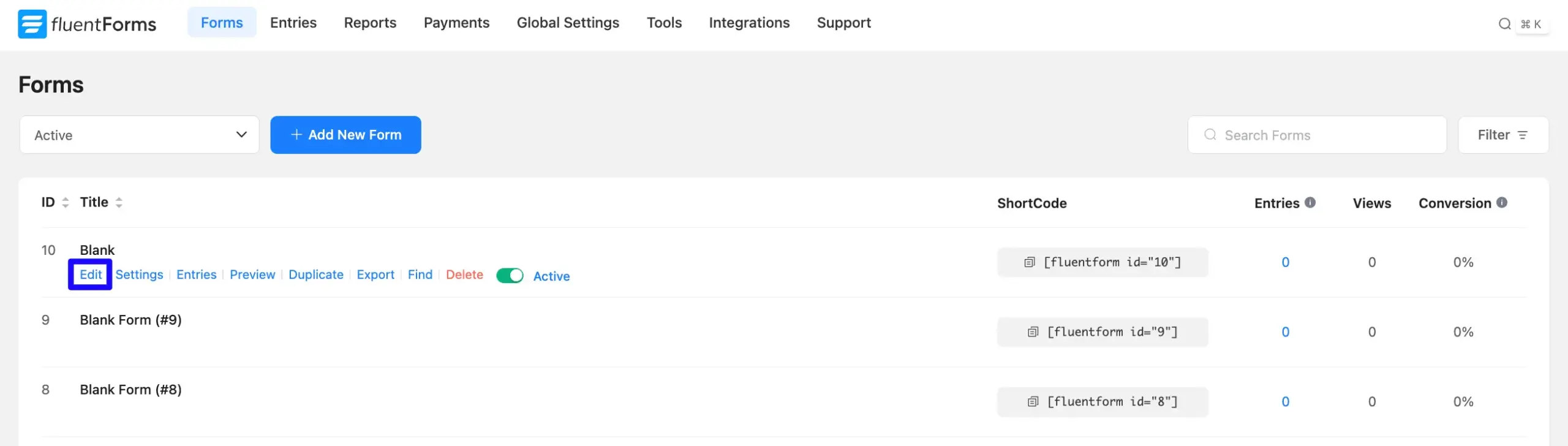
First, go to the Forms section from the Fluent Forms Navbar, choose a desired Form to which you wish to add the Accordion Container field, and click the Pencil/Edit icon to open the Editor page of that form.
Note: If you do not have any existing forms, read the Create a Form from Scratch or Create a Form using Templates documentation to create a new one. For example, here I choose an existing form to show the whole process.
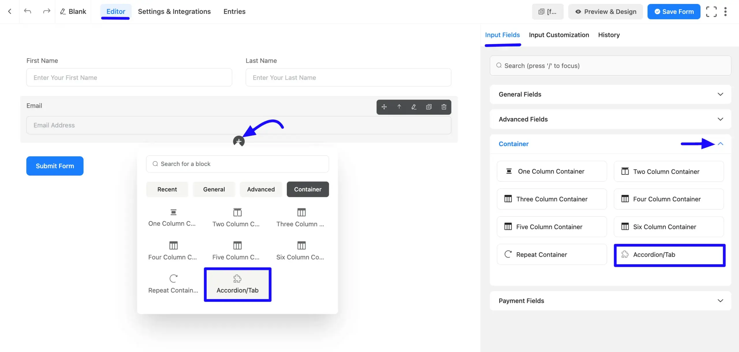
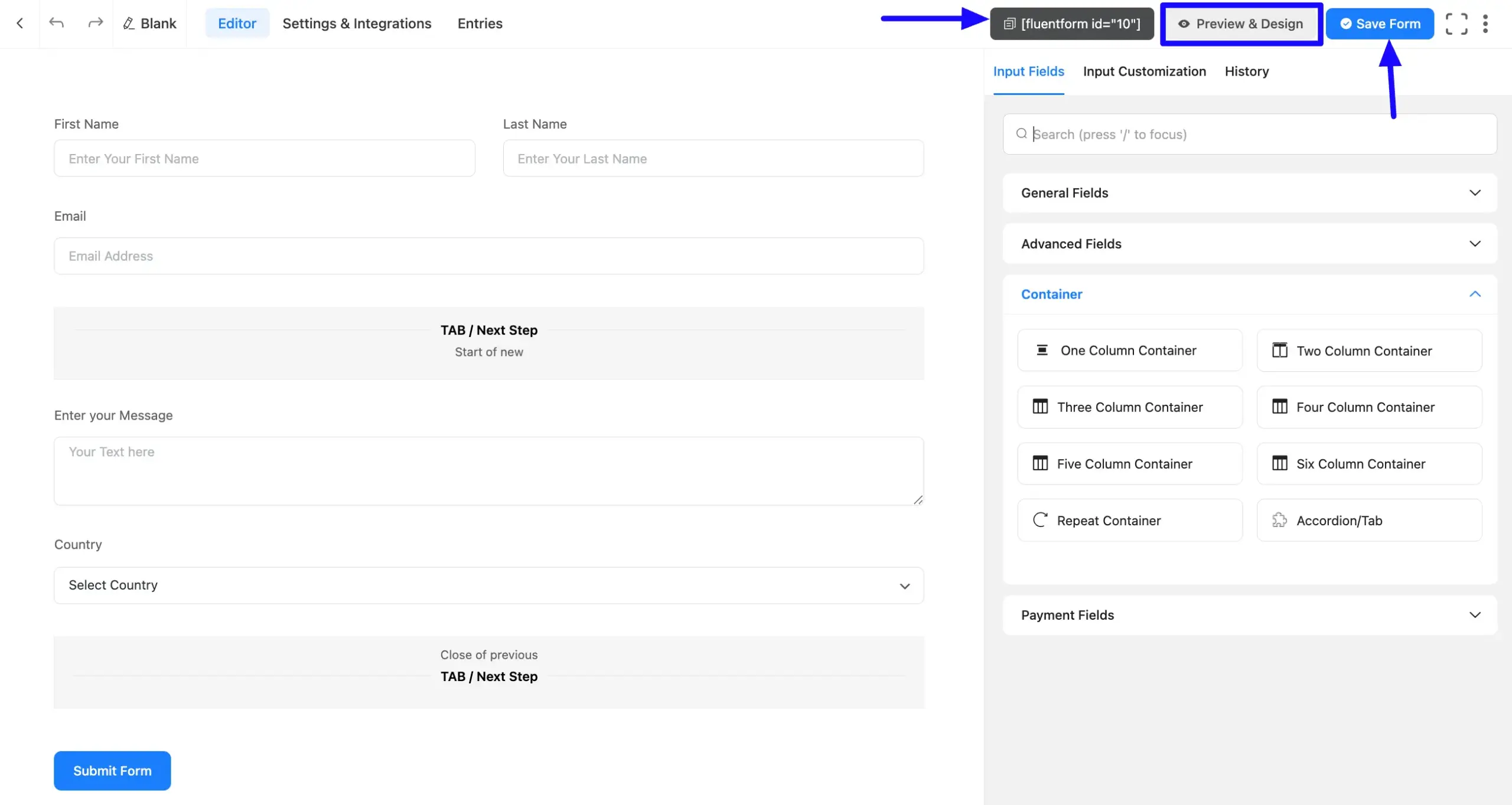
Once you are on the Editor page, click the Plus Icon in your form editor and open the Container input fields module. The Container option is also in the right sidebar under the Input Fields tab.
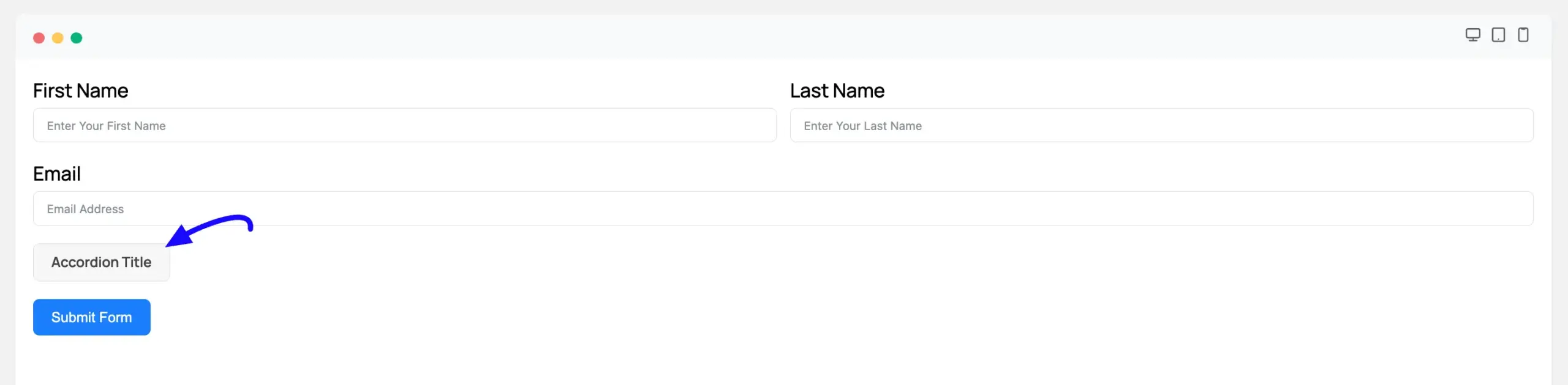
Now, choose the desired Accordion Container by clicking on it or Drag & Drop it into your editor.
Configure the Accordion Settings #
When you click on an Accordion/Tab container in the form editor, the sidebar on the right will show all its Input Customization settings.
Here is a breakdown of each setting:
A. Title: Enter a suitable title. This is the visible, clickable text that appears on the accordion bar.
B. Description: This adds a line of smaller helper text directly below the title. This is an optional field.
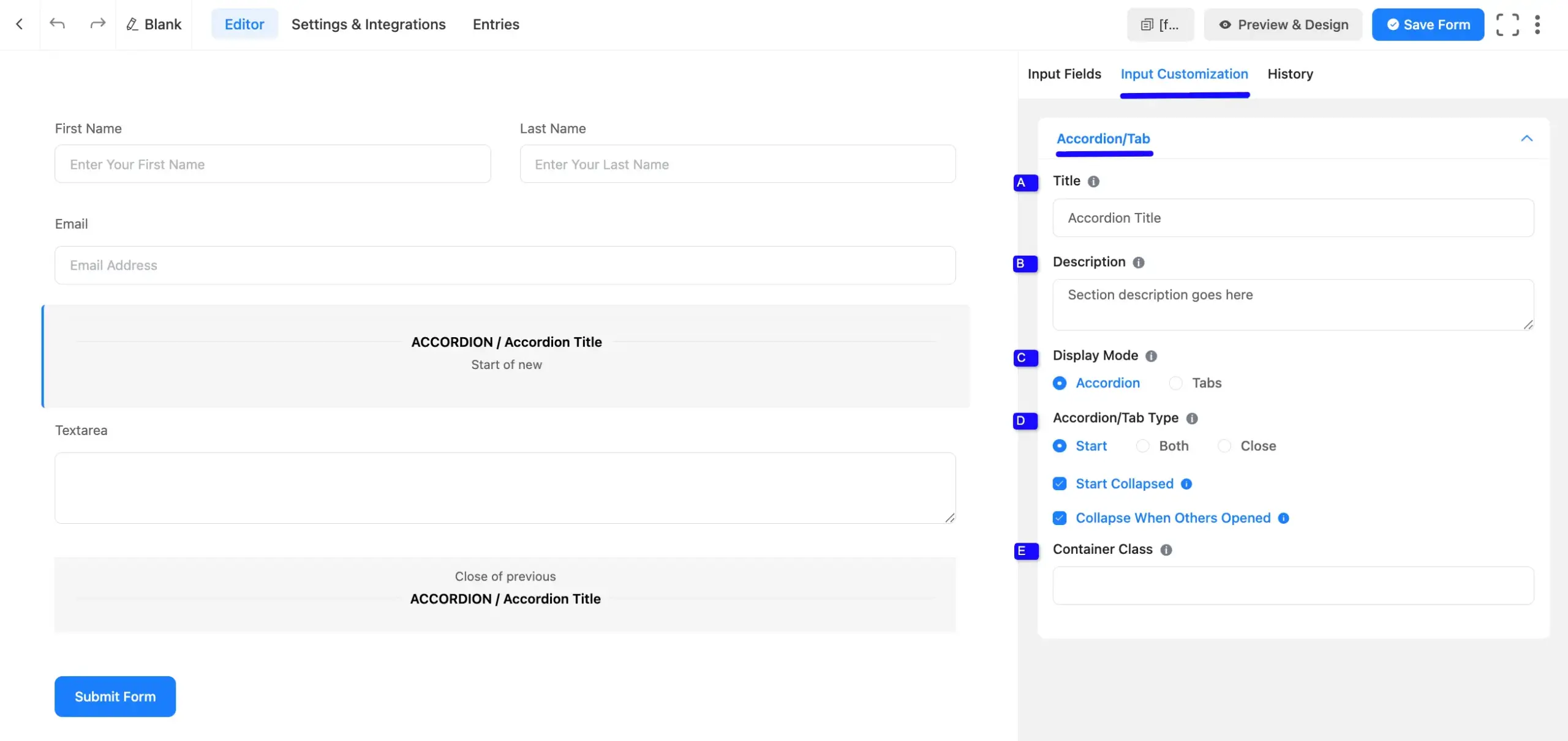
C. Display Mode: This option enables you to select the appearance of the forms in the display. Here you will find two options.
- Accordion: This mode creates a collapsible section. Users see a title bar with a plus (+) icon. Clicking this bar expands the section to reveal the fields inside.
- Tabs: This mode creates a horizontal tab. The Title you set becomes the label for a clickable tab. When a user clicks the tab, the form shows the fields for that section.
D. Accordion/Tab Type: This setting controls how multiple accordions or tabs are grouped. To create a stack of sections, you must use more than one Accordion/Tab field and configure their Type:
- Start: Use this for the first section in your group.
- Both: Use this for any middle sections. This setting tells Fluent Forms to “close the previous section and start a new one.”
- Close: You can use both for the last section as well, or you can use Close to properly end the group.
Start Collapsed: (Accordion Mode Only) When this box is checked, the accordion will be closed by default when the form first loads. The user must click to open it.
Collapse When Others Opened: (Accordion Mode Only) Check this to enable the classic accordion effect. When a user opens this section, any other open sections in the group will automatically close.
E. Container Class: This field allows you to add a custom CSS class. You can then use this class in your stylesheet for advanced custom styling.
Embed the Form into Frontend #
Once you complete the customization, click the Save Form button in the top-right corner to save all your changes. To see a preview, click the Preview & Design button.
To display the form on a page or post, copy the Shortcode (e.g., ) from the top of the editor and paste it into a “Shortcode” block in the Gutenberg editor or any page builder.
Preview of the Accordion Container #
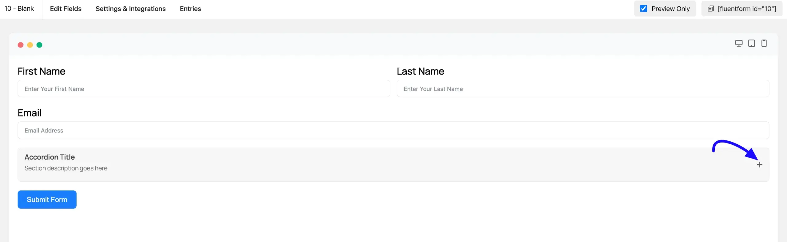
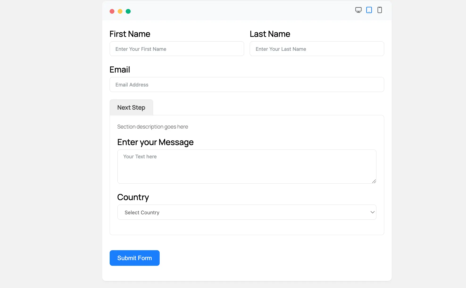
Here is how the Accordion Container will look and function for your users on the live form:
- Collapsed View: If you enabled the “Start Collapsed” setting, the section will be closed when the form first loads. Users will only see the Accordion Title and Description, with a Plus Icon (+) on the right.
- Expanding the Section: When a user clicks anywhere on the title bar or the Plus Icon (+), the container will expand. This will smoothly reveal all the fields you placed inside it (like “Textarea” or “Country”).
- Expanded View: Once expanded, the icon will change to a Minus Icon (-). A user can click this icon or the title bar again to collapse the section, hiding the fields.
Note: The Plus (+) and Minus (-) icons on an Accordion Container are only for expanding and collapsing that one section. To allow users to duplicate or repeat a set of fields, you would use the Repeater Field instead.
This way, you can easily add the Accordion Container fields in Fluent Forms!
If you have any further questions, concerns, or suggestions, please do not hesitate to contact our support team. Thank you.


