The Mask Input Field in Fluent Forms ensures that users enter data in a predefined format, making it ideal for fields such as phone numbers, dates, social security numbers, and license keys.
Fluent Forms offers five pre-defined masking formats, but you can also create custom formats to fit your needs.
This article will guide you through adding the Mask input field in your Fluent Forms for your WordPress Site.
Adding Mask Input Field #
To learn how to add the Mask input field to the Fluent Forms, Follow these steps below-
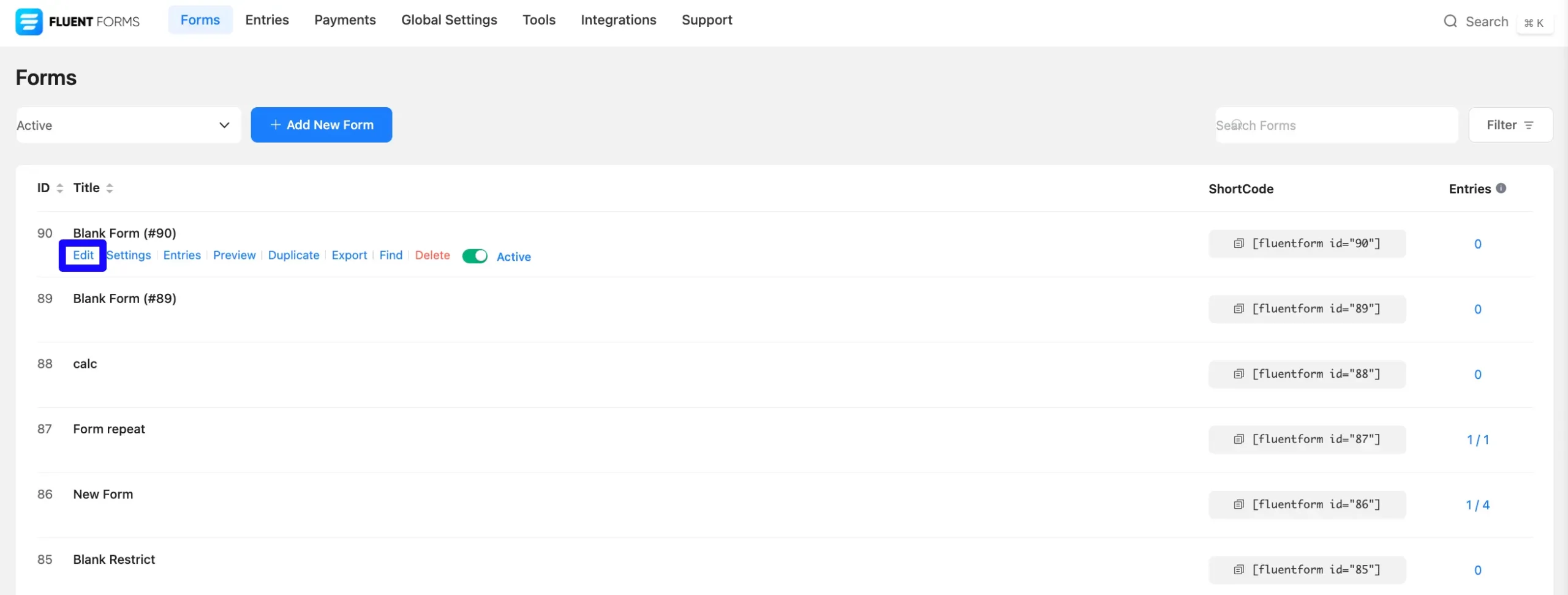
First, go to the Forms section from the Fluent Forms Navbar, choose a desired Form, and click the Pencil/Edit icon to open the Editor page of that form.
If you do not have any existing forms, read Create a Form from Scratch or Create a Form using Templates documentation to create a new one.
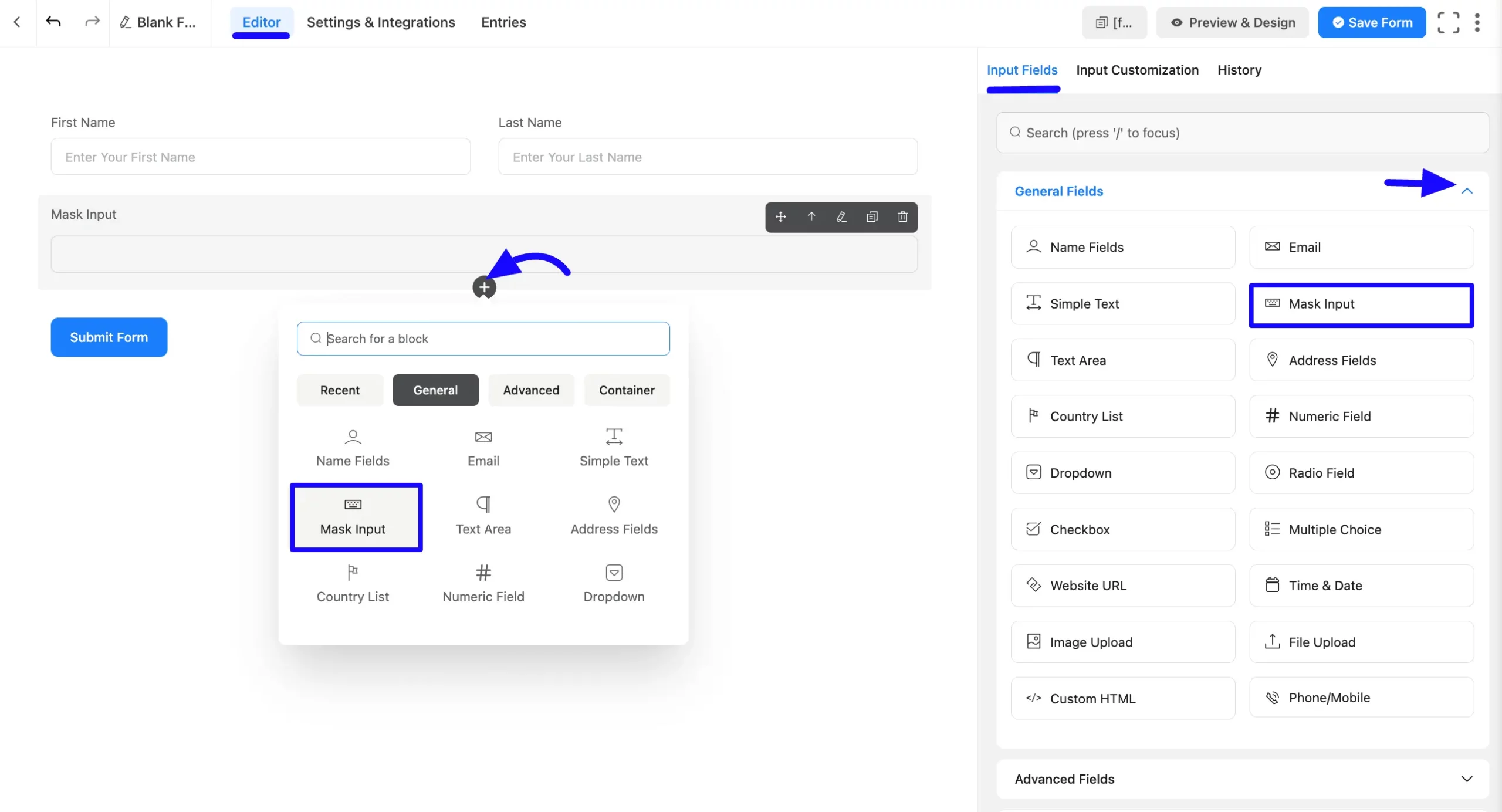
Once on the Editor page, click the Plus Icon in your form editor and open the General Fields module. The General Fields option is also in the right sidebar under the Input Fields tab.
Now, select the desired Mask Input field by clicking on it or Dragging and Dropping it into your editor.
Customizing the Mask Input Field #
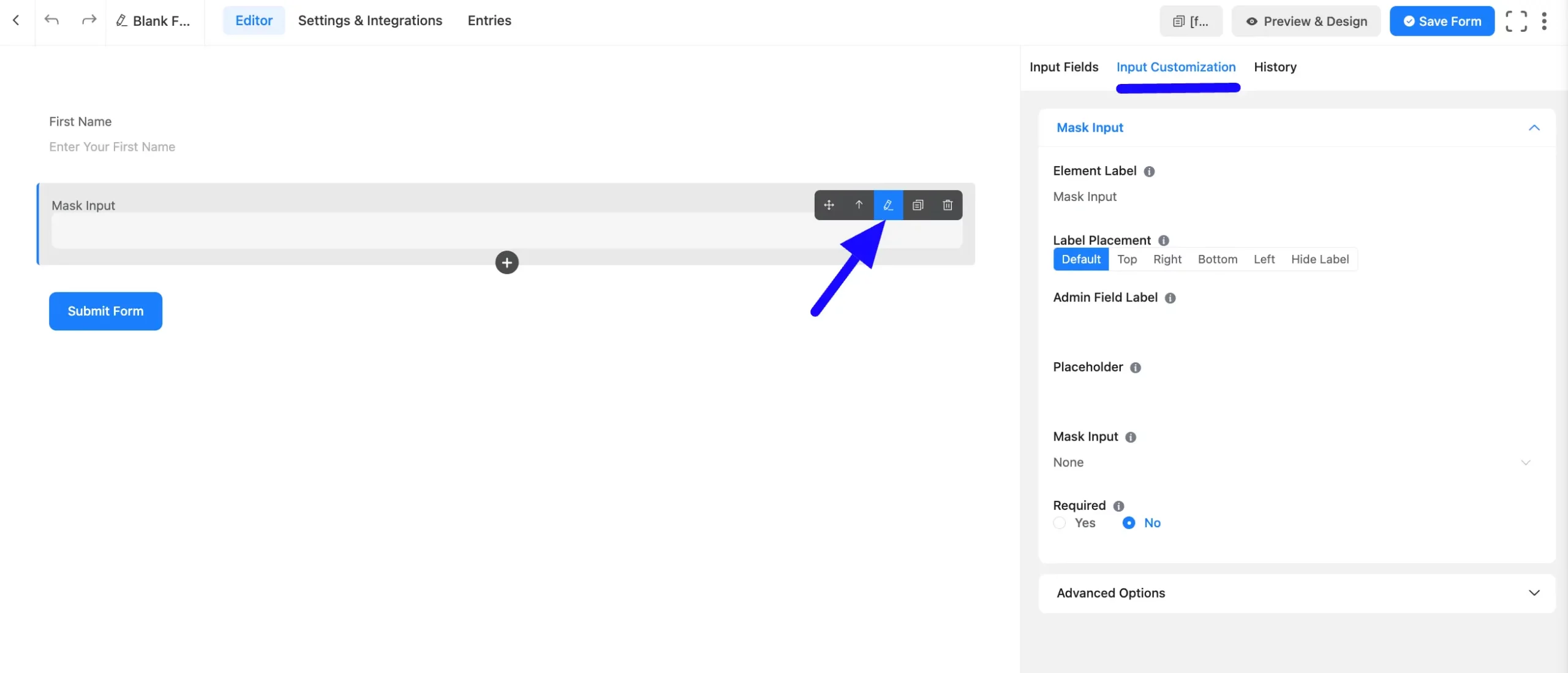
After adding the field, customize the mask input field. Hover over the field and click the Pencil Icon to open the Input Customization tab. It will take you to the Input Customization tab on the right side and offer the following options for customizing the field.
- Mask Input Options
- Advanced Options
Mask Input Options #
You will find various settings options for customizing the field. Located in the Input Customization Tab, these options allow you to configure essential aspects of the Mask input field.
All the Settings under the Mask Field mentioned above are briefly explained below –
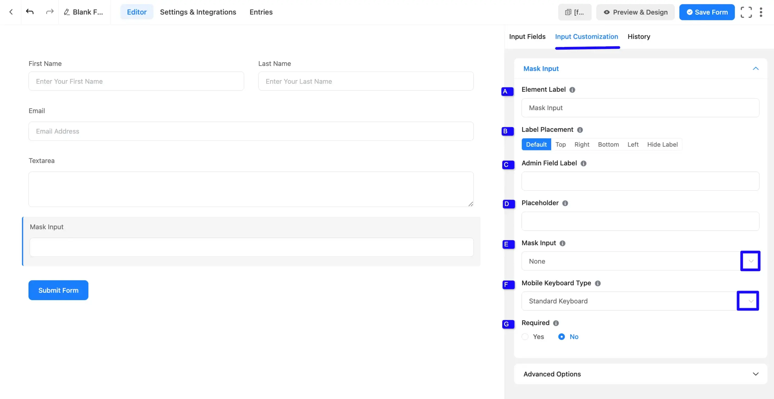
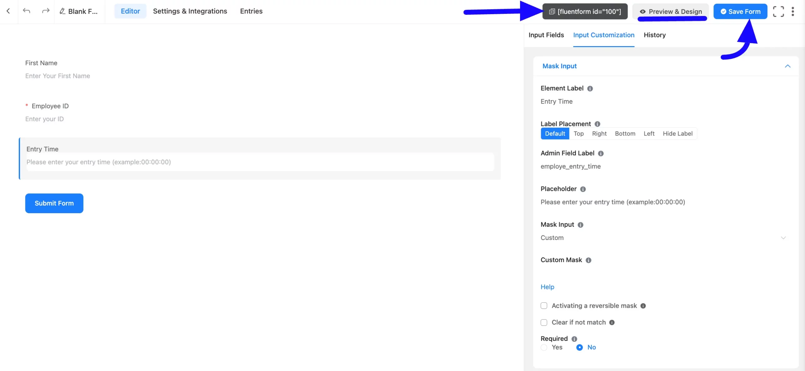
A. Element Label: This is the field title the users will see when filling out the Simple Text field in a form. You can enter any text here to help users understand the purpose of the field.
B. Label Placement: This option allows you to determine the position of the label title where the user will see it. The available options are Top, Left, Right, and Default. All of those are self-explanatory except the Default. If you select the Default option, it will represent your global label placement settings.
C. Admin Field Label: The admin field label is a field title displayed only to admin users. You can configure this option to show a different field label for your admin users when they view the form submissions.
D. Placeholder: When the input field is empty, a message is usually shown to the users so they can understand what the field expects from them. This is the equivalent of the HTML input placeholder attribute.
E. Mask Input: You can choose from predefined masks from the dropdown options or create a custom mask:
Follow the format rules:
- 0-9/ #: Numerical character
- A: Alphabetical character
- *: Alphanumeric character
- Literal characters are automatically displayed
Examples:
Date Mask: 00/00/0000. Valid Input: 10/21/2011
Social Security Number Mask: 000-00-0000. Valid Input: 987-65-4329
Course Code Mask: AAA 999. Valid Input: BIO 101
License Key Mask: *-*-***. Valid Input: a9a-f0c-28Q
F. Mobile Keyboard Type: Select the specific keyboard layout that will appear for mobile users when they tap this field. You can choose from:
- Standard Keyboard: The default full alphanumeric keyboard.
- Numeric (0-9): A number-only pad.
- Decimal (0-9 with .): A numeric pad with a decimal point.
- Telephone (0-9, ; #): A standard phone dialer pad.
G. Required: Decide whether users must select at least one option before submission.
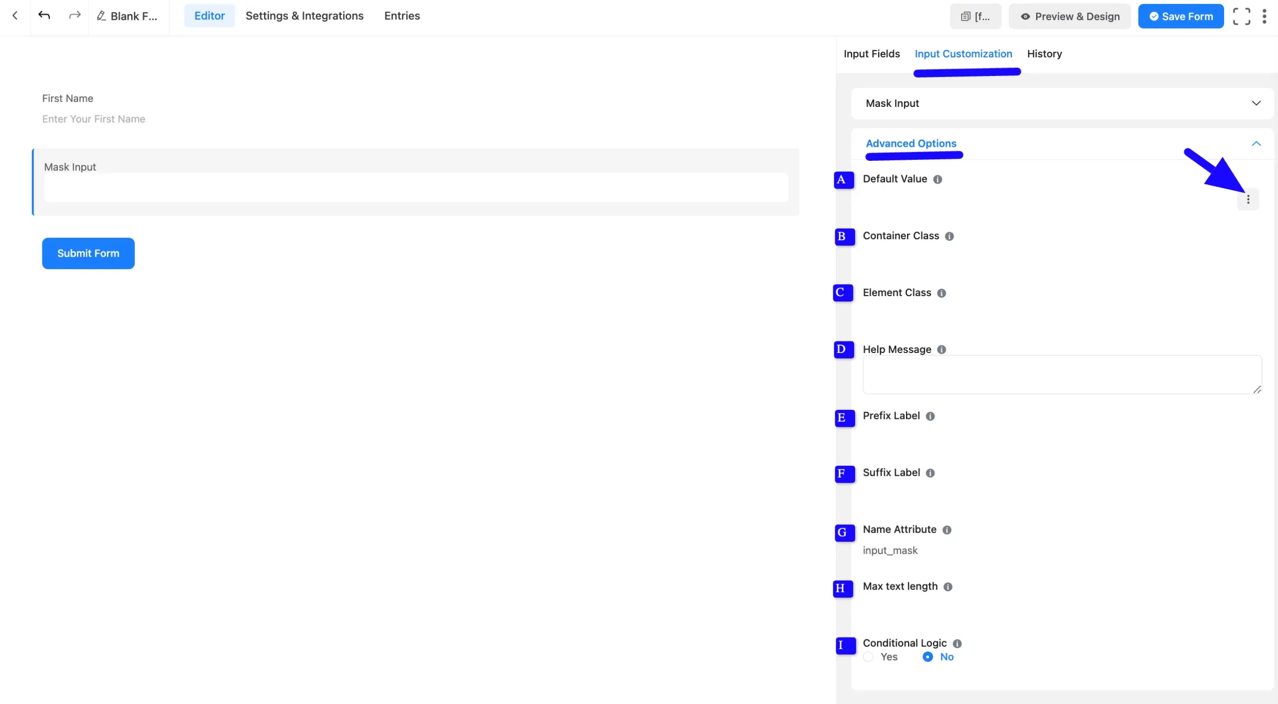
Advanced Options #
Advanced settings allow further customization to meet specific use cases. All the Settings under the Advanced Options tab mentioned in the screenshot are briefly explained below –
A. Default Value: Using our shortcodes, you can manually set any fixed value in your field and pre-fill your input field dynamically. Read this article to understand Dynamic Default values better.
B. Container Class: Use this option to add your custom CSS classes to the field’s wrapper.
C. Element Class: Add custom CSS classes to the input field.
D. Help Message: This option allows you to guide your user thoroughly. Add your text here, which will be shown as a help message to the user.
E. Prefix Label: You can use this field to provide a Prefix Label in your input field. It will show in the input field as a prefix label.
F. Suffix Label: You can use this field to provide a Suffix Label in your input field. It will show in the in-ut field as a suffix label.
G. Name Attribute: The input field’s name attribute is the HTML equivalent of the same name. You don’t need to modify this.
H. Max Text Length: You can set a maximum number of characters that the input field can accept. Ideal for limiting responses like postal codes or short codes.
I. Conditional Logic: This option allows you to create specific rules to dynamically hide/show the input field to function conditionally based on your submission values according to your set of conditional logics. To learn more, read this Documentation.
Embedding the Form on Your Website #
Once you complete the customization, click the Save Form button to save all your changes. Click the Preview & Design button in the middle to see the form preview.
To integrate and display the form on a specific page or post, copy the Shortcode from the top right side and paste it into your desired Page or Post.
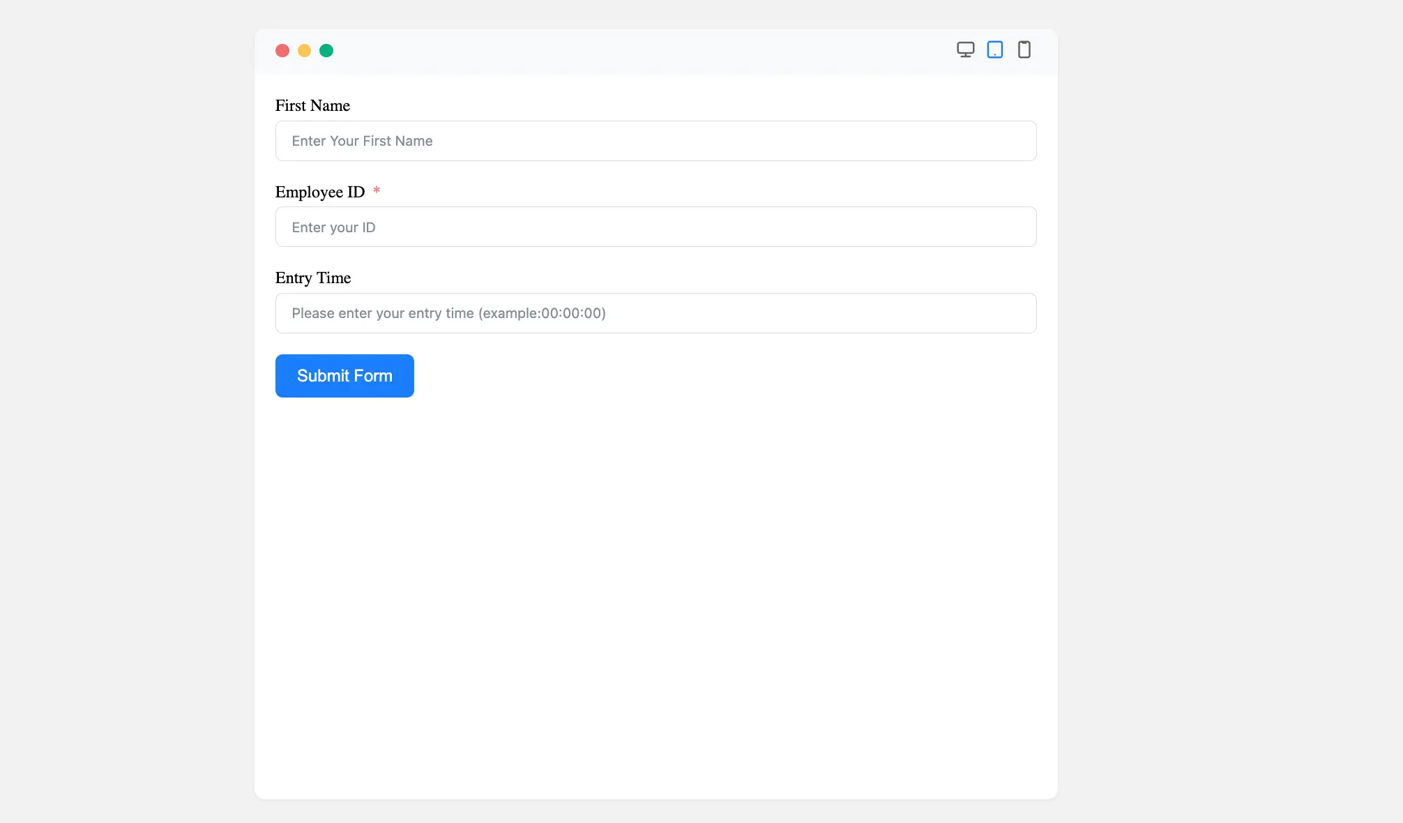
Preview of Added Mask Input Field #
Here is the preview of the added Mask Input field under the Form.
Congratulations! Your Mask Input Field is now ready to ensure users enter data in the correct format.
If you have any questions or need assistance, feel free to contact our support team.


