The Address input field in Fluent Forms offers a suitable way to collect a user’s complete address information, such as Street, City, State, Zip code, and Country, in a single, structured manner. You can also collect multiple address text boxes.
This guide will walk you through adding and customizing the Address Input Field in Fluent Forms for your WordPress site.
You can autocomplete your address field using Google map integrations, see this documentation.
Adding the Address Input Field #
To learn how to add the Address field to Fluent Forms, follow the steps below-
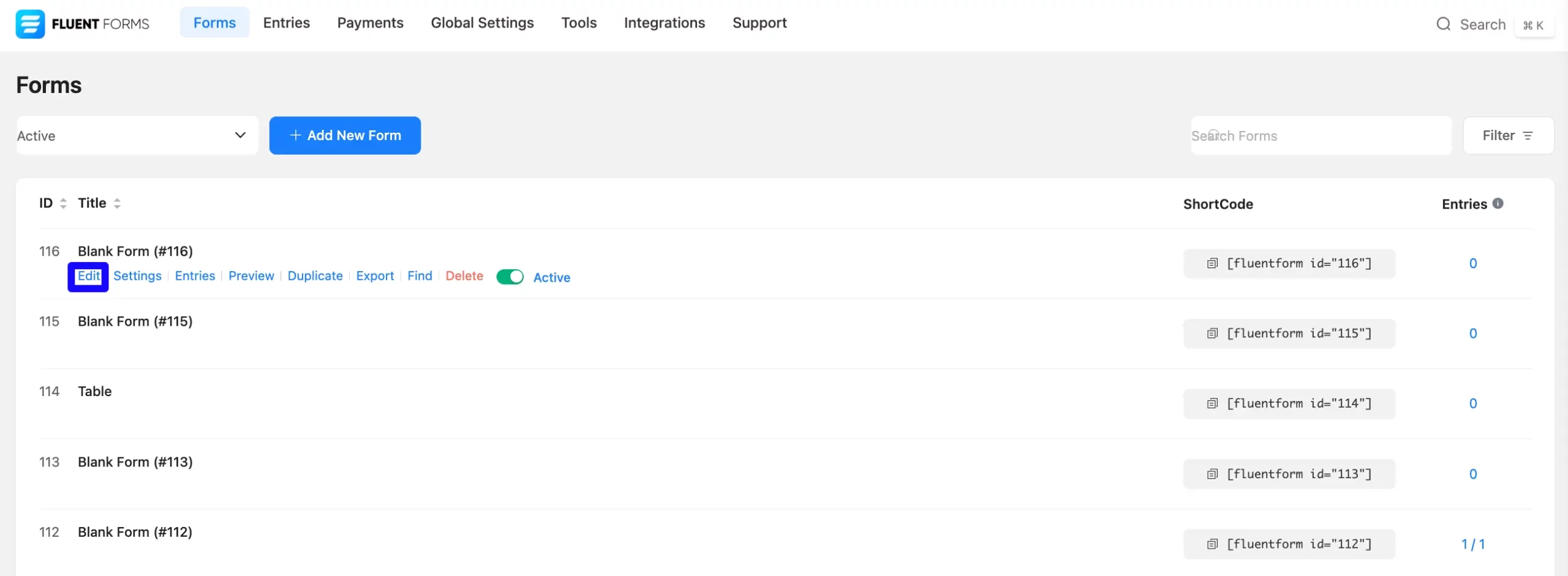
First, go to the Forms section from the Fluent Forms Navbar, choose a desired Form, and click the Edit icon to open the Editor page of that form.
If you do not have any existing forms, read Create a Form from Scratch or Create a Form using Templates documentation to create a new one.
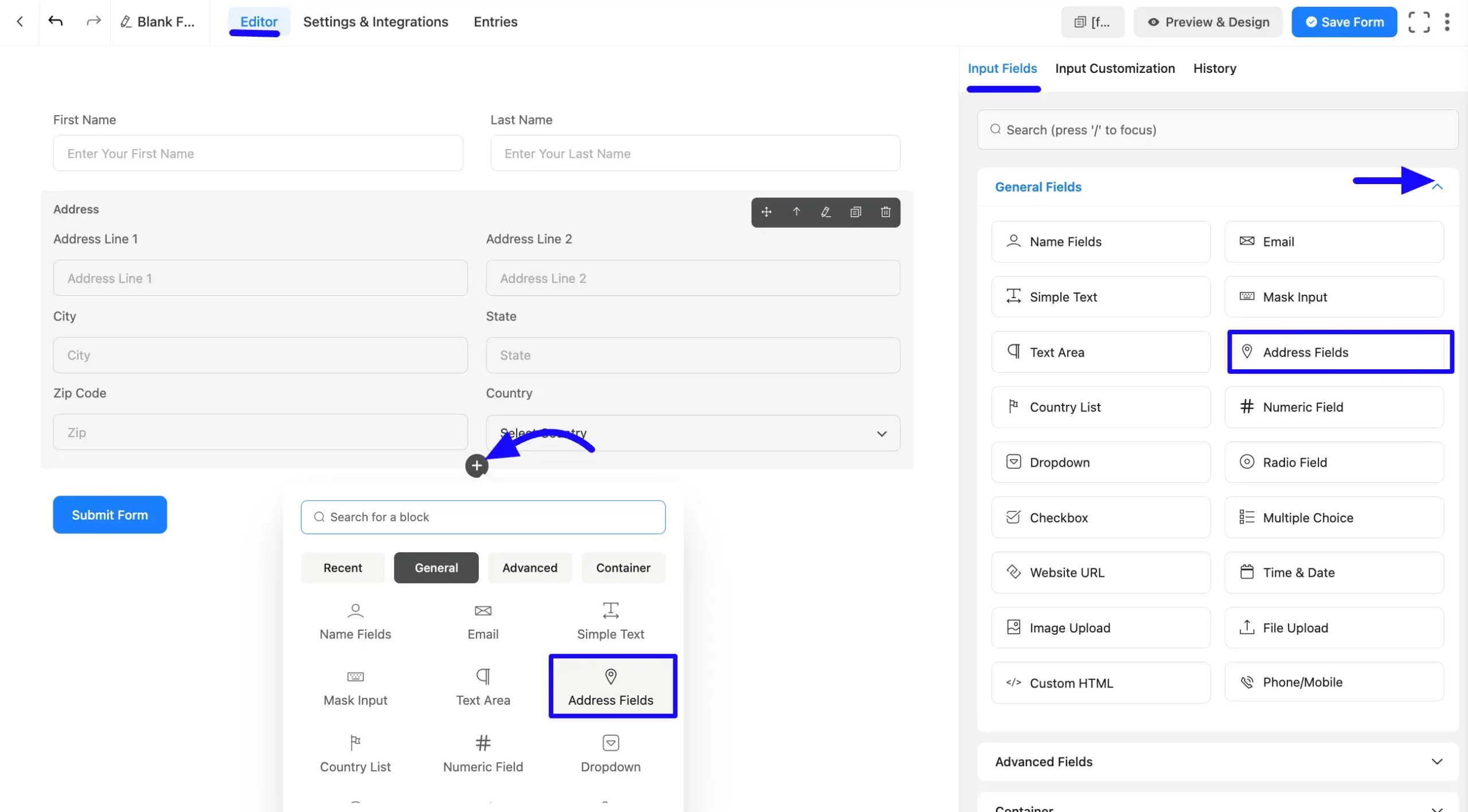
Once you are on the Editor page, click the Plus Icon in your form editor and open the General Fields module. The General Fields option is also in the right sidebar under the Input Fields tab.
Now, choose the desired Address Input field by clicking on it or Drag & Drop it into your editor.
Customizing the Address Input Field #
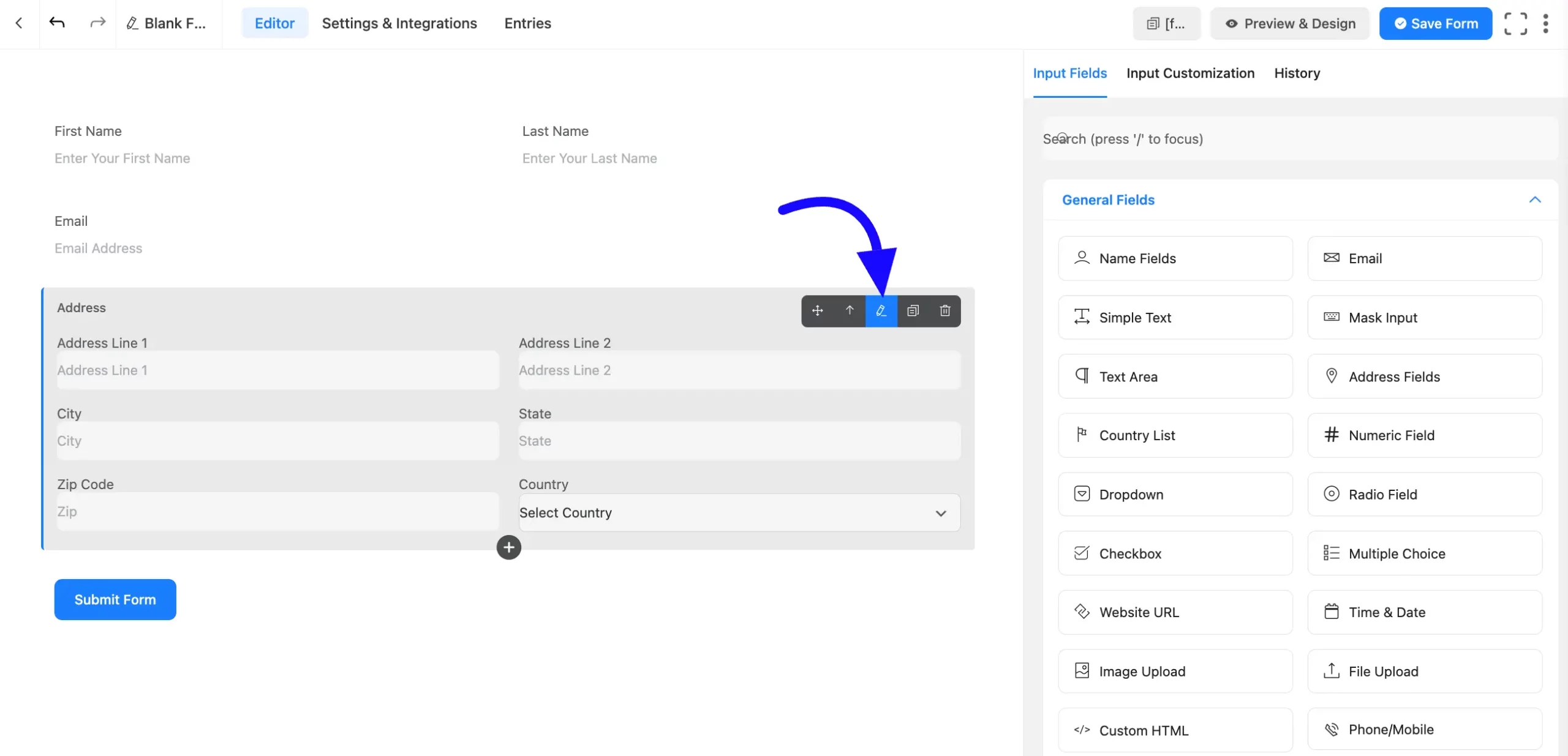
Next, hover over the field and click the Edit icon to customize the Address field. Or click on the Input Customization tab in the right corner when the field is selected.
You can personalize the input field using the following options in the Input Customization area.
- Address Input Options
- Advanced options
Address Input Options #
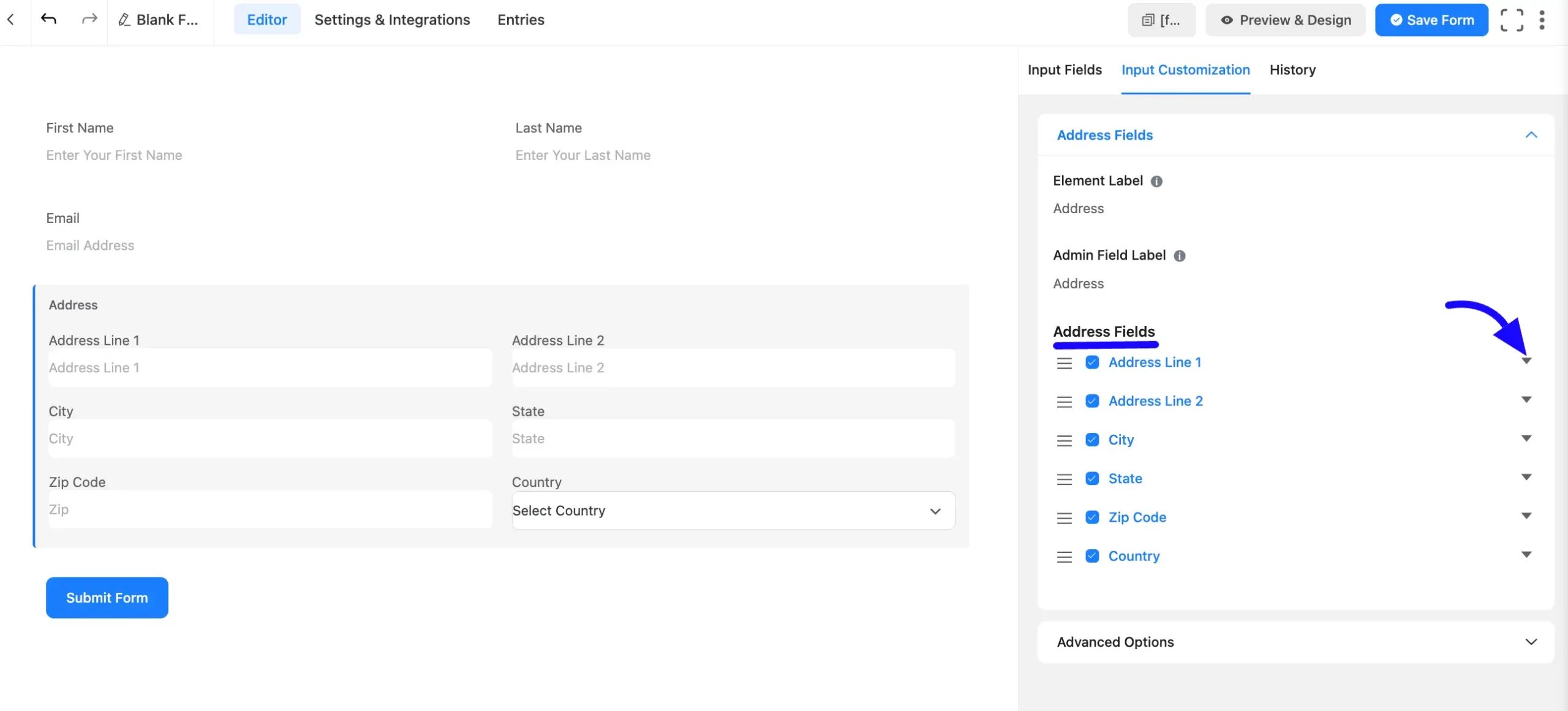
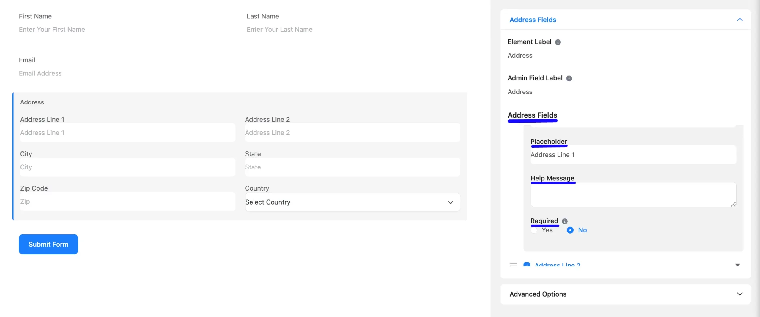
You will find various settings options for customizing the field. Located in the Input Customization Tab, these options allow you to configure essential aspects of the Address Input field.
A. Element Label: This is the field title the users will see when filling out the Address field in a form. You can enter any text here to help users understand the purpose of the field.
B. Admin Field Label: The admin field label is a field title displayed only to admin users. This means that you can configure this option to show a different field label for your admin users when they view the form submissions.
C. Address Field: Here, you will see each part of the address field. There are six options. Click the drop-down button beside these fields to select the Input Field Label, Default, Placeholder, Help Message, and Required choices. If you don’t want any option, uncheck the checkbox.
- Label: You can change the field label as you wish.
- Label Placement: This option determines the position of the label title where the user will see it. The available options are Top, Left, Right, and Default. All of those are self-explanatory except the Default. If you select the Default option, it will represent your global label placement settings.
- Default: There’s a text box where you can set a default value for the Address field, which would pre-populate the field when the form is loaded.
A text box provides additional options or actions related to the default value. You can clear the field, use a dynamic value, or select another advanced setting by clicking and selecting the Three Vertical Dots menu on the right side.

- Placeholder: You can also include a placeholder where users will view the field topic. Add placeholder text, like “Enter your street address,” to guide users in what to input.
- Help Message: This option allows you to guide your user thoroughly. Add your text here, which will be shown as a help message to the user.
- Required: Decide whether users must select at least one option before submission. If you hit the Radio button and pick Yes, the field is compulsory, and the user must answer by submitting the form. By default, it selected No options.
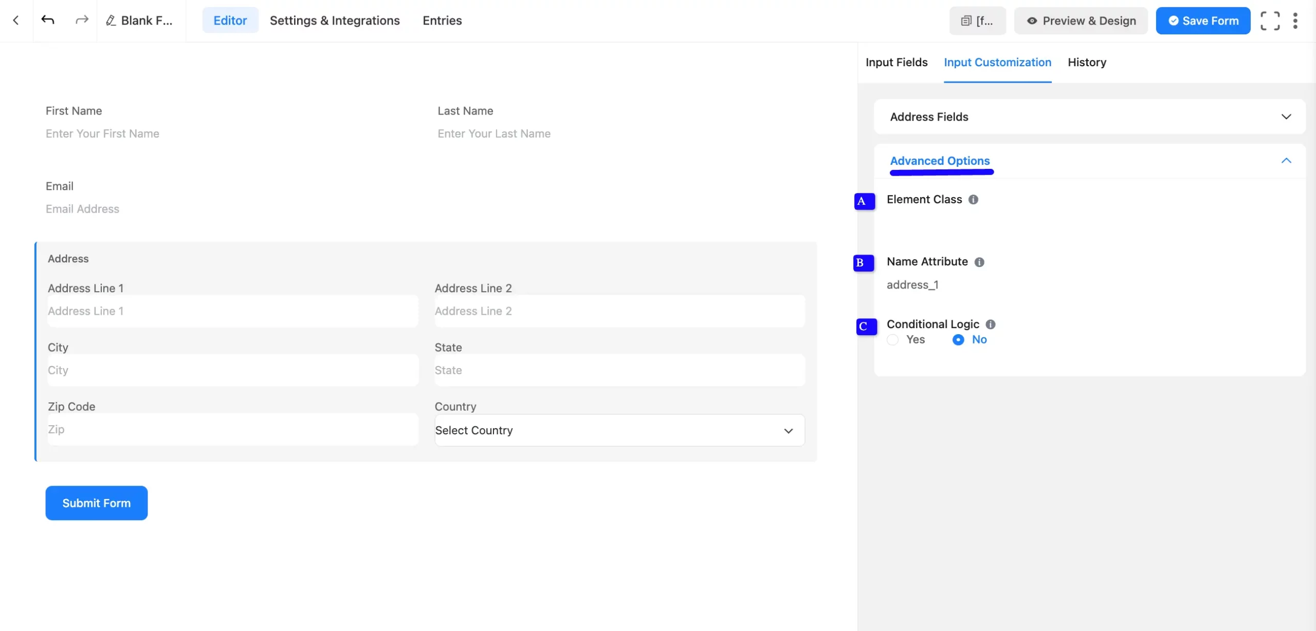
Advanced Options #
Advanced settings allow further customization to meet specific use cases. All the Settings under the Advanced Options tab mentioned in the screenshot are briefly explained below –
A. Element Class: Add custom CSS classes to the input field.
B. Name Attribute: The input field’s name attribute is the HTML equivalent of the same name. You don’t need to modify this.
C. Conditional Logic: This option allows you to create specific rules to dynamically hide/show the input field to function conditionally based on your submission values according to your set of conditional logics. To learn more, read this Documentation.
Embed the Form into the front #
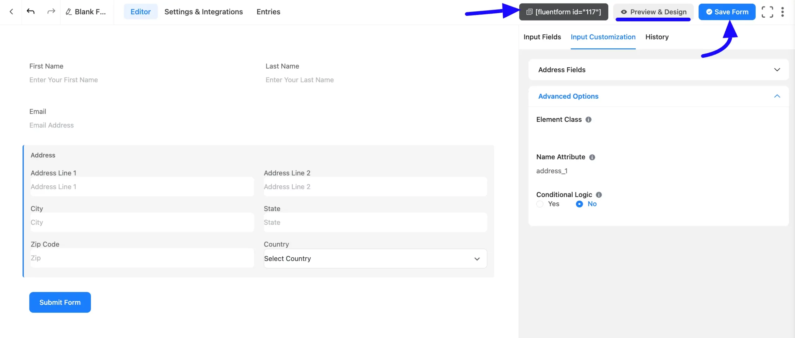
Once you have customized the Address input field, click the Save Form button to apply the changes.
To display the form on a specific page or post, Copy the Shortcode from the top-right corner and Paste it into your desired page or post.
Now, preview the form, click Preview & Design in the middle of the page.
Preview of Added Address Input Field #
Here is a preview of the form with the Address Input field:
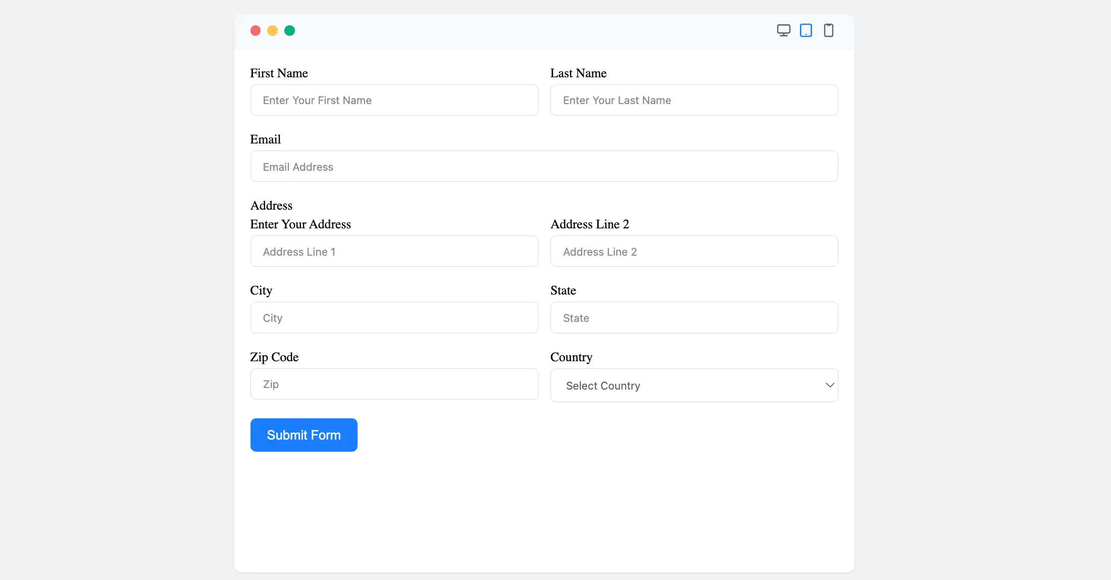
And that’s it! You have successfully added and customized an Address Input Field in Fluent Forms.
If you have any questions, feel free to contact our support team. We’re here to clarify any confusion and provide solutions to your problems.


