The CheckBox Field in Fluent Forms allows users to select one or more options from a list. It is commonly used for surveys, polls, preferences, or consent forms.
This article will guide you through adding the Checkbox field in your Fluent Forms for your WordPress Site.
Adding the Checkbox Field #
To learn how to add the checkbox field to the Fluent Forms, follow the steps with the screenshots below –
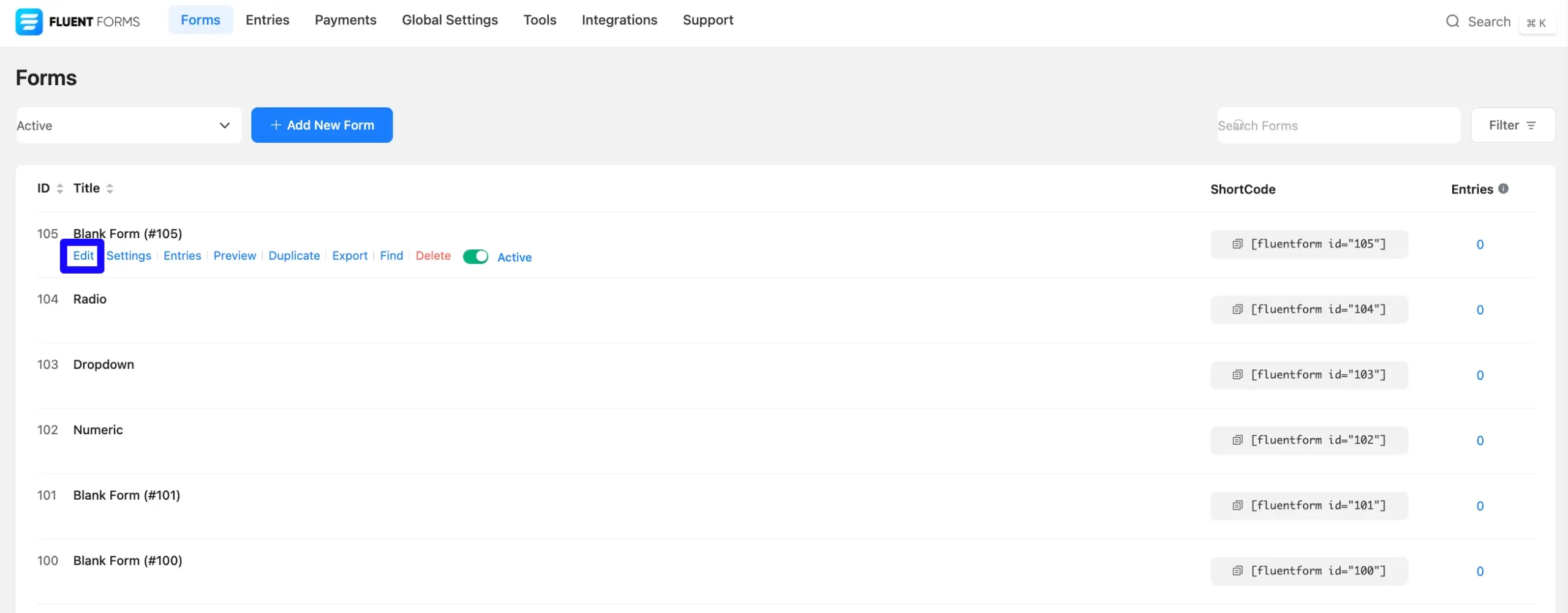
First, go to the Forms section from the Fluent Forms Navbar, choose a desired Form, and click the Edit icon to open the Editor page of that form.
If you do not have any existing forms, read Create a Form from Scratch or Create a Form using Templates documentation to create a new one.
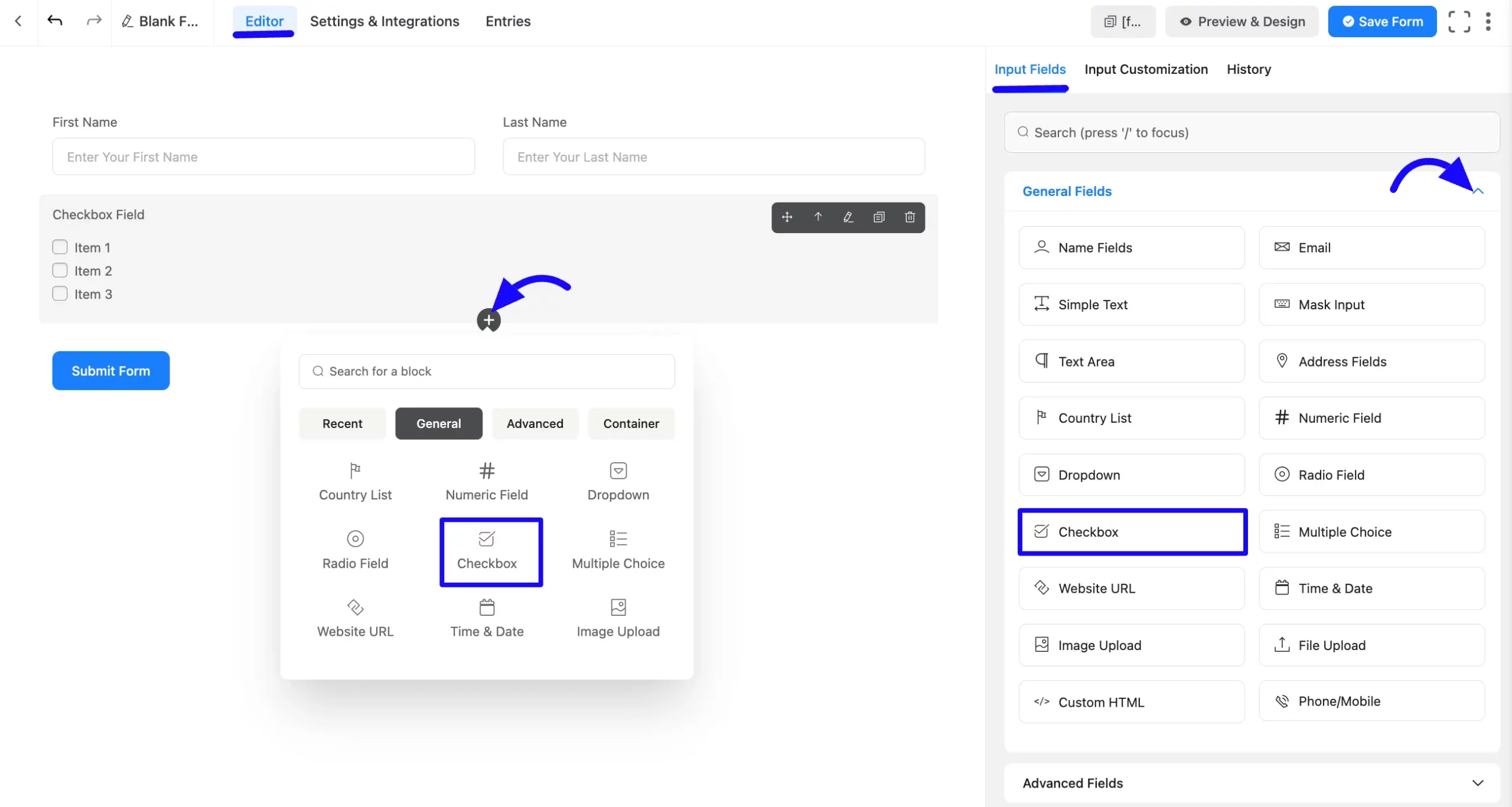
Once you are on the Editor page, click the Plus Icon in your form editor and open the General Fields module. The General Fields option is also in the right sidebar under the Input Fields tab.
Now, choose the desired Checkbox field by clicking on it or Drag & Drop it into your editor.
Customizing the Checkbox Field #
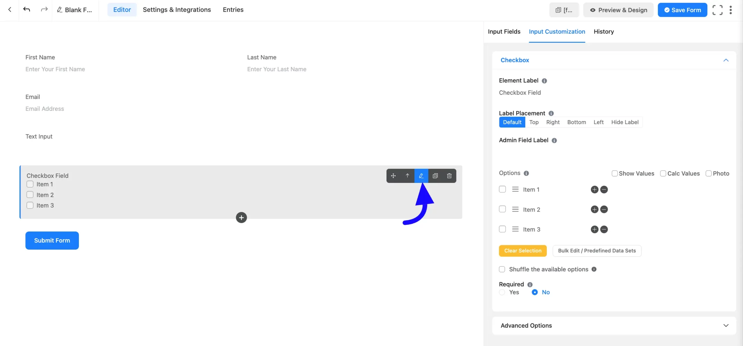
A checkbox field has been added. You can edit this field by hovering over it and clicking the Pencil Icon. It will take you to the Input Customization tab on the right side and offer the following options for customizing the field.
- Checkbox Field Options
- Advanced Options
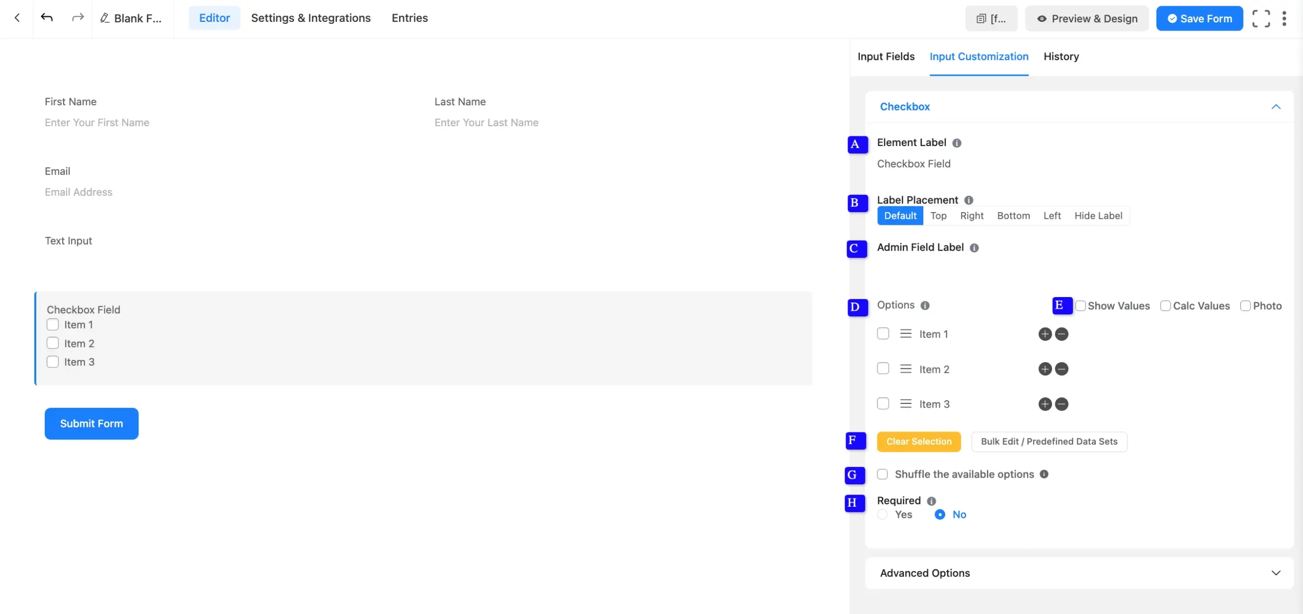
Checkbox Field Options #
You will find various settings options for customizing the field. Located in the Input Customization Tab, these options allow you to configure essential aspects of the Checkbox field.
All the Settings under the Checkbox Field mentioned above are briefly explained below –
A. Element Label: This is the field title the users will see when filling out the Checkbox field in a form. You can enter any text here to help users understand the purpose of the field.
B. Label Placement: This option allows you to determine the position of the label title where the user will see it. The available options are Top, Left, Right, and Default. All of those are self-explanatory except the Default. If you select the Default option, it will represent your global label placement settings.
C. Admin Field Label: The admin field label is a field title displayed only to admin users. This means that you can configure this option to show a different field label for your admin users when they view the form submissions.
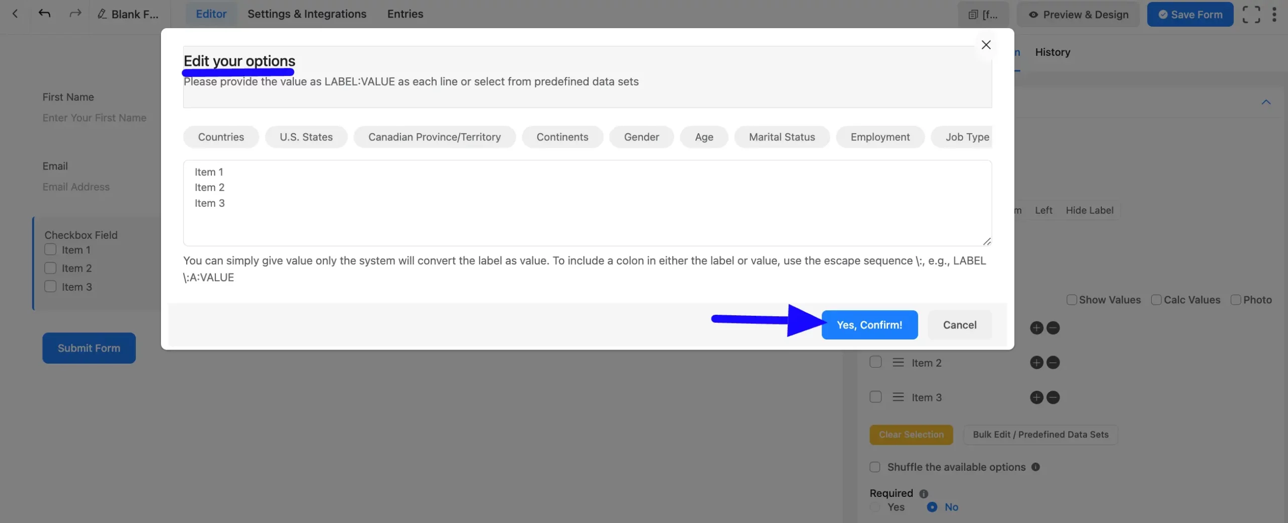
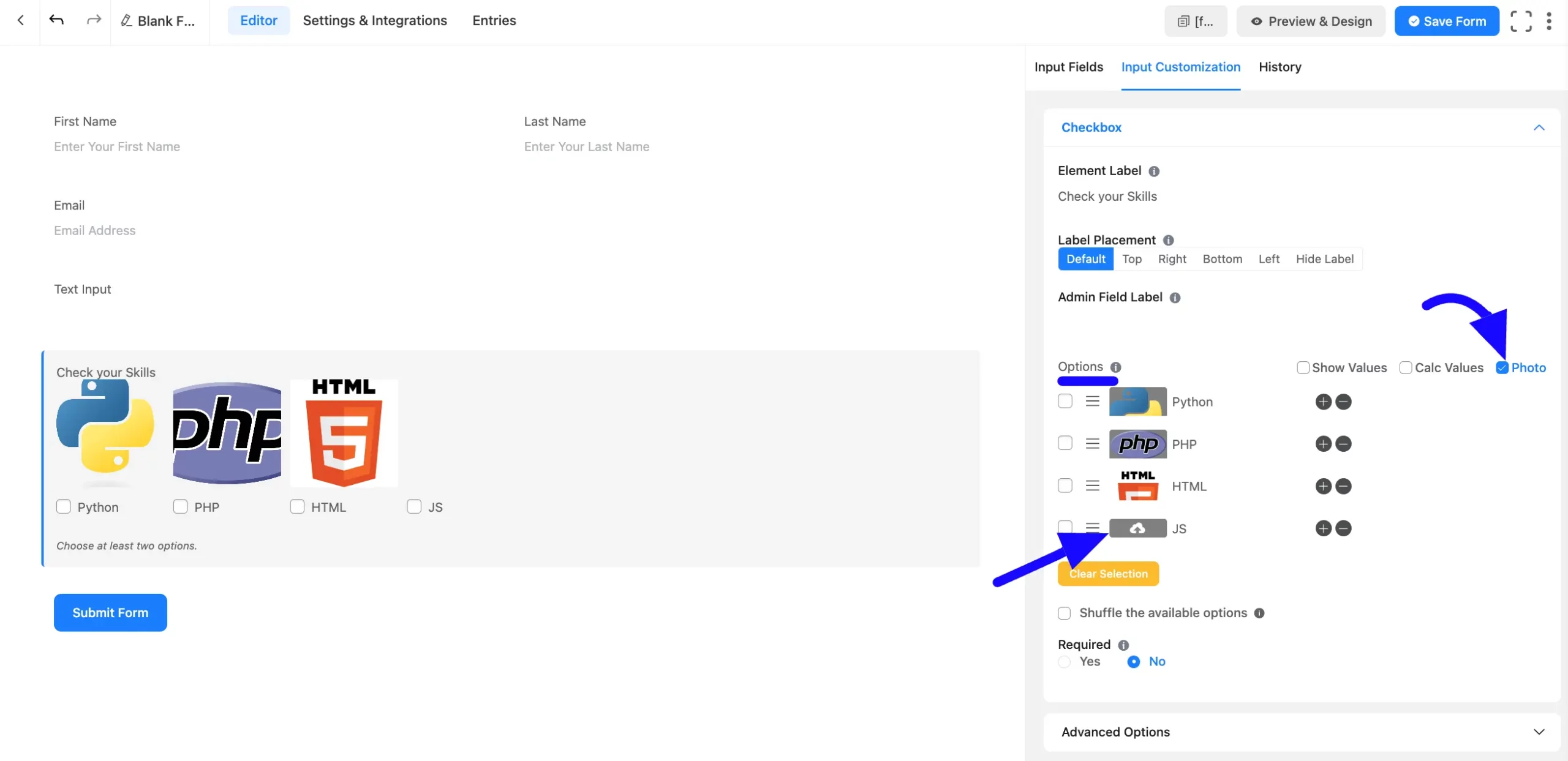
D. Options: Define the dropdown options:
- Create Options: Add the items for users to choose from.
- Set Default Options: Checkmark an option to set it as the default selection.
- Show Values: Display values for admin ease during submissions.
- Rearrange Options: Drag and drop options to reorder them.
- Add/Delete Options: Use the Plus icon to add new options or insert options between existing ones.
E. Show & Calc Value: Users will get Show and Calc Values options. You may display your data and perform calculations using Show and Calc Values.
Also, you can add photos by clicking on the Photo option for the field.
F. Bulk Edit/Predefined Data Sets: You can choose from a predefined data set for the dropdown field, so you don’t have to add each item manually.
You can also save time by importing predefined datasets instead of manually adding each option. (Useful for dropdowns like countries or states.)
G. Shuffle the available options: You can enable the shuffle of your dropdown list or select field options so that every user sees a randomized option.
H. Required: Choose the appropriate option from here to determine whether the field should be empty when the user submits your form.
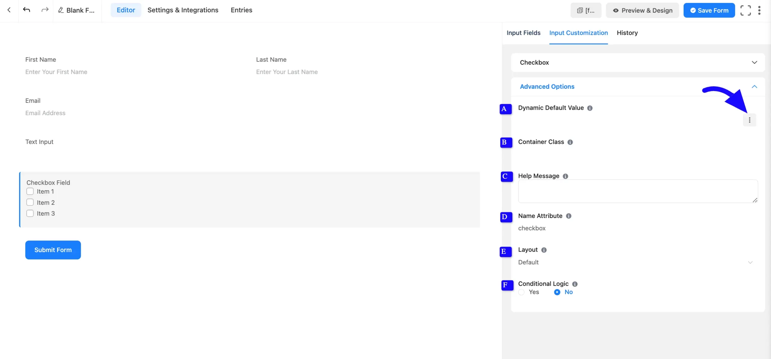
Advanced Options #
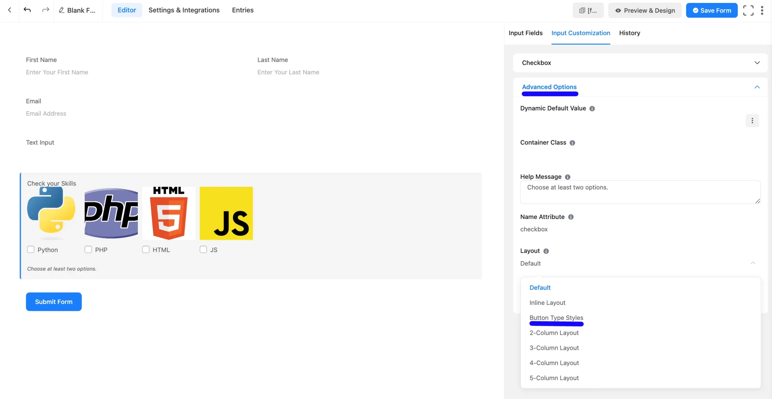
Advanced settings allow further customization to meet specific use cases. All the Settings under the Advanced Options tab mentioned in the screenshot are briefly explained below –
A. Dynamic Default Value: Using our shortcodes, you can manually set any fixed value in your field and pre-fill your input field dynamically. Read this article to better understand Dynamic Default values.
B. Container Class: Use this option to add your custom CSS classes to the field’s wrapper.
C. Help Message: This option allows you to guide your user thoroughly. Add your text here, which will be shown as a help message to the user.
D. Name Attribute: The input field’s name attribute is the HTML equivalent of the same name. You don’t need to modify this.
E. Layout: Choose a layout for the options. Available layouts include Vertical, Horizontal, or Grid-style.
F. Conditional Logic: This option allows you to create specific rules to dynamically hide/show the input field to function conditionally based on your submission values according to your set of conditional logic. To learn more, read this Documentation.
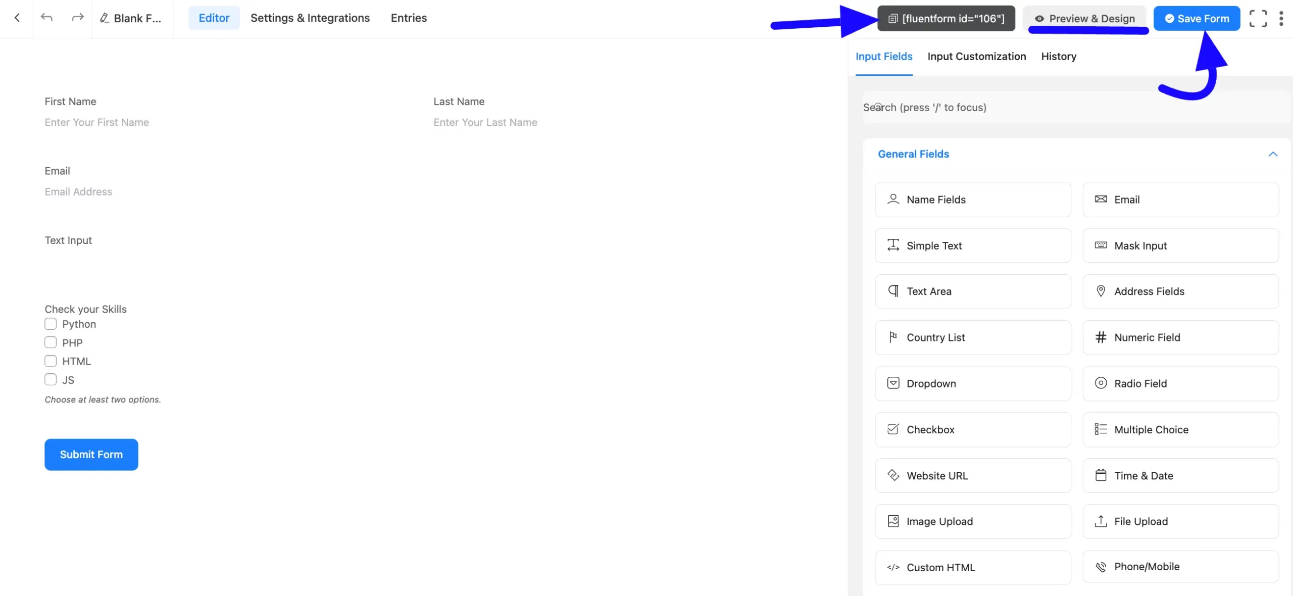
Embed the Form into the Front #
Once you complete the customization, click the Save Form button to save all your changes. Click the Preview & Design button in the middle to see the form preview.
To integrate and display the form on a specific page or post, copy the Shortcode from the top right side and paste it into your desired Page or Post.
Preview of Added Checkbox Field #
Here is the preview of the added Checkbox field under the Form.
You can get the visual representation of this Form. To learn more about this, read this article.
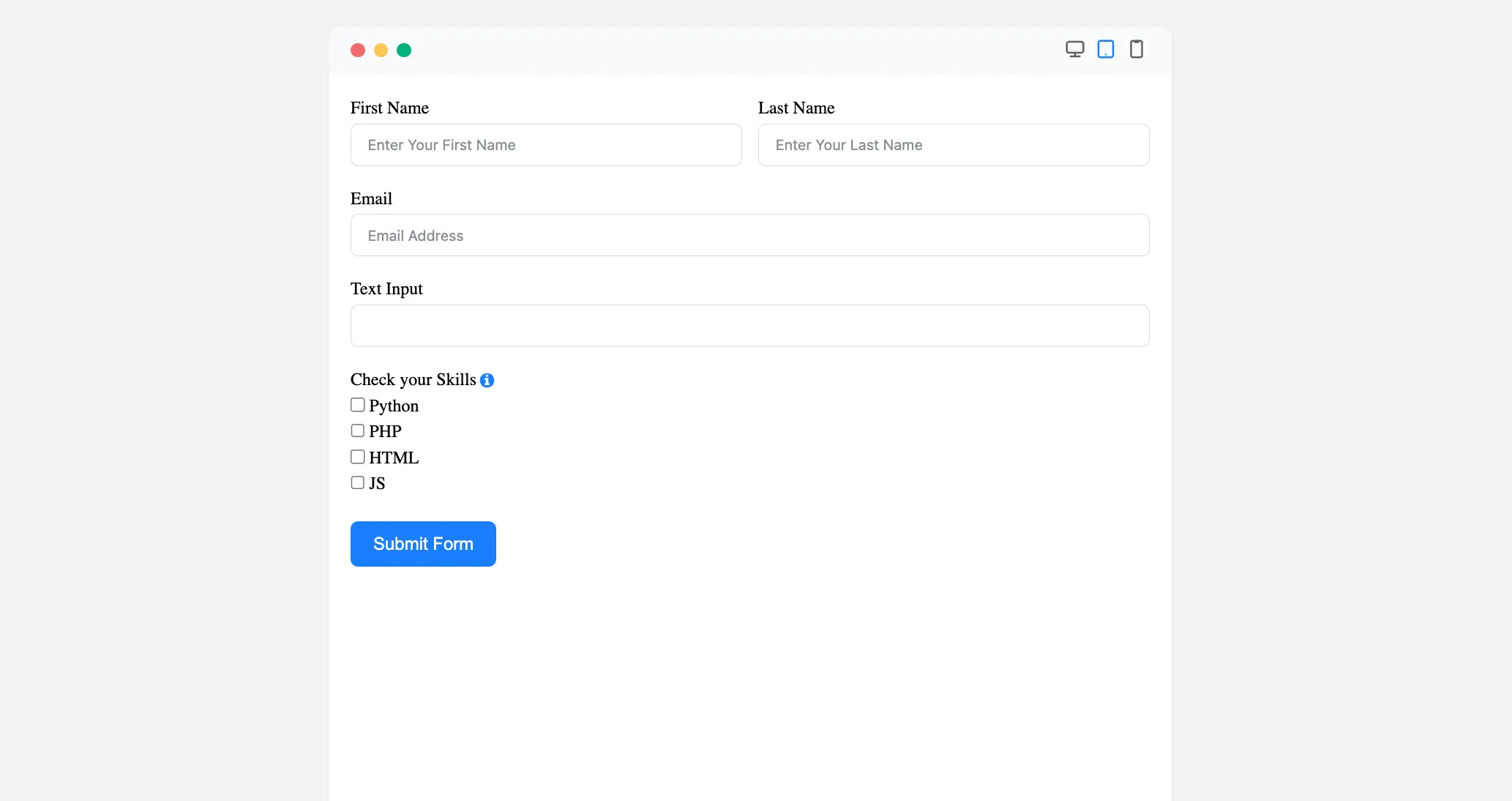
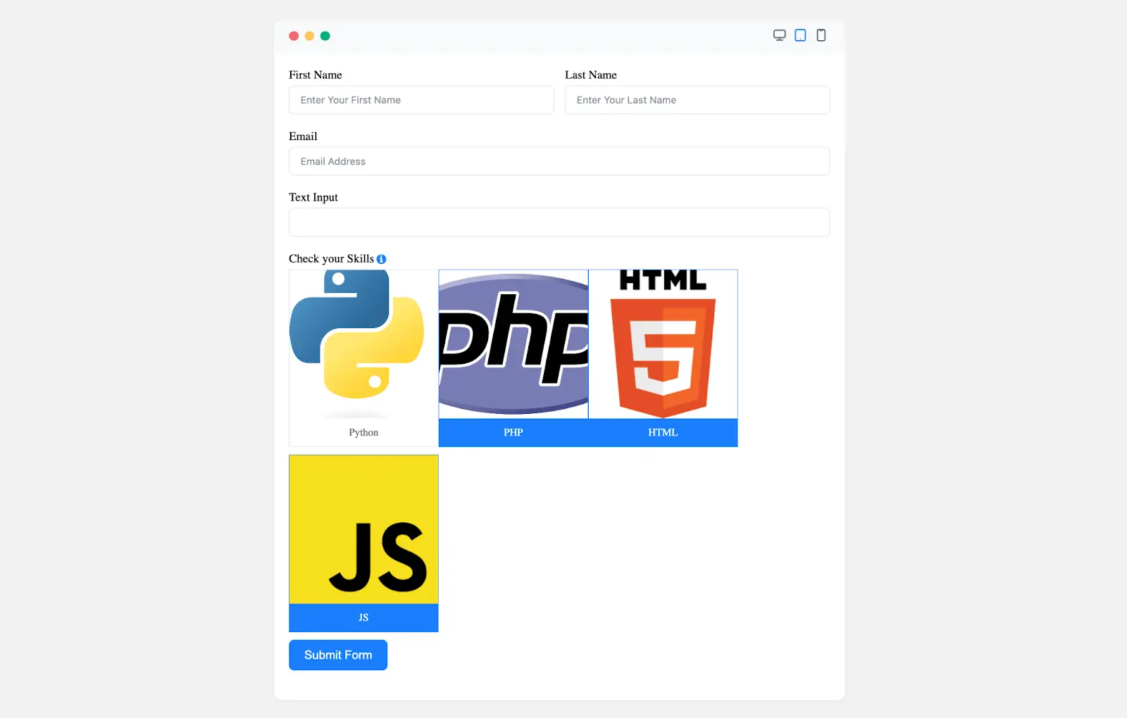
Image Button Layout #
First, enable the Photo Option from the checkbox field’s options, as shown in the screenshot. Now, Upload images for each option in the Photo setting.
After that, Customize the Layout option. Now, navigate Advanced Options and select the desired Button Layout from the dropdown menu.
Once configured, the radio button field will display with clickable image options.
The Checkbox Field in Fluent Forms is a flexible and customizable input type, ideal for multiple-choice forms.
If you have any further questions, concerns, or suggestions, please do not hesitate to contact our support team. Thank you.


