The Country List field in Fluent Forms allows users to select a country from a predefined list. This field helps collect users’ locations, trip destinations, or any other country-related input. It also includes advanced options to show specific countries or exclude certain ones if necessary.
This documentation will guide you through adding a country dropdown list to your website using Fluent Form.
So let’s get started.
Adding Country List Field #
To learn how to add the country list to Fluent Forms, follow the steps below:
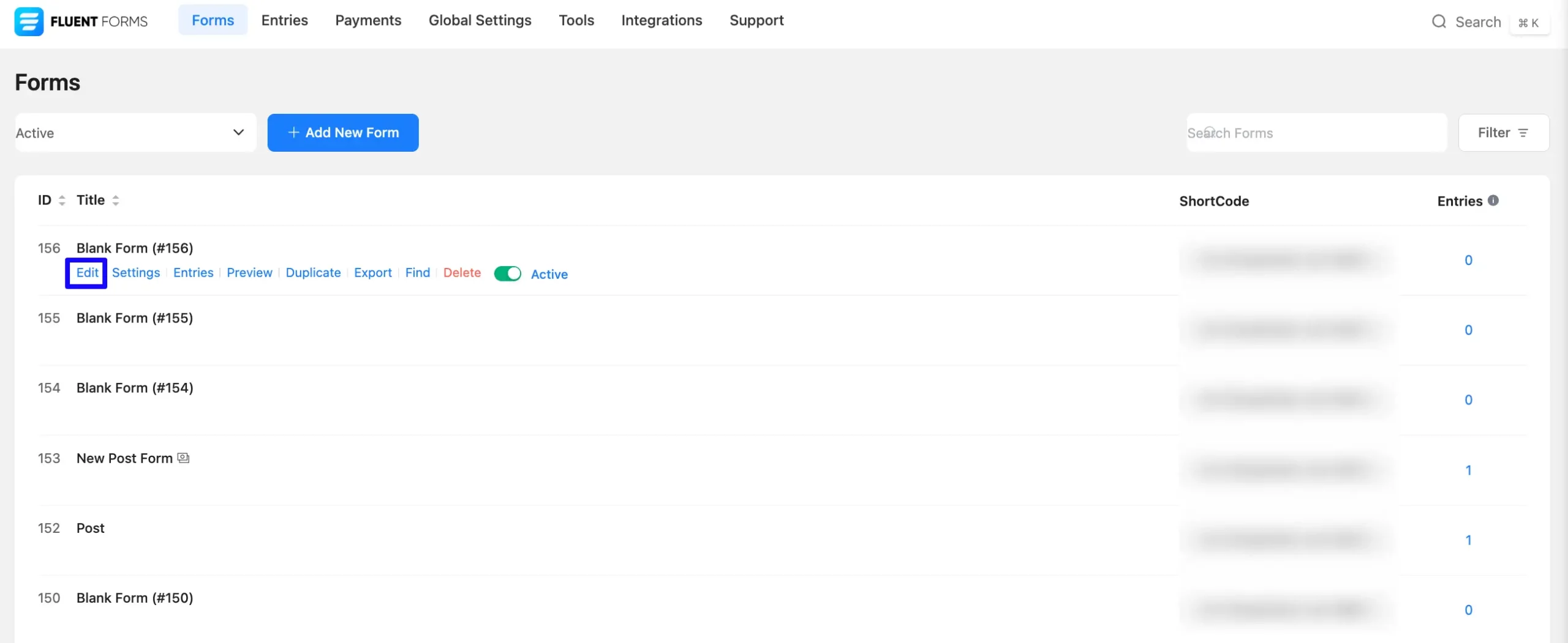
First, go to the Forms section from the Fluent Forms Navbar, choose a desired Form, and click the Edit Icon to open the Editor page of that form.
If you do not have any existing forms, read Create a Form from Scratch or Create a Form using Templates documentation to create a new one.
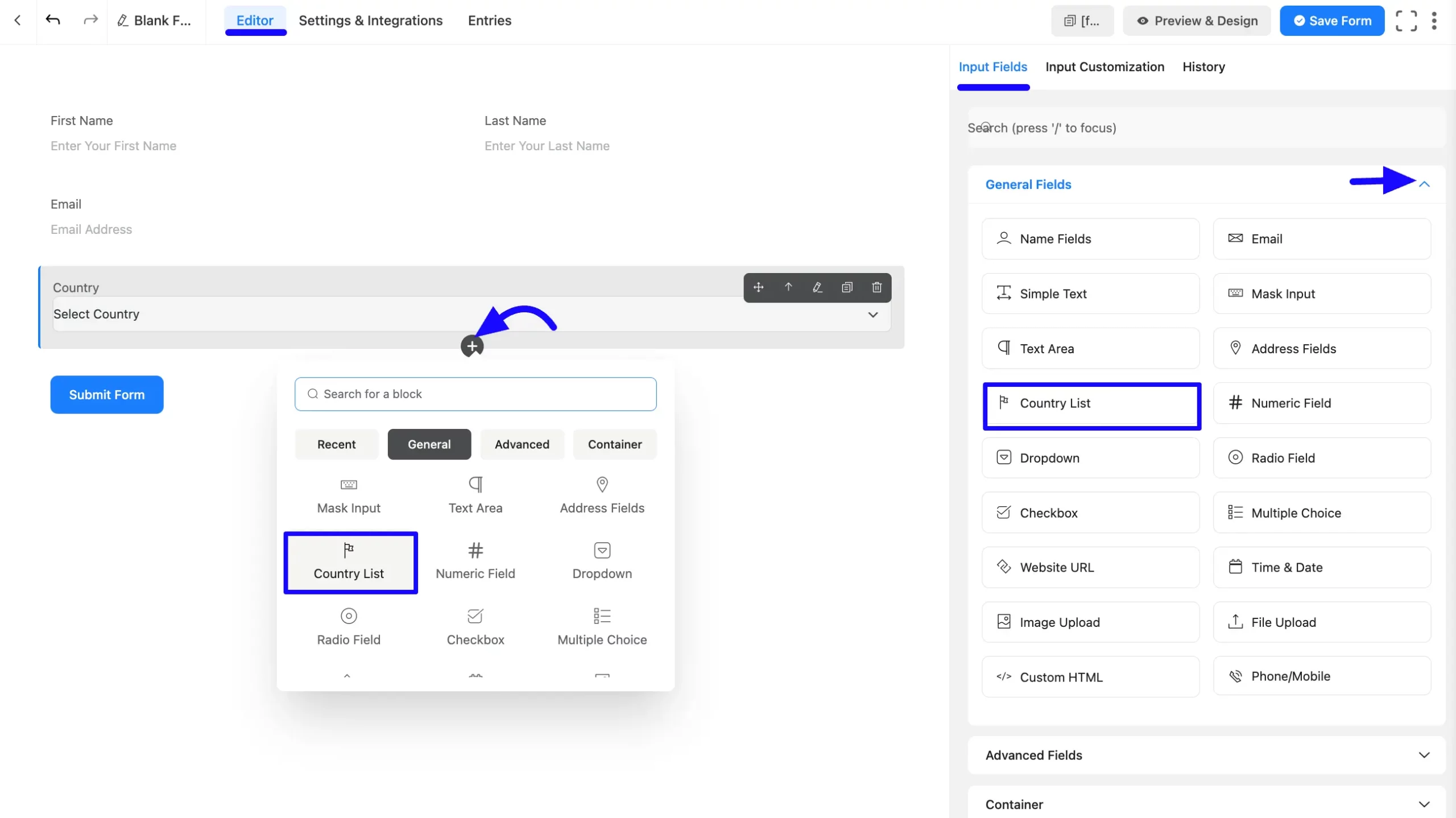
Once you are on the Editor page, click the Plus Icon in your form editor and open the General Fields module. The General Fields option is also in the right sidebar under the Input Fields tab.
Now, select the desired Country List Input field by clicking on it or dragging and dropping it into your editor.
Customizing the Country List Field #
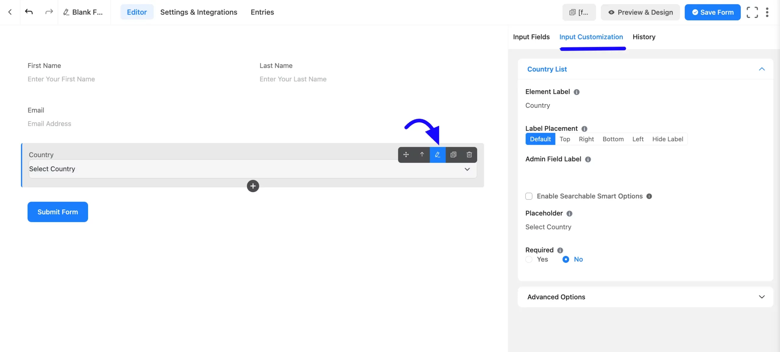
Once added, you can customize the field. Hover over the field and click the Pencil Icon to open the Input Customization tab. It will take you to the Input Customization tab on the right side and offer you the following options for customizing the coupon field.
- Country List Input field options
- Advanced Options
Country List Options #
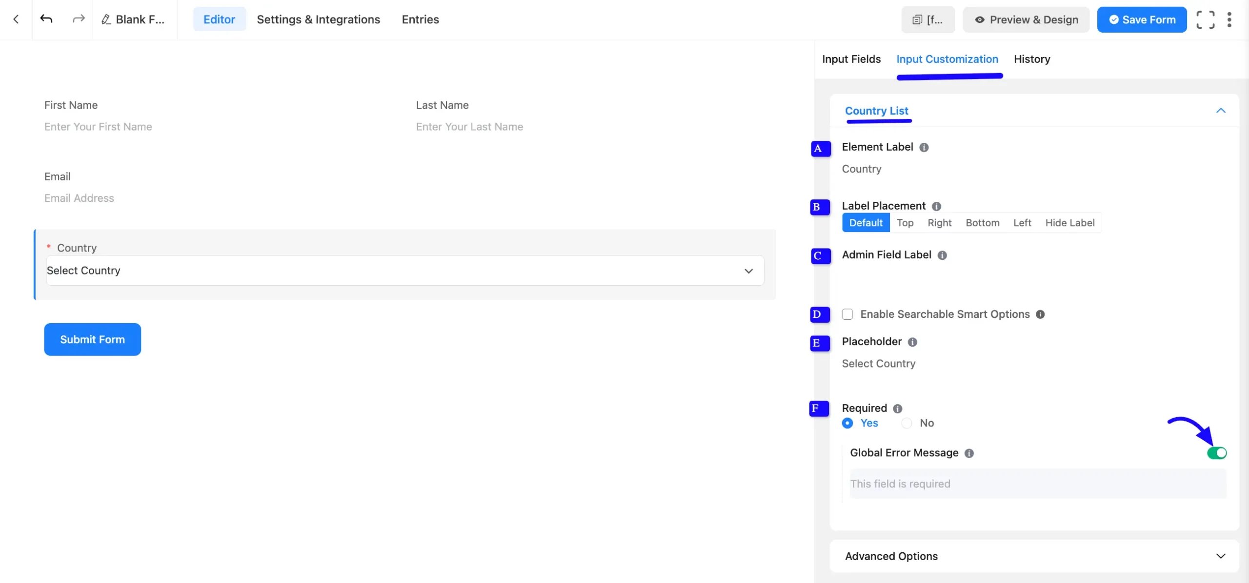
You will find various settings options for customizing the field. Located in the Input Customization Tab, these options allow you to configure essential aspects of the Country List Input field.
A. Element Label: This is the field title that the users will see when filling out the Country List field in a form. You can enter any text here to help users understand the purpose of the field.
B. Label Placement: This option allows you to determine the position of the label title where the user will see it. The available options are Top, Left, Right, and Default. All of those are self-explanatory except the Default. If you select the Default option, it will represent your global label placement settings.
C. Admin Field Label: The admin field label is a field title displayed only to admin users. You can configure this option to show a different field label for your admin users when they view the form submissions.
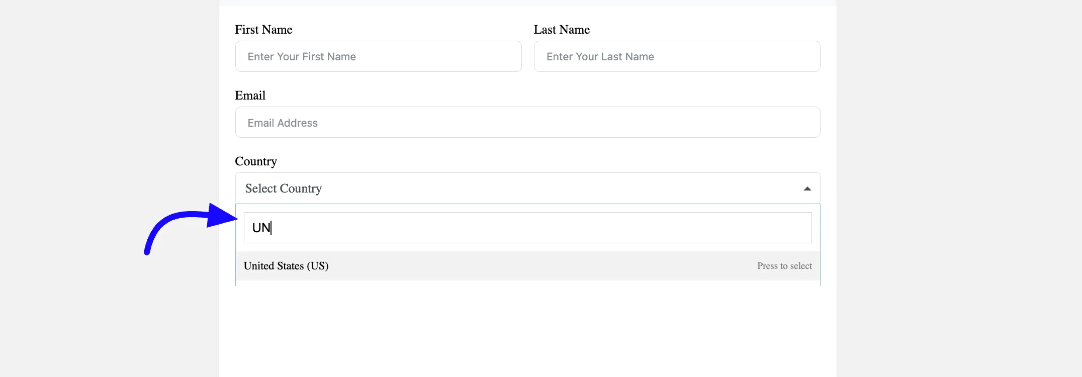
D. Enable Searchable Smart Options: If you think the list of countries is long, turn on this feature so users can quickly find their country.
Suppose your country is the United States (US), type ‘UN’ to see a list of UN-related countries. Scroll down to your country and then select it. You can also search for the country’s full name.
D. Placeholder: You can also have a placeholder by which users will perceive the field’s subject.
F. Required: If this field is essential, make it required so users can’t skip it when filling out the form. By default, it selected ‘No’. If you select ‘YES’ by clicking the Radio button, the field is required where the user must respond by submitting the form.
Global error message: If you enable this option, a global error message will be displayed if the field is not filled out when required.
The default error message displayed is that his field is required.
Advanced Options #
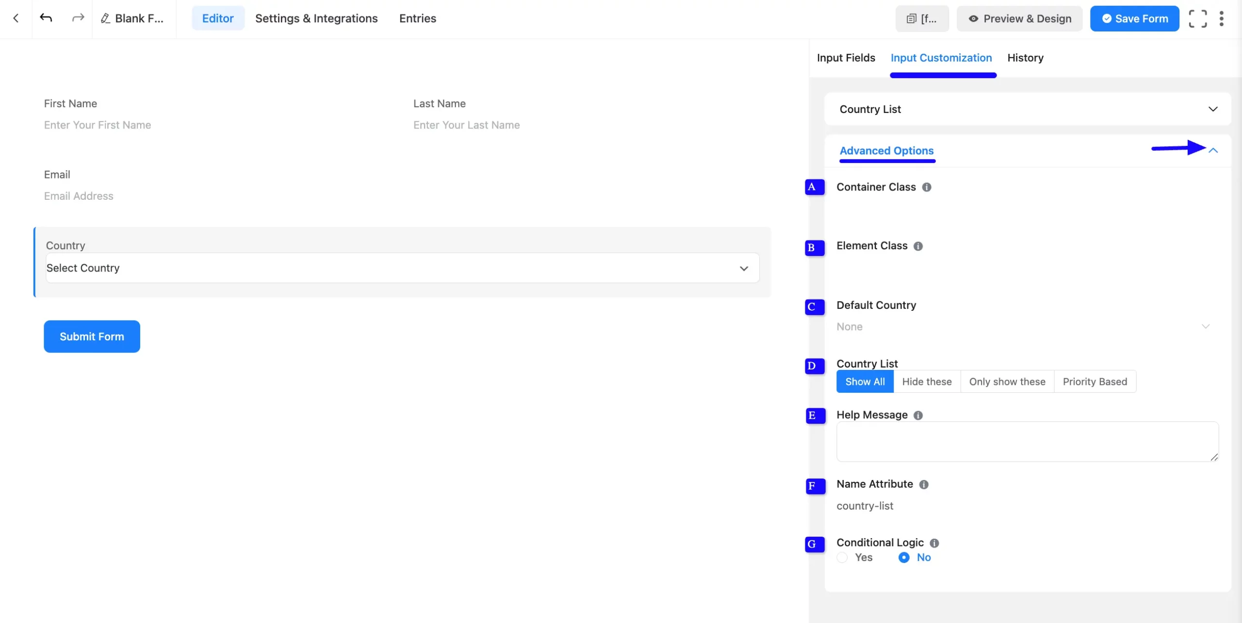
Advanced settings allow further customization to meet specific use cases. All the Settings under the Advanced Options tab mentioned in the screenshot are briefly explained below –
A. Container Class: Use this option to add your custom CSS classes to the field’s wrapper.
B. Element Class: Add custom CSS classes to the input field.
C. Default Country: If most of your users are from a specific country, like the United States, you can set it as the default. If not, leave it blank.
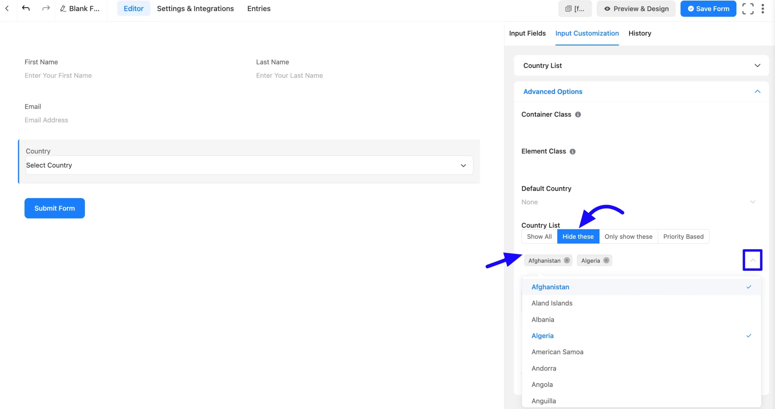
D. Country List Options: Customize which countries are visible in the dropdown. You can only select one option from these four options.
- Show All: Display all countries. This is a default option.
- Hide These: Hide specific countries if needed. You can choose multiple countries in the same way.
- Only Show These: Pick this option if you only want to show a few countries.
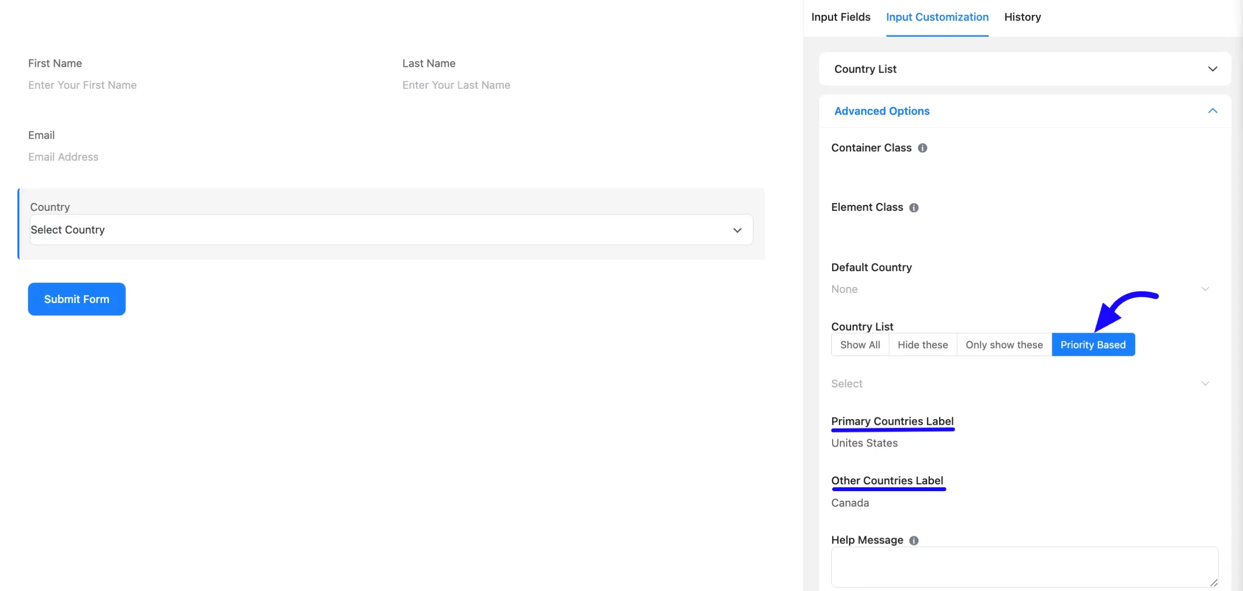
- Priority Based: You can highlight certain countries at the top of the list. For example, if most of your users are from the US, UK, and Canada, you can prioritize these.
This country will rank first in the search results. Two additional options exist: the Primary Countries Label and the Other Countries Label. Users can choose their Primary and Country labels on the priority list.
E. Help Message: This option allows you to guide your user thoroughly. Just add your text here, and it will be shown as a help message to the user. For example, you could add a note like ‘Select the country you are from’ to help users understand what to do.
F. Name Attribute: The input field’s name attribute is the HTML equivalent of the same name. You don’t need to modify this.
G. Conditional Logic: This option allows you to create specific rules to dynamically hide/show the input field to function conditionally based on your submission values according to your set of conditional logics. To learn more, read this Documentation.
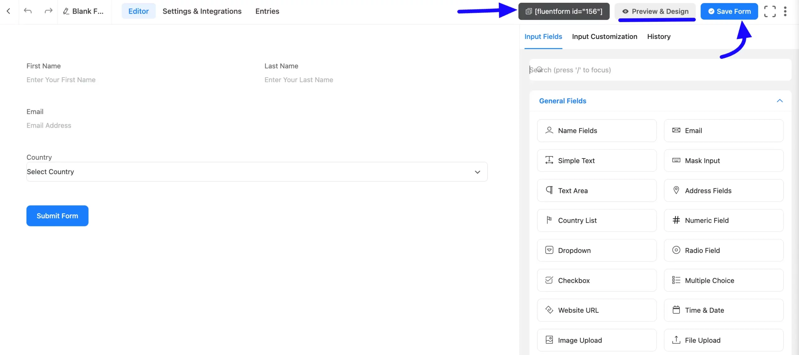
Embedding the Form on Your Website #
Once you complete the customization, click the Save Form button to save all your changes. Click the Preview & Design button in the middle to see the form preview.
To integrate and display the form on a specific page or post, copy the Shortcode from the top right side and paste it into your desired Page or Post.
Preview of Added Country List Field #
Here is the preview of the added country list field under the Form.
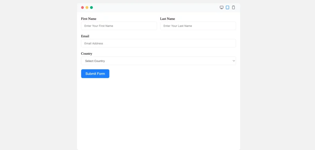
Congratulations! Your Country List Input Field is now ready to collect single-line responses from users.
If you have any further questions, concerns, or suggestions, please do not hesitate to contact our support team. Thank you.


