The Email Address Input Field is essential to any form. Fluent Forms allows you to produce an input field to take user addresses. You can easily add, customize, and validate this field.
Below is a comprehensive guide on configuring the Email Address input field.
Adding the Email Field #
To learn how to add the Email Address field to the Fluent Forms, follow the steps with the screenshots below –
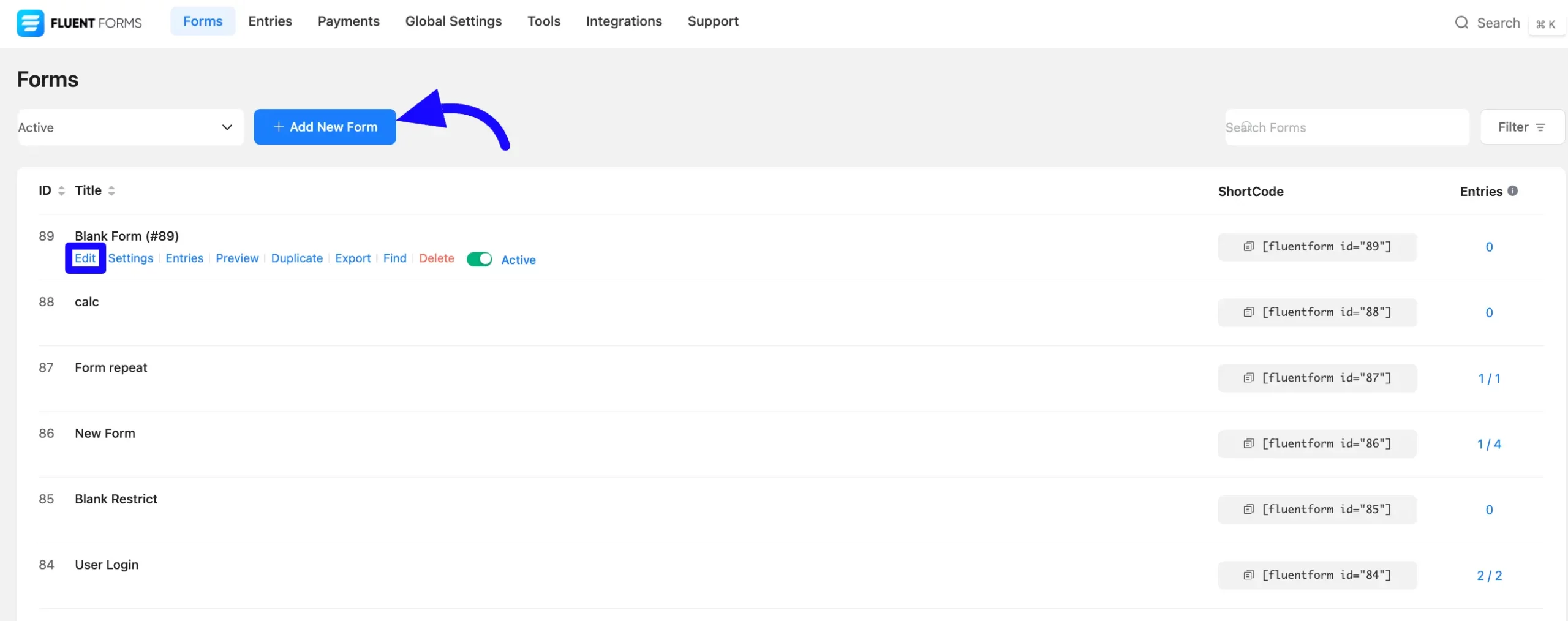
First, go to the Forms section from the Fluent Forms Navbar and click the Add New Form button to create a new form or click the existing forms Edit options.
If you do not have any existing forms, read Create a Form from Scratch or Create a Form using Templates documentation to create a new one.
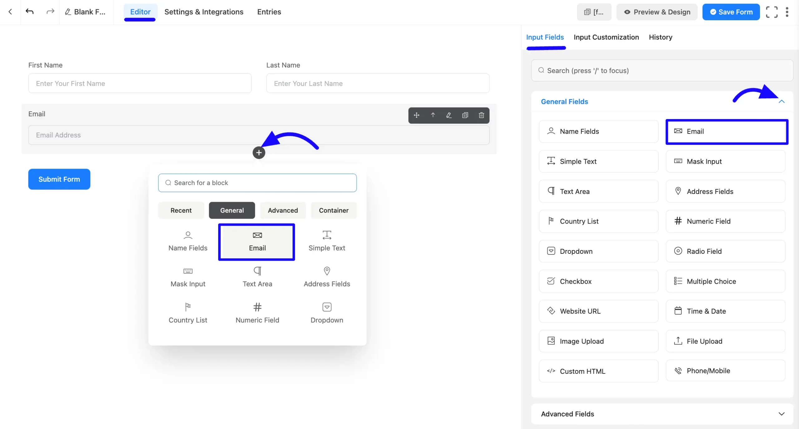
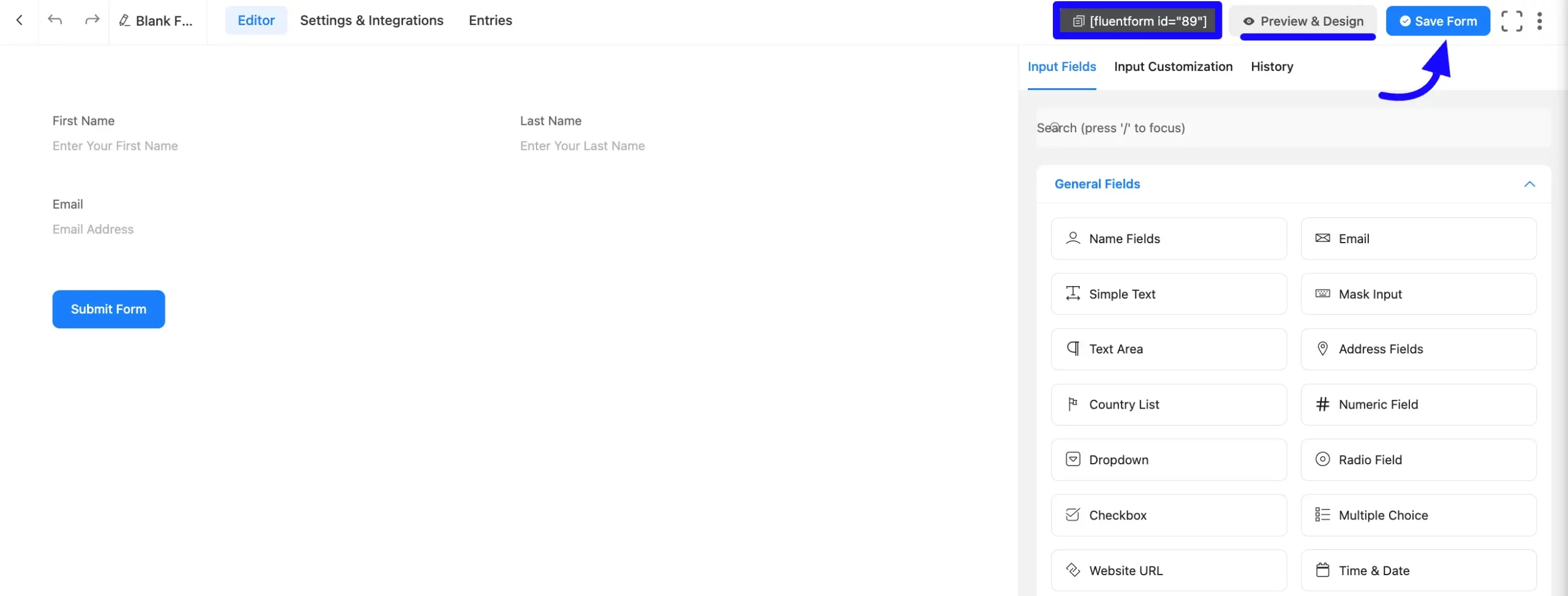
Once on the Editor page, click the Plus Icon in your form editor and open the General Fields module. The General Fields option is also in the right sidebar under the Input Fields tab.
Now, choose the desired Email Address field by clicking or drag and drop it into your editor.
Customizing the Email Address Input Field #
An email field has been added. You can edit this field by hovering over it and clicking the Pencil Icon. It will take you to the Input Customization tab on the right side and offer the following options for customizing the field.
- Email Field Options
- Advanced Options
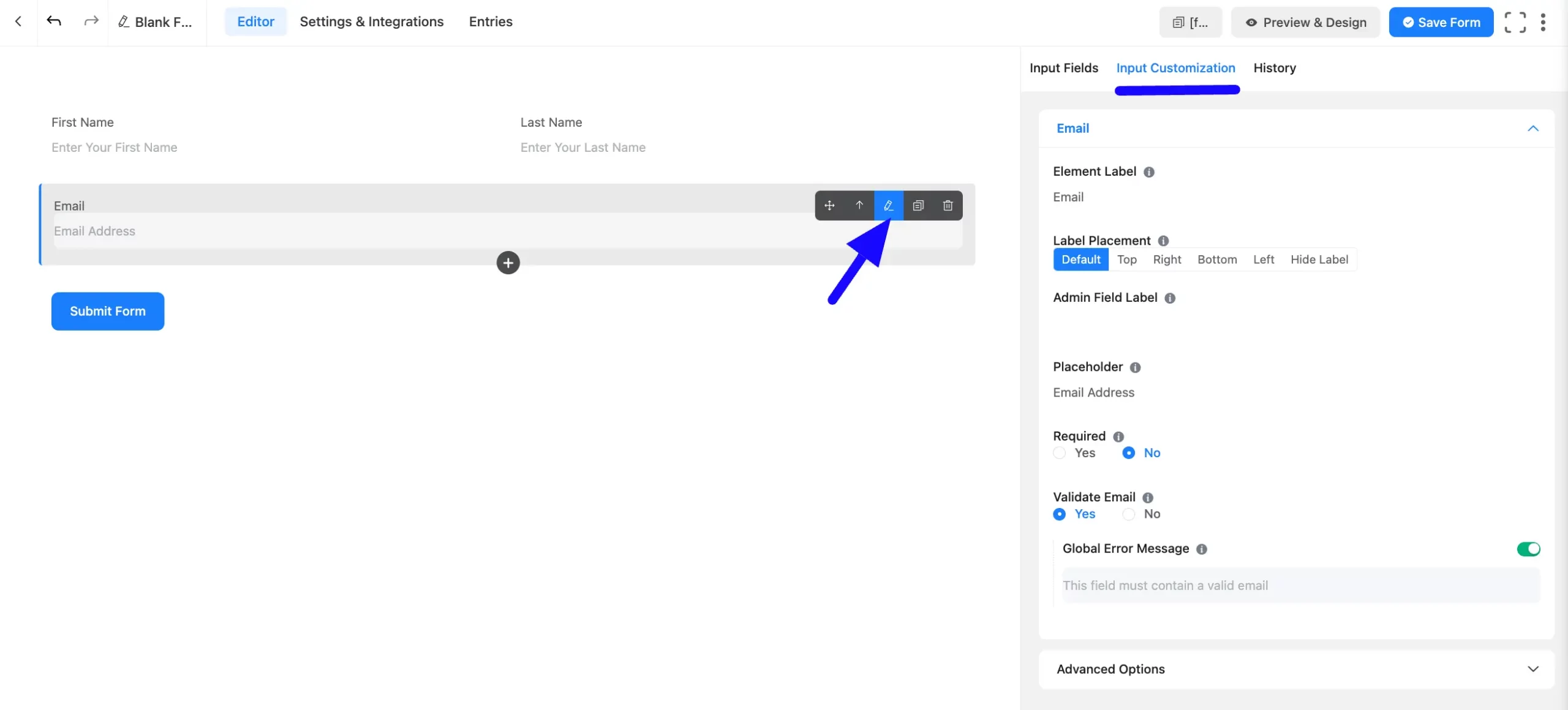
Email Field Options #
You will find various settings options for customizing the field. Located in the Input Customization Tab, these options allow you to configure essential aspects of the Email Address field.
All the Settings under the Email Address Field mentioned above are briefly explained below –
A. Element Label: This is the field title the users will see when filling out the Email field in a form. You can enter any text here to help users understand the purpose of the field.
B. Label Placement: This option allows you to determine the position of the label title where the user will see it. The available options are Top, Left, Right, and Default. All of those are self-explanatory except the Default. If you select the Default option, it will represent your global label placement settings.
C. Admin Field Label: The admin field label is a field title displayed only to admin users. You can configure this option to show a different field label for your admin users when they view the form submissions.
D. Placeholder: When the input field is empty, a message is usually shown to the users so they can understand what the field expects from them. This is the equivalent of the HTML input placeholder attribute.
E. Required: Choose the appropriate option from here to determine whether the field should be empty when the user submits your form.
F. Validate Email: You can select Yes to notify a user that he needs to add a Valid Email; otherwise, an Error message will show. Or you can choose No.
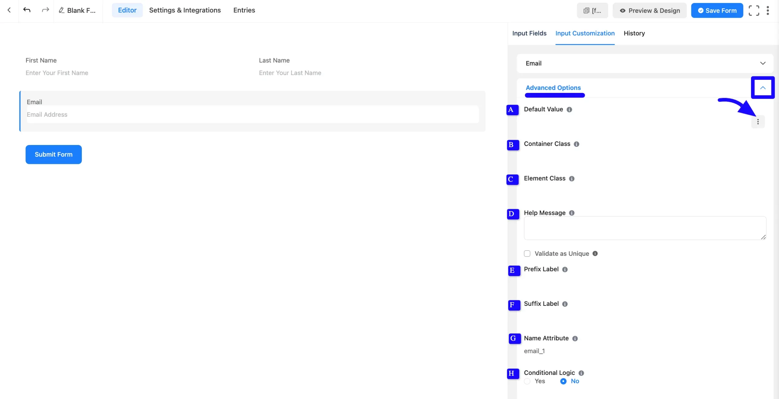
Advanced Options #
Advanced settings allow further customization to meet specific use cases. All the Settings under the Advanced Options tab mentioned in the screenshot are briefly explained below –
A. Default Value: Using our shortcodes, you can manually set any fixed value in your field and pre-filled your input field dynamically. To get a better understanding of Dynamic Default Value, read this article.
B. Container Class: Use this option to add your custom CSS classes to the field’s wrapper.
C. Element Class: Add custom CSS classes to the input field.
D.Help Message: This option allows you to guide your user thoroughly. Add your text here, which will be shown as a help message to the user.
E. Prefix Label: You can use this field to provide a Prefix Label in your input field. It will show in the input field as a prefix label.
F. Suffix Label: You can use this field to provide a Suffix Label in your input field. It will show in the input field as a suffix label.
G. Name Attribute: The input field’s name attribute is the HTML equivalent of the same name. You don’t need to modify this.
H. Conditional Logic: This option allows you to create specific rules to dynamically hide/show the input field to function conditionally based on your submission values according to your set of conditional logics. To learn more, read this Documentation.
Embed the Form into Frontend #
Once you complete the customization, click the Save Form button to save all your changes. Click the Preview & Design button in the middle to see the form preview.
To integrate and display the form on a specific page or post, copy the Shortcode from the top right side and paste it into your desired Page or Post.
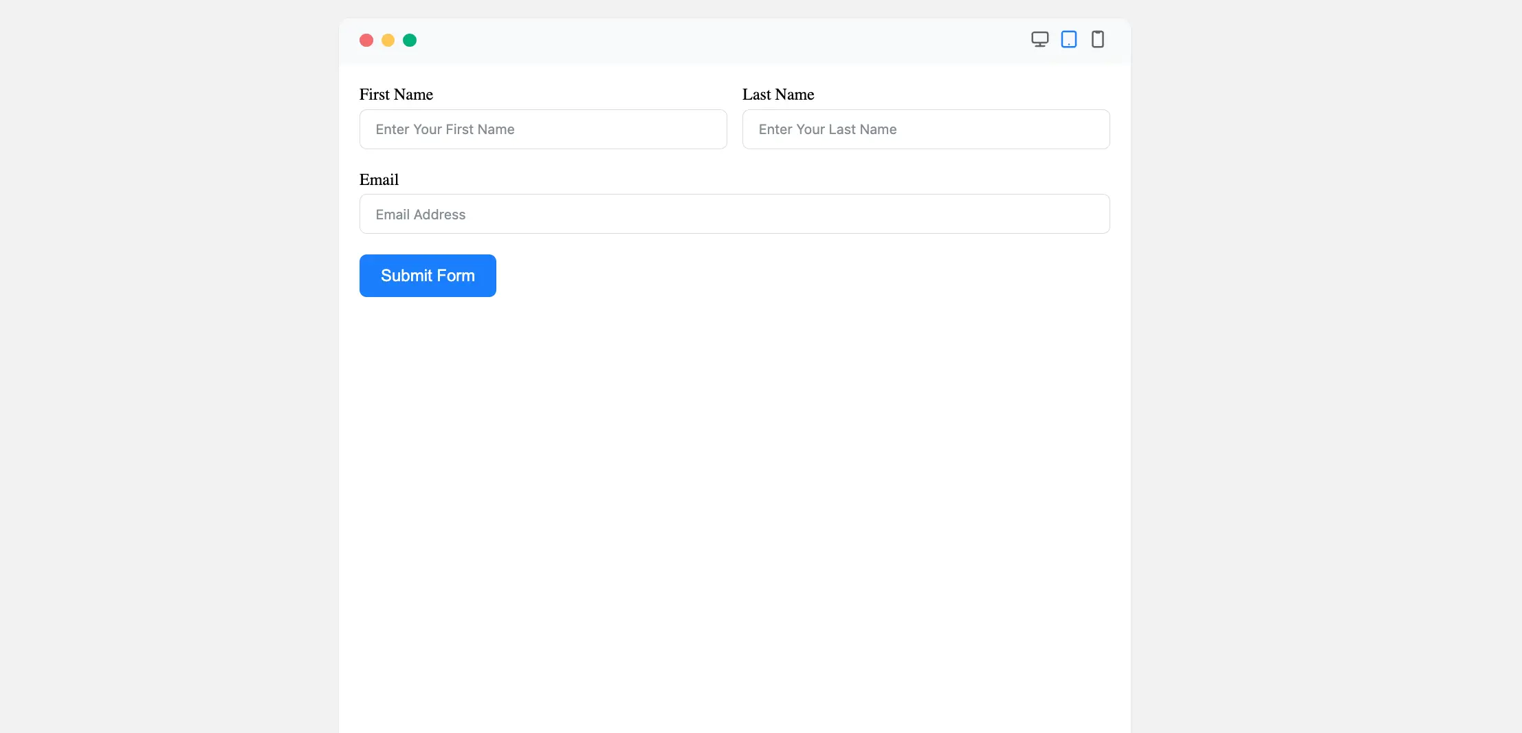
Preview of Added Email Address Field #
Here is the preview of the added Email Address field under the Form.
These are the total configuration processes for the Email Address input field.
If you have any further questions, concerns, or suggestions, please do not hesitate to contact our support team. Thank you.


