Fluent Forms provides a seamless way to embed your forms directly into the Gutenberg editor, making it easy to embed forms into your pages or posts without leaving the editor interface.
This guide will show you how to embed your Fluent Forms directly in a Gutenberg layout.
Adding Gutenberg Editor #
Once you are on your desired Page/Post, start adding Fluent Forms using the Gutenberg editor.
First, click the Plus (+) Icon to add a new block, search for Fluent Forms, and simply click on it.
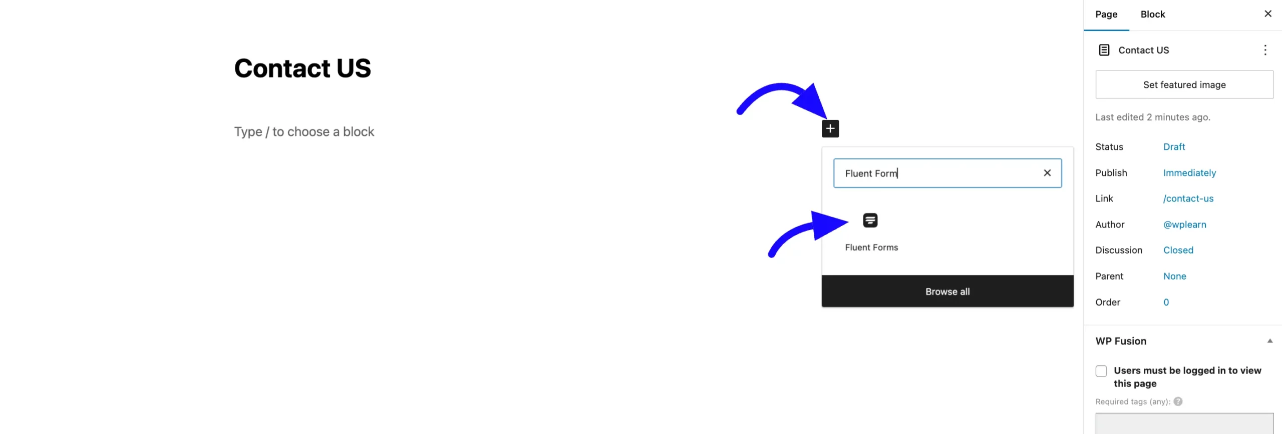
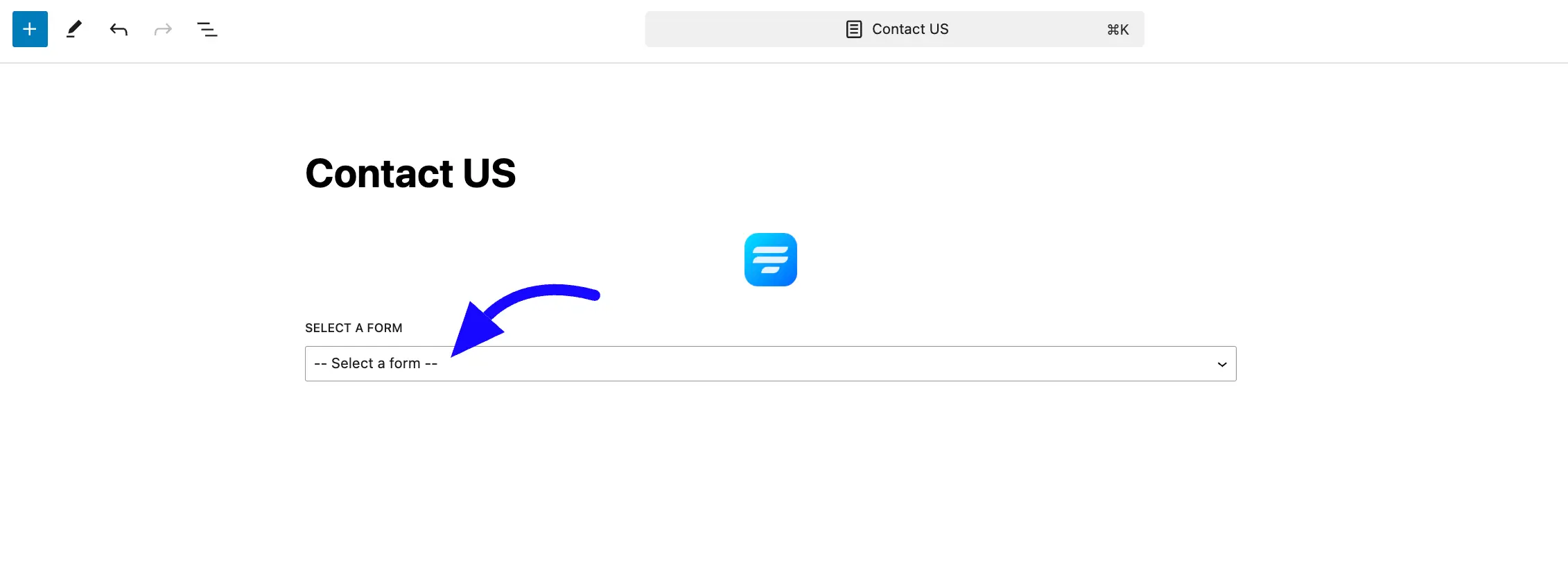
After adding the block, select a saved Fluent Forms from the dropdown menu.
Once selected, the form will automatically appear inside the editor preview. Click Update or Publish to save your changes.
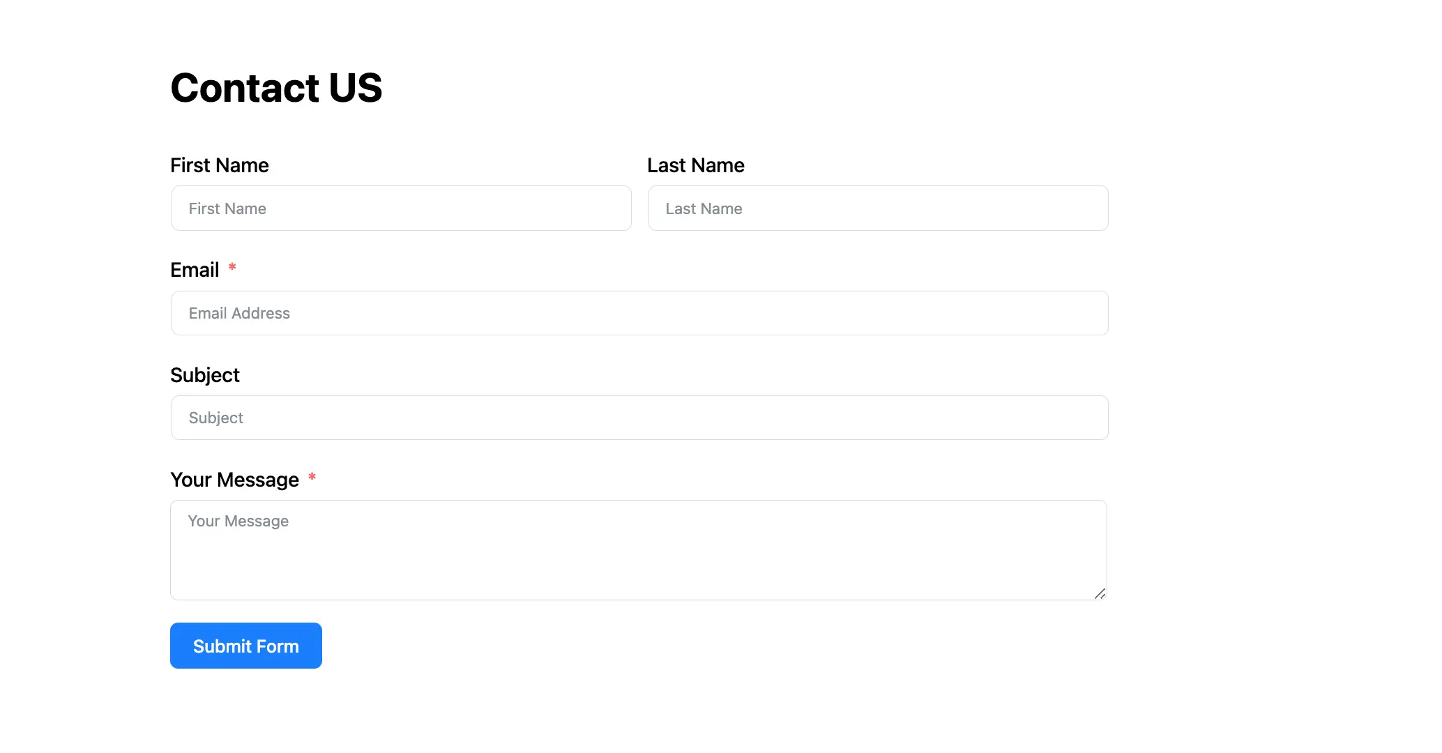
Here, you can see the preview of an embedded Fluent Forms using Gutenberg Block.
You can also add the form in Gutenberg by pasting the form ShortCode into the Gutenberg ShortCode block or HTML block.
Customize Form Styling #
When the Fluent Forms block is selected, the Block Settings sidebar on the right will show three tabs: General, Misc, and Advanced. These tabs give you powerful control over your form’s design.
General Tab #
This tab controls the styling for individual fields and elements within your form.
Form Style Template: Quickly apply a pre-built design by choosing a template. The available pre-built templates are Modern, Classic, Bootstrap style, Inherit style, and Custom (for Advanced customization).
Label Styles: Change the color and typography for your field labels.
Input & Textarea: Customize the text color, background color, typography, spacing, and borders for all text fields. You can set different styles for Normal and Focus (when a user clicks into the field).
Placeholder Styles: Set a custom color for the placeholder text inside your fields.
Radio & Checkbox Styles: Adjust the size and color of radio buttons and checkboxes.
Button Styles: Get full control over the submit button. You can set its Alignment, Width, and styles for Normal and Hover states, including:
- Text Color
- Background Color
- Typography
- Padding & Margin
- Box Shadow
- Border

Misc Tab #
Container Styles:
- Background Type: Set a Classic (solid color or background image) or a Gradient background for the entire form.
- Padding & Margin: Add space inside (padding) or outside (margin) the form container to position it.
- Box Shadow: Apply a shadow effect to the form container to make it “pop” from the page.
- Form Border Settings: Add and style a border around the entire form.

And that’s all. If you have any additional questions, please don’t hesitate to contact our support team.


